Git Product home page Git Product logo

jupyter-scatter's Introduction

Jupyter Scatter

pypi version build status API docs notebook examples tutorial

An interactive scatter plot widget for Jupyter Notebook, Lab, and Google Colab
that can handle millions of points and supports view linking.


Demo

Features?

  • πŸ–±οΈ Interactive: Pan, zoom, and select data points interactively with your mouse or through the Python API.
  • πŸš€ Scalable: Plot up to several millions data points smoothly thanks to WebGL rendering.
  • πŸ”— Interlinked: Synchronize the view, hover, and selection across multiple scatter plot instances.
  • ✨ Effective Defaults: Rely on Jupyter Scatter to choose perceptually effective point colors and opacity by default.
  • πŸ“š Friendly API: Enjoy a readable API that integrates deeply with Pandas DataFrames.
  • πŸ› οΈ Integratable: Use Jupyter Scatter in your own widgets by observing its traitlets.

Why?

Imagine trying to explore a dataset of millions of data points as a 2D scatter. Besides plotting, the exploration typically involves three things: First, we want to interactively adjust the view (e.g., via panning & zooming) and the visual point encoding (e.g., the point color, opacity, or size). Second, we want to be able to select and highlight data points. And third, we want to compare multiple datasets or views of the same dataset (e.g., via synchronized interactions). The goal of jupyter-scatter is to support all three requirements and scale to millions of points.

How?

Internally, Jupyter Scatter uses regl-scatterplot for WebGL rendering, traitlets for two-way communication between the JS and iPython kernels, and anywidget for composing the widget.

Index

  1. Install
  2. Get Started
  3. Docs
  4. Examples
  5. Development

Install

pip install jupyter-scatter

If you are using JupyterLab <=2:

jupyter labextension install @jupyter-widgets/jupyterlab-manager jupyter-scatter

For a minimal working example, take a look at test-environments.

Get Started

Tip

Visit jupyter-scatter.dev for details on all essential features of Jupyter Scatter and check out our full-blown tutorial from SciPy '23.

Simplest Example

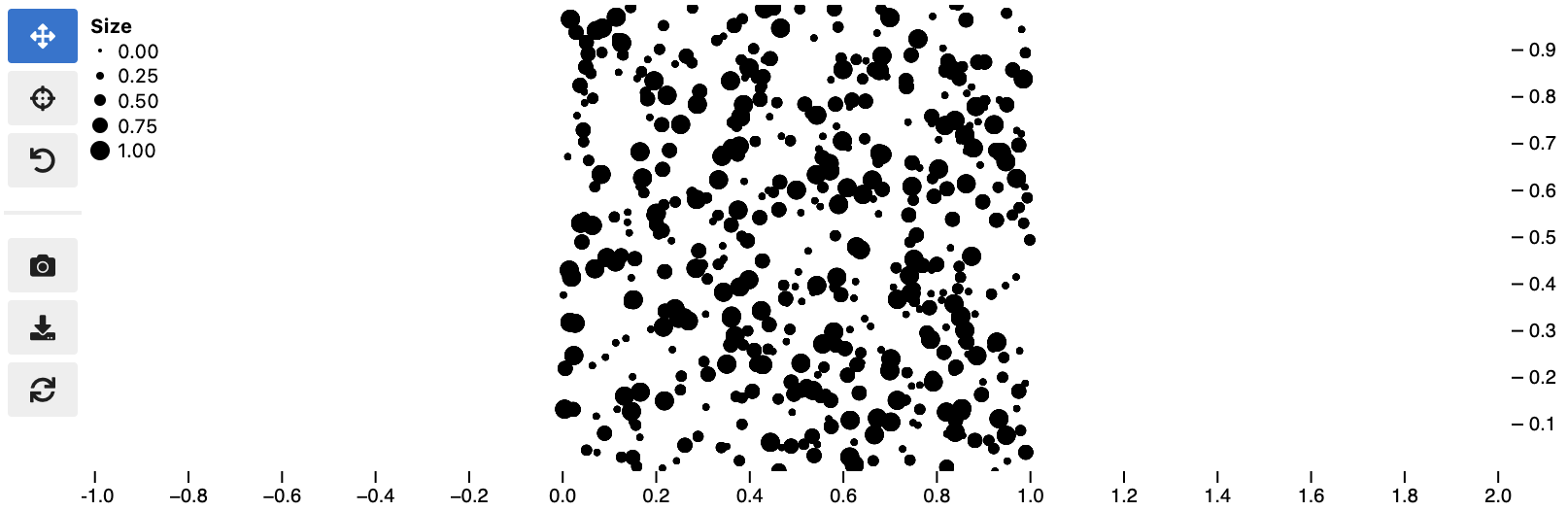
In the simplest case, you can pass the x/y coordinates to the plot function as follows:

import jscatter
import numpy as np

x = np.random.rand(500)
y = np.random.rand(500)

jscatter.plot(x, y)

Simplest scatter plotexample

Pandas Example

Say your data is stored in a Pandas dataframe like the following:

import pandas as pd

# Just some random float and int values
data = np.random.rand(500, 4)
df = pd.DataFrame(data, columns=['mass', 'speed', 'pval', 'group'])
# We'll convert the `group` column to strings to ensure it's recognized as
# categorical data. This will come in handy in the advanced example.
df['group'] = df['group'].map(lambda c: chr(65 + round(c)), na_action=None)
x y value group
0 0.13 0.27 0.51 G
1 0.87 0.93 0.80 B
2 0.10 0.25 0.25 F
3 0.03 0.90 0.01 G
4 0.19 0.78 0.65 D

You can then visualize this data by referencing column names:

jscatter.plot(data=df, x='mass', y='speed')
Show the resulting scatter plot Pandas scatter plot example

Advanced example

Often you want to customize the visual encoding, such as the point color, size, and opacity.

jscatter.plot(
  data=df,
  x='mass',
  y='speed',
  size=8, # static encoding
  color_by='group', # data-driven encoding
  opacity_by='density', # view-driven encoding
)

Advanced scatter plot example

In the above example, we chose a static point size of 8. In contrast, the point color is data-driven and assigned based on the categorical group value. The point opacity is view-driven and defined dynamically by the number of points currently visible in the view.

Also notice how jscatter uses an appropriate color map by default based on the data type used for color encoding. In this examples, jscatter uses the color blindness safe color map from Okabe and Ito as the data type is categorical and the number of categories is less than 9.

Important: in order for jscatter to recognize categorical data, the dtype of the corresponding column needs to be category!

You can, of course, customize the color map and many other parameters of the visual encoding as shown next.

Functional API Example

The flat API can get overwhelming when you want to customize a lot of properties. Therefore, jscatter provides a functional API that groups properties by type and exposes them via meaningfully-named methods.

scatter = jscatter.Scatter(data=df, x='mass', y='speed')
scatter.selection(df.query('mass < 0.5').index)
scatter.color(by='mass', map='plasma', order='reverse')
scatter.opacity(by='density')
scatter.size(by='pval', map=[2, 4, 6, 8, 10])
scatter.height(480)
scatter.background('black')
scatter.show()

Functional API scatter plot example

When you update properties dynamically, i.e., after having called scatter.show(), the plot will update automatically. For instance, try calling scatter.xy('speed', 'mass')and you will see how the points are mirrored along the diagonal.

Moreover, all arguments are optional. If you specify arguments, the methods will act as setters and change the properties. If you call a method without any arguments it will act as a getter and return the property (or properties). For example, scatter.selection() will return the currently selected points.

Finally, the scatter plot is interactive and supports two-way communication. Hence, if you select some point with the lasso tool and then call scatter.selection() you will get the current selection.

Linking Scatter Plots

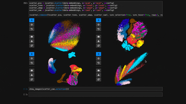
To explore multiple scatter plots and have their view, selection, and hover interactions link, use jscatter.link().

jscatter.link([
  jscatter.Scatter(data=embeddings, x='pcaX', y='pcaY', **config),
  jscatter.Scatter(data=embeddings, x='tsneX', y='tsneY', **config),
  jscatter.Scatter(data=embeddings, x='umapX', y='umapY', **config),
  jscatter.Scatter(data=embeddings, x='caeX', y='caeY', **config)
], rows=2)
linked-scatters-480.mp4

See notebooks/linking.ipynb for more details.

Visualize Millions of Data Points

With jupyter-scatter you can easily visualize and interactively explore datasets with millions of points.

In the following we're visualizing 5 million points generated with the RΓΆssler attractor.

points = np.asarray(roesslerAttractor(5000000))
jscatter.plot(points[:,0], points[:,1], height=640)
5M-roessler-attractor-480.mp4

See notebooks/examples.ipynb for more details.

Google Colab

While jscatter is primarily developed for Jupyter Lab and Notebook, it also runs just fine in Google Colab. See jupyter-scatter-colab-test.ipynb for an example.


Development

Setting up a development environment

Requirements:

Installation:

git clone https://github.com/flekschas/jupyter-scatter/ jscatter && cd jscatter
hatch shell
pip install -e ".[dev]"

After Changing Python code: restart the kernel.

Alternatively, you can enable auto reloading by enabling the autoreload extension. To do so, run the following code at the beginning of a notebook:

%load_ext autoreload
%autoreload 2

After Changing JavaScript code: do cd js && npm run build.

Alternatively, you can run npm run watch and rebundle the code on the fly.

Setting up a test environment

Go to test-environments and follow the instructions.

jupyter-scatter's People

Contributors

danr avatar dependabot[bot] avatar flekschas avatar kurtmckee avatar manzt avatar pablo-gar avatar sehilyi avatar

Stargazers

 avatar  avatar  avatar  avatar  avatar  avatar  avatar  avatar  avatar  avatar  avatar  avatar  avatar  avatar  avatar  avatar  avatar  avatar  avatar  avatar  avatar  avatar  avatar  avatar  avatar  avatar  avatar  avatar  avatar  avatar  avatar  avatar  avatar  avatar  avatar  avatar  avatar  avatar  avatar  avatar  avatar  avatar  avatar  avatar  avatar  avatar  avatar  avatar  avatar  avatar  avatar  avatar  avatar  avatar  avatar  avatar  avatar  avatar  avatar  avatar  avatar  avatar  avatar  avatar  avatar  avatar  avatar  avatar  avatar  avatar  avatar  avatar  avatar  avatar  avatar  avatar  avatar  avatar  avatar  avatar  avatar  avatar  avatar  avatar  avatar  avatar  avatar  avatar  avatar  avatar  avatar  avatar  avatar  avatar  avatar  avatar  avatar  avatar  avatar  avatar

Watchers

 avatar  avatar  avatar  avatar  avatar  avatar  avatar  avatar

jupyter-scatter's Issues

Thank you for making this!

The ability to visualize large amounts of embeddings in 2D was missing from the Python ecosystem for awhile. Thank you so much for making this - it will really improve a lot of downstream functionality related to NLP/CV visualizations.

The x/y axis scale domain is bound to the x/y data domain and not the x/y scale domain

While investigating #104 I noticed that the x/y domain of the axes are incorrectly bound to x/y data domain instead of the x/y scale domain. This is a problem as it makes the axis show the data domain while the x/y scale function might have re-scaled the data.

For instance, in the following the x data domain is [-10, 10] and the y data domain is [-1, 1]. To render the points on a common range, e.g., [-10, 10], we would pass (-10, 10) to x_scale and y_scale. Internally, the data is normalized to [0, 1] using the scale functions. By default, jscatter uses a linear scale that maps [min, max] linearly to [0, 1] but here we enforce the mapping to be [-10, 10] to [0, 1]. Now the issue is that on the JS kernel, the x/y axis would use the pre-normalized data domain (i.e., [-10, 10] for x and [-1, 1] for y). But this is incorrect. The x/y axis should use the post-normalized data domain, i.e., [-10, 10] for both: x and y.

The code below leads to the following issue:

import jscatter
import numpy as np
import pandas as pd

df = pd.DataFrame({
    "x": np.concatenate((np.linspace(start=-10, stop=10, num=50), np.linspace(start=-10, stop=10, num=50))),
    "y": np.concatenate((np.linspace(start=-1, stop=1, num=50), np.linspace(start=1, stop=-1, num=50))),
})

min_max = (df[['x', 'y']].min().min(), df[['x', 'y']].max().max())

scatter = jscatter.Scatter(
    data=df,
    x="x",
    y="y",
    x_scale=min_max,
    y_scale=min_max,
)

scatter.show()

Screenshot 2024-01-20 at 3 29 59β€―PM

The data is appropriated rendered at the common [-10, 10] range but the y axis reports [-0.1, 0.1]

By manually assigning the correct x/y domain, as follows, we get the correct y axis:

scatter = jscatter.Scatter(
    data=df,
    x="x",
    y="y",
    x_scale=common_scale,
    y_scale=common_scale,
)
scatter.widget.x_domain = common_scale
scatter.widget.y_domain = common_scale
scatter.show()

Screenshot 2024-01-20 at 3 30 12β€―PM

Axis tick values not accurate

Hi, thanks so much for developing this wonderful package! It's been extremely helpful, and I'd like to report some bug that I encountered.

I often find the tick label value is different from what I get from the selection. Moreover, the tick label value is not properly adjusted as I zoom in and out.
For example, the following point which should be close to (0, 0) would move further from the origin when I zoomed out.

image
image

I'm using the following code to generate above plot.

# scatterplot 
scatter = jscatter.Scatter(data=plot_df, x='A', y='B', color_by="group", 
                 width=500, height=500, opacity=0.5)
# output area to display dataframe
out = widgets.Output()

# handler for when "selection" changes from scatterplot
def on_change(change):
    out.clear_output()
    with out:
        indicies = change["new"]
        subset = plot_df.iloc[indicies]
        display(subset)
        
# add change handler to scatterplot widget. 
# `on_change` runs every time the `scatterplot.widget.selection` changes

scatter.size(by='rate', norm=(-0.2, 1))
scatter.color(map = {"NegCtrl":"grey", "PosCtrl_inc":"red",
                         "PosCtrl_dec":"blue", "Variant":"green"})
scatter.widget.observe(on_change, names='selection')
scatter.axes(True, True, labels=True)
scatter.legend(True, position='top-left')
display(scatter.show(), out)

Add the ability to visually filter points and update the data

As pointed out by @manzt, it'd be nice to allow filtering out points. Currently, this requires re-initializing the scatter plot instance. However, re-initialization will reset the current camera position etc. which is annoying.

I am proposing a new method for dynamic filtering:

scatter = Scatter(data=df, x='x', y='y')
scatter.filter([1,2,3]) # only show points 1, 2, and 3

@manzt What do yo think of this?

Plots won't display when using jupyter notebook in vscode

I use VSCode when developing and running jupyter notebooks. However, I'm not able to get jupyter-scatter plots to display here. They do work when running a jupyter notebook in the browser. I have not tested jupyterlab functionality.

Here's a small reproducible test case:

from IPython.display import display
import jscatter
import numpy as np

x = np.random.randn(100)
y = np.random.randn(100)
fig = jscatter.Scatter(x, y)
fig.show()

This will return an empty cell. When printing the fig variable, it seems to have been created properly, but does not display. print(fig.show()) produces:

HBox(children=(VBox(children=(Button(button_style='primary', icon='arrows', layout=Layout(width='36px'), style=ButtonStyle(), tooltip='Activate pan & zoom'), Button(icon='....

To verify that ipywidgets still work, I made and displayed the following simple widget. This worked as expected.

import ipywidgets
out = ipywidgets.Dropdown(options=['1', '2', '3'], value='2', description='Number')
display(out)

Demo fails on load

When I try the tool, I keep hitting this error.

CleanShot 2022-10-06 at 16 47 07

[Open Browser Console for more detailed log - Double click to close this message]
Model class 'JupyterScatterModel' from module 'jupyter-scatter' is loaded but can not be instantiated
TypeError: r._deserialize_state is not a function
    at f._make_model (http://localhost:8888/lab/extensions/@jupyter-widgets/jupyterlab-manager/static/150.3e1e5adfd821b9b96340.js?v=3e1e5adfd821b9b96340:1:7933)

Any idea what might cause it? Here are my versions:

jupyter-scatter==0.7.1
jupyterlab==3.4.8

I'm running Python 3.9.9, should that be relevant.

Allow defining the point reference

Currently, selected point are referenced by their index. E.g., scatter.selection([0, 1, 2]) selects the first three points of a dataframe. While this approach works fine, it'd be nice to reference points by some other column of the dataframe as well.

Use Case

Imagine you want to synchronously explore two embeddings with shared point references but non-matching indices. E.g.:

# DataFrame A
| x | y | id  |
| - | - | --- |
| 1 | 0 | 'a' |
| 1 | 1 | 'b' |
| 9 | 9 | 'c' |


# DataFrame B
| x | y | id  |
| - | - | --- |
| 2 | 1 | 'c' |
| 5 | 0 | 'b' |
| 0 | 7 | 'a' |

To synchronously explore the two datasets we'd have to tell jscatter to reference points by the id column

Proposal

Add a new property (called point_id) and method (called id()) that can either be a string referencing a column in the data or an array_like list of point IDs.

Example

Assuming we have the two data frames from above, with the new property/method we could synchronously explore the two dataset as follows:

from jscatter import Scatter, compose

config = dict(x='x', y='y', id='id')

jsc_a = Scatter(data=df_a, **config)
jsc_b = Scatter(data=df_b, **config)

compose([jsc_a, jsc_b], sync_selection=True, sync_hover=True)

Assuming we select the first point in first scatter plot instance, calling jsc_b.selection() would return 'c' (the ID of the first point in data frame B).

@manzt What do you think of this idea?

jupyter-scatter 0.10.0 doesn't work for me

After upgrading to jupyter-scatter==0.10.0 JupyterLab prints the following error:

Error displaying widget: model not found

Rolling back to jupyter-scatter==0.9.0 fixes the issue.
I'm using JupyterLab 3.4.8, jupyterlab_widgets 1.1.1, ipywidgets 7.7.2

Warning in colab

When I use the widget in colab, I get this warning

/usr/local/lib/python3.10/dist-packages/anywidget/_util.py:201: UserWarning: anywidget: Live-reloading feature is disabled. To enable, please install the 'watchfiles' package.
  start_thread=_should_start_thread(maybe_path),

Code

import jscatter
import numpy as np

x = np.random.rand(500)
y = np.random.rand(500)

jscatter.plot(x, y)

Add custom validator for `JupyterScatter.points` and `JupyterScatter.selection`

After #11, we use traittypes.Array to annotate JupyterScatter.points and JupyterScatter.selection.

However, traittypes.Array is valid for any numpy array and the shape/dtype for points and selection are more strict. We should add custom validators for these attributes, which will raise an exception if an array of the wrong shape/dtype is assigned on the python side.

This isn't urgent, since jscatter.Scatter for the most part ensures the data are correct, but this would probably help with tracking down weird bugs of where dtypes aren't what are expected.

Feature request: customizable controls

(or maybe this is possible and I was just unable to find it)

In the applications I'm interested in the "rotation" tool is not really necessary, and I find it a little confusing in how it treats the axis ticks (they seem to change in some strange, not-data-based way). So it would be preferable to disable that tool from the interactive widget.

From reading the code I think this would be fairly simple, just an additional option that changes how mouse_mode_widget is created?

Thanks for developing this tool, it is very cool!

Improve Python API

This is work in progress but I want to document it somewhere:

After discussions with @nvictus I am thinking to change the Python API of plot() to be more intuitive and support dataframes out of the box. The API is inspired by https://seaborn.pydata.org/generated/seaborn.scatterplot.html

jscatter.plot(
  x = str or ndarray,
  y = str or ndarray,
  # Optional:
  data = dataframe, # a dataframe
  color = str or ndarray, # a single color
  color_by = str or ndarray, # color encoding
  color_norm = tuple or matplotlib.colors.Normalize, # normalization strategy for color_by
  color_order = list, # in case of categorical color encoding this specifies the color order
  color_map = list or ndarray, # a list of colors to map color_by to
  size = int or float, # a single point size
  size_by = str or ndarray, # size encoding
  size_norm = tuple or matplotlib.colors.Normalize, # normalization strategy for size_by
  size_order = list, # in case of categorical size encoding this specifies the size order
  size_map = list or ndarray, # a list of size to map size_by to
  connect_by = str or ndarray, # a categorical 
  connect_order = str or ndarray, # order in which the points are to be connected
  opacity = float or str, # a static opacity value that overrides the color's alpha value or 'auto'
)

Using symbols other than circles in scatter plot

You have an idea how to enhance Jupyter Scatter? That's awesome!

Before you file your idea, please:

  • Check for duplicate issues.
  • Describe the feature's goal, motivating use cases, its expected behavior, and impact.
  • If you are proposing a new API, please explain how the current APIs fail to support your goal.
  • If you are proposing to change an existing API, please explain if your proposed is backward compatible or incompatible.
  • If applicable, include screenshots, GIFs, videos, or working examples.

You are encouraged to prototype multiple alternative APIs or implementation approaches for your proposed feature. Doing so often leads to a better solution.

Hi!
Thanks a lot for this great widget!
I wanted to as whether it's currently possible to use different symbols in the scatter plot based on the values of a column of the dataframe or not. A bit like the symbol option in plotly (https://plotly.com/python-api-reference/generated/plotly.express.scatter.html).

I couldn't find anything in the documentation, hence I'm wondering whether there's some workaround or the feature simply does not exist at the moment.

Thanks!

Add ability to show axes labels

I can think of three ways to activate axes labels:

  1. Using the column names of the dataframe (this would only if the user passing in the dataframe via data)

    scatter.axes(True, labels=True)
  2. Using custom labels

    scatter.axes(True, labels=['x', 'y'])
    scatter.axes(True, labels=dict(x='x', y='y'))

Enable pure JS linking of the view, selection, and hover state

When exporting a notebook to HTML via the following snippet, the resulting HTML file properly renders the scatter plot instance and data but the view, selection, and hover linking do not work as they currently require a Python kernel. However, this is not necessary. By using jslink() we can ensure that the linking works with and without a Python kernel. Therefore, we should switch jslink() over observe().

jupyter nbconvert --execute --to html notebooks/get-started.ipynb

Resizing the cell doesn't properly update the x axis

Investigating #107, I noticed that upon resizing the cell, the x axis wouldn't properly update.

As you can see in the video, the left most point, which is located at x equals -10 appears to be located at -20 after the resize. (Also noticed how zooming even just a tiny bit at the end properly re-renders the x axis. This indicates that the resize-related axis updater isn't updating the axis scale correctly.)

Screen.Recording.2024-01-20.at.3.36.01.PM.mp4

Expose setLassoLongPressTime to python

Hi, any plans to xpose setLassoLongPressTime to python? I think the current timeout of 750 ms is way too long and would want it to be much shorter.

Also it seems like the animation has changed? Now it's a circle arc increasing in angle, before it was a circle increasing in size. Any reason why it was changed?

Thanks!

streamlit integration

As a suggestion: think about integrating into streamlit.

I previously used notebooks for scrnaseq and a bit for flow cytometry, but that's too problematic to share with bio folks.

Streamlit provides a better ground for 'shareable interactive visualization'. I currently use a streamlit component based on plotly (it is very scalable too, and provides just selections), but linked plots are much more responsive than my current solution.

The behavior of opacity_by is inconsistent with documentation

Let's say I have this data frame:

data = pd.DataFrame({
    "x": [1, 2, 3],
    "y": [8, 3, 0],
    "color": [0, 0, 1],
})
data

According to the documentation (and this indirect clue), the opacity_by property should be settable like this:

ppp = Scatter(
    data=data,
    x="x",
    y="y",
    color_by="color",
    color_map=glasbey_light,
    size=10,
    opacity_by=[1, 1, 0],
    opacity_map=(.25, 1, 2)
)

However, this raises a TypeError with the following traceback:

---------------------------------------------------------------------------
TypeError                                 Traceback (most recent call last)
Cell In[28], line 1
----> 1 ppp = Scatter(
      2     data=data,
      3     x="x",
      4     y="y",
      5     color_by="color",
      6     color_map=glasbey_light,
      7     size=10,
      8     opacity_by=[1, 1, 0],
      9     opacity_map=(.25, 1, 2)
     10 )
     11 ppp.show()

File ~/cloud-label-propagation/.conda-env/lib/python3.11/site-packages/jscatter/jscatter.py:284, in Scatter.__init__(self, x, y, data, **kwargs)
    271 self.selection(
    272     kwargs.get('selection', UNDEF),
    273 )
    274 self.color(
    275     kwargs.get('color', UNDEF),
    276     kwargs.get('color_selected', UNDEF),
   (...)
    282     kwargs.get('color_labeling', UNDEF),
    283 )
--> 284 self.opacity(
    285     kwargs.get('opacity', UNDEF),
    286     kwargs.get('opacity_unselected', UNDEF),
    287     kwargs.get('opacity_by', UNDEF),
    288     kwargs.get('opacity_map', UNDEF),
    289     kwargs.get('opacity_norm', UNDEF),
    290     kwargs.get('opacity_order', UNDEF),
    291     kwargs.get('opacity_labeling', UNDEF),
    292 )
    293 self.size(
    294     kwargs.get('size', UNDEF),
    295     kwargs.get('size_by', UNDEF),
   (...)
    299     kwargs.get('size_labeling', UNDEF),
    300 )
    301 self.connect(
    302     kwargs.get('connect_by', UNDEF),
    303     kwargs.get('connect_order', UNDEF)
    304 )

File ~/cloud-label-propagation/.conda-env/lib/python3.11/site-packages/jscatter/jscatter.py:1220, in Scatter.opacity(self, default, unselected, by, map, norm, order, labeling, **kwargs)
   1217     self._encodings.delete('opacity')
   1219 else:
-> 1220     self._encodings.set('opacity', by)
   1222     component = self._encodings.data[by].component
   1223     try:

File ~/cloud-label-propagation/.conda-env/lib/python3.11/site-packages/jscatter/encodings.py:124, in Encodings.set(self, channel, dimension)
    121 if self.is_unique(channel):
    122     self.delete(channel)
--> 124 if dimension not in self.data:
    125     assert not self.components.full, f'Only {self.max} data encodings are supported'
    126     # The first value specifies the component
    127     # The second value

TypeError: unhashable type: 'list'

(Fortunately, setting opacity_by as a field of the data frame works as expected.)

Is the documentation wrong, and all data associated to the scatter points expected to be sourced out of the data frame? Or is this a bug?

Set aspect ratio to 'equal'

I would like to ensure that the x and y axis are scaled such that data is shown with equal aspect ratio (similar to matplotlib: ax.set_aspect('equal'). I thought of using the width() and height() function to figure out the dimensions of the scatter widget and use that for scaling. However, width() return auto, and I am not sure I am on the right track.

Unable to reproduce simple example in Jupyter lab

I tried the initial example:

import jscatter

x = np.random.rand(500)
y = np.random.rand(500)

jscatter.plot(x, y)

This is what it looks like

image

After clicking on box:
image

The text reads: 
[Open Browser Console for more detailed log - Double click to close this message]
Failed to load model class 'JupyterScatterModel' from module 'jupyter-scatter'
Error: No version of module jupyter-scatter is registered
    at f.loadClass (http://fry:8888/lab/extensions/@jupyter-widgets/jupyterlab-manager/static/134.402424ef4079078b2e0e.js?v=402424ef4079078b2e0e:1:74855)
    at f.loadModelClass (http://fry:8888/lab/extensions/@jupyter-widgets/jupyterlab-manager/static/150.1a6d6a3a0542a41bec5a.js?v=1a6d6a3a0542a41bec5a:1:10729)
    at f._make_model (http://fry:8888/lab/extensions/@jupyter-widgets/jupyterlab-manager/static/150.1a6d6a3a0542a41bec5a.js?v=1a6d6a3a0542a41bec5a:1:7517)
    at f.new_model (http://fry:8888/lab/extensions/@jupyter-widgets/jupyterlab-manager/static/150.1a6d6a3a0542a41bec5a.js?v=1a6d6a3a0542a41bec5a:1:5137)
    at f.handle_comm_open (http://fry:8888/lab/extensions/@jupyter-widgets/jupyterlab-manager/static/150.1a6d6a3a0542a41bec5a.js?v=1a6d6a3a0542a41bec5a:1:3894)
    at _handleCommOpen (http://fry:8888/lab/extensions/@jupyter-widgets/jupyterlab-manager/static/134.402424ef4079078b2e0e.js?v=402424ef4079078b2e0e:1:73392)
    at y._handleCommOpen (http://fry:8888/static/lab/jlab_core.f68a597bc4700114bad4.js?v=f68a597bc4700114bad4:1:1233317)
    at async y._handleMessage (http://fry:8888/static/lab/jlab_core.f68a597bc4700114bad4.js?v=f68a597bc4700114bad4:1:1235307)

Here are my package versions:

 name         : jupyter-scatter                                       
 version      : 0.12.4                                                
 description  : A scatter plot extension for Jupyter Notebook and Lab 

dependencies
 - ipython *
 - ipywidgets >=7.6,<9
 - jupyter-packaging *
 - jupyterlab-widgets >=1.0,<4
 - matplotlib *
 - numpy *
 - pandas *
 - traittypes >=0.2.1
 - typing-extensions *

 name         : jupyter                                                            
 version      : 1.0.0                                                              
 description  : Jupyter metapackage. Install all the Jupyter components in one go. 

dependencies
 - ipykernel *
 - ipywidgets *
 - jupyter-console *
 - nbconvert *
 - notebook *
 - qtconsole *

 name         : jupyterlab                           
 version      : 4.0.2                                
 description  : JupyterLab computational environment 

dependencies
 - async-lru >=1.0.0
 - importlib-metadata >=4.8.3
 - ipykernel *
 - jinja2 >=3.0.3
 - jupyter-core *
 - jupyter-lsp >=2.0.0
 - jupyter-server >=2.4.0,<3
 - jupyterlab-server >=2.19.0,<3
 - notebook-shim >=0.2
 - packaging *
 - tomli *
 - tornado >=6.2.0
 - traitlets *

jupyter server --version #2.6.0

The `otions` argument is not used during the creation of a `Scatter` instance

As I was investigating #104 I noticed that the options argument, which allows setting any regl-scatterplot option, isn't used during the creation of a Scatter instance.

For instance, the following does not work

scatter = jscatter.Scatter(data=df, x="x", y="y", options={"aspectRatio": 2})
scatter.widget.other_options = {"aspectRatio": 2}
scatter.show()

Instead one has to update the options after initializing the Scatter instance as follows:

scatter = jscatter.Scatter(data=df, x="x", y="y")
scatter.widget.other_options = {"aspectRatio": 2} # this circumvents the issue
scatter.show()

scatter.selection() returns empty list after lasso selection - need help debugging

I couldn't get the scatter_instace.selection() to work with the fresh install of jupyter-scatter (tried different browsers) ...
It looks like the issue is on the javascript side :
Screenshot from 2023-04-12 18-23-06

Could you help me debug it ?

here is an output of pip freeze just in case:

aiofiles==22.1.0
aiosqlite==0.18.0
anyio==3.6.2
argon2-cffi==21.3.0
argon2-cffi-bindings==21.2.0
arrow==1.2.3
asttokens==2.2.1
attrs==22.2.0
Babel==2.12.1
backcall==0.2.0
beautifulsoup4==4.12.2
bleach==6.0.0
certifi==2022.12.7
cffi==1.15.1
charset-normalizer==3.1.0
comm==0.1.3
contourpy @ file:///home/conda/feedstock_root/build_artifacts/contourpy_1673633659350/work
cycler @ file:///home/conda/feedstock_root/build_artifacts/cycler_1635519461629/work
debugpy==1.6.7
decorator==5.1.1
defusedxml==0.7.1
deprecation==2.1.0
executing==1.2.0
fastjsonschema==2.16.3
fonttools @ file:///home/conda/feedstock_root/build_artifacts/fonttools_1680021155848/work
fqdn==1.5.1
idna==3.4
importlib-metadata==6.3.0
importlib-resources @ file:///home/conda/feedstock_root/build_artifacts/importlib_resources_1676919000169/work
ipykernel==6.22.0
ipython==8.12.0
ipython-genutils==0.2.0
ipywidgets==8.0.6
isoduration==20.11.0
jedi==0.18.2
Jinja2==3.1.2
json5==0.9.11
jsonpointer==2.3
jsonschema==4.17.3
jupyter-events==0.6.3
jupyter-scatter==0.11.0
jupyter-ydoc==0.2.4
jupyter_client==8.1.0
jupyter_core==5.3.0
jupyter_packaging==0.12.3
jupyter_server==2.5.0
jupyter_server_fileid==0.9.0
jupyter_server_terminals==0.4.4
jupyter_server_ydoc==0.8.0
jupyterlab==3.6.3
jupyterlab-pygments==0.2.2
jupyterlab-widgets==3.0.7
jupyterlab_server==2.22.0
kiwisolver @ file:///home/conda/feedstock_root/build_artifacts/kiwisolver_1666805784128/work
MarkupSafe==2.1.2
matplotlib @ file:///home/conda/feedstock_root/build_artifacts/matplotlib-suite_1678135567769/work
matplotlib-inline==0.1.6
mistune==2.0.5
munkres==1.1.4
nbclassic==0.5.5
nbclient==0.7.3
nbconvert==7.3.1
nbformat==5.8.0
nest-asyncio==1.5.6
notebook==6.5.4
notebook_shim==0.2.2
numpy @ file:///home/conda/feedstock_root/build_artifacts/numpy_1675642561072/work
packaging @ file:///home/conda/feedstock_root/build_artifacts/packaging_1673482170163/work
pandas==2.0.0
pandocfilters==1.5.0
parso==0.8.3
pexpect==4.8.0
pickleshare==0.7.5
Pillow @ file:///home/conda/feedstock_root/build_artifacts/pillow_1675487166627/work
platformdirs==3.2.0
prometheus-client==0.16.0
prompt-toolkit==3.0.38
psutil==5.9.4
ptyprocess==0.7.0
pure-eval==0.2.2
pyarrow==10.0.1
pycparser==2.21
Pygments==2.15.0
pyparsing @ file:///home/conda/feedstock_root/build_artifacts/pyparsing_1652235407899/work
PyQt5==5.12.3
PyQt5_sip==4.19.18
PyQtChart==5.12
PyQtWebEngine==5.12.1
pyrsistent==0.19.3
python-dateutil @ file:///home/conda/feedstock_root/build_artifacts/python-dateutil_1626286286081/work
python-json-logger==2.0.7
pytz @ file:///home/conda/feedstock_root/build_artifacts/pytz_1680088766131/work
PyYAML==6.0
pyzmq==25.0.2
requests==2.28.2
rfc3339-validator==0.1.4
rfc3986-validator==0.1.1
Send2Trash==1.8.0
six @ file:///home/conda/feedstock_root/build_artifacts/six_1620240208055/work
sniffio==1.3.0
soupsieve==2.4
stack-data==0.6.2
terminado==0.17.1
tinycss2==1.2.1
tomli==2.0.1
tomlkit==0.11.7
tornado @ file:///home/conda/feedstock_root/build_artifacts/tornado_1666788587690/work
traitlets==5.9.0
traittypes==0.2.1
typing_extensions==4.5.0
tzdata @ file:///home/conda/feedstock_root/build_artifacts/python-tzdata_1680081134351/work
unicodedata2 @ file:///home/conda/feedstock_root/build_artifacts/unicodedata2_1667239485250/work
uri-template==1.2.0
urllib3==1.26.15
wcwidth==0.2.6
webcolors==1.13
webencodings==0.5.1
websocket-client==1.5.1
widgetsnbextension==4.0.7
y-py==0.5.9
ypy-websocket==0.8.2
zipp @ file:///home/conda/feedstock_root/build_artifacts/zipp_1677313463193/work

Reversing the size map is not properly reflected in the legend

Note how the size map is reversed in the two examples below. The scatter plot reflects this change. However, the size legend is identical in both cases!

import jscatter
import numpy as np
import pandas as pd

data = np.random.rand(500, 4)

df = pd.DataFrame(data, columns=['mass', 'speed', 'pval', 'group'])
df['group'] = df['group'].map(lambda c: chr(65 + round(c)), na_action=None)

sc = jscatter.Scatter(data=df, x='mass', y='speed', legend=True)
sc.size(by='pval', norm=[0, 1], map=[2, 4, 6, 8, 10], order='reverse')
sc.show()

Screen Shot 2022-11-14 at 4 04 07 PM

sc2 = jscatter.Scatter(data=df, x='mass', y='speed', legend=True)
sc2.size(by='pval', norm=[0, 1], map=[2, 4, 6, 8, 10])
sc2.show()

Screen Shot 2022-11-14 at 4 04 16 PM

Add ability to show a legend

It'd be nice to be able to show a legend explaining the color, opacity, or size encoding. We could likely use https://airbnb.io/visx/docs/legend for this.

API-wise I'm imagining this too look as follows

jscatter.Scatter(legend=True, legend_position='top-right')
# or
scatter.legend(True, position='top-right')

We could support the following positions:

  • top (or top-center)
  • top-left
  • top-right
  • bottom (or bottom-center)
  • bottom-left
  • bottom-right
  • left (or center-left)
  • right (or center-right)
  • center (or center-center)

Since in some cases, the number of categories could be quite high (e.g., for cell embeddings with lots of cell types). There should be an option to show the legend in a separate widget.

[Feature Request] Text Overlays

The ability to overlay text layers for labelling / annotation would be very useful. Some examples include in ThisNotThat (see the plot at the bottom of this page) or Atlas from Nomic eg this example. Looking through the regl-scatterplot examples it looks like this is relatively tractable. Some questions remain as to the exact API that would work well.

Javascript is not a language I know well, but I would be willing to try and get a version working and try to make a PR if you feel like this would be a useful addition. I'm also happy to discuss options on what the API/options exposed on the python end should be.

Error displaying widget: model not found

My JupyterLab version is 3.1.12
I cannot seem to get the example code to work on my system. I get the error as follows -
image

import jscatter
import numpy as np
# Just some random float and int values
data = np.random.rand(500, 4)
tf = pd.DataFrame(data, columns=['mass', 'speed', 'pval', 'group'])
# We'll convert the `group` column to strings to ensure it's recognized as
# categorical data. This will come in handy in the advanced example.
tf['group'] = tf['group'].map(lambda c: chr(65 + round(c)), na_action=None)
jscatter.plot(data=tf, x='mass', y='speed')
Error displaying widget: model not found

how to get selected points after linking?

I found the linked plots does not supply the .selection() method. How can I get the selected points?

given result=jscatter.link(list_of_scatters, );result, I tried result.children[0].selection() but failed

Recommend Projects

  • React photo React

    A declarative, efficient, and flexible JavaScript library for building user interfaces.

  • Vue.js photo Vue.js

    πŸ–– Vue.js is a progressive, incrementally-adoptable JavaScript framework for building UI on the web.

  • Typescript photo Typescript

    TypeScript is a superset of JavaScript that compiles to clean JavaScript output.

  • TensorFlow photo TensorFlow

    An Open Source Machine Learning Framework for Everyone

  • Django photo Django

    The Web framework for perfectionists with deadlines.

  • D3 photo D3

    Bring data to life with SVG, Canvas and HTML. πŸ“ŠπŸ“ˆπŸŽ‰

Recommend Topics

  • javascript

    JavaScript (JS) is a lightweight interpreted programming language with first-class functions.

  • web

    Some thing interesting about web. New door for the world.

  • server

    A server is a program made to process requests and deliver data to clients.

  • Machine learning

    Machine learning is a way of modeling and interpreting data that allows a piece of software to respond intelligently.

  • Game

    Some thing interesting about game, make everyone happy.

Recommend Org

  • Facebook photo Facebook

    We are working to build community through open source technology. NB: members must have two-factor auth.

  • Microsoft photo Microsoft

    Open source projects and samples from Microsoft.

  • Google photo Google

    Google ❀️ Open Source for everyone.

  • D3 photo D3

    Data-Driven Documents codes.