Git Product home page Git Product logo

sphinx_typo3_theme's Introduction

Overview

Sphinx TYPO3 theme for docs.typo3.org

Sphinx TYPO3 theme screenshot

CI

Sphinx TYPO3 theme contains all files required to build a Sphinx extension that provides the theme.

Credits

Benjamin Kott has created this theme from scratch without dependencies to Sphinx themes or the ReadTheDocs theme. Thank you very much, great work!

The ancestor of this package is t3SphinxThemeRtd which had been developed by Martin Bless as a derivative of the ReadTheDocs theme.

Releasing

Make sure to specify all three numbers as in 'v99.88.77'.

Feature demonstration

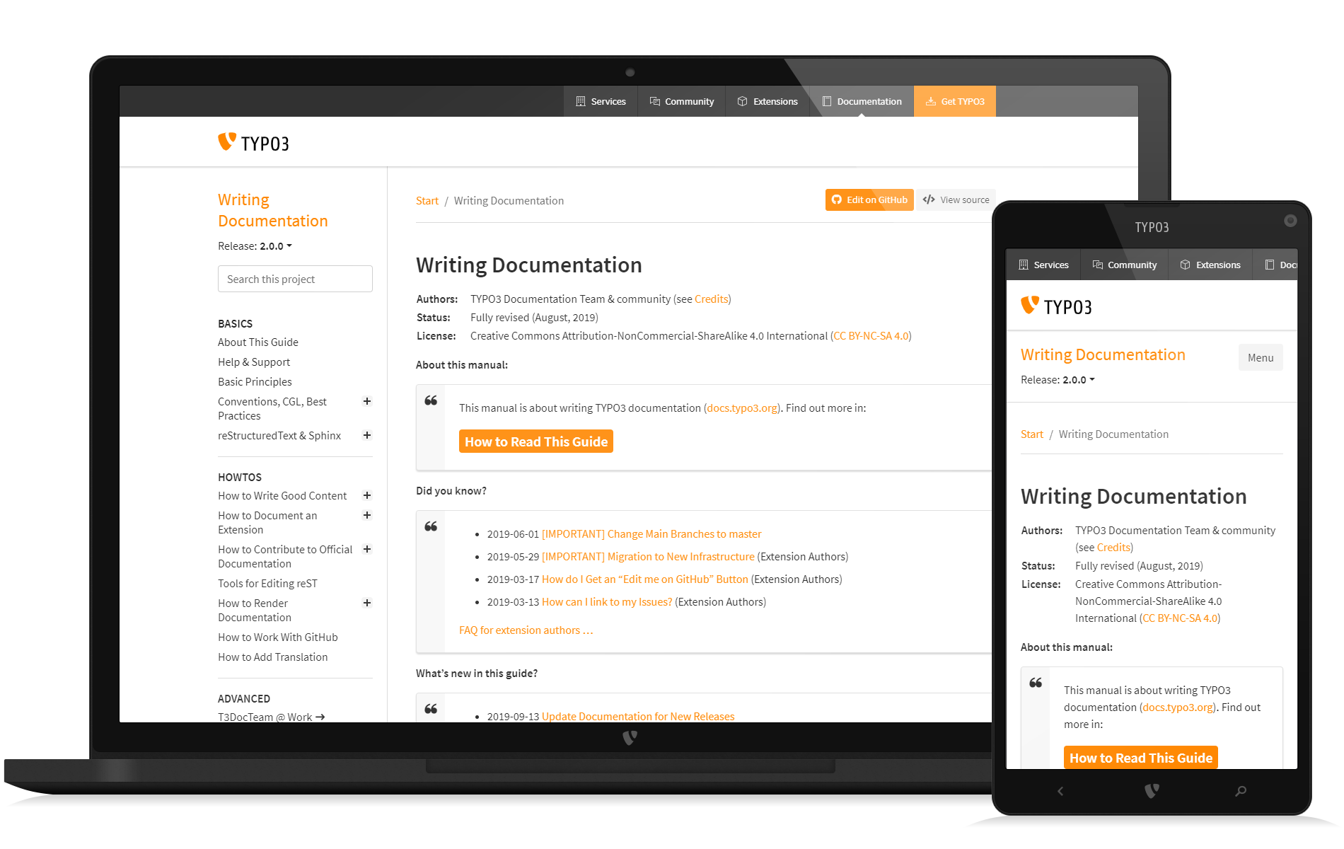
There also is a demo manual which serves as a "stress test" for the theme and shows what markup is possible and how it gets rendered.

Development

We are using Ubuntu (22.04) for development with Python3 installed. Further we are using GNU make for convenience. Next we are using the Node Version Manager (NVM) to install and activate Node version v12:

❯ nvm install 12
❯ nvm ls          # list installed version
❯ nvm use v12     # activate

We also need Yarn and Grunt. Let's install these globally:

❯ npm install -g yarn
❯ npm install -g grunt

Clone the repository:

❯ git clone https://github.com/TYPO3-Documentation/sphinx_typo3_theme/

Further steps:

❯ cd sphinx_typo3_theme  # go there
❯ make                   # see what options you have
❯ cat Makefile           # read for understanding
❯ cat Gruntfile.js       # read for understanding

Use Node version v12, show Python version:

❯ nvm use v12
Now using node v12.22.12 (npm v6.14.16)

❯ python --version
Python 3.10.6

Install the Python modules, install the Node modules and build everything:

make setup buildall

Repeat as you like:

make buildall

Look at folder ./dist to find the build results:

❯ ls ./dist

Example output:

./dist/sphinx_typo3_theme-4.7.10.dev1+gc7ebb3d.d20230426-py2.py3-none-any.whl
./dist/sphinx_typo3_theme-4.7.10.dev1+gc7ebb3d.d20230426.tar.gz

You may study as well the GitHub workflows of this repository.

Restrictions

This theme has not been used or tested with Sphinx versions that are newer than Sphinx-4.5.0.

What else?

Have fun!

sphinx_typo3_theme's People

Contributors

agjohnson avatar benjaminkott avatar chebee7i avatar cloudops-wstevens avatar danieloaks avatar danielsiepmann avatar dependabot[bot] avatar ehough avatar ericholscher avatar gl3n avatar ivoz avatar jodal avatar jonaseberle avatar josefglatz avatar kami avatar kxxoling avatar linawolf avatar marble avatar muzuiget avatar nhovratov avatar robyoung avatar ruguevara avatar snide avatar sypets avatar titilambert avatar tmotyl avatar tony avatar westurner avatar xperseguers avatar xuhdev avatar

Stargazers

 avatar  avatar  avatar  avatar  avatar  avatar  avatar  avatar  avatar  avatar  avatar  avatar  avatar  avatar  avatar  avatar  avatar  avatar  avatar  avatar  avatar  avatar  avatar  avatar  avatar  avatar  avatar

Watchers

 avatar  avatar  avatar  avatar  avatar  avatar  avatar  avatar  avatar  avatar  avatar  avatar  avatar

sphinx_typo3_theme's Issues

Make it visible whether documentation is official / community, extension, etc.

Problem

  • In some cases, you can't even see, that the documentation is the documentation for an extension (except in the URL). Example: extension_builder
  • Even if you always add that information to the start page, I think we should stop assuming, people will always start reading with the start page. They will often google for something and then might land on any page

Why is this a problem?

People might be looking for some general information about TYPO3. Then they find the information on a third party extension page. For beginners, it may take them a while to figure out that this is not a core feature.

Suggestion

Make type of documentation visible.

This should be changed in the theme, so it will automatically be visible on all pages

Classification:

Types:

  • type of manual, use already existing shortcuts: m (manual), c (core extension), p (package = third party extension?)
  • visibly differentiate between "official documentation" and "community documentation".

Goals

  • Make it easier for users to see that it is the documentation of an extension they are looking a

[Questions] Local versus documentation setup

Hello, I am exploring Sphinx and I tried your package. I am curious how to get the result in your documentation here.

My setup is a default setup following the Sphinx documentation with conf.py and index.rst in the source directory.

Question 1: How do I maximize the space?

Me:

1581174471

The documentation:

1581174496

Question 2: How does nested toctree work? For example, the block quotes does not have plus or minus button in my local version, but it has one in the documentation.

Me:

1581175747

The documentation:

1581175735

Question 3: Are you still using Python 2? The sphinxcontrib.youtube didn't work for me. I had to install sphinxcontrib.yt. sphinxcontrib.yt is apparently an updated version for Python 3. The documentation mentions sphinxcontrib.youtube, so it may be a mistake in the documentation. Which library do you use?

Scaled image looks oddly distorted (aspect-ratio)

https://docs.typo3.org/m/typo3/tutorial-getting-started/9.5/en-us/ListModule/MassEditing/Index.html#edit-selected-fields-of-selected-records

.. figure:: ../../Images/BackendListSelectiveEditing.png
   :alt: Selecting records for editing
   :class: with-shadow
   :scale: 70

Though I probably wouldn't recommend using scale, I think this used to be ok, meaning the aspect-ratio was kept when scaling.

This is the image: https://docs.typo3.org/m/typo3/tutorial-getting-started/9.5/en-us/_images/BackendListSelectiveEditing.png

Automatically generate meta information that is currently edited on start page etc.

This is a topic for the theme and the docs generator.

This topic was already raised in Slack


One thing we keep on changing and which is inconsistent is a bunch of boilerplate text that is basically always the same, which is partially outdated etc. That includes:

  • contact information for the team on the start page or about page (we changed that from email to link to the typo3.org team page)
  • the version number (on the start page) - (that is actually already handled if you use |release|)
  • information about licenses
  • information about copyright
  • review status, e.g. when last reviewed (date / TYPO3 version), general review status, e.g. "outdated", "stable" / "ok"
  • "The content of this document is related to TYPO3 etc."
  • "this is official documentation" and a description what that means
  • "this is a reference / Tutorial / guide" etc. and a description what this means
  • Information about contribution (often the outdated tip to email the team is still there - we longer want that. We want people to write issues or make the change themselves. Now we have to change that text in 10+ manuals)
    etc.

A lot of this is edited (in reST) on the start page. I don't really see a need to edit it. Ideally, the metadata can be maintained somewhere in a Settings.cfg, Something.json or whatever and this can be generated and styled automatically, which means we can make changes about how this is to be displayed in one place and can more easily change these things across manuals.

Dealing with these issues again and again takes up time.

One click version / language selection and visible links for that on top of content page

Related: TYPO3-Documentation/t3SphinxThemeRtd#82, TYPO3-Documentation/t3SphinxThemeRtd#81

When switching back and forth between versions or language, I noticed you always need 2 clicks. On mobile, you even need 3.

Additionally, the version / language selection links are a bit hidden and on bottom of page (as already stated in TYPO3-Documentation/t3SphinxThemeRtd#82).

You can regard version / language switching as navigation and might put everything in one top bar:

  • breadcrumb (currently in top left)
  • prev, next button (currently in top under horizontal line)
  • version / language selection

I would prefer buttons for this and only display still available versions (>= TYPO3 8). This could be configured in Settings.cfg. The rest could still be available by clicking "more". That way there is very little cluttering up of page.

Add styles for version hints (versionadded, versionchanged etc.)

We would like to add version hints to the docs to point out "changed since", "deprecated since", etc. TYPO3-Documentation/T3DocTeam#14 (comment)

sphinx: http://www.sphinx-doc.org/en/master/usage/restructuredtext/directives.html#directive-versionadded

This is currently not styled differently, it is just styled as normal text.


reST:

.. versionadded:: 10.2
	PSR-14 events replace hooks and signals.

.. versionchanged:: 2.3.1
	This feature was changed

.. deprecated:: 10.3
	Use ... instead of SwitchableControllerActions

HTML

<div class="versionadded">
<p><span class="versionmodified">New in version 1.0.0: </span>This feature was added</p>
</div>

How it looks:

picture

Decision and style for styled definition list

There is one open issue about how to format the "styled definition lists" which have been used a lot in core manuals and currently use various formatting, see TYPO3-Documentation/TYPO3CMS-Guide-HowToDocument#57

There is a proposal by Martin, which I think is very good because it is simpler to write in reST and also just uses general semantic markup. How it is styled, can be decided in the theme.

So, can we decide to go with this? In that case, we need a style.

[FEATURE] Add theme_info.json to distribution

I just notice that the toolchain that's processing various things during rendering needs to know about the theme and the theme version that was used during rendering.

So I propose to add a file _static/theme_info.json to the distribution that MUST have these two entries:

{
"theme_name": "sphinx_typo3_theme",
"theme_semver": "1.2.3-alpha.1"
}

theme_name is the name of the theme as used in the Sphinx configuration files.
theme_semver ist the version number obeying the rules of https://semver.org/

cc @benjaminkott

Add link (i) to jump straight to information on contributing next to "Edit me on GitHub"

This was suggested by a community member at TYPO3 camp Berlin:

Add a button next to "Edit me on GitHub" to jump straight to https://docs.typo3.org/m/typo3/docs-how-to-document/master/en-us/WritingDocsOfficial/GithubMethod.html

editme

The intent here is not to make it look pretty (yet), but to give the general idea.The colors look weird because new button uses new TYPO3 orange (from styleguide) and "Edit me" uses old orange, see TYPO3-Documentation/t3SphinxThemeRtd#110.

Motivation

Make the information available where the action is to be performed.

We documented the "Edit me on GitHub" workflow pretty thoroughly (with video and documentation). Someone who might want to edit, might:

  • not be sure if this is "allowed" or only for "Documentation Team"
  • land on a login page for GitHub or be instructed to fork the repo

Someone who is new to contributing might easily give up. We want to be inviting and informative.

Add links for 3rd level headers

On docs.typo3.org there are currently 2 levels of headers linked in the navigation, e.g. in the TypoScript reference:

image

All header levels beyond that are not linked anmyore and thus not accessible via links like the previous theme:

image

Here something needs to be integrated to add links at least for the 3rd level headers, if necessary even further. Putting all of this in the main navigation will probably be too much so maybe an autogenerated table of contents (TOC) on each page could help.

Add license text to footer

Property for license text could be added to Settings.cfg and license added to footer (like copyright and authors). That way, it is not necessary to put it on the start page (though that would of course still be possible).

Related:

Color scheme (orange) of docs.typo3.org inconsistent with TYPO3 style guide

Summary:

  • #f49700 #f49700

AFAIK the lighter one (from styleguide) should be used everywhere, so we should change this.

(I have not checked other colors, only orange)


I created new images from some of the icons that was prepared by the design team and noticed that the "TYPO3" orange shades from the style guide clash with the orange we use on docs.typo3.org for "Edit me on GitHub", "Area for home in top left" and the "orange buttons".

These use the color rgb(255, 135, 0), #ff8700.

The orange colors from Style Guide are:

key color
CMYK: 0/47/100/0
RGB: 244/151/0
Hex: f49700

stage orange dark
CMYK: 0/47/100/10
RGB: 225/141/0
Hex: e18d00

stage orange light
CMYK: 0/40/85/0
RGB: 247/168/49
Hex: f7a831

The icons from the design team (e.g. arrow) use the key color.

This is how it looks:

https://docs.typo3.org/Tips/UsingThisSite/Index.html

mobilemenu

horizbuttons-attention-m not working

I am having trouble using horizbuttons-attention-m:

.. rst-class:: horizbuttons-note-m

  • horizbuttons-note-m
  • two
  • three

The list is still vertical, and the buttons do not show up.

Add a "report issue" or "report problem" button

Proposal

Add a "Report problem" button (e.g. next to "Edit on GitHub") to make it even easier to report an issue for a particular page.

This could automatically add the URL to the issue.

Motivation

  • "Issues" link in "Related Links" is somewhat hidden
  • You need to scroll down and click twice to open an issue: click on "Issues", "Click on new"

Advantages

  • Even easier to report issues.
  • Adds context: Which URL
  • Gives us the possibility to interact with new users early

Disadvantages

  • People might feel more inclined to report issues instead of editing. But this can be easily counteracted by suggesting a PR on a comment for an issue report or by providing templates that point out possibilities of creating PR.

Implementation

Put a button on top of the page, e.g. next to "Edit me on GitHub". The link should directly point to create a new issue (Link to issue already in Settings.cfg, just add /new to it) (and add the current link to bodytext).

Example implementation:

https://our.umbraco.com/documentation/?_ga=2.186767979.293132607.1553321766-358997855.1553321766/

report

This writes the URL of the source file into the issue:

***This is the page with issues: https://github.com/umbraco/UmbracoDocs/edit/master/index.md***

Related

In addition or alternatively, some of the other methods of giving feedback could be implemented as suggested in team issue "Evaluate methods to get feedback (surveys, feedback button, ...)".

Scrollbar very thin and hard to use [MacOS]

At least on MacOS it can be very hard to use the scrollbar via click.
On MacOS the window-resizer is triggered instead.

A comment by @benjaminkott in Slack was:

seems to be a bug, introduced by our third party consent management, [...]

image

Text from current events shown in Google snippets.

We now have the text of the events shown at the top of the docs pages in many snippets displayed on google:

google

https://www.google.com/search?q=typoscript+exception+handler+debug&oq=typoscript+exception+handler+debug&aqs=chrome..69i57j33.7835j0j7&client=ubuntu&sourceid=chrome&ie=UTF-8

TYPO3 Developer Days 2020. Akademie Hotel, Karlsruhe July 30th - August 2nd 2020. TYPO3 Explained. Release: master. Loading data. Menu. Quick Links.

We probably don't want that.

Not sure how to solve this currently but there are some resources:

Quick fix: Add a link to global search engine?

This is a quick fix for current search problem. It is not intended as a permanent solution. Maybe this initial idea can be improved?

It does not look like we will get the global search solution as originally planned any time soon. Current search has several problems. See other issues with label search and also the problem that search only searches in current manual.

I think for most users, using an external search engine would be best for now. If we add a link, we give a hint that there are alternatives and make it easier for people to just click.

search4

Even better would be if the current search term was added automatically to the external link (which could be done via JavaScript).

This is really just a simple link. It is no integration of the external search engine whatsoever!


Links for external search engines (I am using google here, but the links should work with most other search engines like start page or duckduckgo):

all docs:

site:docs.typo3.org
https://www.google.com/search?q=site%3Adocs.typo3.org&oq=site%3Adocs.typo3.org

In specific manual
Example for "TYPO3 Explained"
site:docs.typo3.org "/typo3/reference-coreapi/"

https://www.google.com/search?q=site%3Adocs.typo3.org+%22typo3%2Freference-coreapi%22

Example with search term "dependency injection"
site:docs.typo3.org "typo3/reference-coreapi" dependency injection

https://www.google.com/search?q=site%3Adocs.typo3.org+%22typo3%2Freference-coreapi%22+dependency+injection


Related:

  • I already suggested to add a link to an external search engine in #17

Make the drop shadow default for images

If you use :class: with-shadow (with .. figure:: or .. image::), the image gets created with a drop shadow.

Lots of images in manuals do not do this. I think it should not be necessary to define this manually. I haven't seen a page with images in the documentation yet that would not have been improved with the drop shadow.

See Getting Started Tutorial and compare latest (with shadow) with 8.7 version (without shadow).

Additionally, I would also propose to make the drop-shadow stronger (#98) and add an extra margin around images: TYPO3-Documentation/t3SphinxThemeRtd#104

Conside exposing selected 'composer.json' data

See: https://typo3.slack.com/archives/C028JEPJL/p1527694234000358

Robert Wildling [5:30 PM]
The reason I ask is this: When I open the docu for news or for powermail (https://docs.typo3.org/typo3cms/extensions/news/Index.html) there is absolutely no indicator, which TYPO3 version the extension in question supports. Personally I consider this not really helpful. E.g. I just wanted to know, whether news in v7.0.4 still supports TYPO3 8 or TYPO3 7, or already TYPO3 9 for that matter… but… hmmm… nothing…

Change styling for shadow for images

Design Team / Fabian Stein wants to change style for image shadow to make it consistent with Styleguide:

box-shadow: 0 2px 4px 0 rgba(81, 81, 81, 0.2);

Caption of figure directive adds additional text

Environment

  • sphinx_typo3_theme version: 4.1.3
  • Python version: 3.8.2
  • sphinx version: 2.4.4
  • conf.py fragment: language = 'de'

Expected behavior

.. figure:: media/image9j.jpg
   :align: center
   :scale: 70%

   Erstes  Bild

should show the following caption:
Abb. 1 Erstes Bild

Actual behavior

The caption is:
Figure: Abb. 1 Erstes Bild

Issues with highlighting of search term on page with ?highlight=

Was raised on Slack:

?highlight=<search terms> gets added to URL that are linked on search result page.

Example:

  1. search f. dependency injection in TYPO3 Explained
  2. click result, e.g. https://docs.typo3.org/m/typo3/reference-coreapi/master/en-us/ApiOverview/DependencyInjection/Index.html?highlight=dependency%20injection

Issues:

  • highlighting very obtrusive
  • highlighting adds extra spaces, these causes problems when copying code snippet

Feature request:

  • button to turn off highlighting
  • make hightlighting less flashy or less orange, e.g. see results on other pages.

Possibly add style for version hints

We use directives deprecated, versionadded etc. Should this get a style (e.g. with indent, slightly different color, border ...?) to make it more easily visible when skimming text?

Is documented here: https://docs.typo3.org/m/typo3/docs-how-to-document/master/en-us/GeneralConventions/HowToUpdateDocs.html#how-to-add-version-hints

This is an example page:
https://docs.typo3.org/m/typo3/reference-coreapi/master/en-us/ApiOverview/Mail/Index.html

<div class="versionadded">
<p><span class="versionmodified">New in version 10.0: </span>Symfony mailer and mime support was added with this change:
<a class="reference external" href="https://docs.typo3.org/c/typo3/cms-core/master/en-us/Changelog/10.0/Feature-88643-NewMailAPIBasedOnSymfonymailerAndSymfonymime.html" title="(in TYPO3 CMS Core ChangeLog vlatest (10-dev))"><span>Feature: #88643 - New Mail API based on symfony/mailer and symfony/mime</span></a></p>
</div>

Add banner that newer version exists? (e.g. in general, only for ELTS, etc.)

I just saw this in the Neos documentation:

hint-about-newer-version

https://neos.readthedocs.io/en/2.3/References/NeosTypoScriptReference.html

It might be nice to automatically create a hint like this on all pages of official documentation that are not master of the latest supported version with a link to master the latest supported version.

But I would make this a little smaller. And I don't want to add this in reST. I would rather like to switch this on off and style it in a central place. See also Slack for considerations about putting information in .rst or automatically generating it.


other example:

django

source: https://webmasters.stackexchange.com/a/101534/84092

Drop arrows

It has been bugging me for a while and now I'd like to discuss it: I don't see a point in the arrows used in the navigation:

image

The arrows create unnecessary visual noise and have no apparent purpose. Thus I'd like to suggest to drop them, at least from the navigation.

Problem with tables (truncated, horizontal scrollbar)

Slack:

hi, I just stumbled upon a rendering issue: https://docs.typo3.org/m/typo3/reference-coreapi/master/en-us/ApiOverview/ErrorAndExceptionHandling/Configuration/Index.html
All the text in the table is truncated on the right side, can you see that? Is there anything that can be done?

It's caused by the exceptionalErrors row, the

tag with the constants consumes more space than available.

code, .rst-content tt, .rst-content code {
    white-space: nowrap;
}

This CSS breaks it


Related:

Styling of links as "buttons" - should only be used for actions? (see also typo3.org)

This is a question of usability and consistent markup / styling.

AFAIK, links that cause an action can be styled as buttons (and use appropriate markup), other links should not use this style, https://uxmovement.com/buttons/when-to-use-a-button-or-link/

Buttons are often used on GitHub or Gitlab. Not only do they give the hint that it is not just a link but an action is involved, they are also clearly visible and more prominent than the other links.

submit

On docs.typo3.org we have 3 different use cases:

  1. normal links
  2. "button" links that link to an action, e.g. "Edit me on GitHub"
  3. "fat" links: links that should be displayed more prominent and that will stand out if there are several links on one page.

But we currently only have 2 choices in reST to choose from:

  • normal links
  • the rst-class:: horizbutton

.. rst-class:: horizbuttons-primary-xxl

generated HTML:

<ul class="horizbuttons-primary-xxl simple">
<li><a class="reference internal" href="About.html#how-to-read-this-guide"><span class="std std-ref">How to Read This Guide</span></a></li>
</ul>

Currently, we often use the horizbutton for some links that should be prominent, e.g. quicklinks, for example see startpage docs.typo3.org. But they are not actions.

quicklinks

Whether these look like buttons or just have box around them - up for debate.
I think, they look like buttons and it may not be the best choice.

Maybe a better choice is to put several links in a box.

This is a question of how to style this, what our options are with .rst formatting and what are our best practices for the manuals.

See also, typo3.org, it is similar (but they these look a little less like buttons because they don't have rounded edges:

https://typo3.org/community/teams/typo3-development

dash

Add additional help to search results page

Problems

The search result page currently contains this text for no result:

Search Results
Your search did not match any documents. Please make sure that all words 
are spelled correctly and that you've selected enough categories.
  • it is not possible to select categories so this is misleading

Also, whether results are displayed or not:

  • Users should be made aware that only the current manual is searched
  • There is no additional link for searching entire docs

Possible solutions

  • remove part about categories
  • Search results page should always display additional information or a link to additional information at the top (whether results are found or not), e.g.
Did not find what you are looking for? 

The search box on the left currently only searches within the 
current manual (<insert title of manual here>). 

Use <insert link to startpage.com with search query> to 
search through entire TYPO3 documentation. 

Recommend Projects

  • React photo React

    A declarative, efficient, and flexible JavaScript library for building user interfaces.

  • Vue.js photo Vue.js

    🖖 Vue.js is a progressive, incrementally-adoptable JavaScript framework for building UI on the web.

  • Typescript photo Typescript

    TypeScript is a superset of JavaScript that compiles to clean JavaScript output.

  • TensorFlow photo TensorFlow

    An Open Source Machine Learning Framework for Everyone

  • Django photo Django

    The Web framework for perfectionists with deadlines.

  • D3 photo D3

    Bring data to life with SVG, Canvas and HTML. 📊📈🎉

Recommend Topics

  • javascript

    JavaScript (JS) is a lightweight interpreted programming language with first-class functions.

  • web

    Some thing interesting about web. New door for the world.

  • server

    A server is a program made to process requests and deliver data to clients.

  • Machine learning

    Machine learning is a way of modeling and interpreting data that allows a piece of software to respond intelligently.

  • Game

    Some thing interesting about game, make everyone happy.

Recommend Org

  • Facebook photo Facebook

    We are working to build community through open source technology. NB: members must have two-factor auth.

  • Microsoft photo Microsoft

    Open source projects and samples from Microsoft.

  • Google photo Google

    Google ❤️ Open Source for everyone.

  • D3 photo D3

    Data-Driven Documents codes.