Git Product home page Git Product logo

ggplot2's Introduction

ggplot2

R-CMD-check Codecov test coverage CRAN_Status_Badge

Overview

ggplot2 is a system for declaratively creating graphics, based on The Grammar of Graphics. You provide the data, tell ggplot2 how to map variables to aesthetics, what graphical primitives to use, and it takes care of the details.

Installation

# The easiest way to get ggplot2 is to install the whole tidyverse:
install.packages("tidyverse")

# Alternatively, install just ggplot2:
install.packages("ggplot2")

# Or the development version from GitHub:
# install.packages("pak")
pak::pak("tidyverse/ggplot2")

Cheatsheet

Usage

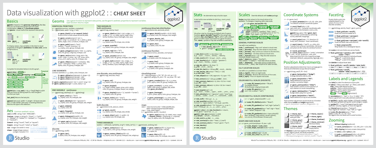
It’s hard to succinctly describe how ggplot2 works because it embodies a deep philosophy of visualisation. However, in most cases you start with ggplot(), supply a dataset and aesthetic mapping (with aes()). You then add on layers (like geom_point() or geom_histogram()), scales (like scale_colour_brewer()), faceting specifications (like facet_wrap()) and coordinate systems (like coord_flip()).

library(ggplot2)

ggplot(mpg, aes(displ, hwy, colour = class)) + 
  geom_point()

Scatterplot of engine displacement versus highway miles per gallon, for 234 cars coloured by 7 'types' of car. The displacement and miles per gallon are inversely correlated.

Lifecycle

lifecycle

ggplot2 is now over 10 years old and is used by hundreds of thousands of people to make millions of plots. That means, by-and-large, ggplot2 itself changes relatively little. When we do make changes, they will be generally to add new functions or arguments rather than changing the behaviour of existing functions, and if we do make changes to existing behaviour we will do them for compelling reasons.

If you are looking for innovation, look to ggplot2’s rich ecosystem of extensions. See a community maintained list at https://exts.ggplot2.tidyverse.org/gallery/.

Learning ggplot2

If you are new to ggplot2 you are better off starting with a systematic introduction, rather than trying to learn from reading individual documentation pages. Currently, there are three good places to start:

  1. The Data Visualization and Communication chapters in R for Data Science. R for Data Science is designed to give you a comprehensive introduction to the tidyverse, and these two chapters will get you up to speed with the essentials of ggplot2 as quickly as possible.

  2. If you’d like to take an online course, try Data Visualization in R With ggplot2 by Kara Woo.

  3. If you’d like to follow a webinar, try Plotting Anything with ggplot2 by Thomas Lin Pedersen.

  4. If you want to dive into making common graphics as quickly as possible, I recommend The R Graphics Cookbook by Winston Chang. It provides a set of recipes to solve common graphics problems.

If you’ve mastered the basics and want to learn more, read ggplot2: Elegant Graphics for Data Analysis. It describes the theoretical underpinnings of ggplot2 and shows you how all the pieces fit together. This book helps you understand the theory that underpins ggplot2, and will help you create new types of graphics specifically tailored to your needs.

Getting help

There are two main places to get help with ggplot2:

  1. The RStudio community is a friendly place to ask any questions about ggplot2.

  2. Stack Overflow is a great source of answers to common ggplot2 questions. It is also a great place to get help, once you have created a reproducible example that illustrates your problem.

ggplot2's People

Contributors

batpigandme avatar briandiggs avatar clauswilke avatar cpsievert avatar dkahle avatar dpseidel avatar eliocamp avatar hadley avatar has2k1 avatar hrbrmstr avatar jakeruss avatar jiho avatar jimhester avatar jofrhwld avatar jorane avatar jrnold avatar karawoo avatar kohske avatar krlmlr avatar lionel- avatar michaelchirico avatar mine-cetinkaya-rundel avatar olivroy avatar paleolimbot avatar tdhock avatar teunbrand avatar thomasp85 avatar topepo avatar wch avatar yutannihilation avatar

Stargazers

 avatar  avatar  avatar  avatar  avatar  avatar  avatar  avatar  avatar  avatar  avatar  avatar  avatar  avatar  avatar  avatar  avatar  avatar  avatar  avatar  avatar  avatar  avatar  avatar  avatar  avatar  avatar  avatar  avatar  avatar  avatar  avatar  avatar  avatar  avatar  avatar  avatar  avatar  avatar  avatar  avatar  avatar  avatar  avatar  avatar  avatar  avatar  avatar  avatar  avatar  avatar  avatar  avatar  avatar  avatar  avatar  avatar  avatar  avatar  avatar  avatar  avatar  avatar  avatar  avatar  avatar  avatar  avatar  avatar  avatar  avatar  avatar  avatar  avatar  avatar  avatar  avatar  avatar  avatar  avatar  avatar  avatar  avatar  avatar  avatar  avatar  avatar  avatar  avatar  avatar  avatar  avatar  avatar  avatar  avatar  avatar  avatar  avatar  avatar  avatar

Watchers

 avatar  avatar  avatar  avatar  avatar  avatar  avatar  avatar  avatar  avatar  avatar  avatar  avatar  avatar  avatar  avatar  avatar  avatar  avatar  avatar  avatar  avatar  avatar  avatar  avatar  avatar  avatar  avatar  avatar  avatar  avatar  avatar  avatar  avatar  avatar  avatar  avatar  avatar  avatar  avatar  avatar  avatar  avatar  avatar  avatar  avatar  avatar  avatar  avatar  avatar  avatar  avatar  avatar  avatar  avatar  avatar  avatar  avatar  avatar  avatar  avatar  avatar  avatar  avatar  avatar  avatar  avatar  avatar  avatar  avatar  avatar  avatar  avatar  avatar  avatar  avatar  avatar  avatar  avatar  avatar  avatar  avatar  avatar  avatar  avatar  avatar  avatar  avatar  avatar  avatar  avatar  avatar  avatar  avatar  avatar  avatar  avatar  avatar  avatar  avatar

ggplot2's Issues

Order aesthetic does not affect order of dodged groups

In the following example, the groups should be displayed in alphabetical order: gain on the left and loss on the right.

df <- data.frame( 
  FRAME = factor(c("Loss", "Gain", "Loss", "Gain")), 
  Mean = c(5.28, 5.23, 4.95, 5.12), 
  FOCUS = factor(c("Prevention", "Prevention", "Promotion", "Promotion"))
)

dodge <- position_dodge(width=0.90)
ggplot(df, aes(FOCUS, Mean, order=FRAME, colour=FRAME)) + 
  geom_point(position=dodge, size = 4)

Store labels in options

By default, scale names should be stored in options. This will allow simplification of the current default scale production so that scales only need to be added when the plot is drawn, and fix the following bugs:

  • can not use ylab() to set the label for histograms
  • annotate overrides the scale defaults

geom_abline doesn't work with scale_log10

myd <- data.frame(
  myvar = c(1,5,10,50,100,500,1000,5000,10000),
  myvarb = c(1:9)
)

base <- ggplot(myd, aes(myvarb, myvar))+
  geom_point()+
  geom_abline(intercept = 1, slope = 100)

base + scale_y_log10()

geom_rect and geom_line should support infinite coordinates

This would be useful for annotations, and for geom_vline and geom_hline. The main complication would be ensuring correct translation in coordinate systems.

  ggplot(data.frame(x=0:1,y=0:1)) +
    geom_rect(aes(x=x,y=y),xmin=.1,xmax=.2,ymin=-Inf,ymax=Inf)

For data, NULL != data.frame()

For example,

qplot(mpg, wt, data = mtcars) + 
  geom_point(data = data.frame(), colour = "red")

should display black points.

This can occur when subsetting and is annoying.

Transformations of scale_colour_gradient don't work

The following two plots are identical:

qplot(carat, price, data = diamonds, geom = "bin2d") +
  scale_colour_gradient()

qplot(carat, price, data = diamonds, geom = "bin2d") +
  scale_colour_gradient(trans = "log10")

Better interaction with theme font size and pointsize

I'm not sure what to do here, but it should at least be documented.

p = qplot(runif(5),runif(5)) + opts(title="A dumb plot")

# this is the default
theme_set(theme_grey(12))
quartz(width=5, height=4, pointsize=12)
p

# this has display issues (overwriting in legends etc.) because the
# font size is too large compared to what the device "expects"
theme_set(theme_grey(25))
quartz(width=5, height=4, pointsize=8)
p

# when the pointsize is set accordingly, the proportions are
# "harmonious" again (well, it still does not look great that's because
#25 is much to big for this size of plot)
theme_set(theme_grey(25))
quartz(width=5, height=4, pointsize=25)
p

# Ahhh, that's better
theme_set(theme_grey(10))
quartz(width=5, height=4, pointsize=10)
p

Ordering across geoms is inconsistent

df <- data.frame( 
  FRAME = factor(c("Loss", "Gain", "Loss", "Gain")), 
  Mean = c(5.28, 5.23, 4.95, 5.12), 
  FOCUS = factor(c("Prevention", "Prevention", "Promotion", "Promotion"))
)

dodge <- position_dodge(width=0.90)
base <- ggplot(df, aes(FOCUS, Mean, fill=FRAME, colour=FRAME)) + 
  geom_point(position=dodge, size = 4)

# Do work:
base + geom_text(aes(label = Mean), position = dodge)
base + geom_bar(position=dodge, stat="identity")
# Don't work
base + geom_bar(position=dodge)
base + geom_boxplot(position=dodge)

Ordinal scales

For integers with limited range and ordered factors, ggplot2 should use ordinal scales. In particular, colour should default to an sequential brewer palette, and shape should use shapes with increasing number of edges.

Layer with all coordinates set does not work

ggplot(mtcars, aes(mpg, wt)) + 
  geom_point() + 
  geom_rect(xmin = 15, xmax = 20, ymin = 3, ymax = 5)

vs.

ggplot() + 
  geom_point(aes(mpg, wt), data = mtcars) + 
  geom_rect(xmin = 15, xmax = 20, ymin = 3, ymax = 5)

coord_polar incorrectly combines expression tick marks

df <- data.frame(x = runif(10) * 2 * pi)

base <- ggplot(df, aes(x, 1)) + 
  geom_point() + 
  ylim(0,1.1) + 
  coord_polar()

breaks <- seq(0, 2 * pi, pi/2)
base + scale_x_continuous(limits = range(breaks), breaks = breaks)

labels <- c("0", expression(frac(pi,2)), expression(pi),
   expression(frac(3*pi,2)), expression(pi))
base + scale_x_continuous(limits = range(breaks), 
  breaks = breaks, labels = labels)
#0 point converted to string

geom_contour

geom_contour generates errors and does not correctly draw contours for density_2d

qplot(rating, length, data = movies, geom = "density2d",
  colour = factor(Comedy), ylim = c(0, 150))

facet_grid free space calculations incorrect

da <- data.frame(
  x = rep(1:5, 2),
  y = c(1+(0:4), 1+(0:4)/10),
  z = rep(1:2, each=5))

qplot(x, y, data=da, group=z, geom="line") +
  facet_grid(z ~ ., scales="free_y", space="free")

Panel two is about half the size it should be

hcl colour scale

That takes hue, chroma and luminance as inputs and outputs colour.

Legend with three constraints doesn't work

data <- data.frame(x = 1:10, y1 = 1:10, y2 = 1:10)
ggplot(data=data, aes(x=x)) + geom_smooth(aes(y=y1, linetype="y1"))
ggplot(data=data, aes(x=x)) + geom_smooth(aes(y=y1, color="y1"))
ggplot(data=data, aes(x=x)) + geom_smooth(aes(y=y1, color="a", linetype="b"))

stat_ecdf

Create stat for computing ecdf. Work with geom_step to create plot of ecdf.

Dates not correctly transformed when used as colour scale

a <- structure(list(date = structure(c(1227633710, 1227633725, 1227633740, 
1227633756, 1227633771, 1227633786, 1227633802, 1227633818, 1227633833, 
1227633848, 1227633863, 1227633878), class = c("POSIXt", "POSIXct"
), tzone = ""), x = c(10.2516422, 11.1053127, 11.6594761, 13.2709195, 
14.0127093, 14.7598268, 14.6802017, 15.2590637, 15.5089719, 15.5101305, 
15.1716798, 14.9050077), y = c(-11.5090033, -10.8087639, -10.0120475, 
-7.9856268, -6.5551218, -5.1593914, -4.1750486, -2.3780065, -0.5245896, 
1.3263083, 3.3031301, 4.5791333)), .Names = c("date", "x", "y"
), row.names = c(NA, -12L), class = "data.frame")

ggplot(a) + geom_point(aes(x=x, y=y, colour=date))

legend should respect layer data subset

In this example, points and lines are used for both values.

df.actual <- data.frame(x = 1:10, y = 1:10)
df.approx <- data.frame(x = 1:15, y = 1:15 + rnorm(15, sd = 3))
ggplot(df.actual, aes(x, y)) +
  geom_point(aes(colour="Actual")) +
  geom_line(aes(colour="Approximate"), data=df.approx)

coord_map and geom_tile

library(maps)
data <- data.frame(
  lat = c(-41,-42,-41,-42),
  lon = c(170,170,171,171),
  var = c(1,2,3,4))
coast <- data.frame(map("nz", plot=FALSE)[c("x","y")])

plot <- ggplot(data,aes(lon, lat)) + 
  geom_tile(aes(fill = var)) +
  geom_polygon(data = coast,aes(x, y))
plot #OK
plot + coord_equal() #OK
plot + coord_map()

coord_flip and geom_hline/geom_vline

qplot(mpg, wt, data = mtcars) + geom_vline(xintercept = 20) + coord_flip()
qplot(mpg, wt, data = mtcars) + geom_hline(yintercept = 5) + coord_flip()

Faster stat_smooth

Exercise 11 of chapter 4 of Simon Woods' GAM book - having obtained the model matrix and penalty for the smooth from the object returned by e.g. smooth.construct2(s(x,bs="cr"),data=list(x=x),knots=NULL)

Should be faster for the special case needed for stat_smooth.

Legend size calculated incorrectly

dummy <- data.frame(
       x = rnorm(1000),
       y = rnorm(1000),
       z = gl(2, 500, labels = c("A rather long label", "An even longer
label than the first label"))
)
ggplot(dummy, aes(x = x, y = y, colour = z)) + geom_point()
last_plot() + theme_gray(base_size = 4)

Reported by Thierry Onkelinx

scales should generate compatible legend keys

set.seed(1)
d = data.frame(x=1:10, y=runif(10), z=runif(10))
ggplot(d) + geom_point(aes(x,y, size=z, colour=z)) + scale_area()
# fails

set.seed(7)
d = data.frame(x=1:10, y=runif(10), z=runif(10))
ggplot(d) + geom_point(aes(x,y, size=z, colour=z)) + scale_area()
# works

Recommend Projects

  • React photo React

    A declarative, efficient, and flexible JavaScript library for building user interfaces.

  • Vue.js photo Vue.js

    🖖 Vue.js is a progressive, incrementally-adoptable JavaScript framework for building UI on the web.

  • Typescript photo Typescript

    TypeScript is a superset of JavaScript that compiles to clean JavaScript output.

  • TensorFlow photo TensorFlow

    An Open Source Machine Learning Framework for Everyone

  • Django photo Django

    The Web framework for perfectionists with deadlines.

  • D3 photo D3

    Bring data to life with SVG, Canvas and HTML. 📊📈🎉

Recommend Topics

  • javascript

    JavaScript (JS) is a lightweight interpreted programming language with first-class functions.

  • web

    Some thing interesting about web. New door for the world.

  • server

    A server is a program made to process requests and deliver data to clients.

  • Machine learning

    Machine learning is a way of modeling and interpreting data that allows a piece of software to respond intelligently.

  • Game

    Some thing interesting about game, make everyone happy.

Recommend Org

  • Facebook photo Facebook

    We are working to build community through open source technology. NB: members must have two-factor auth.

  • Microsoft photo Microsoft

    Open source projects and samples from Microsoft.

  • Google photo Google

    Google ❤️ Open Source for everyone.

  • D3 photo D3

    Data-Driven Documents codes.