sebgroup / react-components Goto Github PK
View Code? Open in Web Editor NEWHome Page: https://sebgroup.github.io/react-components/
License: Apache License 2.0
Home Page: https://sebgroup.github.io/react-components/
License: Apache License 2.0

![dependabot-preview[bot] avatar](https://avatars.githubusercontent.com/in/2141?v=4 "dependabot-preview[bot]")
![dependabot[bot] avatar](https://avatars.githubusercontent.com/in/29110?v=4 "dependabot[bot]")


Is your feature request related to a problem? Please describe.
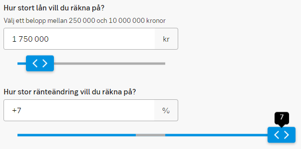
Be able to set where the blue bar should start from.
Describe the solution you'd like
A setting that tells where the midpoint is. If not set it default to min value.
Especially useful when using min values less than 0 and want to show the blue bar from 0.
Describe alternatives you've considered
Still use default behavior from before.
Additional context
Approved by: Ulrika Dettner-Larsson & Henrik Hoglund.
Describe the bug
Some of the component styles do not match the specifications defined in SEB design library.
Expected behavior
Describe the bug
Negative value as min value makes the calculations realy strange on where the thumb will be located.
To Reproduce
Steps to reproduce the behavior:
Expected behavior
Slider thumb should follow mouse/finger.
Slider no longer than 100% width. Now it can end on for example 180% width.
Desktop (please complete the following information):
Additional context
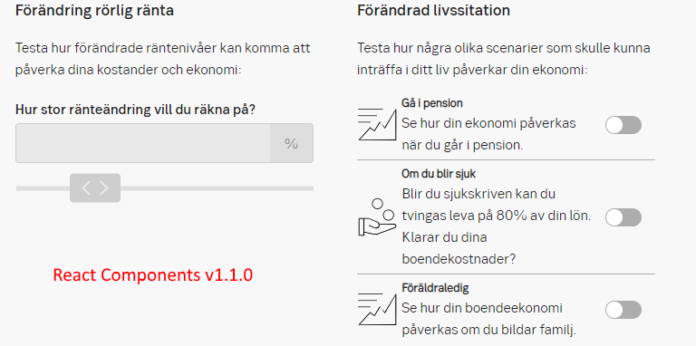
Worked in react-components v1.1.0.
The error indicator for checkbox and radio button have been defined. The component and label text are framed in red border. Red error text is placed under and near the component.
To synk our error indicators across all our sites and apps.
https://designlibrary.sebgroup.com/components/forms/checkbox/#specification
https://designlibrary.sebgroup.com/components/forms/radio-button/
If this is not relevant to you, please close the issue with a comment. Thank you!
/Ulrika,
Design Management team
Describe the bug
The pagination seem to be omitting pageSize and generating negetive values.
To Reproduce
Steps to reproduce the behavior:
<Pagination
    value={paginationValue}
    onChange={setPagination}
    size={3}
    useFirstAndLast={true}
/>
Screenshots
If applicable, add screenshots to help explain your problem.

Additional context
The getlist should be calculated once and only when there is a change in value.
Describe the bug
The following components should have, but are missing a disabled state.
Describe the bug
When triggering a tooltip on mobile, tooltip message box is misaligned and not able to be closed.
To Reproduce
Steps to reproduce the behavior:
Expected behavior
Tooltip message should be able to view clearly and toggle to be hidden or to be seen
Screenshots

The accordion has been updated.
Change
Reason
Many reasons. First of all, it was time to specify the component better. We have adjusted to fit users’ need with more efficient use of space. The direction of chevron is updated to show how it is animated. We also noticed that the component has been (too) content-heavy and added clearer guidelines.
Specification
https://designlibrary.sebgroup.com/components/accordion/

Let us know if you have any questions!
/Ulrika
Design management
Is your feature request related to a problem? Please describe.
My project has a requirement where locale (translation) should be in English but date format should remain in en-GB format
Describe the solution you'd like
Have additional props for Datepicker component that will allow me to specify these configurations separately. react-date-picker's documentation suggests that this is possible.
Describe alternatives you've considered
DatepickerDatepicker component and modifying them myselfDescribe the bug
React (and react-dom?) is listed as a dependency rather than a peerDependency and devDependency. This causes error on pages rendering a component from react-components which uses hooks with the following error:
Invalid hook call. Hooks can only be called inside of the body of a function component. This could happen for one of the following reasons:
1. You might have mismatching versions of React and the renderer (such as React DOM)
2. You might be breaking the Rules of Hooks
3. You might have more than one copy of React in the same app
See https://fb.me/react-invalid-hook-call for tips about how to debug and fix this problem.
More info at: https://reactjs.org/warnings/invalid-hook-call-warning.html#duplicate-react
npm ls react yields
λ npm ls react

+-- @sebgroup/[email protected]
| `-- [email protected]
`-- [email protected]
Which according to the docs is incorrect:
In order for Hooks to work, the react import from your application code needs to resolve to the same module as the react import from inside the react-dom package.
If these react imports resolve to two different exports objects, you will see this warning. This may happen if you accidentally end up with two copies of the react package.
[...]
If you see more than one React, you’ll need to figure out why this happens and fix your dependency tree. For example, maybe a library you’re using incorrectly specifies react as a dependency (rather than a peer dependency). Until that library is fixed, Yarn resolutions is one possible workaround.
Found more info at this open issue for React: facebook/react#13991
I verified that the react-components used a different instance of React with the method listed in docs, linked earler:
// Add this in node_modules/react-dom/index.js
window.React1 = require('react');

// Add this in your component file
// (in this case e.g. node_modules/@sebgroup/react-components/dist/CheckBox)
require('react-dom');
window.React2 = require('react');
console.log(window.React1 === window.React2);
More info regarding dependencies in this SO post: http://stackoverflow.com/questions/30451556/ddg#30454133
Other possible dependencies that should be peer/dev dependency (used for docs?):
react-routerreact-router-domreact-domHi Spartans,
Just a feature suggestion with regards to the accordion component.
Often times when showing summary data, the accordion comes into play for condensing the data.
Could we have one accordion with a plus sign (+) default and minus (-) on collapse as props. Perhaps the float right or left could also be a prop.
Example - default

Example - collapsed
After a long period of testing, we have now updated the Alert ribbon component. See the full description for the details (measurements, colour codes, etc):
https://designlibrary.sebgroup.com/components/alerts/alert-ribbons/#guidelines
Feedback from user tests and usage from several channels, saying that purple was too loud. We also learned that the description in Design Library generally was too confusing. And we hade a design synk between Bootstrap and Design Library which generated sensible updates for both.
Let me know if anything is unclear. Thank you!
Ulrika,
Design Management
Describe the bug
The dropdown component incorrectly overrides a bootstrap class
To Reproduce
Steps to reproduce the behavior:
alert alert-danger class nameExpected behavior
components should not override default bootstrap classes like alert
Describe the bug
The loader is glitching on an iPhone. (see the gif below)
To Reproduce
Steps to reproduce the behavior:
Screenshots
Smartphone (please complete the following information):
Additional context
The problem is related to the right rotator which is completely unnecessary. Removing it could potentially remove the issue but still need to be tested
Pattern (sep 2019)
A pattern that describes a uniform way for the user to add both soft and hard properties. This two-step pattern is especially useful in pages where the user has to manually update values.
A white card triggers a slide-out. Use is the same behaviour for all devices.
Details
See the measurements (etc) in Design Library:
https://designlibrary.sebgroup.com/patterns/crud/#usage
Design library identifier: component-crud

Any questions or feedback? /Ulrika, [email protected]
Describe the bug
The modal component has a tabIndex set to -1 for the div of class modal. This is preventing the normal tab flow of the content inside the modal
To Reproduce
Steps to reproduce the behavior:
Modal componentRadioGroup componentExpected behavior
The values should be changed swiftly without being interrupted
Desktop (please complete the following information):
Additional context
A workaround could be done by selecting the modal div element and running modal.removeAttribute("tabIndex"). This solves the issue.
Please try to add the following:

The design of the tab component has been adjusted:
Mobile version
See the specification to get the correct details:
https://designlibrary.sebgroup.com/components/tab/#specification
Original discussion
sebgroup/design-library#66
Thank you @TheresaHedlund for working on this!
Any feedback? Do contact [email protected]
Ulrika,
Design Management
Describe the bug
Overflowed items in multi-select dropdown is hidden/cut-off
To Reproduce
Expected behavior
The dropdown should expand to accomodate for all selected options, similar to:
https://semantic-ui.com/modules/dropdown.html
Describe the solution you'd like
The components should support accessibility features such as screen reader.
Describe the bug
When we use React Components v2.1.1 we only get checkboxes instead of the toggles.
To Reproduce
Steps to reproduce the behavior:
Expected behavior
Show a normal toggle button.
Screenshots
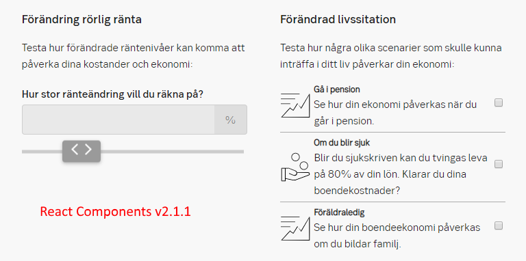
Devices:
Additional context
Please try out and see if you could find any obvious error. Custom css for Toggles are turned off.
Describe the bug
The Loader component is taking unwanted space when it's not in fullscreen mode.
To Reproduce
Steps to reproduce the behavior:
fullscreen set to falseExpected behavior
The loader should not take space, instead it should overlay on top of its host component
Additional context
The issue is happening because the position of the loader is set to relative with a width and height of 100%
Describe the bug
The direction of the arrow if wrong.
Expected behavior
Should face down when closed and up when expanded.
Additional context
The original specification was correct. I just made an error.
Describe the bug
there is no way to set error message to the radio group as the error props is removed. According to the documentation , I should be able to set error message.
To Reproduce
Steps to reproduce the behavior:
RadioGroup componentExpected behavior
Should be able to set error message like other form components
Describe the bug
The loader wrapper is rendered no matter what status the toggle is.
To Reproduce
Steps to reproduce the behavior:
Expected behavior
Loader wrapper should not be rendered if toggle = false
Describe the bug
Cannot use version 2.0.0 or newer in our project.
When starting project get this error:
[...]/node_modules@sebgroup\react-components\dist\Slider\Slider.js:1:3809: Unexpected token (1:3809)
To Reproduce
Steps to reproduce the behavior:
Expected behavior
Not getting any error.
Desktop (please complete the following information):
Additional context
If I check Slider.js, it's the '#' that is the character at number 3809.
(o+="\n/*# sourceMappingURL=data:
We currently only use the slider from react-components.
Is your feature request related to a problem? Please describe.
Passing error will show an error indicator highlighted in red with the message being passed. A new success prop of type boolean has been introduced to switch to a success indicator highlighted in green without a message. Currently, there is no way to pass a success indicator with a success message, or even a warning.
Describe the solution you'd like
This whole indication of error/success/warning should be moved to an indicator prop that has this structure:
interface Indicator {
    type: "success" | "warning" | "error";
    message?: string;
}
Describe alternatives you've considered
having seperate props like this:
interface ElementProps {
   // the rest of the props
   error: string;
   warning: string;
   success: string;
}
but using them will be difficult and also it doesn't allow showing the indicator alone without the message if neededIs your feature request related to a problem? Please describe.
When comitting code you get a lot of changes in the changed files when using a beauitifier/prettier. Code should be formatted the same, not dependent of personal preference or just randomness.
Describe the solution you'd like
Everyone contributing to React Components should use Prettier extension to VS Code (or something equal to it) with same settings (rc file in the project).
Describe alternatives you've considered
Turning of auto formater when using React Components.
Additional context
Extension: Prettier - Code Formater v2.3.0
Using file: .prettierrc
A version similar to how many of you already writes:
{
    "arrowParens": "avoid",
    "bracketSpacing": true,
    "printWidth": 120,
    "semi": true,
    "singleQuote": false,
    "tabWidth": 4,
    "trailingComma": "es5"
}
Or more common version (less width, single quotes):
{
    "arrowParens": "avoid",
    "bracketSpacing": true,
    "printWidth": 80,
    "semi": true,
    "singleQuote": true,
    "tabWidth": 4,
    "trailingComma": "es5"
}
There are two small and important changes on table design:

There is more to come, but these changes are the most urgent. So the rest of what we know about tables stays the same for now.
Thank you!
/Ulrika
Design Management
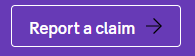
The button Button link used to be called Alternative button.

The name Button link says what it is.
See the full specification here:
https://designlibrary.sebgroup.com/components/forms/button/
Feel free to update this in your frameworks so that we use the same language on components. If this is not relevant to you, please close the issue with a comment. Thank you!
/Ulrika,
Design Management team
Add feature to dismiss the dialogue when clicking on the backdrop, and a close icon button
Is your feature request related to a problem? Please describe.
Missing hover and focus state for slider component. Makes it hard if not impossible to follow the new accessibility law. People with disabilities have hard time to step through components when they do not look different when selected.
Describe the solution you'd like
Describe alternatives you've considered
Use number 1 of these:
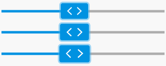
Additional context
Ulrika Dettner-Larsson and Henrik Hoglund have approved this change.
Describe the bug
A clear and concise description of what the bug is.
To Reproduce
At the moment, out accordion doesn't allow user to set the active item among the lists and i believe it should.
Expected behavior
When the props activeIndex is set , the accordion should set the item as active and expand or collapse it.
What is this?
This component calls attention to a status/tag/category.

Details
See the specification to get all the right details:
https://designlibrary.sebgroup.com/components/badge/
Component identifier
component-badge
Thank you!
/Ulrika
Describe the bug
When placing at least two RadioGroup components in the same page and both having the elements with the same label will create a conflict where clicking on a label from on RadioGroup will trigger both RadioGroups to change its value.
To Reproduce
Steps to reproduce the behavior:
radioList: Array<RadioListModel> = [
    { value: "YES", group: "yes-or-no", label: "Yes" },
    { value: "NO", group: "yes-or-no", label: "No" }
]
firstSelected: string = null;
secondSelected: string = null;<RadioGroup
name="first"
list={radioList}
value={firstSelected}
onChange={(value) => { this.setState({ firstSelected: value }); }}
/>
<RadioGroup
name="second"
list={radioList}
value={secondSelected}
onChange={(value) => { this.setState({ secondSelected: value }); }}
/>Expected behavior
The other RadioGroup should not be affected
Additional context
The id and for attributes are set to the label of the radio item. Therefore, having the same label would lead to having two HTML elements with the same id and two labels referring to the same id
Decision from the Design review May 8
The dropdown now has another version that allows multiple selections.

Full specification
See states and sizes here: https://designlibrary.sebgroup.com/components/forms/dropdown/#styles
Component identifier
component-dropdown
Thank you! :)
Ulrika
Design management
Describe the bug
We have an issue with Breadcrumbs caused by React.memo. In our container component we have a list of the breadcrumbs which we manipulate (push/pop) in order to update the breadcrumbs. Since memo only does a shallow compare it will think that the props are still the same, it's the same object but different content.
Our workaround for now is to copy the list every time we update the breadcrumbs to force a rerender.
If it's by design maybe updating the documentation would be an alternative.
To Reproduce
Steps to reproduce the behavior:
Expected behavior
Breadcrumbs rerender with new list content
Screenshots
If applicable, add screenshots to help explain your problem.
Desktop (please complete the following information):
Smartphone (please complete the following information):
N/A
Additional context
Issue started after the memo update
Design update 2019-10-01
To align with the other form components, pls update the height to 44 px for

Original discussion: sebgroup/design-library#16
Thanks!
/Ulrika, Design management
Is your feature request related to a problem? Please describe.
I wanted to add an id attribute to Button component but am unable to do so. It is requested by QA so they can target specific buttons when writing Selenium tests.
Describe the solution you'd like
Ability to pass relevant HTML attributes as props, similar to Material UI
Describe alternatives you've considered
Button in a div and use $("#button-wrapper > button) selector instead, but it's additional effort on both development and QA's sideDescribe the bug
Breadcrumb items do not appear in one line in IE
To Reproduce
Steps to reproduce the behavior:
Expected behavior
All items in the breadcrumb should show in one line
Additional context
It seems that IE is unable to calculate the height of the resized chevron in ::before selector. Adding height property seems to be a working override. It only works if you change it in code. IE doesn't recalculate the height if you only modify the height in IE console
master branch failed. 🚨I recommend you give this issue a high priority, so other packages depending on you could benefit from your bug fixes and new features.
You can find below the list of errors reported by semantic-release. Each one of them has to be resolved in order to automatically publish your package. I’m sure you can resolve this 💪.
Errors are usually caused by a misconfiguration or an authentication problem. With each error reported below you will find explanation and guidance to help you to resolve it.
Once all the errors are resolved, semantic-release will release your package the next time you push a commit to the master branch. You can also manually restart the failed CI job that runs semantic-release.
If you are not sure how to resolve this, here is some links that can help you:
If those don’t help, or if this issue is reporting something you think isn’t right, you can always ask the humans behind semantic-release.
package.json file.A package.json file at the root of your project is required to release on npm.
Please follow the npm guideline to create a valid package.json file.
Good luck with your project ✨
Your semantic-release bot 📦🚀
Describe the solution you'd like
Describe the bug
When an SVG icon is passed to the button component with a wrapper then it will not be colored correctly
To Reproduce
Steps to reproduce the behavior:
<div><svg/></div>Expected behavior
The SVG should be colored regardless, as long as it's inside the button
Screenshots
If applicable, add screenshots to help explain your problem.
What is this?
A new component to display a filter

Details
See the specification to get all the right details:
https://designlibrary.sebgroup.com/components/chips/#specification
Component identifier
component-chip
Thank you!
/Ulrika
Is your feature request related to a problem? Please describe.
It more of a hassle at the moment. These two components share a lot of functionalities and whenever there is an update to how a TextBox should behave we always have to make the changes twice, which is unnecessary.
Describe the solution you'd like
There should be one component called TextBox that allows adding prepend and append elements like icons and texts.
Add support for pattern in TextBox and TextBoxGroup components. The reason is that if I wanted to trigger number pad keyboard on iOS I need to pass patter \d*
Describe the bug
Using RadioGroup component, if one of the radio buttons has a long label, and a custom styling was applied to display them in the same line, then the other radio buttons will be aligned to the bottom. Vertical alignment is required.
To Reproduce
Steps to reproduce the behavior:
max-width 200px)Expected behavior
The radio buttons should be aligned to the top
Screenshots

The default datepicker format is probably the computer's locale. I would like to be able to pick whatever dateformat to be displayed in the datepicker
Selected a one digit month or day would display on digit like this:
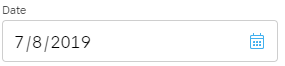
I would like to be able to display something like this 07-08-2019
Is your feature request related to a problem? Please describe.
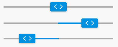
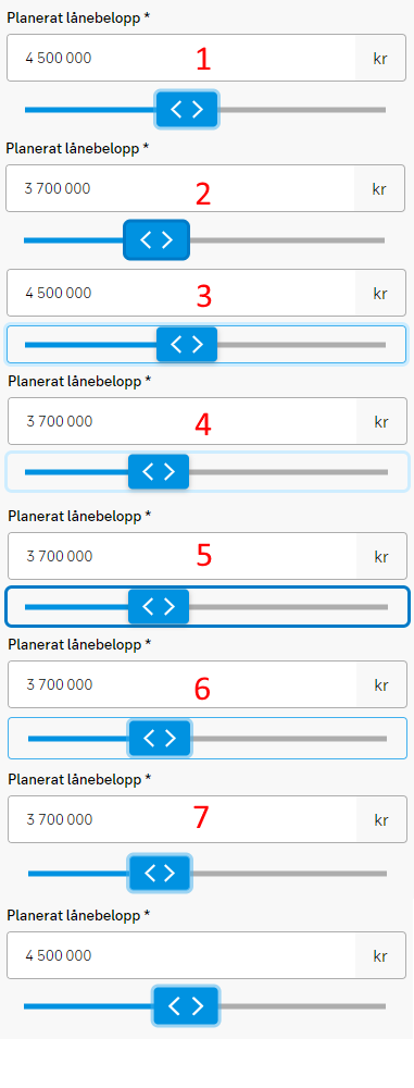
The slider visual looks too big and some users gets confused by the chevrons. Remake the design.
Describe the solution you'd like
Design Library Team (Leopold Roos, Henrik Hoglund & Jessi Nygren Walhed decided on this, with apporval of Ulrika Dettner- Larsson) have made this changes:

Describe alternatives you've considered
Additional context
Add any other context or screenshots about the feature request here.
 React
React
A declarative, efficient, and flexible JavaScript library for building user interfaces.
🖖 Vue.js is a progressive, incrementally-adoptable JavaScript framework for building UI on the web.
 Typescript
TypeScript is a superset of JavaScript that compiles to clean JavaScript output.
An Open Source Machine Learning Framework for Everyone
 Django
The Web framework for perfectionists with deadlines.
 Laravel
A PHP framework for web artisans
Bring data to life with SVG, Canvas and HTML. 📊📈🎉
JavaScript (JS) is a lightweight interpreted programming language with first-class functions.
Some thing interesting about web. New door for the world.
A server is a program made to process requests and deliver data to clients.
Machine learning is a way of modeling and interpreting data that allows a piece of software to respond intelligently.
Some thing interesting about visualization, use data art
Some thing interesting about game, make everyone happy.
 Facebook
We are working to build community through open source technology. NB: members must have two-factor auth.
 Microsoft
Open source projects and samples from Microsoft.
 Google
Google ❤️ Open Source for everyone.
 Alibaba
Alibaba Open Source for everyone
 D3
D3
Data-Driven Documents codes.
 Tencent
China tencent open source team.

