kassambara / ggpubr Goto Github PK
View Code? Open in Web Editor NEW'ggplot2' Based Publication Ready Plots
Home Page: https://rpkgs.datanovia.com/ggpubr/
'ggplot2' Based Publication Ready Plots
Home Page: https://rpkgs.datanovia.com/ggpubr/


As title, I want to use the ggline function, but could it also make the position dodge like geom_line function?
Thanks!
In ggdensity(gghistogram) plot, if data have NA values, the mean within group will be missing.
the test code like:
library(ggpubr)
set.seed(1234)
wdata = data.frame(sex = factor(rep(c("F", "M"), each=200)), weight = c(rnorm(200, 55), rnorm(200, 58)))
wdata[1,2] = NA
ggdensity(wdata, x = "weight", add = "mean", rug = TRUE, color = "sex", palette = c("#00AFBB", "#E7B800"))
It's seems not possible to write special characters as expression, e.g. subscripts or greek letters as labels:
ylab = expression(alpha^{3}*hel ~ "\u223")
This fails and gives :
Error in match(x, table, nomatch = 0L) :
'match' requires vector arguments
Could this be fixed or is there a workaround?
Thanks.
Great package! I'm trying to apply it to a relatively small data set that I have and I'm getting an error when trying to add significance data to the plot.
Running
compare_means(per_bead ~ beads, protein)
yields a 6 x 8 tibble with some of the significance data I'm hoping to add to my plot:
# A tibble: 6 x 8
       .y. group1 group2          p     p.adj p.format p.signif   method
     <chr>  <chr>  <chr>      <dbl>     <dbl>    <chr>    <chr>    <chr>
1 per_bead     20     10 1.00000000 1.0000000    1.000       ns Wilcoxon
2 per_bead     20      8 0.30649217 0.9194765    0.306       ns Wilcoxon
3 per_bead     20      5 0.03038282 0.1822969    0.030        * Wilcoxon
4 per_bead     10      8 0.56136321 1.0000000    0.561       ns Wilcoxon
5 per_bead     10      5 0.06060197 0.3030098    0.061       ns Wilcoxon
6 per_bead      8      5 0.06060197 0.3030098    0.061       ns Wilcoxon
Following the example given in the docs for adding p-values comparing groups:
my_comparisons <- list(c("5, 20"), c("5, 10"), c("10, 20"))
ggboxplot(prot, x = "beads", y = "per_bead",
          color = "beads", palette = "jco") +
  stat_compare_means(comparisons = my_comparisons)
I get the following errors:
Warning messages:
1: Removed 16 rows containing non-finite values (stat_boxplot).
2: Removed 16 rows containing non-finite values (stat_signif).
3: Computation failed in `stat_signif()`:
missing value where TRUE/FALSE needed
I've tried several different arguments in stat_compare_means() without success. I'm hoping to achieve something similar to the example plot below (or just the output of "p.signif" instead of a value):

Hello!
I am using the following as part of ggplot command to plot p-values on a bar-plot:
stat_compare_means (label = "p.format", method = "t.test", ref.group = "mNG") +
My groups are set up as factors, and control ("mNG") is factor level 2.
I am only getting p-values plotted for groups after my control "mNG" group:

If I change the re.group to "parental", it plots them all (but the comparison is wrong. Similarly, if I change it to "parvA", it only plots it for "parvB"

In my opinion, it should still plot the p-values for all groups against control, no matter the factor level.
I am trying to change the significance intervals and the associated *s for the output. I thought map_signif_level should do the trick. Am I wrong? Is there a way to do it. I would appreciate any help.
Thanks
JJ
bonferroni_n <- 4828
symnum.args <- list(cutpoints = c(0, 0.05/bonferroni_n, 0.05, 1), symbols = c("***", "*", "ns"))
Output of compare_means works when I try the following
compare_means(len ~ dose, data = ToothGrowth,method="t.test", symnum.args = symnum.args)
I thought the following should work for the stat_compare_means, but it doesnot.
ggboxplot(ToothGrowth, x = "dose", y = "len" ) +
stat_compare_means( comparisons = my_comparisons,
method = "t.test",
label="p.signif",
paired = TRUE,
map_signif_level = c("***"=0.05/bonferroni_n , "**"=0.001, "*"=0.05) )
Dear Alboukadel,
Awesome package for drawing quickly high quality graphics!
I noticed when using ggbarplot in combination with facet errorbars and means/medians are wrong. I assume they are not recalculated after calling facet?
Here is an example based on one of your examples:
library(ggpubr)
data(ToothGrowth)

df3 <- ToothGrowth

ggbarplot(df3, x = "dose", y = "len", color = "supp",
 add = "mean_se", palette = c("#00AFBB", "#E7B800"),
 position = position_dodge())

gg <- ggbarplot(df3, x = "dose", y = "len", add = "mean_se", palette = c("#00AFBB", "#E7B800"),
          position = position_dodge())
facet(gg, facet.by="supp")

R Under development (unstable) (2017-09-30 r73418)
Platform: x86_64-pc-linux-gnu (64-bit)
Running under: Ubuntu 16.04.3 LTS

Matrix products: default
BLAS: /usr/local/lib64/R/lib/libRblas.so
LAPACK: /usr/local/lib64/R/lib/libRlapack.so

locale:
 [1] LC_CTYPE=en_US.UTF-8       LC_NUMERIC=C
 [3] LC_TIME=nl_NL.UTF-8        LC_COLLATE=en_US.UTF-8
 [5] LC_MONETARY=nl_NL.UTF-8    LC_MESSAGES=en_US.UTF-8
 [7] LC_PAPER=nl_NL.UTF-8       LC_NAME=C
 [9] LC_ADDRESS=C               LC_TELEPHONE=C
[11] LC_MEASUREMENT=nl_NL.UTF-8 LC_IDENTIFICATION=C

attached base packages:
[1] stats     graphics  grDevices utils     datasets  methods   base

other attached packages:
[1] ggpubr_0.1.5  magrittr_1.5  ggplot2_2.2.1

loaded via a namespace (and not attached):
 [1] Rcpp_0.12.13     digest_0.6.12    dplyr_0.7.4      assertthat_0.2.0
 [5] grid_3.5.0       plyr_1.8.4       R6_2.2.2         gtable_0.2.0
 [9] scales_0.5.0     rlang_0.1.2      lazyeval_0.2.0   bindrcpp_0.2
[13] labeling_0.3     tools_3.5.0      glue_1.1.1       purrr_0.2.3
[17] munsell_0.4.3    compiler_3.5.0   pkgconfig_2.0.1  colorspace_1.3-2
[21] bindr_0.1        tibble_1.3.4
>
Cheers,
Maarten

Add the following arguments:
facet.by: grouping variablespanel.labs: to change the panel labelsshort.panel.labs: omit variable names in panel labelsI would like to be able to use comparisons for a subset of the data passed to stat_compare_means. Right now you can do this to compare means against a reference group, but not for specified comparisons. For example, here I'm testing against the lowest dose only for the VC group:
df <- ToothGrowth
df$dose <- as.factor(df$dose)
df.VC <- df[df$supp == "VC",]
#Plot using ref.group
ggbarplot(
  df,
  "dose",
  "len",
  color = "supp",
  add = c("point", "mean_sd"),
  xlab = "dose",
  ylab = "len",
  position = position_dodge(0.72)
  ) + stat_compare_means(
    data = df.VC,
    method = "t.test",
    ref.group = "0.5",
    label = "p.format"
  )
Which produces:

But this does not work for comparisons (the data parameter is ignored, so it pools the supp groups):
#Plot using comparisons - should have same values, but ignores subsetted data (df.VC)
mycomparisons = list(c("0.5", "1"), c("0.5", "2"))
ggbarplot(
  df,
  "dose",
  "len",
  color = "supp",
  add = c("point", "mean_sd"),
  xlab = "dose",
  ylab = "len",
  position = position_dodge(0.72)
) + stat_compare_means(
  data = df.VC,
  method = "t.test",
  comparisons = mycomparisons
)
Which produces:

A separate but related issue, any attempt to pass a label type with comparisons doesn't have the expected result:
#Plot using comparisons - should have same values, but ignores data
mycomparisons = list(c("0.5", "1"), c("0.5", "2"))
ggbarplot(
  df,
  "dose",
  "len",
  color = "supp",
  add = c("point", "mean_sd"),
  xlab = "dose",
  ylab = "len",
  position = position_dodge(0.72)
) + stat_compare_means(
  data = df.VC,
  method = "t.test",
  comparisons = mycomparisons,
  label = "p.format"
)
I would like to support text justification in ggtexttable such that I can align financial data better. I noticed that tableGrob supports an "hjust" parameter (below) but I'm not able to find a way to pass that in to the ggtexttable function.
https://cran.r-project.org/web/packages/gridExtra/vignettes/tableGrob.html
Great package! If I knew were to plug this in I'd offer a PR. Thank you.
Thanks for a great library! I really love it.
But it seems to lack support for Japanese characters.
I assume I can work around if I can change the font.
Can I do that?
I believe that the ggscatter() function in ggpubr has a bug. The problem that I ad was that every time I tried to run ggscatter() I keep having the Error in [.data.frame(data, , x) : undefined columns selected
My code was
install.packages("ggpubr")
library("ggpubr")
my_data <- All_Data_Summer_17_
head(my_data, 6)
ggscatter(my_data, x = "band", y = "Disk",
      add = "reg.line", conf.int = TRUE,
      cor.coef = TRUE, cor.method = "pearson",
      xlab = "Band", ylab = "Disk (cm)")
if instead some elements of the code get rearrange (see new code) the problem is solve. This might indicate that the order does matter. So maybe you guys can look at it.
ggscatter(my_data, x = "band",
                   y = "Disk",
                   add = "reg.line",
                   cor.coef = FALSE,
                   cor.method = "pearson",
                   conf.int = TRUE,
                   xlab = "Band",
                   ylab = "Disk (cm)")
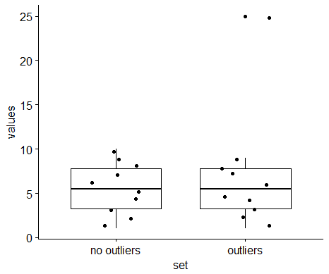
Hi,
When plotting boxplots with outlier points, these outliers are plotted twice when the add="jitter" option is set:
someData <-
  data.frame(values=c(1:10, c(1:9, 25)),
             set=c(rep("no outliers",10), rep("outliers", 10)))

ggboxplot(data=someData,
          x="set",
          y="values",
          add="jitter")
The outlying point (with the value 25) is present twice in the picture:
Hey,
Is there any way to change the thickness of axis, error bar and comparison brackets?
Thanks
Edit: I just realized you can overwrite the axis with ggplot2 code (+theme(axis.line.x=...))
Haven't found a way to change the error bars or comparison brackets though
(e-mail from user)
I have made the plot you can see attached below.
ggbarplot(data.Tmel, x = "continent", y="readNO_Tmel", fill="continent", color = c("#1F78B4","#33A02C"), add="mean_se", position=position_dodge(0.8),
          label = TRUE, lab.pos = "in", lab.col = "white", lab.size = 3.5) +
stat_compare_means(method = "wilcox.test", comparisons = list(c("Europe","Australia")), label="p.format", label.y = 4000) +
scale_fill_manual(values = c("#1F78B4","#33A02C")) +
labs(title="(A)",  x="", y = "Read number") +
theme(plot.title = element_text(size = 9, face = "bold", hjust = 0)) + #hjust = 0.5, to center
theme(axis.title = element_text(face="bold", size = 9)) +
theme(axis.text.x = element_text(size=9, face = "bold", angle = 90, hjust = 1, vjust=0.5, color="black")) +
theme(axis.text.y = element_text(size=7)) +
scale_y_continuous(breaks = seq(0, 4000, 500)) +
theme(legend.position="none")
Is there a way to customize the bracket whiskers?
is there a way to round to 1 decimal the number plotted in white within the bars?
Moreover I am using the flag label="p.format" but I still have the significance code instead of the p-value, where is my msitake there?
use data
> data("ToothGrowth")
> df <- ToothGrowth
> compare_means(len~dose,data = df,method = "t.test")
# A tibble: 3 x 8
    .y. group1 group2            p        p.adj p.format p.signif method
  <chr>  <chr>  <chr>        <dbl>        <dbl>    <chr>    <chr>  <chr>
1   len    0.5      1 6.697250e-09 1.339450e-08  6.7e-09     **** T-test
2   len    0.5      2 1.469534e-16 4.408602e-16  < 2e-16     **** T-test
3   len      1      2 1.442603e-05 1.442603e-05  1.4e-05     **** T-test
## 0.5 VS 1  p.value=6.697250e-09
> my_comparisons <- list( c("0.5", "1"), c("1", "2"), c("0.5", "2") )
> ggboxplot(df, x = "dose", y = "len")+
+  stat_compare_means(comparisons = my_comparisons,method = "t.test")
## 0.5 VS 1  p.value≈1.3e-07

#t.test result  0.5 VS 1
> t.test(df$len[df$dose==0.5],y=df$len[df$dose==1])$p.value
[1] 1.268301e-07
t.test() calculated P value the same of graphics,but compare_means() function is different
Hi Kassambara,
I would really like to use stat_compare_means to display the significance levels of my dataset.
The only thing I can't seem to fix is the order of the labels, ggplot keeps these factor levels nice in order, but your function does not keep this order.
It might be a variable I completely missed, but I have not found a solution in the last 3 days.
p1<- ggplot(data=subsetChain, aes(x=Chothia,y=total.energy))+
geom_boxplot(aes(fill=LCtype),outlier.shape=NA,notch=TRUE)+theme_bw()+
stat_compare_means(aes(group = LCtype), label = "p.signif",geom="label")+
scale_y_continuous(limits=c(-5,5))+ ylab("Total energy (kcal/Mol)")+
theme(axis.title.x=element_blank(),legend.position=c(0.01,0.9))
I have the levels of the dataset properly ordered, ggplot keeps the levels in order, but the labeling of your function does not keep the order, resulting in wrong significance levels, it seems to order the factors alphabettically.
Is that something I can easily fix, or is there a line in your code where the labels are reordered?
Cheers,
Rob van der Kant
Is it possible to access a single cell in a table output? And then change e.g. the background or the font?
Like you can do with the grid and gridExtra package?
Here is an example how it would be done with these packages:
library(gridExtra)
library(grid)
g <- tableGrob(iris[1:4, 1:3])
find_cell <- function(table, row, col, name="core-fg"){
  l <- table$layout
  which(l$t==row & l$l==col & l$name==name)
}

ind <- find_cell(g, 3, 2, "core-fg")
ind2 <- find_cell(g, 2, 3, "core-bg")
g$grobs[ind][[1]][["gp"]] <- gpar(fontsize=15, fontface="bold")
g$grobs[ind2][[1]][["gp"]] <- gpar(fill="darkolivegreen1", col = "darkolivegreen4", lwd=5)
grid.draw(g)
It seems that this is the official extension website for ggplot2:
http://www.ggplot2-exts.org/gallery/
I think ggpubr should be mentioned there.
Hi,
thanks for a nice package!
I posted this a long time ago on stackoverflow. Looking at the background_image() function, I was wondering is this could be used for mapping bar sections instead of the plot background.
In cowplot the plot.grid() function has the label_size option to change the size of labels?
Could this be implemented in ggarrange() too?
Dear Alboukadel
Is it possible to specify position dodge with ggdotchart?
Suppose that I want this polt as a dotchart:
ggbarplot(df2, "dose", "len",
fill = "supp", color = "supp", palette = "Paired",
label = TRUE,
position = position_dodge(0.9))
How can I do it>
Manuel
Not sure if this is by design, but ggpubr won't format axis ticks correctly when given a datetime (POSIXct) column as input.
The fulldate column used in the plots below is of class
> class(n_hours$fulldate)
[1] "POSIXct" "POSIXt"
and has the format "2017-01-01 20:45:00 UTC"
Plot made with ggpubr:
n_hours %>%
  ggline(x = "fulldate", y = "value",
         group = "ID", add = "mean",
         x.text.angle = 25)

and the same data directly with ggplot:
n_hours %>%
  ggplot(aes(x = fulldate, y = value, group = ID)) +
  stat_summary(aes(group = ID), geom = "line", fun.y = mean, size = 0.6)

Here is the problem, if I just use
ggviolin(df,"group","Length",color="group",palette = c("#00AFBB", "#E7B800", "#FC4E07"),
         add = "boxplot",add.params = list(width=0.1))+
  scale_x_discrete(limits=c("de","un","st"),
                   labels=c("D", "NC", "S"))+
  stat_compare_means(comparisons = my_comparisons,method = "t.test",paired = F)+
  theme_light(base_size = 15)+
  ylab("Length")+theme(legend.position = "none")+
  xlab("")

I will get the results there should not significant difference between group D and S
However, when I transformed the ylim with log10 I just want to make the distribution looks more beautiful. the results will change totally.
ggviolin(df,"group","Length",color="group",palette = c("#00AFBB", "#E7B800", "#FC4E07"),
         add = "boxplot",add.params = list(width=0.1))+
  scale_y_log10(breaks = trans_breaks("log10", function(x) 10^x),
                labels = trans_format("log10", math_format(10^.x)))+
  scale_x_discrete(limits=c("destabilized","unchanged","stabilized"),
                   labels=c("D", "NC", "S"))+
  stat_compare_means(comparisons = my_comparisons,method = "t.test",paired = F)+
  theme_light(base_size = 15)+
  ylab("Length")+theme(legend.position = "none")+
  xlab("")

I just wonder how can I keep the original t.test results to show on the figure with ylim transformed.
Thanks!
Kai
Hi,
I am not sure what kind of t-test is performed in ggpubr. It is not a big deal, however, I needed to get the t-statistic for these tests on multiple plots. This is not a function in stat_compare_means so I tried to perform the t.test function (Welch Two Sample t-test) which gave me different p-values than what was printed in ggpubr.
Is there a way to print the t-statistic through ggpubr?
Is there a way to use the Welch Two Sample t-test in ggpubr?
Thanks so much! Looking forward to hearing from you.
Claudia
Hi,
First of all thanks for developing this amazing package!
I am using the function "ggboxplot", it's OK to export the images into pdf files individually while the files are broken and cannot open when I use a "for" loop to export them in batch. Here is my dataframe:
head(a)
exp class cancer_type
1 9.096848 ACC ACC
2 10.808414 ACC ACC
3 9.029533 ACC ACC
4 8.399695 ACC ACC
5 3.248019 ACC ACC
6 7.958241 ACC ACC
And the code:
for(i in c("AMOTL2.txt","AXIN1.txt","AXIN2.txt"))
{
    pdf(paste(i,".pdf",sep=""))
    a = read.table(i,header=T,sep="\t",quote="")
    ggboxplot(a, x="cancer_type", y="exp", font.x=c(14,"bold"),
        font.y=c(14,"bold"),fill = "cancer_type",legend="none",
        outlier.size = -1,xtickslab.rt =60,font.xtickslab=c(12),font.ytickslab=c(12))
    dev.off()
}
I may have found another bug. When using facet_wrap or facet_grid with ggline, both plots show the same lines, even though using the option "mean_se" shows the correct errors.
I've been using your awesome package a lot, thanks for your work!
Hi, I really love the aesthetics of ggpubr. Great work. I have been playing around with some of my own data. Wondering if it's possible to do subgraphs looping over factor variable just as using facet_grid in ggplot2?
I tried replicating the example:
data("ToothGrowth")
df <- ToothGrowth

p <- ggboxplot(df, x = "dose", y = "len",
               color = "dose", palette =c("#00AFBB", "#E7B800", "#FC4E07"),
               add = "jitter", shape = "dose")

my_comparisons <- list( c("0.5", "1"), c("1", "2"), c("0.5", "2") )
p + stat_compare_means(comparisons = my_comparisons)+ stat_compare_means(label.y = 50)
but returned an error message: Error: No stat called StatSignif. Any advice? I am on ggplot2_2.2.1.
(e-mail from auser)
I’m using fviz_pca_biplot and want to group individuals by two factors, is this possible? I was trying to use fill.ind and alpha.ind but couldn’t get alpha.ind to accept a factor variable.
If I use "無回答" in legends, the graph is broken.

The Code is shown below.
`library(ggpubr)
library(dplyr)
df4 <- data.frame(
group = c("男性", "女性", "無回答"),
value = c(25, 20, 55))
head(df4)
labs <- paste0(df4$value, "%")
ggpie(df4, x = "value", fill = "group", color = "white",
title = "割合",
palette = c("#00AFBB", "#E7B800", "#FC4E07"),
label = labs, lab.pos = "in", lab.font = "white",
font.family = "Hiragino Kaku Gothic Pro W6")`
Hi,
I was wondering if it is possible to align when you have used facets in the plots.
See my work in progress plot. I hope the intention is clear.
When I try:
ggarrange(p1, p2, heights = c(2, 0.7), ncol = 1, nrow = 2, align = "v")I get:
Warning messages:
1: Removed 29 rows containing missing values (geom_errorbar).
2: In align_plots(plotlist = plots, align = align) :
  Graphs cannot be vertically aligned. Placing graphs unaligned.
Hi,
Great package.
When using stat_compare_means , I cannot find a way of specifying the alternative for the wilcox.test (e.g. setting alternative = "less").
Is this possible using the function? It seems like a core parameter for a graphical function of this sort to be used extensively.
Thanks and regards
Nico
Hi I would like an option to use p.adj as the basis for p.format and display, is it possible?
When annotating ggplot2, the ref.group must precede other groups for significance measures to display.
stat_compare_means(ref.group = "1", label = "p.signif") +
If the ref.group is the last group, none of the other groups display significance measures.
Using ggarrange always results in the error:
Error in element_grob.element_text(el, ...) : Text element requires non-NULL value for 'angle'.
I'm using the latest github version of ggpubr and all my packages are up-to-date as of today (27th of July, 2017).
To reproduce the error simply run the example code in the ggarrange help page.
I am unable to change the location of p-value labels and the corresponding lines showing the pairwise comparisons in a barplot using the fill option.
The mean bar heights are negative. Still, the locations of the lines and p-values start at the maximum value for the dependent (y-axis) variable.
I am not able to change this via "lab.vjust" or "lab.hjust". These two options do nothing.
Is there a possibility to fix this?
Kind regards (and thanks for the wonderful function),
Zirys
request by e-mail
I've tried using 'font.tickslab' but as far as I can see, there's no option to change the size of the ticks individually a la 'font.ticklab.x' and 'font.ticklab.y'.
Hello, thanks for the great package. I'm trying to use ggpubr inside a Shiny app but so far not able to get rid of the white border surrounding the image to blend in with the rest. Here's a screenshot:

I have tried adding
bgcolor("#ecf0f5") +
theme(legend.background = element_rect("#ecf0f5"),
panel.background = element_rect("#ecf0f5"),
plot.background = element_rect("#ecf0f5"),
plot.margin = unit(x = c(0, 0, 0, 0), units = "mm"))
but still have the faint lines shown in the image. I thought setting the margins to 0 would solve it, but it only got rid of the part in the middle (top of the legend). Any ideas to either get rid of it or changing its color? Cheers.
if (.is_p.signif_in_mapping(mapping) | !.is_empty(label %in%
                                                  "p.signif")) {
  map_signif_level <- c(`****` = 1e-04, `***` = 0.001,
                        `**` = 0.01, `*` = 0.05, ` ` = 1)
  if (hide.ns)
    map_signif_level[5] <- c(` ` = 1)
Should there be a ns ?
i.e.
map_signif_level <- c(**** = 1e-04, *** = 0.001,
** = 0.01, * = 0.05, ns = 1)
Good morning,
I am using ggpubr to add significance to my ggbarplot but I am having contrasting results form stat_compare_means(method = "kruskal.test", ...) and the basic function kruskal.test() when used on the same set of data.
Please see below for details:
head(data.test)
data.test$site <- as.factor(data.test$site)
head(data.tmel.eur)
sampleID readNO_Tmel abund_ecm abund_whol continent site b management site_b
1 EU_ITS_35B 0 0.00000000 0.000000000 Europe EA inside cultivated EA.inside
2 EU_ITS_35HB 0 0.00000000 0.000000000 Europe EA outside cultivated EA.outside
3 EU_ITS_42B 935 79.91452991 6.274746661 Europe EA inside cultivated EA.inside
4 EU_ITS_42HB 0 0.00000000 0.000000000 Europe EA outside cultivated EA.outside
5 EU_ITS_44B 688 40.16345593 2.988705474 Europe EA inside cultivated EA.inside
6 EU_ITS_44HB 1 0.09532888 0.004022688 Europe EA outside cultivated EA.outside
my_comparisons <- list(c("EA.inside","EA.outside"),c("EB.inside","EB.outside"),c("EC.inside","EC.outside"),c("ED.inside","ED.outside"),
c("EE.inside","EE.outside"),c("EF.inside","EF.outside"),c("EG.inside","EG.outside"),c("EH.inside","EH.outside"),
c("EI.inside","EI.outside"),c("EL.inside","EL.outside"),c("EM.inside","EM.outside"),c("EN.inside","EN.outside"),
c("EP.inside","EP.outside"))
ggbarplot(data.test, x = "site_b", y="readNO_Tmel", fill="b", add="mean_se",
position=position_dodge(0.8), legend="none") +
stat_compare_means(method = "kruskal.test", label.x.npc=0.1, label.y =15000) +
stat_compare_means(method = "wilcox.test", comparisons = my_comparisons, label = "p.signif",label.y =13000) +
scale_fill_manual(values = brewer.pal(4, "Paired")[1:2]) +
labs(title="Europe", x="Site", y="Read number") +
theme(plot.title = element_text(hjust = 0.5, face="bold")) +
theme(axis.title = element_text(face="bold")) +
scale_y_continuous(breaks = seq(0, 16000, 2000)) +
theme(axis.text.x = element_text(size=8)) +
theme(axis.text.y = element_text(size=8)) +
rotate_x_text(angle = 45)
On the barplot graph I have Kruskal−Wallis, p < 2.2e−16 which is very close to zero and so a very significant test result, but when I am doing it by using the standard function I have
data.test$site <- as.factor(data.test$site)
kruskal.test(data.test$readNO_Tmel ~ data.test$site)
Kruskal-Wallis rank sum test
data: data.test$readNO_Tmel by data.test$site
Kruskal-Wallis chi-squared = 18.517, df = 12, p-value = 0.1009
That is a very different result from what reported by the stat_compare_means()
Can you please tell me where is my mistake?
Thanks,
G.
Hi,
First of all thanks for developing this amazing package!
Actually I am playing with ggbarplot, and unfortunately my bar labels does not correspond to the true size of the bar. Here is my dataframe:
> df
  cl   scl len ylabel_pos
1  0 chr13  56         56
2  0 chr17  96        152
3  1 chr13  34         34
4  1 chr17 166        200
and here my command:
ggbarplot(df, x = "cl", y = "len",
          fill = "scl", color = "scl",
          label = TRUE, lab.col = "white", lab.pos = "in")

I like the simplicity of quickly adding the correlation coefficient and p-value to a scatter plot produced with ggscatter(). It would be nice to be able to select the R^2 value instead of r as a method in stat_cor() .
Hi,
Thanks for this great package. I am trying to use ggline where x-axis is time (time <- c(0,1,3,6,24)) so I need the x-axis values to be treated as numeric, not categorical. However, ggline seems to by default convert x-axis to categorical values. Is there a way to stop it from converting numeric x-axis values to categorical?
Thanks.
Hello,
I am having an issue with faceted plots, and in particular I cannot place labels of stat_compare_means in a specific place for each faceted plot.
No matter what I try, it always ends up being at the top.
This is a reproducible example, any idea of what I am doing wrong?
In this example I am leaving some space at the top because I would like to put some other annotations there.
library(ggpubr)
library(data.table)
library(magrittr)

group = c('A', 'B')
vars = c('X', 'Y', 'K', 'J')
test = data.table(vars = rep(vars, each = 10))

test[,values:=rnorm(length(vars))*rep(1:4,each = 10)]
test[,values:= values - min(values), by = vars]

test[, ymin:=min(values)*0.5, by = .(vars)]
test[, ymax:=max(values)*1.3, by = .(vars)]
test[, ylab_pos:=max(values)*1, by = .(vars)]

# ylab_vec = unique(test$ylab)

test$group = rep(group, each = 20) %>% sample

ggplot(test, aes(x=group, y = values, fill=group)) +
  geom_boxplot() +
  geom_blank(aes(y=ymax*3))+
  facet_wrap(~vars, scales = 'free') +
  stat_compare_means(comparisons=list(c("A","B")), aes(label.y=ylab_pos))```
A declarative, efficient, and flexible JavaScript library for building user interfaces.
🖖 Vue.js is a progressive, incrementally-adoptable JavaScript framework for building UI on the web.
TypeScript is a superset of JavaScript that compiles to clean JavaScript output.
An Open Source Machine Learning Framework for Everyone
The Web framework for perfectionists with deadlines.
A PHP framework for web artisans
Bring data to life with SVG, Canvas and HTML. 📊📈🎉
JavaScript (JS) is a lightweight interpreted programming language with first-class functions.
Some thing interesting about web. New door for the world.
A server is a program made to process requests and deliver data to clients.
Machine learning is a way of modeling and interpreting data that allows a piece of software to respond intelligently.
Some thing interesting about visualization, use data art
Some thing interesting about game, make everyone happy.
We are working to build community through open source technology. NB: members must have two-factor auth.
Open source projects and samples from Microsoft.
Google ❤️ Open Source for everyone.
Alibaba Open Source for everyone
Data-Driven Documents codes.
China tencent open source team.


