Git Product home page Git Product logo

bootstrap-offcanvas's Introduction

Bootstrap Offcanvas Build Status

Super simple, easy to use off-canvas navigation menu for Bootstrap.

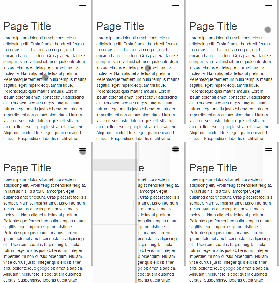
It uses Bootstrap classes and markup to create an off-canvas menu that not only looks good. But works perfectly. Example can be found here.

Screencap showing off-canvas menu

Installation

Available to download through Bower

bower install bootstrap-offcanvas

Add the stylehseet from the dist folder to your HTML document.

<link rel="stylesheet" href="../dist/css/bootstrap.offcanvas.min.css"/>

Add the JavaScript from the dist folder to your HTML document.

NOTE: Ensure that jQuery is also present. Otherwise this won't work

<script src="../dist/js/bootstrap.offcanvas.js"></script>

In the HTML itself there needs to a button or something to trigger the menu. NOTE: It can be ANY HTML element

The below example is the exact same markup as from the Bootstrap docs. The only differences are the data-toggle, data-target attributes and offcanvas-toggle class. Note: The .icon-bars need to be wrapped in an element for the close icon to correctly show.

<button type="button" class="navbar-toggle offcanvas-toggle" data-toggle="offcanvas" data-target="#js-bootstrap-offcanvas">
    <span class="sr-only">Toggle navigation</span>
    <span>
      <span class="icon-bar"></span>
      <span class="icon-bar"></span>
      <span class="icon-bar"></span>
    </span>
</button>

Finally, the nav HTML should be as follows. The only things needed are:

  • The class navbar-offcanvas
  • The selector that is specified in the data-target of the toggle. Example below uses an ID. NOTE: This can also be any element as long as the classes and attributes are correct
<nav class="navbar navbar-default" role="navigation">
    ...
    <div class="navbar-offcanvas navbar-offcanvas-touch" id="js-bootstrap-offcanvas">
        ...
    </div>
</nav>

You can change the position of the off-canvas nav by adding the following class

navbar-offcanvas-right

Dropdown menus are supported, again using the Bootstrap standard markup.

The only difference is that it doesn't need the data-toggle. But this could be left in if you require it to be present.

<li class="dropdown">
    <a href="#" class="dropdown-toggle">Dropdown <span class="caret"></span></a>
    <ul class="dropdown-menu" role="menu">
        <li><a href="#">Action</a></li>
        <li><a href="#">Another action</a></li>
        <li><a href="#">Something else here</a></li>
        <li class="divider"></li>
        <li><a href="#">Separated link</a></li>
        <li class="divider"></li>
        <li><a href="#">One more separated link</a></li>
    </ul>
</li>

You can have another button somewhere on the page that will toggle the status of the offcanvas between in & out. NOTE: The plugin doesn't know which one you want as the main button to toggle the offcanvas. So it instead just uses the first it finds for the specified target element

<button type="button" class="navbar-toggle offcanvas-toggle pull-right" data-toggle="offcanvas" data-target="#js-bootstrap-offcanvas">
    <span class="sr-only">Toggle navigation</span>
    <i class="glyphicon glyphicon-remove"></i>
</button>

There is an in-built version of a offcanvas toggle which uses the icon bars. Simply use the below markup

<button type="button" class="navbar-toggle offcanvas-toggle offcanvas-toggle-close" data-toggle="offcanvas" data-target="#js-bootstrap-offcanvas">
    <span class="icon-bar"></span>
    <span class="icon-bar"></span>
    <span class="icon-bar"></span>
    <span class="sr-only">Toggle navigation</span>
</button>

Transitions

There is 1 additional transition and this is fade in/out. This is done by adding the below class. Note: This also works with touch events and will correctly do the right amount of opacity for the location of the touch.

navbar-offcanvas-fade

Touch events

It is possible to add touch events to swipe the menu in and out by simply adding the following class to the navigation HTML element.

navbar-offcanvas-touch

NOTE Whilst multiple touch navs do work, they must be on the other side of the screen to each other. If two navs on the same side have touch, it won't work correctly. But then you knew that anyway right?

iOS7+ does have a gesture to swipe the page back and forward, and a threshold has been put in. This might not be perfect, and might need tweaking.

Events

There are four different events that are triggered on the nav element. These follow the same syntax as the Official Bootstrap JS plugins.

Event Type Description
show.bs.offcanvas Fire before the offcanvas menu is shown
shown.bs.offcanvas Fire after the offcanvas menu is shown
hide.bs.offcanvas Fire before the offcanvas menu is hidden
hidden.bs.offcanvas Fire after the offcanvas menu is hidden

Trigger events

If you want to toggle the offcanvas yourself, you can trigger an event on the menu element. See below.

$("#js-bootstrap-offcanvas").trigger("offcanvas.toggle"); // Toggle open & close
$("#js-bootstrap-offcanvas").trigger("offcanvas.open"); // Open the menu
$("#js-bootstrap-offcanvas").trigger("offcanvas.close"); // Close the menu

Running example

Run the below commands to install all dependencies and then just open the index.html file in example/

npm install
bower install

Customizing

Its possible to customize to your needs by using SASS.

Want to include with your Bootstrap SASS? Copy across the files in src/sass.

The SASS files use a few variables. These are explained below.

$offcanvas-width: 250px !default; // The width of the offcanvas menu
$offcanvas-animation-time: 0.15s !default; // Transition time to pull/hide menu
$offcanvas-toggle-background: #f8f8f8 !default; // Background colour for toggle
$offcanvas-toggle-bars-color: #000 !default; // Colour for icon bars in toggle

There is one media query and this uses the Bootstrap $screen-xs-max variable. If this isn't present, then the width of 767px is used for the breakpoint.

Tests

Open tests/index.html to run the tests.

bootstrap-offcanvas's People

Contributors

balajidharma avatar gitter-badger avatar iamphill avatar mattmattv avatar salaros avatar turbobrian avatar yagudaev avatar

Stargazers

 avatar  avatar  avatar  avatar  avatar  avatar  avatar  avatar  avatar  avatar  avatar  avatar  avatar  avatar  avatar  avatar  avatar  avatar  avatar  avatar  avatar  avatar  avatar  avatar  avatar  avatar  avatar  avatar  avatar  avatar  avatar  avatar  avatar  avatar  avatar  avatar  avatar  avatar  avatar  avatar  avatar  avatar  avatar  avatar  avatar  avatar  avatar  avatar  avatar  avatar  avatar  avatar  avatar  avatar  avatar  avatar  avatar  avatar  avatar  avatar  avatar  avatar  avatar  avatar  avatar  avatar  avatar  avatar  avatar  avatar  avatar  avatar  avatar  avatar  avatar  avatar  avatar  avatar  avatar  avatar  avatar  avatar  avatar  avatar  avatar  avatar  avatar  avatar  avatar  avatar  avatar  avatar  avatar  avatar  avatar  avatar  avatar  avatar  avatar  avatar

Watchers

 avatar  avatar  avatar  avatar  avatar  avatar  avatar  avatar  avatar  avatar  avatar  avatar  avatar  avatar  avatar  avatar  avatar  avatar  avatar  avatar  avatar  avatar  avatar  avatar  avatar  avatar  avatar  avatar  avatar  avatar  avatar  avatar  avatar  avatar

bootstrap-offcanvas's Issues

Menu behavior on iPhone and iPad

I implemented your plugin on two sites and noticed that on iPhone / iPad only the menu opens from left top to right bottom on toggle in stead of from left to right.

Menu totall hidden on ipad

The problem is that the menu is totally hidden on iPad. The space is still used and causes whitespace on the page.

It seems to be caused by the media-query where max-width: 768px.
The grid-break for bootstrap is at min-width: 768px for tablets (sm-device). If I set the media-query to max-width: 767px (as it is in bootstrap for xs-devices) it works as expected.

I think the max-width should be used in general, not the next higher min-width.

add support for bootstrap 4

I've just used this project in my bootstrap 4 project.

I had to do the following to make it work.

for the icon bar:

v4 doesn't use span class="icon-bar" anymore for it's hamburger menu. instead it uses ☰
There is no more styling done for the icon-bar class. I just copied over the styles from v3 and changed navbar-toggle to navbar-toggler.

    .navbar-toggler .icon-bar {
      background-color: #888;
    }
    .navbar-toggler .icon-bar {
      display: block;
      width: 22px;
      height: 2px;
      border-radius: 1px;
    }
    .navbar-toggler .icon-bar + .icon-bar {
      margin-top: 4px;
    }

icon-bar animation.

I had to move the sr-only Toggle navigation line to the bottom

    span class="icon-bar"
    span class="icon-bar"
    span class="icon-bar"
    span class="sr-only" Toggle navigation

as otherwise the the sr-only line was the 1st child etc.

.offcanvas-toggle.is-open .icon-bar:nth-child(1) {
  transform: rotate(45deg) translate(5px, 4px);
}
.offcanvas-toggle.is-open .icon-bar:nth-child(2) {
  opacity: 0;
}
.offcanvas-toggle.is-open .icon-bar:nth-child(3) {
  transform: rotate(-45deg) translate(4px, -4px);
}

css hierarchy different in v4

The offcanvas css assumes a structure like in v3. However v4 has quite a different navbar example.
if it could reduce the tight coupling to the one or the other would be good. Having examples for both v3 and v4 as well.

From http://v4-alpha.getbootstrap.com/components/navbar/

<nav class="navbar navbar-light bg-faded">
  <button class="navbar-toggler hidden-sm-up" type="button" data-toggle="collapse" data-target="#exCollapsingNavbar2">
    &#9776;
  </button>
  <div class="collapse navbar-toggleable-xs" id="exCollapsingNavbar2">
    <a class="navbar-brand" href="#">Responsive navbar</a>
    <ul class="nav navbar-nav">
      <li class="nav-item active">
        <a class="nav-link" href="#">Home <span class="sr-only">(current)</span></a>
      </li>
      <li class="nav-item">
        <a class="nav-link" href="#">Features</a>
      </li>
      <li class="nav-item">
        <a class="nav-link" href="#">Pricing</a>
      </li>
      <li class="nav-item">
        <a class="nav-link" href="#">About</a>
      </li>
    </ul>
  </div>
</nav>

compare to the old v3 example https://getbootstrap.com/components/#navbar

<nav class="navbar navbar-default">
  <div class="container-fluid">
    <!-- Brand and toggle get grouped for better mobile display -->
    <div class="navbar-header">
      <button type="button" class="navbar-toggle collapsed" data-toggle="collapse" data-target="#bs-example-navbar-collapse-1" aria-expanded="false">
        <span class="sr-only">Toggle navigation</span>
        <span class="icon-bar"></span>
        <span class="icon-bar"></span>
        <span class="icon-bar"></span>
      </button>
      <a class="navbar-brand" href="#">Brand</a>
    </div>

    <!-- Collect the nav links, forms, and other content for toggling -->
    <div class="collapse navbar-collapse" id="bs-example-navbar-collapse-1">
      <ul class="nav navbar-nav">
        <li class="active"><a href="#">Link <span class="sr-only">(current)</span></a></li>
        <li><a href="#">Link</a></li>
        <li class="dropdown">
          <a href="#" class="dropdown-toggle" data-toggle="dropdown" role="button" aria-haspopup="true" aria-expanded="false">Dropdown <span class="caret"></span></a>
          <ul class="dropdown-menu">
            <li><a href="#">Action</a></li>
            <li><a href="#">Another action</a></li>
            <li><a href="#">Something else here</a></li>
            <li role="separator" class="divider"></li>
            <li><a href="#">Separated link</a></li>
            <li role="separator" class="divider"></li>
            <li><a href="#">One more separated link</a></li>
          </ul>
        </li>
      </ul>
      <form class="navbar-form navbar-left" role="search">
        <div class="form-group">
          <input type="text" class="form-control" placeholder="Search">
        </div>
        <button type="submit" class="btn btn-default">Submit</button>
      </form>
      <ul class="nav navbar-nav navbar-right">
        <li><a href="#">Link</a></li>
        <li class="dropdown">
          <a href="#" class="dropdown-toggle" data-toggle="dropdown" role="button" aria-haspopup="true" aria-expanded="false">Dropdown <span class="caret"></span></a>
          <ul class="dropdown-menu">
            <li><a href="#">Action</a></li>
            <li><a href="#">Another action</a></li>
            <li><a href="#">Something else here</a></li>
            <li role="separator" class="divider"></li>
            <li><a href="#">Separated link</a></li>
          </ul>
        </li>
      </ul>
    </div><!-- /.navbar-collapse -->
  </div><!-- /.container-fluid -->
</nav>

css lost on resizing

I have implemented the provided menu but without bower simply copied css and js files and it worked wonderfully but the only issue i have faced using chrome if i open up menu by toggle button after minimizing browser window it works and if i click any where out side and maximize the browser it goes well but,,,,if i open up menu after minimizing chrome browser and click on maximize button without clicking any where on the page my whole page looses its css. Please help.

Issues with larger screen and touch gesture

Hey, great script! I really like how it looks but I have a few issues with it.

I have altered the SASS variable to make menu appear in ipad portrait mode.

$screen-xs-max:                   991px !default;

I have also increased the @grid-float-breakpoint collapse breakpoint in main bootstrap SASS.

It works but there are some issues.

When trying to drag the menu from the left it is tricky to find the right part of the screen to swipe. There is a small gutter to the very left of the screen where the swipe is not recognised (I am guessing the standard bootstrap container margin), then there is a thin strip where if I swipe right it will pull the menu out and then the rest of the screen will not recognise the swipe gesture to pull out the menu.

I guess it is meant to be a thin bar that the finger can slide over but it doesn't work like this. If the swipe is not initiated directly on the right place then the menu doesn't slide in.

This is somewhat noticeable on the small mobile screen but it extremely noticeable on ipad in portrait.

When I emulate the swipe in chrome dev tools the menu comes in at full height but on my actual ipad 2 then the menu comes in at 50% height.

When using the toggle button it will come in at 50% height and then quickly resize to 100%..

When using a swipe gesture it comes in at 50% height and stays that height. If I tap the top half of the screen it will resize to 100%. If I tap the bottom half of screen the menu dissapears.

I tried using your example in case I did something wrong but I got the same result.

I am not very good at javasript so not really sure how to go about debugging this.

Any ideas?

Events fire in wrong order

  $('body').on 'show.bs.offcanvas', '#js-bootstrap-offcanvas', ->
    console.log 'show.bs.offcanvas'

  $('body').on 'shown.bs.offcanvas', '#js-bootstrap-offcanvas', ->
    console.log 'shown.bs.offcanvas'

  $('body').on 'hide.bs.offcanvas', '#js-bootstrap-offcanvas', ->
    console.log 'hide.bs.offcanvas'

  $('body').on 'hidden.bs.offcanvas', '#js-bootstrap-offcanvas', ->
    console.log 'hidden.bs.offcanvas'

screen shot 2016-08-31 at 17 42 40

Doesn't work with prototype.js

Looks like this doesn't work with prototype.js , All jquery library functions I am using are working except for this one, I am trying to use this with magento shop.

Can't scroll contents when window resized

Thank you for great plugin.
I saw the issue in following steps.

  1. open offcanvas menu
  2. window resize. In Android, swipe up menu then header bar is hidden and "resize" event occur.
  3. automatically menu closed
  4. can't scroll contents

so I inserted a code in "transitionend" event.

this.target.on('transitionend', (function(_this) {
  return function() {
    if (_this.target.is(':not(.in)')) {
      _this.bodyOverflow(); // Insert this line
      return _this.target.height('');
    }
  };
})(this));

It works so far.
Is this good solution?

Drop jQuery

Drop jQuery as a dependency. Shouldn't be too difficult.

Plugins

Move internal features into plugins. Touch support might not be needed by everyone so that could be moved out of the core.

Possible typos ?

In the coffee script, there is 3 occurences of offcavas (lines 172 and 179)

Is that an error or is it normal ?

Multiple offcanvas menus

Is it possible to have two offcanvas menus? I have no problem adding one offcanvas menu but when I try to add a second it wont work.

button data-toggle="offcanvas" data-target=".js-offcanvas-menu"
button data-toggle="offcanvas" data-target=".js-offcanvas-cart"

div class="navbar-offcanvas navbar-offcanvas-right navbar-offcanvas-fade js-offcanvas-menu"
div class="navbar-offcanvas navbar-offcanvas-right navbar-offcanvas-fade js-offcanvas-cart"

Please add support for manually close the navbar using trigger

As per in the manual there is a offcanvas.toggle trigger I can fire which opens/closes the navbar, eg.:

$("#js-bootstrap-offcanvas").trigger("offcanvas.toggle");

I'd like to have a similar trigger which not triggers but closes the navbar if it was open, something like:

$("#js-bootstrap-offcanvas").trigger("offcanvas.close");

This is also required for my Angular (ajax) application which uses HTML5 Push States to navigate between different pages. When a new state (or page) is loaded the opened offcanvas navbar remains opened. I need it to be closed this case.

The demo doesn't work in Android/Chrome browser

I have a Nexus 5, the demo page doesn't work, the menu button doesn't toggle the menu consistently, and when the menu finally reveals, any touch of the screen causes the menu to disappear.

Offcanvas on iPad

Hi!
First of all, thanks for an amazing offcanvas menu. Works brilliantly!
So.. not an issue really. Rather a question.
I would like the offcanvas menu to work on an iPad/tablet. I tried to change the media query but didn´t get it to work. Is there anything else I can try?
Thanks in advance and once again, awesome work!

Gap below offcanvas menu area when scrolled down

Hi!

I noticed a "bug" when using the offcanvas menu on mobile. When scrolled down a bit on a page, just enough to the top toolbar/browser navigation (with the address field etc.) disappears, a big gap appears below the menu area. The gap is pretty much the same height as the browser toolbar. See attached screenshot. Tried both on Android (Samsung Galaxy S7 Edge) and iPhone (6) and both has the same issue.

Is this a known problem? If so, is there a workaround for it? Tried to search but came up with nothing.

screenshot_20170303-092711

Tap issue on larger touch screen devices when not in offcanvas mode

Hi, Thanks a bunch for this very useful script!

I have had the following issue:
When one taps on a page that is not in offcanvas mode, it resizes the navbar to height of the window.
This can be reproduced in the example page provided with Bootstrap-Offcanvas. I have tested it using Chrome DevTools' Device Mode (devices: Nexus 10 or Nexus 7 in landscape mode or any other larger device).
I have added a check which seems to have fixed it:

OffcanvasTouch.prototype._touchStart = function(e) {
   this.startX = e.originalEvent.touches[0].pageX;
   if (this.element.is('.in')) {
          return this.element.height($(window).outerHeight());
   }
};

Not sure if this could have an impact on other functionality, will report it if I do come across any side effects.

Android

In Android default browser, menu not work.

window.on resize disables toggle button and scrolls to top on iOS devices 9.0.2 with Safari

window.on resize disables toggle button and scrolls to top on iOS devices 9.0.2 with Safari.
Then when you reached top the toggle button works again.

Removing
$(window).on 'resize', ->
$('body').css
overflow: ''
position: ''
$('.navbar-offcanvas.in').each ->
$(@).height('').removeClass 'in'
and replacing this with a enquire media query resolved this issue for me.

Only allowing one opened (sub)menu

ping @iamphill

What is the best approach to only allow one menu to be opened, e.g. showing its children?

For instance:

Assuming my page tree looked like this:

Page A
|_ Child
|_ Child
Page B
|_ Child
|_ Child

When the user visits my site on a mobile device:

Page A
Page B

When the user opens Page A

Page A
|_ Child
|_ Child
Page B

Now I want the following behaviour when the user opens Page B while Page A is showing its children:

Page A
Page B
|_ Child
|_ Child

Any hints? :) Thanks!

Close button

Thanks for the awesome plugin!

I'd like to add a close button to provide a visual cue that allows for closing the sidebar.

I've looked at two approaches for this:

  • add a second button to toggle the sidebar off, only visible when the sidebar is out
  • change the text and icon of the existing button via JS, when the sidebar is out

Either way, although the classes imply the button is a "toggle" - I can click once on the button to open the sidebar, but when I click the button again, the sidebar does not close. The only UI way to close the sidebar appears to be clicking or tapping on some white space outside the sidebar.

It looks like I'll use the second approach above, and remove the "offcanvas-toggle" class when the sidebar is out, so when the user taps the button, it's the equivalent of tapping outside the sidebar.

How would you suggest implementing a close button using this plugin? Is there a way in the current version? Can we change the button into a true toggle in future versions, to make this easier?

Thanks! David

Question: Version 2

Hey.

I'm glad I found this addon. Seems like it's gonna make my life easier :).

Is the v2 branch stable enough for usage? If not, is there an estimation when it will be released? Also, will it present BC breaking changes?

The offcanvas navbar is not working if the navbar definition is loaded by ajax

I have an AngularJs application in which the header part is defined in a separate file thus it is loaded into the HTML by an AJAX call. This case the navbar toggle button does not work. It won't open the offcanvas menu.
However if I re-run the entire bootstrap-offcanvas javascript code in F12 console the navbar toggle works.
So this means this component does not support navbar-s that are loaded by AJAX.
Please add support for it!

Uncaught TypeError: undefined is not a function

I'm getting the following error when loading my page with bootstrap.offcanvas.js installed:

Uncaught TypeError: undefined is not a functionbootstrap.offcanvas.js?ver=4.0:229 (anonymous function)bootstrap.offcanvas.js?ver=4.0:253 (anonymous function)

Loading bootstrap.offcanvas.min.js produces the same result.

Navbar button color initially wrong with navbar-inverse

When the navbar button first comes up with navbar-inverse it is not inversed color, however after pressing it to expand the menu, it changes to the correct color.

Any ideas how I can get it to display properly on page load?

Only um trigger works in navbar-header

Why other element inside navbar-brand don't trigger ?

Look my code:

<div class="navbar-header">
                        <button type="button" class="navbar-toggle inicial offcanvas-toggle pull-right" data-toggle="offcanvas" data-target="#js-bootstrap-offcanvas-1" style="float:left;">
                        <span class="sr-only">Toggle navegação</span>
                      <span class="icon-bar left"></span>
                      <span class="icon-bar center"></span>
                      <span class="icon-bar right"></span>
                          </button>
                          <a  class="navbar-brand visible-xs offcanvas-toggle"  data-toggle="offcanvas" data-target="#js-bootstrap-offcanvas-1" href="#">menu</a>
</div>

Move to ES6

CoffeeScript is old news. Should be re-written in ES6.

Provided Examples Not Working

Hi,

I downloaded the source files and ran the example/index.html locally and it did not load the menu at all when pressing the toggle button. Same thing happened when I tried the test/index.html example. The only example that actually works is the following hosted example: http://iamphill.github.io/Bootstrap-Offcanvas/example.html. Is there anything special happening with the hosted example?

Thank you very much for your help!

Icon state at the time of window resizing

Thanks for the awesome plugin!

An icon state when I resized a window is not right.

Now it works correctly with this JavaScript code.

$(window).on('resize', function() {
  return $('.navbar-offcanvas.in').each(function() {
    $(this).parent().find('.offcanvas-toggle').removeClass('is-open');
    return $(this).height('').removeClass('in');
  });
});

Thanks!

Dropdown doesn´t work correctly

Hi,

I have Bootstrap 3.3.6 with bootstrap css + js loaded. After this your offcanvas js is loaded. But when I open at offcanvas the submenu and I click into empty space on offcanvas, the submenu is not closed and there are some other style problems.

Can you fix this that your offcanvas version work with submenus?

The example is broke again it looks like?

When i visit the example or try to integrate this in to my site, there is huge issues, it will create a huge container, so the content is pushed further down the page, and the "gray" menu color dominates the page.

Besides that i would wish an inline example, where you just change the button in normal Navbar, to open the Offcanvas, so you can keep the bar in the top with your logo in it....

Doesn't work using AngularJS ngView

In my app I load the navbar dynamically depending on the user that is logged in, using the angularjs directive ngView, however if I tried to use this plugin it just doesn't trigger the off canvas menu

close button state

Hi Phill, cool plugin!

bug found, downloaded github version:

  1. in collapsed mobile mode (less that 768px). click menu button,
  2. side navigation shows
  3. expand screen to fullscreen again by dragging browser
  4. collapse to mobile view again by dragging browser
  5. you will still see the close icon (but now the offcanvas menu is hidden).
    if you click the X button the menu shows (ie. rolls are reversed for what the button is showing)

when click on search text box the menu is hidding auto

HI,
i have add your code in my site but when i check this on mobile the canvas menu is auto hiding when click on search or menu anywhere in canvas menu.. can you please help me with that .. i am not coder and i don't now jquery etc.
my website is: http://goo.gl/3bB8dA
check on mobile.. i have test it with android device mate 7

thanks

Converting Offcanvas to Wordpress dynamic nav

Hi, I am trying to convert my working index.html , bootstrap and offcanvas css and js. It is working fine on html but when I convert into the header.php on Wordpress using wp_bootstrap_navwalker.php. The offcanvas slides but does not show when collapes but does before collapsing though. I do not have a demo site at the moment but before are the files. Thanks in advance for the time:)

Below are the codes I've used.

Index.html

Header.php

    <header>                
         <nav class="navbar navbar-default" role="navigation">
            <div class="container">          
                <div class="navbar-header">
                    <a class="navbar-brand wow fadeInLeft" href="<?php echo home_url(); ?>">
                        <img src="<?php bloginfo('stylesheet_directory'); ?>/img/logo.png" width="269" height="94" class="img-responsive">
                    </a>
                     <button type="button" class="navbar-toggle offcanvas-toggle pull-right" data-toggle="offcanvas" data-target="#js-bootstrap-offcanvas">
                        <span class="sr-only">Toggle navigation</span>
                            <span>
                              <span class="icon-bar"></span>
                              <span class="icon-bar"></span>
                              <span class="icon-bar"></span>
                            </span>
                     </button>
                     <a class="phone-no" href="#">6280 5666 (24/7)</a>
                </div>

                <div class="navbar-offcanvas navbar-offcanvas-right" id="js-bootstrap-offcanvas">
                    <ul class="social-share">
                        <li><a href="#"><i class="fa fa-facebook"></i></a></li>
                        <li><a href="#"><i class="fa fa-google-plus"></i></a></li>
                        <li><a href="#" id="careers"><i>Careers</i></a></li>
                        <a href="#" id="book">Book appt</a>
                    </ul>
                    <?php
                        wp_nav_menu( array(
                            'menu'              => 'primary',
                            'theme_location'    => 'primary',
                            'depth'             => 2,
                            'container'         => 'div',
                            'container_class'   => 'collapse navbar-collapse navbar-toggle offcanvas-toggle',
                            'container_id'      => 'js-bootstrap-offcanvas',
                            'menu_class'        => 'nav navbar-nav navbar-right navbar-offcanvas navbar-offcanvas-right',
                            'fallback_cb'       => 'wp_bootstrap_navwalker::fallback',
                            'walker'            => new wp_bootstrap_navwalker())
                        );
                    ?>                      
                </div>
            </div> <!-- end .container -->
        </nav> <!-- end .navbar -->     
    </header> <!-- end header -->

** After adding the menu dynamically in WP, it shows for desktop site.

Bootstrap v4

I am using this with v4 alpha, works perfectly. Would be good to update the examples etc. Thanks for this lib, really nice.

Recommend Projects

  • React photo React

    A declarative, efficient, and flexible JavaScript library for building user interfaces.

  • Vue.js photo Vue.js

    🖖 Vue.js is a progressive, incrementally-adoptable JavaScript framework for building UI on the web.

  • Typescript photo Typescript

    TypeScript is a superset of JavaScript that compiles to clean JavaScript output.

  • TensorFlow photo TensorFlow

    An Open Source Machine Learning Framework for Everyone

  • Django photo Django

    The Web framework for perfectionists with deadlines.

  • D3 photo D3

    Bring data to life with SVG, Canvas and HTML. 📊📈🎉

Recommend Topics

  • javascript

    JavaScript (JS) is a lightweight interpreted programming language with first-class functions.

  • web

    Some thing interesting about web. New door for the world.

  • server

    A server is a program made to process requests and deliver data to clients.

  • Machine learning

    Machine learning is a way of modeling and interpreting data that allows a piece of software to respond intelligently.

  • Game

    Some thing interesting about game, make everyone happy.

Recommend Org

  • Facebook photo Facebook

    We are working to build community through open source technology. NB: members must have two-factor auth.

  • Microsoft photo Microsoft

    Open source projects and samples from Microsoft.

  • Google photo Google

    Google ❤️ Open Source for everyone.

  • D3 photo D3

    Data-Driven Documents codes.