whitakerlab / brainsforpublication Goto Github PK
View Code? Open in Web Editor NEWCode and documentation for the Brains for Publication proposal for the 2016 OHBM Hackathon
License: MIT License
Code and documentation for the Brains for Publication proposal for the 2016 OHBM Hackathon
License: MIT License


Wrapper scripts around many of the lovely pysurfer commands.
Hi!
Firstly, many thanks for having developed those scripts for neuroimaging visualization! I am new to neuroimaging analysis overall, so please apologize me in advance if my question is too rudimentary.
I ran pysurfer_plot_parcellation_surface_values.py using a .csv file with t-statistics as the only input. Although it ran smoothly, the output images I got did not have the t-statistics printed on the surfaces. So, I would like to ask if there is any way to fix this issue.
Many thanks in advance!
The lovely @miykael is working on a wrapper using nipy and nilearn to show orthogonal slices of an MNI brain with cluster overlays.
Input will be a 3D statisical map in nifti format.
Output will be individual images for each cluster (optionally showing cross hairs) along with a summary figure of all the images. Additionally a csv file with the atlas region and stats for each cluster will be created.
Current work is removing dependency on FSL by transitioning to nilearn.
Not sure how well it fits since I've already written up a methods paper, but I'm happy to share code related to this: http://f1000research.com/articles/4-466/.
Are there any key points that should be included in the GigaScience report for this project?
Use this issue to collect your ideas together 😄
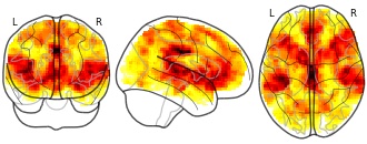
This wonderful visualisation from the Medical Image Analysis Lab shows both magnitude of an effect and the outcome of the statistical test (in this case a t-test) using hue and transparency coding.
The code is shared and available for download here and there is an accompanying paper:
Data Visualization in the Neurosciences: Overcoming the Curse of Dimensionality,
Elena A. Allen, Erik B. Erhardt, and Vince D. Calhoun, Neuron 74 (2012)
doi:10.1016/j.neuron.2012.05.001
An example of a fMRI statistical map showing magnitude and statistical test outcome using hue and transparency coding:
The goal of this project is to make it easy for people to make reproducible figures even if they don't want to interact too closely with code! The goal is to have users set up one time and then be able to use the code whenever they need without having to think too much about it.
However, we also want to make the project welcoming to researchers who are looking to dip their toe into making their work flows more reproducible.
I think there's a better way of describing who our target audience is! Any suggestions are welcome :)
Mybinder is a pretty snazzy little tool that runs jupyter notebooks from your github repository online.
They're executable so if we could get this project running on mybinder then the user wouldn't ever have to download or install anything! WOOOOO.
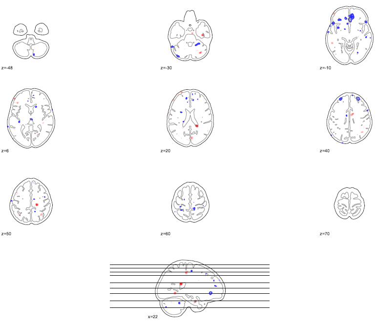
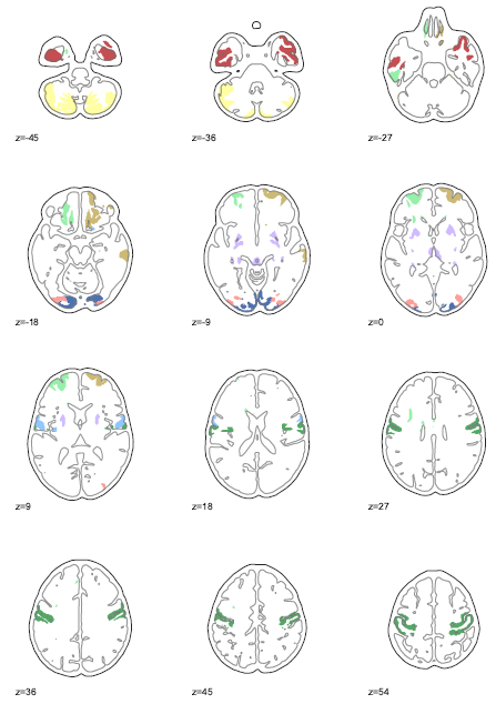
Kirstie's code for making pngs of all slices of a stats file on top of a high res background.
Added to DrawingVolumes directory.
Updated plan is to convert this code to nipy and nilearn and use PIL to combine the images into a gif.
Check out this advice on stackoverflow: http://stackoverflow.com/a/35943809
Additional stretch goal is to include an overlay for stats files :)
At the moment we have a lower boundary option in the mni_glass_brain.py code to control the range of the colourmaps, however it doesn't work as there is a bug/decision in the nilearn plotting function to fix the limit to either -vmax or 0. (See issue 1149 at nilearn).
Once this issue is resolved (if it is) then checking to see if our code actually works is important! 😀
This gist is an ipython notebook created by @chrisfilo on "How to generate beautiful 3D brain activation maps using pysurfer".
There are already lots of comments explaining all the steps along the way!
@KirstieJane copied the gist into the ActivationMapsInPysurfer folder within the NotYetCurated directory.
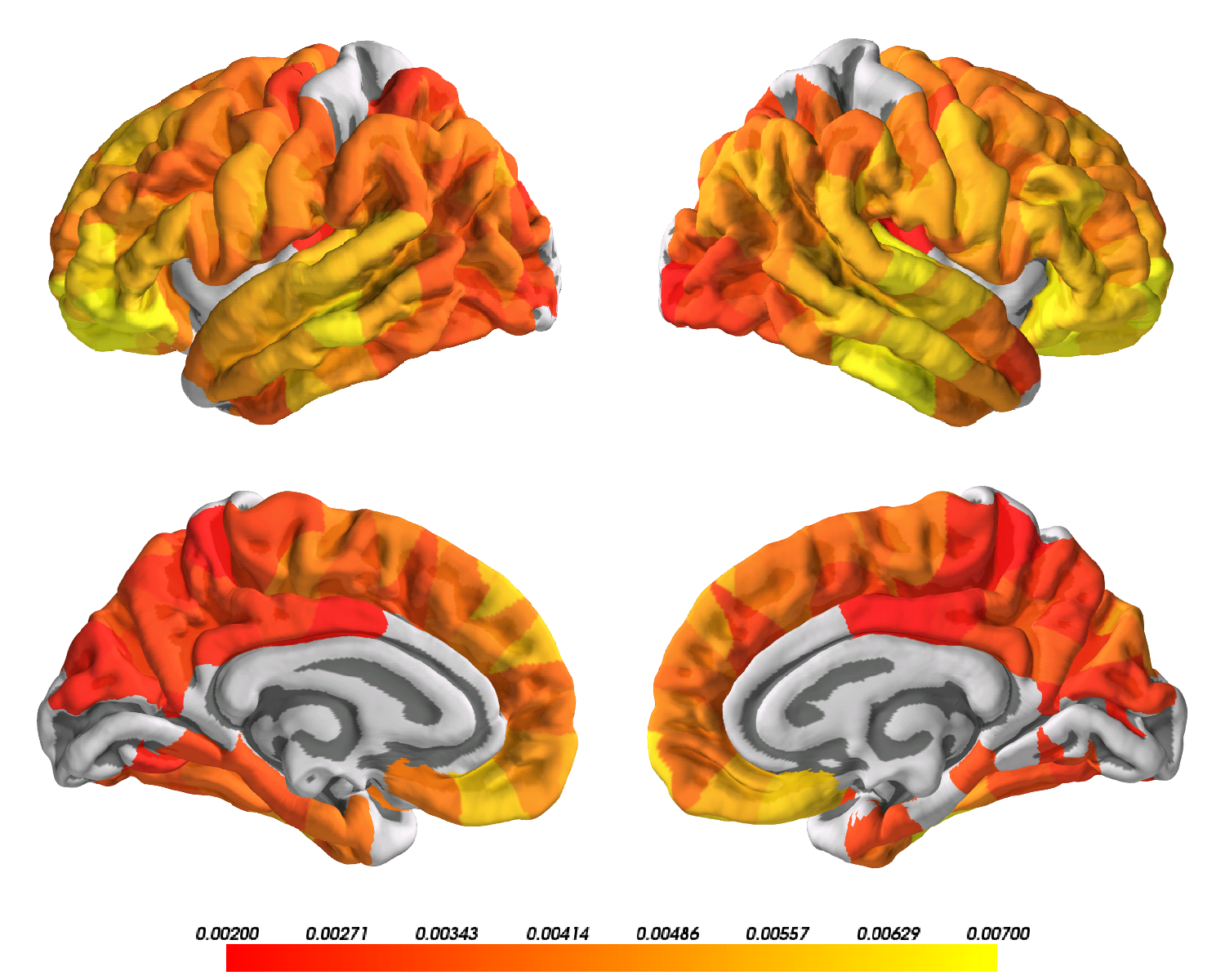
@roscha contributed code to create the following combined images of brain activation overlaid on multiple slices.
Is it possible to integrate some instructions on how to get started with plotly to generate web based interactive plots to accompany the static images/movies in publications?
Suggested by @pbellec in the #brains4publication channel of the BrainHack slack group.
At the moment if a whole hemisphere has no non-NaN values, the code returns an error. If all NaNs are converted to -99 it works with no error. Need to build this in automatically.
Hey everyone, I found that show_cluster_in_volume.py in scripts can't not run and show 'NameSpace' wrong. So I noted down the core function and run in my own IDE instead of running in terminal. Is there any modified version?I can't get my picture as beautiful as the picture in https://github.com/WhitakerLab/BrainsForPublication, and what does the parameter 'showCross' mean?
BrainNet (https://www.nitrc.org/projects/bnv/) has proven a useful tool to visualise brain networks, in their most recent version they have added in the option of loading freesurfer surface files (.pial) and freesurfer mappings (.annot) as well as nodal files created in Matlab (https://github.com/rb643/brains/blob/master/writeNodes.m). I'm looking for a way to write out mapping information from matlab into freesurfer format so I can combine them. The pysurfer code (https://github.com/KirstieJane/DESCRIBING_DATA) already provides a way to write these mapping to standard png's but it could be useful to have them in .annot format as well.
There is a requirements.md file inside the docs folder. It should contain all the packages and downloads that anyone needs to run the code in the scripts directory.
The documentation that @KirstieJane has already created here should be integrated!
This issue is our roadmap for the BrainsForPublication project.
Our goal: Make neuroimaging publications more beautiful while promoting best practices for reproducible research.
The roadmap is created as an issue as it is very likely to change rapidly please liberally comment/suggest edits for the steps we need to take before, during and after the 2016 OHBM hackathon.
Related to this goal is issue #3 Where's the best place for documentation
We could create a wiki page for each of the code samples, but are there better suggestions?
Is there a process that can more easily be transitioned into a gh-pages website? Would a gh-pages website be useful?
@chrisfilo and the NeuroVault development team are also exploring visualisation tools through the NeuroVault platform.
You can easily create 3D (pial, inflated or flattened) figures using pycortex when you upload your maps to NeuroVault as well as interactive volume visualisation using papaya.
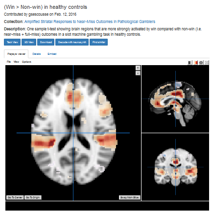
An example of a volume visualisation from http://neurovault.org/images/16208
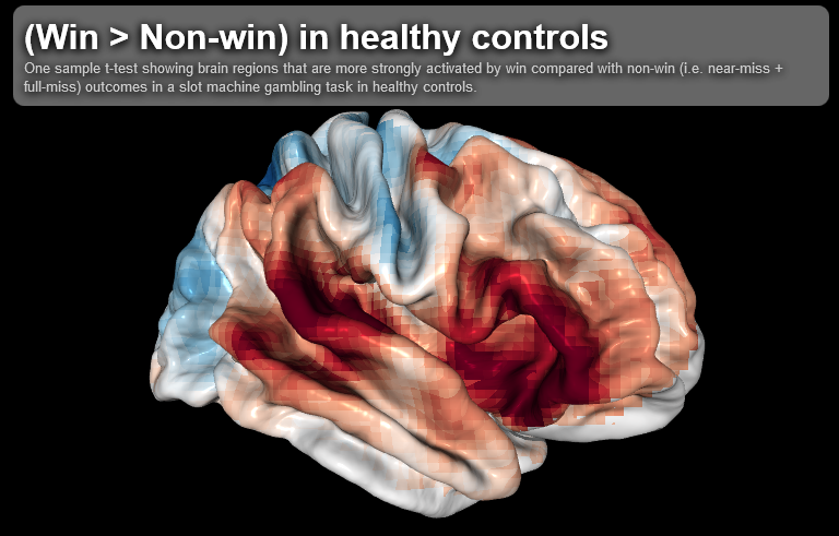
Corresponding surface visualisation from http://neurovault.org/images/16208/pycortex
You can also generate glass brain images for each map, such as this one:
Hi there,
I just found your repository out of sheer luck. I have made similar visualization scripts for my own needs, maybe this can be merged in this repo?
https://github.com/lrq3000/neuro-python-plotting
There is some overlap with what you made here, but there are two notable differences:
1- my scripts focus on plotting a lot of maps on a single image, on a grid, to summarize the results. For example, plot_correl_maps_overview.ipynb is similar to #7 but can plot more than one result, for example it can plot multiple conditions and contrasts on a 2D grid, with shared colorbar to ease comparison.
2- I made another type of visualization that is not available here, the barplotwithsamples.ipynb notebook, which plots the effect sizes per group and per cluster. It can also automatically detect the clusters center coordinates and atlas regions names, and color them on an atlas and on the bar plots accordingly, which is a lot more readable than a legend. Example: https://github.com/lrq3000/neuro-python-plotting/blob/master/README.md
Note: some notebooks are not yet illustrated in the readme, because I will first publish the figures in my next paper before using them as examples :-)
Alluvials diagrams can be very useful to visualise a group difference in for example modularity or community structure. To the best of my knowledge R, Matlab or Python do not provide very intuitive ways of visualising this. Luckily there is quite a nice online tool to do this: http://app.raw.densitydesign.org
I rally like this visualisation by the MRN http://mialab.mrn.org/datavis/index.html

A declarative, efficient, and flexible JavaScript library for building user interfaces.
🖖 Vue.js is a progressive, incrementally-adoptable JavaScript framework for building UI on the web.
TypeScript is a superset of JavaScript that compiles to clean JavaScript output.
An Open Source Machine Learning Framework for Everyone
The Web framework for perfectionists with deadlines.
A PHP framework for web artisans
Bring data to life with SVG, Canvas and HTML. 📊📈🎉
JavaScript (JS) is a lightweight interpreted programming language with first-class functions.
Some thing interesting about web. New door for the world.
A server is a program made to process requests and deliver data to clients.
Machine learning is a way of modeling and interpreting data that allows a piece of software to respond intelligently.
Some thing interesting about visualization, use data art
Some thing interesting about game, make everyone happy.
We are working to build community through open source technology. NB: members must have two-factor auth.
Open source projects and samples from Microsoft.
Google ❤️ Open Source for everyone.
Alibaba Open Source for everyone
Data-Driven Documents codes.
China tencent open source team.