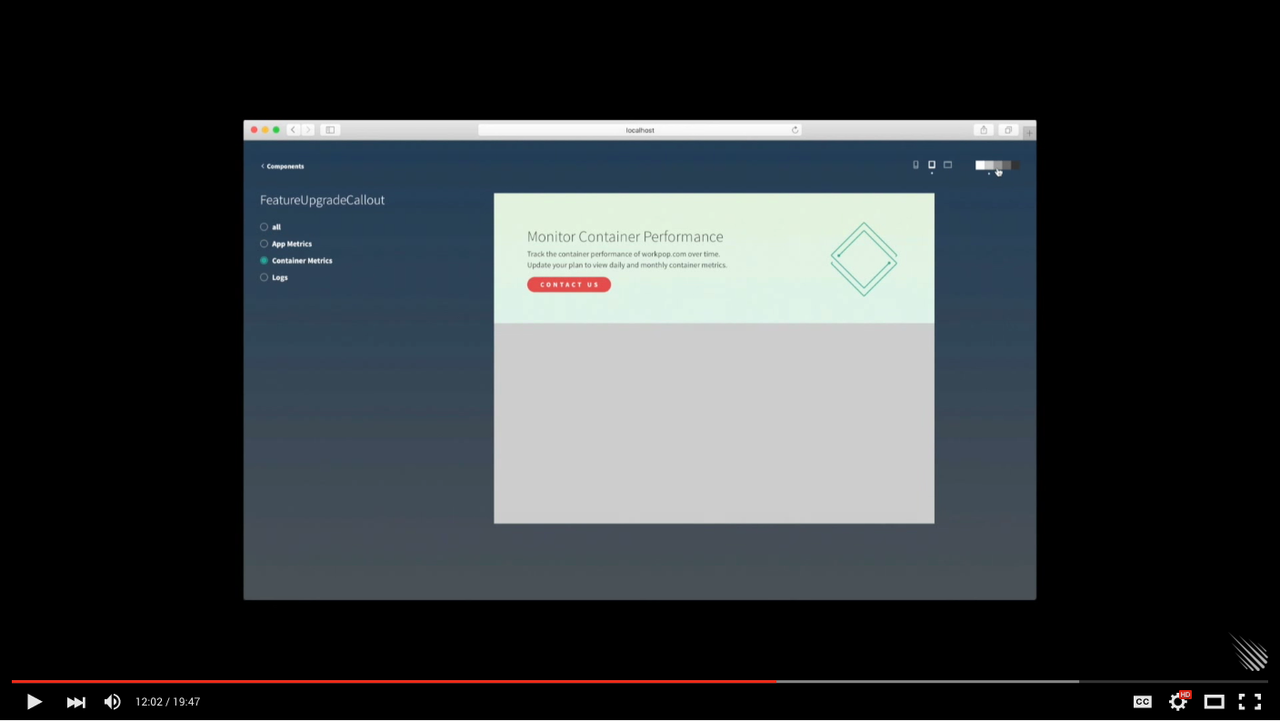
Explore, visualize, and prototype your UI components.
meteor add mdg:chromaticMake Chromatic available at /styleguide in your app in development mode:
const {ChromaticExplorer} = Package['mdg:chromatic-explorer'] || {};Versions 0.0.x of these packages are compatible with Meteor 1.2
const { Chromatic } = Package['mdg:chromatic-api'] || {};Versions 0.1.x are compatible with Meteor 1.3
import { Chromatic } from 'meteor/mdg:chromatic';Configure the URL:
import { ChromaticExplorer } from 'meteor/mdg:chromatic';

if (ChromaticExplorer) {
  ChromaticExplorer.configure({ basePath: '/styleguide' });
}=======
import { Chromatic } from 'meteor/mdg:chromatic';

ComponentName = React.createClass({
  // code
});

if (Chromatic) {
  Chromatic.add(ComponentName, {
    specs: [
      new Chromatic.Spec('specName1', {
        props: {
          // props used by your component
        }
      }),
      new Chromatic.Spec('specName2', {
        props: {
          // props used by your component
        }
      })
    ]
  });
}mdg:animations
mdg:buttons
mdg:callout
mdg:code-block
mdg:color-grid
mdg:date-components
mdg:form-components
mdg:list
mdg:loading-spinner
mdg:overlays
mdg:sortable
mdg:tooltips
mdg:outlinesWhen extending Chromatic itself you may need to import the API directly to avoid circular references:
import { Chromatic } from 'meteor/mdg:chromatic-api';


 React
React
 Typescript
 Django
 Laravel
 Facebook
 Microsoft
 Google
 Alibaba
 D3
D3
 Tencent