Git Product home page Git Product logo

react-native-woodpicker's Introduction

react-native-woodpicker

Customisable picker and datePicker react-native components for Android and iOS.

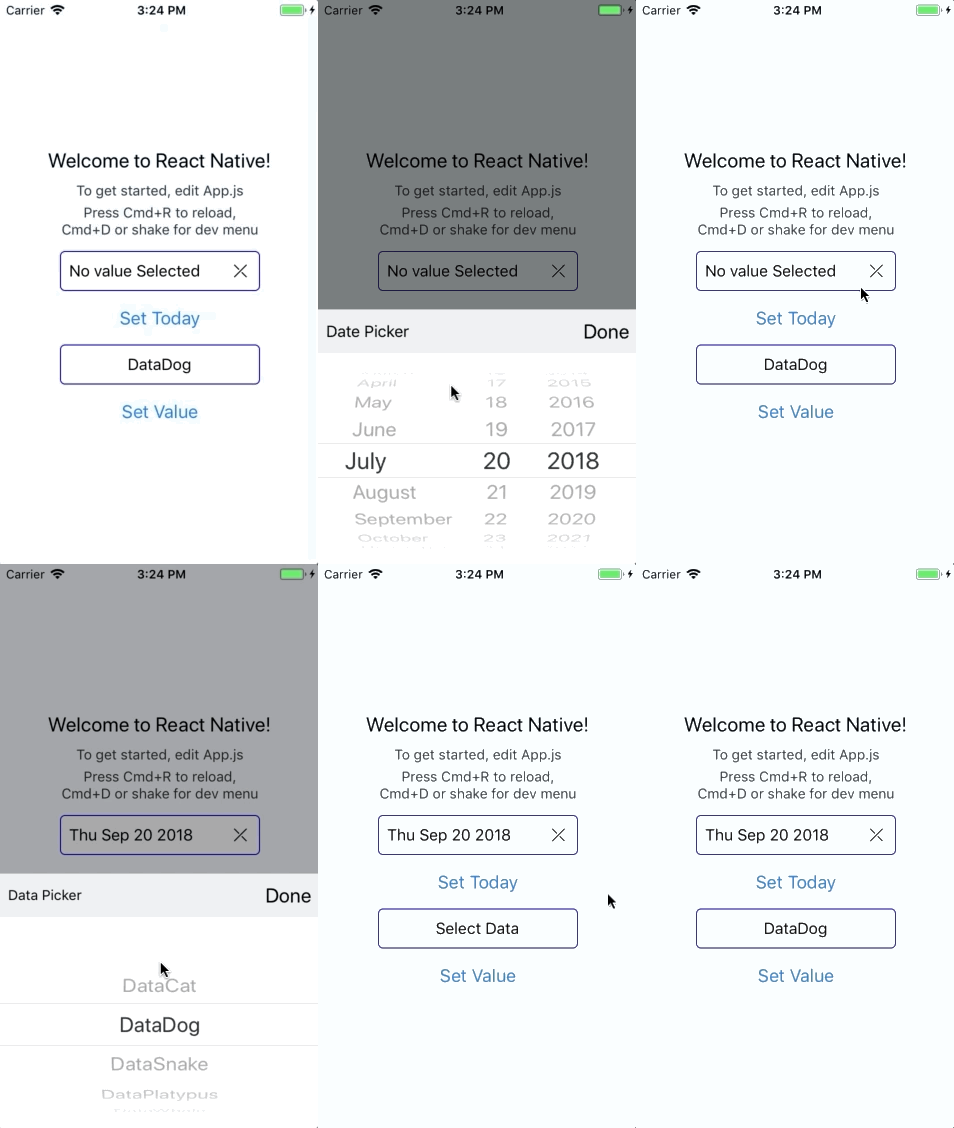
Preview

Preview

Preview-Android

Installation

yarn add react-native-woodpicker @react-native-community/datetimepicker @react-native-picker/picker

or

npm install react-native-woodpicker @react-native-community/datetimepicker @react-native-picker/picker --save

Expo

// add react-native-woodpicker with your package manager (yarn / npm / ...) and :
expo install @react-native-community/datetimepicker @react-native-picker/picker

Version

0.1.0

New Version 0.1.0 integrate new React-Native component DateTimePicker from @react-native-community/datetimepicker and Hooks. Don't forget to add it to your project.

0.2.0

New Version 0.2.0 integrate new React-Native component Picker from @react-native-community/picker.

0.3.0

New Version 0.3.0 use Typescript and change the picker dependency from @react-native-community/picker to @react-native-picker/picker.

Contribution

Thanks to everyone for your contribution! I try my best to review and update this repository. PR and feedback are welcomed!

Usage

Picker

You can use Picker to pick values/objects.

import type { PickerItem } from 'react-native-woodpicker'
import { Picker } from 'react-native-woodpicker'

[...]

const ExampleApp = (): JSX.Element => {
  const [pickedData, setPickedData] = useState<PickerItem>();

  const data: Array<PickerItem> = [
    { label: "DataCat", value: 1 },
    { label: "DataDog", value: 2 },
    { label: "DataSnake", value: 3 },
    { label: "DataPlatypus", value: 4 },
    { label: "DataWhale", value: 5 }
  ];

  return (
    <View>
      <Picker
        item={pickedData}
        items={data}
        onItemChange={setPickedData}
        title="Data Picker"
        placeholder="Select Data"
        isNullable={false}
      //backdropAnimation={{ opacity: 0 }}
      //mode="dropdown"
      //isNullable
      //disable
    />
    </View>
  );
}

DatePicker

You can use DatePicker to pick Dates. Unlike the Picker, you need to handle the placeholder.

import { DatePicker } from 'react-native-woodpicker'

[...]

const ExampleApp = (): JSX.Element => {
  const [pickedDate, setPickedDate] = useState<Date>();

  const handleText = (): string => pickedDate
      ? pickedDate.toDateString()
      : "No value Selected";

  return (
    <View>
      <DatePicker
        value={pickedDate}
        onDateChange={setPickedDate}
        title="Date Picker"
        text={handleText()}
        isNullable={false}
        iosDisplay="inline"
        //backdropAnimation={{ opacity: 0 }}
        //minimumDate={new Date(Date.now())}
        //maximumDate={new Date(Date.now()+2000000000)}
        //iosMode="date"
        //androidMode="countdown"
        //iosDisplay="spinner"
        //androidDisplay="spinner"
        //locale="fr"
      />
    </View>
  );
}

Props

General

Name type Required Description
title string false Change DoneBar title
doneButtonLabel string false Change done button label
style ViewStyle false Configure the input style (View)
containerStyle ViewStyle false Configure the input container style (View)
textInputStyle TextStyle false Configure the input text style (Text)
disabled boolean false Disable the input
isNullable boolean false Picker : Add null value on items, DatePicker: add reset button
InputComponent React.ElementType false Component to replace input.
DoneBarComponent React.ElementType false Component to replace iOS Picker Done Bar
onOpen function false Triggered when the picker is opening
onClose function false Triggered when the picker is closing
backdropAnimation Object false Configure backdrop animation property. Default: {opacity: 0.5 , duration: 1000, delay: 300}
iOSCustomProps Object false Configure iOS props to pass to the native component (Picker or DatePicker) from react-native-community
androidCustomProps Object false Configure Android props to pass to the native component (Picker or DatePicker) from react-native-community

Picker

Name type Required Description
item PickerItem ({ label: string, value: any }) true Configure the current selected item
placeholder string false Configure the picker label if no item is selected
onItemChange (item: PickerItem, index: number) => void; true Add listener on change event
items Array true Configure the list of available items
mode (Android Only) "dialog" or "dropdown" false Configure the android picker mode
itemFontFamily string false Configure the default font family for items (each item can have a fontFamily property)
itemColor string false Configure the default color for items (each item can have a color property)

DatePicker

Name type Required Description
value Date true Configure the picker title (not the placeholder)
onDateChange (date: ?Date) => {} true Configure the placeholder when no value is selected
locale string (Locale IDs) false Change the iOS picker locale
iosMode (iOS Only) "date" or "time" or "datetime" false Change the iOS picker mode
androidMode (Android Only) "calendar" or "spinner" or "default" false Change the Android picker mode
iosDisplay (iOS Only) "default" or "spinner" or "inline" or "compact" false Change the iOS picker display
androidDisplay (Android Only) "default" or "spinner" or "calendar" or "clock" false Change the Android picker display
minimumDate Date false Restrict date selection with a minimum date
maximumDate Date false Restrict date selection with a minimum date
neutralButtonLabel (Android Only) string false Change "clear" button label
is24Hour (Android Only) boolean false Changing timepicker to 24h format
textColor (iOS Only) string false Change text color on "spinner" display
text string false Change picker button text
onOpen () => void false Add listener on modal open event
onClose () => void false Add listener on modal close event
minuteInterval number : 1 or 2 or 3 or 4 or 5 or 6 or 10 or 12 or 15 or 20 or 30 false The interval at which minutes can be selected
timeZoneOffsetInMinutes number false Change the timeZone of the date picker
iosCompactHiddenStyle (iOS only) ViewStyle false Change style for the ios picker in compact mode
touchableStyle ViewStyle false Change style touchable view in the picker

ItemComponent specific

Name type Description
resetValue () => void Reset value to null if nullable (DatePicker only)
togglePicker (event: GestureResponderEvent) => void Close Picker (iOS only)
text string Input text recieved from the current element
textInputStyle StyleObj textInputStyle props configured in the picker component
isNullable boolean isNullable props configured in the picker component
isCompactHiddenPickerNeeded (iOS only) boolean true if you need to use renderHiddenCompactIOSPicker
renderHiddenCompactIOSPicker (iOS only) () => JSX.Element Render the DateTimePicker as a invisible button that overlay his parent

DoneBar Picker specific (iOS only)

Name type Description
title string title props configured in the picker component
doneButtonLabel string doneButtonLabel props configured in the picker component
onDonePress (event: GestureResponderEvent) => void Close the picker and trigger onChange

react-native-woodpicker's People

Contributors

alexandre-zatti avatar bjornbreck avatar dependabot[bot] avatar jerrykhw avatar oleksandr-dziuban avatar paveldikiy avatar taulant avatar thodubois avatar

Stargazers

 avatar  avatar  avatar  avatar  avatar  avatar  avatar  avatar  avatar  avatar  avatar  avatar  avatar  avatar  avatar  avatar  avatar  avatar  avatar  avatar  avatar  avatar  avatar  avatar  avatar  avatar  avatar  avatar  avatar  avatar  avatar  avatar  avatar  avatar  avatar  avatar  avatar  avatar  avatar  avatar  avatar  avatar  avatar  avatar  avatar  avatar  avatar  avatar  avatar  avatar  avatar  avatar  avatar  avatar  avatar  avatar  avatar  avatar  avatar  avatar  avatar  avatar  avatar  avatar  avatar  avatar  avatar  avatar  avatar  avatar  avatar  avatar  avatar  avatar  avatar  avatar  avatar  avatar  avatar  avatar  avatar  avatar  avatar  avatar  avatar  avatar  avatar  avatar  avatar  avatar  avatar  avatar  avatar  avatar  avatar  avatar  avatar  avatar  avatar  avatar

Watchers

 avatar  avatar  avatar  avatar

react-native-woodpicker's Issues

Item Object in Items List not found, since its comparing references, not Object values

When having a List of Objects and a singular Object, which is identical to one of the Objects in the list, it does not get found, which results in unexpected errors.

I think this would fix the issue, and result in less unexpected errors.

in Picker.js:

const [selectedItem, setSelectedItem] = useState(
    item
      /* This compares the object references */
      //? items.find((current) => current === item)
      
      /* This compares the object values */
      ? items.find((current) => current.label === item.label && current.value === current.value)
      : isNullable
        ? EMPTY_ITEM
        : items[0],
  );

Cancel/OK Button are white

On DatePicker on android (I don't know about ios) it's displaying 'cancel' and 'ok' buttons with white color and they are not visible, but I can press them.

Example Code:

<DatePicker
    value={pickedDate || new Date()}
    onDateChange={(date: Date | null) => setPickedDate(date || new Date())}
    title="Date Picker"
    text={handleText()}
    androidMode="date"
    androidDisplay="calendar"
    iosMode="date"
    iosDisplay="inline"
    minimumDate={new Date(Date.now())}
    textInputStyle={{
        color: '#464646',
        fontSize: 20,
        fontFamily: 'Montserrat Regular',
    }}
    isNullable={true}
    style={styles.input}
/>

251374348_594273221907717_4116997108627501035_n

BackdropAnimationType typo

animation.d.ts

export declare type BackdropAnimationType = { opactiy: number; duration: number; delay: number; };

Should be opacity instead of opactiy

[iOS Date Picker] - Weird behavior happens in iPhone

Environment OS

  • MacBook Pro
  • Expo ~42.0.1
  • React Native Woodpicker ^0.3.17

Device

  • iPhone 11 Pro Max
  • Software version 15.3.1

Date picker works fine in iOS simulator, but when I build on my iPhone get a weird behavior like a image below.
IMG_4503

Close DatePicker when date is selected

I've been looking here but I can't figure out the way to do this.
Is it possible to close the Date Picker (ios: compact, android: calendar) when the user selects a date?

onClose fired on render and no more, onOpen is fired on first opening and no more

"version": "0.3.15"

I have this code

<Picker
   DoneBarComponent={() => (
   	<DoneBar
   		onDonePress={() => {
   			const item = pickerItem || selectedItem;
   			if (!item) {
   				return;
   			}
   			props.onChange(item.value);
   			pickerRef.current && pickerRef.current.close();
   		}}
   	/>
   )}
   doneButtonLabel="Готово"
   isNullable={false}
   item={selectedItem}
   items={props.items}
   placeholder={props.placeholder}
   ref={pickerRef}
   style={styles.picker}
   onClose={() => {
   	console.log("closed");
   	setOpened(false);
   }}
   onItemChange={setPickerItem}
   onOpen={() => {
   	console.log("opened");
   	setOpened(true);
   }}
   //backdropAnimation={{ opacity: 0 }}
   // mode="dropdown"
   //disable
/>

onClose is fired immediately on render and no more in future
onOpen is fired on first opening and no more in future

 LOG  closed
 LOG  closed
 LOG  opened
 LOG  opened

Tried with mode="dropdown" and mode="dialog", no differene

"No inputs were found in config file" error in VSCode

When I imported the Picker into my project, VSCode started showing me the following error:

{
	"resource": "<project folder>/node_modules/react-native-woodpicker/tsconfig.json",
	"owner": "typescript",
	"severity": 8,
	"message": "No inputs were found in config file '<project folder>/node_modules/react-native-woodpicker/tsconfig.json'. Specified 'include' paths were '[\"src\"]' and 'exclude' paths were '[\"./dist\"]'.",
	"source": "ts",
	"startLineNumber": 1,
	"startColumn": 1,
	"endLineNumber": 1,
	"endColumn": 2
}

What does it mean, and how do I fix it?

Android 6/7 clear icon is broken

Hello @thodubois
I have noticed that on Android 6 / 7 and on some real devices with Android 8+ clear icon symbol is broken:

86012

What about to change this icon to the symbol "\u2715" to have cross-platform support?
Please check my PR:
#11

duplicate properties

In description props for DatePicker, file README
iosMode => iosDisplay
androidMode => androidDisplay

not hide android date picker when click "OK"

In react-native-woodpicker/components/DatePicker.js / , method handleAndroidDateChange
there is a commented out code "//togglePicker();".
I think this is the problem, when I delete the comment, it works well

Differentiate between change item and selected (Done) item

Is there a way to differentiate between changing an item (before Done is pressed) and selecting the item (when Done is pressed)? My app uses a time-consuming async process when an item is chosen and I don't want it running every single time the selector is changed before Done is pressed.

Setting testID props

Hi,
it will be great if testID props can be set for testing selecting items in dialog and so on..

<Picker .... testID={'myPicker'} />

And the items in dialog has generated testID for example myPicker-item-<index>

Now the items testID is undefined

Object {
    "label": "Jan Vandame",
     "testID": undefined,
     "textColor": undefined,
      "value": 456,
},

Thanks

How to stylize the picker properly?

I am trying to implement the DatePicker in my app, but it takes a lot of space. It has a huge height. I tried to color these parts to distinguis them. Here's the code and the output:

import React, { useState } from 'react';
import { StyleSheet } from 'react-native';
import { DatePicker } from 'react-native-woodpicker';

const Test = () => {
  const [pickedDate, setPickedDate] = useState();

  const handleText = () =>
    pickedDate ? pickedDate.toDateString() : 'No value Selected';

  const handleDateChange = (date) => {
    setPickedDate(date);
  };

  return (
    <DatePicker
      style={styles.picker}
      containerStyle={styles.inputContainer}
      textInputStyle={styles.input}
      value={pickedDate}
      onDateChange={handleDateChange}
      title="Date Picker"
      text={handleText()}
      androidMode="calendar"
      androidDisplay="calendar"
      iosMode="date"
      iosDisplay="inline"
      isNullable
    />
  );
};

export default Test;

const styles = StyleSheet.create({
  picker: {
    backgroundColor: '#E1E1FF',
  },
  inputContainer: {
    backgroundColor: '#D3D3FF',
  },
  input: {
    borderColor: 'rgba(214,214,214,60)',
    backgroundColor: '#FFFFFF',
    borderWidth: 2,
    width: '100%',
    borderRadius: 6,
    paddingHorizontal: 12,
    paddingVertical: 4,
  },
});

image

How do I manage the sizes appropriately? I want it to look like a simple text input.

minDate & maxDate not working on iOS?

I'm trying to use minDate and maxDate but doesn't seem to work on iOS.

This is how my Picker looks:

<DatePicker
        onDateChange={this.handleDatePicker}
        value={this.state.pet.dateOfBirth}
        title={i18n.t('dateOfBirth')}
        placeholder={this.handleDatePickerPlaceholder()}
        placeholderStyle={scopedStyles.datePickerText}
        iosPickerMode="date"
        androidPickerMode="spinner"
        locale="en"
        minDate={ () => {
              var date = new Date();
              date.setFullYear(date.getFullYear() - 3);
              return date;
         }}
         maxDate={new Date()}
/>

Am I doing it fine?

After checking the code, it looks like the minDate and maxDate are being handled by handleAndroidDatePicker() function and is only used for the Android Picker instance... nothing at all on the iOS picker. Seems it's not supported by this lib yet?

Change colour of slide up box on Picker

Hi not really an issue but is there a way in which we can add a style property to the slide up picker as i would like to enable a dark mode feature to my app but the colour remains "white" i don't see anywhere in the docs about it being able to be changed?

Inconsistency in documentation

While reading documentation for DateTimePicker, I encountered an inconsistency between the example and the props table.
The example uses props onChange, selectedDate, whereas the props table shows props as value and onDateChange.

Please make sure to remove this as well as any other consistencies, if present.

Can't select first item on Android when isNullable={false}

When on Android and using the component, if the isNullable prop is set to false or left as default, when the user selects the first item in the list, it doesn't trigger the onItemChange function and the value stays as the placeholder.

If you select any other item, the picker behaves correctly. Once you've done this, you can select the first item and the picker again behaves correctly.

`placeholder` props is not optional

When using the Picker component, the placeholder props is not optional in Typescript even though it is mentioned as not required in the README.

Different Style for placeholder?

Hey again,
Is there a way to set a style that is only applied when the placeholder is active?

For example having the placeholder in a different Font Color compared to when an actual item is selected.

Picker Buttons are white and can't be distinguished from background

On some Android devices the Picker Buttons "Cancel" and "Ok" aren't visibile because they have the same white color as the background, making them not visible. Not sure what is causing this issue. Everything worked fine on my colleague's phone, and then I noticed this on my phone and on the simulator. When I opened a new simulator on my laptop (the one on the right in the picture), it seemed to be working just fine. Android versions on both my phone and the simulator that works is 11, so that might not be the reason.
image
.

Remove title indent on Android picker

We want to get rid of the indent on the title as seen in the attached image. The available styling options (textInputStyle, containerStyle, style) do not alter the appearance of the popup. Is there a way to get rid of the indent, or align the menu items with the title? The version in question is 0.3.17.

Screen Shot 2023-01-19 at 3 49 08 PM

Large box around regular input

I've got Picker working as a basic selector (not a Datetime selector) but it has a large hit area around it instead of just around the data (border is my styling):
IMG_4DE7662FF85F-1
The examples don't seem to reflect this but I'm not sure what I could be doing wrong as I'm using almost exactly the same code as in the example.
Do I need to use InputComponent to control this? Is there documentation on that?

Style items in picker dialog

Hey,
Is there a way to set a style for example (bold style) for selected item in the picker list? I want to somehow highlight selected item.
Thanks.

update pickedDate when changed props "value"

Hello!
When i passing default date and update it - pickedDate is not work. Calendar show me today date or the first given date.
We needed update pickedDate when changing props "value"

In fiile DatePicker.tsx add:

useEffect(() => {
setPickedDate(value);
}, [value]);

Weird behaviour when iosDisplay="compact"

Hi again,
Following a recent IOS update (I think), the spinner has changed behaviour when having a date picker set to iosDisplay="compact".

Instead of opening the modal right where the picker is, it first opens the bottom sheet, which contains another date button.
When that date is pressed, the modal opens.

Is that something that could be controlled by your library, or is it a native problem?

Support React 18?

When I try to install I get:

npm ERR! Could not resolve dependency:
npm ERR! peer react@"16 || 17" from @react-native-picker/[email protected]
npm ERR! node_modules/@react-native-picker/picker
npm ERR!   @react-native-picker/picker@"2.4.2" from the root project

Is there a workaround?

Add an optional icon on the right

Hi,
I'm trying to implement an icon on the right hand side of my Item Picker to indicate to the user that this item is a dropdown. I've got the designs done, but I can't figure out a way to trigger the ItemPicker to open if the user clicks the Icon.

Example below
Screenshot 2021-07-09 at 20 15 24

Is there a way to toggle the ItemPicker when the user clicks on the Icon, or alternatively have a prop for iconRight/Left or something similar?

Recommend Projects

  • React photo React

    A declarative, efficient, and flexible JavaScript library for building user interfaces.

  • Vue.js photo Vue.js

    🖖 Vue.js is a progressive, incrementally-adoptable JavaScript framework for building UI on the web.

  • Typescript photo Typescript

    TypeScript is a superset of JavaScript that compiles to clean JavaScript output.

  • TensorFlow photo TensorFlow

    An Open Source Machine Learning Framework for Everyone

  • Django photo Django

    The Web framework for perfectionists with deadlines.

  • D3 photo D3

    Bring data to life with SVG, Canvas and HTML. 📊📈🎉

Recommend Topics

  • javascript

    JavaScript (JS) is a lightweight interpreted programming language with first-class functions.

  • web

    Some thing interesting about web. New door for the world.

  • server

    A server is a program made to process requests and deliver data to clients.

  • Machine learning

    Machine learning is a way of modeling and interpreting data that allows a piece of software to respond intelligently.

  • Game

    Some thing interesting about game, make everyone happy.

Recommend Org

  • Facebook photo Facebook

    We are working to build community through open source technology. NB: members must have two-factor auth.

  • Microsoft photo Microsoft

    Open source projects and samples from Microsoft.

  • Google photo Google

    Google ❤️ Open Source for everyone.

  • D3 photo D3

    Data-Driven Documents codes.