sumup-oss / circuit-ui Goto Github PK
View Code? Open in Web Editor NEWSumUp's design system for the web
Home Page: https://circuit.sumup.com
License: Apache License 2.0
SumUp's design system for the web
Home Page: https://circuit.sumup.com
License: Apache License 2.0


Ordered and unordered list
Modals must relate to current page - actions that require more complex or granular editing
Be used for in-context tasks that require an explicit action to be taken
Be used for focused, specific tasks that can’t be left half-completed
Include no more than a single primary call to action
Not be used as a way to present additional sections of content without actions because they can disrupt a merchant’s workflow
Not be used for complicated flows that require a merchant to take multiple paths or complete more than one primary task
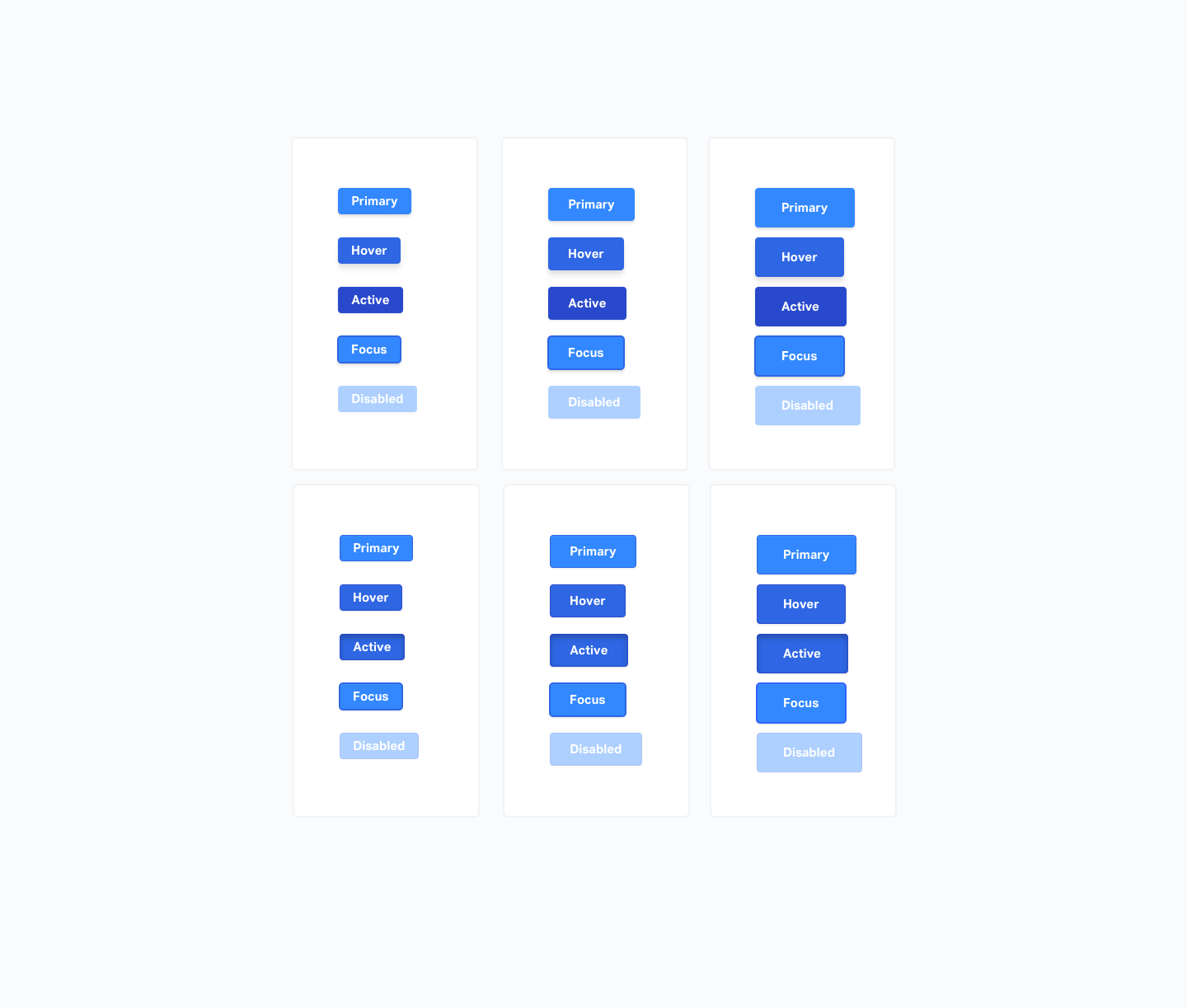
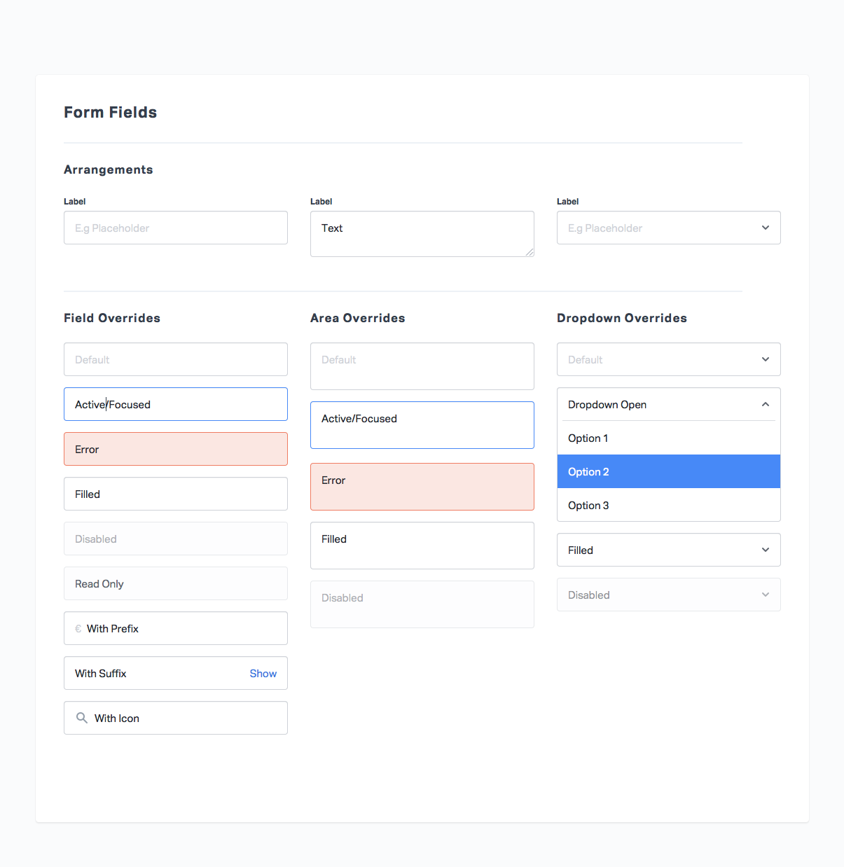
Title
Format
Primary CTA or CLOSE
Refers to #31
One option, two opposing states
Accompanying copy should imply what the toggle is for. Not show the state of the toggle.
Toggle must have a title that never changes, if secondary copy is required for a better description, this can change depending on the state.
Toggle UI
Text
Heading
Related message colour
Icon
Link for action (Close)
Inline Messages
Skeleton loads will appear in place of an organism to show it is loading.
If something does not contain data that needs to be pulled, a skeleton loading state may not be necessary
Card
Rectangles
Colour
How would a skeleton image look like
How would a skeleton text look like
How would a skeleton icon look like
Icons for general usage. Various sizes will be necessary.
For use in various locations in apps/sites
Right now it's the default cursor and doesn't look clickable ^_^
You should always be able to type but also have the option to view a calendar.
in many cases it will be an input field with the opportunity to click an icon to choose the date with the calendar.
Ideally we want a good calendar picker that you can use on one text field
Which scenarios are date pickers best, relative vs absolute dates. (Filters, DOB)
Date picker in isolation, just the calendar alone
Potential time picking element
Text field with date input
Contain:
Selectors act as buttons that have multiple options ( more than 2 )
Sectors can be enabled but only one can be enabled at one time
If a selector does not require a heading, icons & imagery then we recommend a CHECKBOX & RADIO BUTTON
It must be easy to know which item is selected. Selected states must be clear
Shape
Colour
Text
Icon
Imagery

I'm implementing the port of the general page, and noticed that the text overflows in this scenario. Can you take a look?
We need to think about what scenarios can trigger what patterns.
Bubble
Text
Caret in all directions
Currently all our build tasks revolve around building and publishing the storybook.
To set up distribution via NPM or even just using circuit-ui we need a proper build script that will create modules in a distribution folder.
Here are some open questions regarding how such a build setup should work:
import and import() in browsers and optionally builds versions for browsers that don't support these ES features, yet. Is it worth investigating Rollup? On the other hand Webpack 4 is around the corner and Storybook uses Webpack anyway. Should we have a project with two bundlers for different use cases?Since we are at the very beginning of the library I think it is the best moment to propose it and try to build a ground for a maintainable code. :)
I noticed that we are currently adding all components under folder components which isn't a problem, but since we are following the Atomic Design principles for this lib. How about separate the components, not for implementation details but instead structure around the atomic design component kind. Like atoms, molecules and organisms?
** Impact of a Name **
There is nothing new with modular design and development. Hence, what is the impact of certain terms used as in “atoms”, “molecules”, and “organisms”? Design and development terms like “modules”, “components”, and “elements” could easily be adopted as standard. However, the discussion on atomic design requires the choice of chemical terminology to imply a hierarchy which assists those with basic chemistry knowledge to understand on atomic design. Other terminologies lack that ability to help UI designers, developers and end users appreciate and understand the full effect as clearly.
reference: http://ubie.io/atomic-design/
src/components/
  atoms/
    ▾ Input/
        index.js
        Input.js
        Input.spec.js
    ▾ Button/
        Button.js
        Button.spec.js
        index.js
    ▾ Icon/
        Icon.js
        Icon.spec.js
        index.js
  molecules/
    ▾ SearchInput/
        index.js
        SearchInput.js (Icon + Input)
  organisms/
     ▾ HorizontalNavigation/
        index.js
        HorizontalNavigation.js
That makes easier to think about the components in terms of usage and concerns. Plus a new joiner will easily understand the idea behind the components design/principles.
Also in the future, we could create small bundles only with atoms, molecules or organisms them who uses the library could import only the set of components that he will use instead of the whole lib.
Some references behind this structure usage:
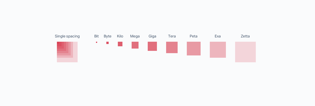
We're using a 4px baseline grind. Therefore all spacings (except the smallest one - bit) should be divisible by 8px.
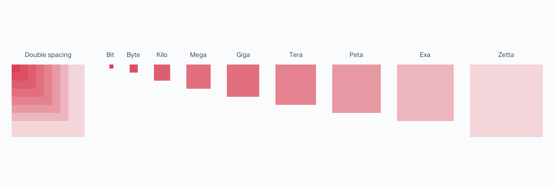
For bigger spacings we added a 'double-spacing'
These are not supposed to be used for any interface and are only designed for the big paddings that we need on the marketing website - not sure if it's worth it implementing all of them, but to me just having the regular ones x2 seems easy, even if we will have some duplicates.
I've received this feedback from a developer that tried to use the lib. He wanted to see a concrete usage of the circuit-ui. He mentioned that a "Todo list" is the most common sample app.
He mentioned that the storybook wasn't enough for him because there weren't examples of configuring (package and theme) there.
So I am opening this issue just to keep track of it and provide it in the future :)
It's kind of simple task so I'm gonna mark it as good first issue for who wants to contribute
Mostly done
TODO:
Horizontal navigation
Same nave for Dashboard and mkt site.
Ideally it also can contain icons
Related to 👉 #23
/* BasicButton/Default: */
background: #GREY-100;
border: 1px solid #GREY-300;
box-shadow: inset 0 1px 0 1px rgba(255,255,255,0.06);
border-radius: 4px;
/* BasicButton/Hover: */
background: #GREY-300;
border: 1px solid #GREY-500;
box-shadow: inset 0 1px 0 1px rgba(255,255,255,0.06);
border-radius: 4px;
/* BasicButton/Active: */
background: #GREY-300;
border: 1px solid #GREY-500;
box-shadow: inset 0 2px 4px 0 #GREY-500;
border-radius: 4px;
/* BasicButton/Focus: */
background: #GREY-100;
border: 2px solid #GREY-300;
Acts as element with standard button
24px Container with 16px Icon
Utilises same spacing as each button size
Icon should be easily fillable with colour if needed (Social Media icons etc.)
The basic card component needs to combine shadows, background and spacings.
We need our various colors.
Anything that is larger than a molecule will show a SKELETON LOADING STATE
Molecules with loading state will remove CTA and show loading icon
Shape & colour
Icon
Text
When running yarn deploy to build storybook and publish to GitHub Pages, it seems the global styles are not included. I noticed this because the default -webkit- margins aren't reset anymore.
This might be related to the recent upgrade from Storybook v3.3.3 to v3.3.13.
Empty state that can initiate an action
Shows some context of page or component
Has either skeleton or illustration to represent content that will be there once status is filled
Text
Illustration
CTA

/* Ground: */
background: #FFFFFF;
box-shadow: 0 0 0 2px rgba(12,15,20,0.03);
border-radius: 4px;
/* Single elevation: */
background: #FFFFFF;
box-shadow: 0 0 0 1px rgba(12,15,20,0.02), 0 0 1px 0 rgba(12,15,20,0.06), 0 2px 2px 0 rgba(12,15,20,0.06);
border-radius: 4px;/* Double elevation: */
background: #FFFFFF;
box-shadow: 0 0 0 1px rgba(12,15,20,0.02), 0 2px 2px 0 rgba(12,15,20,0.06), 0 4px 4px 0 rgba(12,15,20,0.06);
border-radius: 4px;/* Triple elevation: */
background: #FFFFFF;
box-shadow: 0 0 0 1px rgba(12,15,20,0.02), 0 4px 4px 0 rgba(12,15,20,0.06), 0 8px 8px 0 rgba(12,15,20,0.06);
border-radius: 4px;Shows the non-specific state of loading for a given process/activity
Visual of progress
Sample use

Tags can be clickable & link to something
They can be used everywhere
When applied to search and filter, they can be dismissible
Tags in the search can be predefined and selectable. Results in filtering with predefined tags
Icon
Text
Dismiss action
Used as positional progress for page scrolling (Blog, Signup)
Can contain:
One option, two opposing states
Accompanying copy should imply what the toggle is for. Not show the state of the toggle.
Toggle must have a title that never changes, if secondary copy is required for a better description, this can change depending on the state.
Toggle UI
Text

Font-size / Line-height marked in each title. If we want to stick to the bit, byte... Naming I suggest to use the order from above. Like this, we can still add smaller and bigger ones.
The font Used is Aktiv Grotesk (Regular/XBold) and can currently only be used on Adobe. They suggest the following implementations:
<link rel="stylesheet" href="https://use.typekit.net/dxb5kvg.css"><style>
@import url("https://use.typekit.net/dxb5kvg.css");
</style><script>
(function(d) {
var config = {
kitId: 'dxb5kvg',
scriptTimeout: 3000,
async: true
},
h=d.documentElement,t=setTimeout(function(){h.className=h.className.replace(/\bwf-loading\b/g,"")+" wf-inactive";},config.scriptTimeout),tk=d.createElement("script"),f=false,s=d.getElementsByTagName("script")[0],a;h.className+=" wf-loading";tk.src='https://use.typekit.net/'+config.kitId+'.js';tk.async=true;tk.onload=tk.onreadystatechange=function(){a=this.readyState;if(f||a&&a!="complete"&&a!="loaded")return;f=true;clearTimeout(t);try{Typekit.load(config)}catch(e){}};s.parentNode.insertBefore(tk,s)
})(document);
</script>More infos here: https://helpx.adobe.com/typekit/using/embed-codes.html
Hello there.
I've cloned the project and followed the README, but it complains about a missing file ./jest-test-results.json
ERROR in ./jest-test-results.json
Module build failed: Error: ENOENT: no such file or directory, open '/Users/cristianoliveira/work/circuit-ui/jest-test-results.json'
 @ ./src/util/withTests.js 4:0-51
 @ ./src/components/Input/Input.story.js
 @ ./src/components \.story\.js$
 @ ./.storybook/config.js
 @ multi ./node_modules/@storybook/react/dist/server/config/polyfills.js ./node_modules/@storybook/react/dist/server/config/globals.js (webpack)-hot-middleware/client.js?reload=true ./.storybook/config.js
I've created an empty file and it fixed the problem. I think we could have a npm task called setup where we can generate any file needed. What do you think?
We need to load our new font. For this we should either define font-faces or find some other way to declare and load fonts efficiently. Most importantly, we need to have the fonts. The URL from typekit does not seem to work.
It's possible the actual font is only relevant in the projects using this library. If those declare the font families with names this library uses, we don't need to care about this here? Do we want to buy a license for everyone using this library? I bet that does not work 😆 So probably we should keep fonts separate from circuit after all?
Potentially useful resources:
 React
React
A declarative, efficient, and flexible JavaScript library for building user interfaces.
🖖 Vue.js is a progressive, incrementally-adoptable JavaScript framework for building UI on the web.
 Typescript
TypeScript is a superset of JavaScript that compiles to clean JavaScript output.
An Open Source Machine Learning Framework for Everyone
 Django
The Web framework for perfectionists with deadlines.
 Laravel
A PHP framework for web artisans
Bring data to life with SVG, Canvas and HTML. 📊📈🎉
JavaScript (JS) is a lightweight interpreted programming language with first-class functions.
Some thing interesting about web. New door for the world.
A server is a program made to process requests and deliver data to clients.
Machine learning is a way of modeling and interpreting data that allows a piece of software to respond intelligently.
Some thing interesting about visualization, use data art
Some thing interesting about game, make everyone happy.
 Facebook
We are working to build community through open source technology. NB: members must have two-factor auth.
 Microsoft
Open source projects and samples from Microsoft.
 Google
Google ❤️ Open Source for everyone.
 Alibaba
Alibaba Open Source for everyone
 D3
D3
Data-Driven Documents codes.
 Tencent
China tencent open source team.