strypper / mauisland Goto Github PK
View Code? Open in Web Editor NEWMAUIsland 🏝️ is the number 1 controls gallery for .NET MAUI
License: MIT License
MAUIsland 🏝️ is the number 1 controls gallery for .NET MAUI
License: MIT License
When the application tries to contact Intranet Cloud, it does not show any relevant failing errors telling the users that their devices don't have an internet connection, and this is important later on every feature that needs to fetch data from our server
7.0
Android, Windows, MacOS, IOS
NoneAdd information inside the installation section in README.md guide the users how to create the appsettings.Development.json file and this file will not contain any private key
{
  "AppSettings": {
    "SyncfusionKey": "Your_syncfustion_key"
  }
}
Help user build our application
New feature settings page that gives the users the ability to adjust application settings and see all the contributions and contributors
None
Support more realistic data when searching, and customize suggestion view
Implement the search built in controls in the simple example

Implement the real search for this example

HorizontalWrapLayout come from the POS MAUI Demo we reused it in our project with the benefit to have the layout similar to the gridview in WPF and WinUI.
Problem: This layout won't allow the scrollviewer reach to the bottom
Usage: MAUIAllControlsPage.xaml
Layout:
git fetch origin
git checkout 67-implement-editor-page-show-keyboard-type-to-the-user
Missions
Check out this branch
git fetch origin
git checkout 101-timepicker
The WinUI toggle switch will have the minimum width 100 this will cause confusion to developers when they see a huge white space on the right of the switch on Window
Release mode since Debug mode run without an issue
Run mode: Release
App shut down without any logs when navigating to RadiobuttonPage
Root cause: ControlTemplate="{StaticResource RadioButtonTemplate}"
7.0
Android, Windows
None
When you on Galley -> Syncfusion -> SfRadialGauge, SfBadgeView -> More detail to open the new page-> It can't do it and got out of the program.
7.0
Windows
System.Runtime.InteropServices.COMException: 'The application called an interface that was marshalled for a different thread. (0x8001010E (RPC_E_WRONG_THREAD))'
Badges are used to notify users of new or unread messages, notifications, or the status of something.
https://help.syncfusion.com/maui/badge-view/overview
<badge:SfBadgeView HorizontalOptions="Center" VerticalOptions="Center" >
        <badge:SfBadgeView.Content>
            <Button Text="Primary" WidthRequest="120"  HeightRequest="60"/>
        </badge:SfBadgeView.Content>
</badge:SfBadgeView>
SfBadgeView sfBadgeView = new SfBadgeView();
sfBadgeView.HorizontalOptions = LayoutOptions.Center;
sfBadgeView.VerticalOptions = LayoutOptions.Center;
//Adding image to the content of the badge view.
Button button = new Button();
button.Text = "Primary";
button.WidthRequest = 120;
button.HeightRequest = 60;
sfBadgeView.Content = button;
Content = sfBadgeView;Position : Position the badge text around the badge content.
Predefined styles : Customize the badge background with predefined colors.
Animation : Use animations for badge text.
The DrawingView provides a surface that allows for the drawing of lines through the use of touch or mouse interaction. The result of a users drawing can be saved out as an image. A common use case for this is to provide a signature box in an application.

<toolkit:DrawingView
            Lines="{Binding MyLines}"
            LineColor="Red"
LineWidth="5" />Guide people to use this control
https://learn.microsoft.com/en-us/dotnet/communitytoolkit/maui/views/drawingview
The stupid git just tracking my settings file can anyone have a solution for this ?

7.0
Windows
No response
The .NET MAUI Maps control is a powerful data visualization component that displays statistical information for a geographical area. It has highly interactive and customizable features such as selection, tooltip, legends, markers, bubbles, and color mapping. Using the Maps control, you can generate maps for population density, sales, political boundaries, weather, elections, and routes.
<map:SfMaps>

</map:SfMaps>
SfMaps map = new SfMaps();
this.Content = map;When you on Galley -> Built-in-> Check Box-> More detail to open the new page -> It can't do it and got out of the program

7.0
Windows
Exception thrown: 'System.Runtime.InteropServices.COMException' in WinRT.Runtime.dll
An exception of type 'System.Runtime.InteropServices.COMException' occurred in WinRT.Runtime.dll but was not handled in user code
The application called an interface that was marshalled for a different thread. (0x8001010E (RPC_E_WRONG_THREAD))Later
Later

The .NET MAUI Avatar View control provides a graphical representation of user image that allows you to customize the view by adding image, background color, icon, text, etc.
https://help.syncfusion.com/maui/avatar-view/overview
<ContentPage.Content>
<Grid>
    <sfavatar:SfAvatarView ContentType="Custom"
                           ImageSource="alex.png"
                           VerticalOptions="Center"
                           HorizontalOptions="Center"
                           HeightRequest="50"
                           CornerRadius="25"
                           WidthRequest="50" />
</Grid>
</ContentPage.Content>
using Syncfusion.Maui.Core;
namespace AvatarViewGettingStarted
{
public partial class MainPage : ContentPage
{
public MainPage()
{
InitializeComponent();
//main grid
Grid mainGrid = new Grid();
// Create an SfAvatarView control.
SfAvatarView avatarview = new SfAvatarView();
avatarview.VerticalOptions = LayoutOptions.Center;
avatarview.HorizontalOptions = LayoutOptions.Center;
avatarview.BackgroundColor = Color.FromRgba("#ffb6c1");
avatarview.ContentType = ContentType.Custom;
avatarview.ImageSource = "alex.png";
avatarview.WidthRequest = 50;
avatarview.HeightRequest = 50;
avatarview.CornerRadius = 25;
mainGrid.Children.Add(avatarview);
this.Content = mainGrid;
}
}
}Windows require Page datatype to lead to a different page and it doesn't allow page navigation through URL.
Temporary Solution:
Create a third page called: "BridgeWindowChat.xaml" to render the URL and then use it as a Page datatype to Navigate.
6.0 (Default)
No response
No response

The .NET MAUI ComboBox control is a selection component that allows users to type a value or choose an option from a list of predefined options. It has many features, such as data binding, editing, searching, clear button and dropdown button customization, and more.
xmlns:editors="clr-namespace:Syncfusion.Maui.Inputs;assembly=Syncfusion.Maui.Inputs"<ContentPage.Content>
<editors:SfComboBox x:Name="comboBox" />
</ContentPage.Content>Data binding – Support binding various types of data sources.
Editable mode – Editable and non-editable text boxes to select items from the given data source.
Filtering – The ComboBox filters items based on the entered text and auto-fills with the first suggestion.
Searching – Highlights the matching item in the drop-down list based on the provided input.
Placeholder – Display placeholder text inside the control until the user enters text.
I don't think the TabbedPage is designed for desktop, as you can see it's trying to behave the navigation and position the same as what phone operating systems do, but in reality, these behaviors are a such mess that we can't even begin identifying what are goals it's trying to archive
Should we include this in our app ?
When you on Galley -> Built-in-> TabbedPage -> Detail -> I can't back to Menu Galley

7.0
Windows
NoneDemonstrate how the refresh view page works in Maui
Missions:
CollectionViewPlease see the refit documents for this issue: https://github.com/reactiveui/refit
This is refit example showing us how to upload file through HTTP
public interface ISomeApi
{
    [Multipart]
    [Post("/users/{id}/photo")]
    Task UploadPhoto(int id, [AliasAs("myPhoto")] StreamPart stream);
}Our API in Intranet Authentication Controller
    [AllowAnonymous]
    [HttpPost]
    public async Task<IActionResult> Register([FromForm] UserSignUpDTO dto, CancellationToken cancellationToken = default)
    {
        var user = new User()
        {
            UserName = dto.username,
            Email = dto.email
        };
        var result = await _userRepository.CreateAccount(user, dto.password);
        if (result.Succeeded)
        {
            if (dto.avatarfile is null) return Ok();
            if (_mediaService.IsImage(dto.avatarfile))
            {
                using (Stream stream = dto.avatarfile.OpenReadStream())
                {
                    Tuple<bool, string> uploadresults = await _mediaService.UploadAvatarToStorage(stream, dto.avatarfile.FileName);
                    var isUploaded = uploadresults.Item1;
                    var stringUrl = uploadresults.Item2;
                    if (isUploaded && !string.IsNullOrEmpty(stringUrl))
                    {
                        user.ProfilePic = stringUrl;
                        await _userRepository.UpdateUser(user, cancellationToken);
                        return Ok();
                    }
                    else return BadRequest("Look like the image couldnt upload to the storage, but your account have created successfully");
                }
            }
        }
        return BadRequest();
}public record UserSignUpDTO(string username,
string password,
string firstname,
string lastname,
string email,
string phonenumber,
string[]? roles,
IFormFile? avatarfile)
{ }As you can see the avatarfile is an IFormFile which we included inside this object, so far we haven't found a way to use refit to send this kind of object to our backend to recognize.
If we don't have a solution, we must call 2 requests to complete our registration process. we had the code for uploading files in using the System.Net.Http will be this massive like this
This is an example of my previous object uploading a file to ASP.NET
        public async Task<PetaverseMedia> CreatePetAvatarAsync(Animal petInfo, StorageFile avatar)
        {
            if (avatar != null)
            {
                var multipartFormContent = new MultipartFormDataContent();

                var handle = avatar.CreateSafeFileHandle(options: FileOptions.RandomAccess);
                var stream = new FileStream(handle, FileAccess.ReadWrite) { Position = 0 };
                var media = new StreamContent(stream);
                media.Headers.Add("Content-Type", "image/jpeg");
                multipartFormContent.Add(media, name: "avatar", fileName: $"{petInfo.Name}");

                try
                {
                    var result = await _httpClient.PostAsync($"api/Animal/UploadPetAvatar/{petInfo.Id}", multipartFormContent);
                    string stringReadResult = await result.Content.ReadAsStringAsync();
                    return JsonConvert.DeserializeObject<PetaverseMedia>(stringReadResult);
                }
                catch (Exception ex)
                {
                    await new HttpRequestErrorContentDialog()
                    {
                        Title = "Can't upload avatar"
                    }.ShowAsync();
                    return null;
                }
            }
            else return null;
} try
{
var response = await this.intranetAuthenticationRefit.Register(new RegisterDTO(userName, firstName, lastName, phoneNumber, email, password, profilePicStream));
if (!response.IsSuccessStatusCode)
{
var errorContentJson = JsonConvert.DeserializeObject<RefitErrorMessageModel>(response.Error.Content);
throw new Exception(errorContentJson.title);
}
}
catch (ApiException ex)
{
throw new Exception(ex.Message);
}Create user information with an avatar with only one call
The Syncfusion .NET MAUI Barcode Generator is a data visualization control used to generate and display data in a machine-readable format. It provides a perfect approach to encode text using supported symbology types.
https://help.syncfusion.com/maui/barcode-generator/overview
xmlns:barcode="clr-namespace:Syncfusion.Maui.Barcode;assembly=Syncfusion.Maui.Barcode"<barcode:SfBarcodeGenerator Value="http://www.syncfusion.com"
HeightRequest="150"/>When I enter the refresh page I'm really confuse how to perform a swipe to refresh action to try out this control, the document should include these following guidance.

Add built-in popup controls guidance
https://learn.microsoft.com/en-us/dotnet/maui/user-interface/pop-ups?view=net-maui-7.0
Most of the time people want to control the grid separation using c# instead of XAML, give them clear guidance on how to do this
What is going on?
When I entrance app:
Page.xaml generated is not included
7.0
Android, Windows, MacOS, IOS
NoneMAUIAllControlsPage

Detail Control Page - Notice there's a back button on top

When MAUIAllControlsPage navigate to DetailControl is fine but when trying to navigate back nothing is happen
Implementation
private void ControlCardContentView_DetailClicked(string route) {
    viewModel.NavigateToDetailCommand.Execute(route);
}
Location MAUIAllControlsPage.cs
Page opened by the new window doesn't visible bar
7.0
Windows
No log includedOriginally posted by Seledy219 January 9, 2023


Implement the time picker control to show the developer how to use it, you can read the documents and other sample control pages for guidance also don't forget to reach @Seledy219 and @truonghocyeuquy for help

The .NET MAUI Autocomplete control is highly optimized to load and populate suggestions quickly from large amounts of data depending on the user’s input characters. It allows users to select an item from the suggestion list. It displays the selected item in the input view with the text and clear button.
xmlns:editors="clr-namespace:Syncfusion.Maui.Inputs;assembly=Syncfusion.Maui.Inputs"<ContentPage.Content>
<editors:SfAutocomplete x:Name="autocomplete" />
</ContentPage.Content>SfAutocomplete autocomplete = new SfAutocomplete();
Content = autocomplete;Original source: https://learn.microsoft.com/en-us/dotnet/communitytoolkit/mvvm/generators/observableproperty
The ObservableProperty type is an attribute that allows generating observable properties from annotated fields. Its purpose is to greatly reduce the amount of boilerplate that is needed to define observable properties.
From this:
public string? Name
{
    get => name;
    set => SetProperty(ref name, value);
}
To this:
[ObservableProperty]
private string? name;
It will also do so with an optimized implementation, so the end result will be even faster.
⚠️ The name of the generated property will be created based on the field name. The generator assumes the field is named eitherlowerCamel,_lowerCamelorm_lowerCamel, and it will transform that toUpperCamelto follow proper .NET naming conventions. The resulting property will always have public accessors, but the field can be declared with any visibility (privateis recommended).
In MVVM it's common that we need to handle custom logic when the property changes, this is why the MVVM Toolkit also give us the ability to do so.
From this:
public string? Name
{
    get => name;
    set
    {
        if (!EqualityComparer<string?>.Default.Equals(name, value))
        {
            OnNameChanging(value);
            OnPropertyChanging();
            name = value;
            OnNameChanged(value);
            OnPropertyChanged();
        }
    }
}

partial void OnNameChanging(string? value);
partial void OnNameChanged(string? value);
To this:
[ObservableProperty]
private string? name;

partial void OnNameChanging(string? value)
{
    Console.WriteLine($"Name is about to change to {value}");
}

partial void OnNameChanged(string? value)
{
    Console.WriteLine($"Name has changed to {value}");
}Imagine you had a FullName property you wanted to raise a notification for whenever Name changes. You can do that by using the NotifyPropertyChangedFor attribute, like so:
[ObservableProperty]
[NotifyPropertyChangedFor(nameof(FullName))]
private string? name;
This will result in a generated property equivalent to this:
public string? Name
{
    get => name;
    set
    {
        if (SetProperty(ref name, value))
        {
            OnPropertyChanged("FullName");
        }
    }
}Imagine you had a command whose execution state was dependent on the value of this property. That is, whenever the property changed, the execution state of the command should be invalidated and computed again. In other words, ICommand.CanExecuteChanged should be raised again. You can achieve this by using the NotifyCanExecuteChangedFor attribute:
[ObservableProperty]
[NotifyCanExecuteChangedFor(nameof(MyCommand))]
private string? name;
public string? Name
{
get => name;
set
{
if (SetProperty(ref name, value))
{
MyCommand.NotifyCanExecuteChanged();
}
}
}level difficult[ObservableProperty]
[NotifyDataErrorInfo]
[Required]
[MinLength(2)] // Any other validation attributes too...
private string? name;That generated ValidateProperty call will then validate the property and update the state of the ObservableValidator object, so that UI components can react to it and display any validation errors appropriately.
level difficultIf the property is declared in a type that inherits from ObservableRecipient, you can use the NotifyPropertyChangedRecipients attribute to instruct the generator to also insert code to send a property changed message for the property change. This will allow registered recipients to dynamically react to the change. That is, consider this code:
[ObservableProperty]
[NotifyPropertyChangedRecipients]
private string? name;
That generated Broadcast call will then send a new PropertyChangedMessage using the IMessenger instance in use in the current viewmodel, to all registered subscribers.
Starting with version 8.0, the MVVM Toolkit includes brand-new Roslyn source generators that will help significantly reduce boilerplate when writing code using the MVVM architecture. They can simplify scenarios where you need to set up observable properties, commands, and more
I think the editor page still not doing a good job of teaching people how to use it. Also, I think doesn't give us much interaction detail
Navigate here
git fetch origin
git checkout 56-enhance-editor-page
Collection view span should change its value dynamically like it normally does on Android.
Check this out on:
https://1drv.ms/v/s!Atp5h2QiqzrFidI4ob-_Odk7H_KEfA?e=j1cQax
Expected:
https://1drv.ms/v/s!Atp5h2QiqzrFidI3Kjial64ufZ9FmQ?e=YovIy3
.NET 7
Windows

In the new version of MAUIsland we include provide it the way to grab the application settings file to get all the settings it need to startup the application, and later for future user settings storage
The problem right now is that we can't get the file with this line of code
using var stream = assembly.GetManifestResourceStream("MAUIsland.appsettings.Development.json");Detail implementation in MauiProgram
    static MauiAppBuilder GetAppSettings(this MauiAppBuilder builder)
    {
        var assembly = Assembly.GetExecutingAssembly();
        using var stream = assembly.GetManifestResourceStream("MAUIsland.appsettings.Development.json");

        if (stream is not null)
        {
            var config = new ConfigurationBuilder()
                        .AddJsonStream(stream)
                        .Build();

            builder.Configuration.AddConfiguration(config);
        }
        else
        {
            var options = new SnackbarOptions
            {
                BackgroundColor = AppColors.Purple,
                TextColor = AppColors.White,
                ActionButtonTextColor = AppColors.Pink,
                CornerRadius = new CornerRadius(Dimensions.ButtonCornerRadius),
                CharacterSpacing = 0.5
            };
            var message = "Can't find app settings file";

            var snackbar = Snackbar.Make(message, null, "OK", TimeSpan.FromSeconds(5), options);
            snackbar.Show();
}7.0
Android, Windows, MacOS, IOS
NoneWe did grab the RoundedEntry from CnP but not sure why the visual UI is not as straightforward as CnP, we haven't tested it on other platforms but we sure need validation in our application so that we can prevent potential issues and bugs in our Register/SignIn feature. Please provide us with validation entry with the below features:
Notice: We can use the same logic from RoundedEntry since the logic is working perfectly fine, but the UI has visual issue so can you investigate that case ?
<app:ValidationEntry/>
For text input that required rules
Original source
https://github.com/rudyspano/MAUI-Adaptive-Properties
XAML is powerful! It allows to describe complex UI and a lot of mechanisms provide solutions to add dynamism: Triggers (DataTrigger, Adaptive Triggers), Visual States, Attached Properties, Behaviors, ...
However, out of the box, you have to write a lot of code in order to adapt UI depending on the running form factor, orientation or state: Phones, Tablets, Foldable Phones, Vertical/Horizontal orientation, ...
The goal of this library is to provide a simple way to develop and maintain UI that handles this complexity.
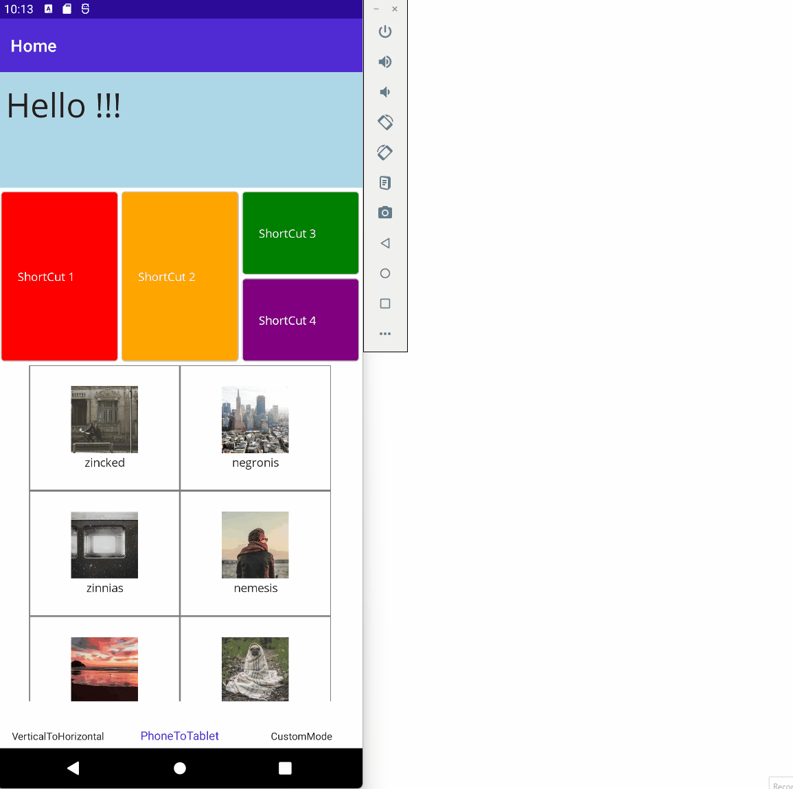
Example:
The following XAML defines a part of UI with a Phone First Approach and overrides properties for Tablet (or foldable phone in the opened state) (m:T.XX, m:TV.XX, m.TH.XX)
<VerticalStackLayout>
      <Grid HeightRequest="200"
            BackgroundColor="LightBlue">

          <Label Margin="10" VerticalOptions="Center"
                 FontSize="40"
                 Text="Hello !!!"
                 m:T.Text="Hello Tablet User :)" />
      </Grid>

      <Grid Padding="4" ColumnSpacing="4" RowSpacing="4" RowDefinitions="100,100" ColumnDefinitions="*,*,*"
            m:TH.RowDefinitions="200" m:TH.ColumnDefinitions="*,*,*,*"
            m:TV.RowDefinitions="200,200" m:TV.ColumnDefinitions="*,*">
          <Frame Grid.RowSpan="2"
                 m:T.RowSpan="1"
                 BackgroundColor="Red"
                 CornerRadius="4">
              <Label VerticalTextAlignment="Center"
                     TextColor="White"
                     Text="ShortCut 1" />
          </Frame>
          <Frame Grid.Column="1" Grid.RowSpan="2"
                 m:T.RowSpan="1"
                 BackgroundColor="Orange"
                 CornerRadius="4">
              <Label VerticalTextAlignment="Center"
                     TextColor="White"
                     Text="ShortCut 2" />
          </Frame>
          <Frame Grid.Column="2"
                 m:TV.Column="0" m:TV.Row="1"
                 BackgroundColor="Green"
                 CornerRadius="4">
              <Label VerticalTextAlignment="Center"
                     TextColor="White"
                     Text="ShortCut 3" />
          </Frame>
          <Frame Grid.Row="1" Grid.Column="2"
                 m:TH.Column="3"
                 m:TV.Column="1" m:TV.Row="1"
                 BackgroundColor="Purple"
                 CornerRadius="4">
              <Label VerticalTextAlignment="Center"
                     TextColor="White"
                     Text="ShortCut 4" />
          </Frame>
      </Grid>

      <FlexLayout BindableLayout.ItemsSource="{Binding ShelfList}"
                  JustifyContent="Center" Wrap="Wrap">
          <BindableLayout.ItemTemplate>
              <DataTemplate x:DataType="Model:Shelf">
                  <Grid WidthRequest="180" HeightRequest="150">
                      <Button BackgroundColor="White" BorderColor="Gray"
                              Command="{Binding BindingContext.GotToShelfCommand, Source={x:Reference HomePageInstance}}"
                              CommandParameter="{Binding}"
                              BorderWidth="1" CornerRadius="0" />

                      <Grid HeightRequest="100" VerticalOptions="Center" RowDefinitions="80,20"
                            m:T.HeightRequest="-1" m:T.VerticalOptions="Fill" m:T.RowDefinitions="*"
                            InputTransparent="True">
                          <Image Source="{Binding ImageUrl}"
                                 m:T.Aspect="AspectFill" />
                          <Label Grid.Row="1" HorizontalOptions="Center"
                                 m:T.Row="0" m:T.VerticalOptions="End"
                                 m:T.TextColor="White"
                                 Text="{Binding Name}" />
                      </Grid>
                  </Grid>
              </DataTemplate>
          </BindableLayout.ItemTemplate>
      </FlexLayout>
</VerticalStackLayout>
You can use the following modes in order to override properties:
| Description | {Prefix}:{Name}.{PropertyName} |
|---|---|
| Phone/Tablet Vertical mode | m:V.{PropertyName} |
| Phone/Tablet Horizontal mode | m:H.{PropertyName} |
| Phone mode | m:P.{PropertyName} |
| Phone Vertical mode | m:PV.{PropertyName} |
| Phone Horizontal mode | m:PH.{PropertyName} |
| Tablet mode | m:T.{PropertyName} |
| Tablet Vertical mode | m:TV.{PropertyName} |
| Tablet Horizontal mode | m:TH.{PropertyName} |
| Custom mode | m:X.{PropertyName} |
If you need to handle other modes based on another state (depending on accessibility for example), you can override properties by using m:X.{PropertyName}, m:X2.{PropertyName}, m:X3.{PropertyName}.
In order to define conditions and trigger a custom mode, you have to use the 2 following methods:
See more in the sample here: https://github.com/rudyspano/MAUI-Adaptive-Properties/tree/main/sources/AdaptiveProperties.Demo/Views/3-CustomMode
A lot but not all properties of MAUI are available.
You can easily see which ones in the definition class here: https://github.com/rudyspano/MAUI-Adaptive-Properties/blob/main/sources/AdaptiveProperties.Configuration/Code.Configuration.cs
The real benefit of this Library depends, of course, of your needs. It is really efficient if the amount of adapations is reasonable => if a lot of adaptations are required, you should probably create specific views.
If your adaptations are mainly based on colors, fontSize (...) and do not concern layout properties, you should simply use Theming out-of-the-box features: https://learn.microsoft.com/en-us/dotnet/maui/user-interface/theming?view=net-maui-7.0
For the moment, properties does'nt handle DataBinding with value tracking and it's not really a goal considering efficient existing mechanisms.
If this project interests you, please share or contribute :)
<VerticalStackLayout>
      <Grid HeightRequest="200"
            BackgroundColor="LightBlue">

          <Label Margin="10" VerticalOptions="Center"
                 FontSize="40"
                 Text="Hello !!!"
                 m:T.Text="Hello Tablet User :)" />
      </Grid>

      <Grid Padding="4" ColumnSpacing="4" RowSpacing="4" RowDefinitions="100,100" ColumnDefinitions="*,*,*"
            m:TH.RowDefinitions="200" m:TH.ColumnDefinitions="*,*,*,*"
            m:TV.RowDefinitions="200,200" m:TV.ColumnDefinitions="*,*">
          <Frame Grid.RowSpan="2"
                 m:T.RowSpan="1"
                 BackgroundColor="Red"
                 CornerRadius="4">
              <Label VerticalTextAlignment="Center"
                     TextColor="White"
                     Text="ShortCut 1" />
          </Frame>
          <Frame Grid.Column="1" Grid.RowSpan="2"
                 m:T.RowSpan="1"
                 BackgroundColor="Orange"
                 CornerRadius="4">
              <Label VerticalTextAlignment="Center"
                     TextColor="White"
                     Text="ShortCut 2" />
          </Frame>
          <Frame Grid.Column="2"
                 m:TV.Column="0" m:TV.Row="1"
                 BackgroundColor="Green"
                 CornerRadius="4">
              <Label VerticalTextAlignment="Center"
                     TextColor="White"
                     Text="ShortCut 3" />
          </Frame>
          <Frame Grid.Row="1" Grid.Column="2"
                 m:TH.Column="3"
                 m:TV.Column="1" m:TV.Row="1"
                 BackgroundColor="Purple"
                 CornerRadius="4">
              <Label VerticalTextAlignment="Center"
                     TextColor="White"
                     Text="ShortCut 4" />
          </Frame>
      </Grid>

      <FlexLayout BindableLayout.ItemsSource="{Binding ShelfList}"
                  JustifyContent="Center" Wrap="Wrap">
          <BindableLayout.ItemTemplate>
              <DataTemplate x:DataType="Model:Shelf">
                  <Grid WidthRequest="180" HeightRequest="150">
                      <Button BackgroundColor="White" BorderColor="Gray"
                              Command="{Binding BindingContext.GotToShelfCommand, Source={x:Reference HomePageInstance}}"
                              CommandParameter="{Binding}"
                              BorderWidth="1" CornerRadius="0" />

                      <Grid HeightRequest="100" VerticalOptions="Center" RowDefinitions="80,20"
                            m:T.HeightRequest="-1" m:T.VerticalOptions="Fill" m:T.RowDefinitions="*"
                            InputTransparent="True">
                          <Image Source="{Binding ImageUrl}"
                                 m:T.Aspect="AspectFill" />
                          <Label Grid.Row="1" HorizontalOptions="Center"
                                 m:T.Row="0" m:T.VerticalOptions="End"
                                 m:T.TextColor="White"
                                 Text="{Binding Name}" />
                      </Grid>
                  </Grid>
              </DataTemplate>
          </BindableLayout.ItemTemplate>
      </FlexLayout>
</VerticalStackLayout>The goal of this library is to provide a simple way to develop and maintain UI that handles this complexity.
Instead of using code editor to display the code, we use the Label for richer color options, this will support many type of programming languages and it's faster than the Editor
Old
<app:SourceCodeExpander XamlCode="{x:Binding SliderWithCustomThumbImageXamlCode}" />New
<app:SourceCodeExpander Code="{x:Binding SliderWithCustomThumbImageXamlCode}" CodeType="Xaml" />
<app:SourceCodeExpander Code="{x:Binding SliderWithCustomThumbImageCSharpCode}" CodeType="CSharp" />For displaying code guidance.
 React
React
A declarative, efficient, and flexible JavaScript library for building user interfaces.
🖖 Vue.js is a progressive, incrementally-adoptable JavaScript framework for building UI on the web.
 Typescript
TypeScript is a superset of JavaScript that compiles to clean JavaScript output.
An Open Source Machine Learning Framework for Everyone
 Django
The Web framework for perfectionists with deadlines.
 Laravel
A PHP framework for web artisans
Bring data to life with SVG, Canvas and HTML. 📊📈🎉
JavaScript (JS) is a lightweight interpreted programming language with first-class functions.
Some thing interesting about web. New door for the world.
A server is a program made to process requests and deliver data to clients.
Machine learning is a way of modeling and interpreting data that allows a piece of software to respond intelligently.
Some thing interesting about visualization, use data art
Some thing interesting about game, make everyone happy.
 Facebook
We are working to build community through open source technology. NB: members must have two-factor auth.
 Microsoft
Open source projects and samples from Microsoft.
 Google
Google ❤️ Open Source for everyone.
 Alibaba
Alibaba Open Source for everyone
 D3
D3
Data-Driven Documents codes.
 Tencent
China tencent open source team.