An extremely customizable multi level accordion. It's receives a high level tree structure in json format.
极其可定制的多层手风琴。 它以json格式接收高级树结构。
Example 1:

Example 2:

- Although there are some accordion plugins, there aren't so many that offers a nested structure of any number of levels.
- Existing accordions are usually hard to customize because they come with their own styling configuration.
The above reasons led me to build an extremely customizable recursive accordion.
- First install package by npm.
npm i vue-multilevel-accordion
- Import the component and register it where you want to use it.
<script>
  import MultilevelAccordion from "vue-multilevel-accordion";
  import tree from "./tree.js";

  export default {
    components: {
      MultilevelAccordion
    },
    data() {
      return {
        tree
      };
    }
  };
</script>- Create the tree structure and save it on a file (in this case it's called tree.js). The first level (root level) it's not going to be rendered but is required by the component.
const tree = {
  text: "Root",
  children: [
    {
      text: "Musicians",
      children: [
        {
          text: "IDM",
          children: [
            {
              text: "Ae"
            },
            {
              text: "BOC"
            }
          ]
        },
        {
          text: "Post Rock",
          children: [
            {
              text: "Tortoise"
            }
          ]
        }
      ]
    }
  ]
};

export { tree };- Define the recursive template that is going to be in every tab. You've to use slot-scope and destructurate { tree } property. For more options see the Options section.
For example, this is going to show text field defined previously in every tab. Also, when the user clicks on the tab, the method select(value) will be called.
<template slot-scope="{ tree }">
  <div @click="select(tree.text)" style="padding: 10px;">
    <p>{{ tree.text }}</p>
  </div>
</template>- Place the component with the slot wherever you want. You've to pass the component the tree structure and optionally a margin on the left that it's going to growth with every level of depth. For more options see the Options section.
<multilevel-accordion :tree="tree" :marginLeft="2">
  <template slot-scope="{ tree }">
    <div @click="select(tree.text)">
      <p>{{ tree.text }}</p>
    </div>
  </template>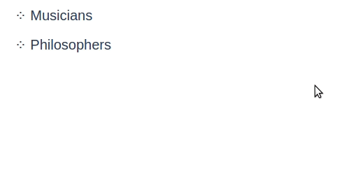
</multilevel-accordion>- You can see the result!

- Props:
The component receives 2 posible props:
<multilevel-accordion :tree="tree" :marginLeft="2"> </multilevel-accordion>| Prop | Type | Default | Description |
|---|---|---|---|
| tree | Object | null | Contains the tree in json format that's required to render the component. |
| marginLeft | Float | 0 | It's the accumulative margin on the left that growths with each level. Is in rem units. |
- Destructuring:
For each element in the tree some properties can be individually accesed via slot-scope directive.
<multilevel-accordion :tree="tree" :marginLeft="2">
  <template slot-scope="{ tree, interleaved, level, expanded, leaf }">
    <div>
      <p>{{ tree.text }}</p>
    </div>
  </template>
</multilevel-accordion>| Field | Type | Description |
|---|---|---|
| tree | Object | Contains the fields defined in the tree structure. |
| interleaved | Boolean | Alternates between true and false depending on the row. It can be use to select a background color, for example. |
| level | Number | Integer that indicates the depth level of the row. |
| expanded | Boolean | Is true if the row is expanded, else otherwise. |
| leaf | Boolean | Is true if the tab is a leaf (doesnt have any children element), false otherwise. You can override this default behaviour by adding leaf: true or leaf: false in the tree structure for each element. |
Important:
In this repository there is a functional example that you can run locally in your pc. Please go to the example folder and follow the instructions.
Adding some styling you can quickly scalate the complexity of the component and the design.
For example, you can:
- Alternate the color for each row to bring a better UX.
This is done with the { interleaved } destructuring.
- Specific rules for leaf and non leaf tabs.
This can be done with the { leaf } destructuring: leaf is going to be true if the element is a leaf, and false otherwise. Combine this with v-if or conditionals.
- Specific rules or css styles when the element is expanded.
This can be done with the { expanded } destructuring, which is going to be true is the tab is expanded and false otherwise.
- Specifics rules or styles depending of the depth level
This can be done with the { level } destructuring which is an Integer that represents the current level of depth.
For example, using this component and the library Tailwind Css you could reach pretty different styles:
You can run locally in your computer the following examples. To do this, just go to the github repository and clone the folder example. To install, follow the instructions listed on the readme file of that folder.
Example 1:
Example 2:
Example 3:
This is a pretty basic project that I did in a weekend. If you want to contribute improving this, adding more functionality of fixing issues I'll be glad to receive PR.
MIT License
Copyright (c) 2019 Santiago Díaz de Valdés Williamson
Permission is hereby granted, free of charge, to any person obtaining a copy of this software and associated documentation files (the "Software"), to deal in the Software without restriction, including without limitation the rights to use, copy, modify, merge, publish, distribute, sublicense, and/or sell copies of the Software, and to permit persons to whom the Software is furnished to do so, subject to the following conditions:
The above copyright notice and this permission notice shall be included in all copies or substantial portions of the Software.
THE SOFTWARE IS PROVIDED "AS IS", WITHOUT WARRANTY OF ANY KIND, EXPRESS OR IMPLIED, INCLUDING BUT NOT LIMITED TO THE WARRANTIES OF MERCHANTABILITY, FITNESS FOR A PARTICULAR PURPOSE AND NONINFRINGEMENT. IN NO EVENT SHALL THE AUTHORS OR COPYRIGHT HOLDERS BE LIABLE FOR ANY CLAIM, DAMAGES OR OTHER LIABILITY, WHETHER IN AN ACTION OF CONTRACT, TORT OR OTHERWISE, ARISING FROM, OUT OF OR IN CONNECTION WITH THE SOFTWARE OR THE USE OR OTHER DEALINGS IN THE SOFTWARE.
 React
React
 Typescript
 Django
 Laravel
 Facebook
 Microsoft
 Google
 Alibaba
 D3
D3
 Tencent