Comments (133)
 ikeydoherty
commented on August 15, 2024
11
ikeydoherty
commented on August 15, 2024
11
Cheers for starting the new thread! Ok so from my perspective there are 2 clear things to avoid for us (aesthetically)
- Mimicking macOS
- Mimicking KDE
Ideally we want a new Budgie (Shell) specific theming component, with at least:
- Global control on UI accents
- Global toggle for dark/light mode
The rest should be well defined, and we need a palette. Personally I'm kinda tired of blue, it's overused as the de facto "this is professional" colour. Personally I'm hoping for something "light" and "fresh". If possible, I'm open to green. Psychologically speaking we kinda crave these things, and being sat in front of the computer for long periods, well, we should make sure our users "feel" good.
I'd like to avoid information overload, favouring progressive disclosure for settings and such. As the core mantra (and cliché) we want to keep out of the users way, but also look after them. Additionally the users need to own their experience, but with sane defaults. So it should be customisable at it's core.
Transparency and blur are nice when used sparingly, and when the user interface isn't modified solely to show off these blurs, rather it should take advantage of it. I'm in favour of a "nearly flat" UI approach as opposed to complete flat (depth + shadow are critical visual cues), as well as obvious layouts. You'll notice in more modern UIs the focus is on clear separation in column layouts.
I think its safe to say we also need to account for applications to some regard, so think of the "OS basics" and the System Settings (we won't be using GNOME Control Center).
Hopefully this opens the floor to a more open discussion and frees up some constraints (i.e we're not just focusing on the shell chrome, but more of a formal HIG.
To assist me (codemonkey) in implementing mockups, please provide hexadecimal colour schemes along with the various layout critical pieces (padding, font point sizes, etc.)
from budgie-rd.
 villekivela
commented on August 15, 2024
11
villekivela
commented on August 15, 2024
11
Hey people,
I made an somewhat interactive mockup. There are three applications that you can preview:
firefox, gnome-settings and nautilus. Nautilus shows the inactive style of an app and settings shows the active one. Firefox tries to demonstrate how an application would look in fullscreen.
You can click the menu icon to show application menu. There's an favorite applications panel on the left side of screen to show the application windows.
Clicking taskbar icons shows Raven. Raven has mockup of notifications and widgets. There are some dummy widgets under the widget panel. You can also change the theme of the UI from the bottom of the Widgets panel.
I used Sams Solus icon theme for the most part. Some are from elementary plus and Suru themes.
The font looks bit weird on firefox under Solus (might be my webrenderer settings) but on my worklaptop it was fine. Also it works best with 1920x1200 resolution. Other resolutions need a bit of tweaking.
Please tell me if you want the source files.
from budgie-rd.
 awareofdistractions
commented on August 15, 2024
9
awareofdistractions
commented on August 15, 2024
9
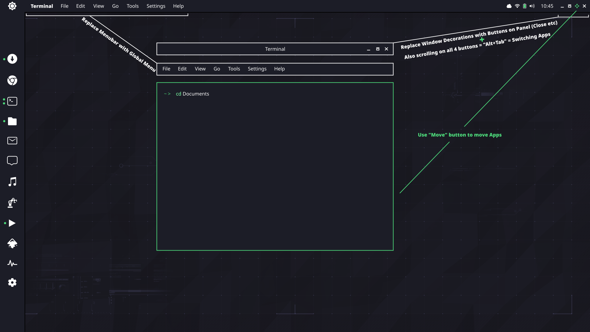
In my opinion Window Decorations and Menubar are massive waste of space:

I think it would be nice to merge current 3 bars (panel, titlebar and menubar) into one panel:
from budgie-rd.
 tobcro
commented on August 15, 2024
5
tobcro
commented on August 15, 2024
5
Since this is a open discussion :) I really like the thought of a global dark/white theme. The accent color is also important, I would however not focus so much on a specific standard color (blue, green etc) - I probably would want to change it anyway to match my desktop background. So to be able to change the accent color - I am thinking a few presets but also the ability to add your own hexadecimal values as well - would just add a little little extra for me. Of course there is always the option to create your own theme, "the Linux way" . But I think that is silly when you only want to change the accent color...
from budgie-rd.
 kucho
commented on August 15, 2024
5
kucho
commented on August 15, 2024
5
What about using Cerebro? It's open source
from budgie-rd.
 tuxattack80
commented on August 15, 2024
4
tuxattack80
commented on August 15, 2024
4
Like the retro look displayed above, seems like that could be very theme friendly, I actually think a legit theme engine in Solus would be something to consider. Not just something that stores and displays themes installed but something that would allow the user to tweak accents and background colors along with icons for system apps, notification drawer and application icons. Could be built in with budge settings or whatever settings manager is used in Budgie 11. Too bad icons built for Android can't be crossed over to Linux 🤔 Yeah pipe dreaming at the moment. But yeah I think user control would be the way to go and just have several accents to choose from like zorin without the need of paying for it.
from budgie-rd.
ikeydoherty
commented on August 15, 2024
3
We're not using KDE apps. We'll have our own settings application. Latte dock is separate and shouldn't be considered part of our project scope. It's third party.
from budgie-rd.
 haunt98
commented on August 15, 2024
3
haunt98
commented on August 15, 2024
3
May be a bit more retro like this
This palette I get from gruvbox
from budgie-rd.
tuxattack80
commented on August 15, 2024
3
https://goo.gl/photos/pYPEdEn7fkEootzt5 I know it's Android but it's the closet device I had at the time but just wanted to give an example of how white and black could work and in a dark theme id say just invert the colors.
from budgie-rd.
 bollian
commented on August 15, 2024
3
bollian
commented on August 15, 2024
3
Currently, the two biggest features that are keeping me with GNOME are:
- The window and workspace overview (called Activities)
- The ability to open Activities and switch workspaces with touchpad gestures under Wayland
The ability to graphically drag windows between workspaces or get an overview of all your windows is, to me, very intuitive. Now that this works on both macOS and windows 10, any non-linux user anyone who tries to use my laptop expects these features.
Obviously you'd also want ways to access the overview for when you aren't using a laptop, but that could be as simple as an applet and keyboard shortcuts.
from budgie-rd.
 tristan957
commented on August 15, 2024
3
tristan957
commented on August 15, 2024
3
Why do you need a theme so badly? I just need my boot loader to let me boot my OS. I see it for like 4 seconds and I move on with my life
from budgie-rd.
villekivela
commented on August 15, 2024
3
Thanks for the comments. Here are few screenshots with different accent colors:
Login/Lockscreen

Panel with icon application list

GTK theme and application menu

Ravens widgets panel

Ravens notifications panel

from budgie-rd.
 MaxJonasG
commented on August 15, 2024
2
MaxJonasG
commented on August 15, 2024
2
the 4th picture from the top ticks all the boxes (semi-flat, column design, teal highlights).
http://www.fromupnorth.com/user-interface-inspiration-696/
from budgie-rd.
 zoomer296
commented on August 15, 2024
2
zoomer296
commented on August 15, 2024
2
I know flat icons are in style right now, but what do you guys think about using an icon pack that isn't completely flat? Something similar to breeze-icons.
from budgie-rd.
villekivela
commented on August 15, 2024
2
Here's a fast hack without properly sized icons so they are blurry.

from budgie-rd.
ikeydoherty
commented on August 15, 2024
1
Actually John McCormack helped name that. Basic idea was around the delivery of information and intelligence. Plus it kept the avian theme going.
from budgie-rd.
 STiAT
commented on August 15, 2024
1
STiAT
commented on August 15, 2024
1
While I personally dislike red in designs (too fretful for my taste, I get uneasy if something is red on my desktop), I've checked with a colleague who's red/green blind, and the design @mrkucho and @yaymalaga seem to prefer (Matcha) works. I'd certainly prefer it without red though.
from budgie-rd.
 cunidev
commented on August 15, 2024
1
cunidev
commented on August 15, 2024
1
@STiAT
I was also thinking of separate switches for sound and popups, but then I thought I might be overcomplicating it for nothing.
So my idea was:
Normal: sound, popups, raven
Silent: popups, raven
DND (or maybe something like "Immersive" mode?): raven only
Not showing notifications even in Raven looks kinda pointless to me, as we'd basically be throwing them away for nothing. The systray icon should remain as it is, except maybe show a half-moon icon instead of a white or red bell to symbolize that there might be or not notifications, but you won't be bothered unless you check manually.
Is the systray icon gonna remain anyway? Looks somewhat redundant, I'd rather have the unread notifications number near the Raven trigger...
from budgie-rd.
 vikz95
commented on August 15, 2024
1
vikz95
commented on August 15, 2024
1
Just saw this video on YouTube: https://youtu.be/-5tak0tHqIg
It seems interesting. The guy is trying to make a new OS with nodejs, but I don't think that he alone could do much.
But would be great to have creative people working on Budgie 11 to bring us a good desktop environment, with an innovative interface and user experience.
I think that Budgie is too much flat and minimalistic.
Just my opinion, greetings.
from budgie-rd.
 luispabon
commented on August 15, 2024
1
luispabon
commented on August 15, 2024
1
Unity and its integrated menu on the window decoration got the idea right, and well implemented.
from budgie-rd.
zoomer296
commented on August 15, 2024
1
@rawsh Exactly. The small touches are one of the reasons Solus is getting so much attention right now. Skipping right over the bootloader would be a travesty.
@bobafetthotmail Yep. Once something works, it's time to make it look nice.
Not to mention that plain text on the screen makes average users flip their shit.
Me not knowing about fancier grub themes was part of the reason I didn't move my sister to Linux back in '15
from budgie-rd.
 wisetux
commented on August 15, 2024
wisetux
commented on August 15, 2024
When I read that you were personally tired of blue, this is the color that immediately crossed my mind. And there it is in your very next line - "Green".

from budgie-rd.
ikeydoherty
commented on August 15, 2024
Could be nice as an accent yeah
from budgie-rd.
ikeydoherty
commented on August 15, 2024
I think it might be worth us exposing parts of the palette to allow several "add-on" palettes. A typical pattern we see in GNOME applications is the use of red + blue for suggested-action and destructive-action. Unfortunately those are kinda no-go areas for colour blindness, etc.
So while we could use those in the core palette, a mechanism to change to another well defined palette is a must imho. Only core concepts such as accent, suggested (primary) and destructive (deletion). I think for much of Budgie we should at least provide undo mechanisms for dangerous actions instead of relying on scary "DON'T DO THIS" red buttons though.
from budgie-rd.
 Mazino-Urek
commented on August 15, 2024
Mazino-Urek
commented on August 15, 2024
If gnome settings not used, what will be used?
Native or kde settings?
As far as I know KDE is revamping their settings menu through QML.
As budgie is going qt, latte dock can be considered for docking. It is well maintained.
from budgie-rd.
ikeydoherty
commented on August 15, 2024
We're still going to provide a full transition from Budgie 10 to Budgie 11, which means we still have a configurable and powerful panels system, Raven, etc.
from budgie-rd.
 JohnBlood
commented on August 15, 2024
JohnBlood
commented on August 15, 2024
@ikeydoherty If I may ask, why did you name it Raven? Were you reading Poe at the time? I do agree that the computing world (mobile, Windows, Linux. Mac) is very blue heavy (well, except for Ubuntu). Help us move towards greener fields. 😄
from budgie-rd.
 bmeznarsic
commented on August 15, 2024
bmeznarsic
commented on August 15, 2024
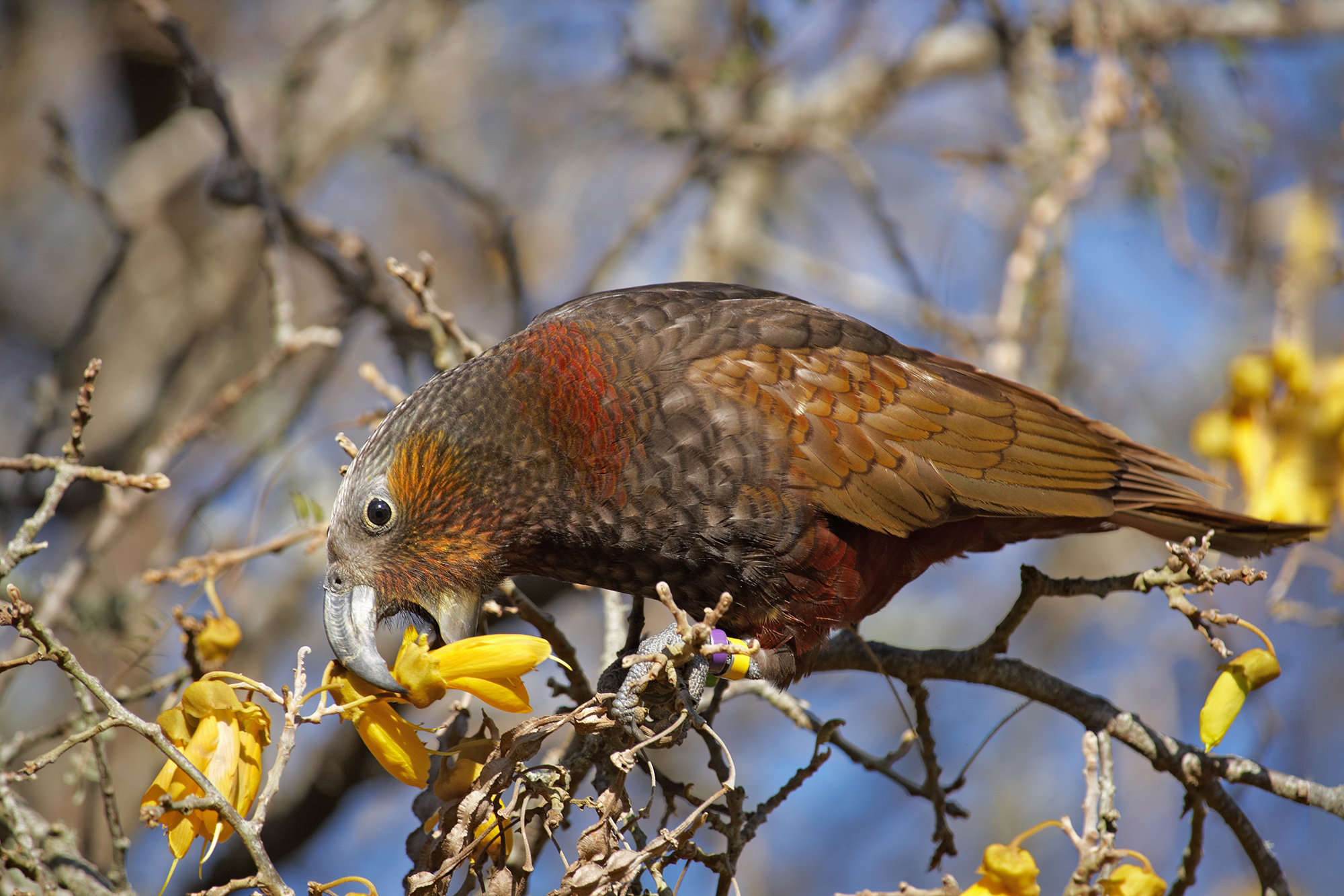
Kaka parrot to the rescue http://nzbirdsonline.org.nz/sites/all/files/Kaka%20on%20kowhai%20Wilton%20Sep%202013.jpg
from budgie-rd.
Mazino-Urek
commented on August 15, 2024
Is Wayland coming along with this project?
from budgie-rd.
ikeydoherty
commented on August 15, 2024
Yes - but lets keep this thread specific to design :D
from budgie-rd.
Mazino-Urek
commented on August 15, 2024
Hope this may help adjust colour contrast:
https://color.adobe.com/explore/?filter=newest
from budgie-rd.
 MrMonotone
commented on August 15, 2024
MrMonotone
commented on August 15, 2024
I like the theme right now. I think the shades of blue that were chosen are nice. For whatever reason I just think of SUSE when I think green. I do not know why it turns me off the color it just does.
EDIT: ALso I feel that blue looks better with the Solus logo!
from budgie-rd.
 SLmanDR
commented on August 15, 2024
SLmanDR
commented on August 15, 2024
Reply to Ikey's "... use of red + blue ...colour blindness, etc."
But could you use those colour concepts and get a colour blind persons input and add perhaps a subtle pattern. Thus enhancing the colour blind person experience and maintaining a "standard".
from budgie-rd.
tuxattack80
commented on August 15, 2024
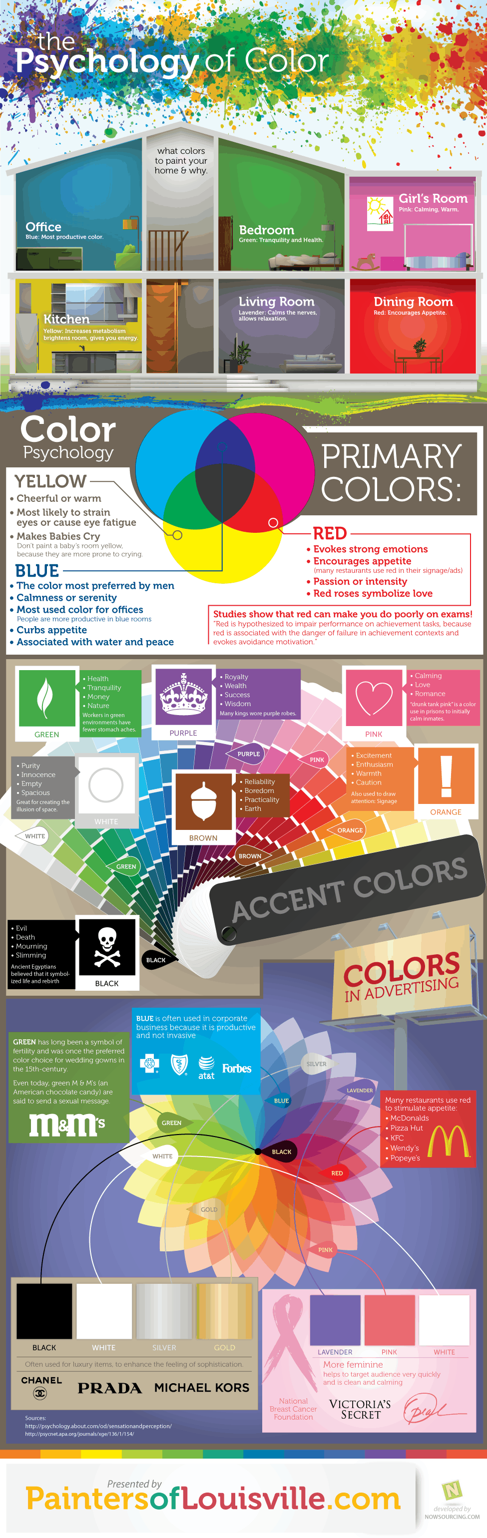
http://www.dailyinfographic.com/wp-content/uploads/2012/09/psychology-of-color.png
I say red accents and a partnership with McDonalds lol! But seriously may be something to consider when picking colors, I personally like the blue but if there is going to be a true dark and light theme id say just invert the accents. Other than that you really can't go orange because many will think Ubuntu and green is okay if done right and in the right shade (Android system icons before they went blue) don't need people think Linux Mint when using Solus. And red isn't really a neutral color and is often used for a sign of importance or warning I can see the wide spread panic amongst users that don't read messages when a lot of red buttons come popping up 🤔
from budgie-rd.
tuxattack80
commented on August 15, 2024
And stay away from yellow unless you want Solus to be known as the OS that makes babies cry lol!!
from budgie-rd.
 rroll1
commented on August 15, 2024
rroll1
commented on August 15, 2024
One suggestion I'd like to see would be an improved alt-tab dialog. It's entirely functional at this point, but I feel it needs to be refined a bit.
For instance, it'd be nice if the alt-tab box were to auto-size to the number of windows opened. If I only have 2 windows open, for example, there's a ton of empty space on the right-hand side.
While that is primarily about design, in regards to behavior it'd be nice if we had the option to click-to-raise: currently, when you hover your mouse over the icons, nothing happens, when I'd expect it to be more like GNOME/Cinnamon/Windows/MacOS, which is that hovering will select an icon, and then clicking brings it to focus immediately. Current behavior is:
Hit alt-tab, dialog opens
While holding alt, you can click an icon thereby selecting it
The application in question does not come forward until you let go of alt
I personally think that it'd be more expected behavior to have hovering the mouse to select the icon, then releasing alt OR clicking the icon would bring it forward immediately. (So if you clicked it you wouldn't have to release the alt key)
from budgie-rd.
 PretzelJones
commented on August 15, 2024
PretzelJones
commented on August 15, 2024
Is there a plan to edit the Solus and Budgie logos as well? They currently have an "Arc" theme with the grey and blue (intentional?).
from budgie-rd.
SLmanDR
commented on August 15, 2024
Sea greens, blues and greys to fit the nautical logo theme seems appropriate. Anyone own a Pantone swatch kit on the island? Go forth! Compare and record.
from budgie-rd.
kucho
commented on August 15, 2024
I would love to see a theme with these styles: flat with transparent elements or flat and morder style
from budgie-rd.
 yaymalaga
commented on August 15, 2024
yaymalaga
commented on August 15, 2024
I agree with @mrkucho, the second theme(https://www.gnome-look.org/p/1187179/) is just amazing.
It looks like a modern arc theme mixed with adapta, so this way budgie 11 style would still be very familiar and modernized. The green color is also perfect (named teal), as it is so material.
from budgie-rd.
cunidev
commented on August 15, 2024


A simple wireframe idea for the "do not disturb" switch design (no icons of course, can be adapted to most design guidelines) vs. the current simple, somewhat Apple-like "do not disturb" Raven switch in the current budgie-rd build. Cheers!
from budgie-rd.
STiAT
commented on August 15, 2024
@cunidev could you elaborate what would be the diffeerence between silent and do not disturb? I could think on a few possibilities...
- "silent" show in systray & raven, but not showing a popup.
- "silent" show only in raven, but don't indicate in systray, no popup as well.
- "dnd" dismiss all notifications, so no popup, nothing in tray, nothing in raven.
- "dnd" show in raven, no popup, no indicator
etc.
from budgie-rd.
MaxJonasG
commented on August 15, 2024
I really like what Christian and villekivela have done in the old thread, if you want green I'm sure you can replace the blue with teal.
I guess you are looking for an evolution of the existing design, not a a complete makeover. Please keep the recent improvements to the panels/docks and the ability of intelligent transparency etc. I also agree with trying not to emulate MacOS
from budgie-rd.
cunidev
commented on August 15, 2024
Any ideas for an improved search dialog, possibly not kde- or osx-clone? It'd be nice to have it query several asynchronous threads for each "service" (app search, file search, calculator), but that'd require complex file indexing etc., which isn't a priority at the moment. I'm unsure whether the box should have a translucent dark blocking mask to cover the desktop or not for instance.
from budgie-rd.
cunidev
commented on August 15, 2024
That's *literally* a Spotlight clone though. I prefer the idea of a maybe
simpler, better integrated budgie-run-dialog.
from budgie-rd.
ikeydoherty
commented on August 15, 2024
Grrr at unclickable pinterest links.. :)
from budgie-rd.
tristan957
commented on August 15, 2024
Cerebro looks extremely nice. The author has done a lot of good work. Looks good and extremely impressive.
from budgie-rd.
yaymalaga
commented on August 15, 2024
Just saw this video: https://youtu.be/cwzT6IL9320
Deepin remains me of budgie, but it's also true that it seems to have a more polish UI.
Maybe budgie 11 can also take ideas from it :p
from budgie-rd.
 dermariusz
commented on August 15, 2024
dermariusz
commented on August 15, 2024
If we take green we probably should also take yellow. After after all it's called Budgie Deskop:
from budgie-rd.
 Justinzobel
commented on August 15, 2024
Justinzobel
commented on August 15, 2024
They come in a variety of colours..
from budgie-rd.
 Extarys
commented on August 15, 2024
Extarys
commented on August 15, 2024
I started playing with the configurations available in Budgie
I tried putting my panel transparent but depending on the wallpaper it's hard to see the text. So, we should be able to choose the background
- Transparent to black (for when the panel is at the bottom)
- Black to transparent (for when the panel is at the top)
- Support semi-transparent (ie 50%)
Also maybe - but just maybe:
- Support a choice of color ? Even though I probably would not really play with that one but some might find this attractive
from budgie-rd.
zoomer296
commented on August 15, 2024
May i suggest the option of an iconified app list similar to what Pantheon offers? It may help to draw in previous Unity users. I'd suggest scroll progression rather than pages.
from budgie-rd.
 lachlan-00
commented on August 15, 2024
lachlan-00
commented on August 15, 2024
@calciferSparks suggestions regarding the overview are the big reason gnome-shell works so well for me.
I am always throwing my mouse to the top left corner hoping for an overlay no matter teh OS. The current hotcorners applet is for running commands but something more like the activities overlay with app search would be a killer feature for anyone who uses gnome regularly.
If the window manager could allow that through an applet/command i'd write one for budgie straight away. It's much easier to use over alt/super + tab
from budgie-rd.
 craig-toyoracer
commented on August 15, 2024
craig-toyoracer
commented on August 15, 2024
First off, I really like Budgie 10.4 so I hope Budgie 11 will keep the overall feeling.
Adding a color pallet say from GIMP may be over kill but choice would be unlimited.
Personnel favorites for a base line http://www.color-hex.com/216-web-safe-colors/
0000cc - 00cc00 - 660000 - 6600cc - ff6600 - ffff00 also a muted (softer) version choice.
Would be great to have active calendar in Raven. Right click date to open menu - highlight color with attached memo, eg: birthday, appointment ...
If user choice settings could be made as layers. Then an undo history would be possible, again like GIMP.
from budgie-rd.
 Jacalz
commented on August 15, 2024
Jacalz
commented on August 15, 2024
I really like the look of budgie 10.4 and as @MrMonotone said, the shades of blue goes very well with the Solus logo. I would say that you should definitely improve the design and make it look more stylish. But at the same time you should not stray too far away from the feel of 10.4!
After looking through the old thread I saw all the mockups and the ones from @villekivela. The mockups that he made just simply look amazing with consistent styling from budgie 10 but still with a taste of freshness. Dark and blue are the way to go, not green! Sorry @ikeydoherty
Here is the link to the absolutely awesome mockups created by @villekivela if anyone is interested:
https://github.com/#issuecomment-280838956
from budgie-rd.
Jacalz
commented on August 15, 2024
I would say that budgie 11 should have the buttons to turn off the computer in the menu on the left, just like in the brisk menu in Solus Mate 😅
from budgie-rd.
ikeydoherty
commented on August 15, 2024
me thinks that link is broken
from budgie-rd.
Jacalz
commented on August 15, 2024
I see that too, strange :P
Maby need to use the picture link instead:
https://cloud.githubusercontent.com/assets/5814559/23313231/83013ade-fac5-11e6-98ac-b00f1ce8f584.png
from budgie-rd.
 christiankaindl
commented on August 15, 2024
christiankaindl
commented on August 15, 2024
Just a random question here: Is the Solus Icon Theme still a thing? The repo hasn't seen any activities in a while.
Here's the repo link: https://github.com/solus-project/solus-icon-theme
Other note: I don't know if @ikeydoherty has any thought on this but I think it would be a good idea to stick with a similar style for the Budgie 11 desktop a the current one (Adapta). For some time now I used the Arc theme (Arc Darker) because I felt the deep black and light accent colors from Adapta are too much for a great everyday use design. But after using it for a few days now, I really like it.
from budgie-rd.
ikeydoherty
commented on August 15, 2024
@christiankaindl re: icon theme, I have absolutely no clue.
from budgie-rd.
 rawsh
commented on August 15, 2024
rawsh
commented on August 15, 2024
As for the blur in panel, I think something similar to the windows creators update would be nice:

I actually really like this effect.
from budgie-rd.
zoomer296
commented on August 15, 2024
I know this discussion is primarily focused on the look and feel, but would it be hard to implement some form of a backup and restore function for panels?
Also, regardless of what you choose for the default theme, both a light theme and a dark theme should probably be included. The dark theme should have a neutral color temperature rather than cool. Think arc-grey-theme as opposed to arc-theme.
I think Ikey is going somewhere with the suggestion of green accents. Blue has been overused in OS design for nearly two decades. I'm thinking something like #79d5b2.
from budgie-rd.
 bitstrings
commented on August 15, 2024
bitstrings
commented on August 15, 2024
I'm wondering how you will resolve the fact that kwin will not draw shadows on gtk menus and windows (csd)?
from budgie-rd.
bmeznarsic
commented on August 15, 2024
@bitstrings irrelevant since they're doing a QtWayland based compositor instead.
from budgie-rd.
 karakunai
commented on August 15, 2024
karakunai
commented on August 15, 2024
When it comes to Budgie, I am agree that we should never try to mimic someone's work, but if the main goal is identical, adapting some knowledge about their design philosophy should not be that bad at all.
For colors, I have to agree that blue is being pretty common right now as it matches most of the condition in certain area. But, should we really define a default color accent for Budgie ? In my opinion, being monochromatic can be another good option to consider as it would be helpful enough to heavily improve accessibility. For example, you can color a "yes" button in dark grey and left that "no" button light grey to justify the meaning of each button, red and blue can't match these duo in terms of contrast. Last but not least, I do believe every of us do have our own taste when it comes to color. We should better focus on UX.
For blurs it can affects the content if it's not blurred enough, but having a blur toggle to activate and a slider to define the amount of blurs can be a nice addition for some fancy user like me.
NOTE: I have no idea about shadows though, being flat is more favorable sometimes.
from budgie-rd.
tristan957
commented on August 15, 2024
Unless you switch to Qt based applications or non HeaderBar applications, this will never happen. Unfortunately menu bars are a thing of the past :(
from budgie-rd.
cunidev
commented on August 15, 2024
Global menus are a thing, but buttons in the top bar are far from being
practical...
Il 08 feb 2018 4:41 PM, "Tristan Partin" <[email protected]> ha
scritto:
… Unless you switch to Qt based applications or non HeaderBar applications,
this will never happen. Unfortunately menu bars are a thing of the past :(
—
You are receiving this because you were mentioned.
Reply to this email directly, view it on GitHub
<#1 (comment)>,
or mute the thread
<https://github.com/notifications/unsubscribe-auth/ANPgrzvBl5R7IQJb9RpsgJEnZgyzV0rwks5tSxWpgaJpZM4PIeGG>
.
from budgie-rd.
zoomer296
commented on August 15, 2024
@awareofdistractions Yes, something has to be done about that. Vertical space is already in short supply on 16x9 displays.
Current Budgie has budgie-pixel-saver-applet and budgie-appmenu-applet for that.
from budgie-rd.
zoomer296
commented on August 15, 2024
I know we are talking about the Budgie desktop, but while we're talking themes, why not pack a nice GRUB theme into Solus as well? I'm not talking about a picture and a background color, I'm talking about a full GRUB theme like what chakra-project has with Dharma
from budgie-rd.
 bobafetthotmail
commented on August 15, 2024
bobafetthotmail
commented on August 15, 2024
why not pack a nice GRUB theme into Solus as well?
Because they aren't using GRUB, but a fork of systemd-boot/Gummiboot.
from budgie-rd.
Justinzobel
commented on August 15, 2024
Because they aren't using GRUB, but a fork of systemd-boot/Gummiboot.
Solus uses GRUB still for legacy installs.
from budgie-rd.
zoomer296
commented on August 15, 2024
@bobafetthotmail systemd-boot is only used on UEFI machines. GRUB is still used for BIOS.
Does systemd boot support themes? It seems a little bland considering the alternatives.
from budgie-rd.
bobafetthotmail
commented on August 15, 2024
Does systemd boot support themes? It seems a little bland considering the alternatives.
afaik no. Gummiboot had boot splash support at some point but I think it was removed (as there is no documentation about it for systemd-boot), I've never seen any theming support.
I've always been a fan of rEFInd boot manager, because it has a good GUI with theme support.
I've added Solus icon to the theme I use https://github.com/bobafetthotmail/refind-theme-regular
(yes it's a fork because that theme seems abandoned, my PR to add icons has not received any attention in a year, not a major issue as it's easy to maintain/add new icons due to the scripts he has written.)
from budgie-rd.
rawsh
commented on August 15, 2024
@tristan957 true but the feel of the os is entirely dependant upon the varying things you see for 5 seconds. What about the installer? Login? Settings? All of those are used rarely but are very important.
from budgie-rd.
bobafetthotmail
commented on August 15, 2024
Why do you need a theme so badly?
Looks more polished and "mature" than something text-based.
rEFind mimics MacOS graphical boot manager, and also Windows 8/10 has a similar one (Older windows have text-based boot selection). Neither is shown unless you actually have more than one OS installed, of course.
from budgie-rd.
cunidev
commented on August 15, 2024
An extremely raw mockup for a simple, improved app switcher (Alt+Tab) dialog that might be a starting point for a better design. A Pin button near the × to close the window, for example, might be useful. Better designs are more than welcome :)

Btw, I'm also not a fan of boot menu themes, as those are the things that somewhat slow down boot times...
from budgie-rd.
zoomer296
commented on August 15, 2024
Do GRUB themes also slow down boot time when grub is hidden?
The amount of time that a theme takes to load won't matter too much when added to the amount of time it takes for the OS selection menu to pop up.
The theme doesn't have to be too fancy. Minimalism is in style right now.
from budgie-rd.
zoomer296
commented on August 15, 2024
@villekivela *Tear streams down face* It's beautiful.
from budgie-rd.
rawsh
commented on August 15, 2024
@villekivela @zoomer296 Could we get some screenshots for the people on phones?
from budgie-rd.
cunidev
commented on August 15, 2024
+1. It's impressive. The app preview doesn't work on my machine though, or how should I launch it?
from budgie-rd.
rawsh
commented on August 15, 2024
I vote moka:

I feel like the icons fit in the best out of all the sets I've tried
from budgie-rd.
zoomer296
commented on August 15, 2024
@rawsh I'll have to wait until I get to an outlet to get you a screenshot. My computer has a bad battery.
I attempted it, but it shut off before I could finish.
from budgie-rd.
zoomer296
commented on August 15, 2024
It should work if you extract it and open the .htm file. It opened fine for me under windows, but it wouldn't get past the "login screen" under solus for some reason.
from budgie-rd.
cunidev
commented on August 15, 2024
Maybe you were offline and it couldn't load Jquery? It gets past that
"screen" on all browsers for me, just doesn't "open" any app
from budgie-rd.
zoomer296
commented on August 15, 2024
cunidev Yep, I was offline. I'll try it again later.
from budgie-rd.
zoomer296
commented on August 15, 2024
@Tromino
"We're not ballerinas, gerd dermit." Says GNOME.
"Fusion haaa" says Plasma.
from budgie-rd.
zoomer296
commented on August 15, 2024
@rawsh If we were to use moka-icon-theme, I'd recommend using pocillo-icon-theme instead. It uses moka icons, but adds more.
However, I was thinking something a little less uniform.
from budgie-rd.
zoomer296
commented on August 15, 2024
Got those screenshots. There's also a dock, but it doesn't display properly on my laptop.
from budgie-rd.
zoomer296
commented on August 15, 2024


from budgie-rd.
zoomer296
commented on August 15, 2024
D'aww. GitHub's little 404 error screen has a parallax effect.
from budgie-rd.
zoomer296
commented on August 15, 2024
@villekivela I see your menu has a little list toggle. What does the list menu look like in this updated mockup?
from budgie-rd.
I think the Solus icon theme or something like it (skeuomorphic-yet-flat) will fit better, using uniform-shaped icons looks kind of unfinished when there's no support for a set of icons (see Suru on Ubuntu)
from budgie-rd.
 axelmeunier
commented on August 15, 2024
axelmeunier
commented on August 15, 2024
Nice to see some action in here !
There is some really good ideas in @villekivela's mock-up, congratulations !
I especially like the buttons to change the accent color. Super simple, intuitive and innovative. Something never seen anywhere else before.
I think the menu + raven would benefit from a little bit more transparency - right now it looks almost solid, so a bit bulky (sorry it's not the right word but i wouldn't know better in english). I've read the discussions about transparency in the earlier thread. Maybe you could try a bit more transparency see how it looks.
The right balance between blur and transparency - that would work with many different wallpapers - will be subtil.
I also agree about the solus icon theme/moka/breeze as an alternative to 100% mega flat icons. Flat design has become ubiquitous, right now it still looks trendy and pretty, but soon everybody will be bored.
But solus icon theme right now does not have much apps, apart from terminal and file manager I think.
In the same spirit, I could mention the new Antu icons https://www.gnome-look.org/p/1188266/. They're really early alpha, but worth a look as far as unflat is concerned.
from budgie-rd.
zoomer296
commented on August 15, 2024
@feddasch Exactly my thoughts. The unthemed icons will still stick out as they are usually designed to GNOME guidelines, but it won't be as bad as with a uniform icon set.
Another benefit is that it will age better.
from budgie-rd.
zoomer296
commented on August 15, 2024
@villekivela thanks. I'm also curious as to how it will look with transparency or blur disabled.
from budgie-rd.
cunidev
commented on August 15, 2024
A primarily light theme as Budgie default was the idea though, and dark
only as a choice. But it should be not too difficult to adapt this very
good design to a primarily light theme.
from budgie-rd.
villekivela
commented on August 15, 2024
@axelmeunier I agree that it does look a bit heavy.
Here's a shot of raven bit more transparent color (rgba(#12161B, 0.5)). Obviously the contrast between background and text suffers. I think that with transparency the background blur is a must to keep the information legitable. Also the darker color matches better with the GTK header color.
About the light theme, I personally like the darker shell more than lighter one. Also when you make it lighter you immediatly get the impression of macOs and plasma which was a thing to avoid.

from budgie-rd.
cunidev
commented on August 15, 2024
That's also true... Also better avoid too heavy W10 look
(dark+transparency+blur) but fortunately that's not the case. Gotta use
infrared and UV colors in the palette, or it's bound to look somewhat like
something else apparently :D
from budgie-rd.
zoomer296
commented on August 15, 2024
@cunidev Current Budgie also looks very reminiscent of Windows 10.
Aside from the yet-to-be-integrated control panel and the damned live tiles, Windows 10 has pretty decent interface. And besides, no matter what you do, you'll be accused of copying some other interface anyway.
The goal should really be to just make something nice.
from budgie-rd.
zoomer296
commented on August 15, 2024
@villekivela We should probably make sure it looks good with a light theme anyway.
Light themes are more sensitive to transparency.
from budgie-rd.
Related Issues (12)
- Grid workspaces support
- New blur effect include in budgie 11 HOT 4
- Keyboard Window Navigation and placement HOT 2
- [Question] Migration on Qt? HOT 2
- design: Advanced search functionality
- So does the next version use QT or gtk4 HOT 3
- Replace use of QSettings HOT 3
- wm Use kwin? HOT 3
- Improved Workspaces (Separate Monitors) HOT 2
- Suggestions for Control Center HOT 3
- Active Window and Focus Window (or focus location) issue...
Recommend Projects
-
 React
React
A declarative, efficient, and flexible JavaScript library for building user interfaces.
-
Vue.js
🖖 Vue.js is a progressive, incrementally-adoptable JavaScript framework for building UI on the web.
-
 Typescript
TypeScript is a superset of JavaScript that compiles to clean JavaScript output.
-
TensorFlow
An Open Source Machine Learning Framework for Everyone
-
Django
The Web framework for perfectionists with deadlines.
-
 Laravel
A PHP framework for web artisans
-
D3
Bring data to life with SVG, Canvas and HTML. 📊📈🎉
-
Recommend Topics
-
javascript
JavaScript (JS) is a lightweight interpreted programming language with first-class functions.
-
web
Some thing interesting about web. New door for the world.
-
server
A server is a program made to process requests and deliver data to clients.
-
Machine learning
Machine learning is a way of modeling and interpreting data that allows a piece of software to respond intelligently.
-
Visualization
Some thing interesting about visualization, use data art
-
Game
Some thing interesting about game, make everyone happy.
Recommend Org
-
Facebook
We are working to build community through open source technology. NB: members must have two-factor auth.
-
Microsoft
Open source projects and samples from Microsoft.
-
Google
Google ❤️ Open Source for everyone.
-
Alibaba
Alibaba Open Source for everyone
-
D3
Data-Driven Documents codes.
-
Tencent
China tencent open source team.
from budgie-rd.