Git Product home page Git Product logo

seek-style-guide's Introduction

⚠️ NOTE: This project has been deprecated in favour of Braid Design System.


Build Status npm semantic-release Commitizen friendly Styled with Prettier

seek-style-guide

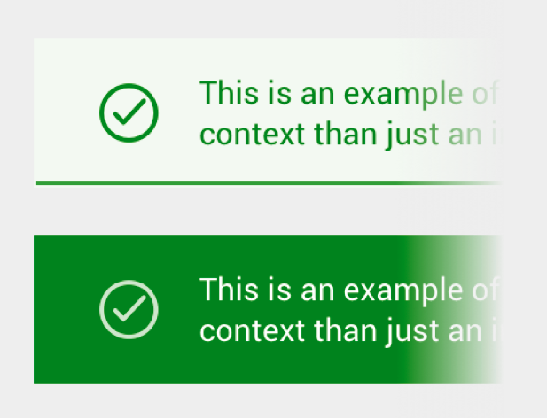
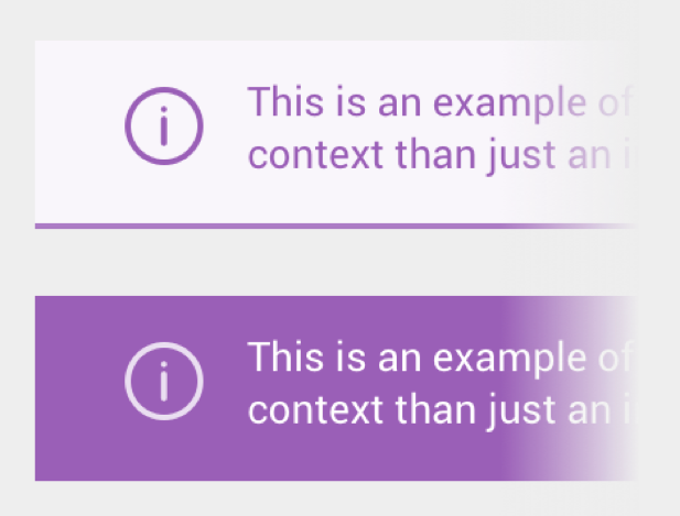
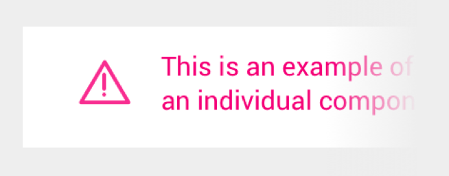
Living style guide for SEEK, powered by React, webpack, CSS Modules and Less.

If you're creating a new project from scratch, consider using sku, our officially supported front-end development toolkit. It's specially designed to get your project up and running as quickly as possible, while simplifying the process of keeping your development environment up to date.

If you'd instead like to work on a custom webpack project, you can use seek-style-guide-webpack to streamline the integration process.

Installation

$ npm install --save seek-style-guide react react-dom react-helmet

Optionally, if not making use of the React components, you can install seek-style-guide by itself:

$ npm install --save seek-style-guide

Upgrading

Consumers can stay up to date by following our release notes, which are published automatically whenever a new release is published to npm.

Setup

Wrap your app with the StyleGuideProvider component to use any of the style guide components. For example:

import React, { Component } from 'react';
import { StyleGuideProvider } from 'seek-style-guide/react';

export default class App extends Component {
  render() {
    const locale = 'AU';
    const title = '...';
    const meta = [{ name: 'description', content: '...' }];
    const link = [{ rel: 'canonical', href: 'https://www.seek.com.au/' }];

    return (
      <StyleGuideProvider locale={locale} title={title} meta={meta} link={link}>
        ...
      </StyleGuideProvider>
    );
  }
}

StyleGuideProvider's props are used to set the page head properties using Helmet.

High Level Components

As much as possible, you should aim to minimise the amount of custom CSS you need to write. This is achieved by leveraging our suite of high level components, which are demonstrated on our style guide documentation site.

Low Level Styling

For more advanced pages, if you need to drop down into Less, the style guide provides a set of mixins and variables to make it easier to stay on brand.

In any style sheet that depends on the style guide, first import the Less theme by reference.

@import (reference) '~seek-style-guide/theme';

Responsive Breakpoint

The style guide exposes one responsive breakpoint:

@responsive-breakpoint: 740px;

Content should otherwise be responsive within its container. The set of included components follow this model internally if you'd like to get a sense of what this looks like in practice.

Color Variables

As much as possible, colors should be directly imported from the style guide.

The following colors are provided:

// Brand colors
@sk-blue-darker;
@sk-blue-dark;
@sk-blue;
@sk-blue-light;
@sk-blue-lighter;
@sk-pink;
@sk-green;
@sk-green-light;
@sk-purple;
@sk-teal;
@sk-orange;
@sk-yellow;
@sk-yellow-light;

// Partner brand colors
@sk-business;
@sk-volunteer;
@sk-learning-light;
@sk-learning-medium;
@sk-learning-dark;

// Grays
@sk-black;
@sk-charcoal;
@sk-mid-gray-dark;
@sk-mid-gray-medium;
@sk-mid-gray;
@sk-mid-gray-light;
@sk-gray-light;
@sk-gray-lightest;
@sk-off-white;
@sk-white;

// Element colors
@sk-link;
@sk-link-visited;
@sk-focus;
@sk-footer;
@sk-background;
@sk-form-accent;
@sk-positive-light;
@sk-positive;
@sk-info-light;
@sk-info;
@sk-critical-light;
@sk-critical;
@sk-help-light;
@sk-help;

Z-Indexes

To ensure correct relative elements stacking order, z-index variables are provided:

@z-index-header-overlay;
@z-index-header;
@z-index-page-overlay;
@z-index-inline-overlay;
@z-index-negative;

Accessible Color Variants

The contrast ratio of certain foreground/background color combinations don't meet the AA accessibility standards that we aim for. As a result, a suite of accessible variants have been provided:

@sk-mid-gray-on-white;
@sk-pink-on-gray-light;
@sk-learning-dark-on-gray-light;
@sk-business-on-gray-light;
@sk-link-on-mid-gray-light;
@sk-mid-gray-dark-on-gray-light;

Please note that this list is not exhaustive, so contributions are encouraged. To validate color combinations, we recommend the use of the web-based tool Accessible Colors by @moroshko.

Grid Variables

In order to ensure elements correctly follow the grid, element sizing should always be controlled by the following variables:

@row-height;
@gutter-width;
@column-width;
@container-width;

When defining a document content container:

.element {
  max-width: @container-width;
}

When defining heights and vertical padding/margins:

.element {
  height: (@row-height * 3);
  padding-bottom: @row-height;
  margin-bottom: @row-height;
}

When defining widths and horizontal padding/margins:

.element {
  width: (@column-width * 3);
  padding-right: @gutter-width;
  margin-right: @column-width;
}

It's important to note that any additions to these values (e.g. borders) will need to be negated to maintain rhythm:

.element {
  @border-width: 1px;
  border-bottom: @border-width solid @sk-charcoal;
  padding-bottom: @row-height - @border-width;
}

Advanced Usage

Babel Plugin

Note: If you're using sku, this plugin is already enabled.

In order to help you optimise your bundle size, you can use babel-plugin-seek-style-guide.

$ npm install --save-dev babel-plugin-seek-style-guide

Then, add seek-style-guide to the plugins list in your Babel config. For example, in .babelrc:

{
  "plugins": ["seek-style-guide"]
}

Flow Type Checking

We've opted to include flow type checking in this project. If you're unfamiliar with static type checking you should start by reading React's overview.

This is completely opt-in and if you've decided not to use type checking in your project then there is nothing you need to do. It shouldn't impact your ability to include the style guide so long as you are using either sku or our webpack decorator.

Conversely, if you would like to opt-in to flow types you'll need to ensure that your .flowconfig includes a few exclusions and special options.

[ignore]
.*/node_modules/config-chain/.*
.*/node_modules/npmconf/.*

[include]

[libs]

[lints]

[options]
# This is required to prevent errors to less file imports
module.name_mapper.extension='less' -> '<PROJECT_ROOT>/no-declarations.js.flow'

# Good idea to ignore json too
module.name_mapper.extension='json' -> '<PROJECT_ROOT>/no-declarations.js.flow'

no-declarations.js.flow is just an empty file

Sketch asset generation

On every successful build (via npm test), asketch.json files (i.e. almost Sketch files) are generated by html-sketchapp containing document styles and symbols. These are provided via the following JSON files:

  • dist/asketch/document.asketch.json
  • dist/asketch/page.asketch.json

These can be manually imported into Sketch by downloading html-sketchapp and installing asketch2sketch.sketchplugin.

Once in Sketch, open the "Plugins" menu and select "From *Almost* Sketch to Sketch". Assuming you've run a full build of the style guide via npm test, you should now be able to select the asketch.json files in dist/asketch.

Contributing

Refer to CONTRIBUTING.md.

If you're planning to change the public API, please open a new issue and follow the provided RFC template in the GitHub issue template.

License

MIT.

seek-style-guide's People

Contributors

adenj avatar benjervis avatar chardos avatar conshow avatar dborysiewicz avatar dependabot[bot] avatar etaoins avatar fastninja avatar georgespyropoulos avatar greenkeeper[bot] avatar jahredhope avatar jeremy-putt avatar kosanna avatar lgshaw avatar markdalgleish avatar mattcompiles avatar mengtzu avatar michaeltaranto avatar moroshko avatar renovate[bot] avatar ryardley avatar seangrant avatar seek-showcase avatar shawn-dsz avatar stephaniemoss avatar tamoore avatar terenceduong avatar trevorgk avatar vedranio avatar vgoulko avatar

Stargazers

 avatar  avatar  avatar  avatar  avatar  avatar  avatar  avatar  avatar  avatar  avatar  avatar  avatar  avatar  avatar  avatar  avatar  avatar  avatar  avatar  avatar  avatar  avatar  avatar  avatar  avatar  avatar  avatar  avatar  avatar  avatar  avatar  avatar  avatar  avatar  avatar  avatar  avatar  avatar  avatar  avatar  avatar  avatar  avatar  avatar  avatar  avatar  avatar  avatar  avatar  avatar  avatar  avatar  avatar  avatar  avatar  avatar  avatar  avatar  avatar  avatar  avatar  avatar  avatar  avatar  avatar  avatar  avatar  avatar  avatar  avatar  avatar  avatar  avatar  avatar  avatar  avatar  avatar  avatar  avatar  avatar  avatar  avatar  avatar  avatar  avatar  avatar  avatar  avatar  avatar  avatar  avatar  avatar  avatar  avatar  avatar  avatar  avatar  avatar  avatar

Watchers

 avatar  avatar  avatar  avatar  avatar  avatar  avatar  avatar  avatar  avatar  avatar  avatar  avatar  avatar  avatar  avatar  avatar  avatar  avatar  avatar  avatar  avatar  avatar  avatar  avatar  avatar  avatar  avatar  avatar  avatar  avatar  avatar  avatar  avatar  avatar  avatar  avatar  avatar  avatar  avatar  avatar  avatar

seek-style-guide's Issues

RFC: Allow Header to accept custom logo components

Summary

Add support for a custom logoComponent prop to the <Header /> component so custom logo overrides can be provided by consumers.

Motivation

SEEK has a long history of changing the logo in the header, but this has essentially fallen away as we've moved towards a microservice architecture. Now that we have a living style guide, we have the opportunity to bring this tradition back, albeit with a different technical implementation.

Detailed design

At least as a first step, I'm proposing that we add a logoComponent prop that accepts a React component to render instead of the default Logo component.

For example:

import { Header } from 'seek-style-guide/react';

const MyCustomLogo = () => { ... };

<Header {...} logoComponent={MyCustomLogo} />

While we have no immediate plans to do this just yet, this API is designed to be future-proofed enough to handle logos being included in the style guide in a way that also allows for us to keep our bundle sizes to a minimum. For example:

// NOTE: This is only a concept, not part of this proposal:
import { Header, Logo_NYE } from 'seek-style-guide/react';

<Header {...} logoComponent={Logo_NYE} />

How We Teach This

Since we're already using the <Logo /> component internally, we can instruct style guide consumers to simply duplicate this and apply the necessary alterations, making it a relatively painless process.

Drawbacks

This puts the responsibility of managing logo variations onto individual teams, rather than centralising the work. This is a conscious tradeoff, but certainly one to be aware of.

Alternatives

It was first floated that we could allow you to choose the logo variant via a string/boolean based prop, but this would have a negative effect on bundle size since you would be forced to bundle every logo variation, regardless of whether it actually gets used or not. This option seems like a bit of a non-starter.

We've also talked about potentially including the logo variations in the style guide itself. This is definitely an option, but I'm not sure it makes sense in the long run. Most (if not all) logo variations are quite ephemeral, only being used once. This would lead to constant version churn as we cycle through different logos and remove old ones. Centralising and co-ordinating logo changes definitely makes sense, but I think we should probably have separate infrastructure to achieve this.

Finally, if we agree on the proposed approach, there's still obviously a bit of room to adjust the API. The only other suggestion I'd make is moving towards a renderLogo API, which is obviously very similar when dealing with functional components:

import { Header } from 'seek-style-guide/react';

const renderLogo = () => { ... };

<Header {...} renderLogo={renderLogo} />

Unresolved questions

To address some of the concerns with the alternative approach mentioned above, is it okay if we only change the logo in the core job search product (home page, search results and job details)? This would eliminate the need to co-ordinate logo changes cross-team, making this work even simpler, but of course this isn't really a technical decision for us to make without further guidance.

RFC: New 6px baseline grid to enable 16px / 24px standard text

Summary

Migrate from a 9px grid to a 6px grid to allow for larger 16px body copy over a 24px line height across the site.

Motivation

Our current standard text size is 14px / 18px on desktop and 18px / 27px on mobile. We also have substandard and superstandard variants which, respectively, maintain 14px / 18px or 18px / 27px across both desktop and mobile. In many cases, both of these are causing us issues:

  • For dense, skimmable content (e.g. search results), 14px is smaller than we would like on mobile, but 18px is much too big. We'd choose a font size between these two, but it doesn't sit correctly on our current 9px grid, generating excess amounts of leading.
  • For more long-form content on desktop, 18px seems to be more preferable, but our heading sizes were not designed with 18px body copy in mind. When using superstandard text in combination with the full range of headings, it can lead to very unbalanced typography.

Another issue to consider is that, in practice, the 9px grid often creates too much whitespace by forcing elements to either be too close or too far from each other. If we can improve the amount of design flexibility, without undoing all the benefits of having a baseline grid, that would be a positive outcome too.

Detailed design

If we want to properly solve this issue, we find ourselves naturally gravitating towards a pretty substantial change—discarding the current 9px grid, settling on a larger body copy size that works everywhere (without any sub/super variant hacks), and using this to form the basis a new baseline grid.

From a design perspective, we quickly landed on 16px / 24px, which leaves us with a grid system based on either 8px, 6px or 4px. After much experimentation across a wide range of projects, we landed on 6px as it provided the best balance between project-level flexibility and system-level rigidity.

Since the grid variables are used in many calculations throughout the site, changing their values will no doubt cause widespread breakage. As a result, I think we should introduce entirely new grid variables so that consumers have a chance to upgrade without being forced to convert every single grid-based calculation at once, e.g.

@grid-row: 6px; // New
@grid-row-height: 9px; // Old

Our horizontal grid values shouldn't need to change, but, for consistency, we might introduce new names for these too, e.g.

@grid-gutter: 20px; // New
@grid-gutter-width: 20px; // Old

So far, the new type hierarchy based on a 6px baseline grid looks like this:

Desktop:

  • Substandard/Superstandard: DEPRECATED 🎉
  • Standard: 16px / 4 (24px)
  • Small: 14px / 3 (18px)
  • Interaction: 18px / 8 (48px)
  • Subheading: 18px / 4 (24px)
  • Heading: 21px / 5 (30px)
  • Headline: 28px / 6 (36px)
  • Hero: 42px / 8 (48px)

Mobile:

  • Substandard/Superstandard: DEPRECATED 🎉🎉
  • Standard: 16px / 4 (24px)
  • Small: 14px / 3 (18px)
  • Interaction: 18px / 8 (48px)
  • Subheading: 18px / 4 (24px)
  • Heading: 21px / 5 (30px)
  • Headline: 21px / 5 (30px)
  • Hero: 21px / 5 (30px)

Components that make use of these variables internally will need to be migrated, but in theory they should be able to be upgraded without too much trouble.

How We Teach This

We'll refer to the new variables going forwards and remove references to the old ones, but otherwise the style guide remains largely the same.

Drawbacks

Any project that uses both new and old grid variables at the same time will no longer be on-grid. This isn't a huge problem, assuming we fully migrate away from the old variables sooner rather than later.

Alternatives

We could opt for an 8px grid instead, although this doesn't give us much more flexility than we have currently.

We could also leave the current variable names in place and simply change their values, but as discussed earlier, this would drastically increase the odds of breaking existing layouts.

Unresolved questions

How do we handle the shared header, which is on the 9px grid but is used on pages that aren't yet using the style guide? Should we update the header to follow the new grid, or leave it alone? Is it okay if the header changes height slightly between newer and older pages?

Should we change the horizontal grid variables to match the 6px grid? Now would be a good time to do it, if we wanted to.

An in-range update of eslint-plugin-jest is breaking the build 🚨

Version 21.3.1 of eslint-plugin-jest was just published.

Branch Build failing 🚨
Dependency eslint-plugin-jest
Current Version 21.3.0
Type devDependency

This version is covered by your current version range and after updating it in your project the build failed.

eslint-plugin-jest is a devDependency of this project. It might not break your production code or affect downstream projects, but probably breaks your build or test tools, which may prevent deploying or publishing.

Status Details
  • continuous-integration/travis-ci/push The Travis CI build failed Details

Commits

The new version differs by 2 commits.

See the full diff

FAQ and help

There is a collection of frequently asked questions. If those don’t help, you can always ask the humans behind Greenkeeper.


Your Greenkeeper Bot 🌴

RFC: Alert styles

Summary

Alert styles are a way to highlight certain pieces of copy to give them the correct visual weight and tone to communicate a message to the user.

Big thanks to @stephaniemoss for putting this together! I am merely the messenger here

Motivation

Currently our styling for these types of alerts is inconsistent, so there is no pattern to deal with them. This means they get implemented in different ways across streams and products which can confuse the user.

Having a consistent set of patterns for dealing with alerts helps with overall communication, consistency and gives everyone the tools to make sure their copy is seen and understood in the right contexts.

Detailed design

The alerts are a set of visual patterns that have different types and a hierarchy that can be applied to a number of different implementations.

There are 4 types of alerts:

Positive

This alert uses green and ticks. It is used for positive and success alerts to let the user know that something has succeeded.

image

Info

This alert uses purple and an i within a circle (info icon). It is used for important information that a user should definitely read.

image

Critical

This alert uses pink and an exclamation mark in a triangle (error icon). It is used for errors to let a user know that something has gone wrong and they can’t continue.

image

Help

This alert uses grey and a question mark in a circle (help icon). It is used for helpful but not critical information, usually accessed voluntarily by the user in case they need further instructions or help.

image

There are three different alert levels

Primary

Used when you want the alert to be loud and draw attention. Dark background, light text, light icons.

image

Secondary

Used when you want the alert to be on a normal volume level. Light background, dark text, dark icons, underline.

image

Tertiary

Used when the alert should be integrated into the design and not confused with another type of element like a button. Dark icon and text but no background tint or underline.

image

Generic anatomy

image

Colour specifications

image
image

Example alert being used in production

image

Code sample

<Alert
  type={postitive|info|ciritical|help}
  level={primary|secondary|tertiary}
  message="I am the text that is displayed in the alert"
  position={inline|pullOut|standalone|card}
/>

More details

All images and design details are available here

Alert styles.zip

How We Teach This

Since this is a new feature, there won't be any need to communicate any breaking changes to styleguide consumers. Alert styles will have their own demo page will which allow designers and developers to view all variations and options that can be applied to alerts.

Drawbacks

Can't see any reason why we shouldn't have alert styles...

Alternatives

The current designs are comprehensive and have been through multiple iterations. The zip file under 'Example uses' shows how the alert styles could be used in across seek's products

The impact of not doing this is that alert styles are not currently uniform, even for teams that use the styleguide heavily. This RFC is attempting to make alert styling uniform across seek

Unresolved questions

Should we build all alert options initially or start with an MVP and add features incrementally

Webpack 2 support

Webpack 2 final is out, and will soon be the default version installed for everyone that starts a new project from scratch. We'll need to ensure that the style guide is able to decorate Webpack 2 config with no issues. It's possible that this won't require any work, but it's something we'll need to investigate at least.

An in-range update of seek-style-guide-webpack is breaking the build 🚨

Version 2.1.3 of seek-style-guide-webpack was just published.

Branch Build failing 🚨
Dependency seek-style-guide-webpack
Current Version 2.1.2
Type devDependency

This version is covered by your current version range and after updating it in your project the build failed.

seek-style-guide-webpack is a devDependency of this project. It might not break your production code or affect downstream projects, but probably breaks your build or test tools, which may prevent deploying or publishing.

Status Details
  • continuous-integration/travis-ci/push The Travis CI build failed Details

Release Notes v2.1.3

2.1.3 (2017-11-01)

Bug Fixes

  • icons: Revert SVGO & svgo-loader upgrade (#29) (4538851)
Commits

The new version differs by 1 commits.

  • 4538851 fix(icons): Revert SVGO & svgo-loader upgrade (#29)

See the full diff

FAQ and help

There is a collection of frequently asked questions. If those don’t help, you can always ask the humans behind Greenkeeper.


Your Greenkeeper Bot 🌴

An in-range update of module-alias is breaking the build 🚨

Version 2.0.3 of module-alias was just published.

Branch Build failing 🚨
Dependency module-alias
Current Version 2.0.2
Type devDependency

This version is covered by your current version range and after updating it in your project the build failed.

module-alias is a devDependency of this project. It might not break your production code or affect downstream projects, but probably breaks your build or test tools, which may prevent deploying or publishing.

Status Details
  • continuous-integration/travis-ci/push The Travis CI build could not complete due to an error Details

Commits

The new version differs by 4 commits.

  • 13bf637 version bump
  • e519e75 Merge pull request #18 from jdalton/module
  • 9808ed4 Make Module assignment more generic.
  • 1ccacf4 Update Webpack 3 example

See the full diff

FAQ and help

There is a collection of frequently asked questions. If those don’t help, you can always ask the humans behind Greenkeeper.


Your Greenkeeper Bot 🌴

Button groups

We don't currently have a defined way of grouping a row of buttons together.

Why does this require transpilation?

As in, is there a technical reason why it couldn't bundle its assets in a /dist folder, thus preventing the need to use babel on node_modules in a consuming project?

Warning when label props are not specified

The bellow warning appears when label props are not specified for autosuggest label

Warning: Failed prop type: Specifying labelProps is redundant when label is not specified in FieldLabel.

preview
(the warning does not appear in console)

Autosuggest bug for multiple fields on the page

Pull Request #298

NOTE: This template is also available at https://github.com/seek-oss/seek-style-guide/blob/master/.github/ISSUE_TEMPLATE.md if you'd like to refer to it later.

RFC TEMPLATE

NOTE: For complete examples, have a look at Yarn's list of accepted RFCs - https://github.com/yarnpkg/rfcs/tree/master/accepted

Issue title:

RFC: {{ Name of proposal }}

Issue body:

Summary

When multiple Autosuggest exist on a page, clicking on the label always puts focus on the input of the first Component on the page.

Motivation

https://www.seek.com.au/companies/
Implementing the 'search for a company' functionality.

Detailed design

When clicking the label, it should focus on the accompanying input field of that Component.

How We Teach This

?

Drawbacks

Not sure..

Alternatives

We'd have to manually work around this.

Unresolved questions

Full disclosure, we're first time contributors to the Seek Style Guide and we're not completely sure on how to address this.

Module parse failed: Unexpected token in Button.js

Try to install this in a whole new createReactApp. It does not work expected. What is the Button.js expected module need?

/node_modules/seek-style-guide/react/Button/Button.js Module parse failed: Unexpected token (10:21) You may need an appropriate loader to handle this file type. | | export default class Button extends Component { | static displayName = 'Button'; | | static propTypes = {

Router is not working on IE

React-Router is not fully supported on IE, well, this is another example.

so basically, on IE, each component's demo page is down.

image

RFC: Add 'tertiaryLabel' option to all form fields

Summary

There is a need to support a extra label (message) in my case is a TextLink that is right aligned of text field's primary label.

Motivation

To reduce the form height by allowing context specific messaging to be positioned directly above the form field, instead of being forced to place it in a separate row below the field, or at the bottom of the form.

For example, this is useful for password reset links:

screen shot 2017-09-05 at 11 03 45 am

Detailed design

This will be implemented in the internal FieldLabel component so that all form components have access to this new label style.

In order for it to support links, it should accept any node, whether a string or a React element:

<TextField {...} tertiaryLabel="..." />
<TextField {...} tertiaryLabel={<TextLink {...} />} />

How We Teach This

This is a relatively straightforward addition since it follows established patterns (secondaryLabel already exists), and fits within a larger pattern of primary / secondary / tertiary variants.

Form field examples on the demo site will need to be updated to feature this new option.

Drawbacks

This unfortunately adds extra complication to the form field APIs for something that is not very common.

In addition, this is also hard-coding the visual placement of this message, which might not suit future needs and lead to even further API complication. It's possible we might need to revisit this in the future.

Alternatives

We could provide lower level render control via something like a labelRenderer function, but we then run the risk of allowing too much style divergence across projects.

Adding FlowType to the styleguide

Just adding an issue as a catch all discussion area for #412

The current plan is to use babylon to create an AST of the styleguide and build a library definition from proptypes defined per component.

Spec

The plan at the moment is just to support a pretty trivial FS whereby one file exports all the components we want in the lib definition (basically how the style guide is currently set up).

It will use a generic placeholder type for any component that hasn't got a leading '@flow' comment at the top of the file.

Large body text size

Motivation

Currently there are two supported body text sizes. small and standard.
There is a need to create important, standout or lead information in designs.

We've looked at using use-case based naming however these often don't support the variety of situations where it might be used:

  • lead
  • lede
  • important
  • intro

Currently work-arounds appear to be created by using subheading in areas where the text is not a heading. This causes semantic issues but also creates undesirable additional bottom margins that are supplied for headings.

Proposed solution

<Text large>

A Text node with large will use the standard size line-height, font-weight and bottom margin.
A Text node with large will have 18px font-size.
A Text node with large will not have the additional bottom margin supplied to heading sizes.

large will be added to the Text props interface making it available to components that use the current text props.

Trouble rendering in Sketch

This project is a wonderful idea to streamline developer - designer interaction. I struggle getting it to render in Sketch:

  • It builds successfully running npm run test
  • It creates two asketch files in /dist/asketch
    -rw-r--r-- 1 user staff 15654 Oct 11 11:15 document.asketch.json
    -rw-r--r-- 1 user staff 2405555 Oct 11 11:15 page.asketch.json
  • Using Sketch 52.1, now 52.2, asketch2sketch plugin 4.0.0, no other plugins or libraries
  • Create a new document in Sketch
  • Import files using plugin, either document or page first, or both selected at the same time

It creates a page entry 'html-sketchapp-symbols' in the left navigation. The Sketch page remains empty. There are no new symbols or anything. Either I must be missing something fundamental, or there is an issue with this version of Sketch. Any suggestions would be great.

Deploy standalone static site for each PR

This will help us visualise and experiment with changes without having to run the new code locally.

Perhaps we could deploy the PR branch via surge.sh, which makes deploying static sites really simple.

Contribution documentation

We should add a CONTRIBUTING.md to assist those who are working on the style guide itself, not just consuming it.

Buttons loading indicator doesn't work in Firefox

To display a loading indicator in PinkButton and BlueButton, we rely on animating the content property. Although this works in Chrome, this is not part of the CSS spec, and isn't supported by other browsers. This article sheds more light on this. We need to come up with a solution that is supported in all major browsers.

Question: Autosuggest custom Props, are they used?

I had a look over the code and it seemed to just validate whether this prop was defined.

It wasn't immediately apparent to me that this needs to be a custom prop validation. It seemed like it's main purpose (aside from checking that it was a string) is to validate that if a theme is included and contains a suggestionsContainer and a prop suggestionsContainerClassName is defined then Error.

Does anyone know the reason for this or could give me some background on this?

suggestionsContainerClassName: (props, _, componentName) => {

An in-range update of autoprefixer is breaking the build 🚨

Version 7.1.6 of autoprefixer was just published.

Branch Build failing 🚨
Dependency autoprefixer
Current Version 7.1.5
Type devDependency

This version is covered by your current version range and after updating it in your project the build failed.

autoprefixer is a devDependency of this project. It might not break your production code or affect downstream projects, but probably breaks your build or test tools, which may prevent deploying or publishing.

Status Details
  • continuous-integration/travis-ci/push The Travis CI build failed Details

Release Notes 7.1.6
  • Add warning for using browserslist option instead of browsers.
  • Add warning for multiple control comments in the same scope.
  • Fix Invalid array length error during indent changes.
FAQ and help

There is a collection of frequently asked questions. If those don’t help, you can always ask the humans behind Greenkeeper.


Your Greenkeeper Bot 🌴

Autosuggest styling broken

if there are 2 text fields(in this case, job title/company name) with autosuggest, the styling for the 1st autosuggest list will be broken.

image

Typo in design principles on website

'Accessibile' should read 'Accessible'. Super nit picky, but I noticed it so thought I'd let you know 👍

While I'm here - thank you for open sourcing this for others to learn from.

image

RFC: Textarea description

Summary

Add an optional description prop to Textarea

Motivation

This will add the ability to give more context to a Textarea, in cases where we want to prompt the user to give specific styles of input or give them ideas on what to write. Currently, we can only add information below the input which is not ideal for mobile and accessibility reasons.

Detailed design

Simply add an extra optional string prop called description to Textarea and render it between the label and the input. This would supercede using the message prop for help text and reserve the message for more asynchronous information that may be displayed.

Other possible prop names:

  • prompt
  • help
  • explanation

eg.
image

How We Teach This

Add prop to the Textarea demo page.

Drawbacks

The new prop may be confusing when compared with the existing message prop.

This will also introduce extra space between the label and the input in cases where it is used. This could become a problem on mobile devices, especially if too much text is entered.

Alternatives

Alternatively, we could continue adding help text below the field.

RFC: Add '<ButtonGroup>' component, introduce '<CardGroup>' to replace '<Card group>'

Summary

There is a need for consistent (& responsive) buttons that are being used with forms.

Motivation

The initial motivation was to make a form submit button more predominant on mobile by going full-width. However, after discussing this, we've decided it might be a good idea to make this a more general pattern for groups of Button components in the context of forms.

Example of implementation:
screen shot 2017-09-14 at 10 16 25 am

Detailed design

This will be implemented as a separate ButtonGroup component

<ButtonGroup>
  <Button {...} />
  <Button {...} />
</ButtonGroup>

<Button group> will be a div wrapper that will have display: flex; set but also set extra/override css on all nested buttons. This will also include targeting certain button colors with different css overrides.

We currently have a <Card group> component, but we're proposing that we also migrate this to a separate <CardGroup> component, even if it's just a surface level change for now, rendering a <Card group> internally.

How We Teach This

This should be fairly straightforward since it follows established patterns, i.e. <Card group>, soon the be renamed as <CardGroup>.

Since it's a new component, we'll add a new ButtonGroup page to the demo site.

Drawbacks

It's not a silver bullet for all implementations of button but should work for most cases with forms.
As usual, it does adds extra complication to the API.

Alternatives

We could provide a prop (flexible?) directly to button without wrapping them in a group, but we'd still need to nest them within a container with display: flex. To better support this, we've talked about making a generic Flex component, but felt like this would be branching off into a very different pattern to what we current have.

An in-range update of eslint-plugin-react is breaking the build 🚨

Version 7.5.0 of eslint-plugin-react was just published.

Branch Build failing 🚨
Dependency eslint-plugin-react
Current Version 7.4.0
Type devDependency

This version is covered by your current version range and after updating it in your project the build failed.

eslint-plugin-react is a devDependency of this project. It might not break your production code or affect downstream projects, but probably breaks your build or test tools, which may prevent deploying or publishing.

Status Details
  • continuous-integration/travis-ci/push The Travis CI build failed Details

Release Notes v7.5.0

Added

Fixed

Changed

Commits

The new version differs by 176 commits.

  • c148893 Update CHANGELOG and bump version
  • f746d68 Update dependencies
  • 771f534 Merge pull request #1539 from jseminck/jsx-indent-bug
  • acc4f24 Use the new function also in jsx-indent-props
  • c51087c Extract isNodeFirstInLine to astUtil function
  • 6d50fb6 Fix test by using the same isNodeFirstInLine function found in jsx-closing-tag-location rule
  • 8f3dc55 Add failing test
  • 27b8279 Merge pull request #1532 from jomasti/issue-1524
  • 24190c6 Merge pull request #1398 from jseminck/components-as-class
  • cf2d6f6 Keep existing API of exporting Components
  • 04a42a9 Move private functions out of the class
  • a0d47cf Export an object with a single detect() function, removing the static class property
  • e3638ab Remove @class jsdoc
  • c379156 Move detect to a static class property
  • 8d66521 Re-write Components as a class

There are 176 commits in total.

See the full diff

FAQ and help

There is a collection of frequently asked questions. If those don’t help, you can always ask the humans behind Greenkeeper.


Your Greenkeeper Bot 🌴

Recommend Projects

  • React photo React

    A declarative, efficient, and flexible JavaScript library for building user interfaces.

  • Vue.js photo Vue.js

    🖖 Vue.js is a progressive, incrementally-adoptable JavaScript framework for building UI on the web.

  • Typescript photo Typescript

    TypeScript is a superset of JavaScript that compiles to clean JavaScript output.

  • TensorFlow photo TensorFlow

    An Open Source Machine Learning Framework for Everyone

  • Django photo Django

    The Web framework for perfectionists with deadlines.

  • D3 photo D3

    Bring data to life with SVG, Canvas and HTML. 📊📈🎉

Recommend Topics

  • javascript

    JavaScript (JS) is a lightweight interpreted programming language with first-class functions.

  • web

    Some thing interesting about web. New door for the world.

  • server

    A server is a program made to process requests and deliver data to clients.

  • Machine learning

    Machine learning is a way of modeling and interpreting data that allows a piece of software to respond intelligently.

  • Game

    Some thing interesting about game, make everyone happy.

Recommend Org

  • Facebook photo Facebook

    We are working to build community through open source technology. NB: members must have two-factor auth.

  • Microsoft photo Microsoft

    Open source projects and samples from Microsoft.

  • Google photo Google

    Google ❤️ Open Source for everyone.

  • D3 photo D3

    Data-Driven Documents codes.