Git Product home page Git Product logo

rewindui / rewindui Goto Github PK

View Code? Open in Web Editor NEW
615.0 5.0 26.0 2.9 MB

A React component library for building modern web applications using Tailwind CSS.

Home Page: https://rewind-ui.dev

License: MIT License

JavaScript 0.51% TypeScript 74.02% CSS 0.15% MDX 25.30% HTML 0.02%
class-variance-authority component-library cva nextjs react reactjs storybook tailwind tailwind-css tailwindcss ui-kit

rewindui's Introduction

Rewind-UI, Effortless user interfaces

license npm latest package npm downloads bundle size

Introduction

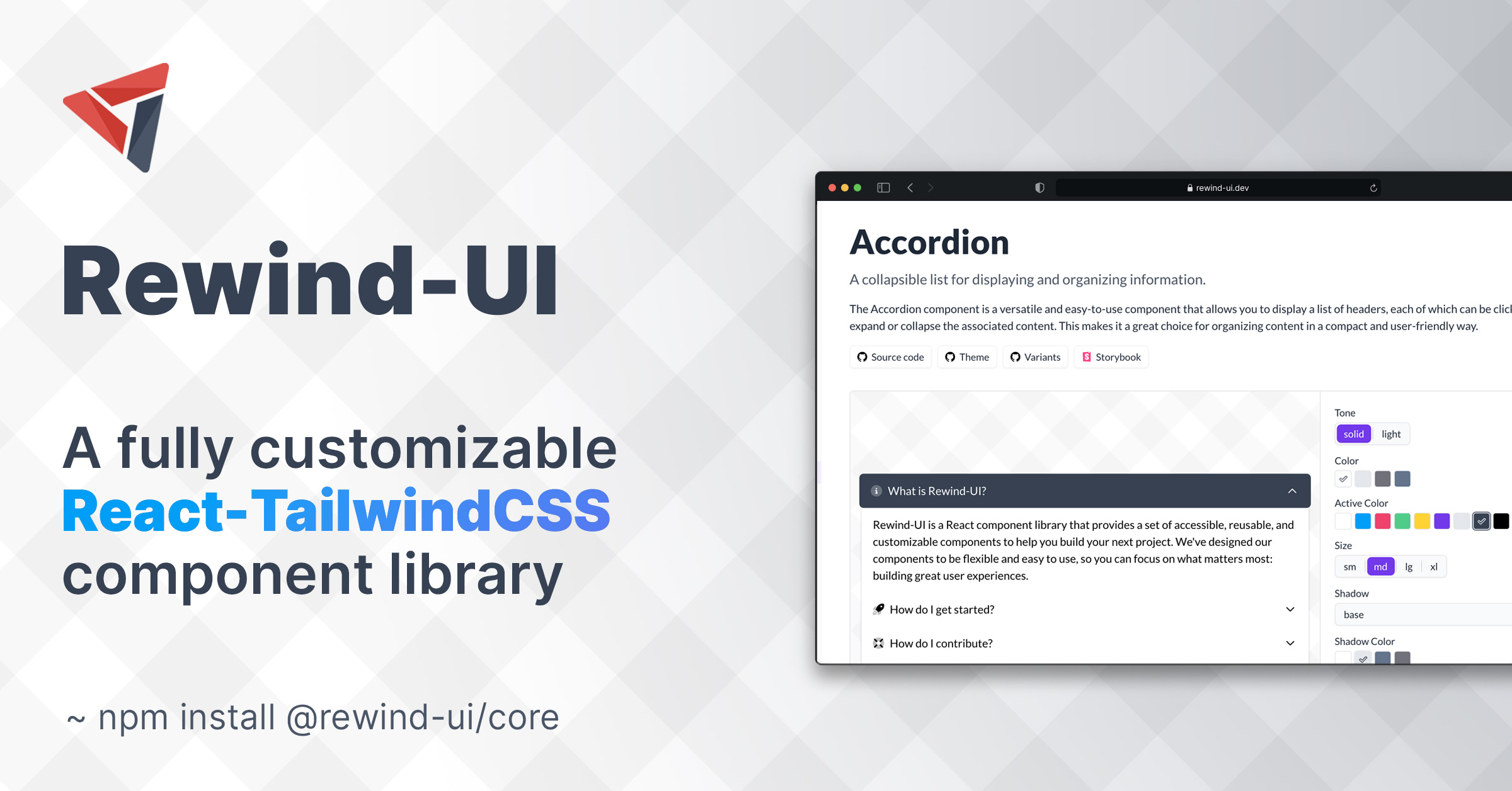
Built specifically for use with React and Tailwind CSS, Rewind-UI offers a range of accessible, highly customizable components that can be easily integrated into any react project. Rewind-UI comes with a set of default styles that can be easily customized using Tailwind CSS classes. Furthermore, each component can be parameterized using a set of props that can be used to change the default styles of the component.

Installation

Rewind-UI is available as an NPM package and can be installed using the following command:

npm install @rewind-ui/core

Configuration

Rewind-UI is designed to be used with React and Tailwind CSS. To use Rewind-UI, you must first install ReactJS and Tailwind CSS in your project. Furthermore, you must also install the following NPM packages:

npm install tailwind-scrollbar @tailwindcss/forms @tailwindcss/typography

After having installed Tailwind CSS, you must configure it to work with Rewind-UI. To do this, you must first create a tailwind.config.js file in the root directory of your project. Then, add the following code to that config file:

It is highly recommended to add only the needed style files to avoid having a bloated css file

module.exports = {
  content: [
    './src/**/*.{html,jsx,tsx}',
    // you can either add all styles
    './node_modules/@rewind-ui/core/dist/theme/styles/*.js',
    // OR you can add only the styles you need
    './node_modules/@rewind-ui/core/dist/theme/styles/Button.styles.js',
    './node_modules/@rewind-ui/core/dist/theme/styles/Text.styles.js'
  ],
  plugins: [
    require('@tailwindcss/typography'),
    require('tailwind-scrollbar')({ nocompatible: true }),
    require('@tailwindcss/forms')({
      strategy: 'class' // only generate classes
    })
  ]
};

Usage

To start using Rewind-UI components just add the following import statement to the top of your React component:

import { Button } from '@rewind-ui/core';

Then, you can use the component in your JSX code:

<Button>Click Me</Button>

Properties

Each component has a set of default styles that can be parameterized using the corresponding props. For example, the Button component has a default blue color and a medium size. These values can be changed by setting the color and size props to the component:

<Button color="black" size="sm">Click Me</Button>

Moreover, the style of a component can be customized by passing the normal className prop to it. This prop can be used to override the default styles of the component. For example, the following code will change the font weight of the button to semi-bold:

Rewind-UI is using tailwind-merge to merge the default classes with the classes you provide in the className prop and resolve any possible conflicts.

  <Button color="black" size="sm" className="font-semibold">Click Me</Button>

Variants

Trying to avoid to make the user use multiple properties again and again we have created a variant prop. A variant is basically a pre-defined set of properties that can be used to customize a component. For example, the Button component has a success variant that can be used to create a bootstrap-like success button:

  <Button variant="success">Click Me</Button>

You can read more about the variants of each component in their corresponding documentation page.

Customization

All Rewind-UI components are highly customizable. This means that you can easily change the default styles of a component by overriding the corresponding Tailwind CSS classes. You can read more about style customization on the theming page.

Credits

Special thanks to the following people:

Special thanks to the following teams:

  • React - For creating React.
  • Tailwind Labs - For creating Tailwind CSS.
  • Vercel - For creating Next.js and their awesome open source templates.
  • Floating-UI - For creating Floating-UI.
  • Phosphor - For creating Phosphor icon family.

Powered by Vercel

rewindui's People

Contributors

adrielgro avatar boweihan avatar github-actions[bot] avatar nickdunas avatar singhlify avatar tjcafferkey avatar

Stargazers

 avatar  avatar  avatar  avatar  avatar  avatar  avatar  avatar  avatar  avatar  avatar  avatar  avatar  avatar  avatar  avatar  avatar  avatar  avatar  avatar  avatar  avatar  avatar  avatar  avatar  avatar  avatar  avatar  avatar  avatar  avatar  avatar  avatar  avatar  avatar  avatar  avatar  avatar  avatar  avatar  avatar  avatar  avatar  avatar  avatar  avatar  avatar  avatar  avatar  avatar  avatar  avatar  avatar  avatar  avatar  avatar  avatar  avatar  avatar  avatar  avatar  avatar  avatar  avatar  avatar  avatar  avatar  avatar  avatar  avatar  avatar  avatar  avatar  avatar  avatar  avatar  avatar  avatar  avatar  avatar  avatar  avatar  avatar  avatar  avatar  avatar  avatar  avatar  avatar  avatar  avatar  avatar  avatar  avatar  avatar  avatar  avatar  avatar  avatar  avatar

Watchers

 avatar  avatar  avatar  avatar  avatar

rewindui's Issues

Missing current value props?

First, thanks for building this! Rewind is just the type of library I've been wanting to see built on top of Tailwind!

I have some confusion, though, using some components.

Many controls do not seem to have a way to set the current value. For example, Switch and Checkbox normally have a checked prop in other React libraries, while Select would usually have a value for the current value.

Are these just not implemented yet or is there some other way of dealing with this in Rewind?

Thanks.

Feature Request : Add Disabled State for Tabs

Hey, really nice library. I have a feature request that I believe will make it even better! Currently, the tabs component lacks a disabled state, which limits its accessibility and user experience in certain scenarios. When a tab is in the disabled state, it should be unclickable and should be skipped during keyboard navigation. I would love to take this issue and contribute to this amazing library.

Missing value for Radio component

Hi! When using Radio component (together with RadioGroup), I can't seem to get the selected value. Or to be more precise, I always get "on" as a value.

I've checked the HTML code and also the component code and it seems like value attribute isn't set on the input element. If I test the same scenario with native <input type="radio" /> element, it works correctly.

I'd like to help and send a PR with the fix, but I first wanted to check if I'm not doing something wrong ๐Ÿ™‚

Feature Request: Add Button Story Template for Icons and Labels

Summary:
As part of enhancing the usability and versatility of our Button component library, I propose the addition of a new story template that demonstrates buttons with icons and accompanying labels. This feature will provide developers with a clear and practical example of designing buttons for actions that require both visual cues and descriptive text.

Feature Request:
I suggest the creation of a new story template named LabelWithIconTemplate. This template should showcase buttons that include icons and text labels, demonstrating how these two elements can work together to provide a more user-friendly and informative UI.

Use Case:
Buttons with icons and labels are a common UI design pattern used to enhance user understanding of button actions. By showcasing this pattern in the Storybook stories, it aims to help developers implement buttons that are both visually appealing and contextually informative.

Expected Behavior:

  • The LabelWithIconTemplate story template should include buttons that have icons and corresponding labels.
  • The icon should be appropriately integrated into the button, and the label should provide clear and meaningful text that describes the action.
  • The buttons should be customizable with different colors, tones, and sizes to accommodate various design requirements.

Benefits:

  1. Provides developers with a concrete example of how to design buttons with icons and labels.
  2. Demonstrates the synergy between icons and labels in conveying button actions.
  3. Enhances the value and functionality of the Button in the component library.
  4. Empowers users to create more user-friendly and accessible UI components.

Implementation:
The proposed story template should be structured similar to the existing Button component story templates. It should dynamically generate buttons with icons and labels based on selected color, tone, and size options.

Impact:
The addition of the LabelWithIconTemplate story template will enhance our Button component library by showcasing a widely used UI design pattern. This feature aligns with the commitment to providing developers with comprehensive and user-centric UI component solutions.

Related Issues:
None

Status Position on Avatar component doesn't change

I am trying to use the Avatar component on my ProfileHeader, however, cannot change the status position. I've set the status prop to 'online' and statusPosition to 'bottom-right'. It stays on the center of the avatar. I've tried the boilerplate from the docs and the result is the same.


import { ProfileHeader } from "@/interfaces";
import { Button, Card } from "@rewind-ui/core";
import React from "react";
import { Avatar } from "@rewind-ui/core";

const ProfileHeader = ({ isExpanded }: ProfileHeader) => {
  return (
    <nav className="w-full flex items-center justify-center justify-around h-14 bg-slate-800">
      <Button>Hello</Button>
      <Button>Hello</Button>
      <Card radius="lg">
        <Card.Body className="flex space-x-3 p-2">
          <Avatar
            src="https://avatars.githubusercontent.com/u/810438?s=96&v=4"
            initials="DA"
            alt="Dan Abramov"
            status="online"
            statusPosition="bottom-right"
          />
          <div className="flex flex-col">
            <div className="font-medium text-gray-700 text-base">
              Dan Abramov
            </div>
            <div className="text-gray-400 text-sm">@facebook</div>
          </div>
        </Card.Body>
      </Card>
    </nav>
  );
};

export default ProfileHeader;

Dark Mode

How do you imagine dark mode integrating with this framework?

Contributing documentation

At the moment there's no clear documentation on how to contribute to this project.

Here are just some things I think might be worth having

  • Getting started documentation
  • How can we work on UI components in this repo? (e.g. a local environment/Storybook?)

Tabs.Tab `ref` does not allow clicking / selection

My goal is to programmatically select a tab.

When using useRef with Tabs.Tab, doing ref.current.click() doesn't work.
e.g. <Tabs.Tab ref={ref} anchor="compare">
The ref never seems to get populated correctly.

As a workaround, if I assign an id:
<Tabs.Tab id="compare" anchor="compare">
Then I can do document.getElementById("compare")?.click();

Is ref not being set correctly internally?

Center Alignment of Table Headers and Footer

Problem

In the current state of the project's Storybook example, the alignment of table headers and footers was inconsistent with the alignment of the table body cells. Specifically, all the header and footer texts were center-aligned, while in the body, only the first column was center-aligned, and the rest were left-aligned. This inconsistency led to an unpolished and visually unappealing table layout.

Solution

I propose adjusting the alignment of table headers and footers to ensure a more consistent and polished appearance. The changes made are as follows:

  • Center-align the first column headers and footers.
  • Left-align the remaining headers and footers.

These adjustments result in a more visually appealing and uniform table layout within the Storybook example.

Steps to Reproduce:

  1. Navigate to the Storybook example.
  2. Observe the alignment of table headers and footers.
  3. Observe the alignment of table body cells.

Expected Behavior:

  • Headers and footers should exhibit consistent alignment with the body cells for a polished appearance.

Screenshots:
image

Running rewindui storybook in local throws error with node v17 or greater.

Issue Description:
When running the rewindui storybook locally, an error is encountered when using Node.js version 17 or greater. The command line displays the following error message: Error: error:0308010C:digital envelope routines::unsupported.

Solution:
To resolve this issue, follow the steps below based on your operating system:

For Windows:

  1. Open the command prompt (cmd).
  2. Run the following command:

set NODE_OPTIONS=--openssl-legacy-provider

For Unix, Linux, and macOS:

  1. Open the terminal.
  2. Run the following command:

export NODE_OPTIONS=--openssl-legacy-provider

After setting the NODE_OPTIONS environment variable, navigate to the storybook folder and run the following command:

pnpm dev

This should start the rewindui storybook without encountering the "unsupported" error when using Node.js version 17 or higher.

Please note that these steps are specific to resolving the mentioned error related to the rewindui storybook. If you encounter any other issues or errors, please provide additional details for further assistance.

Contributor Agreement:
I confirm that I have read and agree to the project's contributor guidelines or licensing terms.

Theming documentation isn't clear

The documentation around setting theme colors which are inherited by the components aren't very clear. I think in order for people to start using this library it would be great to have more thorough documentation around aspects almost every user will be looking to use, and theming I think is definitely one of those features.

I think some things worth covering are:

  • How do people set primary/secondary/accent colors similar to what they will have set in their tailwind setup?
  • Do these theming settings get inherited by components (e.g. buttons?) if not it would be good to show/explain how that's done.
  • More thorough examples in the documentation demonstrating how it's done/best practices.

Missing input type

The form input class does not have and option for phone numbers. I would use text but users would be able to input letters except i define a set of regex. A tel input type would remove that complexity and make the code look neat.

Something like this:

<Input type="tel" />

Please consider adding it.

Node warning: "Module not found: Can't resolve '@emotion/is-prop-valid"

Upon building my Next.js app I get the following warning:

./node_modules/.pnpm/@[email protected][email protected][email protected]/node_modules/@rewind-ui/core/dist/node_modules/framer-motion/dist/es/render/dom/utils/filter-props.js
Module not found: Can't resolve '@emotion/is-prop-valid' in '/home/conor/Documents/coding/projects/data_technologies/node_modules/.pnpm/@[email protected][email protected][email protected]/node_modules/@rewind-ui/core/dist/node_modules/framer-motion/dist/es/render/dom/utils'

Import trace for requested module:
./node_modules/.pnpm/@[email protected][email protected][email protected]/node_modules/@rewind-ui/core/dist/node_modules/framer-motion/dist/es/render/dom/utils/filter-props.js
./node_modules/.pnpm/@[email protected][email protected][email protected]/node_modules/@rewind-ui/core/dist/node_modules/framer-motion/dist/es/render/dom/use-render.js
./node_modules/.pnpm/@[email protected][email protected][email protected]/node_modules/@rewind-ui/core/dist/node_modules/framer-motion/dist/es/render/dom/utils/create-config.js
./node_modules/.pnpm/@[email protected][email protected][email protected]/node_modules/@rewind-ui/core/dist/node_modules/framer-motion/dist/es/render/dom/motion.js
./node_modules/.pnpm/@[email protected][email protected][email protected]/node_modules/@rewind-ui/core/dist/components/Calendar/Calendar.js
./node_modules/.pnpm/@[email protected][email protected][email protected]/node_modules/@rewind-ui/core/dist/index.js
./app/_components/layout/DrawerMenu.jsx

It's not breaking, just annoying. I'm not using the Calendar component nor Framer Motion, which is why the warnings are popping up.

But it seems unnecessary. Is there a plan to support installing RewindUI components independently - without having to grab the entire core itself?

Outline colors

Hello,

I'm having difficulty changing the outline color of the inputs when they are active. Is there a way to achieve this?

Thank you in advance.

image

Feature : Add Dark Mode Button

##Description:
We would like to propose the addition of a Dark Mode feature to improve the user experience of our application. Dark Mode is becoming increasingly popular among users, as it reduces eye strain, conserves battery life on OLED screens, and provides a sleek, modern look.

##Feature Request Details:

##Objective: Implement Dark Mode in our application.
Benefits:
Improved user experience, especially in low-light environments.
Staying competitive with other applications that offer Dark Mode

Single entry point

Won't having a single entry point make it hard to use in Next13 since some of the components have hooks , and on that same note won't it make it hard to tree shake when building the final project?

Color gradient doesn't work with 'color' property

Hello, I try to use gradient color with the color property of component provide by Rewind.ui so it doesn't works as expected.

If I pass : color="blue" it works, the blue color I defined in tailwind.config.ts is considered

If I pass : color="blue-500" it doesn't works, the blue color gradient I defined in tailwind.config.ts is not considered.

How can I work with color gradient other than className="bg-blue-500" tailwind class ?

ImageEditor Component

As someone new to component libraries, I am interested in contributing to the project by adding a basic ImageEditor component if it's feasible and allowed, I am eager to contribute to the library by implementing it and I believe this addition would enhance the functionality of the library.

Recommend Projects

  • React photo React

    A declarative, efficient, and flexible JavaScript library for building user interfaces.

  • Vue.js photo Vue.js

    ๐Ÿ–– Vue.js is a progressive, incrementally-adoptable JavaScript framework for building UI on the web.

  • Typescript photo Typescript

    TypeScript is a superset of JavaScript that compiles to clean JavaScript output.

  • TensorFlow photo TensorFlow

    An Open Source Machine Learning Framework for Everyone

  • Django photo Django

    The Web framework for perfectionists with deadlines.

  • D3 photo D3

    Bring data to life with SVG, Canvas and HTML. ๐Ÿ“Š๐Ÿ“ˆ๐ŸŽ‰

Recommend Topics

  • javascript

    JavaScript (JS) is a lightweight interpreted programming language with first-class functions.

  • web

    Some thing interesting about web. New door for the world.

  • server

    A server is a program made to process requests and deliver data to clients.

  • Machine learning

    Machine learning is a way of modeling and interpreting data that allows a piece of software to respond intelligently.

  • Game

    Some thing interesting about game, make everyone happy.

Recommend Org

  • Facebook photo Facebook

    We are working to build community through open source technology. NB: members must have two-factor auth.

  • Microsoft photo Microsoft

    Open source projects and samples from Microsoft.

  • Google photo Google

    Google โค๏ธ Open Source for everyone.

  • D3 photo D3

    Data-Driven Documents codes.