


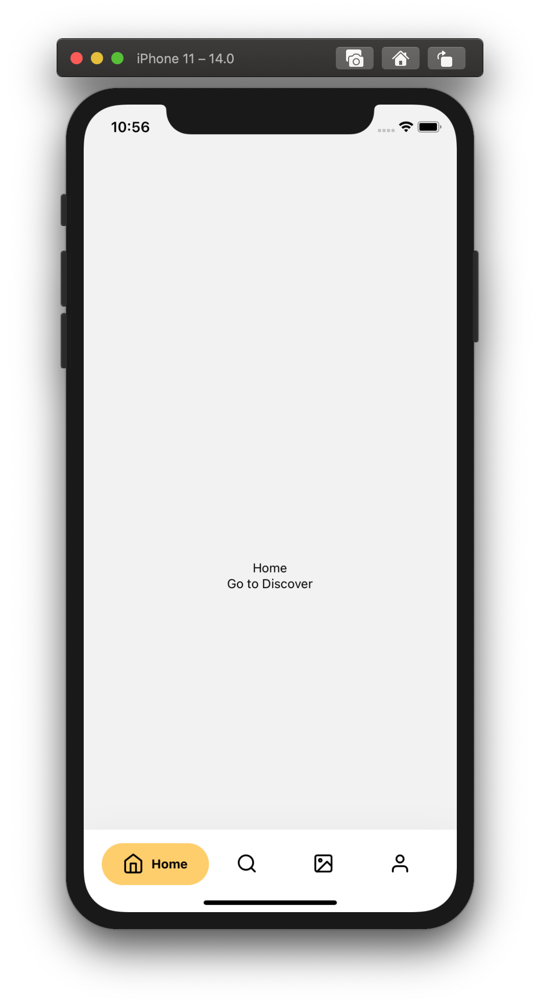
A simple and customizable React Native component that implements an animated bottom tab bar for React Navigation v5.
- 60FPS
- Support for iPhoneX
- Lots of customization
- Bottom Tab Bar Floating style


👋 If your app is deployed to AppStore/GooglePlay and you're using this package, send me a DM on Twitter @torgeadelin
❗️In order to use the component, you need to have React Navigation v5 installed.
If using yarn
yarn add react-native-animated-nav-tab-bar
If using npm
npm install react-native-animated-nav-tab-bar
If you updated the package to a new version, don't forget to run npm run start -- --reset-cache to have the latest version.
// Javascript
import { AnimatedTabBarNavigator } from "react-native-animated-nav-tab-bar";
// Typescript
import {
  AnimatedTabBarNavigator,
  DotSize, // optional
  TabElementDisplayOptions, // optional
  TabButtonLayout, // optional
  IAppearanceOptions // optional
} from 'react-native-animated-nav-tab-bar'Then create a navigator using the navigation builder that you imported, and create your navigation! Look at the example below.
...

const Tabs = AnimatedTabBarNavigator();

export default () => (
  <Tabs.Navigator
    // default configuration from React Navigation
    tabBarOptions={{
      activeTintColor: "#2F7C6E",
      inactiveTintColor: "#222222"
    }}
  >

    // Home Screen
    <Tabs.Screen name="Home" component={Home} />

    // Other screens go here.
    ...

  </Tabs.Navigator>
)If you'd like to add icons to your Bottom Navigation you can use react-native-vector-icons. Look at an example of how to add icons to your tab bar.
Example
import Icon from 'react-native-vector-icons/Feather';

...

export default () =>
  <Tabs.Navigator
    tabBarOptions={{
      activeTintColor: "#2F7C6E",
      inactiveTintColor: "#222222"
    }}
  >
    <Tabs.Screen
      name="Home"
      component={Home}
      options={{
        tabBarIcon: ({ focused, color, size }) => (
            <Icon
                name="Home"
                size={size ? size : 24}
                color={focused ? color : "#222222"}
                focused={focused}
                color={color}
            />
        )
      }}
    />
    </Tabs.Navigator>

...The navigation component takes two main props which help you customize your navigation. tabBarOptions is the default prop from React Navigation which you can use to specify different tint colors and more (see available options below). for all the details. The second prop is appearance. Here you'll be able to adjust several properties of the tab bar as you wish. See the available properties above.
-
tabBarOptions
- ✅
activeTintColor- Label and icon color of the active tab item. - ✅
inactiveTintColor- Label and icon color of the inactive tab item. - ✅
activeBackgroundColor- Background color of the active tab item. - ✅
tabStyle- Style object for the tab wrapper (Note! it overrides the properties inappearanceprop (see below). - ✅
labelStyle- Style object for the tab label text.
- ✅
-
appearance
-
✅
topPadding(default: 20) - Space between the tab button and the wrapper (top) -
✅
horizontalPadding(default: 20) - Vertical space between for the tab buttons -
✅
tabBarBackground(default: "white") - Background color for the wrapper that contains the navigation tabs -
✅
shadow(default: true) - If set to true, the wrapper has a light shadow -
✅
activeTabBackgrounds- Array of hex colours for the background of each tab when active. (if not specified, falls back to theactiveBackgroundColorfromtabBarOptions) -
✅
activeColors- Array of hex colours for the tint of each tab when active. (if not specified, falls back to theactiveTintColorfromtabBarOptions) -
✅
floating(default: false) - If set to true, the nav bar will float on top of the current screen. Look at examples above. -
✅
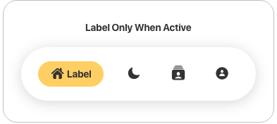
whenActiveShow(default: "both") Configure the appearance of the active tab. Available valuesboth,label-only,icon-only. -
✅
whenInactiveShow(default: "icon-only") Configure the appearance of the inactive tabs. Available valuesboth,label-only,icon-only. -
✅
tabButtonLayout(default: "horizontal") Configure the layout of the tab button. Available valuesvertical,horizontal. -
✅
dotCornerRadius(default: 100) Corner radius for the active background / dot. -
✅
dotSize(default: "medium") Size of dot for the active tab. Available valuessmall,medium,large.
Note! Make sure you reload your view after changing the props. The animation might be stuck while changing them dynamically.
-
- My tab doesn't reflect the
tabStyleobject when I setpaddingTop. Solution: You must provide the same value forpaddingTopin bothtabStyleobject andtopPaddingproperty fromappearance. This is due to the fact that the dot / active background uses position absolute, and the parent's padding top does not affect it. - My appearance prop style doesn't apply. Solution: Up until version 3.1.2 there was a typo with the appearance prop. (Instead of appearance it was appearence). It has been fixed in 3.1.3 and you should make sure you're using the right spelling too if you update to 3.1.3.
Pull requests are always welcome! Feel free to open a new GitHub issue for any changes that can be made.
If you raise an issue, please add proper steps to reproduce it and proper logs. Thanks!
Working on your first Pull Request? You can learn how from this free series How to Contribute to an Open Source Project on GitHub
Catalin Torge @torgeadelin


![dependabot[bot] avatar](https://avatars.githubusercontent.com/in/29110?v=4 "dependabot[bot]")


 React
React
 Typescript
 Django
 Laravel
 Facebook
 Microsoft
 Google
 Alibaba
 D3
D3
 Tencent