rawgraphs / rawgraphs-charts Goto Github PK
View Code? Open in Web Editor NEWA curated selection of charts provided through RAWGraphs interface
Home Page: https://rawgraphs.io/
License: Apache License 2.0
A curated selection of charts provided through RAWGraphs interface
Home Page: https://rawgraphs.io/
License: Apache License 2.0


Use webpack magic to bundle base64
In the other charts colors is in another accordion just for colors

It would be nice to display the aggregation (sum, avg, etc) on the axis and on the legends to be more clear and avoid "mistakes".


If we don't include legends in this first version I would suggest to remove the message about the total widht/height of the chart in the artboard options
All option labels appear as "Labels 1" while we should have an option for each dimension dropped in "label". If I drop only 2 dimension, I will see only two style options.

This applies to:
[X] Matrix plot throws an error if there are negative values on size
[ ] Bee swarm
[ ] circle packing
[ ] circular dendrogram
[ ] dendrogram
[X] stacked barchart An error is thrown if there are negative values
[X] radar chart An error is thrown if there are negative values
Chart that should not have the issue, to be checked:
[X] scatterplot allows negative values on axes, throws an error if there are negative values on size
[X] line chart allows negative values on axes
[X] barcharts bars are drawn below if values are negative
[X] multi-set barcharts bars are drawn below if values are negative

When I visualize series, left margins don't apply to the series labels.

I think we should move all the mandatory fields at the beggining (for example in line charts we should have X*, Y*, Lines, Series, Color) i think
I think we should have it for all the charts. Ideally i would put the dimension "Series" always as last, after labels.
I would just the option 0 or 100. Rounded corners square don't keep the right proportions
very broad and naif proposal:
chart_name_folder/
dimensions.jsonoptions.jsonsrc/
render.jsother.jsindex.js -> export chartcould be useful for external charts?
It looks like the chart variable "x" (horizontal axis) only accepts dates (numbers break it).
The error occurs with the sample dataset about Music Industry and with the column "year" set as numbers. If I change the data type to dates it works. It is curios that if I change it back to numbers it continues to work.
Using the "wine tasting" dataset, the level 2 gets misplaced on the right. See schreenshots.


also line should be optional cause in this way I can easily visualize a dataset with only 2 columns without adding another column

Series titles don't respect the artboards margins

Remove the links and update the message under the data input part such as "Questions about how to format your data? Check out our guides."
In the online version on dev the legend is missing.
When we map numerical dimensions to labels, we could have numbers with a very long decimal part due to the chosen aggregations (see image below). We could hardcode a rounding function, but sometimes users would like to keep the decimal part.
I have no idea on how to solve the issue

Cells of the heatmap have different sizes even if I don't drop anything in "size" - I have 1 record for each cell, they should all be the same. It seems like it displays two records instead of one (i see it by displying the labels)

I attach the data sample. I forced Month and Day as string but the problem persists.
meteo-heatmap.csv.zip
Mapping a value on the "size" dimension does not change the actual circles dimensions.
Using the "movies" sample dataset. Color and Size have the same dataset dimension mapped on.
The aggregation function is not working as well, but it might be a consequence of the above issue.


I would say 50 px like for the matrix
due the way d3 works, the margins applies outside the chart, which is defined by the axes. It means that al the textual elements (titles, ticks, labels) are not in the canvas if margin is set to 0.
This is not a great issue when dealing with a single chart, but becomes a mess when dealing with multiple series, since all those elements are appended around the chart, creating a lot of cluttering.
See below image to see the logic:
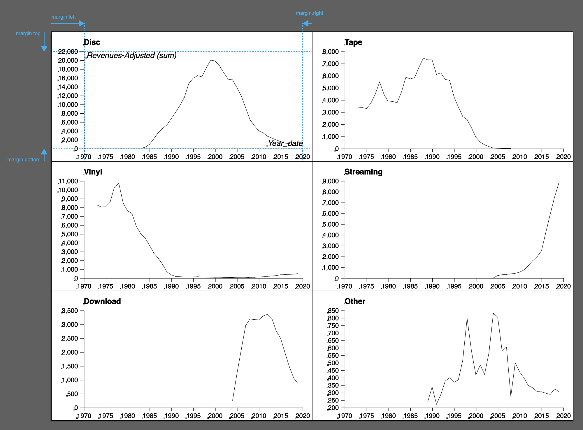
My suggestion is to use clippaths to avoid overlaps and to help the user in setting margins
Applies to all the charts with series
Change from natural to linear
What about adding a message on smaller screens that says "RAWGraphs is not intended to work on small screens and mobile devices. Send yourself an email (link) as a reminder to come back here once you are in front of a laptop" or something similar.

I would not make "size" and "colors" mandatory in order to be able to make both matrix and heatmaps.

Axis labels are not aligned. It would be good to align them at the center of the rows/columns if possible.
Is it possible to throw an error from the chart to RAWGraphs interface? For example, in radar chart you should drop at minimum three dimensions to see something. Would be nice to tell it to the user
Add the property multipleRequired to chart dimensions that require more than a single data-header input to work (e.g. Steps in Alluvial Diagram).
{
    id: 'steps',
    name: 'steps',
    validTypes: ['number', 'date', 'string'],
    required: true,
    multiple: true,

    multipleRequired: true

  }
when there are many small arcs, it become difficult to read labels.
We could expose an option for their filtering.
Should we filter them by:


When mapping vote percentages on Y axis, strange values appear.

The chart doesn't get vertically centred.

the chart updates correctly only when the mapping is changed and not when options are changed
I would suggest to have this default settings for all the artobopard:
Some values can change according to the chart (ex: square format charts such as sunburst)
should we add rawgraphs-core as peerDependencies (since is already used in the frontend) or just in devDependencies (since it's needed for the sandbox) or keep it in both?
Can we hide the "Choose a chart" if there is no data in the first section as we do in RAWGraphs 1.0.
Specify charts categories. Now all charts have the category "dispersion".
A declarative, efficient, and flexible JavaScript library for building user interfaces.
🖖 Vue.js is a progressive, incrementally-adoptable JavaScript framework for building UI on the web.
TypeScript is a superset of JavaScript that compiles to clean JavaScript output.
An Open Source Machine Learning Framework for Everyone
The Web framework for perfectionists with deadlines.
A PHP framework for web artisans
Bring data to life with SVG, Canvas and HTML. 📊📈🎉
JavaScript (JS) is a lightweight interpreted programming language with first-class functions.
Some thing interesting about web. New door for the world.
A server is a program made to process requests and deliver data to clients.
Machine learning is a way of modeling and interpreting data that allows a piece of software to respond intelligently.
Some thing interesting about visualization, use data art
Some thing interesting about game, make everyone happy.
We are working to build community through open source technology. NB: members must have two-factor auth.
Open source projects and samples from Microsoft.
Google ❤️ Open Source for everyone.
Alibaba Open Source for everyone
Data-Driven Documents codes.
China tencent open source team.