angular-bootstrap-scrolling-tabs
Angular directives for making Bootstrap 3 Tabs or AngularUI Bootstrap Tabs scroll horizontally rather than wrap. (Note that jQuery is required, not just JQLite.)
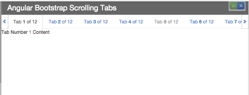
Here's what they look like:
And here are plunks showing them working with:
- Bootstrap 3 Tabs (and Pills)
- AngularUI Bootstrap Tabs
- Bootstrap 3 Tabs with tabs added dynamically after page load
- AngularUI Bootstrap Tabs with tabs added dynamically after page load
Use Cases
There are two directives to choose from, and three ways to use them:
- Use Case #1: Replace Standard Bootstrap Tabs
- Use Case #2: Wrap Standard Bootstrap Tabs (or Pills)
- Use Case #3: Wrap AngularUI Bootstrap Tabs
Optional Features
There are also some optional features available:
Usage
- Download it or install it using bower:
bower install angular-bootstrap-scrolling-tabsor npm:npm install angular-bootstrap-scrolling-tabs - Include
scrolling-tabs.min.css(orscrolling-tabs.css) on your page after Bootstrap's CSS - Include
scrolling-tabs.min.js(orscrolling-tabs.js) on your page (make sure that jQuery and Angular are included before it, and that jQuery is included before Angular) - Add
mj.scrollingTabsas a module dependency to your app:angular.module('myapp', ['mj.scrollingTabs']);
Overview
If you're using Bootstrap Tabs (nav-tabs) or AngularUI Bootstrap Tabs (tabset) and you don't want them to wrap if the page is too narrow to accommodate them all in one row, you can use these Angular directives to keep them in a row that scrolls horizontally.
It adjusts itself on window resize (debounced to prevent resize event wackiness), so if the window is widened enough to accommodate all tabs, scrolling will deactivate and the scroll arrows will disappear. (And, of course, vice versa if the window is narrowed.)
There are two directives to choose from, depending on your application:
scrolling-tabs is an element directive that replaces your standard Bootstrap ul.nav-tabs element.
scrolling-tabs-wrapper is an attribute directive that wraps either a standard Bootstrap ul.nav-tabs element or an AngularUI Bootstrap tabset element.
Use Cases
Use Case #1: Replace Standard Bootstrap Tabs
If your nav-tabs markup looks like this (it assumes your tabs are data-driven and you're using ng-repeat to generate them):
<div class="scrolling-tabs-container" ng-controller="MainCtrl as main">

  <!-- Nav tabs -->
  <ul class="nav nav-tabs" role="tablist">
    <li ng-class="{ 'active': tab.active, 'disabled': tab.disabled }" ng-repeat="tab in main.tabs">
      <a ng-href="{{'#' + tab.paneId}}" role="tab" data-toggle="tab">{{tab.title}}</a>
    </li>
  </ul>

  <!-- Tab panes -->
  <div class="tab-content">
    <div class="tab-pane" ng-class="{ 'active': tab.active }" id="{{tab.paneId}}"
                                    ng-repeat="tab in main.tabs">{{tab.content}}</div>
  </div>

</div>
you can replace the ul.nav-tabs element with the scrolling-tabs element directive, like so:
<div class="scrolling-tabs-container" ng-controller="MainCtrl as main">

  <!-- Scrolling Nav tabs -->
  <scrolling-tabs tabs="{{main.tabs}}"
                  prop-pane-id="paneId"
                  prop-title="title"
                  prop-active="active"
                  prop-disabled="disabled"
                  tab-click="main.handleClickOnTab($event, $index, tab);">
  </scrolling-tabs>

  <!-- Tab panes -->
  <div class="tab-content">
    <div class="tab-pane" ng-class="{ 'active': tab.active }" id="{{tab.paneId}}"
                                    ng-repeat="tab in main.tabs">{{tab.content}}</div>
  </div>

</div>
The only attribute the directive requires is a tabs attribute—the others are all optional, depending on your setup—which must be set to an array of objects like this (note that the tab titles can contain HTML):
var tabs = [
  { paneId: 'tab01', title: 'Tab <em>1</em> of 12', content: 'Tab Number 1 Content', active: true, disabled: false },
  { paneId: 'tab02', title: 'Tab 2 of 12', content: 'Tab Number 2 Content', active: false, disabled: false },
  { paneId: 'tab03', title: 'Tab 3 of 12', content: 'Tab Number 3 Content', active: false, disabled: false },
  { paneId: 'tab04', title: 'Tab 4 of 12', content: 'Tab Number 4 Content', active: false, disabled: false },
  { paneId: 'tab05', title: 'Tab 5 of 12', content: 'Tab Number 5 Content', active: false, disabled: false }
];
Each object must have a property for the tab title, a property for the ID of its target pane (so its href property can be set), and a boolean property for its active state; optionally, it can also have a boolean for its disabled state.
By default, the directive assumes those properties will be named title, paneId, active, and disabled, but if you want to use different property names, you can pass them in as attributes on the directive element:
| Property | Default Property Name | Optional Attribute for Custom Property Name |
|---|---|---|
| Title | title | prop-title |
| Target Pane ID | paneId | prop-pane-id |
| Active | active | prop-active |
| Disabled | disabled | prop-disabled |
So, for example, if your tab objects used the property name tabLabel for their titles, you would add attribute prop-title="tabLabel" to the <scrolling-tabs> element.
An optional tab-click attribute can also be added to the directive. That function will be called when a tab is clicked. It can be configured to accept the Angular $event and $index arguments, as well as the tab object that was clicked (which must be assigned the parameter name tab).
Use Case #2: Wrap Standard Bootstrap Tabs (or Pills)
If you would prefer to keep your standard Bootstrap ul.nav-tabs (or ul.nav-pills) markup and just want to make it scrollable, you can wrap it in a div that has the scrolling-tabs-wrapper attribute directive on it:
  <!-- wrap nav-tabs ul in a div with scrolling-tabs-wrapper directive on it -->
  <div scrolling-tabs-wrapper>

    <!-- Standard Bootstrap ul.nav-tabs -->
    <ul class="nav nav-tabs" role="tablist">
      <li ng-class="{ 'active': tab.active, 'disabled': tab.disabled }" ng-repeat="tab in main.tabs">
        <a ng-href="{{'#' + tab.paneId}}" role="tab" data-toggle="tab">{{tab.title}}</a>
      </li>
    </ul>

  </div>

  <!-- Tab panes -->
  <div class="tab-content">
    <div class="tab-pane" ng-class="{ 'active': tab.active }" id="{{tab.paneId}}"
                                        ng-repeat="tab in main.tabs">{{tab.content}}</div>
  </div>
Use Case #3: Wrap AngularUI Bootstrap Tabs
Similarly, if you're using AngularUI Bootstrap Tabs, you can make them scrollable by wrapping the tabset element in a div that has the scrolling-tabs-wrapper attribute directive on it:
  <!-- wrap tabset in a div with scrolling-tabs-wrapper directive on it -->
<div scrolling-tabs-wrapper>

  <tabset>
    <tab ng-repeat="tab in main.tabs" heading="{{tab.title}}" active="tab.active" disabled="tab.disabled">
      {{tab.content}}
    </tab>
  </tabset>

</div>
Optional Features
Support Adding Tabs Dynamically After Page Load
If you will be adding tabs after page load (via, say, button click), add attribute watch-tabs to the directive element and have it point to your tabs array:
<scrolling-tabs tabs="{{main.tabs}}"
watch-tabs="main.tabs"<div scrolling-tabs-wrapper watch-tabs="main.tabs">This will add a watcher to your tabs array that triggers the directive to refresh itself if the array changes.
Force Scroll to Tab Edge
If you want to ensure the scrolling always ends with a tab edge aligned with the left scroll arrow so there won't be a partially hidden tab, add attribute scroll-to-tab-edge="true" to the directive element:
<scrolling-tabs tabs="{{main.tabs}}"
scroll-to-tab-edge="true"<div scrolling-tabs-wrapper scroll-to-tab-edge="true">There's no way to guarantee the left and right edges will be full tabs because that's dependent on the the width of the tabs and the window. So this just makes sure the left side will be a full tab.
License
MIT License.


 React
React
 Typescript
 Django
 Laravel
 Facebook
 Microsoft
 Google
 Alibaba
 D3
D3
 Tencent