


A reusable gauge directive for Angular 1.x apps and dashboards. It provides many configurationable options to customize according to your needs. Checkout the live demo here.
NOTE: In angular-gauge 2.x, some breaking changes have been introduced. If you are upgrading from v1.x.x version to v2.x.x then checkout the Upgrade Guide first.
npm install angularjs-gauge
bower install angularjs-gauge
git clone https://github.com/ashish-chopra/angular-gauge.git
Copy the files from dist/ manually into your project folder.Then, add the script to your code (after adding the dependency of Angular 1.5) and resolving the paths as given below:
<head>
  ...
<head>
<body>
  ...
</body>
  <script src="vendor/angular/angular.min.js"></script>
  <script src="vendor/angularjs-gauge/dist/angularjs-gauge.min.js"></script>
Add as dependency in your module
angular.module('yourApp', ['angularjs-gauge']);Use it in your HTML markup like this
<ng-gauge size="200" type="full" thick="5" min="0" max="120" value="68.2" cap="round" label="Speed" foreground-color="#ffcc66" background-color="rgba(255,255,255, 0.4)" append="mph"></ng-gauge>If you face any problem, then raise an issue here.
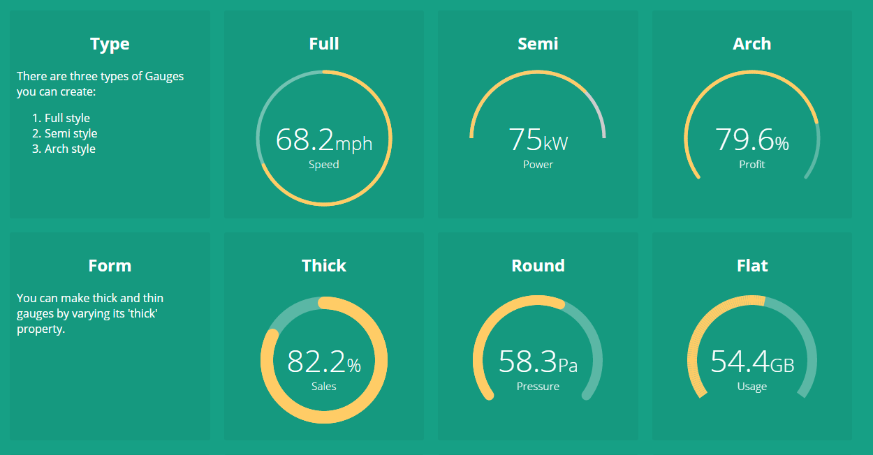
There are plenty of configurable options available to tune the Gauge as per your needs.
| Name | Description | Required | Default value | Possible values |
|---|---|---|---|---|
size |
Specifies the size of the canvas in which Gauge will be drawn. It is used as width and height both. |
No | 200 |
Positive Integer |
type |
Specifies the gauge's type. | No | "full" |
"full", "semi", "arch" |
min |
Specifies the minimum numeric value for gauge's scale. | No | 0 |
Any numeric value |
max |
Specified the maximum numeric value for gauge's scale. | No | 100 |
Any numeric value |
value |
Specifies the current value of the Gauge in the range specified by min and max. It is a required attribute. |
Yes | undefined |
Any numeric value |
cap |
The style of line ending at the gauge's end. | No | "butt" |
"round", "butt" |
thick |
Specified the thickness of the gauge's bar. | No | 6 |
Any Positive Integer |
label |
Specifies the text to display below the Gauge's reading. | No | undefined |
Any String |
foreground-color |
Specifies the foreground color of the Gauge's scale. | No | rgba(0, 150, 136, 1) |
Any color value string |
background-color |
Specifies the background color of the Gauge's scale. | No | rgba(0, 0, 0, 0.1) |
Any color value string |
append |
Specifies a string appended to the Gauge's reading. For example "%" most commonly used. |
No | undefined |
Any string |
prepend |
Specifies a string prepended to the Gauge's reading. For example "$" in case of financial data displayed in Gauge. |
No | undefined |
Any String |
duration |
Specifies the duration (in milliseconds) of the Gauge's animation | No | 1500 |
Positive Integer |
angular-gauge ships with a provider to globally set config options for all gauge instances used in the application during angular config phase. You can specify ngGaugeProvider dependency during config phase. It supports a single API to set config options:
ngGaugeProvider.setOptions(customOptions);Here, customOptions is an object {} where keys are the configOptions name (in camelCase notation), mentioned in above section. For example, let see how to set size, cap, thick, foreground-color and background-color options globally using provider as shown below:
angular
  .module('myApp', ['angularjs-gauge'])
  .config(configApp);

  configApp.$inject = ['ngGaugeProvider'];
  function configApp(ngGaugeProvider) {

    // setting the default parameters for
    // gauge instances globally.
    ngGaugeProvider.setOptions({
        size: 250,
        cap: 'round',
        thick: 15,
        foregroundColor: "#ff8645",   // note the camelCase notation for parameter name
        backgroundColor: "#e4e4e4"
    });
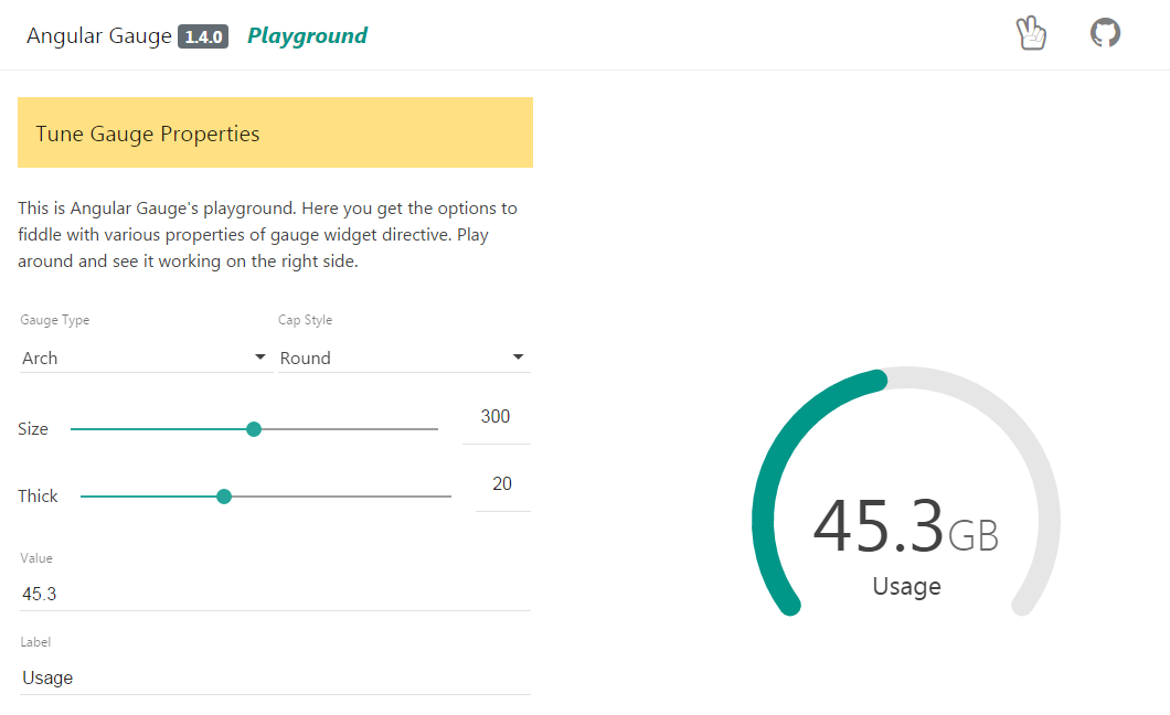
}The examples section is redesigned as a playground where you can play with Gauge by tuning its different parameters. And, you can see the result live on-screen. It is good start to get familiar with Gauge.
If you are upgrading from angular-gauge 1.x version to any version in 2.x family, then make sure to read the release notes of the chosen version on the Releases section.
Following are the breaking changes introduced in 2.x.x onwards:
usedandtotalattributes are removed.minandmaxattributes are introduced which works withvalueattribute. Checkout config options to know more about their usage.
The project is continously evolving with every new release. Give it a star, if you like it. For contribution, setup the development environment as follows:
- clone and setup the project dependencies
$> git clone https://github.com/ashish-chopra/angular-gauge.git
$> npm install- Use following commands based on what you'd like to do:
$> npm start             # starts the server at port 3000 and hosts the `/examples` directory.
$> npm test              # runs test suite once and exit.
$> npm run test:watch    # starts the test framework and watch for changes in code.
$> npm run build # triggers a manual build for library, outputs at `/dist` directory.- To add a new feature or fix a bug, make sure to create a new branch from
master.
First thing first, explore the issue tracker to find something to contribute. There are tons of other project setup related issues and activities in which you can help. Your feedback could also be a great contribution.
If you face any problem, then raise an issue here.


 React
React
 Typescript
 Django
 Laravel
 Facebook
 Microsoft
 Google
 Alibaba
 D3
D3
 Tencent