An Interactive Frontend Development Project.
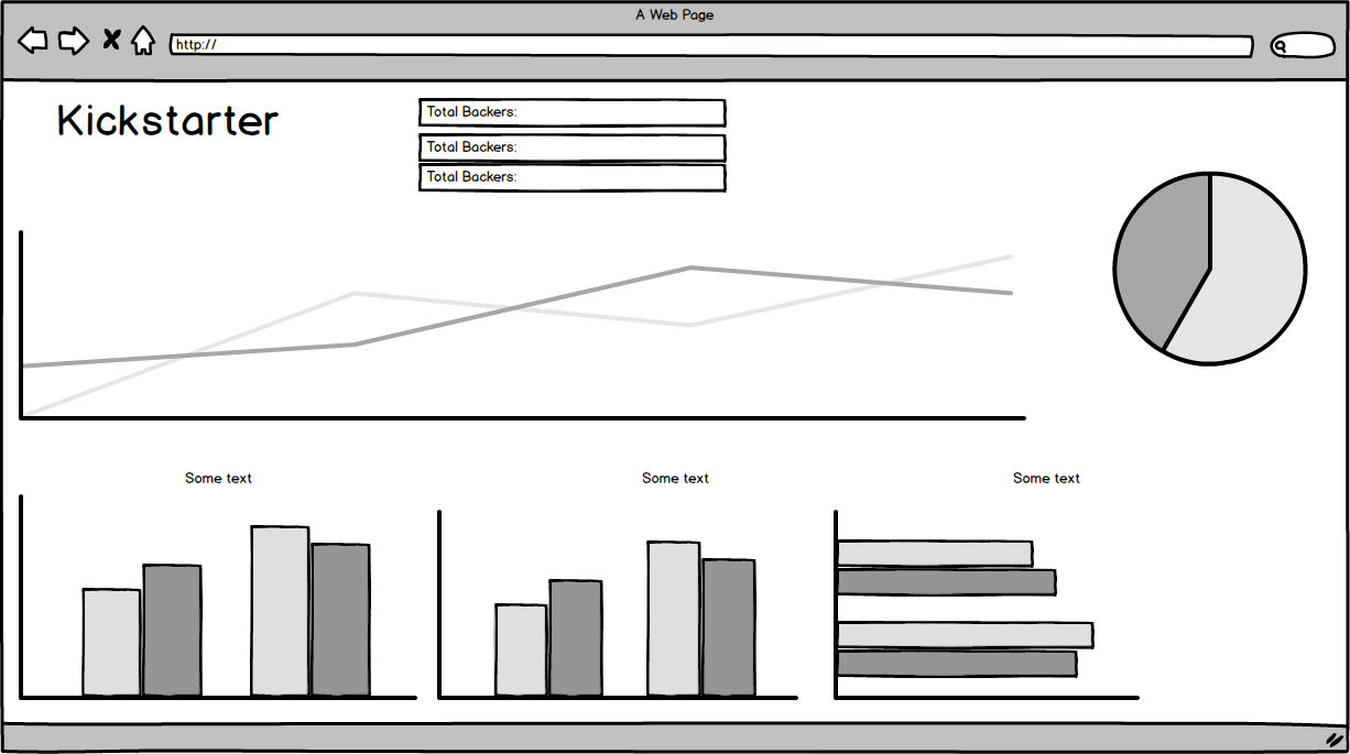
Kickstarted is a data dashboard that takes a dataset of projects launched on the platform Kickstarter and represents an abundance of otherwise hidden information in a simple to consume manner using charts, graphs, and number displays.
This data dashboard currently represents 21,000+ projects launched from 19 countries across 15 different categories over 16 months. It also allows you to see how over 2 Million people engaged in this market with a staggering $195 Million Dollars of their own money.
Kickstarted was built for project managers who wish to launch their projects on the crowdfunding platform but wanted more information on the platforms overall activity. This dashboard can help them achieve an understanding of many relevant key factors such as how much competition has their category faced in the past, what are the previous success and failure rates, how much has been pledged before and by how many backers as well as when during the year might be the best time to launch their project.
As the user interacts with the dashboard, each selection acts as a filter causing the site to update it's information. An example of this is when the user clicks on "Games" in the "No. of Submissions per Category" row chart. Some examples of what they will see is an updated timeline for when "Games" projects have been launched, which country launched the most "Games" projects as well as how many were launched in total and how much was pledged. This is just some of what is shown. The user could make a second selection of their choosing and the site will update again to reflect the information represented by their selections.
I've also implemented modals to display important information upon interaction such as the "About" and the other chart/graph descriptions. This helps my attempt at striking a balance between a clean design and informative tool however it is worth noting that ultimately this dashboard was intended to be used on desktops.
The following user stories are catered for with this data dashboard.
- As a project manager, I want to see when during the year are projects within my category launched,so that I can discover points of saturation in the platform and act accordingly.
- As a project manager, I want to see the funding results of my category as a whole but also throughout the year during different months. This is to identify when is the most promising time to launch.
- As a project manager I want to understand how many projects have been launched in each category but also specifically in my category, as to understand how much competition I may face based on past performances.
- As a project manager I want to see which categories are most popular with each country. This could identify possible foreign markets to target for advertising based on their positive response with projects in my category.
- As a project manager, I would like to see how many people actively pledge towards each of the categories and how much they pledge. This offers me a better understanding of real activity on the platform as opposed to something like "project views".
All the above can be fulfilled by interacting with the dashboard and making relevant selections.
In terms of User Interface, I've kept to the original design planned in the wireframe which can been seen below aside from moving the row chart to the left. All aspects of the site are touch-friendly.
- Simple "Reset Charts" button - Users can interact with the charts as many times as they wish and the Reset Charts button will automatically reset the dashboard back to its default.
- Summary Section - The summary section below the dashboard title will always inform the user of how many projects there are, how many backers were involved and how much was pledged in relation to their chosen filters at any given moment.
- Crossfiltering Information - As the user interacts with the dashboard, it will automatically cross filter all the information on display in relation to it's current selection. This also stacks with multiple selections.
- Simple design - The dashboard displays its information in a simplisic and efficient manner.
- A larger dataset - The original dataset was comprised of over 400,000 projects launched, however it was too large for this current version. Upgrading to Flask and using Python can help me make the most of the original dataset.
- More Charts and Graphs - There is alot more information left to be seen when the full dataset is utilized.
- API integration - I don't believe Kickstarter have a public API however there are sources online offering tutorials on how to query the site using AJAX calls and scraping tutorials. Being able to learn this and create my own API of sorts would give the site a "living" aspect to it constantly showing very recent information.
- HTML5
- CSS3
- Javascript and Jquery
- Bootstrap 3.3.7
- D3.js 3.5.1
- D3.js is a JavaScript library for manipulating documents based on data. D3 helps you bring data to life using HTML, SVG, and CSS. Source: https://d3js.org/
- Dc.css 2.1.8
- Dc.js is a javascript charting library with native crossfilter support and it leverages d3 to render charts in CSS-friendly SVG format. Source: https://dc-js.github.io/dc.js/
- Crossfilter.js 1.3.1
- In summary, Crossfilter allows us to group and filter the data with ease based on the users interaction and selections. For more, click on Crossfilter.js above.
- Balsamiq
- Balsamiq is the tool I used to generate a wireframe which the site design was based on.
- Kaggle
- I've used Kaggle to source the dataset that was used in this project.
I've tested the responsiveness of Kickstarted using a assortment of physical hardware and resolution emulation via the likes of Chrome Dev Tools and ResponsiveDesignChecker. It is worth noting that Firefox Developer tools were not used as extensively as the other options because for some reason it rendered the pie chart full width. Firefox Developer Tools was the only test utility that created this bug.
For the physical hardware, the dashboard was tested on a Sony 75 inch 4k panel, Asus and Dell 15.6 inch 1080p laptops, a Dell Latitude 13 inch touchscreen laptop and a Samsung Galaxy S8 in landscape and portrait mode. The result of the of the hardware testing was that the dashboard despite being intended for desktop use, was very responsive across all resolution types. Even when the site was loaded on a Samsung Galaxy S8 in both landscape and portrait mode, once I double tapped an empty space on the site it would zoom out slighty and accomodate the charts and graphs in a stacked pattern. However, you could not view the specific numerical amounts of each chart/graph as you would on desktop by hovering with your mouse.
For resolution emulation, I used Chrome Dev Tools and ResponsiveDesignChecker. Using Chrome Dev Tools, the dashboard charts and graphs did move well to adjust but at anything below 1030px width was not desirable for use and the footer began to shrink in width. The site perfromed very well using ResponsiveDesignChecker's desktop emulations however once you reached the lower resolutions, a y-axis scroll was introduced and the layout broke slightly between the pie chart and row chart. Also in the smaller devices it just was not suitable nor is it intended for that usage environment.
I also performed some extra manual testing using the CSV file in Google Sheets. Essentially I applied manual filters to see if the same numbers were returned when filtering by different funding result states eg: Successfull or Failed. As well as by different country of submission and total projects, total pledged amounts. Happy to say all this information was being accurately represented in the final product.
It is worth noting that during the development of this project, the charts have been tested at intervals just to ensure everything was truely interactive and filtering by user selection. As of submitting this project, all charts, graphs and number displays work together to represent the information desired by the user.
I've hosted this site using GitHub Pages and deployed from the master branch. These are the steps I took to deploy this project.
- I selected the project repository from my list of repositories and once loaded I then clicked on the settings cog icon.
- I then scrolled down to the GitHub Pages section and under Source, clicked "None" and changed it to "Master Branch".
- This automatically saved and reloaded the page. After scrolling down to the GitHub Pages section, the live link was then available for use.
Any future commits to the master branch will automatically update the site so caution is needed incase an unresolved bug or issue is pushed.
In order to use this repository yourself, enter git clone //github.com/ldettorre/Kickstarter-Data-Project.git into the terminal of yor chosen editor.
The deployed site will update automatically upon new commits to the master branch. In order for the site to deploy correctly on GitHub pages, the landing page must be named index.html.
Although I can no longer see her contribution on my code after making multiple changes of my own, I would like to credit Katie Maxwell for her help while I was learning how to use the technologies for this project.
- The dataset for this project was taken from Kaggle.
- The background image was from Google Images.
