Git Product home page Git Product logo

mikepenz / materialdrawer Goto Github PK

View Code? Open in Web Editor NEW
11.7K 336.0 2.1K 22.63 MB

The flexible, easy to use, all in one drawer library for your Android project. Now brand new with material 2 design.

Home Page: https://mikepenz.dev

License: Apache License 2.0

Ruby 0.47% Kotlin 99.41% Shell 0.11%
materialdrawer drawer java navigation-drawer android material-design drawerlayout android-library android-ui drawer-support

materialdrawer's Introduction

MaterialDrawer

... the flexible, easy to use, all in one drawer library for your Android project.


What's included πŸš€ β€’ Setup πŸ› οΈ β€’ Migration Guide 🧬 β€’ WIKI / FAQ πŸ“– β€’ Used by β€’ Sample App


What's included πŸš€

  • the easiest possible integration
  • uses the androidX support libraries
  • compatible down to API Level 16
  • includes an AccountSwitcher
  • quick and simple api
  • follows the NEW Google Material Design Guidelines
  • use vector (.svg) icons and icon fonts via the Android-Iconics integration
  • Google Material Design Icons, Google Material Community Design Icons, FontAwesome and more
  • comes with various themes which help to get your own themes clean
  • modify the colors on the go
  • comes with multiple default drawer items
  • based on a RecyclerView
  • RTL support
  • Gmail like MiniDrawer
  • expandable items
  • badge support
  • define custom drawer items
  • tested and stable
  • sticky footer or headers
  • absolutely NO limits
  • NavController support by @petretiandrea

If you upgrade from < 8.0.0 follow the MIGRATION GUIDE

Preview

Screenshots πŸŽ‰

Image

Setup

Latest releases πŸ› 

  • Kotlin && Material 3 | v9.0.2
  • Kotlin | v8.4.5 (Provided as-is only)
  • Java && AndroidX | v6.1.2 (Provided as-is only)
  • Java && AppCompat | v6.0.9 (Provided as-is only)

1. Provide the gradle dependency

The latest release is available on Maven Central.

implementation("com.mikepenz:materialdrawer:9.0.1")
//required support lib modules
implementation "androidx.appcompat:appcompat:${versions.appcompat}"
implementation "androidx.recyclerview:recyclerview:${versions.recyclerView}"
implementation "androidx.annotation:annotation:${versions.annotation}"
implementation "com.google.android.material:material:1.5.0-alpha05" // requires at least 1.5.0-x
implementation "androidx.constraintlayout:constraintlayout:${versions.constraintLayout}"

NavController Support @ Maven Central.

// Add for NavController support
implementation "com.mikepenz:materialdrawer-nav:${lastestMaterialDrawerRelease}"

Android-Iconics Support @ Maven Central .

// Add for Android-Iconics support
implementation "com.mikepenz:materialdrawer-iconics:${lastestMaterialDrawerRelease}"

2. Add the Drawer into the XML

The MaterialDrawerSliderView has to be provided as child of the DrawerLayout and will as such act as the slider

<androidx.drawerlayout.widget.DrawerLayout xmlns : android ="http://schemas.android.com/apk/res/android"
xmlns:app = "http://schemas.android.com/apk/res-auto"
android:id = "@+id/root"
    android:layout_width="match_parent"
    android:layout_height="match_parent"
    android:fitsSystemWindows="true">

    ... your content ...

    <com.mikepenz.materialdrawer.widget.MaterialDrawerSliderView
        android:id="@+id/slider"
        android:layout_width="wrap_content"
        android:layout_height="match_parent"
        android:layout_gravity="start"
        android:fitsSystemWindows="true" />
</androidx.drawerlayout.widget.DrawerLayout>

3. Add the DrawerStyle to your theme

<style name="SampleApp.DayNight" parent="Theme.Material3.DayNight.NoActionBar">
    ...
    <item name="materialDrawerStyle">@style/Widget.MaterialDrawerStyle</item>
    <item name="materialDrawerHeaderStyle">@style/Widget.MaterialDrawerHeaderStyle</item>
    ...
</style>

Great. Your drawer is now ready to use.

Note

Using v9.x with Material 3 theming requires a Material3 theme as base for the activity.

Additional Setup

Add items and adding some functionality

//if you want to update the items at a later time it is recommended to keep it in a variable
val item1 = PrimaryDrawerItem().apply { nameRes = R.string.drawer_item_home; identifier = 1 }
val item2 = SecondaryDrawerItem().apply { nameRes = R.string.drawer_item_settings; identifier = 2 }

// get the reference to the slider and add the items
slider.itemAdapter.add(
	    item1,
	    DividerDrawerItem(),
	    item2,
	    SecondaryDrawerItem().apply { nameRes = R.string.drawer_item_settings }
)

// specify a click listener
slider.onDrawerItemClickListener = { v, drawerItem, position ->
    // do something with the clicked item :D
    false
}

Selecting an item

//set the selection to the item with the identifier 1
slider.setSelection(1)
//set the selection to the item with the identifier 2
slider.setSelection(item2)
//set the selection and also fire the `onItemClick`-listener
slider.setSelection(1, true)

By default, when a drawer item is clicked, it becomes the new selected item. If this isn't the expected behavior, you can disable it for this item using isSelectable = false:

SecondaryDrawerItem().apply { nameRes = R.string.drawer_item_dialog; isSelectable = false }

Modify items or the drawer

//modify an item of the drawer
item1.apply {
  nameText = "A new name for this drawerItem"; badge = StringHolder("19")
  badgeStyle = BadgeStyle().apply { textColor = ColorHolder.fromColor(Color.WHITE); color = ColorHolder.fromColorRes(R.color.md_red_700) }
}
//notify the drawer about the updated element. it will take care about everything else
slider.updateItem(item1)

//to update only the name, badge, icon you can also use one of the quick methods
slider.updateName(1, "A new name")

//the result object also allows you to add new items, remove items, add footer, sticky footer, ..
slider.addItem(DividerDrawerItem())
slider.addStickyFooterItem(PrimaryDrawerItem().apply { nameTest = "StickyFooter" })

//remove items with an identifier
slider.removeItem(2)

//open / close the drawer
slider.drawerLayout?.openDrawer(slider)
slider.drawerLayout?.closeDrawer(slider)

//get the reference to the `DrawerLayout` itself
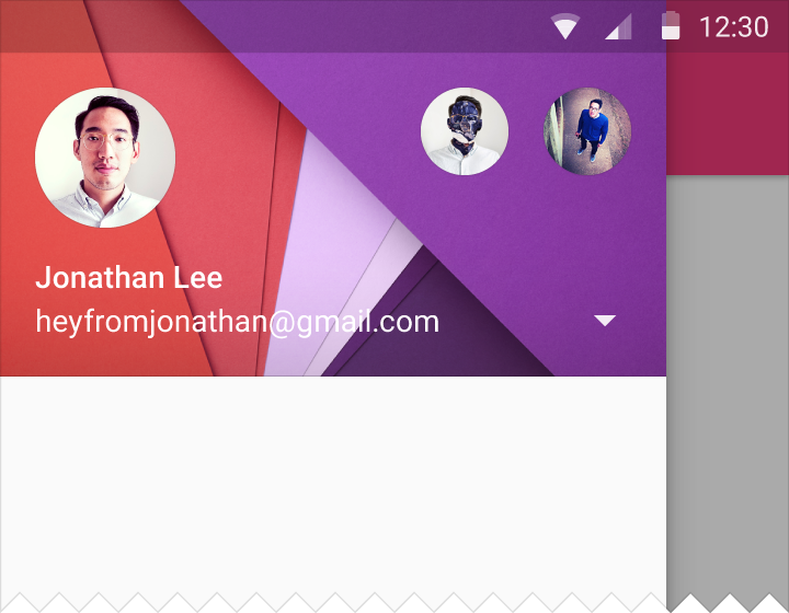
slider.drawerLayout

Add profiles and an AccountHeader

// Create the AccountHeader
headerView = AccountHeaderView(this).apply {
    attachToSliderView(slider) // attach to the slider
    addProfiles(
        ProfileDrawerItem().apply { nameText = "Mike Penz"; descriptionText = "[email protected]"; iconRes = R.drawable.profile; identifier = 102 }
    )
    onAccountHeaderListener = { view, profile, current ->
        // react to profile changes
        false
    }
    withSavedInstance(savedInstanceState)
}

Android-Iconics support

The MaterialDrawer provides an extension for the Android-Iconics library. This allows you to create your DrawerItems with an icon from any font.

Choose the fonts you need. Available Fonts

// Add for Android-Iconics support
implementation "com.mikepenz:materialdrawer-iconics:${lastestMaterialDrawerRelease}"

// fonts
implementation 'com.mikepenz:google-material-typeface:x.y.z@aar' //Google Material Icons
implementation 'com.mikepenz:fontawesome-typeface:x.y.z@aar'     //FontAwesome
//now you can simply use any icon of the Google Material Icons font
PrimaryDrawerItem().apply { iconicsIcon = GoogleMaterial.Icon.gmd_wb_sunny }
//Or an icon from FontAwesome
SecondaryDrawerItem().apply { iconicsIcon = FontAwesomeBrand.Icon.fab_github }

Advanced Setup

For advanced usecases. Please have a look at the provided sample activities.

Load images via url

The MaterialDrawer supports fetching images from URLs and setting them for the Profile icons. As the MaterialDrawer does not contain an ImageLoading library the dev can choose his own implementation (Picasso, Glide, ...). This has to be done, before the first image should be loaded via URL. (Should be done in the Application, but any other spot before loading the first image is working too)

//initialize and create the image loader logic
DrawerImageLoader.init(object : AbstractDrawerImageLoader() {
    override fun set(imageView: ImageView, uri: Uri, placeholder: Drawable) {
        Picasso.get().load(uri).placeholder(placeholder).into(imageView)
    }

    override fun cancel(imageView: ImageView) {
        Picasso.get().cancelRequest(imageView)
    }
    
    /*
    override fun set(imageView: ImageView, uri: Uri, placeholder: Drawable, tag: String?) {
        super.set(imageView, uri, placeholder, tag)
    }

    override fun placeholder(ctx: Context): Drawable {
        return super.placeholder(ctx)
    }

    override fun placeholder(ctx: Context, tag: String?): Drawable {
        return super.placeholder(ctx, tag)
    }
    */
})

An implementation with GLIDE v4 (See tag v6.1.1 for glide v3 sample) can be found in the sample application

JVM Target 1.8

// Since 8.1.0 the drawer includes core ktx 1.3.0 which requires jvm 1.8
kotlinOptions {
    jvmTarget = "1.8"
}

Style the drawer πŸ–ŒοΈ

Custom style - styles.xml

Create your custom style. If you don't need a custom theme see the next section, how you can set the colors just by overwriting the original colors.

// define a custom drawer style
<style name="Widget.MaterialDrawerStyleCustom" parent="Widget.MaterialDrawerStyle">
    <item name="materialDrawerInsetForeground">#4000</item>
    <!-- MaterialDrawer specific values -->
    <item name="materialDrawerBackground">?colorSurface</item>
    <item name="materialDrawerPrimaryText">@color/color_drawer_item_text</item>
    <item name="materialDrawerPrimaryIcon">@color/color_drawer_item_text</item>
    <item name="materialDrawerSecondaryText">@color/color_drawer_item_text</item>
    <item name="materialDrawerSecondaryIcon">@color/color_drawer_item_text</item>
    <item name="materialDrawerDividerColor">?colorOutline</item>
    <item name="materialDrawerSelectedBackgroundColor">?colorSecondaryContainer</item>
</style>

// define a custom header style
<style name="Widget.MaterialDrawerHeaderStyleCustom" parent="">
    <item name="materialDrawerCompactStyle">true</item>
    <item name="materialDrawerHeaderSelectionText">?colorOnSurface</item>
    <item name="materialDrawerHeaderSelectionSubtext">?colorOnSurface</item>
</style>

// define the custom styles for the theme
<style name="SampleApp" parent="Theme.Material3.Light.NoActionBar">
    ...
    <item name="materialDrawerStyle">@style/Widget.MaterialDrawerStyleCustom</item>
    <item name="materialDrawerHeaderStyle">@style/Widget.MaterialDrawerHeaderStyleCustom</item>
    ...
</style>

Adjust BezelImageView style

Overwrite the Style of the BezelImageView for the whole MaterialDrawer

<style name="BezelImageView">
    <item name="biv_maskDrawable">@drawable/material_drawer_rectangle_mask</item>
    <item name="biv_drawCircularShadow">false</item>
    <item name="biv_selectorOnPress">@color/material_drawer_primary</item>
    <item name="android:scaleType">centerInside</item>
</style>

Used by

(feel free to send me new projects)

Articles about the MaterialDrawer

Credits

Developed By

License

Copyright 2021 Mike Penz

Licensed under the Apache License, Version 2.0 (the "License");
you may not use this file except in compliance with the License.
You may obtain a copy of the License at

   http://www.apache.org/licenses/LICENSE-2.0

Unless required by applicable law or agreed to in writing, software
distributed under the License is distributed on an "AS IS" BASIS,
WITHOUT WARRANTIES OR CONDITIONS OF ANY KIND, either express or implied.
See the License for the specific language governing permissions and
limitations under the License.

materialdrawer's People

Contributors

allanwang avatar alorma avatar alvarobrey avatar auchri avatar burekas7 avatar carlos-mg89 avatar cketti avatar connyduck avatar danielgomezrico avatar darvid7 avatar davcpas1234 avatar dependabot[bot] avatar edesdan avatar emartynov avatar fwest98 avatar gpulido avatar herau avatar intari avatar mikepenz avatar nateshoffner avatar nohus avatar quentin-st avatar rocboronat avatar tajchert avatar theapache64 avatar timoschwarzer avatar vanniktech avatar wimbervoets avatar wkovacs64 avatar zsmb13 avatar

Stargazers

 avatar  avatar  avatar  avatar  avatar  avatar  avatar  avatar  avatar  avatar  avatar  avatar  avatar  avatar  avatar  avatar  avatar  avatar  avatar  avatar  avatar  avatar  avatar  avatar  avatar  avatar  avatar  avatar  avatar  avatar  avatar  avatar  avatar  avatar  avatar  avatar  avatar  avatar  avatar  avatar  avatar  avatar  avatar  avatar  avatar  avatar  avatar  avatar  avatar  avatar  avatar  avatar  avatar  avatar  avatar  avatar  avatar  avatar  avatar  avatar  avatar  avatar  avatar  avatar  avatar  avatar  avatar  avatar  avatar  avatar  avatar  avatar  avatar  avatar  avatar  avatar  avatar  avatar  avatar  avatar  avatar  avatar  avatar  avatar  avatar  avatar  avatar  avatar  avatar  avatar  avatar  avatar  avatar  avatar  avatar  avatar  avatar  avatar  avatar  avatar

Watchers

 avatar  avatar  avatar  avatar  avatar  avatar  avatar  avatar  avatar  avatar  avatar  avatar  avatar  avatar  avatar  avatar  avatar  avatar  avatar  avatar  avatar  avatar  avatar  avatar  avatar  avatar  avatar  avatar  avatar  avatar  avatar  avatar  avatar  avatar  avatar  avatar  avatar  avatar  avatar  avatar  avatar  avatar  avatar  avatar  avatar  avatar  avatar  avatar  avatar  avatar  avatar  avatar  avatar  avatar  avatar  avatar  avatar  avatar  avatar  avatar  avatar  avatar  avatar  avatar  avatar  avatar  avatar  avatar  avatar  avatar  avatar  avatar  avatar  avatar  avatar  avatar  avatar  avatar  avatar  avatar  avatar  avatar  avatar  avatar  avatar  avatar  avatar  avatar  avatar  avatar  avatar  avatar  avatar  avatar  avatar  avatar  avatar  avatar  avatar  avatar

materialdrawer's Issues

disable header clickable

this is the logcat?Can we disable header clickable?
02-26 14:17:21.657 9330-9330/com.mikepenz.materialdrawer.app E/AndroidRuntimeοΉ• FATAL EXCEPTION: main
Process: com.mikepenz.materialdrawer.app, PID: 9330
java.lang.NullPointerException: Attempt to invoke interface method 'int com.mikepenz.materialdrawer.model.interfaces.IDrawerItem.getIdentifier()' on a null object reference
at com.mikepenz.materialdrawer.app.SimpleDrawerActivity$1.onItemClick(SimpleDrawerActivity.java:116)
at com.mikepenz.materialdrawer.Drawer$3.onItemClick(Drawer.java:803)
at android.widget.AdapterView.performItemClick(AdapterView.java:300)
at android.widget.AbsListView.performItemClick(AbsListView.java:1145)
at android.widget.AbsListView$PerformClick.run(AbsListView.java:3046)
at android.widget.AbsListView$3.run(AbsListView.java:3835)
at android.os.Handler.handleCallback(Handler.java:739)
at android.os.Handler.dispatchMessage(Handler.java:95)
at android.os.Looper.loop(Looper.java:135)
at android.app.ActivityThread.main(ActivityThread.java:5223)
at java.lang.reflect.Method.invoke(Native Method)
at java.lang.reflect.Method.invoke(Method.java:372)
at com.android.internal.os.ZygoteInit$MethodAndArgsCaller.run(ZygoteInit.java:899)
at com.android.internal.os.ZygoteInit.main(ZygoteInit.java:694)
at de.robv.android.xposed.XposedBridge.main(XposedBridge.java:117)

Resources.NotFoundException

When I run application on real device (Prestigio PAP5451DUO, API 17) I get this exception:

java.lang.RuntimeException: Unable to start activity ComponentInfo{co.application/co.application.ui.activities.Activity}: android.content.res.Resources$NotFoundException: Resource ID #0x7f09008a

It looks like the resource in question is

material_drawer_width

I think this happens because this resource isn't defined in the values folder, which is the default, but only in values-sw384dp and values-sw360dp.

DrawerItem().withIcon(...) please also resID

yet implemented:

public PrimaryDrawerItem withIcon(Drawable icon) {...}
public PrimaryDrawerItem withIcon(IIcon iicon) {...}

I have to write:

new PrimaryDrawerItem().withIcon(getDrawable(R.drawable.ic_person_grey600_24dp));

but I want:

new PrimaryDrawerItem().withIcon(R.drawable.ic_person_grey600_24dp);

Is this possible?

min sdk 10

Can you explain why the min sdk is not 10.
I would like to help to backport it.

rtl text

support for RTL text in drawer

Back icon indicator

Hello,
How can we show the back indicator when going to a fragment rather than the drawer toggle?
Thank you

ripple

Could you add the ripple effect?

Display drawer below actionbar/appbar

Hi there,

I really like the features and handling of this library and would like to use it in my app.
However, I need the drawer to be displayed below my appbar.
Is this possible or if not, is it planned to be implemented?

Change theme name from AppTheme

AppTheme seems like a bad choice of name for the theme. I think the Android Studio templates for apps uses this by default so it called confusion when all my ActionBars disappeared.

A better name would be something like MaterialDrawerTheme.

Hard/Soft back button

On the standard Material Drawer, for example, on Hangouts, when you touch the "back button" on the Android UI, it closes the Navigation Drawer. This is not happening with this library.

BTW, awesome work!

idea: user-defined layouts

idea:
Make ist possible that the dev could use own layouts for the drawer-items.

Maybe we should discuss this. :-)

PrimaryDrawerItem with icon

If an icon is setted as following lines:

PrimaryDrawerItem().withName(R.string.drawer_item_find_friends).withIcon(getResources().getDrawable(R.drawable.image))

the project doesn't compile.

Error:(55, 92) error: cannot access IIcon
class file for com.mikepenz.iconics.typeface.IIcon not found

EDIT**
I forgot the "transitive" property in build.gradle. Sorry about that.

Badge ( Counter or String )

Could you add an optional badge on the right of item? ( the badge should be upgradable with a String or Integer )
Thanks :)

material_drawer_primary_dark doesn't work?

Hi, in your sample I'm trying to override colors (in colors.xml of the App).

<?xml version="1.0" encoding="utf-8"?>
<resources>
    <!-- Material SAMPLE DARK colors -->

    <color name="material_drawer_primary">#4BAE4F</color>
    <color name="material_drawer_primary_dark">#FF4081</color>
    <color name="material_drawer_primary_light">#C8E5C9</color>
    <color name="material_drawer_accent">#FE5621</color>

    <color name="material_drawer_background">#303030</color>
    <color name="material_drawer_icons">#000</color>
    <color name="material_drawer_primary_text">#FFF</color>
    <color name="material_drawer_secondary_text">#DEDEDE</color>
    <color name="material_drawer_hint_text">#ABABAB</color>
    <color name="material_drawer_contrast_text">#000</color>
    <color name="material_drawer_divider">#555555</color>
    <color name="material_drawer_selected">#262626</color>

</resources>

Status bar has to be PINK according to this settings, but it's still dark green. Android 5.0.1, Nexus 5.

Image of error

(AccountSwitcher) Circle Image and details

Hey, first of this is an excellent start. Would love to be able to include this in the layout xml.

Suggestion: If you see the image in the url, there is a big circle profile picture along with Name and E-mail. It would be amazing to provide a layout a template for that. I could work on it if you accept pull requests.

http://material-design.storage.googleapis.com/publish/v_2/material_ext_publish/0Bx4BSt6jniD7c2dhcFRZdzBPWnM/patterns_navdrawer_elevation1.png

Drawer Width should be handled automatically

At the moment the drawer width is defined by the full width - 56dp margin by the drawerLayout.

The width of the drawer should be automatically set for tablets too.
MaxWidth on phones: 280dp (56x5)
MaxWidth on tablets: 320dp (64x5)

Which icons should be used

The Material guidelines said that we should use "24dp" icons for the Drawer. But on the layout the ImageView of the icon has a "48dp" size.

Any recommendation?

Error Build with 1.0.1

I cannot build my project if update dependence from 1.0.0 to 1.0.1

Error:A problem occurred configuring project ':app'.
> Could not resolve all dependencies for configuration ':app:_debugCompile'.
   > Could not find Android-Iconics:library:unspecified.
     Searched in the following locations:
         https://jcenter.bintray.com/Android-Iconics/library/unspecified/library-unspecified.pom
         https://jcenter.bintray.com/Android-Iconics/library/unspecified/library-unspecified.jar
         file:/C:/Android Sdk/sdk/extras/android/m2repository/Android-Iconics/library/unspecified/library-unspecified.pom
         file:/C:/Android Sdk/sdk/extras/android/m2repository/Android-Iconics/library/unspecified/library-unspecified.jar
         file:/C:/Android Sdk/sdk/extras/google/m2repository/Android-Iconics/library/unspecified/library-unspecified.pom
         file:/C:/Android Sdk/sdk/extras/google/m2repository/Android-Iconics/library/unspecified/library-unspecified.jar
     Required by:
         WebAnimex4:app:unspecified > com.mikepenz.iconics:google-material-typeface:1.1.1

And I can't understand why

Required by:
WebAnimex4:app:unspecified > com.mikepenz.iconics:google-material-typeface:1.1.1

I have

 compile 'com.mikepenz.iconics:google-material-typeface:1.1.0@aar'

App is crashing if I use onBackPressed()

I use this code for hide Navigation Drawer/close activity:

@Override
public void onBackPressed() {
     if (drawerResult.isDrawerOpen()) {
           drawerResult.closeDrawer();
     } else {
          super.onBackPressed();
     }
}

LogCat:
java.lang.NullPointerException: Attempt to invoke virtual method 'boolean com.mikepenz.materialdrawer.Drawer$Result.isDrawerOpen()' on a null object reference at ru.sezex.miped.MainActivity.onBackPressed(MainActivity.java:213)

Rewrite Documentation

Rewrite the documentation and include document more features.

Probably create a wiki

dark drawer with light theme

is it possible?

    <color name="material_drawer_primary_text">#FFF</color>
    <color name="material_drawer_secondary_text">#DEDEDE</color>
    <color name="material_drawer_hint_text">#ABABAB</color>
    <color name="material_drawer_contrast_text">#000</color>
    <color name="material_drawer_divider">#555555</color>
    <color name="material_drawer_selected">#262626</color>

does not do the job

Primary/Secondary Extend BaseNavItem?

Is there any reason that the Primary/Secondary Nav items couldn't extend a BaseNavItem w/common methods like getName()?

Right now my code looks like this:

                    if (drawerItem instanceof PrimaryDrawerItem) {
                        String name = ((PrimaryDrawerItem) drawerItem).getName();
                        selectMenuItem(name);
                    }
                    if (drawerItem instanceof SecondaryDrawerItem) {
                        String name = ((SecondaryDrawerItem) drawerItem).getName();
                        selectMenuItem(name);
                    }

But looking at your code I don't really see any reason why they couldn't have a common superclass. Unless I'm missing something....

AlertDialog smaller width

I'm finding that when extending from this theme, my AlertDialog width is a lot smaller. Why is this happening?

Hide keyboard automatically

Hello!
First of all let me express my appreciation for the useful lib!
While using, I noticed an issue: if the software keyboard is shown and you open the drawer - keyboard doesn't disappear:
screenshot

If we take any Google App (Google Play app for example) and open a drawer there while keyboard is showing - the keyboard closes automatically after 0.5-1 seconds.

Can you implement the same behaviour? Or I should implement in my code?

Decrease header height

Hi, first of all thanks for this library. I am new to Android, so maybe you can help me...

I want to decrease my navigation drawer header height, is possible? This is my header.xml layout that I am passing as parameter in .withHeader:

<?xml version="1.0" encoding="utf-8"?>
<RelativeLayout xmlns:android="http://schemas.android.com/apk/res/android"
    android:layout_width="match_parent"
    android:layout_height="170dp"
    android:background="@drawable/backheader"
    android:orientation="vertical"
    android:weightSum="1">

    <LinearLayout
        android:layout_width="match_parent"
        android:layout_height="56dp"
        android:orientation="vertical"
        android:layout_alignParentBottom="true"
        android:layout_alignParentLeft="true"
        android:layout_alignParentStart="true">

        <TextView
            android:id="@+id/name"
            android:layout_width="wrap_content"
            android:layout_height="wrap_content"
            android:layout_marginLeft="16dp"
            android:textColor="#ffffff"
            android:text="Akash Bangad"
            android:textSize="14sp"
            android:textStyle="bold"

            />

        <TextView
            android:id="@+id/email"
            android:layout_width="wrap_content"
            android:layout_height="wrap_content"
            android:textColor="#ffffff"
            android:layout_marginLeft="16dp"
            android:layout_marginTop="5dp"
            android:text="[email protected]"
            android:textSize="14sp"
            android:textStyle="normal"

            />
    </LinearLayout>
</RelativeLayout>

But even if I change the layout height of my drawer xml root layout to 50dp or something, the header keeps with the same height.

Wrong readme

It's compatible down to API Level 14 The AboutLibraries library allows you to easily 
create an used open source libraries fragment/activity within your app.
 As an extra feature you can also add an about this app section.

Custom item

Is there a way to set a custom "item layout"? Basically for the "primary item". My problem is that I need to add some view customizations to the items.

colored status bar

I've had to add a view and in order to make it work.

<View
        android:id="@+id/status_bar"
        android:layout_width="match_parent"
        android:layout_height="25dp"
        android:background="@color/primary_color_dark" />

Divider after HeaderView

If the dev sets a headerView there should be a divider below the item, according to the material design guidelines.

DrawerToggle is not centered

Hello, thanks for this great lib.
I have noticed that DrawerToggle (and menu) is not centered in the height of the toolbar on some device (here nexus 7 lollipop) or after a rotation. I don't know what happens.
screenshot_2015-02-16-10-52-08

If someone has an idea...
Thanks

Drawer width

Hi,
can someone tell me how to adjust the drawer width? As it is now, it always takes about 80% of the screen, which is ok for phones, but doesn't look so good in landscape or on tablets.

Other than that, it's great, good job ;)

CardListView is getting "squeezed"

For some reason, the awesome Gabriele Mariotti's CardListView is not properly displayed.
Screenshot:
Left: used a regular drawerlayout
Right: MaterialDrawer.

BTW, I have tried all of the available DrawerLayout libs and this is by far my favorite, I love its flexibility and the fact that I don't have to extend any bloody class. I also love the fact that it's activity-friendly.

Aziz
cardlistview_vs_recyclerview

Recommend Projects

  • React photo React

    A declarative, efficient, and flexible JavaScript library for building user interfaces.

  • Vue.js photo Vue.js

    πŸ–– Vue.js is a progressive, incrementally-adoptable JavaScript framework for building UI on the web.

  • Typescript photo Typescript

    TypeScript is a superset of JavaScript that compiles to clean JavaScript output.

  • TensorFlow photo TensorFlow

    An Open Source Machine Learning Framework for Everyone

  • Django photo Django

    The Web framework for perfectionists with deadlines.

  • D3 photo D3

    Bring data to life with SVG, Canvas and HTML. πŸ“ŠπŸ“ˆπŸŽ‰

Recommend Topics

  • javascript

    JavaScript (JS) is a lightweight interpreted programming language with first-class functions.

  • web

    Some thing interesting about web. New door for the world.

  • server

    A server is a program made to process requests and deliver data to clients.

  • Machine learning

    Machine learning is a way of modeling and interpreting data that allows a piece of software to respond intelligently.

  • Game

    Some thing interesting about game, make everyone happy.

Recommend Org

  • Facebook photo Facebook

    We are working to build community through open source technology. NB: members must have two-factor auth.

  • Microsoft photo Microsoft

    Open source projects and samples from Microsoft.

  • Google photo Google

    Google ❀️ Open Source for everyone.

  • D3 photo D3

    Data-Driven Documents codes.