Git Product home page Git Product logo

powerbi-visuals-chord's Introduction

powerbi-visuals-chord

build Coverage Status Build Status Known Vulnerabilities

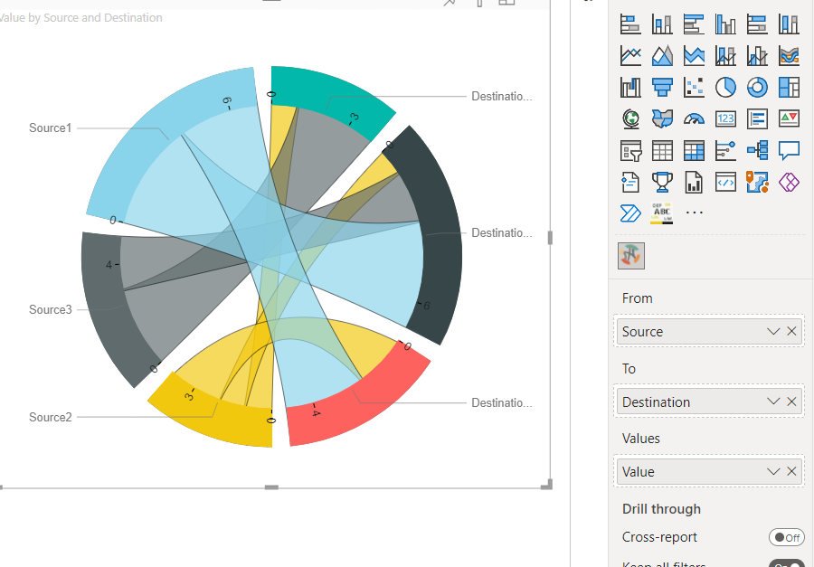
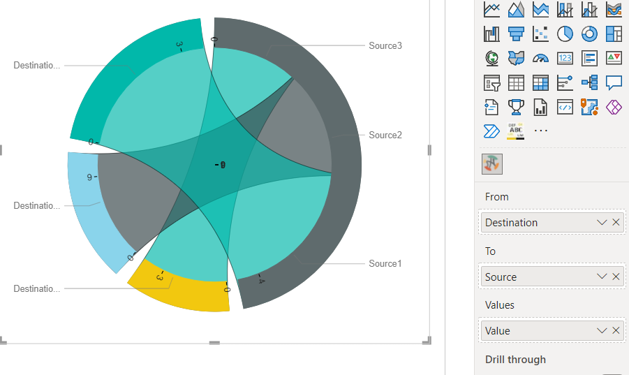
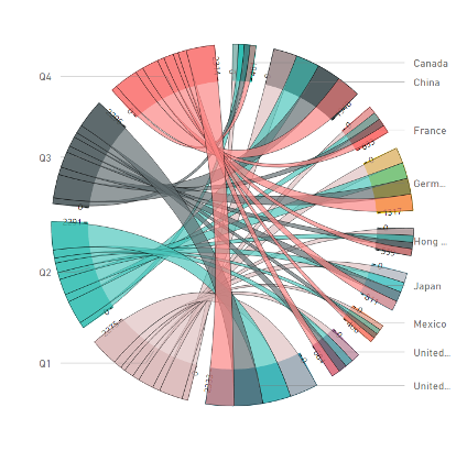
A chord diagram is a graphical method of displaying the inter-relationships between data in a matrix.

Chord diagramm screenshotCancel changes

Overview

This type of diagram visualizes the inter-relationships between entities. The connections between entities are used to display that they share something in common. This makes Chord Diagrams ideal for comparing the similarities within a dataset or between different groups of data.

Nodes are arranged around a circle, with the relationships between points connected to each other either through the use of arcs or Bézier curves. Values are assigned to each connection, which is represented proportionally by the size of each arc.

Customize data colors, axis, labels and more.

See also Chord chart at the Microsoft Office store

powerbi-visuals-chord's People

Contributors

avisander avatar eugeneelkin avatar ignatvilesov avatar kirillter avatar kkdroidgit avatar mvgaliev avatar pbicvbot avatar raananzvi avatar savvinsergey avatar snyk-bot avatar uve avatar vtkalek avatar zbritva avatar

Stargazers

 avatar  avatar  avatar  avatar  avatar  avatar  avatar  avatar  avatar  avatar  avatar  avatar  avatar  avatar  avatar  avatar  avatar  avatar  avatar  avatar  avatar  avatar  avatar  avatar  avatar  avatar  avatar  avatar

Watchers

 avatar  avatar  avatar  avatar  avatar  avatar  avatar  avatar  avatar  avatar  avatar  avatar  avatar  avatar

powerbi-visuals-chord's Issues

Data label tweaking

Hi,

Many thanks for this great visual! Is there anyway to enable data-label tweaking (font type/color/wrapping)? Currently the only customizable element is size.

Visual breaking

First time loading the visual :
image
getting expected output

but after switching to and from data the visual is displayed as:
image
which is not correct

again after switching back to the initial data the whole visual is breaking
image

Chord diagram max value

Thank you for this great app. I tested it on smaller Excel files and it looks beautiful.

However, I can see that it has a max value limit = 1000. My main Excel has 1200 rows (and three columns), and the graph is always incomplete.

Is it possible to increase the max value to 1200 rows? I would be grateful if you could let me know. Thank you!

Tooltip for second layer format

Good day to all, I'm posting this observation about the tooltip format:

As for the external data layer, when using currency values, the tooltip shows the amount correctly formated, i.e.: $1,123,456.99, but on the chord data, even using the same currency values, the amount shown in the tooltip appears as a non formatted number, i.e.: 1123456.99999999999

I'm posting 2 screen captures of this issue:
01_correct_format

02_non-formatted

Thank you for your work and your attention.

Tooltip customization

Hi,

Many thanks for the this great visual. Is there a way to enable tooltip option for the chord chart? I would like to create a page with additional information and use that page as a tooltip for the chord chart, similar to any other embedded visuals. Is that possible?

Recommend Projects

  • React photo React

    A declarative, efficient, and flexible JavaScript library for building user interfaces.

  • Vue.js photo Vue.js

    🖖 Vue.js is a progressive, incrementally-adoptable JavaScript framework for building UI on the web.

  • Typescript photo Typescript

    TypeScript is a superset of JavaScript that compiles to clean JavaScript output.

  • TensorFlow photo TensorFlow

    An Open Source Machine Learning Framework for Everyone

  • Django photo Django

    The Web framework for perfectionists with deadlines.

  • D3 photo D3

    Bring data to life with SVG, Canvas and HTML. 📊📈🎉

Recommend Topics

  • javascript

    JavaScript (JS) is a lightweight interpreted programming language with first-class functions.

  • web

    Some thing interesting about web. New door for the world.

  • server

    A server is a program made to process requests and deliver data to clients.

  • Machine learning

    Machine learning is a way of modeling and interpreting data that allows a piece of software to respond intelligently.

  • Game

    Some thing interesting about game, make everyone happy.

Recommend Org

  • Facebook photo Facebook

    We are working to build community through open source technology. NB: members must have two-factor auth.

  • Microsoft photo Microsoft

    Open source projects and samples from Microsoft.

  • Google photo Google

    Google ❤️ Open Source for everyone.

  • D3 photo D3

    Data-Driven Documents codes.