Statistische Analyse der täglichen Diagnoseschlüssel der offiziellen deutschen COVID-19 Tracing-App (Corona-Warn-App). Zur Auswertung werden die täglich vom Corona-Warn-App-Server verteilten Diagnoseschlüssel-Pakete mit dem diagnosis-keys-Toolset von mh- analysiert. Aufgrund der dezentralen Architektur der Corona-Warn-App können die analysierten Daten nur geschätzt werden. Daher sind alle Angaben ohne Gewähr. Die Diagramme in diesem Repository sind lizensiert unter CC BY-NC-SA. Mehr Informationen zur COVID-19 Tracing App für Deutschland unter coronawarn.app.
Hinweis: Seit Februar 2021 werden täglich in der App genaue Kennzahlen veröffentlicht, die diese Seite verwendet und seitdem die Schätzung überflüssig macht.
Vielen Dank für die initiative. Wäre es sinnvoll, als Basis für das Verhältnis zu den RKI-Zahlen die Zahl der Fälle nach Meldetatum zu nehmen ("Für die Darstellung der neuübermittelten Fälle pro Tag wird das Meldedatum verwendet – das Datum, an dem das lokale Gesundheitsamt Kenntnis über den Fall erlangt und ihn elektronisch erfasst hat."- aus dem RKI-Dashboard Disclaimer)? Das könnte besser passen, als die tägl. Differenz der Gesamtzahl der Infizierten, schleppt aber immer drei, vier Tage nach.
There seem to be a bug in the calculation of estimated number of positive tested people that share diagnosis keys. This number did rise by almost 30% on 24-09-2020 and 25-ß0-2020 while the number of keys transmitted via the CWA on those days stayed almost constant. I cannot imagine this is real. Can you check this?
Once a week, Telekom releases the total number of requested teleTANs. In the same weekly cadence, we could calculate:
Estimated number of uploading users without teleTAN = people uploading that week - issued teleTANs
Of course not every teleTAN must be used for upload so the actual number of people uploading without teleTAN can be higher.
With this weekly statistic we could better follow the usage of the QR code test retrieval process within CWA.
Wie berechnest / schätzt du eigentlich inzwischen die Anzahl der User, die DEK keys hochladen? Oder ist das eine Kennzahl, die das RKI inzwischen veröffentlicht?
Seit cws v 1.9 (?) / den neuen TRL Zuweisungen, wo 'days since symptoms' mit eingerechnet werden stimmt ja der 'naive' Ansatz mit dem TRL=6 nicht mehr?
Die am 23.06 veröffentlichten Daten enthalten Schlüssel, die via App in der Zeit vom 16.06 bis 23.06 gemeldet wurden.
Deshalb muss man für die % Zahl auch die Summe der vom RKI gemeldeten Infektionen in Relation setzen (4023).
RKI: 345+580+770+601+687+537+503 statt 503
Nach meinen Berechnungen ergeben sich aber auch 44 Personen.
Hier meine Tabelle https://github.com/Tho-Mat/corona-stuff/blob/master/%C3%BCberblick.xlsx
User:
16-23.06 44      <<< im Laufe des 23.06 wurde der Faktor von 1 auf 10 geändert.
   24.06 11 (incl. 2 Meldungen vom 23.06)
   25.06 19
   26.06 20
   27.06 15 (incl. 1 Meldung vom 26.06)
   28.06 8
   29.06 15 (incl. 1 Meldung vom 28.06)
   30.06 26 (incl. 1 Meldung vom 29.06)
   01.07 18 (incl. 1 Meldung vom 30.06)
   02.07 33 (incl. 1 Meldung vom 01.07)  oder 38 incl. 2 Meldungen vom 01.07 <<< hier wurde der Faktor von 10 auf 5 geändert
   03.07 16
   04.07 11
   05.07 3
   06.07 10
Da nicht immer 140 Schlüssel für die "hour" Dateien zusammenkommen werden 1 bis 2 Meldungen manchmal erst am nächsten Tag veröffentlicht.
The diagnosis key statistics should be based on the hourly packages to obtain a higher precision and to minimize problems connected with a padding multiplier change. To achieve this goal a rewrite of the scrapers and parsing scripts is necessary.
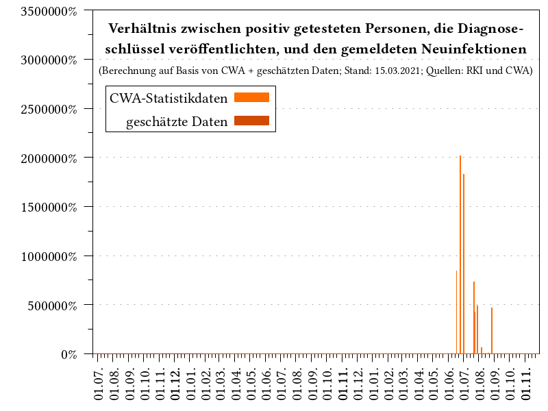
There's a comma missing in one of the graphs' titles. It should spell "Verhältnis zwischen positiv getesteten Personen, die Diagnoseschlüssel teilen, und den gemeldeten Neuinfektionen".
Each user can at max upload 13 keys. It seems that recently there has been a strong divergence in the number of users uploading keys vs. actual number keys uploaded:
22.08: 86 people vs 639 keys: 7.4 keys/person
20.08: 91 people vs 948 keys: 10.4 keys/person
My guess would be that maybe some ppl who got tested and wanted to receive their result via app only installed it once they got tested and therefore only very few keys will be submitted.
This information might also be interesting in context of the discussion on how to improve CWA efficiency/uptake in the wishlist repo: corona-warn-app/cwa-wishlist#150.
That's why I thought it would be nice to have a graph visualizing the keys/person development 🙂.
The plots in "Verteilung Transmission Risk Level (TRL) in Diagnoseschlüsseln" currently use the number of keys transmitted including the padded fake keys afaiu. As long as the padding factor stays the same this shouldn't be a problem. But this factor will change from tomorrow on (the plan is to bring it down to 1 eventually). The changes in the padding multiplier will cause some distortion in those graphs as new data will receive less weight.
Great dashboard, love it! Although I think it'd be good to highlight one or two really important graphs at the top, and leave the more detailed, less important ones at the bottom. (I think the number of reports per day and the proportion of case reported through app are the most important one - and should be at the top - but that's a separate issue)
I like that you compare app reports with case reports from JHU and RKI. It looks like JHU is better (not surprisingly) but there seems to be a 1 day shift between JHU and app. You call it a correlation, but you're not really doing that (plotting the cases from app and JHU on a scatter plot against each other).
This lends itself perfectly for a proper time series analysis (probably not something you come across as a chemist a lot, but econometricians do that all the time). Could you provide the raw data for your plot so that I can run a time series analysis? I think it'd be great if we could have a stable comparison, the lag of one day makes it look less stable than it could be, but it's best to do this properly and then adjust the plot.
It seems the plots for the number of CWA downloads is updated on master, but not on the github.io page.
On master the plot_cwa_downloads.png contains the data for today (29.06.20) but it is missing from the io page.
I have a question on your diagram of daily reported keys to corona warning app (plot_keys).
Your very first number on 23.June is 477 keys, but I received 503 keys on 24.June. All your other numbers match exactly with what I received.
Do you have an idea how to explain this difference on the first day? Could these be keys from the first week?
Derzeit werden die veroeffentlichten Diagnoseschluessel aller CWA Benutzer im direkten Verhältnis zu den gemeldeten Neuinfektionen aller Einwohner dargestellt.
Gesucht ist der Anteil derer ist, die nicht ihre positiven Testergebnisse als Warnung freischalten und zwar nicht im Bezug auf die Gesamtbevoelkerung sondern auf das was im Idealfall maximal moeglich ist.
Q = Einwohnerzahl/Appbenutzerzahl (Grössenverhältnis)
Die im Idealfall erreichbare Anzahl an gemeldeten Diagnoseschluesseln (Positivtests) =: X
Gemeldete Neuinfektionen =: N
Tatsächlich gemeldete Diagnoseschluessel =: Y
X = N / Q
"CWA Performance" in % = 100 / (X / Y)
Dies nur als Vorschlag. Gut moeglich dass sich hier noch Rechen oder Denkfehler verstecken!
sehe auf Deinen tollen Dashboards (vielen Dank!) seit letzter Woche einen größeren Anstieg insbesondere bei Personen die Diagnose Schlüssel teilen. Seit letzter Woche werden für die CWA ja auch Keys anderer europäischer Länder (bislang imho noch nicht viele) veröffentlicht. Deine Zahlen beziehen sich aber auf Deutschland. Falls möglich und noch nicht geschehen, solltest Du für Deine Statistiken nur die Deutschen Keys übernehmen.
I think the two graphs in "Verteilung Transmission Risk Level (TRL) in Diagnoseschlüsseln" are redundant, since they are only scaled with respect to each other.
Wouldn't it be simpler to just include the relative ratios next to the absolute numbers in the first graph (i.e. "4649 (30.2 %)" instead of just "4649"?
We're currently (05.08.) in Week 32, but last bars in the weekly diagrams - which seem to depict aggregate data for the current week - are denoted with "KW 31", shouldn't this be "KW 32" ?
Additionally: I'd actually suggest only displaying weekly bar diagrams for weeks which have concluded. Imho this makes the endpoints in those weekly graphs less confusing in general.
Currently, the x-axis of the "Summe ausgegebener TeleTANs" graph is updated daily, even if there is no new data for a day. This makes it easy to see how recent the latest data point is.
The same should be done for the Downloads graph, i.e. expand the x-axis daily, even though new data points might only be entered once a week.
The corona warn app risk level calculation is parameterized by the RKI, the app downloads this parameters regularly. They are 5 or 6 parameters that define what signal strength and duration of exposures is considered a risk. All are transmitted using protobufs. I would be nice if this parametrization could be plotted as well and be able to see how this correlates with uploaded diagnosis keys over time.
I was planning to do this myself, but did not get to it up to now. Maybe you are interested in doing it.


