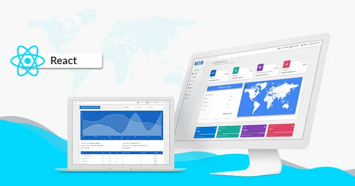
Bootstrap 4 & React 16 UI KIT - 700+ components, MIT license, simple installation.
MDB is a collection of free Bootstrap templates, themes, design tools & resources.
Newer version is available for Bootstrap 5. We recommend migrating to the latest version of our product
Simple installation via .zip, npm or cdnjs.
Free Hosting, WordPress support, custom domains, SSL support, free database, frontend & backend templates, webpack starter included, git repostiory, FTP & jenkins support.
One click setup! MDB GO allows you to create a WordPress page with a single click. Regardless whether you want to create a Travel Blog or an e-commerce shop to sell your product you can easily do that. You can even combine both into single page.
Created by 


Trusted by 2 000 000+ developers & designers. Used by companies & institutions like
 |
 |
 |
 |
| 
| 
| 
| 
| 
| 
| 
| 
|
|
|
>> Learn more about Bootstrap 5
>> Subscribe to our YouTube channel with dozens of Bootstrap tutorials
|

|
|
Start learning from Basics 
|
Learn Bootstrap 5 | Crash Course for Beginners in 1.5H
|
Simplicity and ease of use are key features of MDB 4 React UI Kit. You need only one minute to install and run it.
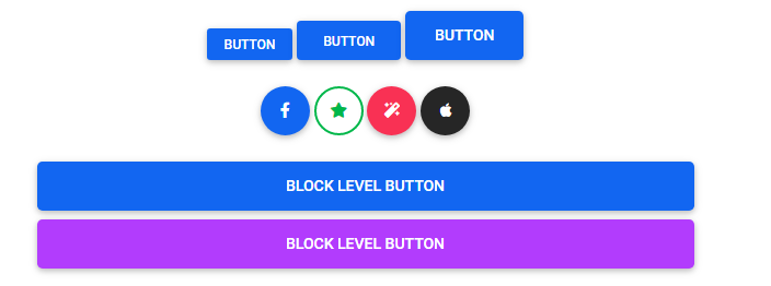
Use MDB custom button styles for actions in forms, dialogs, and more with support for multiple sizes, states, and more.


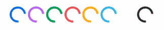
Indicate the loading state of a component or page with MDB spinners, built entirely with HTML, CSS, and no JavaScript.

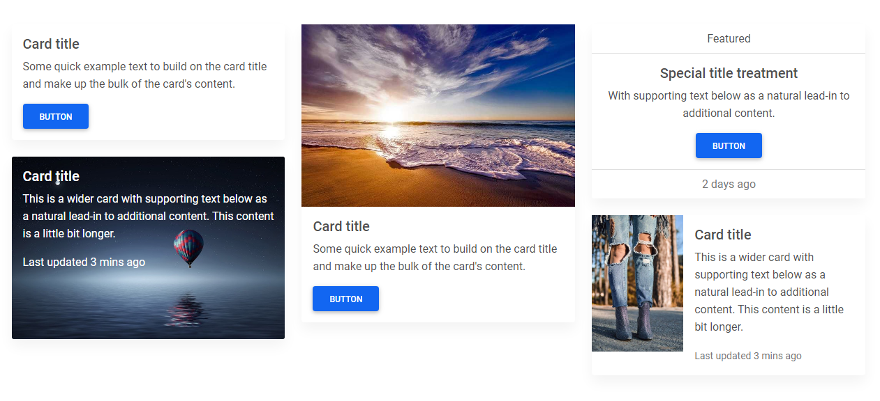
A card is a flexible and extensible content container. It includes options for headers and footers, a wide variety of content, contextual background colors, and powerful display options.
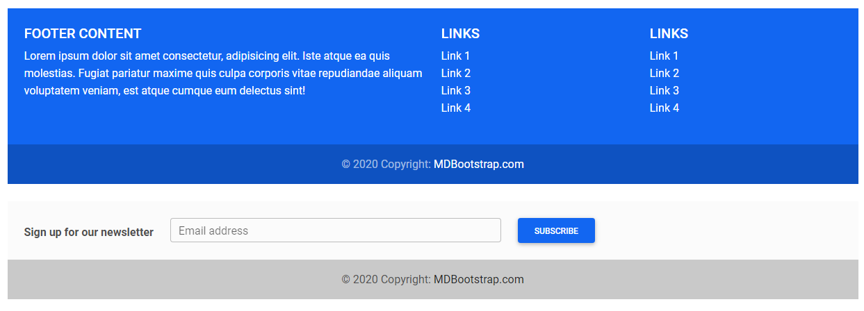
A footer is an additional navigation component. It can hold links, buttons, company info, copyrights, forms, and many other elements.
MDB hover effect appears when the user positions the computer cursor over an element without activating it. Hover effects make a website more interactive.
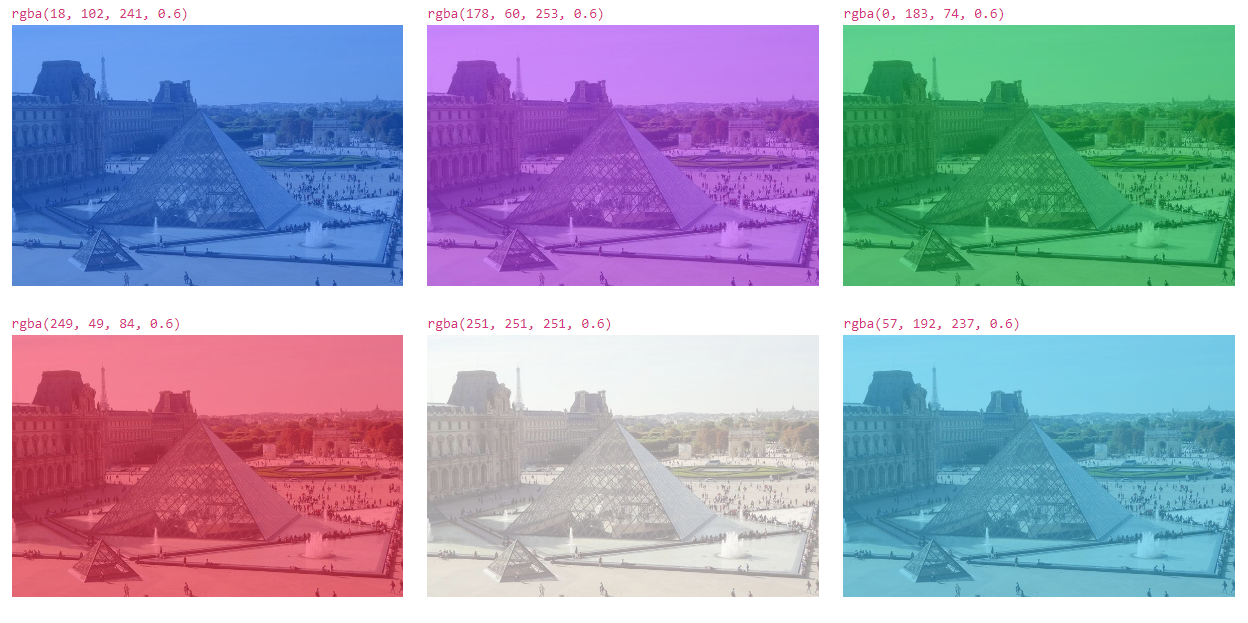
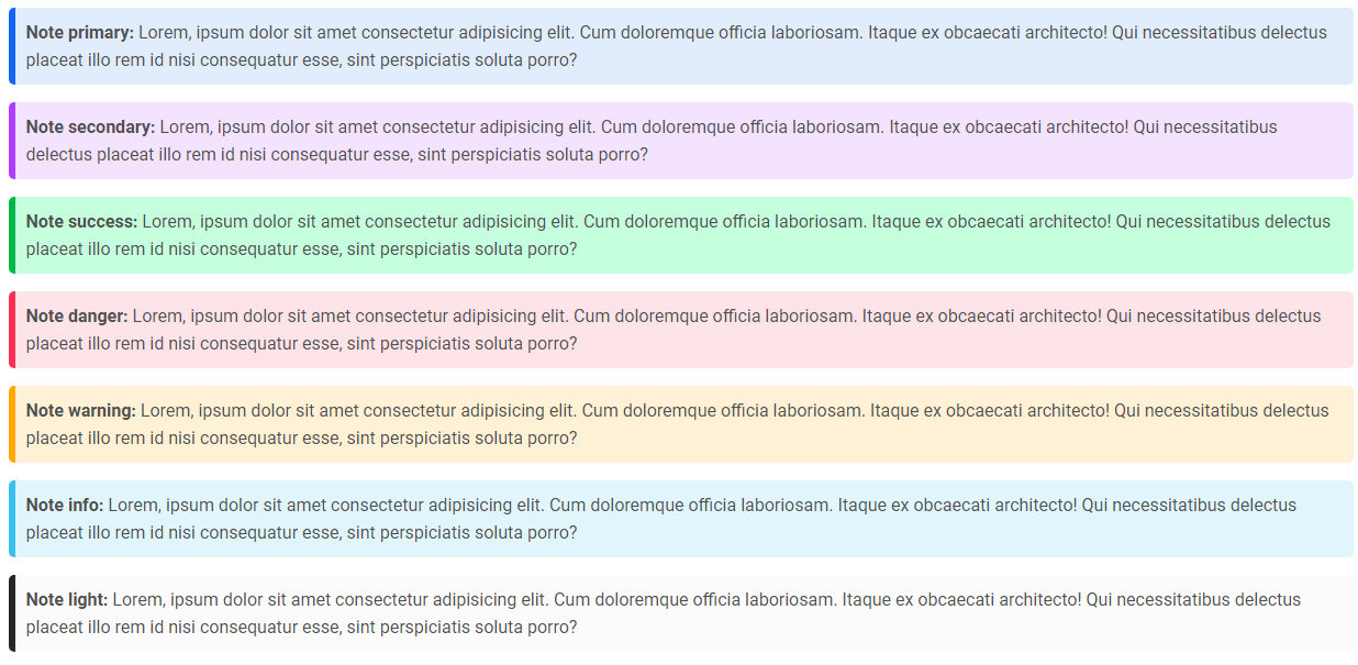
Notes are small components very helpful in inserting an additional piece of information.
- Bootstrap Address Form
- Bootstrap Avatar
- Bootstrap Back To Top Button
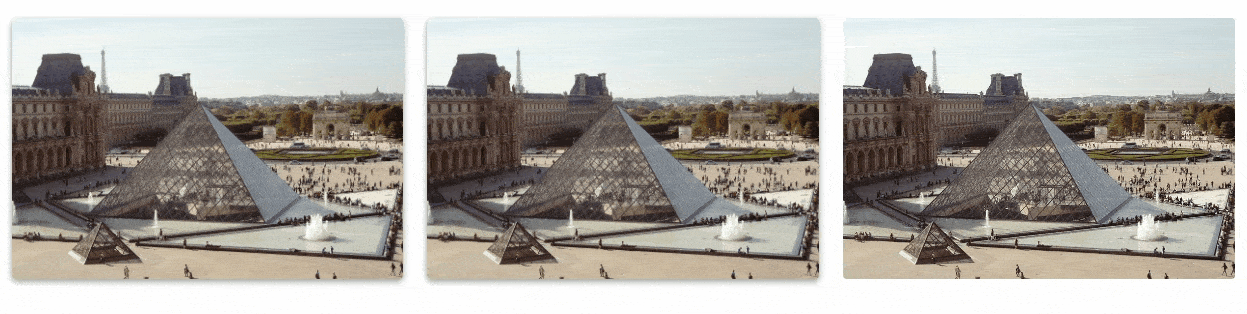
- Bootstrap Carousel Slider with Thumbnails
- Bootstrap Chat
- Bootstrap Code Blocks
- Bootstrap Comments
- Bootstrap Comparison Table
- Bootstrap Credit Card Form
- Bootstrap Drawer
- Bootstrap Nested Dropdown
- Bootstrap FAQ component / section
- Bootstrap Gallery
- Bootstrap Hamburger Menu
- Bootstrap Invoice
- Bootstrap Jumbotron
- Bootstrap Login Form
- Bootstrap Maps
- Bootstrap Media Object
- Bootstrap Mega Menu
- Bootstrap Multiselect
- Bootstrap News Feed
- Bootstrap Offcanvas
- Bootstrap Order Details
- Bootstrap Page Transitions
- Bootstrap Payment Forms
- Bootstrap Product Cards
- Bootstrap Profiles
- Bootstrap Quotes
- Bootstrap Registration Form
- Bootstrap Expanding Search Bar
- Bootstrap Shopping Carts
- Bootstrap Side Navbar
- Bootstrap Sidebar
- Bootstrap Social Media Icons & Buttons
- Bootstrap Square Buttons
- Bootstrap Survey Form
- Bootstrap Testimonial Slider
- Bootstrap Testimonials
- Bootstrap Textarea
- Bootstrap Timeline
- Bootstrap To Do List
- Bootstrap Video Carousel / Gallery
- Bootstrap Weather


 React
React
 Typescript
 Django
 Laravel
 Facebook
 Microsoft
 Google
 Alibaba
 D3
D3
 Tencent