


A new Material Design text field that comes in a box, based on Google Material Design guidelines. 中文看这里
- Android 4.0.3 IceCreamSandwich (API lv 15) or greater
- Your favorite IDE
In order to use it, you need to include it in your project.
allprojects {
    repositories {
      ...
      maven { url 'https://jitpack.io' }
    }
}
dependencies {
compile 'com.github.HITGIF:TextFieldBoxes:1.1.0'
}<repositories>
<repository>
<id>jitpack.io</id>
<url>https://jitpack.io</url>
</repository>
</repositories><dependency>
<groupId>com.github.HITGIF</groupId>
<artifactId>TextFieldBoxes</artifactId>
<version>1.1.0</version>
</dependency>resolvers += "jitpack" at "https://jitpack.io"libraryDependencies += "com.github.HITGIF" % "TextFieldBoxes" % "1.1.0":repositories [["jitpack" "https://jitpack.io"]]:dependencies [[com.github.hitgif/textfieldboxes "1.1.0"]]
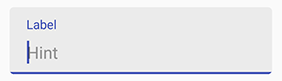
Add studio.carbonylgroup.textfieldboxes.TextFieldBoxes to your layout:
...
<studio.carbonylgroup.textfieldboxes.TextFieldBoxes
    android:id="@+id/text_field_boxes"
    android:layout_width="match_parent"
    android:layout_height="wrap_content"
    android:hint="Hint" />
...
app:enabled in xml or setEnabled(boolean _enabled) in Java.
app:enabled="false"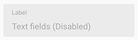
Use app:singleLine in xml or setSingleLine(boolean _singleLine) in Java to set whether the EditText is single-lined, that scrolls horizontally.
app:singleLine="true"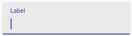
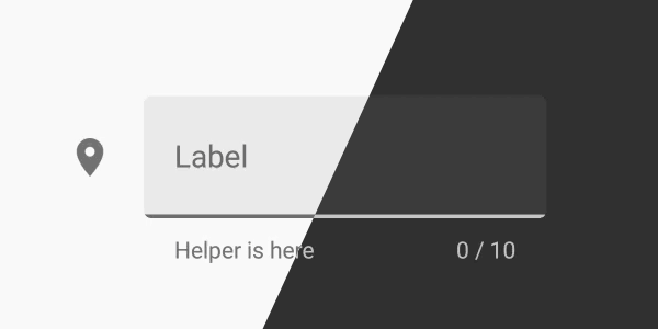
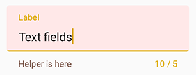
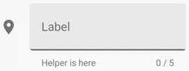
helper text: app:helperText in xml or setHelperText(String _helperText) in Java.
app:helperText="Helper is here"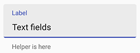
error text: setError(String _errorText) in Java.
NOTE: Error will be removed when the text changes (input or delete).
setError("Error message");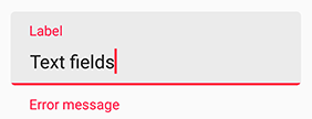
Use app:prefix in xml or setPrefix(String _prefix) to set the unselectable prefix text at the start of the EditText.
Use app:suffix in xml or setSuffix(String _suffix) to set the unselectable suffix text at the end of the EditText.
app:prefix="$ "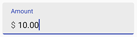
app:suffix="\@gmail.com"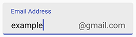
Use app:maxLines in xml or setMaxLines(Int _maxlines) to set the number of maximum lines allowed in the text field. Integer.MAX_VALUE by default.
app:maxLines="3"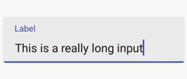
Use app:maxCharacters in xml or setMaxCharacters(int _maxCharacters) in java code to set the max characters count.
Use app:minCharacters in xml or setMinCharacters(int _minCharacters) in java code to set the min characters count.
The color of the bottom line will turn to errorColor (red by default) when exceeding max or min characters limit. 0, as default, means no max or min characters.
NOTE: Space and line feed will NOT count.
app:maxCharacters="10"
app:minCharacters="5"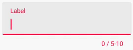
app:maxCharacters="5"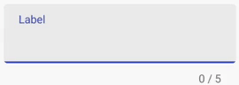
Use app:iconSignifier in xml or setIconSignifier(Int resourceID) to set the icon that is shown in front of the TextFieldBoxes.
app:iconSignifier="@drawable/ic_vpn_key_black_24dp"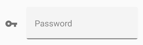

Primary Color will be used for the color of the underline and the hint text. You can use app:primaryColor in xml or setPrimaryColor(int _colorRes) in Java. Current theme Primary Color by default.
Error Color will be used for the color that indicates error (e.g. exceeding max characters, setError()). You can use app:errorColor in xml or setErrorColor(int _colorRes) in Java. A400 red by default.
Helper Text Color will be used for the color of the helper text. You can use app:helperTextColor in xml or setHelperTextColor(int _colorRes) in Java. 54% black by default.
Panel Background Color will be used for the color of panel at the back. You can use app:panelBackgroundColor in xml or setPanelBackgroundColor(int _colorRes) in Java. 6% black by default. NOTE that the default color, as in the guideline, is the black (#000000) color with the transparency of 6%, so when you're customizing and want it to still be transparent you have to set a color with transparency.
app:primaryColor="#1B5E20"          <!--Green-->
app:errorColor="#ddaa00"            <!--Yellow-->
app:helperTextColor="#795548"       <!--Brown-->
app:panelBackgroundColor="#ffe8e8"  <!--Pink-->
If you want to customize the EditText in the TextFieldBoxes (which is a inherited FrameLayout that contains a EditText for input), use the getEditText() methond in Java and do whatever you like (e.g. setOnKeyListener(), addTextChangedListener())
final TextFieldBoxes textFieldBoxes = findViewById(R.id.text_field_boxes);
textFieldBoxes.getEditText().addTextChangedListener(new TextWatcher() {
    @Override
    public void beforeTextChanged(CharSequence charSequence, int i, int i1, int i2) {

    }

    @Override
    public void onTextChanged(CharSequence charSequence, int i, int i1, int i2) {

    }

    @Override
    public void afterTextChanged(Editable editable) {
    if (editable.toString().equals("wrong"))
        textFieldBoxes.setError("It's wrong");
    }
});
TextFieldBoxes use the color attributes within the current theme and will automatically change its color to fit the dark theme without additional settings.

| Attribute | Description |
|---|---|
app:text |
EditText text |
app:hint |
Hint text at the top |
app:helperText |
Helper text at the bottom |
app:prefix |
Prefix Text |
app:suffix |
Suffix Text |
| Attribute | Description | Default |
|---|---|---|
app:helperTextColor |
Helper text color | Current theme textColorTertiary |
app:errorColor |
The color that is used to indicate error (e.g. exceeding max characters, setError()) |
A400 red |
app:primaryColor |
The color for the underline and the hint text | Current theme colorPrimary |
app:prefixTextColor |
Prefix text color | Current theme textColorTertiary |
app:suffixTextColor |
Suffix text color | Current theme textColorTertiary |
app:panelBackgroundColor |
The color for the panel at the back | 6% colorForeground |
| Attribute | Description | Default |
|---|---|---|
app:maxCharacters |
Max characters count limit. 0 means no limit |
0 |
app:minCharacters |
Min characters count limit. 0 means no limit |
0 |
| Attribute | Description | Default |
|---|---|---|
app:enabled |
Whether the text field is enabled | True |
app:singleLine |
Whether the EditText is single-lined | False |
app:maxLines |
The number of maximum lines allowed in the text field | Integer.MAX_VALUE |
app:iconSignifier |
The resource ID of the icon before the TextFieldBoxes | 0 |
app:hasFocus |
Whether the EditText is having the focus | False |
- Prefix & Suffix
- Icon signifier
- Dark theme
Copyright 2017 Carbonylgroup Studio

Licensed under the Apache License, Version 2.0 (the "License");
you may not use this file except in compliance with the License.
You may obtain a copy of the License at

    http://www.apache.org/licenses/LICENSE-2.0

Unless required by applicable law or agreed to in writing, software
distributed under the License is distributed on an "AS IS" BASIS,
WITHOUT WARRANTIES OR CONDITIONS OF ANY KIND, either express or implied.
See the License for the specific language governing permissions and
limitations under the License.

 React
React
 Typescript
 Django
 Laravel
 Facebook
 Microsoft
 Google
 Alibaba
 D3
D3
 Tencent