“Human knowledge is never contained in one person. It grows from the relationships we create between each other and the world, and still it is never complete.” ― Paul Kalanithi
In this lesson, we'll look at Auto Layout and constraints
- Describe how Auto Layout allows for flexible UI design
- Use constraints to align objects in iOS user interfaces
- Add constraints to user interface elements
- Examine the constraints that have been added to storyboards
- Look up constraints' attributes in Interface Builder
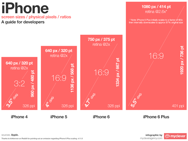
Frames and bounds are very important bits of knowledge to know and understand, but don't forget the motivation for learning about them. The real issue is that your iOS programs have to be designed to run on screens of different dimensions, including the 4-inch screen of the iPhone SE; the 4.7-inch screen of the iPhone 6, 6S, and 7; and the 5.5-inch screen of the iPhone 6+, 6S+, and 7+. You might even want your app to run on an iPad, which obviously has a much larger screen than the iPhones. These screens differ not only in physical size, but also in the number of pixels they can display; the iPhone 7+ is 1920×1080, whereas the iPhone 7 is 1334x750. Your app may also run in landscape mode, which reverses the pixel dimensions—the viewable area of an app in landscape mode is much wider but a bit shorter than an app running in portrait mode. Here's a helpful infographic that shows the plethora of screen sizes available on Apple devices:
These various screen sizes and modes can make it difficult to design and lay out an app's user interface so it looks good across all devices. Luckily, Apple has a response to this problem: Auto Layout. Auto Layout lets you design your UI so the user interface elements are laid out relative to each other and the screen. This means that instead of saying, "The top-left corner of this button should appear at exactly 200 pixels to the left and 200 pixels from the top of the screen," you can say, "This button should appear 20 pixels to the right and 20 pixels below this other image view," and it will look correct across all devices. Or you can say, "This label should appear exactly in the middle of the screen," and it will appear in the middle for all devices.
Let's take a look at how Auto Layout works in Xcode and Interface Builder.
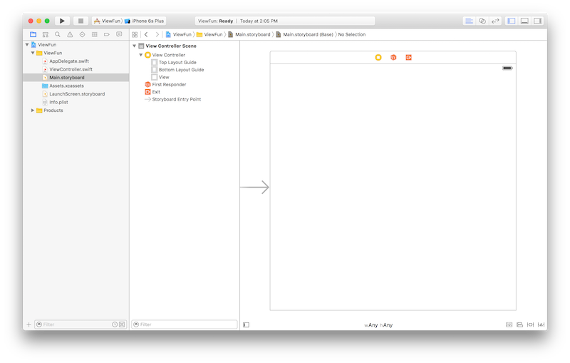
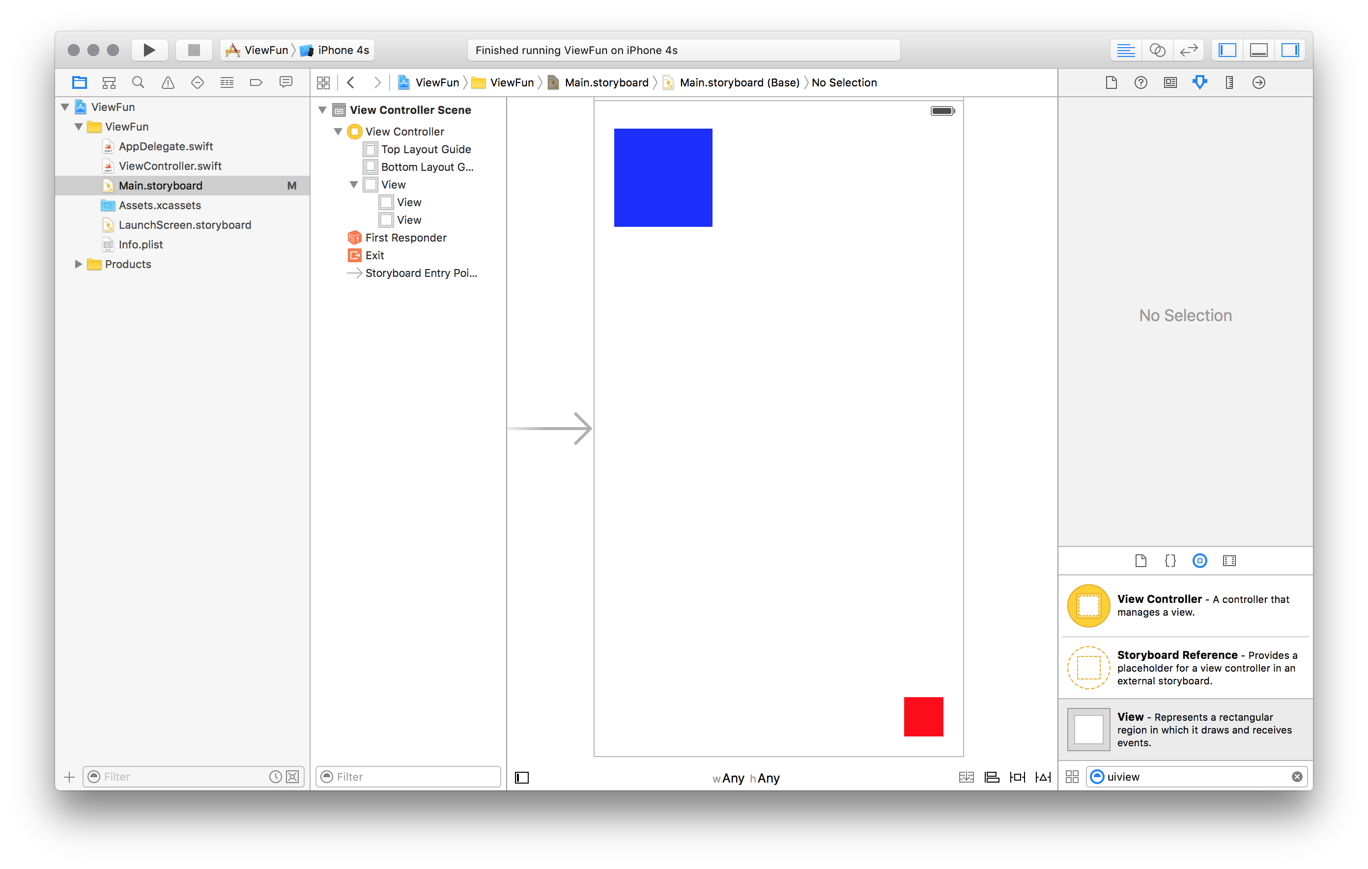
Open up the ViewFun.xcodeproj project in this repo in Xcode. Click on Main.storyboard to bring it up in Interface Builder. You'll see something like this:
The thought of designing your app for so many differing device sizes may seem daunting. Interface Builder provides an escape valve, though. You can set storyboards to display for a specific device, if you want to be able to initially lay out elements more comfortably. With Main.storyboard open, you can click on the View as: option at the bottom of the storyboard, which allows you to simulate the size of various devices in Interface Builder.
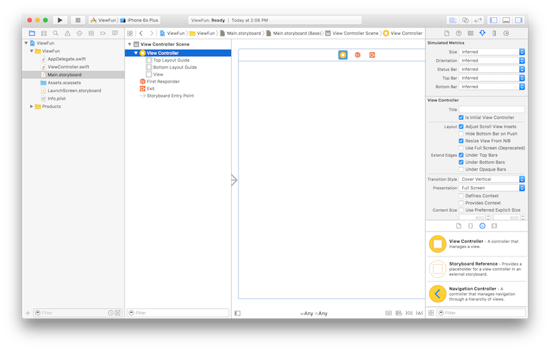
Remember to try out different sizes to see how your layout will appear on different devices!
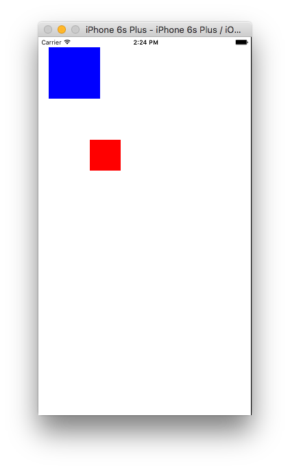
To demonstrate the problems that Auto Layout solves, let's first dispense with Interface Builder entirely, and instead draw a simple UI in code. This UI will simply draw a blue square in the top left corner of the screen, and a smaller red square in the bottom right corner.
Start a new Xcode project using the Single View Application template. This will give you a completely blank app. Add this bit of code to ViewController's viewDidLoad() method (in ViewController.swift):
let blueView = UIView(frame: CGRect(x: 20.0, y: 20.0, width: 100.0, height: 100.0))
blueView.backgroundColor = UIColor.blue
view.addSubview(blueView)

let redView = UIView(frame: CGRect(x: 150.0, y: 150.0, width: 40.0, height: 40.0))
redView.backgroundColor = UIColor.red
view.addSubview(redView)
If you build and run this app in the iPhone 6S Plus simulator (the default simulator), you'll see something like this:
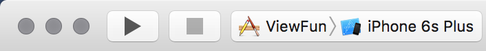
Not exactly what you want, but good enough as an example. Now, try running it in the iPhone 4S Simulator. You can do that by clicking on the menu that says iPhone 6S Plus in Xcode's toolbar:
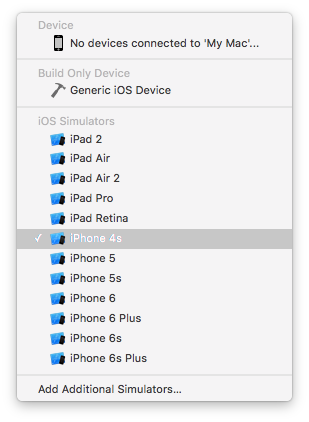
Doing so brings up a menu where you can select the iPhone 4S simulator:
When you run your app in the iPhone 4S simulator, you'll see something like this:
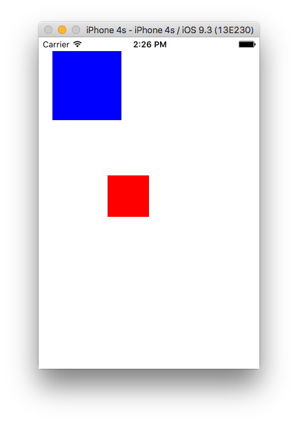
That looks a lot like what you saw in the iPhone 6 Plus...but not exactly the same. It needs a bit of tweaking to look identical.
Unfortunately, you've probably realized by now that you'd have to do a lot of tweaking to make this UI look the same (or nearly the same) across all iOS devices. That's pretty time consuming, and it's no way to build a UI in this day and age!
Let's use Interface Builder and Auto Layout instead. Delete the code you added to viewDidLoad() and open up Main.storyboard in Interface Builder.
iOS's Auto Layout system allows you to lay out user interface in reference to each other and the app's main screen. It also allows you to specify the dimensions (height and width) of various user interface elements relative to the screen size, instead of having a hardcoded size (although you can still have a hardcoded size if you want, too). It does this partly through the use of constraints, which specify dimensions and layout based on sizes and distances to other elements. Let's take a look at this in action.
You want to add a blue square to the top left corner and a red square to the bottom right corner of your app's screen. Remember when you learned about frames and parent frames in the previous lesson? Obviously you can't add square to hardcoded coordinates, since the squares' parent frame (the iOS screen) will be different according to the device you're running the app on. Instead, you can lay them out relative to the specific parent frame being used by the iOS app on the current device.
In Interface Builder, drag a new UIView onto the storyboard. Position it in the top left corner of your storyboard. In the view's Size Inspector, set its size to 100×100. In its Attributes Inspector, set its background color to blue.
Drag another UIView to the bottom right corner of your storyboard. In the view's Size Inspector, set its size to 40×40. In its Attributes Inspector, set its background color to red.
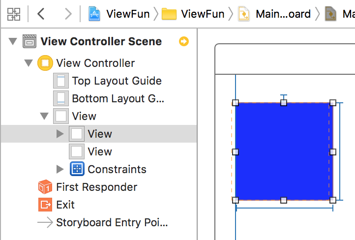
When you're done, your storyboard should look like this:
At this point, you are not yet using Auto Layout at all. Run your app on different simulators. You'll see a different UI in each simulator. For example, on the iPhone 6S Plus, the red square probably won't be anchored to the bottom right corner. In the iPhone 4S, you might not even see the red square at all.
Let's add constraints to this app.
First, select the blue square. To add constraints, click on the Pin button on the bottom of Interface Builder. It looks like this:
Click once on that icon to bring up the Pin menu. This aspect of Auto Layout lets you set constraints that pin your UI element (in this case, a UIView) to other elements (in this case, the main view of the app). You want this square to always appear in the top left corner on every device, so click the dotted red lines on the top and left side of the white square in the Pin menu. You should also check the Width and Height menus. When you're done, the Pin menu will look like this:
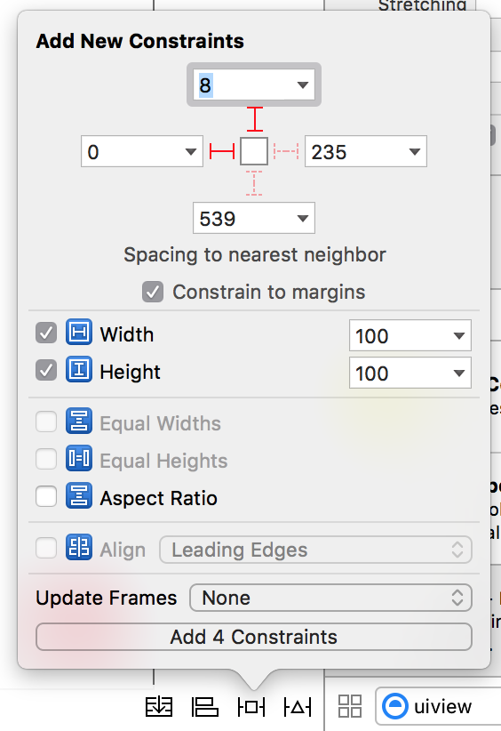
Click Add 4 Constraints to add these constraints. You can see a Constraints item has been added to the object library. You'll also see some subtle blue lines around the blue square indicating what constraints are being applied to that view.
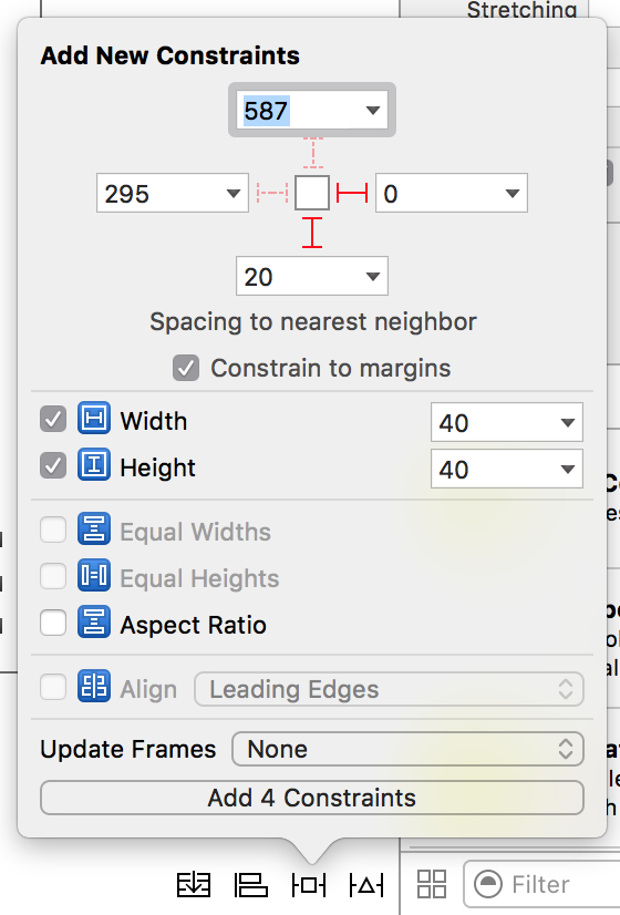
Now select the red square. Do the same thing you did the blue square to add constraints, except this time, select the dotted line of the bottom and right, like this:
You can check out the constraints you have created in the object library:

Select the constraint marked height = 100. The Attributes Inspector will show the attributes for the constraints:

In the Attributes Inspector, you can adjust parameters for the constraint if you want. For example, in the Constant text field, you could change the width of the view (the blue square) to something else, like 200. You don't want to change any attributes right now, so for now you can ignore this pane, but you may find it to be useful in the future.
You've probably noticed the yellow warning icon in Xcode's toolbar. Click once on it. It'll display two warnings, both of which are Frame for "View" will be different at run time. These warnings mean that the app (and more specifically, some of its views) will look a bit different when you run the app then they do now. Because of the constraints you set up, the view's frames look a bit different in the storyboard than they will when you run the app. But you can fix this!
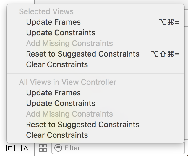
Immediately to the right the Pin menu, you should see a menu called Resolve Auto Layout Issues. Clicking it will bring up a menu that will let you quickly and easily fix Auto Layout issues. Select Update Frames from the All Views in View Controller section to resolve the warnings. Boom, warnings gone.
Now build and run your app on various simulators. You should see that your views appear in the proper corners on every device. That's the power of Auto Layout and constraints!
View Auto Layout IBS Reading on Learn.co and start learning to code for free.


 React
React
 Typescript
 Django
 Laravel
 Facebook
 Microsoft
 Google
 Alibaba
 D3
D3
 Tencent