If the goal of your presentation is to convince an employer of your credibility, you do not want anything distracting from your work. Design aspects can be distracting, particularly:
- inconsistencies in style
- heavy text and clutter
- messy visualizations
You will be able to:
- identify what slide components count as "style"
- describe the impact of a slide template
- declutter slides by removing excessive text and redundant visualizations
- define the characteristics of a "complete" visualization
One goal of your presentation is to convey a professional presentation style. A professional presentation style demonstrates that you pay attention to details and are aware of how the design of your slides will impact the viewer as much as the content. Fonts (including font size and consistency), colors, and visuals (including both photos and visualizations you build) all contribute to the design and style of your presentation. These choices can either enhance or distract from your material.
The slide below has a few examples of inconsistent style:
Beyond any problems in content, this example slide showcases a few inconsistent style problems:
- Multiple fonts
- Confusing use of colors
- Fluctuating font size
- Distracting background (makes text harder to read)
A simple solution is to use a slide template. There are great websites such as SlideCarnival, that provide professional-quality templates made by designers that integrate easily into Google Slides or other presentation tools. A good template keeps the font choices, font sizes, and color schemes consistent. Since few data scientists also have a degree in design, using the right template saves your presentation from looking unprofessional.
Quickly, in five seconds or less, review the following two slides:
Time's up! What was the main point of each slide? What was your initial response to those slides?
Not everything needs to be in the slides themselves. Slides are not expected to stand alone. Slides are a supplement to you presenting your work. You are the star, not your presentation materials.
Remember, the rule is one key point per slide. Additional information that you plan on sharing verbally, or wish to have available for later readers, should go in the slide notes which can be saved and shared in PDF versions of your presentations.
Which visualization in Slide B is most important? What is the key point this slide is trying to make? A good rule to follow is one visualization per slide, and the visualization should take up at least 60% of the slide's real estate.
Whitespace that is not filled with text or images is just as important as the information being conveyed. An overcrowded slide is unappealing to the eye and off-putting to viewers.
Review the updated slides below and compare them to their original versions:
As you can see, having less on the slide is more appealing to review. When in doubt about having extra information on a slide, put it in the notes and include it in your delivery.
Visualizations for presentations work a little differently than visualizations you create for your own use, and should be held to pretty high standards. If you're using a visualization you create in a presentation, it should work to make a key point and should be stylized not only to match your presentation template but also to stand on its own.
David McCandless, from the website Information is Beautiful, wrote in his 2014 book Knowledge is Beautiful that a quality visualization contains four elements: information, function, visual form, and story.

More specifically, visualizations built for presentations should:
- Be Purposeful. The visualization must be relevant to the analysis and fit into the narrative of the presentation. The most important part of the visualization should be highlighted. Is this one group different from the others? Where does this model not perform well?
- Be Appropriately Labeled. Each visualization should have a title, a legend, and labeled axes.
- Have Readable Numbers. Dollars should have a $ in front of them. Percents should be formated as 50% rather than 0.5. Scientific notation has no business on 99% of data visualizations, especially in presentations.
- Have Readable Text. Text should be large enough to read and not overlap with other text. All text should be meaningful and immediately understandable by your audence, so the axis label should read "House Sale Price" rather than "salesprice" - no variable names with CamelCase or underscores!
- Be Saved to File. Using a screenshot can produce fuzzy and grainy resolution if the image needs to scaled. Instead, use
savefigor whichever appropriate command to save your images directly from your notebook.
For further reading on what makes a great data visualization, David McCandless also provides a great recommended reading list of data visualization books.
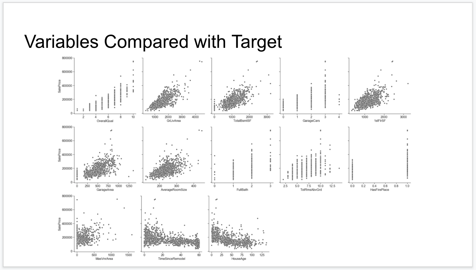
In this sample visualization, there are 4 aspects that, if fixed, would enhance the credibility of this presentation. Take a moment to see if you can identify what is missing:
As you can see in the numbered picture below, the visualizations has the following issues:
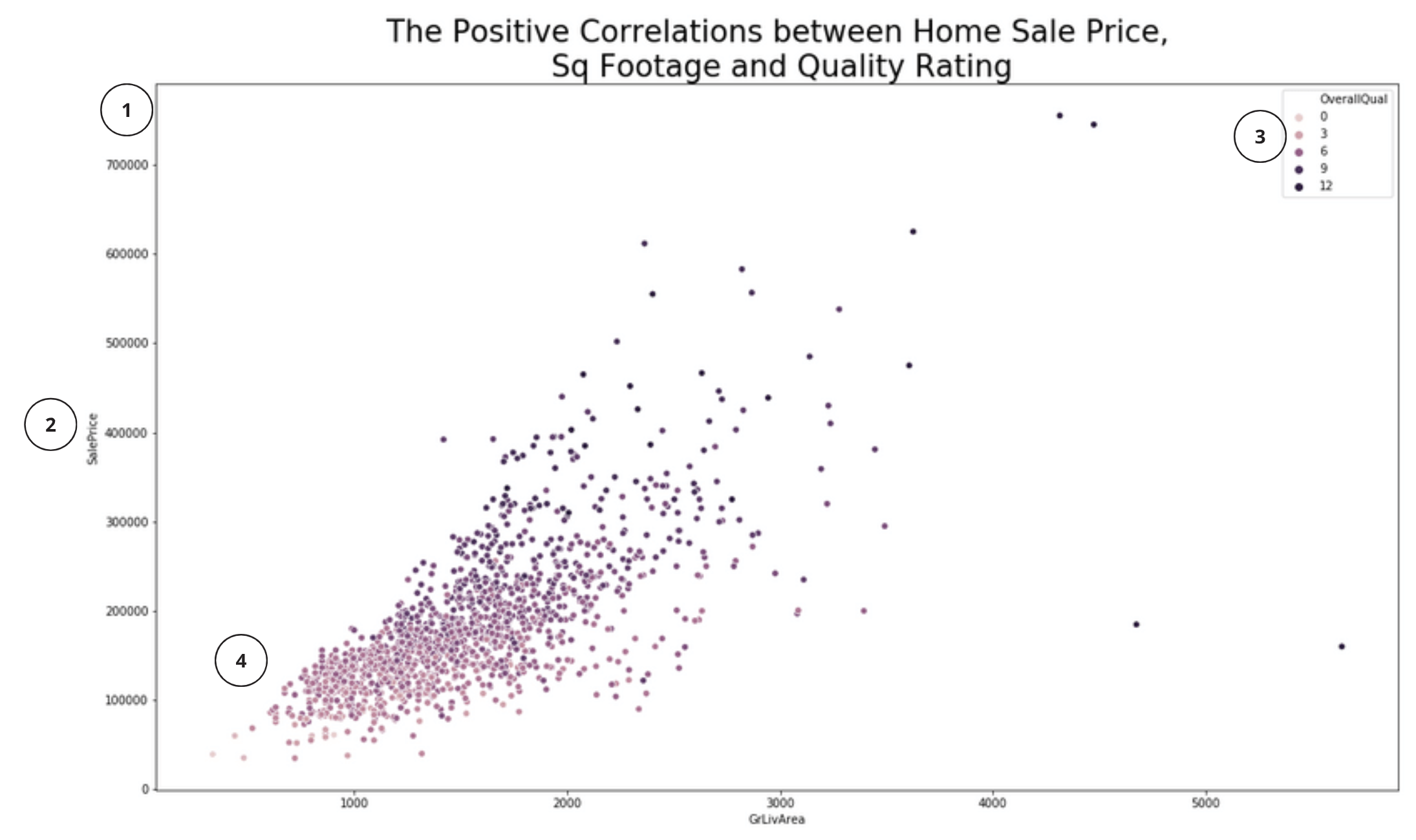
- The y-axis is not immediately interpretable
- Axis labels and legend use raw-variable names rather than a nice label
- Legend does not use all the categories
- Default color is not informative or easily distinguishable
The key with a great presentation visual is that it is immediately interpretable - your audience should not need to guess what the numbers or colors mean, or interpret a variable name, or squint to distinguish between colors.
The Python Graph Gallery is a great resource for finding the exact code to enhance a visualization created using matplotlib or seaborn. The matplotlib documentation also has plenty of code examples and the seaborn graph gallery can be a useful resource.
Below, review the differences between the code used to generate the earlier example and the code used to generate a much more polished visualization:
plt.figure(figsize=(16, 10))
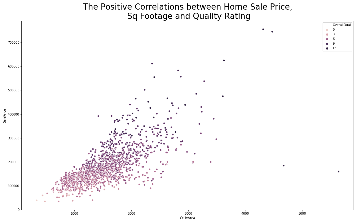
sns.scatterplot(x='GrLivArea', y='SalePrice', data = df, hue='OverallQual')
plt.title("The Positive Correlations between Home Sale Price,\n Sq Footage and Quality Rating", fontsize=26)
plt.tight_layout()
plt.show()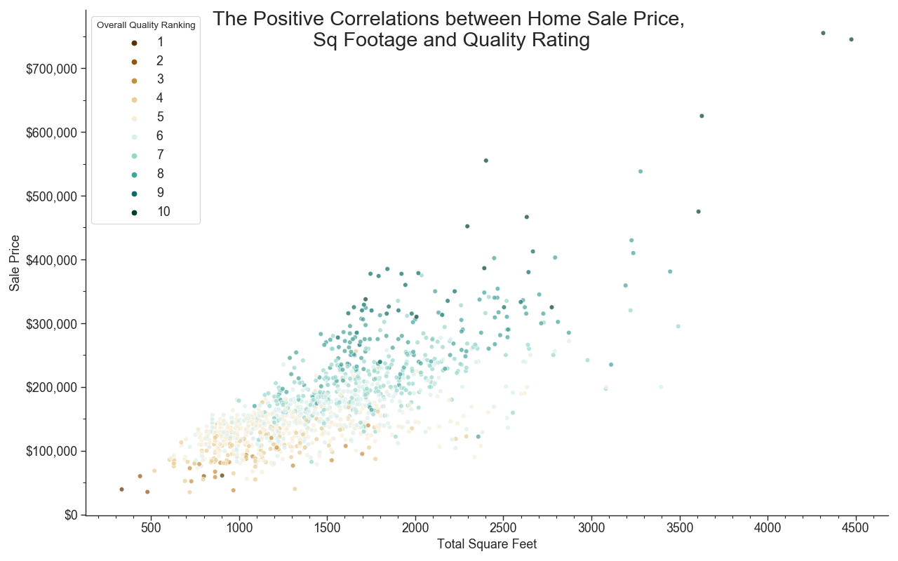
fig = plt.figure(figsize=(16, 10), dpi=80)
# Creates one subplot within our figure and uses the classes fig and ax
fig, ax = plt.subplots(figsize=(16, 10), dpi= 80, facecolor='w', edgecolor='k')
# Uses hue to add an extra element, and changes the palette
chart = sns.scatterplot(x='GrLivArea', y='SalePrice', data = test,
                        hue=test.OverallQual.values, legend='full', alpha = .7,
                        palette="BrBG")

# Setting axis ticks and formulating numbers
ax.yaxis.set_major_locator(ticker.MultipleLocator(100000.00))
ax.yaxis.set_minor_locator(ticker.MultipleLocator(50000))
ax.yaxis.set_major_formatter(ticker.StrMethodFormatter('${x:,.0f}'))
ax.xaxis.set_major_locator(ticker.MultipleLocator(500))
ax.xaxis.set_minor_locator(ticker.MultipleLocator(100))

# Naming the visual and each axis
fig.suptitle("The Positive Correlations between Home Sale Price,\n Sq Footage and Quality Rating", fontsize=26)
ax.set_xlabel("Total Square Feet")
ax.set_ylabel("Sale Price")

# Creating the legend
ax.get_legend().set_title("Overall Quality Ranking")

plt.tight_layout()Small changes can have a big impact on the profesional quality of your slide design. There are many resources out there to help your slides be more consistent, polished, and informative. Utilize them!


