repo for GitHub pages
languagetool-org / languagetool-website-2018 Goto Github PK
View Code? Open in Web Editor NEWOUTDATED, do not use anymore
OUTDATED, do not use anymore


![dependabot[bot] avatar](https://avatars.githubusercontent.com/in/29110?v=4 "dependabot[bot]")


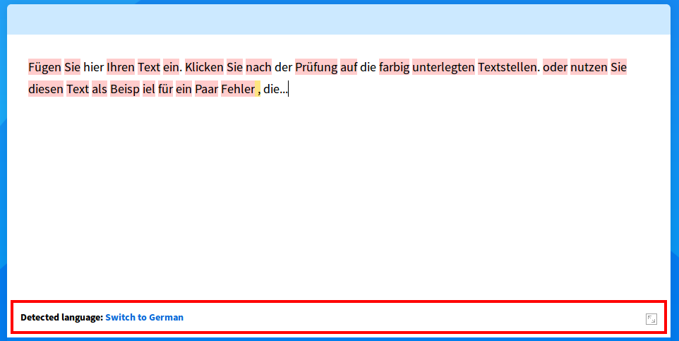
Inserting "Масло масляное" in Russian lead to detection of English, which is wrong. In the meanwhile the russian error is correctly detected.

should be blue, see zeplin
Currently languagetool.org appears like this in the Google search results:

Below the link, some random text from the main page is displayed. Looks a little messy.
AFAIK, this can be easily remedied by adding the following line to the <head> section of the main page:
<meta name="description" content="LanguageTool is ..."> . This is also a commonly used SEO technique.

This sometimes happens - timing issue?
see zeplin (you can skip the facebook icon)

See zeplin - the design has a new background image, the current one is still the old one from languagetoolplus.com. Please replace it with the correct one so it looks like the design at zeplin.
Do you have a suggestion how to translate in JS with the same system as in Laravel? I need to translate this: https://github.com/languagetool-org/languagetool-website-2018/blob/master/public/js/main.js#L77-L90
I think this screenshot sums it up:

In Firefox (Linux) with 1024 px screen width, part of the slider text is cut off on the right for me:

The text in the top right next to the logo should not have an underline as hover effect
Language menu (on desktop) needs a shadow and a checkmark to indicate the current language - just like at zeplin (design slide "languages").

Shouldn't this always be the current version number?
Clicking on the button to change the language for grammar checking on
LT's main page (https://languagetool.org/ ) shows a list of languages.
The languages seem layed out in random order. We should order them
alphabetically or else it's a bit hard to find the language user is interested in.
Improve design of /dev (used to be /development) according to design at zeplin. ("development")
The multi-column approach used there doesn't seem to be mobile compatible.
The editor still uses its own translation, e.g. languagetool_i18n_ignore_once in main.js. This should be unified so the editor also uses Laravel's messages.php.
Also, why do the strings also appear in resources/assets/vanilla/editor.js, but changing them there doesn't seem to have an effect?
Hello, press return, type how are youThis is probably somehow caused by the return. It does not happen on Safari 11.1 on the desktop (tested in browserstack.com).
Click on a MS Word screenshot, it will say "image 3 of 9", even though there are only 5 images.
TypeError: vex.dialog is undefinedSee current languagetool.org for how it is supposed to work.
on hover, the button is 100% white
Texts probably too long?

There's a typo in the description meta tag which gets surfaced when things like Discord produce an oEmbed card.

"software" is not a countable noun, so it should be either "is free proofreading software" or "is a free proofreading tool", not "is a free proofreading software"
"Access a l'API" Should be black to be better readable:

If translation gets too long, it gets messy, can space be made dynamic?

@neprev This is feedback from Elena. When she says something should be different, she usually refers to the design at zeplin. Ask me in the upwork chat or here if something is not clear.


Hover with the mouse and the menu will appear, it shouldn't in fullscreen mode.

See "main blue" and "blue 2" in zeplin
Click on an error: most of them have an "Examples..." item. However, nothing happens. Maybe it's just the library which is missing.
Undo my change that made the Premium button red, but add the star icon (should be at zeplin now or soon).
One of your latest changes make the sub headline ("proofreading service") thinner. I think it's more difficult to read now, please undo this:

Any optimizations should be discussed here first. Also use Google's PageSpeed Insights.
I have recently added some error type to categories in de-DE-x-simple-language/grammar.xml:
<category id="DIFFICULT_WORDS" name="Schwierige Wörter und Wendungen" type="misspelling">
In the standalone application this leads to different color for errors in this category.

The online version does not show a different color:

Can this be fixed?
The add-ons menu needs to scroll down when the user is on a "full" page that has all the content (/, /de, /fr etc). On other pages, it needs to link /#anchor instead so it goes to the section on the main page.
For the language selection on the website, the languages should be labeled with their native names ("English, Deutsch, Français"). Also, the menu item should stay in English ("Languages"). Otherwise, a user could get stuck on a version on the website where he can't find back to his mother tongue.

Same goes with Italian.
How are these files related, does one get automatically built from the other?
Clicking "menu" open a nice mobile-ready menu, clicking the language menu opens the same menu as on desktop. Couldn't the mobile menu be used here, too?
Where can I increase the font size for mobile only? The content font is also a bit too small on mobile.
What's a clean way to create some whitespace right and left to the table. The same should be true for other "light" pages that have only header and footer from the design.
My recent commit "make example dialog work again" (2018-04-14) broken the accordion design, how to properly fix that?

I'd like to add more reference customers with their logos to that section. To fit more logos, please turn that section into a slider, similar to the ones we have, but:
See https://forum.languagetool.org/t/testing-the-new-website/2869/54?u=dnaber - can be reproduced on browerstack
A declarative, efficient, and flexible JavaScript library for building user interfaces.
🖖 Vue.js is a progressive, incrementally-adoptable JavaScript framework for building UI on the web.
TypeScript is a superset of JavaScript that compiles to clean JavaScript output.
An Open Source Machine Learning Framework for Everyone
The Web framework for perfectionists with deadlines.
A PHP framework for web artisans
Bring data to life with SVG, Canvas and HTML. 📊📈🎉
JavaScript (JS) is a lightweight interpreted programming language with first-class functions.
Some thing interesting about web. New door for the world.
A server is a program made to process requests and deliver data to clients.
Machine learning is a way of modeling and interpreting data that allows a piece of software to respond intelligently.
Some thing interesting about visualization, use data art
Some thing interesting about game, make everyone happy.
We are working to build community through open source technology. NB: members must have two-factor auth.
Open source projects and samples from Microsoft.
Google ❤️ Open Source for everyone.
Alibaba Open Source for everyone
Data-Driven Documents codes.
China tencent open source team.