react-page-layout allows you to share a common layout across many different components. Very usefull with something like react-router to abstract the main elements of your design across many routes and reducing code duplication.
npm install react-page-layout --save
or if you use yarn
yarn add react-page-layout
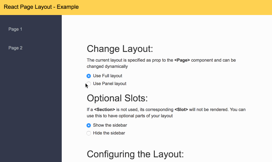
There is an example in this repo under the examples directory.
To run in clone the repo. Go to the examples directory
and run npm install; npm start
This library allows for you to concentrate all your layout logic into its own components. It allows you to create a layout that can have serveral <Slots> where you can inject content.
A layout aware component can use the <Page> and <Section> to fill out the slots.
-
First Step is that you have to create a layout component, this is a regular react component that has several slots where content can be injected. You define one or more slots by using the <Slot> component and giving them a name. In this case "main"
import React, { Component } from 'react';
import { Slot } from 'react-page-layout';

class PublicLayout extends Component {
	render() {
		return (
			<div>
				<header>Page Header</header>
				<Slot name="main" />
				<footer>Page Footer</footer>
			</div>
		);
	}
}

export default PublicLayout;
-
You have to make your app layout aware. In order to do this you use the <LayoutProvider> component to let decendants know about the different layouts of your app. It requires that you specify its layouts prop with an object, where the keys are the names and the values are the layout components;
import React, { Component } from 'react';
import { render } from 'react-dom';
import { LayoutProvider } from 'react-page-layout';
import PublicLayout from './layouts/public';
import LoginPage from './pages/login';

// Create a map for all your layouts
const layouts = {
	'public': PublicLayout,
};

class App extends Component {

	function render() {

		// Render your page inside
		// the layout provider
		return (
			<LayoutProvider layouts={layouts}>
				<LoginPage />
			</LayoutProvider>
		);
	}
}

render(App, document.getElementById('root'));
Note: Your page components don't have to be direct decendents of the <LayoutProvider>, in fact you probably will never use it this way. This is for illustration purposes only. This feature is what allows you to use this package with any routing library.
-
Next you have to create pages. The pages provide the content for the different slots in your layout. To do this we use two components, <Page> and <Section>.
import { Page, Section } from 'react-page-layout';

class LoginPage extends Component {
		render() {
			return (
				<Page layout="public">
					<Section slot="main">
						<h1> THIS IS THE PAGE CONTENT </h1>
					</Section>
				</div>
			);
		}
}
You have to pass the layout property to the <Page>, so it knows what layout you want to use. Similarly each <Section> has a slot property that ties it to the slot in the layout for which it provides content. In this case since we only have one layout named public, and it only has one slot named it main we use those values.
-
By default, the root of a slot is a div, but it can be customized via its the <Slot> props. You can also customize className and styles. See the documentation for details.
-
You can use several slots in a layout.
	...
	<Slot name="header" component="header" />
	<Slot name="content" component="main" />
	<Slot name="footer" component="footer" />
	...
-
A slot can have default content, that will be used when no corresponding section is specified
	...
	<Slot name="header" component="header">
		Default Header content
	</Slot>
	...
-
If a slot doesn't have content it doesn't render at all. Meaning that the dom doesn't contain any elements for that slot. This is usefull because you don't have to have extra elements lying arround.
-
Any props passed to the <Page> component are passed to the layout. This can be usefull for titles, breadcrumbs or to flag any customization that the page requires.
-
Slots can be nested
	...
	<Slot name="main" component="main">
		Ill show up before content

		<Slot
			name="content"
			component="div"
			style={{ margin: 20 }}
		/>

		Ill show up after content
	</Slot>
	...
In this case the <Slot> with name content has a margin. And the main slot has extra content. The corresponding page can decide, what it wants to show by using the corresponding slot.
	...
	<Page layout="mylayout">
		<Section slot="content">
			I have things on top and after me, and
			I have a margin
		</Section>
	</Slot>
	...
	...
	<Page layout="mylayout">
		<Section slot="main">
			Im alone and margin-less
		</Section>
	</Slot>
	...
The layout provider, makes your app layout aware. It should be placed as high as possible into the component hierarchy.
| Prop | Description | required |
|---|---|---|
| layouts | Map of all the component layouts, with keys being the names, and the values the components | Yes |
| Prop | Description | Default | required |
|---|---|---|---|
| name | The name of the slot | - | Yes |
| component | It allows you to determine the root component for this slot, for example you could pass "header" create a <header> element | div | No |
| wrapper | If you don't want to specify a component you can specify an element of your choice, for example <MyComponent className="red" /> | - | No |
| className | class to be added to the root of this slot | - | No |
| style | styles to be appended to the root of this slot | - | {} |
| Prop | Description | Default | required |
|---|---|---|---|
| layout | The name of the layout used to render this page | - | Yes |
| ... | Any other prop, will be passed as is, to the layout | - | No |
| Prop | Description | Default | required |
|---|---|---|---|
| slot | The name of the slot this section is providing content for | - | Yes |


 React
React
 Typescript
 Django
 Laravel
 Facebook
 Microsoft
 Google
 Alibaba
 D3
D3
 Tencent