The spreadsheet with superpowers ✨!

A highly customizable widget to render and interact with JSON objects.

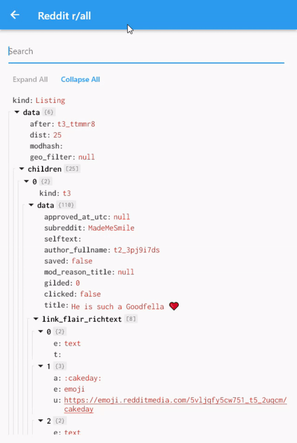
- Expand and collapse classes and array nodes.
- Dynamic search with highlight.
- Configurable theme and interactions.
- Configurable data display format.
- Indentation guidelines.
The data to be displayed is managed by a store, the DataExplorerStore.
In order to use all features from this package you need to register it in
a Provider.
final DataExplorerStore store = DataExplorerStore();

/// ...
ChangeNotifierProvider.value(
  value: store,
  child:
/// ...
To load a json object, use DataExplorerStore.build nodes method.
store.buildNodes(json.decode(myJson));To display the data explorer, you can use the JsonDataExplorer widget.
The only required parameter is a list of node models, which you can take
from the DataExplorerStore after a json was decoded.
Widget build(BuildContext context) {
  return Scaffold(
    appBar: AppBar(
      title: Text(widget.title),
    ),
    body: SafeArea(
      minimum: const EdgeInsets.all(16),
      child: ChangeNotifierProvider.value(
        value: store,
        child: Consumer<DataExplorerStore>(
          builder: (context, state, child) => JsonDataExplorer(
            nodes: state.displayNodes,
          ),
        ),
      ),
    ),
  );
}
This will display a decoded json using a default theme.
Check the /example app for more information on how to customize the
look and feel of JsonDataExplorer widget.
The JsonDataExplorer can be customized to fit different visual requirements.
To change fonts and colors, use a DataExplorerTheme:
JsonDataExplorer(
  nodes: state.displayNodes,
  theme: DataExplorerTheme(
    rootKeyTextStyle: GoogleFonts.inconsolata(
      color: Colors.black,
      fontWeight: FontWeight.bold,
      fontSize: 16,
    ),
    propertyKeyTextStyle: GoogleFonts.inconsolata(
      color: Colors.black.withOpacity(0.7),
      fontWeight: FontWeight.bold,
      fontSize: 16,
    ),
    keySearchHighlightTextStyle: GoogleFonts.inconsolata(
      color: Colors.black,
      backgroundColor: const Color(0xFFFFEDAD),
      fontWeight: FontWeight.bold,
      fontSize: 16,
    ),
    focusedKeySearchHighlightTextStyle:
        GoogleFonts.inconsolata(
      color: Colors.black,
      backgroundColor: const Color(0xFFF29D0B),
      fontWeight: FontWeight.bold,
      fontSize: 16,
    ),
    valueTextStyle: GoogleFonts.inconsolata(
      color: const Color(0xFFCA442C),
      fontSize: 16,
    ),
    valueSearchHighlightTextStyle: GoogleFonts.inconsolata(
      color: const Color(0xFFCA442C),
      backgroundColor: const Color(0xFFFFEDAD),
      fontWeight: FontWeight.bold,
      fontSize: 16,
    ),
    focusedValueSearchHighlightTextStyle:
        GoogleFonts.inconsolata(
      color: Colors.black,
      backgroundColor: const Color(0xFFF29D0B),
      fontWeight: FontWeight.bold,
      fontSize: 16,
    ),
    indentationLineColor: const Color(0xFFE1E1E1),
    highlightColor: const Color(0xFFF1F1F1),
  ),
)Changing the theme is not the only way to customize how the widget looks,
Formatter methods can be used to change how key and values are converted
into strings.
The default behavior to display json property names is key:, but this
can be changed with a formatter:
JsonDataExplorer(
  nodes: state.displayNodes,
  propertyNameFormatter: (name) => '$name ->',
)
Now all property keys are displayed as key ->.
Property values style and onTap can be changed dynamically by using
the valueStyleBuilder parameter. It expects a function that receives
the property dynamic value and the current style, and returns
a PropertyOverrides.
An example is adding interaction to values that contains links:
JsonDataExplorer(
  nodes: state.displayNodes,
  valueStyleBuilder: (value, style) {
    final isUrl = _valueIsUrl(value);
    return PropertyOverrides(
      style: isUrl
          ? style.copyWith(
              decoration: TextDecoration.underline,
            )
          : style,
      onTap: isUrl ? () => _launchUrl(value) : null,
    );
  },
)
Or, folowing the same principle, change how the value looks for specific value types:
JsonDataExplorer(
  nodes: state.displayNodes,
  valueStyleBuilder: (value, style) {
    if (value is num) {
      return PropertyOverrides(
        style: style.copyWith(
          color: Colors.blue,
        ),
      );
    }
    return PropertyOverrides(
      style: style,
    );
  },
)collapsableToggleBuilder allow the expand and collapse button that
is displayed on root nodes to be changed.
For example to use a simple implicitly animated widget:
JsonDataExplorer(
  nodes: state.displayNodes,
  collapsableToggleBuilder: (context, node) =>
      AnimatedRotation(
    turns: node.isCollapsed ? -0.25 : 0,
    duration: const Duration(milliseconds: 300),
    child: const Icon(Icons.arrow_drop_down),
  ),
)
rootInformationBuilder builds a widget that is displayed in classes and
arrays root nodes.
As an example, this can be used to display some information about its
children nodes.
JsonDataExplorer(
  nodes: state.displayNodes,
  rootInformationBuilder: (context, node) => Text(
    node.isClass
        ? '{${(node.childrenCount)}}'
        : '[${node.childrenCount}]',
  ),
)
trailingBuilder builds a trailing widget in each node. The NodeViewModelState
argument allows the widget to react to certain nodes properties.
To build a widget that appears only when a node is currently focused
for example:
JsonDataExplorer(
  nodes: state.displayNodes,
  trailingBuilder: (context, node) => node.isFocused
    ? Text("I'm focused :)")
    : const SizedBox(),
)DataExplorerStore provides search functionality using the search method.
JsonDataExplorer widget already reacts to those state changes and highlights the search results.
Refer to DataExplorerTheme to change the looks of search the results.
The focused result can be changed by calling the focusPreviousSearchResult and focusNextSearchResult methods.
Here is an example of a simple search bar, you can check a full example
in the example folder.
Row(
  children: [
    Expanded(
      child: TextField(
        controller: searchController,
        onChanged: (term) => dataExplorerStore.search(term),
        maxLines: 1,
        decoration: const InputDecoration(
          hintText: 'Search',
        ),
      ),
    ),
    const SizedBox(
      width: 8,
    ),
    IconButton(
      onPressed: dataExplorerStore.focusPreviousSearchResult,
      icon: const Icon(Icons.arrow_drop_up),
    ),
    IconButton(
      onPressed: dataExplorerStore.focusNextSearchResult,
      icon: const Icon(Icons.arrow_drop_down),
    ),
  ],
),It is possible to implement your own scrolling by using the JsonAttribute
widget to display each node.
A simple ListView.builder looks like this:
ListView.builder(
  itemCount: state.displayNodes.length,
  itemBuilder: (context, index) => JsonAttribute(
    node: state.displayNodes.elementAt(index),
    theme: DataExplorerTheme.defaultTheme,
  ),
),

 React
React
 Typescript
 Django
 Laravel
 Facebook
 Microsoft
 Google
 Alibaba
 D3
D3
 Tencent