BackgroudLibrary
A framework for directly generating shape through Tags, no need to write shape.xml again(通过标签直接生成shape,无需再写shape.xml)
依赖方式:
implementation "com.android.support:appcompat-v7:$supportVersion"
implementation 'com.noober.background:core:1.3.1'
版本更新:
1.0.5 解决android 8以下Fragment中view显示问题,解决水波纹不能与press事件共存问题,优化水波纹显示
1.2.0 增加对selector的支持
1.2.2 修复部分属性不生效的bug
1.2.3 checkbox radiobutton使用的bug
1.2.4 新增了text不同状态变色的支持
1.2.5 去除kotlin依赖
1.2.6 修复调用其他换肤框架可能失效的问题
1.2.7 新增pressed_stroke_color等边框的属性
1.3.0 提供通过代码生成Drawable的方法;为了防止属性冲突,所有属性以bl_开头
1.3.1 优化代码,减少内存占用
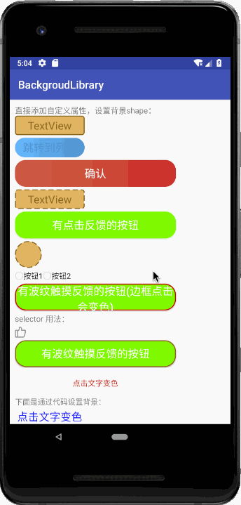
示例效果
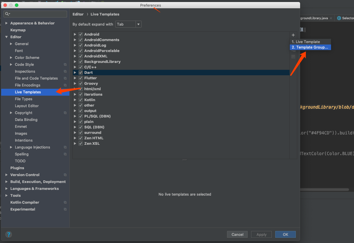
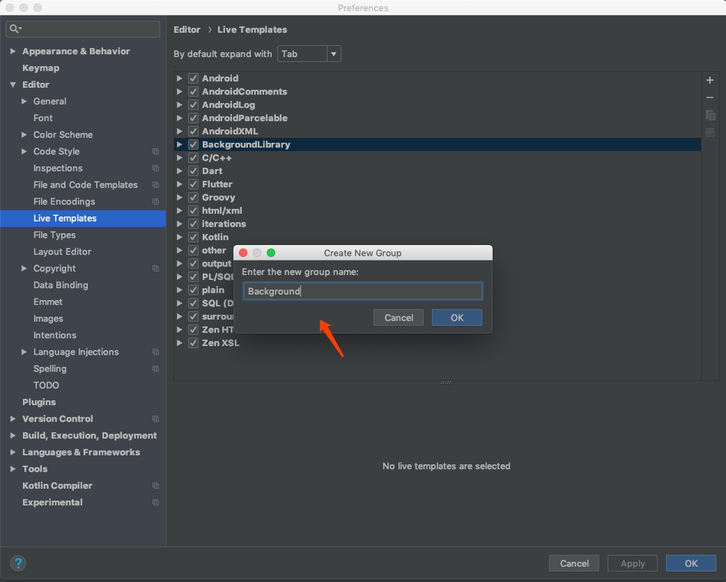
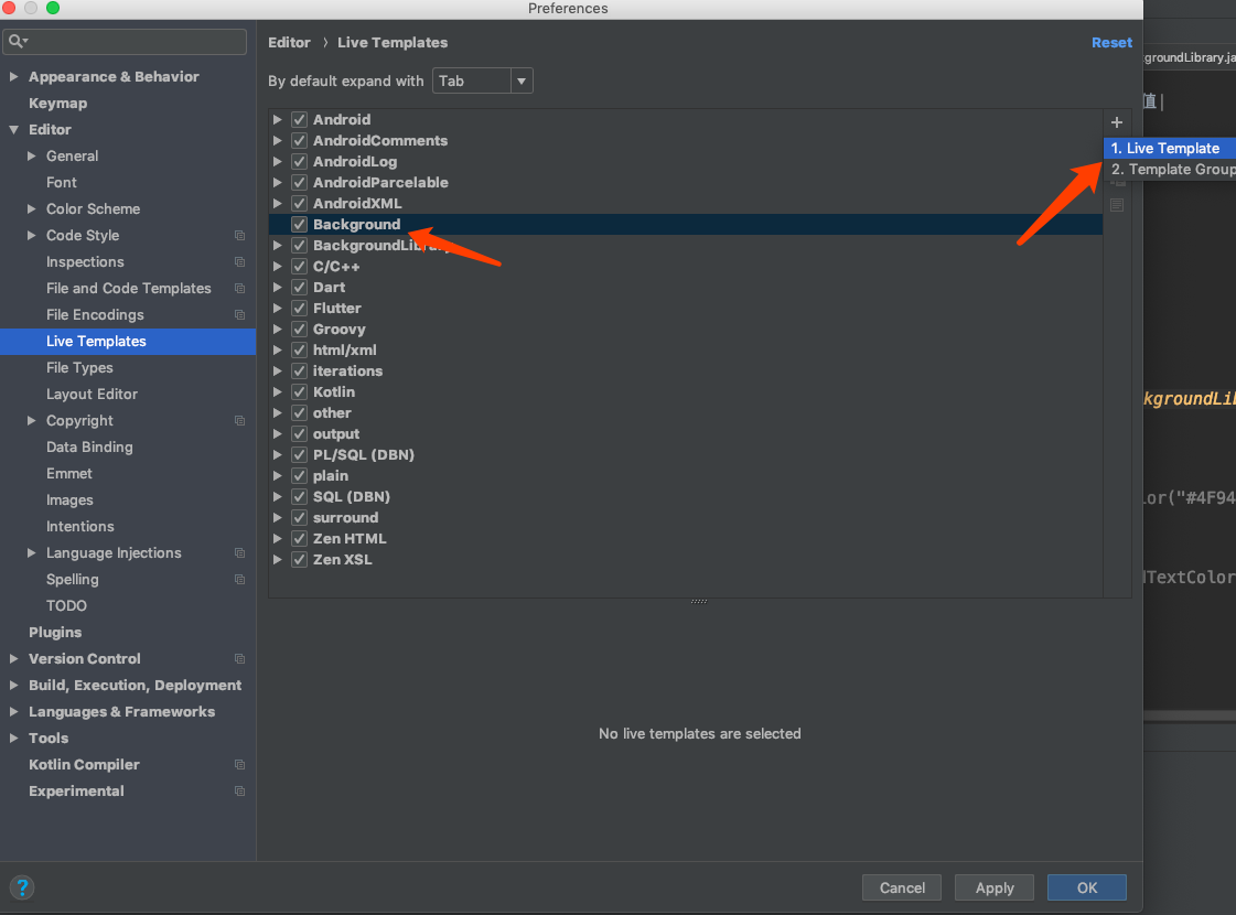
通过配置Live Templates,实现自动代码提示

使用方法
1、在BaseActivity中的super.onCreate之前调用。
BackgroundLibrary.inject(context);
2、在layout中直接添加属性即可。
支持的自定义属性
下面是所有的自定义属性,使用方法和shape、selector完全一样
shape类
支持shape的所有属性,命名规则就是标签名_标签属性名:
| 名称 | 类型 |
|---|---|
| bl_shape | rectangle、oval、line、ring(暂时不支持) |
| bl_solid_color | color |
| bl_corners_radius | dimension |
| bl_corners_bottomLeftRadius | dimension |
| bl_corners_bottomRightRadius | dimension |
| bl_corners_topLeftRadius | dimension |
| bl_corners_topRightRadius | dimension |
| bl_gradient_angle | integer |
| bl_gradient_centerX | float |
| bl_gradient_centerY | float |
| bl_gradient_centerColor | color |
| bl_gradient_endColor | color |
| bl_gradient_startColor | color |
| bl_gradient_gradientRadius | dimension |
| bl_gradient_type | linear、radial、sweep |
| bl_gradient_useLevel | boolean |
| bl_size_width | dimension |
| bl_size_height | dimension |
| bl_stroke_width | dimension |
| bl_stroke_color | color |
| bl_stroke_dashWidth | dimension |
| bl_stroke_dashGap | dimension |
selector类
支持selector的所有属性:
| 名称 | 类型 |
|---|---|
| bl_checkable_drawable | color、reference |
| bl_checked_drawable | color、reference |
| bl_enabled_drawable | color、reference |
| bl_selected_drawable | color、reference |
| bl_pressed_drawable | color、reference |
| bl_focused_drawable | color、reference |
| bl_focused_hovered | color、reference |
| bl_focused_activated | color、reference |
| bl_unCheckable_drawable | color、reference |
| bl_unChecked_drawable | color、reference |
| bl_unEnabled_drawable | color、reference |
| bl_unSelected_drawable | color、reference |
| bl_unPressed_drawable | color、reference |
| bl_unFocused_drawable | color、reference |
| bl_unFocused_hovered | color、reference |
| bl_unFocused_activated | color、reference |
| 关于text颜色的设置 | |
| bl_checkable_textColor | color |
| bl_checked_textColor | color |
| bl_enabled_textColor | color |
| bl_selected_textColor | color |
| bl_pressed_textColor | color |
| bl_focused_textColor | color |
| bl_unCheckable_textColor | color |
| bl_unChecked_textColor | color |
| bl_unEnabled_textColor | color |
| bl_unSelected_textColor | color |
| bl_unPressed_textColor | color |
| bl_unFocused_textColor | color |
其他属性(sdk21及以上的手机才支持)
| 名称 | 类型 | 备注 |
|---|---|---|
| bl_ripple_enable | boolean | 是否开启点击的水波纹效果 |
| bl_ripple_color | color | 水波纹颜色(如果开启,一定要有这个属性能生效) |
| bl_checkable_stroke_color | color | 边框状态的属性,如果在sdk21以下,会没有效果,默认固定边框色取stroke_color的值 |
| bl_checked_stroke_color | color | |
| bl_enabled_stroke_color | color | |
| bl_selected_stroke_color | color | |
| bl_pressed_stroke_color | color | |
| bl_focused_stroke_color | color | |
| bl_unCheckable_stroke_color | color | |
| bl_unChecked_stroke_color | color | |
| bl_unEnabled_stroke_color | color | |
| bl_unSelected_stroke_color | color | |
| bl_unPressed_stroke_color | color | |
| bl_unFocused_stroke_color | color |
代码生成Drawable的Api,详情见DrawableCreator类
所有的属性都提供了set方法去通过代码设置,具体见DrawableCreator.Build 使用方法如下:
//设置button圆角背景
Drawable drawable = new DrawableCreator.Builder().setCornersRadius(dip2px(20))
                .setGradientAngle(0).setGradientColor(Color.parseColor("#63B8FF"), Color.parseColor("#4F94CD")).build();
btn.setBackground(drawable);
//文字点击变色
tvTest1.setClickable(true);//由于Android源码的原因,必须调用,否则不生效
ColorStateList colors = new DrawableCreator.Builder().setPressedTextColor(Color.RED).setUnPressedTextColor(Color.BLUE).buildTextColor();
tvTest1.setTextColor(colors);
使用例子
1.边框+背景+圆角
<TextView
    android:layout_width="130dp"
    android:layout_height="36dp"
    android:gravity="center"
    android:text="TextView"
    android:textColor="#8c6822"
    android:textSize="20sp"
    app:bl_corners_radius="4dp"
    app:bl_solid_color="#E3B666"
    app:bl_stroke_color="#8c6822"
    app:bl_stroke_width="2dp" />
等同于
<shape xmlns:android="http://schemas.android.com/apk/res/android">
    <corners android:radius="2dp"/>
    <solid android:color="#E3B666"/>
    <stroke android:color="#E3B666" android:width="2dp"/>
</shape>
2、渐变
<shape xmlns:android="http://schemas.android.com/apk/res/android">
    <corners android:radius="2dp"/>
    <gradient android:angle="0"
              android:startColor="#63B8FF"
              android:endColor="#4F94CD"/>
</shape>
等同于
 <Button
    android:id="@+id/btn"
    android:layout_width="130dp"
    android:layout_height="36dp"
    android:layout_marginTop="5dp"
    android:gravity="center"
    android:padding="0dp"
    android:text="跳转到列表"
    android:textColor="#4F94CD"
    android:textSize="20sp"
    app:bl_corners_radius="2dp"
    app:bl_gradient_angle="0"
    app:bl_gradient_endColor="#4F94CD"
    app:bl_gradient_startColor="#63B8FF" />
点击效果
第一个点赞效果:
android:layout_width="20dp"
android:layout_height="20dp"
android:layout_marginTop="5dp"
app:bl_pressed_drawable="@drawable/circle_like_pressed"
app:bl_unPressed_drawable="@drawable/circle_like_normal" />
就等同于:
<selector xmlns:android="http://schemas.android.com/apk/res/android">
    <item android:state_pressed="true"
        android:drawable="@drawable/circle_like_pressed" />
    <item android:state_pressed="false"
        android:drawable="@drawable/circle_like_normal" />
</selector>
通过代码设置:
Drawable drawable4 = new DrawableCreator.Builder().setCornersRadius(dip2px(20))
        .setPressedDrawable(ContextCompat.getDrawable(this, R.drawable.circle_like_pressed))
        .setUnPressedDrawable(ContextCompat.getDrawable(this, R.drawable.circle_like_normal))
        .build();
tv.setClickable(true);
tv.setBackground(drawable4);
第二个按钮效果:
<Button
        android:layout_width="300dp"
        android:layout_height="50dp"
        android:layout_marginTop="5dp"
        android:gravity="center"
        android:padding="0dp"
        android:text="有波纹触摸反馈的按钮"
        android:textColor="@android:color/white"
        android:textSize="20sp"
        app:bl_corners_radius="20dp"
        app:bl_pressed_drawable="#71C671"
        app:bl_ripple_color="#71C671"
        app:bl_ripple_enable="true"
        app:bl_stroke_color="#8c6822"
        app:bl_stroke_width="2dp"
        app:bl_unPressed_drawable="#7CFC00" />
通过代码设置:
Drawable drawable3 = new DrawableCreator.Builder().setCornersRadius(dip2px(20))
        .setRipple(true, Color.parseColor("#71C671"))
        .setSolidColor(Color.parseColor("#7CFC00"))
        .setStrokeColor(Color.parseColor("#8c6822"))
        .setStrokeWidth(dip2px(2))
        .build();
btn.setBackground(drawable3);
使用其实基本和selector shape一样。
3.点击文字变色
<Button
    android:layout_width="300dp"
    android:layout_height="50dp"
    android:layout_marginTop="5dp"
    android:gravity="center"
    android:padding="0dp"
    android:text="点击文字变色"
    app:bl_pressed_textColor="#919DAF"
    app:bl_unPressed_textColor="@android:color/holo_red_dark"/>
4.style类似的使用方式
style中不要加入"app:", 直接写属性名即可
<style name="bg">
    <item name="bl_corners_radius">4dp</item>
    <item name="bl_solid_color">#E3B666</item>
    <item name="bl_stroke_color">#8c6822</item>
    <item name="bl_stroke_width">2dp</item>
</style>

<TextView
    android:layout_width="130dp"
    android:layout_height="36dp"
    android:gravity="center"
    android:text="TextView"
    android:textColor="#8c6822"
    android:textSize="20sp"
    style="@style/bg"/>
简单的性能测试
我用原生的方法写了例子里面的shape和selector,做了一个比较简单的测试:
下面两幅图,是没有background时打开MainActivity界面的启动时间和打开ListActivity的启动时间
下面两幅图,是使用原生drawable.xml去设置background时打开MainActivity界面的启动时间和打开ListActivity的启动时间
最后这两幅图,是使用自定义标签去设置background时打开MainActivity界面的启动时间和打开ListActivity的启动时间
可以看得出来,其实通过自定义标签去创建drawable并没有真的很损耗性能,其实与本身的drawable.xml差不多,但是在list中,如果没有使用viewholer,会比较消耗性能,如果使用的话,应该差不多。
不过这个分析比较简单,只能看个大概,给担心性能的同学心里可以有个底。
使用注意
1、selector的相关属性,如果传入的drawable不是颜色的资源,会覆盖掉shape设置的属性
2、在根布局添加
tools:ignore="MissingPrefix"
可以防止报红
3、因为layoutInflater限制了只能有一个factory,如果有其他库已经使用了setFactory方法,比如换肤的库,只需要在其他库调用layoutInflater.setFactory之后调用
BackgroundLibrary.inject2(context);
这样其他的库与本库同样可以生效。
4、selector一个item表示多个属性,暂时无法实现,如下:
 <item android:state_pressed="true" android:state_focused="true"
    android:drawable="@drawable/button_pressed" />
因为无法用一个属性去表示两种状态,有思路的同学可以告诉我
5、fragment使用无需任何处理,其Activity调用inject即可
6、listView,recyclerView使用也无需任何处理。
如果不生效,只需要
//在调用inflate只需调用一次context,保证adapter创建View时传入的是同一个context即可
BackgroundLibrary.inject(context);

View item = LayoutInflater.from(context).inflate(xxx)
7、自定义View中调用了inflate,同listView一样处理即可
8、关于水波纹,如果光设置下面两个属性是无效的,必须还要有个填充颜色的属性,原因如下:
app:ripple_color="#71C671"
app:ripple_enable="true"
水波纹需要设置一个默认背景颜色,也就是填充颜色。比如app:solid_color 或者app:unPressed_drawable 或者app:unFocussed_drawable等都行,这些都是默认等背景颜色。而app:ripple_color是波纹的颜色。如果没有一个背景色,这个波纹颜色是无法显示的
9、由于Android源码的原因,如果是通过代码生成有点击状态drawable,需要先调用一下
view.setClickable(true);
否则点击状态可能不生效
代码提示解决方案
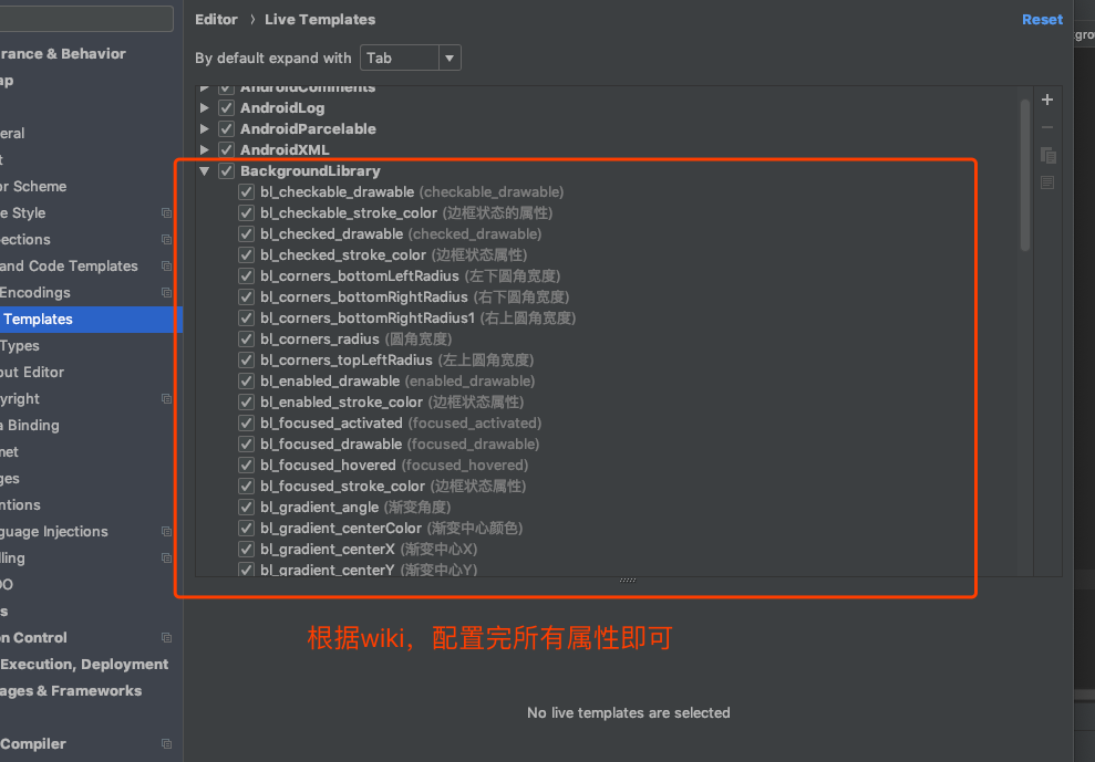
配置Live Templates步骤:
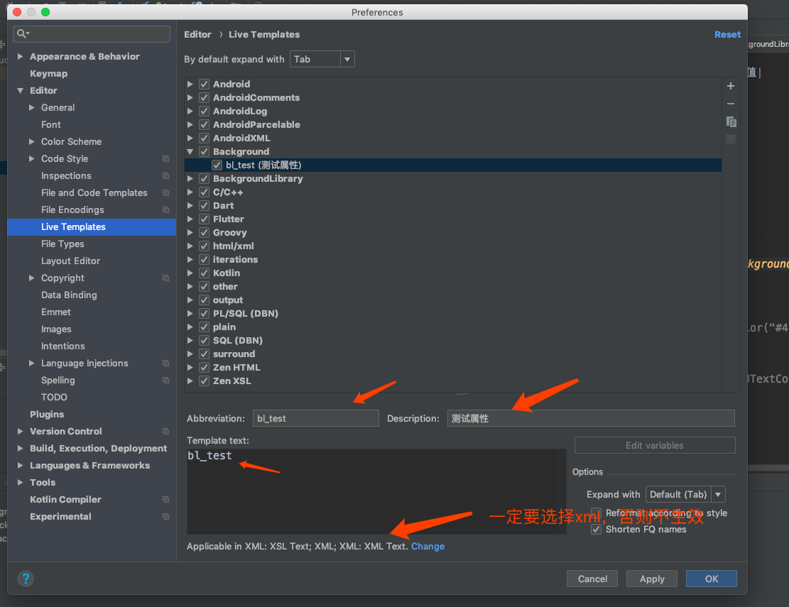 配置完所有属性,大约10分钟
 效果:
效果:

MIT License

Copyright (c) 2018 javaKepp

Permission is hereby granted, free of charge, to any person obtaining a copy
of this software and associated documentation files (the "Software"), to deal
in the Software without restriction, including without limitation the rights
to use, copy, modify, merge, publish, distribute, sublicense, and/or sell
copies of the Software, and to permit persons to whom the Software is
furnished to do so, subject to the following conditions:

The above copyright notice and this permission notice shall be included in all
copies or substantial portions of the Software.

THE SOFTWARE IS PROVIDED "AS IS", WITHOUT WARRANTY OF ANY KIND, EXPRESS OR
IMPLIED, INCLUDING BUT NOT LIMITED TO THE WARRANTIES OF MERCHANTABILITY,
FITNESS FOR A PARTICULAR PURPOSE AND NONINFRINGEMENT. IN NO EVENT SHALL THE
AUTHORS OR COPYRIGHT HOLDERS BE LIABLE FOR ANY CLAIM, DAMAGES OR OTHER
LIABILITY, WHETHER IN AN ACTION OF CONTRACT, TORT OR OTHERWISE, ARISING FROM,
OUT OF OR IN CONNECTION WITH THE SOFTWARE OR THE USE OR OTHER DEALINGS IN THE
SOFTWARE.


 React
React
 Typescript
 Django
 Laravel
 Facebook
 Microsoft
 Google
 Alibaba
 D3
D3
 Tencent