Git Product home page Git Product logo

discreteslider's Introduction

DiscreteSlider

JitPack license

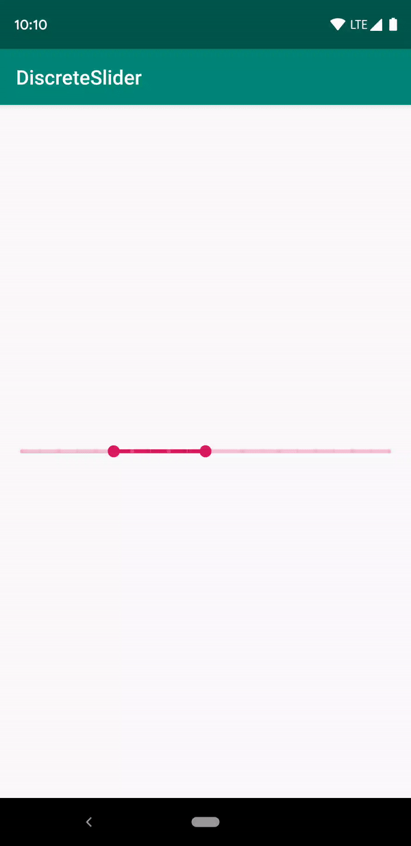
DiscreteSlider tries to offer you the slider with value label as shown in the Material Design spec, with an API. The library also offer you range slider mode.

Screenshot

Normal Mode

Range Mode

Vertical Orientation

Setup

The easiest way to add the DiscreteSlider library to your project is by adding it as a dependency to your build.gradle

Step 1. Add the JitPack repository to your build file

allprojects {
    repositories {
        ...
        maven { url 'https://jitpack.io' }
    }
}

Step 2. Add the dependency

dependencies {
    implementation 'com.github.hearsilent:DiscreteSlider:1.2.1'
}

Usage

Setup Track in Java

mSlider.setTrackWidth(Utils.convertDpToPixel(4, this));
mSlider.setTrackColor(0xFFD81B60);
mSlider.setInactiveTrackColor(0x3DD81B60);

Setup Track in Xml

app:ds_trackWidth="4dp"
app:ds_trackColor="#D81B60"
app:ds_inactiveTrackColor="#3DD81B60"

Setup Thumb in Java

mSlider.setThumbRadius(Utils.convertDpToPixel(6, this));
mSlider.setThumbColor(0xFFD81B60);
mSlider.setThumbPressedColor(0x1FD81B60);

Setup Thumb in Xml

app:ds_thumbRadius="6dp"
app:ds_thumbColor="#D81B60"
app:ds_thumbPressedColor="#1FD81B60"

Setup TickMark in Java

mSlider.setTickMarkColor(0x3DFFFFFF);
mSlider.setTickMarkInactiveColor(0x1FD81B60);
mSlider.setTickMarkPatterns(Arrays.asList(new Dot(), new Dash(Utils.convertDpToPixel(1, this))));
// TickMark step must be a factor of (count - 1)
mSlider.setTickMarkStep(1);

Setup TickMark in Xml

app:ds_tickMarkColor="#3DFFFFFF"
app:ds_tickMarkInactiveColor="#1FD81B60"
<!-- Separated by commas, only accept `dot` or `dash`. You can also fill in "dot,dash,dash" -->
app:ds_tickMarkPatterns="dot,dash"
app:ds_tickMarkDashLength="1dp"
<!-- TickMark step must be a factor of (count - 1) -->
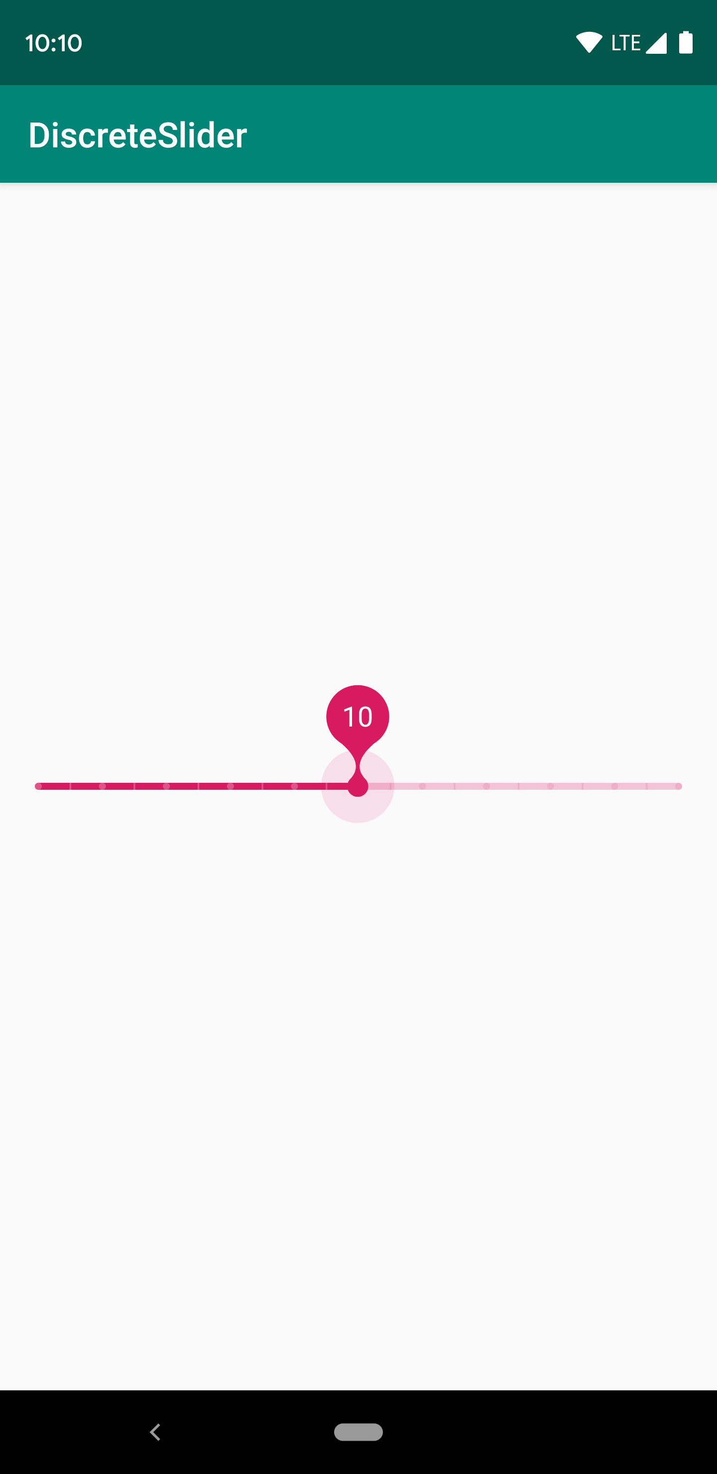
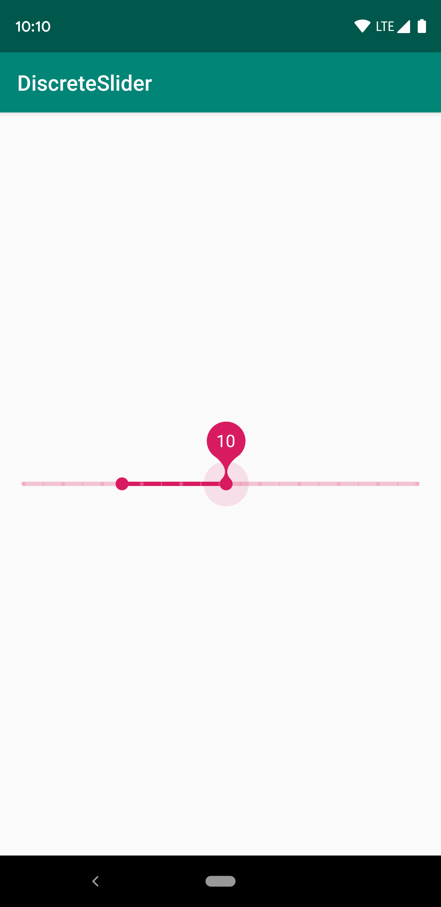
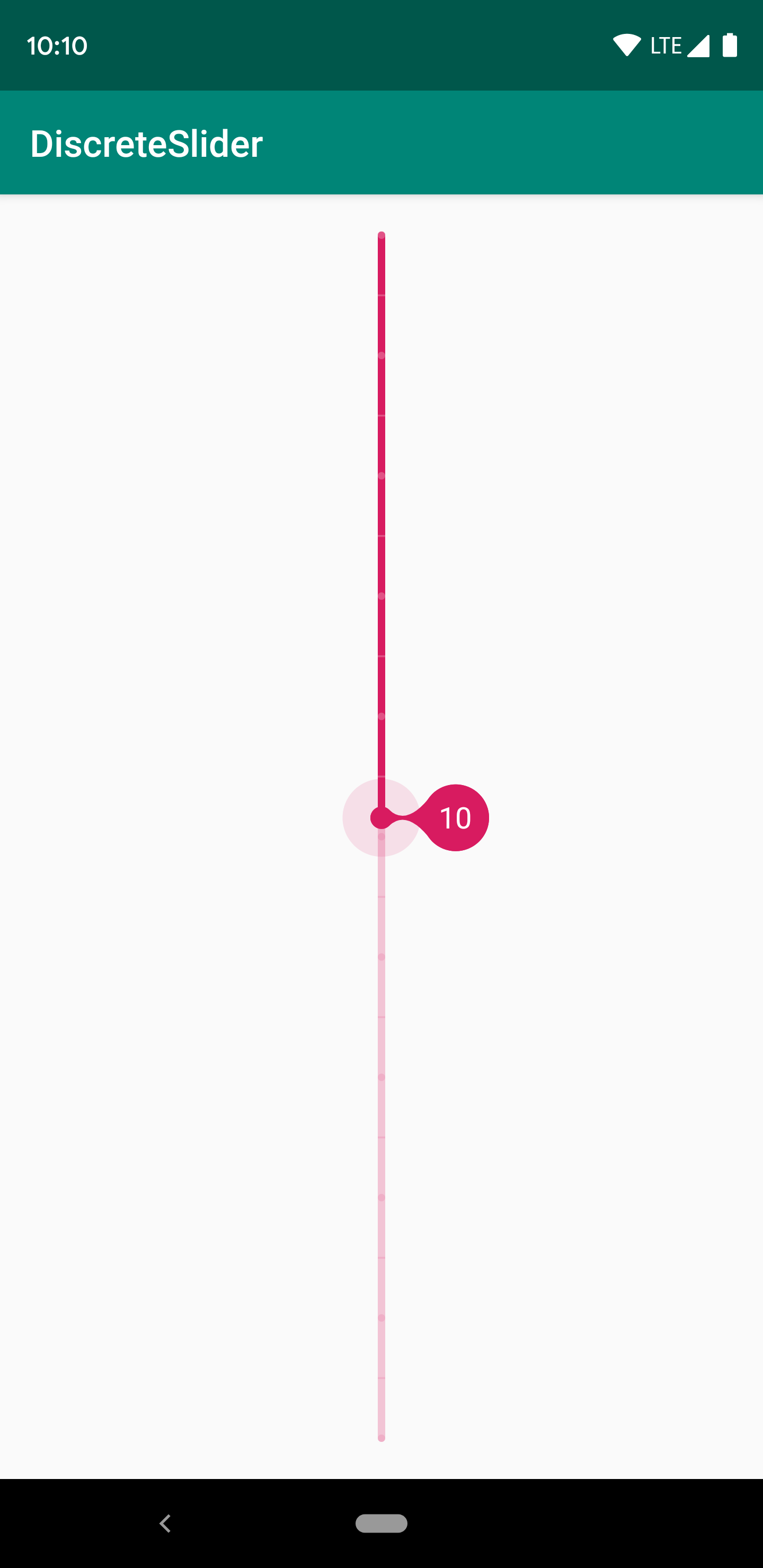
app:ds_tickMarkStep="1"

Setup ValueLabel in Java

mSlider.setValueLabelTextColor(Color.WHITE);
mSlider.setValueLabelTextSize(Utils.convertSpToPixel(16, this));
mSlider.setValueLabelGravity(DiscreteSlider.TOP);
// Customize value label's text by `setValueLabelFormatter`
mSlider.setValueLabelFormatter(new DiscreteSlider.ValueLabelFormatter() {

    @Override
    public String getLabel(int input) {
        return Integer.toString(input);
    }
});
mSlider.setValueLabelMode(1); // 0: none, 1: showOnPressHold, 2: showOnProgressChange, 3: showOnPressHold & showOnProgressChange
mSlider.setValueLabelDuration(1500); // Use for mode `showOnProgressChange`

Setup ValueLabel in Xml

app:ds_valueLabelTextColor="#FFF"
app:ds_valueLabelTextSize="16sp"
app:ds_valueLabelGravity="top"
app:ds_valueLabelMode="showOnPressHold|showOnProgressChange" <!-- Default is showOnPressHold -->
app:ds_valueLabelDuration="2500" <!-- Default is 1500ms -->

Setup Progress in Java

mSlider.setCount(21);
mSlider.setProgressOffset(10);
mSlider.setProgress(5); // The same as `setMinProgress`.
mSlider.setMinProgress(5);
mSlider.setMaxProgress(10); // Only can call in range mode.

Setup Progress in Xml

app:ds_count="21"
app:ds_progressOffset="10"
app:ds_minProgress="5"
app:ds_maxProgress="5"

Get Progress in Java

mSlider.getProgress(); // The same as `getMinProgress`.
mSlider.getMinProgress();
mSlider.getMaxProgress();
mSlider.setValueChangedImmediately(true); // Default is false
mSlider.setOnValueChangedListener(new DiscreteSlider.OnValueChangedListener() {

    @Override
    public void onValueChanged(int progress, boolean fromUser) {
        super.onValueChanged(progress, fromUser);
        Log.i("DiscreteSlider", "Progress: " + progress + ", fromUser: " + fromUser);
    }

    @Override
    public void onValueChanged(int minProgress, int maxProgress, boolean fromUser) {
        super.onValueChanged(minProgress, maxProgress, fromUser);
        Log.i("DiscreteSlider",
                "MinProgress: " + minProgress + ", MaxProgress: " + maxProgress +
                        ", fromUser: " + fromUser);
    }
});

Setup Mode in Java

mSlider.setMode(DiscreteSlider.MODE_RANGE);

Setup Mode in Xml

app:ds_mode="range"

Setup Click to Move in Java (By default is false)

mSlider.setClickable(true);

Setup Click to Move in Xml (By default is false)

android:clickable="true"
android:focusable="true"

Setup Orientation in Xml (By default is horizontal)

app:ds_orientation="vertical"

Setup HapticFeedback in Java (By default is Enabled)

mSlider.setHapticFeedbackEnabled(false);

Customize

You can draw thumb as you want.

public class CustomDiscreteSlider extends DiscreteSlider {

    @Override
    public void onDrawThumb(Canvas canvas, float cx, float cy, boolean hasTouched) {
        // Draw thumb as you want
    }

    @Override
    public int getSize() {
        // Override this value to your thumb size
        return super.getSize();
    }
}

Notice

Must set clipChildren to false in parent layout.

Compatibility

Android ICE CREAM SANDWICH 4.0+

Credits

This project was inspired by the Material Design spec by Google.

License

MIT License

Copyright (c) 2019 HearSilent

Permission is hereby granted, free of charge, to any person obtaining a copy
of this software and associated documentation files (the "Software"), to deal
in the Software without restriction, including without limitation the rights
to use, copy, modify, merge, publish, distribute, sublicense, and/or sell
copies of the Software, and to permit persons to whom the Software is
furnished to do so, subject to the following conditions:

The above copyright notice and this permission notice shall be included in all
copies or substantial portions of the Software.

THE SOFTWARE IS PROVIDED "AS IS", WITHOUT WARRANTY OF ANY KIND, EXPRESS OR
IMPLIED, INCLUDING BUT NOT LIMITED TO THE WARRANTIES OF MERCHANTABILITY,
FITNESS FOR A PARTICULAR PURPOSE AND NONINFRINGEMENT. IN NO EVENT SHALL THE
AUTHORS OR COPYRIGHT HOLDERS BE LIABLE FOR ANY CLAIM, DAMAGES OR OTHER
LIABILITY, WHETHER IN AN ACTION OF CONTRACT, TORT OR OTHERWISE, ARISING FROM,
OUT OF OR IN CONNECTION WITH THE SOFTWARE OR THE USE OR OTHER DEALINGS IN THE
SOFTWARE.

discreteslider's People

Contributors

hearsilent avatar

Stargazers

 avatar  avatar  avatar  avatar  avatar  avatar  avatar  avatar  avatar  avatar  avatar  avatar  avatar  avatar  avatar  avatar  avatar  avatar  avatar  avatar  avatar  avatar  avatar  avatar  avatar  avatar  avatar  avatar  avatar  avatar  avatar  avatar  avatar  avatar  avatar  avatar  avatar  avatar  avatar  avatar  avatar  avatar  avatar  avatar  avatar  avatar  avatar  avatar  avatar  avatar  avatar  avatar  avatar  avatar  avatar  avatar  avatar  avatar  avatar  avatar  avatar  avatar  avatar  avatar  avatar  avatar  avatar  avatar  avatar  avatar  avatar  avatar  avatar  avatar  avatar  avatar  avatar  avatar  avatar  avatar  avatar  avatar  avatar  avatar  avatar  avatar  avatar  avatar  avatar  avatar  avatar  avatar  avatar  avatar  avatar  avatar  avatar  avatar  avatar  avatar

Watchers

 avatar  avatar  avatar  avatar  avatar

discreteslider's Issues

Slider bubble not fully displayed

Screenshot_20190510-212226_Photo Map

As you can see, the bubble is cutted.

Part of the layout xml:

        <hearsilent.discreteslider.DiscreteSlider
            android:layout_width="wrap_content"
            android:layout_height="wrap_content"
            app:ds_orientation="vertical"
            android:layout_margin="16dp"
            app:layout_constraintBottom_toTopOf="@+id/filter_text_view"
            app:layout_constraintStart_toStartOf="parent"
            app:layout_constraintTop_toBottomOf="@+id/screen_share_button"
            />

        <hearsilent.discreteslider.DiscreteSlider
            android:id="@+id/discreteSlider"
            android:layout_width="match_parent"
            android:layout_height="wrap_content"
            android:layout_marginStart="8dp"
            android:layout_marginEnd="8dp"
            android:clickable="true"
            android:focusable="true"
            android:paddingLeft="16dp"
            android:paddingRight="16dp"
            app:ds_count="21"
            app:ds_inactiveTrackColor="#3DD81B60"
            app:ds_maxProgress="10"
            app:ds_minProgress="5"
            app:ds_mode="range"
            app:ds_thumbColor="@color/colorAccent"
            app:ds_thumbPressedColor="#1FD81B60"
            app:ds_thumbRadius="6dp"
            app:ds_tickMarkColor="#3DFFFFFF"
            app:ds_tickMarkDashLength="1dp"
            app:ds_tickMarkInactiveColor="#1FD81B60"
            app:ds_tickMarkPatterns="dot,dash"
            app:ds_trackColor="@color/colorAccent"
            app:ds_trackWidth="4dp"
            app:layout_constraintBottom_toBottomOf="parent"
            app:layout_constraintEnd_toEndOf="parent"
            app:layout_constraintStart_toEndOf="@+id/toggleButton" />

All this is inside two constraint layout.

I copied the second slider from your Sample Activity.

Show tick mark every x step

Hi,
can you implement to show tick marks on, e.g. every 20 step. Currently when I set a tickMarkPattern of "dot,dash" I get a tick mark on every single step so when I have a count of 250 I have 250 marks.
Thanks in advance!

Listeners and nullability

Hi,

Nice work in here. Just a few suggestions: split the listeners in two different ones for range mode and normal mode. If I only pretend to use normal code, boilerplate code is gonna be everywhere. Also, annotate your interface. I checked your code and it isn't. For people using Kotlin, the code generator will understand it as a possible null.

Again, nice work. I'll probably gonna use it in my apps.

Tick label

Is there a way to setup library to show label above or below each tick all the time?

progress label visibility

Hello ..

Thanks for amazing library, is there any way to keep label visible after use change thumb ?

Setting the maximum progress value

How can you set the largest possible progress value on the slider? For example if I wanted the range to be between 0 and 250, or 1 and 14 how can that be done?

I assumed calling:

slider.setMinProgress(0)
slider.setMaxProgress(250)

but that didn't work.

Vertical Orientation

Hi,

that's an awesome library.

If you want to make it possible to draw it vertically, you will be much better that the other library and I will used it in my app.
The bubble should appear on the right or on the left side (configurable).

Not working with Tab layout

When used inside a tab with TabLayout, the slider is not working as the scrolling is blocked. I tried the active Slider and it works well!

Add feature: label show up on non user value changes.

Hi.
It will be very nice if You add modes for label such as showing up on setting values from code (like
when attaching it to scroll listeners) or showing up when pressed.
Let me know how are Your thoughts on this.

Swiping on the slider without touching the thumb doesn't update the displayed progress

When I swipe on the slider (without touching the thumb), the progress is correctly changed (the onValueChanged(int progress, boolean fromUser) method is called), but the progress doesn't update (the thumb doesn't move).

To replicate this, set progress for example to 0, count to for example 10 and call mSlider.setClickable(true);. Then start swiping from e. g. 3 (or any value but 0 (any value but the one where the thumb currently is)) to e. g. 6. The onValueChanged(int progress, boolean fromUser) method is called correctly (with progress variable being 6 and fromUser being true), but the thumb doesn't move and the active track stays at 0. This happens every time when you start swiping from anywhere where the thumb isn't.

A workaround is calling mSlider.setProgress(progress); in onValueChanged(int progress, boolean fromUser), but that breaks animations.

is there a way to reverse vertical slider?

im using DiscreteSlider for my apps, and i need to make slider starts from bottom to top ( vertical slider )
im able to make slider vertical, but unable to make the progress value in bubble starts from 1 (from bottom)

is there a way to make it happend?, or i missing an option to make that?

sorry for bad english

AAPT: error: attribute ds_progressOffset not found.

I get this error when setting the progress offset attribute:

AAPT: error: attribute ds_progressOffset (aka com.example.android:ds_progressOffset) not found.

I am using this version:
implementation 'com.github.hearsilent:DiscreteSlider:1.1.2'

Feature Request: range slider thumbs should be able to cross each other

Hi, Thank you for your great library.

I have used the Google material slider component and found that each thumb can be dragged from minProgress up to maxProgress and they can pass through each other.

You can see the behavior in the following GIF:

ezgif com-video-to-gif

Currently, in range mode, the min and max value thumbs cannot be dragged past each other.

Recommend Projects

  • React photo React

    A declarative, efficient, and flexible JavaScript library for building user interfaces.

  • Vue.js photo Vue.js

    ๐Ÿ–– Vue.js is a progressive, incrementally-adoptable JavaScript framework for building UI on the web.

  • Typescript photo Typescript

    TypeScript is a superset of JavaScript that compiles to clean JavaScript output.

  • TensorFlow photo TensorFlow

    An Open Source Machine Learning Framework for Everyone

  • Django photo Django

    The Web framework for perfectionists with deadlines.

  • D3 photo D3

    Bring data to life with SVG, Canvas and HTML. ๐Ÿ“Š๐Ÿ“ˆ๐ŸŽ‰

Recommend Topics

  • javascript

    JavaScript (JS) is a lightweight interpreted programming language with first-class functions.

  • web

    Some thing interesting about web. New door for the world.

  • server

    A server is a program made to process requests and deliver data to clients.

  • Machine learning

    Machine learning is a way of modeling and interpreting data that allows a piece of software to respond intelligently.

  • Game

    Some thing interesting about game, make everyone happy.

Recommend Org

  • Facebook photo Facebook

    We are working to build community through open source technology. NB: members must have two-factor auth.

  • Microsoft photo Microsoft

    Open source projects and samples from Microsoft.

  • Google photo Google

    Google โค๏ธ Open Source for everyone.

  • D3 photo D3

    Data-Driven Documents codes.