Simple DropDown menu for React Native App! Your Select Tag for React Native.
react-native-chooser : This is an upgraded and simple-to-use API. You can customize it to fullest.
React Native Selectme is simple, customizable and easy to use dropdown in React Native. It has been tested on both Android and IOS and works like a charm.
npm i react-native-selectme --save
Require it inside your Javascript files. Also supporting components using object-deconstructing.
Select Option OptionList.
<OptionList /> Is to be used to append the options. This has to be placed as a last component so that it take the highest Z-Index.
import React, {
Component,
AppRegistry,
Text,
View,
} from 'react-native';
import DropDown, {
Select,
Option,
OptionList,
} from 'react-native-selectme';
class App extends Component {
constructor(props) {
super(props);
this.state = {
canada: ''
};
}
_getOptionList() {
return this.refs['OPTIONLIST'];
}
_canada(province) {
this.setState({
...this.state,
canada: province
});
}
render() {
return (
<View style={{ flex: 1, justifyContent: 'center', alignItems: 'center' }}>
<Select
width={250}
ref="SELECT1"
optionListRef={this._getOptionList.bind(this)}
defaultValue="Select a Province in Canada ..."
onSelect={this._canada.bind(this)}>
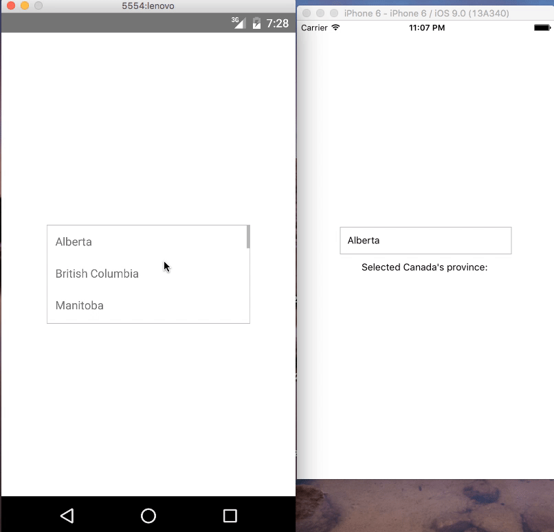
<Option value = {{id : "alberta"}}>Alberta</Option>
<Option>British Columbia</Option>
<Option>Manitoba</Option>
<Option>New Brunswick</Option>
<Option>Newfoundland and Labrador</Option>
<Option>Northwest Territories</Option>
<Option>Nova Scotia</Option>
<Option>Nunavut</Option>
<Option>Ontario</Option>
<Option>Prince Edward Island</Option>
<Option>Quebec</Option>
<Option>Saskatchewan</Option>
<Option>Yukon</Option>
</Select>
<Text>Selected Canada's province: {this.state.canada}</Text>
<OptionList ref="OPTIONLIST"/>
</View>
);
}
}
AppRegistry.registerComponent('App', () => App);
| Property | Type | Default | Description |
|---|---|---|---|
| width | number | 400 | Width of the selection |
| onSelect | function(text, value) | null | function to be invoked when option is selected |
| height | number | 50 | Height of the selection |
| optionListRef | function | required | Reference to <OptionList /> to display the selection menu |
| style | object | null | Custom styles to be applied if supplied |
| defaultValue | string | first option | The value to be displayed if none of the options are selected. |
blur() : close the select by calling blur this.refs.SELECT1.blur();
| Property | Type | Default | Description |
|---|---|---|---|
| value | any | null | value will be passed on callback onSelect as second argument |
| style | object | null | Styles to be applied on 'Option' component |
| styleText | object | null | Styles to be applied on text inside of 'Option' |
| Property | Type | Default | Description |
|---|---|---|---|
| overlayStyles | object | null | Styles to be applied on 'overlay' backdrop |
| itemsStyles | object | null | Styles to be applied on 'items' dropdown |
Your contributions and suggestions are heartily♡ welcome. (✿◠‿◠)


 React
React
 Typescript
 Django
 Laravel
 Facebook
 Microsoft
 Google
 Alibaba
 D3
D3
 Tencent