


MUI-Datatables is a responsive datatables component built on Material-UI. It comes with features like filtering, resizable columns, view/hide columns, draggable columns, search, export to CSV download, printing, selectable rows, expandable rows, pagination, and sorting. On top of the ability to customize styling on most views, there are three responsive modes "vertical", "standard", and "simple" for mobile/tablet devices.
Version 3 has been released! You can read about the updates here!
npm install mui-datatables --save
If your project doesn't already use them, you need to install mui v5 and it's icon pack:
npm --save install @mui/material @emotion/react @emotion/styled @mui/icons-material
| mui-datatables | material-ui | Required Dependencies |
|---|---|---|
| ^2.0.0 | ^3.0.0 | @material-ui/core,@material-ui/icons |
| ^3.0.0 | ^4.10.0 | @material-ui/core,@material-ui/icons |
| ^3.8.0 | ^4.12.0 | @material-ui/core,@material-ui/icons |
| ^4.0.0 | ^5.9.3 | @mui/material,@mui/icons-material |

Browse live demos of all examples in this repo in here!
For a simple table:
import MUIDataTable from "mui-datatables";

const columns = ["Name", "Company", "City", "State"];

const data = [
 ["Joe James", "Test Corp", "Yonkers", "NY"],
 ["John Walsh", "Test Corp", "Hartford", "CT"],
 ["Bob Herm", "Test Corp", "Tampa", "FL"],
 ["James Houston", "Test Corp", "Dallas", "TX"],
];

const options = {
  filterType: 'checkbox',
};

<MUIDataTable
  title={"Employee List"}
  data={data}
  columns={columns}
  options={options}
/>
Or customize columns:
import React from "react"
import MUIDataTable from "mui-datatables";

const columns = [
 {
  name: "name",
  label: "Name",
  options: {
   filter: true,
   sort: true,
  }
 },
 {
  name: "company",
  label: "Company",
  options: {
   filter: true,
   sort: false,
  }
 },
 {
  name: "city",
  label: "City",
  options: {
   filter: true,
   sort: false,
  }
 },
 {
  name: "state",
  label: "State",
  options: {
   filter: true,
   sort: false,
  }
 },
];

const data = [
 { name: "Joe James", company: "Test Corp", city: "Yonkers", state: "NY" },
 { name: "John Walsh", company: "Test Corp", city: "Hartford", state: "CT" },
 { name: "Bob Herm", company: "Test Corp", city: "Tampa", state: "FL" },
 { name: "James Houston", company: "Test Corp", city: "Dallas", state: "TX" },
];

const options = {
  filterType: 'checkbox',
};

<MUIDataTable
  title={"Employee List"}
  data={data}
  columns={columns}
  options={options}
/>The component accepts the following props:
| Name | Type | Description |
|---|---|---|
title |
array | Title used to caption table |
columns |
array | Columns used to describe table. Must be either an array of simple strings or objects describing a column |
data |
array | Data used to describe table. Must be either an array containing objects of key/value pairs with values that are strings or numbers, or arrays of strings or numbers (Ex: data: [{"Name": "Joe", "Job Title": "Plumber", "Age": 30}, {"Name": "Jane", "Job Title": "Electrician", "Age": 45}] or data: [["Joe", "Plumber", 30], ["Jane", "Electrician", 45]]). The customBodyRender and customBodyRenderLite options can be used to control the data display. |
options |
object | Options used to describe table |
components |
object | Custom components used to render the table |
| Name | Type | Default | Description |
|---|---|---|---|
caseSensitive |
boolean | false | Enable/disable case sensitivity for search. |
confirmFilters |
boolean | false | Works in conjunction with the customFilterDialogFooter option and makes it so filters have to be confirmed before being applied to the table. When this option is true, the customFilterDialogFooter callback will receive an applyFilters function which, when called, will apply the filters to the table. Example |
columnOrder |
array | An array of numbers (column indices) indicating the order the columns should be displayed in. Defaults to the order provided by the Columns prop. This option is useful if you'd like certain columns to swap positions (see draggableColumns option). | |
count |
number | User provided override for total number of rows. | |
customFilterDialogFooter |
function | Add a custom footer to the filter dialog. customFilterDialogFooter(curentFilterList: array, applyFilters: function) => React Component |
|
customFooter |
function | Render a custom table footer. function(count, page, rowsPerPage, changeRowsPerPage, changePage, textLabels: object) => string| React Component Example |
|
customRowRender |
function | Override default row rendering with custom function. customRowRender(data, dataIndex, rowIndex) => React Component |
|
customSearch |
function | Override default search with custom function. customSearch(searchQuery: string, currentRow: array, columns: array) => boolean |
|
customSearchRender |
function | Render a custom table search. customSearchRender(searchText: string, handleSearch, hideSearch, options) => React Component |
|
customSort |
function | Override default sorting with custom function. If you just need to override the sorting for a particular column, see the sortCompare method in the column options. function(data: array, colIndex: number, order: string) => array Example |
|
customTableBodyFooterRender |
function | Render a footer under the table body but above the table's standard footer. This is useful for creating footers for individual columns. Example | |
customToolbar |
function | Render a custom toolbar function({displayData}) => React Component |
|
customToolbarSelect |
function | Render a custom selected rows toolbar. function(selectedRows, displayData, setSelectedRows) => void |
|
download |
boolean or string | true | Show/hide download icon from toolbar. Possible values:
|
downloadOptions |
object | see -> | An object of options to change the output of the CSV file:
Default Value: |
draggableColumns |
object | {} | An object of options describing how dragging columns should work. The options are:
|
elevation |
number | 4 | Shadow depth applied to Paper component. |
enableNestedDataAccess |
string | "" | If provided a non-empty string (ex: "."), it will use that value in the column's names to access nested data. For example, given a enableNestedDataAccess value of "." and a column name of "phone.cell", the column would use the value found in phone:{cell:"555-5555"}. Any amount of nesting will work. Example demonstrates the functionality. |
expandableRows |
boolean | false | Enable/disable expandable rows. Example |
expandableRowsHeader |
boolean | true | Show/hide the expand all/collapse all row header for expandable rows. |
expandableRowsOnClick |
boolean | false | Enable/disable expand trigger when row is clicked. When False, only expand icon will trigger this action. |
filter |
boolean or string | true | Show/hide filter icon from toolbar. Possible values:
|
filterArrayFullMatch |
boolean | true | For array values, default checks if all the filter values are included in the array. If false, checks if at least one of the filter values is in the array. |
filterType |
string | Choice of filtering view. enum('checkbox', 'dropdown', 'multiselect', 'textField', 'custom') |
|
fixedHeader |
boolean | true | Enable/disable a fixed header for the table Example |
fixedSelectColumn |
boolean | true | Enable/disable fixed select column. Example |
isRowExpandable |
function | Enable/disable expansion or collapse on certain expandable rows with custom function. Will be considered true if not provided. function(dataIndex: number, expandedRows: object(lookup: {dataIndex: number}, data: arrayOfObjects: {index: number, dataIndex: number})) => boolean. |
|
isRowSelectable |
function | Enable/disable selection on certain rows with custom function. Returns true if not provided. function(dataIndex: number, selectedRows: object(lookup: {dataindex: boolean}, data: arrayOfObjects: {index, dataIndex})) => boolean. |
|
jumpToPage |
boolean | false | When true, this option adds a dropdown to the table's footer that allows a user to navigate to a specific page. Example |
onCellClick |
function | Callback function that triggers when a cell is clicked. function(colData: any, cellMeta: { colIndex: number, rowIndex: number, dataIndex: number }) => void |
|
onChangePage |
function | Callback function that triggers when a page has changed. function(currentPage: number) => void |
|
onChangeRowsPerPage |
function | Callback function that triggers when the number of rows per page has changed. function(numberOfRows: number) => void |
|
onColumnOrderChange |
function | Callback function that triggers when a column has been dragged to a new location. function(newColumnOrder:array, columnIndex:number, newPosition:number) => void |
|
onColumnSortChange |
function | Callback function that triggers when a column has been sorted. function(changedColumn: string, direction: string) => void |
|
onDownload |
function | A callback function that triggers when the user downloads the CSV file. In the callback, you can control what is written to the CSV file. This method can be used to add the Excel specific BOM character (see this example). function(buildHead: (columns) => string, buildBody: (data) => string, columns, data) => string. Return false to cancel download of file. |
|
onFilterChange |
function | Callback function that triggers when filters have changed. function(changedColumn: string, filterList: array, type: enum('checkbox', 'dropdown', 'multiselect', 'textField', 'custom', 'chip', 'reset'), changedColumnIndex, displayData) => void |
|
onFilterChipClose |
function | Callback function that is triggered when a user clicks the "X" on a filter chip. function(index : number, removedFilter : string, filterList : array) => void Example |
|
onFilterConfirm |
function | Callback function that is triggered when a user presses the "confirm" button on the filter popover. This occurs only if you've set confirmFilters option to true. function(filterList: array) => void Example |
|
onFilterDialogClose |
function | Callback function that triggers when the filter dialog closes. function() => void |
|
onFilterDialogOpen |
function | Callback function that triggers when the filter dialog opens. function() => void |
|
onRowClick |
function | Callback function that triggers when a row is clicked. function(rowData: string[], rowMeta: { dataIndex: number, rowIndex: number }) => void |
|
onRowExpansionChange |
function | Callback function that triggers when row(s) are expanded/collapsed. function(currentRowsExpanded: array, allRowsExpanded: array, rowsExpanded: array) => void |
|
onRowsDelete |
function | Callback function that triggers when row(s) are deleted. function(rowsDeleted: object(lookup: {[dataIndex]: boolean}, data: arrayOfObjects: {index: number, dataIndex: number}), newTableData) => void OR false (Returning false prevents row deletion.) |
|
onRowSelectionChange |
function | Callback function that triggers when row(s) are selected/deselected. function(currentRowsSelected: array, allRowsSelected: array, rowsSelected: array) => void |
|
onSearchChange |
function | Callback function that triggers when the search text value has changed. function(searchText: string) => void |
|
onSearchClose |
function | Callback function that triggers when the searchbox closes. function() => void |
|
onSearchOpen |
function | Callback function that triggers when the searchbox opens. function() => void |
|
onTableChange |
function | Callback function that triggers when table state has changed. function(action: string, tableState: object) => void |
|
onTableInit |
function | Callback function that triggers when table state has been initialized. function(action: string, tableState: object) => void |
|
onViewColumnsChange |
function | Callback function that triggers when a column view has been changed. Previously known as onColumnViewChange. function(changedColumn: string, action: string) => void |
|
page |
number | User provided page for pagination. | |
pagination |
boolean | true | Enable/disable pagination. |
print |
boolean or string | true | Show/hide print icon from toolbar. Possible values:
|
renderExpandableRow |
function | Render expandable row. function(rowData, rowMeta) => React Component Example |
|
resizableColumns |
boolean | false | Enable/disable resizable columns. |
responsive |
string | 'stacked' | Enable/disable responsive table views. Options:
|
rowHover |
boolean | true | Enable/disable hover style over rows. |
rowsExpanded |
array | User provided expanded rows. | |
rowsPerPage |
number | 10 | Number of rows allowed per page. |
rowsPerPageOptions |
array | [10,15,100] | Options to provide in pagination for number of rows a user can select. |
rowsSelected |
array | User provided array of numbers (dataIndexes) which indicates the selected rows. | |
search |
boolean or string | true | Show/hide search icon from toolbar. Possible values:
|
searchPlaceholder |
string | Search text placeholder. Example | |
searchProps |
object | {} | Props applied to the search text box. You can set method callbacks like onBlur, onKeyUp, etc, this way. Example |
searchOpen |
boolean | false | Initially displays search bar. |
searchAlwaysOpen |
boolean | false | Always displays search bar, and hides search icon in toolbar. |
searchText |
string | Search text for the table. | |
selectableRows |
string | 'multiple' | Indicates if rows can be selected. Options are "multiple", "single", "none". |
selectableRowsHeader |
boolean | true | Show/hide the select all/deselect all checkbox header for selectable rows. |
selectableRowsHideCheckboxes |
boolean | false | Hides the checkboxes that appear when selectableRows is set to "multiple" or "single". Can provide a more custom UX, especially when paired with selectableRowsOnClick. |
selectableRowsOnClick |
boolean | false | Enable/disable select toggle when row is clicked. When False, only checkbox will trigger this action. |
selectToolbarPlacement |
string | 'replace' | Controls the visibility of the Select Toolbar, options are 'replace' (select toolbar replaces default toolbar when a row is selected), 'above' (select toolbar will appear above default toolbar when a row is selected) and 'none' (select toolbar will never appear) |
serverSide |
boolean | false | Enable remote data source. |
setFilterChipProps |
function | Is called for each filter chip and allows you to place custom props on a filter chip. function(colIndex: number, colName: string, filterValue: string) => object Example |
|
setRowProps |
function | Is called for each row and allows you to return custom props for this row based on its data. function(row: array, dataIndex: number, rowIndex: number) => object Example |
|
setTableProps |
function | Is called for the table and allows you to return custom props for the table based on its data. function() => object Example |
|
sort |
boolean | true | Enable/disable sort on all columns. |
sortFilterList |
boolean | true | Enable/disable alphanumeric sorting of filter lists. |
sortOrder |
object | {} | Sets the column to sort by and its sort direction. To remove/reset sorting, input in an empty object. The object options are the column name and the direction: name: string, direction: enum('asc', 'desc') Example |
tableId |
string | auto generated | A string that is used internally for identifying the table. It's auto-generated, however, if you need it set to a custom value (ex: server-side rendering), you can set it via this property. |
tableBodyHeight |
string | 'auto' | CSS string for the height of the table (ex: '500px', '100%', 'auto'). |
tableBodyMaxHeight |
string | CSS string for the height of the table (ex: '500px', '100%', 'auto'). | |
textLabels |
object | User provided labels to localize text. | |
viewColumns |
boolean or string | true | Show/hide viewColumns icon from toolbar. Possible values:
|
storageKey |
string | save current state to local storage(Only browser). |
On each column object, you have the ability to customize columns to your liking with the 'options' property. Example:
const columns = [
 {
  name: "Name",
  options: {
   filter: true,
   sort: false
  }
 },
 ...
];| Name | Type | Description |
|---|---|---|
name |
string | Name of column (This field is required) |
label |
string | Column Header Name override |
options |
object | Options for customizing column |
| Name | Type | Default | Description |
|---|---|---|---|
customBodyRender |
function | Function that returns a string or React component. Used to display data within all table cells of a given column. The value returned from this function will be used for filtering in the filter dialog. If this isn't need, you may want to consider customBodyRenderLite instead. function(value, tableMeta, updateValue) => string| React Component Example |
|
customBodyRenderLite |
function | Function that returns a string or React component. Used to display data within all table cells of a given column. This method performs better than customBodyRender but has the following caveats:
function(dataIndex, rowIndex) => string| React Component Example |
|
customHeadLabelRender |
function | Function that returns a string or React component. Used for creating a custom header to a column. This method only affects the display in the table's header, other areas of the table (such as the View Columns popover), will use the column's label. function(columnMeta : object) => string| React Component |
|
customFilterListOptions |
object | (These options only affect the filter chips that display after filters are selected. To modify the filters themselves, see filterOptions)
|
|
customHeadRender |
function | Function that returns a string or React component. Used as display for column header. function(columnMeta, handleToggleColumn, sortOrder) => string| React Component |
|
display |
boolean or string | true | Display column in table. Possible values:
See also: |
download |
boolean | true | Display column in CSV download file. |
draggable |
boolean | true | Determines if a column can be dragged. The draggableColumns.enabled option must also be true. |
empty |
boolean | false | This denotes whether the column has data or not (for use with intentionally empty columns). |
filter |
boolean | true | Display column in filter list. |
filterList |
array | Filter value list Example | |
filterOptions |
object | These options affect the filter display and functionality from the filter dialog. To modify the filter chips that display after selecting filters, see This option is an object of several options for customizing the filter display and how filtering works.
|
|
filterType |
string | 'dropdown' | Choice of filtering view. Takes priority over global filterType option.enum('checkbox', 'dropdown', 'multiselect', 'textField', 'custom') Use 'custom' if you are supplying your own rendering via filterOptions. |
hint |
string | Display hint icon with string as tooltip on hover. | |
print |
boolean | true | Display column when printing. |
searchable |
boolean | true | Exclude/include column from search results. |
setCellHeaderProps |
function | Is called for each header cell and allows you to return custom props for the header cell based on its data. function(columnMeta: object) => object Example |
|
setCellProps |
function | Is called for each cell and allows to you return custom props for this cell based on its data. function(cellValue: string, rowIndex: number, columnIndex: number) => object Example |
|
sort |
boolean | true | Enable/disable sorting on column. |
sortCompare |
function | Custom sort function for the column. Takes in an order string and returns a function that compares the two column values. If this method and options.customSort are both defined, this method will take precedence. (order) => ({data: val1}, {data: val2}) => number Example |
|
sortDescFirst |
boolean | false | Causes the first click on a column to sort by desc rather than asc. Example |
sortThirdClickReset |
boolean | false | Allows for a third click on a column header to undo any sorting on the column. Example |
viewColumns |
boolean | true | Allow user to toggle column visibility through 'View Column' list. |
customHeadRender is called with these arguments:
function(columnMeta: {
  customHeadRender: func,
  display: enum('true', 'false', 'excluded'),
  filter: boolean,
  sort: boolean,
  download: boolean,
  empty: boolean,
  index: number,
  label: string,
  name: string,
  print: boolean,
  searchable: boolean,
  viewColumns: boolean
}, handleToggleColumn: function(columnIndex))
customBodyRender is called with these arguments:
function(value: any, tableMeta: {
  rowIndex: number,
  columnIndex: number,
  columnData: array, // Columns Options object
  rowData: array, // Full row data
  tableData: array, // Full table data - Please use currentTableData instead
  currentTableData: array, // The current table data
  tableState: {
    announceText: null|string,
    page: number,
    rowsPerPage: number,
    filterList: array,
    selectedRows: {
      data: array,
      lookup: object,
    },
    showResponsive: boolean,
    searchText: null|string,
  },
}, updateValue: function)The table lends itself to plug-ins in many areas, especially in the customRender functions. Many use cases for these render functions are common, so a set of plug-ins are available that you can use.
| Name | Type | Default | Description |
|---|---|---|---|
debounceSearchRender |
function | Function that returns a function for the customSearchRender method. This plug-in allows you to create a debounced search which can be useful for server-side tables and tables with large data sets. function(debounceWait) => function Example |
Using Material-UI theme overrides will allow you to customize styling to your liking. First, determine which component you would want to target and then lookup the override classname. Let's start with a simple example where we will change the background color of a body cell to be red:
import React from "react";
import MUIDataTable from "mui-datatables";
import { createTheme, ThemeProvider } from '@mui/material/styles';
class BodyCellExample extends React.Component {
getMuiTheme = () => createTheme({
components: {
MUIDataTableBodyCell: {
styleOverrides:{
root: {
backgroundColor: "#FF0000"
}
}
}
}
})
render() {
return (
<ThemeProvider theme={this.getMuiTheme()}>
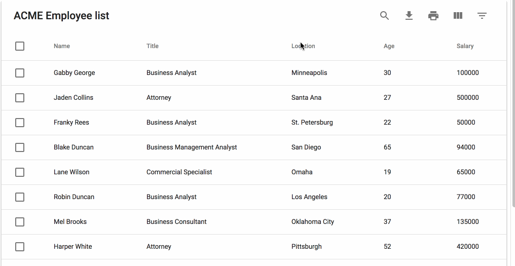
<MUIDataTable title={"ACME Employee list"} data={data} columns={columns} options={options} />
</ThemeProvider>
);
}
}You can pass custom components to further customize the table:
import React from "react";
import Chip from '@mui/material/Chip';
import MUIDataTable, { TableFilterList } from "mui-datatables";

const CustomChip = ({ label, onDelete }) => {
    return (
        <Chip
            variant="outlined"
            color="secondary"
            label={label}
            onDelete={onDelete}
        />
    );
};

const CustomFilterList = (props) => {
    return <TableFilterList {...props} ItemComponent={CustomChip} />;
};

class CustomDataTable extends React.Component {
    render() {
        return (
            <MUIDataTable
                columns={columns}
                data={data}
                components={{
                  TableFilterList: CustomFilterList,
                }}
            />
        );
    }
}
Supported customizable components:
Checkbox- A special 'data-description' prop lets you differentiate checkboxes Example. Valid values: ['row-select', 'row-select-header', 'table-filter', 'table-view-col'].The dataIndex is also passed via the "data-index" prop.ExpandButtonExampleDragDropBackendTableBodyTableViewCol- The component that displays the view/hide list of columns on the toolbar.TableFilterList- You can passItemComponentprop to render custom filter list item.TableFooterTableHeadTableResizeTableToolbarTableToolbarSelectTooltipicons- An object containing optional replacement icon classes for the actions toolbar. ExampleSearchIconDownloadIconPrintIconViewColumnIconFilterIcon
For more information, please see this example. Additionally, all examples can be viewed live at our CodeSandbox.
If you are looking to work with remote data sets or handle pagination, filtering, and sorting on a remote server you can do that with the following options:
const options = {
  serverSide: true,
  onTableChange: (action, tableState) => {
    this.xhrRequest('my.api.com/tableData', result => {
      this.setState({ data: result });
    });
  }
};
To see an example Click Here
This package decided that the cost of bringing in another library to perform localizations would be too expensive. Instead the ability to override all text labels (which aren't many) is offered through the options property textLabels. The available strings:
const options = {
  ...
  textLabels: {
    body: {
      noMatch: "Sorry, no matching records found",
      toolTip: "Sort",
      columnHeaderTooltip: column => `Sort for ${column.label}`
    },
    pagination: {
      next: "Next Page",
      previous: "Previous Page",
      rowsPerPage: "Rows per page:",
      displayRows: "of",
    },
    toolbar: {
      search: "Search",
      downloadCsv: "Download CSV",
      print: "Print",
      viewColumns: "View Columns",
      filterTable: "Filter Table",
    },
    filter: {
      all: "All",
      title: "FILTERS",
      reset: "RESET",
    },
    viewColumns: {
      title: "Show Columns",
      titleAria: "Show/Hide Table Columns",
    },
    selectedRows: {
      text: "row(s) selected",
      delete: "Delete",
      deleteAria: "Delete Selected Rows",
    },
  }
  ...
}Thanks for taking an interest in the library and the github community!
The following commands should get you started:
npm i
npm run dev
open http://localhost:5050/ in browser
After you make your changes locally, you can run the test suite with npm test.
The files included in this repository are licensed under the MIT license.
Thank you to BrowserStack for providing the infrastructure that allows us to test in real browsers.


![dependabot[bot] avatar](https://avatars.githubusercontent.com/in/29110?v=4 "dependabot[bot]")


 React
React
 Typescript
 Django
 Laravel
 Facebook
 Microsoft
 Google
 Alibaba
 D3
D3
 Tencent