Serverless coding environments for the web.

Overview
• Getting Started
• Project files
• Module resolution
• TypeScript
• Hiding & Folding
• Custom layouts
• Bundling
• Sandbox security
• Components
• Styling
• Syntax highlighting
• Contributing
• FAQ
Playground Elements are a set of components for creating interactive editable coding environments on the web, with live updating previews. You can use Playground Elements to:
- Embed editable code examples in your documentation.
- Build interactive tutorials and example galleries.
- Build full-featured coding sandboxes (think Glitch or JSBin).
Unlike other coding environments, Playground never sends code to a backend server. Instead, Playground uses a Service Worker to create a virtual URL-space that runs 100% within the browser. If you can host static files, you can host a Playground.
Playground automatically compiles .ts files using TypeScript, and
automatically fetches typings for your imports in order to display errors.
Compilation happens in a Web Worker on a separate thread, so your page stays
responsive.
Playground uses Web Components, so it doesn't require a framework. But it will play nicely with any framework you're already using, like React, Vue, and Angular.
Playground is broken up into small components like an editor, file picker, and
preview. Mix-and-match components to create any layout you want, or just use
<playground-ide> for an easy out-of-the-box experience.
Playground is fully themeable with CSS Custom Properties, down to the color of each kind of syntax-highlighted token. You can import themes from VSCode using the configurator, and it comes with a number of presets too.
Install from NPM:
npm i playground-elements<script
type="module"
src="/node_modules/playground-elements/playground-ide.js"
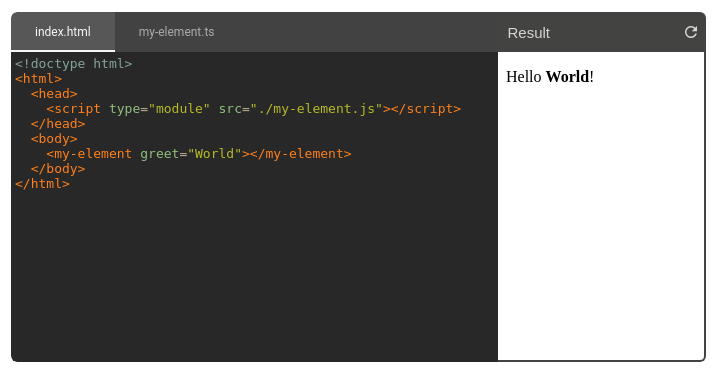
></script>Create a <playground-ide> element in your HTML, and specify your project files
inline:
<playground-ide editable-file-system line-numbers resizable>
<script type="sample/html" filename="index.html">
<!doctype html>
<body>
Hello
<script type="module" src="./index.js"></script>
</body>
</script>
<script type="sample/ts" filename="index.ts">
document.body.appendChild(document.createTextNode("World!"))
</script>
</playground-ide>Use a server like @web/dev-server to handle bare module import resolution automatically:
npm i -D @web/dev-server
npx web-dev-server --node-resolve --watch
Or, use a tool like Rollup to resolve bare module imports to paths at build time. If you need more help with building and serving, check out the Modern Web Guides.
Playground is supported by all modern browsers. It requires support for custom elements, JS modules, service workers, and web workers.
Supported: 
 Chrome
 Firefox
 Safari
 Edge
Edge
Unsupported: 
 Internet Explorer
There are 3 ways to specify the files of a playground project:
Add one or more <script> tags as children of
your <playground-ide> or <playground-project>, using the following attributes:
| Attribute | Description |
|---|---|
type |
Required filetype. Options: sample/html, sample/css, sample/js, sample/ts, sample/json, sample/importmap. |
filename |
Required filename. |
label |
Optional label for display in playground-tab-bar. If omitted, the filename is displayed. |
hidden |
If present, the file won't be visible in playground-tab-bar. |
selected |
If present, this file's tab will be selected when the project is loaded. Only one file should have this attribute. |
preserve-whitespace |
Disable the default behavior where leading whitespace that is common to all lines is removed. |
Be sure to escape closing </script> tags within your source as </script>.
<playground-project>
<script type="sample/html" filename="index.html">
<!doctype html>
<head>
<script type="module" src="javascript.js"></script>
<script type="module" src="typescript.js"></script>
<link rel="stylesheet" href="styles.css">
</head>
<body>
<p>Hello World!</p>
</body>
</script>
<script type="sample/js" filename="javascript.js">
console.log('hello from javascript');
</script>
<script type="sample/ts" filename="typescript.ts">
console.log('hello from typescript');
</script>
<script type="sample/css" filename="styles.css">
body { color: blue; }
</script>
</playground-project>Set the project-src attribute or projectSrc property to a JSON file with format:
| Property | Description |
|---|---|
files |
An object mapping filenames to file data. |
files.content |
Optional text content of the file. If omitted, a fetch is made to retrieve the file by filename, relative to the manifest URL. |
files.contentType |
Optional MIME type of the file. If omitted, type is taken from either the fetch response Content-Type header, or inferred from the filename extension when content is set. |
files.label |
Optional label for display in playground-tab-bar. If omitted, the filename is displayed. |
files.hidden |
If true, the file won't be visible in playground-tab-bar. |
files.selected |
If true, this file's tab will be selected when the project is loaded. Only one file should have this field set. |
extends |
Optional URL to another JSON config file to extend from. Configs are deeply merged. URLs are interpreted relative to the URL of each extendee config. |
<playground-ide project-src="/path/to/my/project.json"> </playground-ide>{
"files": {
"index.html": {},
"typescript.ts": {
"content": "console.log('hello');"
},
"javascript.js": {
"contentType": "text/javascript"
},
"styles.css": {
"label": "Style"
}
}
}In JavaScript, directly set the config property to an object. The format is
identical to the JSON config file.
const ide = document.querySelector('playground-ide');
ide.config = {
  files: {
    'index.html': {},
    'typescript.ts': {
      content: "console.log('hello');",
    },
  },
};
If both project-src and config are set, then the one set most recently has
precedence. When either are set, inline scripts are ignored.
By default, bare module specifiers in JavaScript and TypeScript files are
transformed to special ./node_modules/ URLs, and fetched behind-the-scenes
from unpkg.com at the latest version.
// What you write:
import {html} from 'lit';

// What playground serves:
import {html} from './node_modules/[email protected]/index.js';

// What playground fetches behind-the-scenes:
// https://unpkg.com/lit@latestTo customize the version of a module you import, create a file called
package.json in your project containing a
dependencies
map. This works exactly like it does when using NPM locally.
{
  "dependencies": {
    "lit": "^2.0.2"
  }
}
TIP: Use the
hiddenattribute or property to hide thepackage.jsonfile from being displayed in the list of project files, if you don't want the end-user to be able to see or modify it.
Playground supports Node-style export
conditions when
resolving modules in dependencies, and sets the following
conditions:
module, import, development, and browser.
For full control over module resolution, you can configure an import map. You may want to do this to change CDNs or point to a locally served copy of a module:
{
  "files": { ... },
  "importMap": {
    "imports": {
      "lit": "https://cdn.skypack.dev/lit@^2.0.2",
      "lit/": "https://cdn.skypack.dev/lit@^2.0.2/"
    }
  }
}
When using inline project files, you can specify your import map like so:
<playground-ide>
  <script type="sample/importmap">
    {
      "imports": {
        "lit": "https://cdn.skypack.dev/lit@^2.0.2",
        "lit/": "https://cdn.skypack.dev/lit@^2.0.2/"
      }
    }
  </script>
  ...
</playground-ide>
If an import map is defined, but does not contain an entry for a bare module,
then playground defaults to the unpkg.com URL.
Playground automatically compiles .ts, .tsx, and .jsx files using
TypeScript.
The following compiler settings are used:
| Name | Value |
|---|---|
target |
es2021 |
module |
esnext |
moduleResolution |
nodenext |
experimentalDecorators |
true |
allowJs |
true |
jsx |
react |
Note that when you import from another project module, the import
statement should use the .js extension (the same as you would do when running
tsc locally):
import './my-other-module.js';You may also include any Definitely Typed (@types) packages for type checking
during compilation by listing it as a dependency in the project's
package.json file.
If a region of code in a Playground project file is surrounded by
playground-hide and playground-hide-end comments, then that region won't be
visible or editable by the user, but it will still be compiled and served.
Similarly, if a region is surrounded by playground-fold and
playground-fold-end comments, then the region will be replaced with a … that
expands to reveal the original editable code when clicked.
Use these special regions to help users focus on a particular part of a file, by de-emphasizing boilerplate or unrelated code.
Note that JavaScript // style comments are not supported.
/* playground-fold */
import {html, LitElement} from 'lit';
/* playground-fold-end */

class MyElement extends LitElement {
  render() {
    return html`Hello <slot></slot>!`;
  }
}
/* playground-fold */

customElements.define('my-element', MyElement);
Result:

<!-- playground-hide -->
<head>
  <title>Boring stuff</title>
  <script type="module" src="./my-element.js"></script>
</head>
<body>
<!-- playground-hide-end -->
<my-element>World</my-element>
<!-- playground-hide -->
</body>
<!-- playground-hide-end -->
Result:

Hiding and folding is enabled by default, but can be disabled by setting the
pragmas property to "off" (disabled with comments hidden) or "off-visible"
(disabled with comments visible). The pragmas property is available on ide,
file-editor, and code-editor.
<playground-ide> provides a complete out-of-the-box experience that's a good
start for many use-cases, but you can mix-and-match the various Playground
sub-components to make your custom layouts.
For example, say we need a layout with an editor above, a preview below, and only one particular file from the project visible — like this:

To do this, first import just the components you need. The main
playground-elements import loads all Playground elements, but when making a
custom layout it's a good idea to only load the sub-components you're actually
using. This will make your JavaScript bundle smaller.
<script type="module">
  import 'playground-elements/playground-project.js';
  import 'playground-elements/playground-file-editor.js';
  import 'playground-elements/playground-preview.js';
</script>
Next create a <playground-project>, with some inline project files. We could also
write our project files separately, and specify them in a JSON manifest. This
project element manages the virtual file system, and coordinates with the
Playground workers. We give it a unique id, which we'll use to connect up the
editor and preview.
<playground-project id="project1">
<script type="sample/ts" filename="index.ts">
window.addEventListener('DOMContentLoaded', () => {
const world = document.createTextNode(' World!');
document.body.appendChild(world);
});
</script>
<script type="sample/html" filename="index.html">
<!doctype html>
<head>
<script type="module" src="./index.js"></script>
</head>
<body>Hello</body>
</script>
</playground-project>Next create an editor and preview. Connect both to the project by setting the
property attribute to the project element's id. We could also directly set
the project property to the project element, if we were using JavaScript.
By setting the filename attribute on the editor, we've pinned it to one
particular file. Since we didn't include a <playground-tab-bar>, there's no
way for the user to see or switch to other files in the project.
<div class="example">
  <playground-file-editor
    project="project1"
    filename="index.ts"
  ></playground-file-editor>

  <playground-preview project="project1"> </playground-preview>
</div>
Finally, add a little style:
<style>
  .example {
    width: 500px;
    border: 1px solid #ccc;
  }
  .example > playground-file-editor {
    height: 110px;
  }
  .example > playground-preview {
    height: 100px;
    border-top: 1px solid #ccc;
    --playground-preview-toolbar-background: #eaeaea;
  }
</style>Playground uses a Web
Worker
to perform TypeScript compilation. If you are bundling or otherwise modifying
the layout of the playground-elements NPM package, you may need to add special
handling for this file.
Use the Rollup
@web/rollup-plugin-import-meta-assets
plugin to automatically copy the worker script into the correct location. See
examples/rollup
for an example configuration.
Webpack 5+ automatically supports loading Web Workers with no additional plugins. See examples/webpack for an example configuration.
If you are bundling in another way, you'll need to configure your build so that
the file node_modules/playground-elements/playground-typescript-worker.js is
copied into the same directory as your bundle.
For example, if you bundled playground elements into ./js/app.js, then you
should copy the worker module to ./js/playground-typescript-worker.js.
⚠️ Changing the sandbox base URL from the default can create a security vulnerability for your site if not done carefully. Do not change the default unless you have a specific reason to, and please read this entire section carefully.
The sandboxBaseUrl property and sandbox-base-url attribute can be used to
override the origin where untrusted code will execute when displaying Playground
previews. The default origin is unpkg.com, which is secure because it is
unprivileged and cannot modify the host window.
You may wish to override this default sandbox base URL if you do not want a
dependency on unpkg.com, e.g. for isolation from outages, or because your
network does not have access to it. Note that Playground currently also uses
unpkg.com to retrieve imported bare modules that are not otherwise handled by
an import map, so the unpkg.com dependency cannot
currently be completely eliminated.
Playground previews work by using a service
worker.
This service worker takes control over requests to a particular URL space,
allowing it to respond to HTTP requests using the files from your local project,
instead of from a remote server. The playground preview component contains an
<iframe> pointing to the index.html within that URL space.
When JavaScript in this preview <iframe> executes, it does so with the full
privileges of whichever
origin the service
worker was registered on. This means it can access cookies on that origin, make
HTTP requests to sensitive URLs on that origin, and directly access the
<iframe> parent window if it has the same origin.
The JavaScript in Playground project files should always be considered untrusted and potentially malicious. This is particularly the case if you implement a share feature, because a user can be tricked into executing malicious code simply by visiting a URL.
By default, the sandbox base URL is
https://unpkg.com/playground-elements@<version>/playground-projects/. This is
a secure default because unpkg.com is unprivileged and cannot modify the host
window.
If you change the sandbox base URL from the default, ensure that the new URL meets all of the following requirements:
-
Must be a different origin to the origin hosting the Playground components. This prevents untrusted code from modifying the parent window using
window.parent, e.g. to change your sign-in link to a malicious URL.NOTE: It is highly recommended to furthermore use either an entirely different site, or to use the
Origin-Agent-Clusterheader, to improve performance and prevent lockups. See Process isolation for more information. -
Must not have access to any sensitive cookies. This prevents untrusted code from e.g. reading and forwarding your user's authentication token.
-
Must not have access to any sensitive resources or APIs, either through the same-origin policy, or through CORS headers that grant the origin access to resources on other origins. This prevents untrusted code from e.g. making a request to your
get_credit_cardorchange_passwordAPIs. -
Must serve the following two pre-minified files from the
playground-elementsNPM package at the same version as your imported components:playground-service-worker.jsplayground-service-worker-proxy.html
Some browsers such as Chrome are sometimes able to allocate a separate process or thread for iframes. This is highly desirable for Playground, because it improves responsiveness and prevents full lockups (resulting from e.g. an infinite loop accidentally written by a user).
By default, this iframe process isolation can only occur if the iframe and the
parent window are different sites. While an origin is defined by (protocol +
subdomain + top-level domain + port), a site is defined only by (protocol +
top-level domain). For example, example.com and foo.example.com are
different-origin but same-site, whereas example.com and example.net are
different-origin and different-site.
Alternatively, if the Origin-Agent-Cluster: ?1 header is set on all server
responses from one or the other origins, then iframe process isolation can also
occur with different-origin but same-site configurations. Note that this header
must truly be set on all responses from the origin, because the browser will
remember the setting based on the first response it gets from that origin. See
"Requesting performance isolation with the Origin-Agent-Cluster
header" for more information about this
header.
<playground-ide>
• <playground-project>
• <playground-file-editor>
• <playground-code-editor>
• <playground-preview>
• <playground-tab-bar>
• <playground-file-system-controls>
All-in-one project, editor, file switcher, and preview with a horizontal side-by-side layout.
| Name | Type | Default | Description |
|---|---|---|---|
projectSrc |
string |
undefined |
URL of the project manifest to load |
config |
ProjectManifest |
undefined |
Get or set the project configuration and files, (details). |
lineNumbers |
boolean |
false |
Render a gutter with line numbers in the editor |
lineWrapping |
boolean |
false |
If true, long lines are wrapped, otherwise the editor will scroll. |
editableFileSystem |
boolean |
false |
Allow adding, removing, and renaming files |
resizable |
boolean |
false |
Allow dragging the line between editor and preview to change relative sizes |
sandboxBaseUrl |
string |
module parent directory | Base URL for untrusted JavaScript execution (<playground-project>. |
pragmas |
"on" | "off" | "off-visible" |
"on" |
How to handle playground-hide and playground-fold comments (details). |
modified |
boolean |
false |
Whether the user has modified, added, or removed any project files. Resets whenever a new project is loaded. |
htmlFile |
string |
"index.html" |
The HTML file used in the preview. |
noCompletions |
boolean |
false |
If interactive code completions should be shown. This setting only applies to TypeScript files. |
| Name | Description |
|---|---|
default |
Inline files (details) |
Invisible element that coordinates the filesystem, build worker, and service
worker. Unless you're using <playground-ide>, all Playground layouts need a
project element.
| Name | Type | Default | Description |
|---|---|---|---|
projectSrc |
string |
undefined |
URL of a project files manifest to load. |
config |
ProjectManifest |
undefined |
Get or set the project configuration and files, (details). |
sandboxScope |
string |
"playground-elements" |
The service worker scope to register on. |
sandboxBaseUrl |
string |
module parent directory | Base URL for untrusted JavaScript execution (<playground-project>. |
diagnostics |
Map<string, lsp.Diagnostic> |
undefined |
Map from filename to array of Language Server Protocol diagnostics resulting from the latest compilation. |
modified |
boolean |
false |
Whether the user has modified, added, or removed any project files. Resets whenever a new project is loaded. |
| Method | Description |
|---|---|
addFile(filename: string) |
Create a new file. Type is inferred from filename extension. |
deleteFile(filename: string) |
Delete a file. |
renameFile(oldName: string, newName: string) |
Rename a file. |
| Name | Description |
|---|---|
default |
Inline files (details) |
| Event | Description |
|---|---|
filesChanged |
A file was added, removed, or renamed. |
urlChanged |
The preview URL has changed |
compileStart |
A build has started. |
compileEnd |
A build has completed. |
| Property | Type | Default | Description |
|---|---|---|---|
project |
string | PlaygroundProject |
undefined |
The project this bar is associated with. Either the <playground-project> itself, or its id in the host scope. |
editor |
string | PlaygroundFileEditor |
undefined |
The editor this bar controls. Either the <playground-file-editor> itself, or its id in the host scope. |
editableFileSystem |
boolean |
false |
Allow adding, removing, and renaming files |
| Name | Type | Default | Description |
|---|---|---|---|
project |
string | PlaygroundProject |
undefined |
The project that this editor is associated with. Either the <playground-project> node itself, or its id in the host scope. |
filename |
string |
undefined |
The name of the project file that is currently being displayed. Set when changing tabs. Does not reflect to attribute. |
type |
"js" | "ts" | "html" | "css" |
undefined |
File type. |
lineNumbers |
boolean |
false |
Render a gutter with line numbers in the editor |
pragmas |
"on" | "off" | "off-visible" |
"on" |
How to handle playground-hide and playground-fold comments (details). |
readonly |
boolean |
false |
Do not allow edits |
noCompletions |
boolean |
false |
If interactive code completions should be shown. This setting only applies to TypeScript files. |
A pure text editor based on CodeMirror with syntax highlighting for HTML, CSS, JavaScript, and TypeScript.
| Name | Type | Default | Description |
|---|---|---|---|
value |
string |
"" |
Code as string |
type |
"js" | "ts" | "html" | "css" |
undefined |
Language of the file to syntax highlight |
readonly |
boolean |
false |
Do not allow edits |
lineNumbers |
boolean |
false |
Render a gutter with line numbers in the editor |
pragmas |
"on" | "off" | "off-visible" |
"on" |
How to handle playground-hide and playground-fold comments (details). |
documentKey |
object |
undefined |
Editor history for undo/redo is isolated per documentKey. Default behavior is a single instance. |
noCompletions |
boolean |
false |
If interactive code completions should be shown. This setting only applies to TypeScript files. |
| Event | Description |
|---|---|
change |
User made an edit to the active file |
The playground code editor extends the CodeMirror default keyboard shortcuts with the following:
| Keyboard shortcut | Description |
|---|---|
Ctrl + Space |
Trigger code completion when supported |
Ctrl + / or Cmd + / |
Toggle line comments |
ESC |
De-focus the code editor |
| Name | Type | Default | Description |
|---|---|---|---|
project |
string PlaygroundProject |
undefined |
The project that this editor is associated with. Either the <playground-project> node itself, or its id in the host scope. |
location |
string |
"" |
|
htmlFile |
string |
"index.html" |
The HTML file used in the preview. |
iframe |
HTMLIFrameElement | null |
null |
A reference to the internal iframe element that is used to render the preview. |
Floating controls for adding, deleting, and renaming files.
| Name | Type | Default | Description |
|---|---|---|---|
state |
"closed" | "menu" | "rename" | "newfile" |
"closed" |
The kind of control to display.closed: Hidden.menu: Menu with "Rename" and "Delete" items.rename: Control for renaming an existing file.newfile: Control for creating a new file. |
filename |
string |
undefined |
When state is menu or newfile, the name of the relevant file. |
anchorElement |
HTMLElement |
undefined |
Absolutely position these controls at the bottom-left corner of this element. |
| Event | Detail | Description |
|---|---|---|
newFile |
{filename: string} |
The specified new file was created through these controls. |
TIP: Use the configurator to quickly experiment with themes and other customizations.
| Name | Default | Description |
|---|---|---|
--playground-bar-height |
40px |
height of the tab bar and the preview bar |
--playground-code-font-family |
monospace |
font-family of code in the editor |
--playground-code-font-size |
14px |
font-size of code in the editor |
--playground-code-line-height |
1.4em |
line-height of code in the editor |
--playground-code-TOKEN-color |
various | Color of each kind of TOKEN in syntax highlighted-code. See the syntax highlighting section for details. |
--playground-highlight-color |
 #6200EE |
Color of the active file-picker tab label and indicator, and the preview loading bar |
--playground-code-background |
 #FFFFFF |
background of the code editor |
--playground-code-gutter-background |
var(--playground-code-background, #FFFFFF) |
background of the line-numbers gutter |
--playground-code-gutter-box-shadow |
none |
box-shadow of the line-numbers gutter |
--playground-code-gutter-border-right |
none |
border-right of the line-numbers gutter |
--playground-code-linenumber-color |
 #767676 |
color of line-numbers |
--playground-code-cursor-color |
 var(--playground-code-default-color, #000000) |
color of the cursor |
--playground-code-selection-background |
 #D7D4F0 |
background of selected text |
--playground-code-padding |
0 |
padding around the editor code block |
--playground-code-line-padding |
0 4px |
padding around each line of code |
--playground-tab-bar-background |
 #EAEAEA |
background of the file-picker tab bar |
--playground-tab-bar-active-background |
transparent |
background of the active file-picker tab |
--playground-tab-bar-foreground-color |
#000000 |
Text color of inactive file-picker tabs |
--playground-tab-bar-active-color |
var(--playground-highlight-color, #6200EE) |
Text color of active file-picker tab |
--playground-tab-bar-indicator-color |
var(--playground-highlight-color, #6200EE) |
color of active file-picker tab indicator (use transparent to hide) |
--playground-tab-bar-font-size |
14px |
font-size of tab titles in the file-picker tab bar |
--playground-preview-toolbar-background |
#FFFFFF |
background of the preview toolbar |
--playground-preview-toolbar-foreground-color |
 #444444 |
Text color of the preview toolbar |
--playground-border |
 1px solid #DDDDDD |
Outer and inner border |
--playground-floating-controls-highlight-color |
var(--playground-highlight-color, #6200EE) |
Highlight color of popup controls buttons and inputs |
The following CSS shadow parts are exported, which you can style with additional rules not covered by the above CSS custom properties.
| Part name | Exported by | Description |
|---|---|---|
tab-bar |
ide |
Tab bar file switcher |
editor |
ide |
Editor |
preview |
ide |
Preview |
preview-toolbar |
ide, preview |
Preview top bar |
preview-location |
ide, preview |
Preview top bar "Result" heading |
preview-reload-button |
ide, preview |
Preview top bar reload button |
preview-loading-indicator |
ide, preview |
Preview top bar horizontal loading indicator |
diagnostic-tooltip |
ide, file-editor, code-editor |
The tooltip that appears when hovering over a code span that has an error |
dialog |
ide, file-editor, code-editor |
Dialogs appearing on top of a component (e.g. the editor keyboard help modal that shows on keyboard focus) |
The playground-elements package includes a directory of pre-configured
syntax-highlighting themes. To load a theme, import its stylesheet, and apply the
corresponding class name to the playground element or one of its ancestors:
<import
  rel="stylesheet"
  src="/node_modules/playground-elements/themes/ayu-mirage.css"
>
  <playground-ide class="playground-theme-ayu-mirage"></playground-ide
></import>
A .js file is also provided for each theme, which exports a Lit
CSSResult. You can include this
directly in the static styles of your own Lit components, or get a
CSSStyleSheet or string representation for other use cases:
import ayuMirageTheme from 'playground-elements/themes/ayu-mirage.css.js';

ayuMirageTheme; // Lit CSSResult
ayuMirageTheme.styleSheet; // CSSStyleSheet
ayuMirageTheme.cssText; // stringEach kind of language token is controlled by a CSS custom property with the name
--playground-code-TOKEN-color. For example, the keyword token is controlled
by --playground-code-keyword-color.
| Token | Default | JS/TS | HTML | CSS |
|---|---|---|---|---|
default |
#000000 |
{}[]; |
<p>foo</p> |
{}:; |
atom |
 #221199 |
true |
& |
bold |
attribute |
 #0000CC |
<foo bar> |
@media screen { } |
|
builtin |
 #3300AA |
#id { } |
||
callee |
#000000 |
func() |
calc() |
|
comment |
 #AA5500 |
// foo |
<!-- foo --> |
/* foo */ |
def |
 #0000FF |
let foo = bar /**@param {string} foo*/ |
@media |
|
keyword |
 #770088 |
class |
blue |
|
meta |
 #555555 |
<!doctype html> |
||
number |
 #116644 |
4 |
4px |
|
operator |
#000000 |
= |
||
property |
#000000 |
class foo { bar; } |
color: |
|
qualifier |
#555555 |
.class { } |
||
string |
 #AA1111 |
"foo" |
<a b="c"> |
content: "foo" |
string-2 |
 #FF5500 |
`foo` /foo/ |
zoom: 50% 1 |
|
tag |
 #117700 |
/**@param {string} foo*/ |
<foo> |
div { } |
type |
 #008855 |
let foo: string /**@param {string} foo*/ |
||
variable |
#000000 |
let foo = bar |
@keyframes spin { } |
|
variable-2 |
 #0055AA |
(arg) => { arg } 2 |
||
variable-3 |
#008855 |
::hover |
||
local |
#0000FF |
(arg) => { } |
- In CSS,
string-2is used for "non-standard" properties, but the list is outdated. - In JS/TS,
variable-2is used for function-local variables.
Playground uses the google_modes CodeMirror syntax highlighting modes for
TS/JS/HTML, because they support highlighting of HTML and CSS within JavaScript
tagged template literals.
- JavaScript: https://github.com/codemirror/google-modes/blob/master/src/javascript.grammar
- TypeScript: https://github.com/codemirror/google-modes/blob/master/src/typescript.grammar
- JSDoc: https://github.com/codemirror/google-modes/blob/master/src/jsdoc.grammar
- HTML: https://github.com/codemirror/google-modes/blob/master/src/html.grammar
- CSS: https://github.com/codemirror/CodeMirror/blob/master/mode/css/css.js
Contributions are very welcome.
For substantial changes, please file an issue first to discuss the changes. For small changes, sending a PR immediately is fine.
Initialize the repo:
git clone [email protected]:google/playground-elements.git
cd playground-elements
npm i
npm run build
Launch the configurator/demo locally and build continuously:
npm run serve --watchUse the config property of a <playground-ide> or <playground-project> to
get or set the current state of the project
(details).
How you persist and retrieve serialized project state is up to you. Here are a few ideas:
-
JSON + base64url encode the config, and save it to the URL hash.
Note that built-in
btoafunction is not safe for this purpose because it cannot encode non-latin code points, and the+character has a special meaning in URLs. See here for an example safe implementation, and #102 to track adding this implementation to Playground itself. -
Integrate with a third-party API like GitHub gists.
-
Write to your own datastore.
Support for build plugins like JSX, SASS, and CSS modules are on the roadmap, but are not yet available. Follow and comment on #66.
There are currently some missing features in module resolution that you might be hitting. Please comment on the issue if it affects you:


![dependabot[bot] avatar](https://avatars.githubusercontent.com/in/29110?v=4 "dependabot[bot]")


 React
React
 Typescript
 Django
 Laravel
 Facebook
 Microsoft
 Google
 Alibaba
 D3
D3
 Tencent