Git Product home page Git Product logo

visualization-contest-2022's Introduction

Sustainability assessment visualization contest

Contest submissions are now closed.

Visualization of life cycle assessment information could be significantly improved. Visualization of input data, calculation results, and interpretation algorithms helps us understand what we can say, how strongly we can believe it, and where we should prioritize future work. We invite entries on visualization schemes, graph layouts, and interactive programs; All forms of visualization are acceptable.

We have provided examples of the types of visualization used in life cycle assessment in the examples directory.

Example data

We have provided example data drawn from the open US EEIO table, and available here (115MB download). The US EEIO can be thought of as a graph, with nodes and edges. In this perspective, the edges trace the flow of money through industries (industries buy inputs from other industries), and of mass or energy as the economy interacts with the natural world (industries releases pollution and consume natural resources).

The code to create the example data is given in the notebook Visualization fixtures creation.ipynb.

The example data has the following files and file structure:

  • useeio_nodes.csv: Metadata on the products and nodes provided in the database. The integer ids in this file are used consistently in all other data files.
  • useeio_edges.csv: Edges are between two nodes in the database and represent the consumption of inputs or the releases of emissions relative to one dollar of that industry's production. For example, the second data line in this file tells us that there is an edge of 0.00133 USD from State and local government enterprises to Frozen food; at manufacturer. These edges are in relation to the production amount of the target node (Frozen food; at manufacturer) - the first data line tells us that the production amount is 1 USD.
  • useeio_product_scores.csv: A list of the total environmental impact of consuming one dollar of each product in the US EEIO for 19 impact categories. The unit is dependent on the impact category, see the US EEIO repo for details.
  • useeio_technsophere_matrix.csv and useeio_biosphere_matrix.csv: If we transform our graph edges into a matrix, we would the technosphere matrix (flows between industries) and the biosphere matrix (flows to or from the natural world). In the technosphere matrix, consumption is negative and production is positive; in the biosphere matrix, everything is positive, even consumption of natural resources (yes, we know...). In these files, the row_id and col_id refer to the ids given in useeio_nodes.csv.
  • products: Folder given more detail on the source of impacts for all products and all impact categories. The folder names are id numbers; each file is for one impact category, and gives the inputs which are directly responsible for the highest impact. By directly responsible, we mean the processes which produce actual emissions or consume resources, not the supply chain which induces these effects. In the categorized matrix, rows are biosphere flows (emissions and resources), and columns are processes.
  • characterization: Characterization matrices for the different impact categories which list the relative impact of emissions (e.g. methane has more global warming potential than CO2)
  • graphs: Graph traversal results for four impact categories and five products each which show how impacts can flow down the supply chain. The data format is explained in the documentation.

If you have questions, please create an issue, give it the label "question", and tag @cmutel and @tngTUDOR in the question text.

Prize fund

The prize fund is €2000, sponsored by the ecoinvent association. Thanks a lot!

  • First place: €1000
  • Second place: €500
  • Third place: €250 (2 awards)

Rules

  • Entries must be submitted by 12:00 UTC on February 19, 2023
  • Entries can be from individuals or teams. Teams must nominate one member to receive the prize money.
  • Entries are submitted by creating a new issue in the contest repository with the label entry. Entries must include links to the visualization, the code used to create the visualization, and a video presenting the visualization.
  • Entries must include linked source code with an open license. Entry code licensed using the GPL or AGPL are not eligible for prizes.
  • Entries must be complete software programs which consume one of the example datasets or other LCA/MFA/Industrial Ecology data. Please provide a link if not using the data provided. Installation instructions must be provided if needed.
  • Prizes will be awarded by a committee of ecoinvent association staff, Départ de Sentier members, and graphic design professionals.
  • Monetary prizes can only be awarded to participants in countries reachable via either a SWIFT transaction or via Wise.com. The organizing committee reserves the right to cancel monetary prizes in cases where the award of such prizes would pose legal or reputational risks.

visualization-contest-2022's People

Contributors

cmutel avatar tngtudor avatar

Stargazers

Felix avatar Florian Dierickx avatar  avatar Jin Li avatar François Le Rall avatar Rémy Le Calloch avatar Oleg Lavrovsky avatar Moș Daniele avatar  avatar tam kien duong avatar Mael avatar  avatar Michael Weinold avatar

Watchers

 avatar  avatar Aleksandra Kim avatar

Forkers

alicepalmucci

visualization-contest-2022's Issues

Contest entry - lca_graphic

Submitter

lca_graphic is the result of the collaboration of the experience of Florent Blondin, who spent 10 years on LCA datavizualisation and the skills of Téo Lavisse, a PhD Student at the University of Grenoble and CEA.

Description

This tool is designed to provide several easy-to-understand graphics for everyday LCA practionners to quickly analyze their LCA results in Brightway.

The tool offers simple methods to display three dashboards :

  1. to compare LCA results in different impact categories on the one hand,
  2. to analyze the contributions of each activity in different impact categories on the other hand
  3. to plot the variations of the contribution of the top processes (for the reference method) for each impact category to assess an potential impact transfer

The visualisations provided are direct or indirect outcomes from the scientific paper "Investigating Product Designer LCA Preferred Logics and Visualisations" Maud Rio, Florent Blondin, Peggy Zwolinski, Procedia CIRP, 2019, ISSN 2212-8271, https://doi.org/10.1016/j.procir.2019.04.293.
(https://www.sciencedirect.com/science/article/pii/S2212827119309412)

Database(s) used

  • Used example data from the contest repository : US LCI
  • Used another database : Ecoinvent

Links to the code and visualization

Code

An example of the practical use of our tools can be found in the following notebook. Unfortunately, dashboards do not appear in the Github. Thus, the code should be executed on an Jupyter Notebook to see the dashboards for real.

And the main functions are gathered in two python files :
The utils.py file gives useful tool for quickly LCA computations and analyse of the contributions.
The dashboards.py provides the methods to gather all the results into three dashboards :

  1. compare to compare LCA results in different impact categories on the one hand,
  2. impact_transfer to plot the variations of the contribution of the top processes (for the reference method) for each impact category to identify the impact transfers,
  3. hotspots to analyze the contributions of each activity in different impact categories on the other hand.
    All these methods are generated all at once in the method lca_graphic

Visualizations

  1. compare https://github.com/teolvs/lca_graphic/blob/main/outputs/compare.gif
  2. impact_transfer https://github.com/teolvs/lca_graphic/blob/main/outputs/impact_transfer.gif
  3. hotspots https://github.com/teolvs/lca_graphic/blob/main/outputs/hotspots.gif

Presentation video

https://youtu.be/nhVetFpbGFY

License

BSD 2-Clause "Simplified" License

Contest entry - [your entry name]

Submitter

Please let us know who you are. Are you an individual participant? A group of participants?

Description

One sentence description.
Hello world

More detailed description can also be added here. In multiple sentences. You can also link to a full documentation.

Database(s) used

  • Used example data from the contest repository
  • Used another database 👉 [used database name](url to the database)

Links to the code and visualization

Code

Please specify here the location of the code that produced the visualization submitted.

Visualizations

Please specify here the location of the example visualizations produced with your code.

Presentation video

Please put here the links to a video of maximum 4 minutes where you present your visualization.

License

Please specify the open license you used.
You can find lists of Open Source licenses at https://opensource.org/licenses/category.
You can write here either the full name of the license, or the unique identifier from: https://spdx.org/licenses/.
Make sure that the one you specify here is the one you added to the source code.

Contest entry - bw2widgets

Submitter

Elias S. Azzi, part-time researcher at the Swedish University of Agricultural Sciences (SLU), Department of Energy & Technology; working with LCA & biochar systems. Individual participant here.

Description

Turn your parametrized LCA models into interactive HTML/JS contribution analysis charts that can easily be shared with colleagues or integrated to websites.

More details available in the Readme and in the supporting presentation.

Database(s) used

  • Used another database 👉 ecoinvent
  • Used example data from the contest repository

Note: any brightway2 LCA project may be used (and more generally, any graph data); the code and its visualisations are not specific to the ecoinvent database.

Links to the code and visualization

The overall project repository is https://github.com/SLU-biochar/bw2-widgets

Code

The code that generated the example submitted is in this notebook: https://github.com/SLU-biochar/bw2-widgets/blob/main/demo4contest.ipynb

Visualizations

The output visualizations are located in the folder html_export. The files are:

To make use of the visualisation, download the 3 files in the same folder and open the HTML file. Something similar to the screencast below should appear in your browser:

demo4contest-waterfall

Note: the numerical data in the file widget_waterfall_demo4contest.js was replaced by dummy data to comply with the end-user license agreement of the ecoinvent database.

Presentation video

Please put here the links to a video of maximum 4 minutes where you present your visualization: https://youtu.be/Y-NDLulnhCU

License

Creative Commons Attribution Share Alike 4.0 International / CC-BY-SA-4.0

Contest entry - database explorer

Submitter

We are Romain Besseau and Oliver Hurtig, and we are both working at the Joint Research Center in Ispra in the north of Italy. Our work includes LCA of bioenergy pathways, and in that context, we started to develop some visualization tools that we are happy to share with you. We were on a rush so many things can be improved, especially the performance of the dashboard function. The new GraphTraversal takes something between 15 minutes and 1 hour to run depending on the dataset... But once this calculation optimized, we hope you will be convinced by the potential of the toolbox and the dashboard! The possibility is select various LCIA method is not implemented but will be once the calculation will be faster.

Description

We present you the toolbox database explorer and its dashboard that is designed to help explore and analyze the content of a database on a given topic.

This toolbox includes functions to:

  • explore the datasets contained into a database
  • analyze the difference between those datasets in terms of inventories and impacts
  • do some contribution analysis in terms of substances and processes (however, we lose the tree representation on these graphs)
  • get an interactive dashboard to analyze the impact chain of an activity. You then get sunburst representations of respectively positive and negative impacts. Those positive and negative impacts are also represented on a waterfall. Finally, you also have an interactive sankey diagram.

Database(s) used

  • Used example data from the contest repository
  • Used another database 👉 [ecoinvent 3.7 database cut-off]

Links to the code and visualization

Code

The code is here on GitHub, or here.

Visualizations

Visualisations are here or here.

Presentation video

The video is here.

License

MIT License

Contest entry - Hannes Schneider

Submitter

My name is Hannes Schneider. I am process engineer and scientific assistent at the ICTV - TU Braunschweig. I am an individual participant.

Description

Visualize uncertainty of LCA graph data with sankey diagrams.

Sankey diagrams are next to bar charts one of the most famous ways to visualize LCA data. This can be explained with the very intuitive way to visualize the contribution of the supply chain. But the amount of information of sankey diagrams is limited. Inspired by a paper from Vosough et al, where different approaches to visualize uncertainty with sankey diagrams are researched, I implemented two different ways to visualize Monte Carlo graph results of brightway2 activities with the plotly sankey package.
For the graph traversal, an adjusted version of the bw2analyzer function "recursive_calculation_to_object()" from brightway2 is used.
It is tested with brightway2.5 and ecoinvent 3.8 cutoff.

Database(s) used

  • Used example data from the contest repository
  • Used another database 👉 Ecoinvent 3.8

Links to the code and visualization

Code

You find the code here:
https://github.com/HaSchneider/sankertainpy

Visualizations

Visualization Example

And more example images

Presentation video

Video about the entry

License

BSD 3-Clause "New" or "Revised" License

Contest entry - Contribution analysis for parameterized LCA

Submitter

I'm Lisa Zakrisson, PhD student at the Swedish university of Agricultural Sciences. I am submitting this entry with my colleague Elias Azzi, researcher at the same university.

Description

A contribution analysis applied to an LCA result based on a parameterized data inventory.

This entry is based on the work shown in the article "Bioenergy with or without carbon dioxide removal: influence of functional unit choice and parameter variability", which is currently available as a preprint (https://eartharxiv.org/repository/view/3420/) and will soon be available as a published paper.

Database(s) used

Links to the code and visualization

Code

Notebook at https://github.com/lisazakrisson/visualization-contest

Visualizations

CA_distrib

Presentation video

https://youtu.be/SF4xFVd8X-A

License

Creative Commons Zero v1.0 Universal

Contest entry - Muhammad Umer

Submitter

Hello, I'm Muhammad Umer, a recent civil engg graduate and researcher in concrete technology from Pakistan with research focused on sustainability assessments and predictive modeling of low CO2 concrete. This is an individual submission

Description

Identify the most critical processes and coalesce midpoint, endpoint LCA and process contributions

1- All too often, we have to unravel the most critical processes (that have principal contributions) in more impact categories. Traditional stacked bar charts used for process contribution are difficult and time consuming for this purpose and have also resulted in awry conclusions. A more coherent visualization has been proposed using ribbon charts.
2- Secondly, a visualization to combine midpoint LCA, endpoint LCA and process contributions has been proposed to summarize lca results in a visually appealing way (useful in posters and graphical abstracts of scientific publications)

Database(s) used

Links to the code and visualization

Code

Please specify here the location of the code that produced the visualization submitted.
https://github.com/muhammadumer26/Muhammad-Umer/blob/main/Code-Muhammad%20Umer.pdf
https://github.com/muhammadumer26/Muhammad-Umer/blob/main/Code-Muhammad%20Umer.py

Visualizations

Please specify here the location of the example visualizations produced with your code.
https://github.com/muhammadumer26/Muhammad-Umer/blob/main/visulalization%201.jpg
https://github.com/muhammadumer26/Muhammad-Umer/blob/main/visulalization%202.jpg

Presentation video

Please put here the links to a video of maximum 4 minutes where you present your visualization.
https://www.youtube.com/watch?v=8UrLYomxwEo

License

BSD 2-Clause "Simplified" License
https://github.com/muhammadumer26/Muhammad-Umer/blob/main/LICENSE

Question

@cmutel @tngTUDOR
Dear Mr. Chris
Hope you are having a great time,
Kindly if you could tell, do we have to use the code that you have provided in the Visualization fixtures creation.ipynb and make the visualization for this, or can we create a custom code as well and use it?
Much Obliged
Muhammad Umer

Livia Cabernard

Submitter

I am a postdoc from the Ecological Systems Design Group at ETH Zurich.

Description

Global supply chain analysis of the carbon footprint (GHG emissions) of global plastics production in 2015.

Figure 1 from:
Cabernard, L., Pfister, S., Oberschelp, C. et al. Growing environmental footprint of plastics driven by coal combustion. Nat Sustain 5, 139–148 (2022). 👉Link study

Detailed description:
a–e, The sum of each horizontal bar of the flow chart refers to the carbon footprint of global plastics production in 2015 (1.9 GtCO2e, 100%) and allocates it to the different perspectives in the global value chain: the sectors where GHG emissions are released (a); the processes that release GHG emissions, that is, combustion (88%) and non-combustion (7%) processes of fossil fuels (left side: 95% in total) and other processes (right side: 5 % in total): biogenic emissions (2.7%), hydrofluorocarbon emissions (1.7%) and cement production (0.8%) (b); the regions where GHG emissions are released (production perspective) (c); the regions where plastics are finally used (consumption perspective) (d); and the end products or sectors where plastics are finally used: plastics packaging material is allocated to the end product or sector where it is used (for example, food packaging in the food sector) (e). The flows show the linkages between the perspectives. To enhance clarity, linkages contributing to less than 0.1% of the plastics-related carbon footprint are not shown. The small graphs on the right show the temporal evolution of the carbon footprint of global plastics production for each perspective (a–e) over the past two decades (1995–2015) and in the future (2020–2030) if the world follows the IEA’s projection for a 2 °C or 6 °C scenario34,35 (but not accounting for the decrease in global GHG emissions in 2020 due to the COVID-19 pandemic, as in Liu et al.66). The colours of the graphs on the right correspond to the bars of the flow chart. The red line in each graph represents the global share.

Database(s) used

  • Used example data from the contest repository
  • Used another database 👉 exiobase for 1995-2015. For the 2° and 6° scenarios we used the future exiobase database from Wiebe et al 2018

Links to the code and visualization

Code

👉 Matlab code to calculate results based on input data from exiobase and Wiebe et al 2018

👉 R and csv input files to create sankey in R with the network D3package

👉 tableau and excel input file to create plots on temporal trends

👉 Compilation and labelling of figures in pptx

Visualizations

👉 Visualization as pdf

Presentation video

👉 Video

License

Creative Commons Attribution 4.0 International

Contest entry - Aleksandra Kim

Submitter

Hi, my name is Aleksandra (Sasha) Kim, I am a postdoctoral researcher at ETH Zurich.

Description

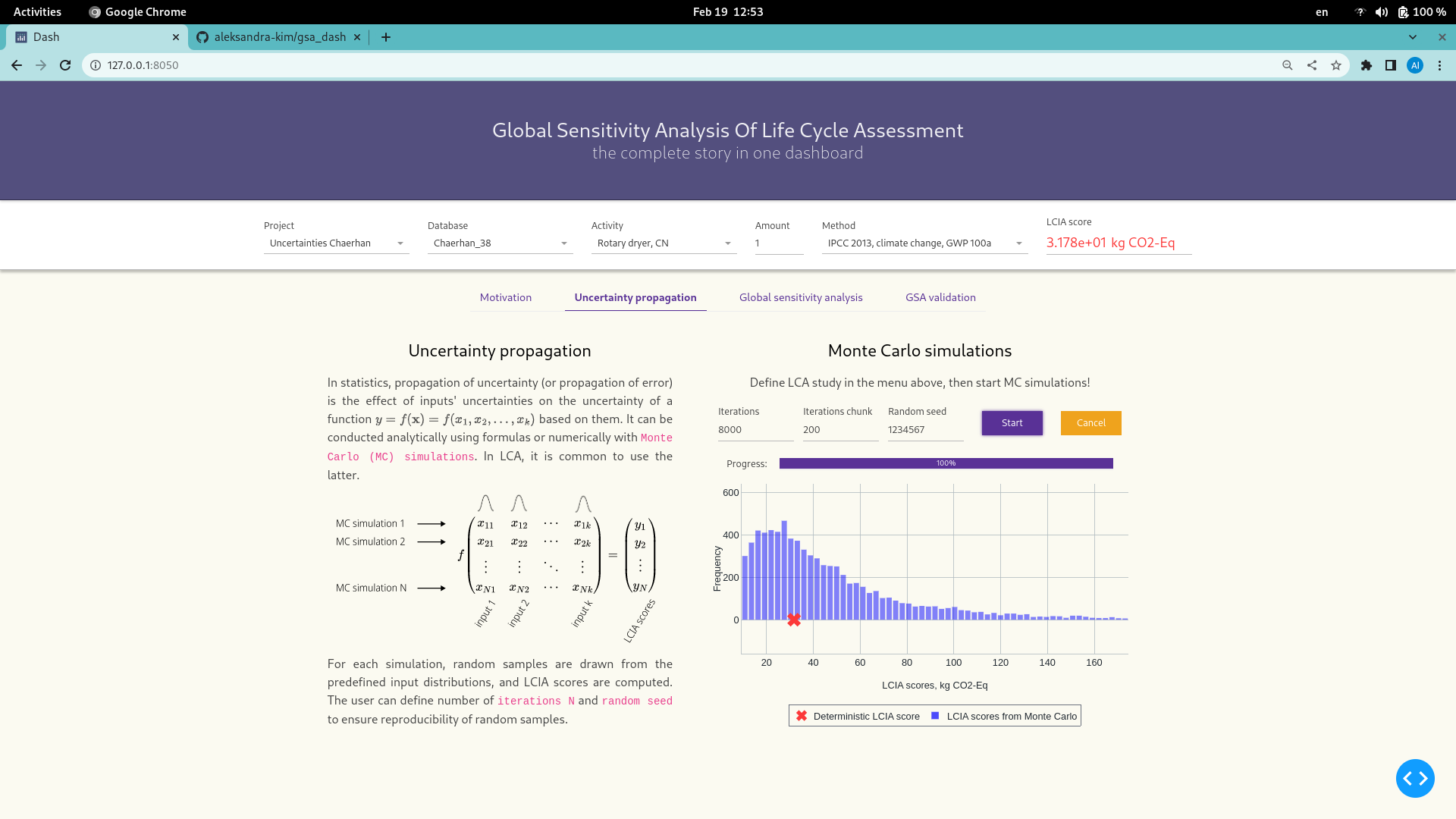
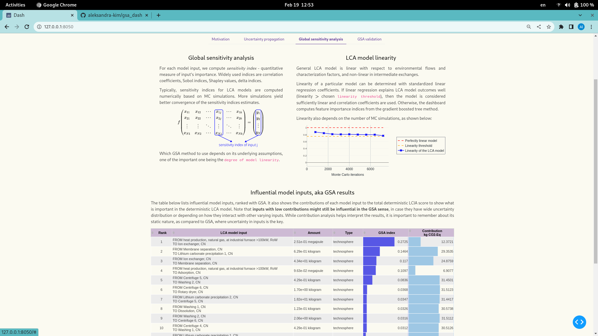
My entry is a dashboard that attempts to combine the story and motivation of global sensitivity analysis of life cycle assessment, with necessary computations, and visualization of the results - all in one place.

The main goal is to make GSA of LCA easier to understand, conduct and interpret. This is why I felt the need to not only provide computations and visualizations, but also explain the underlying components, such as matrix-based LCA model, its degree of linearity, how numerical Monte Carlo simulations are performed, what is the difference between contribution and sensitivity analysis, and how can GSA results be validated. This is the very first version, so it only performs GSA for foreground databases at the moment.

The dashboard contains the following:

  • Control panel, so that the user can define brightway project, functional unit, method, etc.
  • Tab "Motivation" with the explanations of LCA, GSA and LCA model.
  • Tab "Uncertainty propagation", where one can run MC simulations for the selected LCA study.
  • Tab "Global sensitivity analysis" that displays model linearity at different number of iterations, and ranked list of influential LCA model inputs once MC simulations are done. This table also contains visual bar plots for "GSA indices" and "Contributions to the LCIA score" to help interpret the results.
  • Tab "GSA validation" allows to validate the computed GSA results.

Database(s) used

  • Used example data from the contest repository
  • Used another databases 👉 ecoinvent on the background, and foreground inventories on impacts of lithium from brines taken from this case study .

Links to the code and visualization

Code

Github repository

Visualizations

mc
gsa

Presentation video

Video

License

MIT license

Contest entry - Romain Sacchi

Submitter

My name is Romain Sacchi.
I am a postdoctoral researcher working with Life-Cycle Assessment at the Paul Scherrer Institute.

Description

I showcase here polyviz, a small library that allows generating graphs with the javascript library d3.js using data generated with brightway2.

This is a Python package that provides an interface between the brightway2 LCA framework and the D3.js JavaScript library. It is designed to be used in Jupyter notebooks, and provides interactive visualizations of LCA results.

This interface extends the capabilities of d3blocks, and makes it compatible with results generated by brightway2.

polyviz allows the following visualizations to be created from LCA results:

Database(s) used

Links to the code and visualization

Code

Repo -> polyviz

Examples notebook

Visualizations

A few examples:

Presentation video

Link to video

License

BSD 3-Clause "New" or "Revised" License
See License.

Recommend Projects

  • React photo React

    A declarative, efficient, and flexible JavaScript library for building user interfaces.

  • Vue.js photo Vue.js

    🖖 Vue.js is a progressive, incrementally-adoptable JavaScript framework for building UI on the web.

  • Typescript photo Typescript

    TypeScript is a superset of JavaScript that compiles to clean JavaScript output.

  • TensorFlow photo TensorFlow

    An Open Source Machine Learning Framework for Everyone

  • Django photo Django

    The Web framework for perfectionists with deadlines.

  • D3 photo D3

    Bring data to life with SVG, Canvas and HTML. 📊📈🎉

Recommend Topics

  • javascript

    JavaScript (JS) is a lightweight interpreted programming language with first-class functions.

  • web

    Some thing interesting about web. New door for the world.

  • server

    A server is a program made to process requests and deliver data to clients.

  • Machine learning

    Machine learning is a way of modeling and interpreting data that allows a piece of software to respond intelligently.

  • Game

    Some thing interesting about game, make everyone happy.

Recommend Org

  • Facebook photo Facebook

    We are working to build community through open source technology. NB: members must have two-factor auth.

  • Microsoft photo Microsoft

    Open source projects and samples from Microsoft.

  • Google photo Google

    Google ❤️ Open Source for everyone.

  • D3 photo D3

    Data-Driven Documents codes.