decathlon / vitamin-web Goto Github PK
View Code? Open in Web Editor NEWDecathlon Design System UI components for web applications
Home Page: https://decathlon.github.io/vitamin-web
License: Apache License 2.0
Decathlon Design System UI components for web applications
Home Page: https://decathlon.github.io/vitamin-web
License: Apache License 2.0


![dependabot[bot] avatar](https://avatars.githubusercontent.com/in/29110?v=4 "dependabot[bot]")


Subject
Add coveralls + GitHub Action associated for coverage on main + Pull Requests for our packages: https://coveralls.io (free for Open Source projects)
line-height cascades down and shouldn't wear unit
Current behavior
element {
  font-size: 2rem;
  line-height: 3rem;
}
It implies that any children of element without explicit line-height definition will have a 3rem line-height whatever its font-size may be.
Expected behavior
line-height should be a multiplicator of font-size.
element {
  font-size: 2rem;
  line-height: 1.5;
}
That way element children will have a consistent line-height whatever element font-size value or unit is.
Related code
in /packages/css/src/design-tokens/typography.css

Subject
We need to version, make an automated changelog & publish our NPM packages with our CI/CD.
Possible solutions / References:
The goal is to onboard easily every developer that will consume and/or contribute Vitamin web libraries with complete README files.
We are facing a problem when we update a CSS file because the script stylelint:fix is failing when launched with lint-staged on pre-commit hook configured with Husky.
We should commit without add --no-verify
For example, to reproduce:
main branch and modify https://github.com/Decathlon/vitamin-web/blob/main/packages/sources/css/src/design-tokens/src/typography.css.git add .
yarn stylelint:fix:
Thanks in advance for your help & thanks @gabbloquet for reporting me this too!
Feature request
Add icons in button component
Documentation: https://www.decathlon.design/726f8c765/p/8008f8-button/t/653e81
Figma: https://www.figma.com/file/zDZIyayUlr1yTWrsi7cFoo/?node-id=31%3A136
Checklist:
Feature request
In order to separate styles from markup and interaction, we have to create a package dedicated only to CSS styles (design tokens + components classes). This will be used as a dependency of our next component libraries (Web Components, React, Svelte...).
font-family doesn't work for typography CSS styles:
Roboto: KO.

Roboto Condensed => OK.

As you can see here: https://decathlon.github.io/vitamin-web/@vtmn/showcase-svelte/?path=/docs/components-vtmnbutton--overview
The source code is not displayed, and when we change the props, the source code doesn't change too.

Here is a working example with the Storybook showcase for React components: https://decathlon.github.io/vitamin-web/@vtmn/showcase-react/?path=/docs/components-vtmnbutton--overview

Feature request
Add icons in text input component in input and also, in error message.
Documentation: https://www.decathlon.design/726f8c765/p/31121d-text-input
Figma: https://www.figma.com/file/zDZIyayUlr1yTWrsi7cFoo/Vtmn-Web?node-id=150%3A4893
Checklist:
Feature request
Add text input component.
Documentation: https://www.decathlon.design/726f8c765/p/31121d-text-input/b/18ceeb
Figma: https://www.figma.com/file/zDZIyayUlr1yTWrsi7cFoo/?node-id=150%3A3410
Checklist:
Could spacing values be some multiples of 16 (as it is for other design tokens ?)
it allows easily match to integer values.
Here we have multiple of 0.25, this gives us half pixels :

(0.25rem -> 2.5px)
Feature request
We need to publish each Storybook of packages with our CI/CD to a specific environment when merged to default branch.
Nice to have: one environment per Pull Request.
UPDATE: We can compose Storybook, see https://storybook.js.org/docs/react/workflows/storybook-composition
Feature request
When we have a CSS package added (#1), we will also add a Svelte components library that will use the styles pushed in CSS in the other package to create components exposed in a Storybook.
Trigger sonarcloud checks on PR and branches
Add sonarcloud quality gate badge as follow :
Feature request
Add radio button component.
Documentation: https://www.decathlon.design/726f8c765/p/31e934-radio-button/b/649f9c
Figma: https://www.figma.com/file/zDZIyayUlr1yTWrsi7cFoo/?node-id=359%3A30
Checklist:
Subject
Negative line-height should be forbidden.
(WCAG recommends at least 1.5)
Right now we have this for large titles :

This will break readability on multilines titles
See: https://codepen.io/__sch__/pen/QWKaMmX
Bug report
Firefox doesn't seem supported
Current behavior

Uncaught SyntaxError: nothing to repeat
Expected behavior
The website "just works" on Firefox.
Steps to reproduce
Using FF 86.0 (at least on Mac Os 10.15.7).
Browsers affected
Versions
Feature request
Vitamix is the Decathlon icons library based on the open-source icon library called Remix Icon. This original library is under the license Apache 2.0 below and has been modified by Decathlon. Learn more
We need to add them to our repository.
Feature request
When we have a CSS package added (#1), we will also add a React components library that will use the styles pushed in CSS in the other package to create components exposed in a Storybook.
Possible solutions
Bug report
We need to fix our Sonarcloud analysis quality gate that failed now.
Dashboard: https://sonarcloud.io/dashboard?id=Decathlon_vitamin-web
Feature request
Add link component
Documentation: https://www.decathlon.design/726f8c765/p/086ae8-link-beta/b/5496b9
Figma: https://www.figma.com/file/zDZIyayUlr1yTWrsi7cFoo/Vtmn---Web?node-id=1207%3A8898
Checklist:
Subject
Configure Sonarcloud monorepo analysis : https://sonarcloud.io/documentation/analysis/setup-monorepo/
The import './node_modules/@vtmn/icons/dist/vitamix.css' doesn't work.
With './node_modules/@vtmn/icons/dist/vitamix/font/vitamix.css' icons can be displayed but always with the same design.

Bug report
Multiline display for label is broken
Current behavior
Fix multiline label display
Steps to reproduce
Related code
insert short code snippets here
Browsers affected
Versions
Other information:
Vitamin design

Vitamin component

A suggestion from @GaspardMathon (thanks!). It could be nice to use enums instead of union types in TypeScript in @vtmn/react components' prop types.
Because it could avoid some magic words for default values like "medium" that could be dangerous and could cause some bugs in the future.
Bug report
Link component can't be used as inline link with correct vitamin design
Current behavior
Expected behavior
Add inline link styles
Steps to reproduce
Related code
insert short code snippets here
Browsers affected
Versions
Other information:

Feature request
We need to generate two other different formats:
Bug report
Current behavior
In the showcase right panel, if I choose a variant or a size for the button, it doesn't update.
Expected behavior
For each variant and size property, the button should update to show the result of the applied changes.
Steps to reproduce
Go to https://decathlon.github.io/vitamin-web/@vtmn/showcase-vue/?path=/story/components-vtmnbutton--overview and select on the right panel a variant or a size for the button. No changes will affect the button.
Browsers affected
Versions
Other information:
Feature request
Make possible to support IE 11 (CSS Custom Properties).
Alternatives for the moment:
Feature request
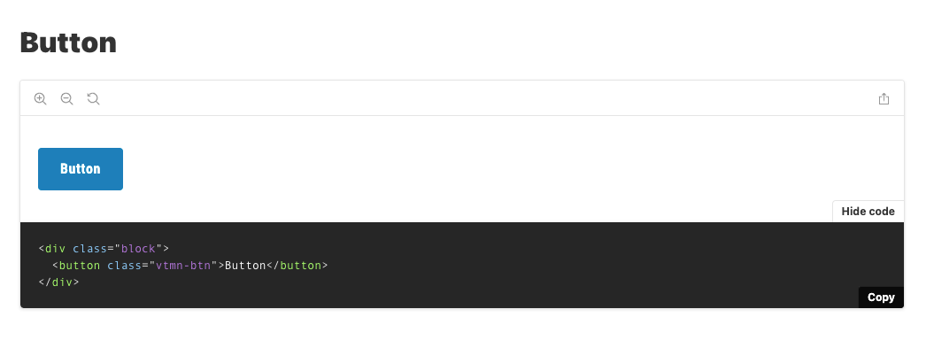
Add button component.
Documentation: https://www.decathlon.design/726f8c765/p/8008f8-button/b/50afe1
Figma: https://www.figma.com/file/zDZIyayUlr1yTWrsi7cFoo/Vtmn-Web?node-id=31%3A136
Checklist:
Feature request
Add CI / CD to build, lint, test & deploy our different packages.
Preferred solution
Github Actions
Follow up
Source code indentation with addon-docs doesn't work when storybook is built for production but ok when start in watch mode.
Maybe a problem of Storybook's webpack configuration? I didn't find the reason why.
Steps to reproduce
1/ yarn start:css, then go to http://localhost:6006/?path=/docs/components-button--default => OK ✅
2/ cd packages/showcases/css && yarn build-storybook
If you serve statically the storybook-static folder generated with http-server (npm i -g http-server) for example: http-server storybook-static, then go to http://localhost:8080 & Components/Button (in "Docs" tab) => KO 🔥
2 bis/ or just simply see the bug to our public showcase: https://decathlon.github.io/vitamin-web/@vtmn/showcase-css/?path=/docs/components-button--default => KO 🔥

Thanks for your help! :)
Our icon font is not well generated and we have differences between SVGs and fonts after generating our vitamix.(ttf,woff,woff2) font files.
After investigation, it seems that this problem comes from our export on Figma with this file (https://www.figma.com/file/ujn50nNMfGKzZJccATv7Vk/Vtmn-Vitamix-Icons?node-id=0%3A1) because when I export with the official file of Remix icon (https://www.figma.com/community/file/847406312498234850/Remix-Icons-for-Figma), it works well.
You can see the difference between External image (SVG) & Icon font here: https://decathlon.github.io/vitamin-web/@vtmn/showcase-icons/


Feature request
We need to use this mono repository with a multiple packages architecture.
For this, we will use Lerna.
Feature request
Add badge component.
Documentation: https://www.decathlon.design/726f8c765/p/465f7c-badge-beta/b/5496b9
Figma: https://www.figma.com/file/zDZIyayUlr1yTWrsi7cFoo/?node-id=1450%3A8683
Checklist:
Feature request
When we have a CSS package added (#1), we will also add a Svelte components library that will use the styles pushed in CSS in the other package to create components exposed in a Storybook.
Bug report
We need to launch Sonarcloud analysis in each PR.
Dashboard: https://sonarcloud.io/dashboard?id=Decathlon_vitamin-web
Refactor request
In order to be compliant with zoom functions and for adoption purpose inside products, we need to switch from pixels to em/rem.
Useful links:
Thanks, @thollander for this suggestion.
The goal is to continue the work from @thollander by using the new format of file showcases/core/src/components/{component}.csf.js in all our stories to have a uniform implementation across web libraries
Bug report
During the commit-msg husky hook we call the commit-msg yarn command ("commitlint --edit $1"), on window machine this command dont work.
Current behavior
When a commit is sent with a right naming convention the git output return :
$ commitlint --edit $1
C:\Users\user\Documents\Vitamin\vitamin-web\node_modules\@commitlint\cli\lib\cli.js:106
        throw err;
        ^

[Error: ENOENT: no such file or directory, open 'C:\Users\user\Documents\Vitamin\vitamin-web\$1'] {
  errno: -4058,
  code: 'ENOENT',
  syscall: 'open',
  path: 'C:\\Users\\user\\Documents\\Vitamin\\vitamin-web\\$1'
}
error Command failed with exit code 1.
Expected behavior
The commit linter should be effective.
Steps to reproduce
WINDOWS USERS ONLY :
Related code
vitamin-web/package.json :
"scripts": {
   "commit-msg": "commitlint --edit $1",
},
vitamin-web/.husky/commit-msg :
yarn commit-msg
Browsers affected
Versions
Other information:
WORKAROUND :
Replace "yarn commit-msg" by "yarn commitlint --edit $1".
Bug report
Checkboxes should not have radius and have a darker border
Current behavior
Expected behavior
You should fix style
Steps to reproduce
Related code
insert short code snippets here
Browsers affected
Versions
Other information:
Vitamin design

Vitamin component

Feature request
Add checkbox component.
Documentation: https://www.decathlon.design/726f8c765/p/953c37-checkbox/b/5496b9
Figma: https://www.figma.com/file/zDZIyayUlr1yTWrsi7cFoo/?node-id=783%3A9869
Checklist:
Feature request
Add toggle component.
Documentation: https://www.decathlon.design/726f8c765/p/99628d-toggle/b/239443
Figma: https://www.figma.com/file/zDZIyayUlr1yTWrsi7cFoo/?node-id=612%3A1192
Checklist:
Subject
We need to have a good documentation about "How to use" in README files.
Feature request
Use the :focus-visible pseudo classes to allow each component to be visible when focused with tab key.
Preferred solution
As for this website : https://www.ikea.com/fr/fr/, when we press tab key, every interactive element must be visible with ouline border.
Refactor
We need to migrate to TailwindCSS in other PR (@apply for custom css) : https://tailwindcss.com/docs/extracting-components#extracting-component-classes-with-apply
Originally posted by @amen-souissi in #16 (comment)
Feature request
On decathlon.design, we already have several design tokens to add in our CSS package (#1).
Preferred solution
Use CSS Custom Properties (CSS variables)
Alternatives
Feel free to comment below.
Additional context
Styles are already available in our documentation:
As you can see here: https://decathlon.github.io/vitamin-web/@vtmn/showcase-vue/?path=/docs/components-vtmnbutton--overview
The source code is not displayed, and when we change the props, the source code doesn't change too.

Here is a working example with the Storybook showcase for React components: https://decathlon.github.io/vitamin-web/@vtmn/showcase-react/?path=/docs/components-vtmnbutton--overview
 React
React
A declarative, efficient, and flexible JavaScript library for building user interfaces.
🖖 Vue.js is a progressive, incrementally-adoptable JavaScript framework for building UI on the web.
 Typescript
TypeScript is a superset of JavaScript that compiles to clean JavaScript output.
An Open Source Machine Learning Framework for Everyone
 Django
The Web framework for perfectionists with deadlines.
 Laravel
A PHP framework for web artisans
Bring data to life with SVG, Canvas and HTML. 📊📈🎉
JavaScript (JS) is a lightweight interpreted programming language with first-class functions.
Some thing interesting about web. New door for the world.
A server is a program made to process requests and deliver data to clients.
Machine learning is a way of modeling and interpreting data that allows a piece of software to respond intelligently.
Some thing interesting about visualization, use data art
Some thing interesting about game, make everyone happy.
 Facebook
We are working to build community through open source technology. NB: members must have two-factor auth.
 Microsoft
Open source projects and samples from Microsoft.
 Google
Google ❤️ Open Source for everyone.
 Alibaba
Alibaba Open Source for everyone
 D3
D3
Data-Driven Documents codes.
 Tencent
China tencent open source team.