datdotorg / datdot-ui Goto Github PK
View Code? Open in Web Editor NEWdatdot-ui is now a datdot-ui organization
datdot-ui is now a datdot-ui organization


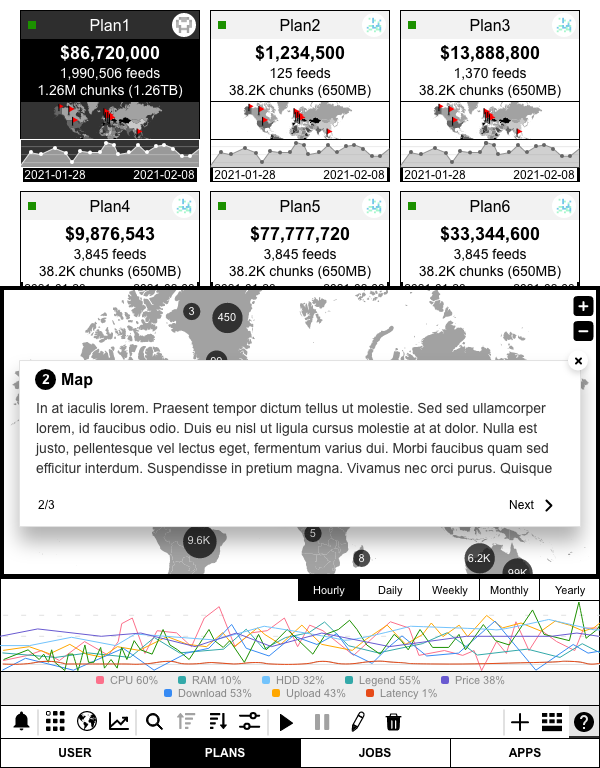
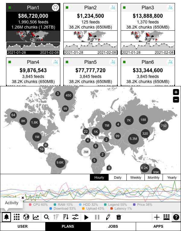
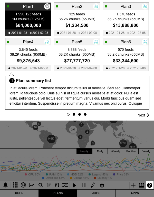
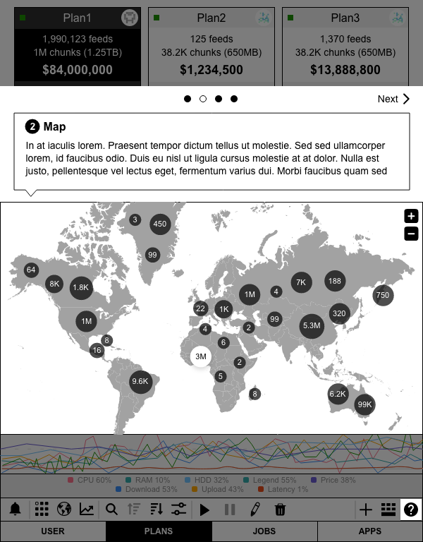
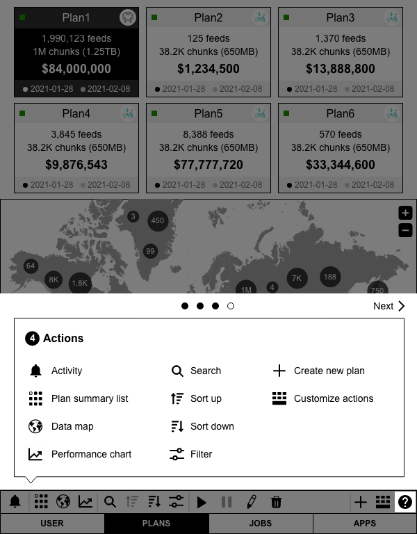
@tododatdot-ui#144 wireframe-plan-dashboard-map"plan card" instead"world map" to highlight regions.@todo@output ❓ repositoryv0.0.1-alpha
@input ❓ repositoryv0.0.1-alpha)@input ❓ wireframes action barsoptsrolesincoming message typesoutgoing message typesstatus the component instance can be in@output ❓ repo#readme.md@output ❓ repo_url#v0.0.1-alpha@info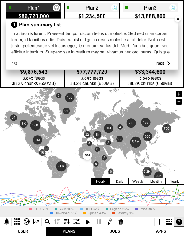
@todo@output ❓ repositoryv0.0.1-alpha
@input ❓ repositoryv0.0.1-alpha)@input ❓ wireframes action barsoptsrolesincoming message typesoutgoing message typesstatus the component instance can be in@output ❓ repo#readme.md@output ❓ repo_url#v0.0.1-alpha@info...
@todo@output ❓ repositoryv0.0.1-alpha
@input ❓ repositoryv0.0.1-alpha)@input ❓ wireframes action barsoptsrolesincoming message typesoutgoing message typesstatus the component instance can be in@output ❓ repo#readme.md@output ❓ repo_url#v0.0.1-alpha@info
Sort by

Sort by

Sort by


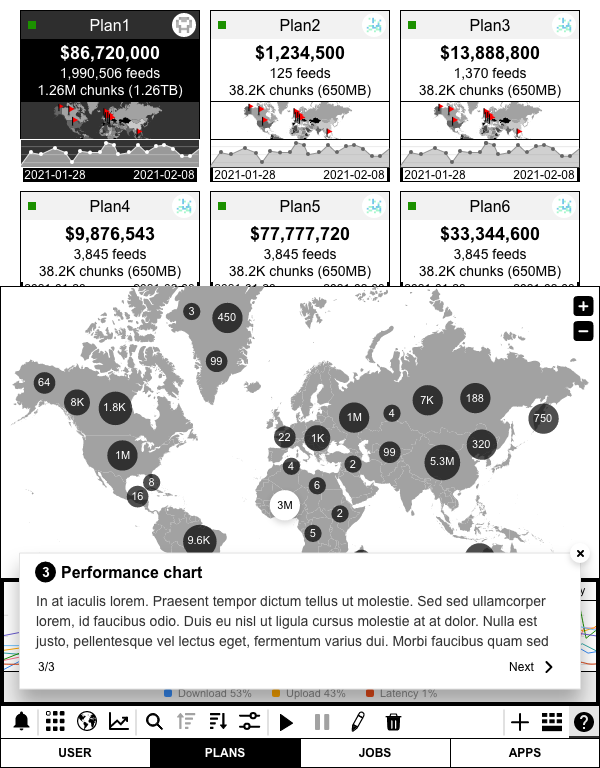
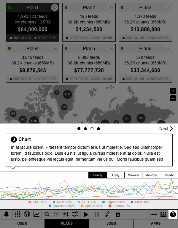
@tododatdot-ui#143 wireframe-plan-dashboard-performance-chartRAM, CPU, HDD, download, upload, price@todopnpm link --global (to make them available)pnpm link --global <./package.json#name>@output 📦 repositoryv0.0.0-prealpha
@input 📦 repository@output 📦 v0.0.0-prealphav0.0.0-alpha
@input 📦 v0.0.0-prealpha@output 📦 v0.0.0-alphav0.0.1-alpha
@input 📦 v0.0.0-alpha@output 📦 v0.0.1-alphav0.0.2-alpha
@input 📦 v0.0.1-alphamessages and status and update documentationoptsrolesincoming message typesoutgoing message typesstatus the component instance can be in@output 📦 README.md@output 📦 v0.0.2-alpha@input 📦 v0.0.2-alpha@output 📦 repository#v0.0.3-alpha@input 📦 v0.0.3-alpha@output 📦 repository#v0.0.4-alpha@info@todopnpm link --global (to make them available)pnpm link --global <./package.json#name>@output 📦 repositoryv0.0.1.-alpha
@input 📦 repository@output 📦 v0.0.1-alpha@input 📦 v0.0.1-alpha@output 🏭 v0.0.3-alphav0.0.4-alpha
@input 📦 v0.0.3-alphaoptsincoming message typesoutgoing message types@output 📦 v0.0.4-alpha@info
@todopnpm link --global (to make them available)pnpm link --global <./package.json#name>@output 📦 repositoryv0.0.0-prealpha
@input 📦 repository@output 📦 v0.0.0-prealphav0.0.0-alpha
@input 📦 v0.0.0-prealpha@output 📦 v0.0.0-alphav0.0.1-alpha
@input 📦 v0.0.0-alpha@output ❓ v0.0.1-alpha@input 📦 v0.0.2-alpha@output ❓ repository#v0.0.3-alphav0.0.4-alpha
@input ❓ v0.0.3-alpha@output 📦 README.md@output 📦 v0.0.4-alpha@infohttps://github.com/datdotorg/datdot-ui-button
https://github.com/datdot-ui/link
@todo@todo@todopnpm link --global (to make them available)pnpm link --global <./package.json#name>@output 📦 repositoryv0.0.0-prealpha
@output 📦 repository@output 📦 v0.0.0-prealphav0.0.1-alpha
@input 📦 v0.0.0-prealpha@output 📦 v0.0.1-alpha@input 📦 v0.0.2-alpha@output ❓ repository#v0.0.3-alphav0.0.4-alpha
@input 📦 v0.0.3-alphamessages and status and update documentation@input ❓ wireframes action barsoptsrolesincoming message typesoutgoing message typesstatus the component instance can be in@output ❓ v0.0.4-alpha@infoTHIS ELEMENT has been merged with the dropdown #71
// datdot-ui-filter
require('datdot-ui-button')https://github.com/datdot-ui/filter

Filter by


https://github.com/datdotorg/datdot-ui-filter-option
let optionList = { unchecked: [], checked: ['Available', 'Not available', 'Hypercore', 'Hyperdrive', 'Cabal']}Option button
const option = filterOption({page, flow, name: 'filter-option', data: optionList.checked}, optionProtocol('filter-option'))
function optionProtocol (name) {
....
....
// get type 'unchecked' or 'checked' to check from and currentValue are equality.
if (type === 'unchecked') {
      // handle chekced status
      const result = optionList.checked.reduce( (acc, currentValue) => {
      if (from === currentValue) {
            const index = optionList.checked.indexOf(from)
            optionList.unchecked.push(from)
            optionList.checked.splice(index, 1)
      }
      acc = optionList.checked
      return acc
}, [])

if (type === 'checked') {
      // handle unchecked status
      const result = optionList.unchecked.reduce( (acc, currentValue) => {
      if (from === currentValue) {
            const index = optionList.unchecked.indexOf(from)
            optionList.checked.push(from)
            optionList.unchecked.splice(index, 1)
      }
      acc = optionList.checked
      return acc
}, [])
This code line is an issue to cause compare failed on Safari
from === currentValueeven change === to == is failed too
option == fromChrome

Safari


Even I do console.log(typeof from, typeof currentValue)
This is what've I got

I've tried many ways with different pattern in JavaScript
let optionList = { unchecked: [], checked: ['Available', 'Not available', 'Hypercore', 'Hyperdrive', 'Cabal']}
optionList.checked.findIndex( option => option === from ) // -1
optionList.splice( optionList.checked.indexOf(from), 1) // it is worked fine in Codepen.io const data = [
{id: 1, status: "Available", active: true},
{id: 2, status: "Not available", active: false},
{id: 3, status: "Hypercore", active: true},
{id: 4, status: "Hyperdrive", active: false},
{id: 5, status: "Cabal", active: true}
]src/index.js
// get lits
    optionListRender(data).then( buttons => {
        buttons.map( (item, i) => {
            const li = bel`<li>${item}</li>`
            // need to set an id to button for toggle using, because Safari cannot compare body or from (string issue)
            item.setAttribute('id', i+1)
            optionList.append(li)
        })
        return buttons
    })
demo/demo.js
function actionToggleCheck (message) {
...
...
      data.map( item => {
            // * better to use return item for add more conditions
            if (item.id === body ) item.active = !item.active
            return item
        })
It is still failed when I refactored the data structure and test again via item.status and body

typeof item.status and typeof body are all string, somehow it is failed to compare string in Safari.
item.status.localeCompare(body) is also return -1, only 0 is matched
Use regex.test(string) to compare from existed array instead of comparing string by from to fix issue on Safari
let options = optionList.map( item => {
    // * better to use return item for add more conditions
    if (item.id === body ) item.active = !item.active
    if (/^Available/.test(item.status) && item.active ) on = online(data)
    if (/^Not available/.test(item.status) && item.active ) off = offline(data)
    return item
}).map( item => {
    if (/core/i.test(item.status) && item.active) {
            let arr = data.filter( obj => /core/i.test(obj.type))
            return result.push(...arr)
    }
    if (/drive/i.test(item.status) && item.active) {
            let arr = data.filter( obj => /drive/i.test(obj.type))
            return result.push(...arr)
    }
    if (/cabal/i.test(item.status) && item.active) {
            let arr = data.filter( obj => /cabal/i.test(obj.type))
            return result.push(...arr)
    }
    return item
})@todo


Plan action

@todopnpm link --global (to make them available)pnpm link --global <./package.json#name>@output 🏭 repositoryv0.0.0-alpha
@input 🏭 repository@output 🏭 v0.0.0-alphav0.0.1-alpha
@input 🏭 v0.0.0-alpha@output 🏭 v0.0.1-alphav0.0.4-alpha
@input 🏭 v0.0.1-alphamessages and status and update documentationoptsincoming message typesoutgoing message types@output 🏭 v0.0.4-alpha@input 🏭 v0.0.4-alpha@input ❓ wireframes action bars@info@todoGeneral UI Components
Screens
devtool components
@info BOTTOM MENU


@todopnpm link --global (to make them available)pnpm link --global <./package.json#name>@output 📦 repositoryv0.0.0-alpha
@input 📦 repository@output 🏭 v0.0.0-alphav0.0.1-alpha
@input 🏭 v0.0.0-alpha@output 🏭 v0.0.1-alphav0.0.2-alpha
@input 🏭 v0.0.1-alphamessages and status and update documentation@input ❓ wireframes action barsoptsrolesincoming message typesoutgoing message typesstatus the component instance can be in@output 🏭 v0.0.2-alpha@info@todopnpm link --global (to make them available)pnpm link --global <./package.json#name>@output 📦 repositoryv0.0.0-prealpha
@output 📦 repository@output 📦 v0.0.0-prealphav0.0.1-alpha
@input 📦 v0.0.0-prealpha@output 📦 v0.0.1-alpha@input 📦 v0.0.2-alpha@output ❓ repository#v0.0.3-alphav0.0.4-alpha
@input 📦 v0.0.3-alphakeyup changes valueArrowRight, ArrowUp and decrease number by ArrowLeft, ArrowDownshiftKey + ArrowRight or ArrowUpshiftKey + ArrowLeft or ArrowDownmessages and status and update documentation@input ❓ wireframes action barsoptsrolesincoming message typesoutgoing message typesstatus the component instance can be in@output 🏭 README.md@output ❓ v0.0.4-alpha@infohttps://github.com/datdotorg/datdot-ui-range-slider
(by @fionataeyang)
@todo@todopnpm link --global (to make them available)pnpm link --global <./package.json#name>@output 📦 repositoryv0.0.1-alpha
@input 📦 repository@output 📦 v0.0.1-alpha@input 📦 v0.0.2-alpha@output ❓ repository#v0.0.3-alphav0.0.4-alpha
@input 📦 v0.0.3-alphamessages and status and update documentation@input ❓ wireframes action barsoptsrolesincoming message typesoutgoing message typesstatus the component instance can be in
@output 🏭 README.md@output 🏭 v0.0.4-alpha@info React
React
A declarative, efficient, and flexible JavaScript library for building user interfaces.
🖖 Vue.js is a progressive, incrementally-adoptable JavaScript framework for building UI on the web.
 Typescript
TypeScript is a superset of JavaScript that compiles to clean JavaScript output.
An Open Source Machine Learning Framework for Everyone
 Django
The Web framework for perfectionists with deadlines.
 Laravel
A PHP framework for web artisans
Bring data to life with SVG, Canvas and HTML. 📊📈🎉
JavaScript (JS) is a lightweight interpreted programming language with first-class functions.
Some thing interesting about web. New door for the world.
A server is a program made to process requests and deliver data to clients.
Machine learning is a way of modeling and interpreting data that allows a piece of software to respond intelligently.
Some thing interesting about visualization, use data art
Some thing interesting about game, make everyone happy.
 Facebook
We are working to build community through open source technology. NB: members must have two-factor auth.
 Microsoft
Open source projects and samples from Microsoft.
 Google
Google ❤️ Open Source for everyone.
 Alibaba
Alibaba Open Source for everyone
 D3
D3
Data-Driven Documents codes.
 Tencent
China tencent open source team.