A library that provides an easy solution to create settings screens with simple and compound options.
- Key-value pairs saved via Shared Preferences
- React style data retrieval
- Disable or hide widgets according to others' value
View code example at: https://github.com/gurulnd-git/shared_preferences_settings_example
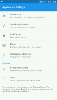


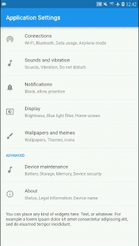

A simple Screen widget that may contain settings tiles or other widgets. The following example shows how you can create an empty settings screen with a title:
SettingsScreen(
    title: "Application Settings",
    children: [],
);
Inside the children parameter you can define settings tiles and other widgets. In this example we create a screen with a simple CheckboxSettingsTile in it:
SettingsScreen(
    title: "Application Settings",
    children: [
        CheckboxSettingsTile(
            settingKey: 'key-of-your-setting',
            title: 'This is a simple Checkbox',
        ),
    ],
);A Screen widget similar to SettingsScreen, but additionally, it contains a built-in Checkbox at the beginning of its body. Therefore, it requires a settingKey to save its value. The following example shows how you can create an empty settings toggle with a title:
SettingsToggleScreen(
    settingKey: 'key-of-your-setting',
    title: 'Title',
    children: [],
);
In this example, we create a settings toggle screen using more parameters and with children widgets according to its state:
SettingsToggleScreen(
    settingKey: 'key-of-your-setting',
    title: 'Title',
    defaultValue: true,
    subtitle: 'Enabled',
    subtitleIfOff: 'Disabled',
    children: [
        SettingsContainer(
            child: Text('This is enabled! :)'),
        ),
    ],
    childrenIfOff: [
        SettingsContainer(
            child: Text('Tap the checkbox to enable.'),
        ),
    ],
);A simple widget settings tile that can open a new screen by tapping it. The following example shows how you can create a SimpleSettingsTile that open a new Screen by tapping it:
SimpleSettingsTile(
    title: 'Advanced',
    subtitle: 'More, advanced settings.'
    screen: SomeSettingsScreen(
        title: 'Sub menu',
        children: [
            CheckboxSettingsTile(
                settingKey: 'key-of-your-setting',
                title: 'This is a simple Checkbox',
            ),
        ],
    ),
);A widget that groups settings tiles and other widgets together with a group title. The following example shows how you can create a group with a simple CheckboxSettingsTile.:
SettingsTileGroup(
    title: 'Group title',
    children: [
        CheckboxSettingsTile(
            settingKey: 'key-of-your-setting',
            title: 'This is a simple Checkbox',
        ),
    ],
);A widget that groups settings tiles and other widgets together with a group title and can be expanded or closed. The following example shows how you can create a simple ExpansionSettingsTile with a CheckboxSettingsTile:
ExpansionSettingsTile(
    title: 'You can expand & close',
    children: [
        CheckboxSettingsTile(
            settingKey: 'key-of-your-setting',
            title: 'This is a simple Checkbox',
        ),
    ],
);A settings tile with a Checkbox that can be true or false. The following example shows how you can create a tile with checkbox:
CheckboxSettingsTile(
    settingKey: 'key-of-your-setting',
    title: 'This is a Checkbox',
);
In this example, we create a tile using more parameters:
CheckboxSettingsTile(
    settingKey: 'wifi_status',
    title: 'Wi-Fi',
    subtitle: 'Connected.',
    subtitleIfOff: 'To see available networks, turn on Wi-Fi.',
    screen: SettingsToggleScreen(
        settingKey: 'wifi_status',
        subtitle: 'Connected',
        subtitleIfOff: 'To see available networks, turn on Wi-Fi.',
        children: [
            SettingsContainer(
                children: [
                    Text('Put some widgets or tiles here.'),
                ],
            ),
        ],
        children: [
            SettingsContainer(
                children: [
                    Text('You are offline.'),
                    Text('Put some widgets or tiles here.'),
                ],
            ),
        ],
    ),
);A settings tile with a Switch that can be true or false. The following example shows how you can create a tile with switch:
SwitchSettingsTile(
    settingKey: 'key-of-your-setting',
    title: 'This is a Switch',
);
In this example, we create a tile using more parameters:
SwitchSettingsTile(
    settingKey: 'wifi_status',
    title: 'Wi-Fi',
    subtitle: 'Connected.',
    subtitleIfOff: 'To see available networks, turn on Wi-Fi.',
    screen: SettingsToggleScreen(
        settingKey: 'wifi_status',
        subtitle: 'Connected',
        subtitleIfOff: 'To see available networks, turn on Wi-Fi.',
        children: [
            SettingsContainer(
                children: [
                    Text('Put some widgets or tiles here.'),
                ],
            ),
        ],
        children: [
            SettingsContainer(
                children: [
                    Text('You are offline.'),
                    Text('Put some widgets or tiles here.'),
                ],
            ),
        ],
    ),
);A settings tile that consist of a tile with title and subtitle and additional tiles according to the given key set. The following example shows how you can create a tile with switch:
RadioSettingsTile(
    settingKey: 'key-of-your-setting',
    title: 'Select one option',
    values: {
        'a': 'Option A',
        'b': 'Option B',
        'c': 'Option C',
        'd': 'Option D',
    },
);A settings tile with a slider within a given range. The following example shows how you can create a tile with a slider:
SliderSettingsTile(
    settingKey: 'key-of-your-setting',
    title: 'Brightness',
    minIcon: Icon(Icons.brightness_4),
    maxIcon: Icon(Icons.brightness_7),
);
In this example, we create a slider tile using more parameters:
SliderSettingsTile(
    settingKey: 'key-of-your-setting',
    title: 'Rate this app',
    subtitle: 'How would you rate this app in a 5 to 1 scale?',
    minValue: 1.0,
    maxValue: 5.0,
    step: 1.0,
);A simple tile that launches a modal dialog with radio buttons. The following example shows how you can create a tile that launches radio buttons:
RadioPickerSettingsTile(
    settingKey: 'key-of-your-setting',
    title: 'Choose one in the modal dialog',
    values: {
        'a': 'Option A',
        'b': 'Option B',
        'c': 'Option C',
        'd': 'Option D',
    },
    defaultKey: 'b',
);A simple tile that launches a modal dialog with a text input. The following example shows how you can create a tile that launches a modal dialog with a text input:
TextFieldModalSettingsTile(
    settingKey: 'key-of-your-setting',
    title: 'Type something',
);
In this example, we create a text field modal tile using more parameters. By giving an emailAddress keyboardType, the phone's keyboard will be optimized to type email addresses easily:
TextFieldModalSettingsTile(
    settingKey: 'key-of-your-setting',
    title: 'Type your email',
    defaultValue: 'This is by default.',
    cancelCaption: 'Cancel',
    okCaption: 'Save Email',
    keyboardType: TextInputType.emailAddress,
);
In this example, we replace the text with a series of bullets to obfuscate sensitive information such as user passwords.
TextFieldModalSettingsTile(
    settingKey: 'key-of-your-setting',
    title: 'Set User Password',
    obfuscateText: true,
);A tile that launches a modal dialog where the user can pick any color. The following example shows how you can create a tile that launches a modal dialog with a color picker:
SimpleColorPickerSettingsTile(
    settingKey: 'key-of-your-setting',
    title: 'Color Picker',
);
In this example, we create the same tile but using more of its parameter:
SimpleColorPickerSettingsTile(
    settingKey: 'key-of-your-setting',
    title: 'Color Picker',
    cancelCaption: 'Keep the old value',
    okCaption: 'Select new',
    confirmText: 'Are you sure want to modify the previously selected color?',
    confirmModalTitle: 'Are you sure?',
    confirmModalCancelCaption: 'Keep the old one',
    confirmModalConfirmCaption: 'Yes, I am sure',
);A tile that launches a modal dialog where the user can pick any Material color. The following example shows how you can create a tile that launches a modal dialog with a Material color picker:
MaterialColorPickerSettingsTile(
    settingKey: 'key-of-your-setting',
    title: 'Color Picker',
);
In this example, we create the same tile but using more of its parameter:
MaterialColorPickerSettingsTile(
    settingKey: 'key-of-your-setting',
    title: 'Color Picker',
    cancelCaption: 'Keep the old value',
    okCaption: 'Select new',
    confirmText: 'Are you sure want to modify the previously selected color?',
    confirmModalTitle: 'Are you sure?',
    confirmModalCancelCaption: 'Keep the old one',
    confirmModalConfirmCaption: 'Yes, I am sure',
);A widget that helps its child or children to fin in the settings screen. It is helpful if you want to place other widgets than settings tiles in the settings screen body. The following example shows how you can create a container with one Text widget:
SettingsContainer(
    child: Text('Hello world'),
);
In this example, we create a container with multiple Text widgets:
SettingsContainer(
    children: [
        Text('First line'),
        Text('Second line'),
    ],
);In this chapter, some StreamBuilder function will be introduced to show how you can retrieve data from Settings that will be rebuilt when the data changes.
Use this function to retrieve a String type value. The following example shows how you can retrieve easily a data you have saved earlier. It also reacts if data changes:
Settings().onStringChanged(
    settingKey: 'key-of-your-setting',
    defaultValue: 'Empty',
    childBuilder: (BuildContext context, String value){
        return Text(value);
    },
);Use this function to retrieve a bool type value. The following example shows how you can retrieve easily a data you have saved earlier. It also reacts if data changes:
Settings().onBoolChanged(
    settingKey: 'key-of-your-setting',
    defaultValue: false,
    childBuilder: (BuildContext context, bool value){
        return Text(value.toString());
    },
);Use this function to retrieve a double type value. The following example shows how you can retrieve easily a data you have saved earlier. It also reacts if data changes:
Settings().onDoubleChanged(
    settingKey: 'key-of-your-setting',
    defaultValue: 0.0,
    childBuilder: (BuildContext context, double value){
        return Text(value.toString());
    },
);Use this function to retrieve a int type value. The following example shows how you can retrieve easily a data you have saved earlier. It also reacts if data changes:
Settings().onIntChanged(
    settingKey: 'key-of-your-setting',
    defaultValue: 0,
    childBuilder: (BuildContext context, int value){
        return Text(value.toString());
    },
);Retrieve String settings value asynchronously. The following example shows how you can retrieve easily a data asynchronously:
void someAsyncFunction() async {
    String myValue = await Settings().getString(
        settingKey: 'key-of-your-setting',
        defaultValue: 'Default value',
    );
    // ...
}Retrieve bool settings value asynchronously. The following example shows how you can retrieve easily a data asynchronously:
void someAsyncFunction() async {
    bool myValue = await Settings().getBool(
        settingKey: 'key-of-your-setting',
        defaultValue: true,
    );
    // ...
}Retrieve double settings value asynchronously. The following example shows how you can retrieve easily a data asynchronously:
void someAsyncFunction() async {
    double myValue = await Settings().getDouble(
        settingKey: 'key-of-your-setting',
        defaultValue: 0.0,
    );
    // ...
}Retrieve int settings value asynchronously. The following example shows how you can retrieve easily a data asynchronously:
void someAsyncFunction() async {
    int myValue = await Settings().getInt(
        settingKey: 'key-of-your-setting',
        defaultValue: 0,
    );
    // ...
}Some Settings Tiles have enabledIfKey and/or visibleIfKey, visibleByDefault parameters. Using these parameters, some basic conditional logic can be achieved.
In this example, the SimpleSettingsTile will be hidden by default and will appear as soon as the Checkbox or Switch that has key-of-parent settingKey get turned on:
SimpleSettingsTile(
    title: 'Conditionally visible',
    visibleIfKey: 'key-of-parent',
);
In this example, the SimpleSettingsTile will be enabled by default because we told it via the defaultVisibility: true parameter. It reams enabled until the key-of-parent is turned on. The parameter called defaultVisibility is the default behaviour of the visibility and the enabled state as well:
SimpleSettingsTile(
    title: 'Conditionally enabled.',
    enabledIfKey: 'key-of-parent',
    defaultVisibility: true,
);MIT License
If you would like to contribute to my work, you can donate via PayPal.
Need customization for this library or a developer? Please contact me via email you can find on my profile.


 React
React
 Typescript
 Django
 Laravel
 Facebook
 Microsoft
 Google
 Alibaba
 D3
D3
 Tencent