Milestone Project 1
Hogwarts School of Witchcraft and Wizardry

Purpose
This site has been designed with my understanding of HTML, CSS and User centric Design modules. This is the first milestone project in my academic schedule with the Code Institute.
Information about project:
I am a crazy Harry Potter fan and I love reading and watching all their movies. I am basing my project on a fictional world and also adding in the factor of the coronavirus situation. Hogwarts cannot use OWL post or let parents come and see the school.
This is why I ascertained the need of creating a website where parents and children and see the information regarding school’s history (for muggles or non-wizarding folk), the school houses and also know more about the actual school. They can also have a look at the images of the school for them to know that this is a safe place for the kids to be. In the future I will look at adding more features to the site as well to enhance the look and feel and to have a magical experience.
Enjoy the magical journey!
View live website here
Table of Contents
UX
Goals
The main reason to create this website is for parents and children and people interested to know more about the school during the Coronavirus situation. Hogwarts cannot use OWL post or let parents come and see the school. This is a safe and secure way to do so.
Vision
To create a memorable experience that gives you a feeling of wonder and excitement.
Aim
My aim is to provide data relevant to the user story and enhance the overall visual experience.
Target Audience
- Prospective Parents and Children.
- Parents of Children currently studying and also the children.
- Apart from the above Professors, Administration staff, Nurse, etc to look for job vacancies.
User Stories
First Time Visitors:
- As a first time visitor, I want to ascertain the purpose of the website and learn more about the school.
- As a first time visitor, I want to be able to easily navigate through the website.
- As a first time visitor, I want to easily access relevant information.
- As a first time visitor, I want to be able to access the site from all device types.
Returning Visitors:
- As a returning visitor, I want to be able to contact the school with questions that I might have.
- As a returning visitor, I want to be able to access the social media links of the school.
Frequent Visitors:
- As a frequent visitor, I want to see any updated newsletters during school year.
Structure of the website
Design
The website is designed to be easy and user-friendy on all type of devices. On desktop, tablet or mobile device there should be no difference for a user to have a fantastic experience. All parts are designed to achieve maximum user satisfaction. User will get some interaction from the interface as links, attachments and button will have a hover effect.
Typography
The below 2 font families have been used for my website mainly:
- Headings- font-family: 'Ubuntu', sans-serif;
- Body- font-family: 'Cantarell', sans-serif;
Color scheme
I used the palette maker from the Coolors website based on the logo image of school.
Colors chosen are either direct colors or in the palette shades to give a better effect as below:
- Headings color: #A40002
- Page background color: #EEDB7A
- Body font color for paragraphs elements: #0F0C00
- Border color for components #751800
- Hover links border color #67003E
- Background for Submit button Hover #E22B60
Click here to view Color Palette
Wireframes
Balsamiq has been used to create wireframes for this project.
Images
Due to the complexity of the subject, I had very little images to source that were free to use. However, I have mentioned in detail regarding this in the credits section.
Features
The website consists of 4 pages. Three are accessible from a navigation menu and one is a 404 error page.
The website has below features:
-
Logo with Header and Navigation Menu:
- Navigation bar is visible on the top of each website. It is responsive and will adapt to all devices.
- The logo with School name that is the first view of the header and is hyperlinked to the home page. So you can click on them at any point and come to home page.
- The navigation menu is constant and follows the logo/school name irrespective of screen size. The menu has “Home”, “Gallery and “Contact Us” tabs.
-
Footer:
- Footer is consistent on all pages. It has contact details on left side and social links on right side. Each link will open in a separate tab in a browser.
-
Home:
- Welcome section:
- An Image of school with a welcome note from the Deputy Headmistress is the first view of this section.
- About us section:
- This highlights the school history and admission process with a video of the school anthem and also a section for newsletters. Newsletters can be opened in a separate tab in a browser and is in a pdf format for people to download.
- School Houses section:
- This section gives information about the various school houses that the children will be a part of.
- Welcome section:
-
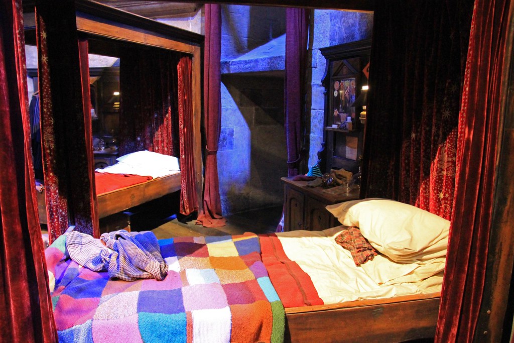
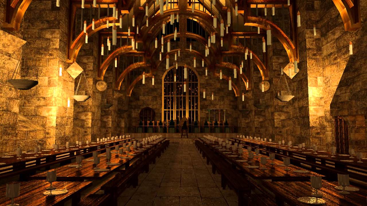
Gallery section:
- This section has pictures of various areas of the school and have a brief description with it. The pictures can also be opened in a separate tab in a browser for a larger view.
-
Contact Us section:
- This section gives the person accessing the option to send a message to school and ask any relevant queries.
-
404 error page:
- This is not a visible site but is available in case there is any error and will have the navigation links to return back to Home page.
Features Left to Implement and will be in future versions:
- I want to see the list of school items or supporting materials needed for school years with list of books.
- I want to see photos and details of the winners of the Quidditch matches and House Points of the year.
- I want to add page which has information about subjects taught and who their respective professors are.
- I want to add a page outlining vacancies for future roles that may be available in the school for job purposes.
Technologies Used
Languages used:
-
HTML5: Used to write the structure of the website.
-
CCS3: Used to style the website.
-
Google fonts: Used as a font resource.
-
Font Awesome: Used as an icon library for social links.
-
Balsamiq: Used to create wireframes.
-
Git: Used as a version control system tracking.
-
Gitpod: Used as a hosting platform.
-
Github: Used as a platform to keep project in a remote server.
-
Google Chrome DevTools: Used for testing responsiveness and solving any problems.
-
HTML Validator: Used for validating HTML code.
-
CSS Validator: Used for validating CSS code.
-
Techsini website to create a visual mockup of the site.
Testing
Functionality Testing:
I used Google Chrome DevTools to check the responsiveness of the web page on different devices and rectified problems accordingly.
Compatibility testing:
Site was tested in various devices on the Google chrome DevTools, however apart from this, physically checked in Moto G4, Redmi Note 5 Pro, Ipad Air, Ipad Air2 and Iphone 11 for different software's.
User Testing Stories:
-
I have created a main home page and have information stored structurally in order of home page where welcome note from Deputy Headmistress is there along with history of school and the newsletter. This covers the below user story:
“I want to ascertain the purpose of the website and learn more about the school.”
-
There are navigational links for the other pages and I have made maximum 3 pages for ease of use. This remains constant for all devices. This covers the below 2 user stories:
“I want to be able to easily navigate through the website.”
“I want to easily access relevant information.”
-
The site has been made responsive to be viewed on laptop, tablets and mobiles. This covers the below user story:
“I want to be able to access the site from all device types.”
-
I have created a contact us form section for any questions or general enquiries that parents may have and that have not been covered yet. The school is magical and does not have any phones. Also the school is hidden and hence the exact location of school also is not shared. People can only contact via the contact us form currently or OWL post. This covers the below user story:
“I want to be able to contact the school with questions that I might have.”
-
The school can be accessed via social media like Instagram, Facebook, You Tube and Twitter. There are links to this on each page as well. This covers the below user story:
"I want to be able to access the social media links of the school."
-
There is a separate tab on the home page which highlights any school newsletters that are announced during school year for parent information. This can also be downloaded as a pdf format and can be used by Parents at their convenience. This covers the below user story:
“I want to see any updated newsletters during school year.”
Code Validation:
At the and of the project I used two websites to validate the codes:
- W3C CSS Validator to validate CSS.
- W3C Html Validator to test HTML.
Note: No errors were received.
Issues found during deployment:
As this was my first project, I have been rectifying changes as I see, however, there were 3 crucial issues that I had to work with.
- Logo and header responsiveness for mobile
- I had the same issue with the responsiveness for the mobiles, as I had originally planned for max widths of 1200px, 950px and 600px respectively. This made an issue with the smaller widths of 300-450px as they did not view well on the mobiles.
- To avoid this situation and with guidance from my mentor, I changed the max-widths to 1200px, 950px, 750px, 600px and 450px.
- Once I implemented the changes the views changed dramatically overall. However, this error was the stepping stone for this major change.
- The code for this scenario changed as below:
- Max-width: 450px - font-size: 90%
- Max-width: 600px - height: 75px and margin: 10px 0 10px 0
- Max-width: 750px - font-size: 130% and height: 130px
- Max-width: 950px - font-size: 160%, line-height: 40px and height: 140px
- Max-width: 1200px - font-size: 180% and margin-right: 0
This has changed the look as shown on the mockup and has become responsive.
- Home page welcome note issue on the hero-image

I then added the following CSS rules as below:
- Max-width: 450px for #cover-text with left: 10% and width: 250px;
- Max-width: 750px for #cover-text with left: 20% and transform: translate(0, -30%)
- Max-width: 950px for #cover-text with font-size: 80%, height: 220px, left: 30% and transform: translate(-10%, -30%);
This has changed the look as shown on the mockup and has become responsive.
- Gallery Page

Unfortunately, I did not take an image of the initial version of the Gallery page so I have attached the last bug that I currently had. The initial page had images all spread around the page and not aligned. I then tried to use the Masonary style from the Love Running project, but that too did not work out for me.
Finally, I referred to the W3schools gallery responsive section and used this as the basis of my code. I split the gallery into 3 sections until 1201px and post this I split the gallery into 2 for ipad and finally for mobile only 1 section. This was possible by using the div.gallery img width: 100% & height: 435px to begin with and then this fell into place with the further responsiveness.

- Contact Us Page

I had to change the #contactus-cover to width: 95%, height: auto, top: 300px. Also the #contactus-image had to amend to max-width: 100%; opacity: .8; and background-size: cover. The backgaround image was changed and also moved from #contactus-cover to #contactus-image.

Performance Testing:
I used Lighthouse tool for testing the performance of my website.
Laptop Lighthouse testing View:

Mobile Lighthouse testing View:

If you wish to see the reports in complete for the website, please click on the links below:
Laptop Lighthouse Testing Report
Mobile Lighthouse Testing Report
Deployment
The project was deployed on GitHub Pages. I used Gitpod as a development environment where I commited all changes to git version control system. I used push command in Gitpod to save changes into GitHub.
To deploy a project I had to:
- Log in to GitHub and click on repository to deploy (Hogwarts-school)
- Select Settings and find GitHub Pages section on the menu on the left hand side.
- From branch select master and then folder as root.
- Click save and page was deployed after auto-refresh.
Your site is published at https://manasi1031.github.io/Hogwarts-school/
To run locally:
- Log in to GitHub and click on repository to download (Hogwarts-school)
- Select Code and click Download the ZIP file.
- After download you can extract the file and use it in your local environment
Alternatively you can Clone or Fork this repository (Hogwarts-school) into your github account.
Credits
Content
-
The text for the Hogwarts school website was copied from the Wikipedia article - Hogwarts
-
The hero-image zoom css style is taken from the love running video from Code Institute. Though I have amended this further to my usage.
-
To complete this project I used Code Institute student template: Gitpod full template
-
I have worked on this project following a step-by-step approach from the Love running project from Code Institute to avoid missing any steps.
-
The gallery responsive code is taken from w3schools CSS – Gallery Responsive section and then further modified to fit the page. My Mentor did suggest to use bootstrap, however, I want to just stick to HTML and CSS.
-
In general, I used the knowledge and reference of w3schools to guide me and learn more.
Media
-
The school photos used in this site were obtained from Pixabay.
-
The Hogwarts crest and the school house crests have been taken from websites online randomly, as these are not available on any other free websites. They are available to use.
-
Some of the generic photos have been taken from google that are unlicensed as this is a very specific topic and not many pictures are available for free. I did discuss this with my mentor and he also agreed.
NOTE: These photographs are just used for a project and at any point of time can be changed if I have more available on the free websites.
Video:
Hogwarts School anthem taken from youtube and credit given on website as well to publisher - Julia Grace.
Newsletter:
As I could not create a real version as of yet, I have just used some comprehensions that my daughter uses in school as an attachment and are not copyrighted. I have confirmed this with her school.
Acknowledgements
I could not have done this project without the guidance and confidence of my mentor - Adegbenga Adeye.
Last but not the least, I would like to thank Code Institute for their support.
Screen Shots


 React
React
 Typescript
 Django
 Laravel
 Facebook
 Microsoft
 Google
 Alibaba
 D3
D3
 Tencent