This is a port/adaptation of imgui-rs-knobs, for C++.
Add imgui-knobs.cpp and imgui-knobs.h to your project and include imgui-knobs.h in some source file.
static float value = 0;

if (ImGuiKnobs::Knob("Volume", &value, -6.0f, 6.0f, 0.1f, "%.1fdB", ImGuiKnobVariant_Tick)) {
    // value was changed
}
Draw knobs using either Knob or KnobInt. The API is:
bool ImGuiKnobs::Knob(label, *value, min, max, [speed, format, variant, size, flags, steps, angle_min, angle_max])
bool ImGuiKnobs::KnobInt(label, *value, min, max, [speed, format, variant, size, flags, steps, angle_min, angle_max])
You can implement double click to reset using standard imgui functionality:
ImGuiKnobs::Knob("Volume", &value, -6.0f, 6.0f, 0.1f, "%.1fdB", ImGuiKnobVariant_Tick);

// Double click to reset, must be directly after drawing the knob so the right imgui "item" is used
if (ImGui::IsItemActive() && ImGui::IsMouseDoubleClicked(0)) {
    value = 0;
}
See example/main.cpp for a demo.
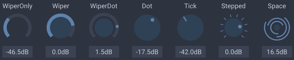
variant determines the visual look of the knob. Available variants are: ImGuiKnobVariant_Tick, ImGuiKnobVariant_Dot, ImGuiKnobVariant_Wiper, ImGuiKnobVariant_WiperOnly, ImGuiKnobVariant_WiperDot, ImGuiKnobVariant_Stepped, ImGuiKnobVariant_Space.
ImGuiKnobFlags_NoTitle: Hide the top title.ImGuiKnobFlags_NoInput: Hide the bottom drag input.ImGuiKnobFlags_ValueTooltip: Show a tooltip with the current value on hover.ImGuiKnobFlags_DragHorizontal: Use horizontal dragging only (default is bi-directional).ImGuiKnobFlags_DragVertical: Use vertical dragging only (default is bi-directional).
You can specify a size given as the width of the knob (will be scaled according to ImGui's FontGlobalScale). Default (0) will use 4x line height.
By default the knobs are styled using colors from the imgui theme. You can push/pop style colors to change individual colors. The color ids/flags default to button colors, thus:
| ImGui Color | Knob meaning |
|---|---|
ImGuiCol_ButtonActive |
The "filled" part |
ImGuiCol_ButtonHovered |
The "filled" part, when hovered |
ImGuiCol_Button |
The knob track |
Use ImGuiCol_FrameBg/ImGuiCol_Text to change the input field colors.
Steps determines the number of steps draw, it is only used for the ImGuiKnobVariant_Stepped variant.
 React
React
 Typescript
 Django
 Laravel
 Facebook
 Microsoft
 Google
 Alibaba
 D3
D3
 Tencent