
Create your own reaction bar or use one of your favorites!
- 4 Different Selectors - Slack, Facebook, Pokemon and GitHub
- 5 Different Counters - GitHub, YouTube, Facebook, Pokemon, and Slack

Install via npm (or from the GitHub Package Registry):
npm i @charkour/react-reactionsThis originated as a fork of casesandberg/react-reactions which is been modified under the MIT license to include additional features.
- Add ability to pass custom icons
- Fixed security vulnerabilities
- CJS and ESM support
- Add ref forwarding support
- Zero dependencies
- Built in Typescript and modern React (with TSDX)
- Works with React 16.8+ and Next 10
- Update current Selectors and Counter to match 2021 styles
- Add Discord Selector and Counter
- Add unit testing
- More??? Suggest a feature on Github Issues
import React from 'react';
import { ReactionBarSelector } from '@charkour/react-reactions';

const Component = () => {
  return <ReactionBarSelector />;
};
Props:
iconSize?: number — String icon pixel size. Defaults to 38px
reactions?: Reaction[]; — Array of Reaction objects {label: "haha", node: <div>😄</div>, key: "smile"} to display.
onSelect: (key: string) => void; — Function callback when emoji is selected
style?: React.CSSProperties - Pass a style object to the selector container
Also works with images.
Note: When passing an <img> as a Reaction. Specify the iconSize as the height of the image. <img height={iconSize} src="img-source" />
import React from 'react';
import { ReactionCounter } from '@charkour/react-reactions';

const Component = () => {
  return <ReactionCounter />;
};Props:*
iconSize?: number - String icon pixel size. Defaults to 24px
bg?: string - String of hex color for outline of overlapping reactions. Defaults to #fff
reactions: ReactionCounterObject[] - Array of emoji to dispay
user?: string - String name of user so that user displays as You
important?: string[] - Array of strings for important users to display their name
showReactsOnly?: boolean - If true, only show the Reactions and no text. Defaults to false
showTotalOnly?: boolean - If true, only show the number of Reactions and no specific names. Defaults to false
showOthersAlways?: boolean - Will display "and 0 others" if you are the only person who reacted. Defaults to true
className?: string - Pass a string that applies to the counter container
onClick?: () => void - Pass a callback that is added to the onClick property to the counter container
style?: React.CSSProperties - Pass a style object to the counter container
import React from 'react';
import { SlackSelector } from '@charkour/react-reactions';

const Component = () => {
  return <SlackSelector />;
};
Props:
active: String of active tab. Defaults to mine
scrollHeight: String pixel height of scroll container. Defaults to 270px
removeEmojis: Array of emojis to remove from emoji list
frequent: Array of emojis to set Frequently Used. Defaults to ['👍', '🐉', '🙌', '🗿', '😊', '🐬', '😹', '👻', '🚀', '🚁', '🏇', '🇨🇦']
onSelect: Function callback when emoji is selected
Fonts: To use the Slack fonts, download the font files here and include them in public/fonts.
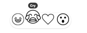
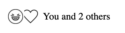
import React from 'react';
import { GithubSelector } from '@charkour/react-reactions';

const Component = () => {
  return <GithubSelector />;
};
Props:
reactions: Array of emoji to dispay. Defaults to ['👍', '👎', '😄', '🎉', '😕', '❤️']
onSelect: Function callback when emoji is selected
import React from 'react';
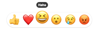
import { FacebookSelector } from '@charkour/react-reactions';
const Component = () => {
return <FacebookSelector />;
};Props:
reactions: Array of strings for reactions to display. Defaults to ['like', 'love', 'haha', 'wow', 'sad', 'angry']
iconSize: String icon pixel size. Defaults to 38px
onSelect: Function callback when emoji is selected
import React from 'react';
import { PokemonSelector } from '@charkour/react-reactions';

const Component = () => {
  return <PokemonSelector />;
};
Props:
reactions: Array of strings for reactions to display. Defaults to ['like', 'love', 'haha', 'wow', 'sad', 'angry']
iconSize: String icon pixel size. Defaults to 38px
onSelect: Function callback when emoji is selected
import React from 'react';
import { GithubCounter } from '@charkour/react-reactions';

const Component = () => {
  return <GithubCounter />;
};
Props:
counters: Array of counter objects structured such that:
{
  emoji: '👍', // String emoji reaction
  by: 'case', // String of persons name
}user: String name of user so that user displays as You
onSelect: Function callback when emoji is selected
onAdd: Function callback when add reaction is clicked
import React from 'react';
import { YoutubeCounter } from '@charkour/react-reactions';

const Component = () => {
  return <YoutubeCounter />;
};
Props:
like: String number of likes
dislike: String number of dislikes
onLikeClick: Function callback when like is clicked
onDislikeClick: Function callback when dislike is clicked
import React from 'react';
import { FacebookCounter } from '@charkour/react-reactions';

const Component = () => {
  return <FacebookCounter />;
};
Props:
counters: Array of counter objects structured such that:
{
  emoji: 'like', // String name of reaction
  by: 'Case Sandberg', // String of persons name
}user: String name of user so that user displays as You
important: Array of strings for important users to display their name
bg: String of hex color for outline of overlapping reactions. Defaults to #fff
onClick: Function callback when clicked
alwaysShowOthers: boolean. Will display "and 0 others" if you are the only person who reacted.
import React from 'react';
import { PokemonCounter } from '@charkour/react-reactions';

const Component = () => {
  return <PokemonCounter />;
};
Props:
counters: Array of counter objects structured such that:
{
  emoji: 'like', // String name of reaction
  by: 'Charles Kornoelje', // String of persons name
}user: String name of user so that user displays as You
important: Array of strings for important users to display their name
bg: String of hex color for outline of overlapping reactions. Defaults to #fff
onClick: Function callback when clicked
alwaysShowOthers: boolean. Will display "and 0 others" if you are the only person who reacted.
import React from 'react';
import { SlackCounter } from '@charkour/react-reactions';

const Component = () => {
  return <SlackCounter />;
};
Props:
counters: Array of counter objects structured such that:
{
  emoji: '🗿', // String emoji reaction
  by: 'case', // String of persons name
}user: String name of user so that user displays as You
onSelect: Function callback when emoji is selected
onAdd: Function callback when add reaction is clicked
Fonts: To use the Slack fonts, download the font files here and include them in public/fonts.
A simple animation can be done on the components using CSS. See this demo. More advaned animations can be done using dynamic styles. See this demo
npm startThis builds to /dist and runs the project in watch mode so any edits you save inside src causes a rebuild to /dist.
Then run either Storybook or the example playground:
Run inside another terminal:
npm run storybookThis loads the stories from ./stories.
NOTE: Stories should reference the components as if using the library, similar to the example playground. This means importing from the root project directory. This has been aliased in the tsconfig and the storybook webpack config as a helper.
Then run the example inside another:
cd example
npm i
npm start
The default example imports and live reloads whatever is in /dist, so if you are seeing an out of date component, make sure TSDX is running in watch mode like we recommend above. No symlinking required, we use Parcel's aliasing.
To do a one-off build, use npm run build.
To run tests, use npm test.
Code quality is set up for you with prettier, husky, and lint-staged. Adjust the respective fields in package.json accordingly.
Jest tests are set up to run with npm test.
mainwhich installs deps w/ cache, lints, tests, and builds on all pushes against a Node and OS matrix
Pokemon Illustrations by Chris Owens


![dependabot[bot] avatar](https://avatars.githubusercontent.com/in/29110?v=4 "dependabot[bot]")


 React
React
 Typescript
 Django
 Laravel
 Facebook
 Microsoft
 Google
 Alibaba
 D3
D3
 Tencent