Git Product home page Git Product logo

obsidian-chartsview-plugin's Introduction

GitHub tag (latest SemVer) GitHub all releases GitHub Release Date GitHub last commit

Obsidian Charts View Plugin

This is a data visualization plugin for Obsidian, based on Ant Design Charts. Support plots and graphs.

Chart Templates

Word Count

Use command Insert Template -> Word Count to insert code block.

#-----------------#
#- chart type    -#
#-----------------#
type: WordCloud

#-----------------#
#- chart data    -#
#-----------------#
data: "wordcount:Words"

#-----------------#
#- chart options -#
#-----------------#
options:
  wordField: "word"
  weightField: "count"
  colorField: "count"
  wordStyle:
    rotation: 30

image

Multi files

data: "wordcount:Words,PARA,@Inbox/"

ALL files

data: "wordcount:/"

Folder

data: "wordcount:@Inbox/"

Pie

Use command Charts View: Insert Template -> Pie to insert code block.

image

WordCloud

Use command Charts View: Insert Template -> WordCloud to insert code block.

image

Treemap

Use command Charts View: Insert Template -> Treemap to insert code block.

image

DualAxes

Use command Charts View: Insert Template -> DualAxes to insert code block.

image

Mix

Use data.<any name> and options.<any name> to set data and options. Keep data and options <any name> same.

Use command Charts View: Insert Template -> Mix to insert code block.

image

Bar

Use command Charts View: Insert Template -> Bar to insert code block.

image

OrganizationTreeGraph

Use command Charts View: Insert Template -> OrganizationTreeGraph to insert code block.

image

Radar

Use command Charts View: Insert Template -> Radar to insert code block.

image

TinyLine

Use command Charts View: Insert Template -> TinyLine to insert code block.

image

Dataviewjs Example (Column)

Chart data by dataviewjs. Use command Charts View: Insert Template -> Dataviewjs Example (Column) to insert code block.

image

Chart Wizard

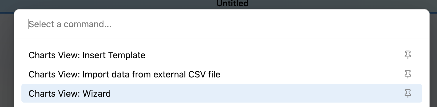
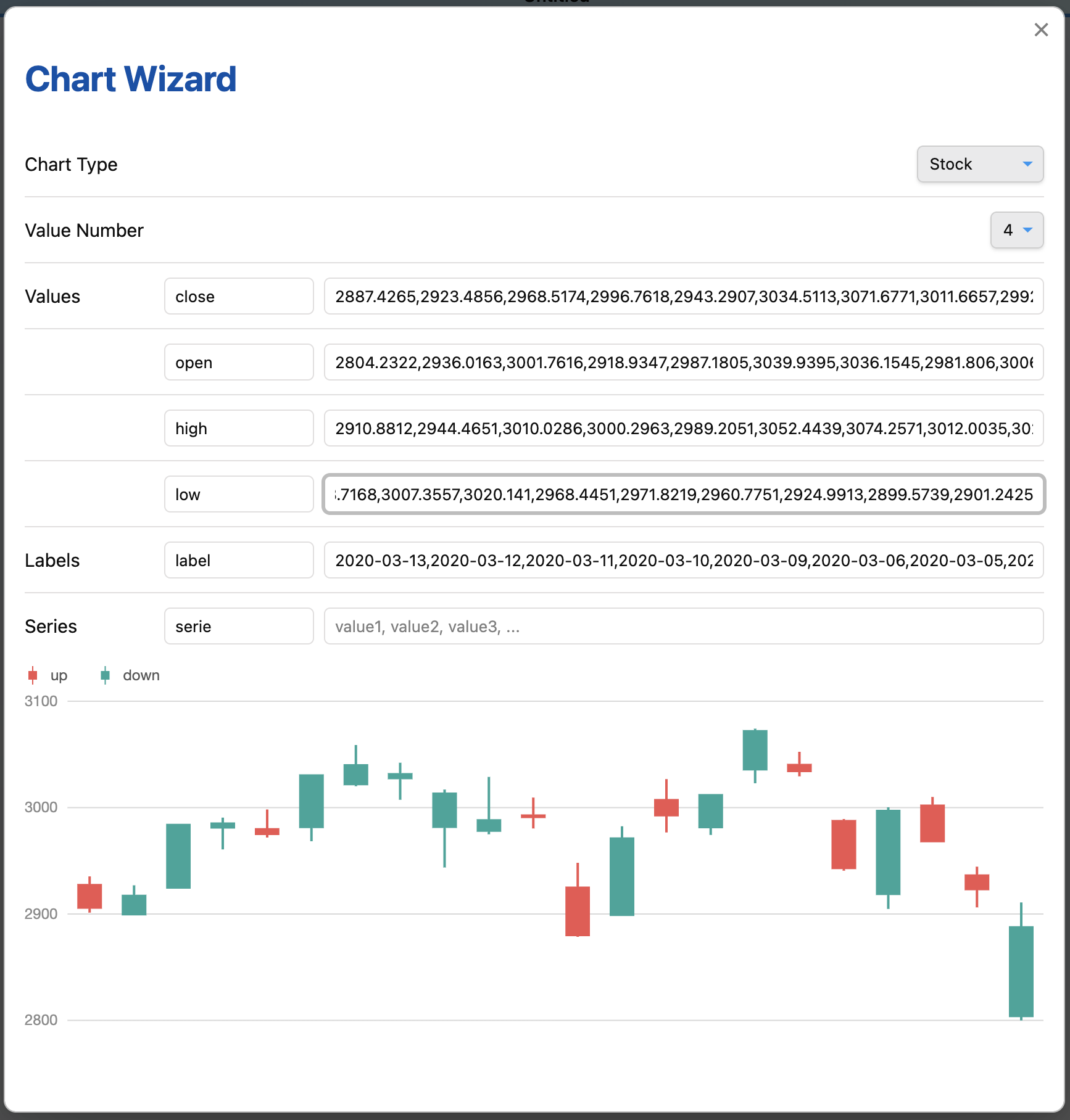
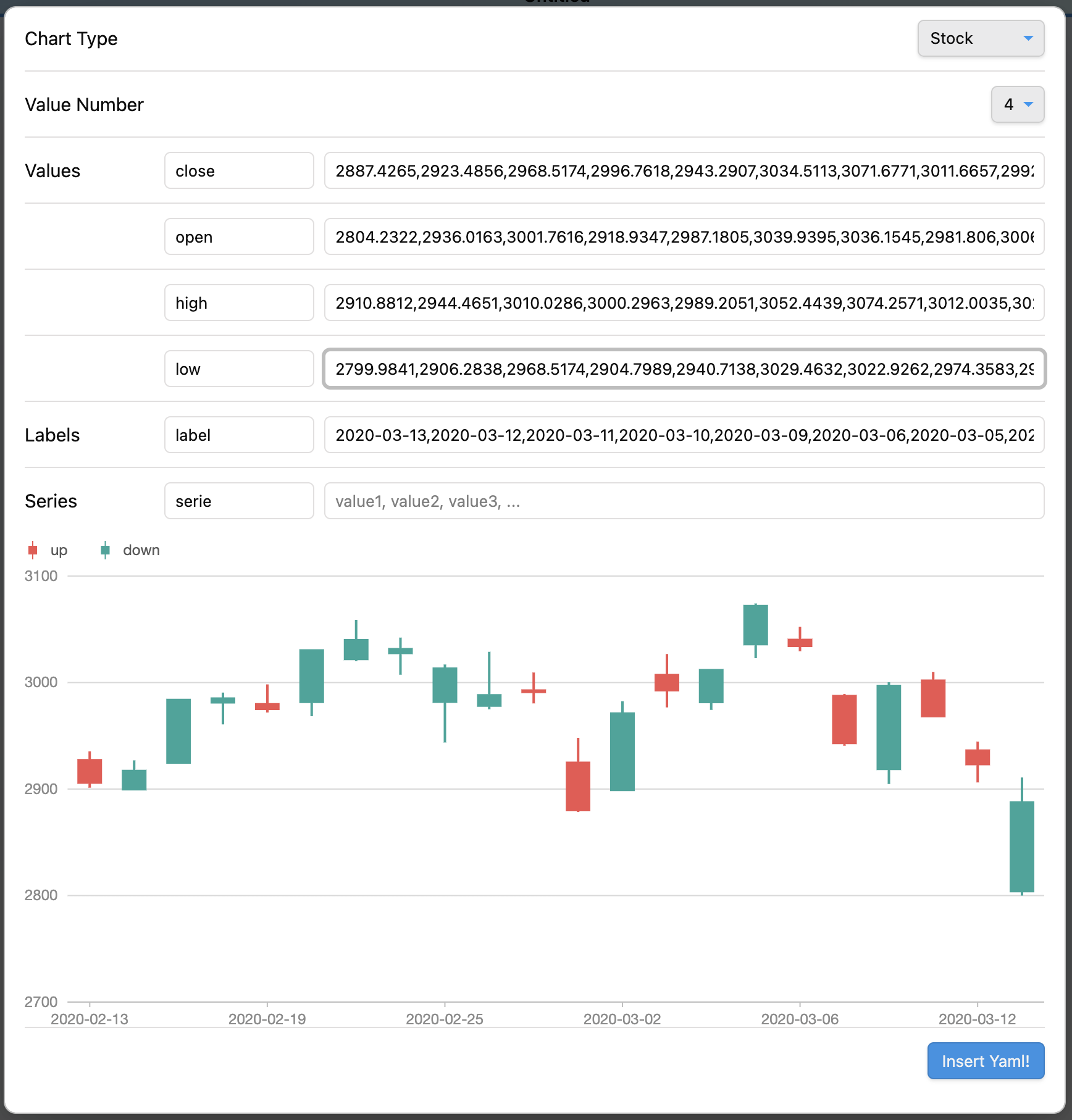
Use command Charts View: Wizard to insert code block.

image

image

image

image

Data from CSV file

Import data from external CSV file (Desktop)

Use command Charts View: Import data from external CSV file to insert data from CSV file.

Load data from internal CSV file

Load CSV file from data path. Data path should be specified in settings.

#-----------------#
#- chart type    -#
#-----------------#
type: Mix

#-----------------#
#- chart data    -#
#-----------------#
data.area:
  - time: 1246406400000
    temperature: [14.3, 27.7]
  - time: 1246492800000
    temperature: [14.5, 27.8]
  - time: 1246579200000
    temperature: [15.5, 29.6]
  - time: 1246665600000
    temperature: [16.7, 30.7]
  - time: 1246752000000
    temperature: [16.5, 25.0]
  - time: 1246838400000
    temperature: [17.8, 25.7]

data.line: LineData.csv

#-----------------#
#- chart options -#
#-----------------#
options:
  appendPadding: 8
  syncViewPadding: true
  tooltip:
    shared: true
    showMarkers: false
    showCrosshairs: true
    offsetY: -50

options.area:
  axes: {}
  meta:
    time:
      type: 'time'
      mask: 'MM-DD'
      nice: true
      tickInterval: 172800000
      range: [0, 1]
    temperature:
      nice: true
      sync: true
      alias: '温度范围'
  geometries:
    - type: 'area'
      xField: 'time'
      yField: 'temperature'
      mapping: {}

options.line:
  axes: false
  meta:
    time:
      type: 'time'
      mask: 'MM-DD'
      nice: true
      tickInterval: 172800000
      range: [0, 1]
    temperature:
      sync: 'temperature'
      alias: '温度'
  geometries:
    - type: 'line'
      xField: 'time'
      yField: 'temperature'
      mapping: {}
    - type: 'point'
      xField: 'time'
      yField: 'temperature'
      mapping:
        shape: 'circle'
        style:
          fillOpacity: 1

Multi CSV files

#-----------------#
#- chart type    -#
#-----------------#
type: DualAxes

#-----------------#
#- chart data    -#
#-----------------#
data: DualAxesData.csv, DualAxesData.csv

#-----------------#
#- chart options -#
#-----------------#
options:
  xField: 'time'
  yField: ['value', 'count']
  yAxis:
    value:
      min: 0
      label:
        formatter:
          function formatter(val) {
            return ''.concat(val, '个');
          }
  geometryOptions:
    - geometry: 'column'
    - geometry: 'line'
      lineStyle:
	    lineWidth: 2

Dataview Plugin Integration

Allowed methods

  • dv.current()
  • dv.pages(source?)
  • dv.pagePaths(source?)
  • dv.page(path)
  • dv.array(value)
  • dv.isArray(value)
  • dv.date(text)
  • dv.fileLink(path, embed?, display-name?)
  • dv.date(pathlike)
  • dv.query(source, settings?)
  • dv.io

See Dataview Codeblock Reference

Interaction

Enable search interaction

Enable the Search in Obsidian interaction when click a chart element by add an option enableSearchInteraction. Use default:

#-----------------#
#- chart options -#
#-----------------#
options:
  ...
  enableSearchInteraction: true

or custom:

#-----------------#
#- chart options -#
#-----------------#
options:
  ...
  enableSearchInteraction:
    field: 'word'
    operator: 'path'
operator Obsidian search opertaor
default
tag tag:
path path:
file file:
task task:
taskTodo task-todo:
taskDone task-done:
matchCase match-case:
ignoreCase ignore-case:
line line:
block block:
content content:
section section:
fileopen Open a file inside Vault

Examples

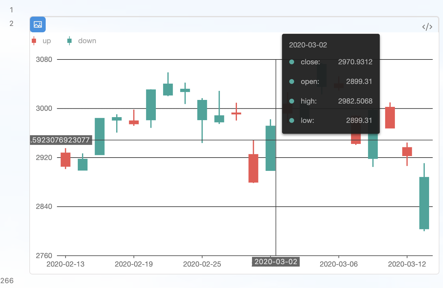
See https://github.com/caronchen/obsidian-chartsview-plugin/wiki/Chart-examples

Manually installing the plugin

  • Copy over main.js, styles.css, manifest.json to your vault VaultFolder/.obsidian/plugins/obsidian-chartsview-plugin/.

Ant Design Charts Demos

See https://charts.ant.design/en/examples/gallery

obsidian-chartsview-plugin's People

Contributors

caronchen avatar sherodtaylor avatar

Stargazers

 avatar  avatar  avatar  avatar  avatar  avatar  avatar  avatar  avatar  avatar  avatar  avatar  avatar  avatar  avatar  avatar  avatar  avatar  avatar  avatar  avatar  avatar  avatar  avatar  avatar  avatar  avatar  avatar  avatar  avatar  avatar  avatar  avatar  avatar  avatar  avatar  avatar  avatar  avatar  avatar  avatar  avatar  avatar  avatar  avatar  avatar  avatar  avatar  avatar  avatar  avatar  avatar  avatar  avatar  avatar  avatar  avatar  avatar  avatar  avatar  avatar  avatar  avatar  avatar  avatar  avatar  avatar  avatar  avatar  avatar  avatar  avatar  avatar  avatar  avatar  avatar  avatar  avatar  avatar  avatar  avatar  avatar  avatar  avatar  avatar  avatar  avatar  avatar  avatar  avatar  avatar  avatar  avatar  avatar  avatar  avatar  avatar  avatar  avatar  avatar

Watchers

 avatar  avatar  avatar

obsidian-chartsview-plugin's Issues

如何调整图表在Obsidian中的布局?

目前图表采用代码块方式,在Obsidian中只能居中或左对齐(调整图表大小),不能实现float、flex等其它布局。请教下如何通过CSS文件调整布局。

Text overlaying other text in pie chart preview

In pie charts with many little fractions text tends to be displayed over other text or not even be shown because there is too little space.

  • Example:
    image

I obviously want to be able to read all text (names and percentage of fractions). To fix this the lines extendeing from the fraction to the text of the fraction could be longer for some fractions.

多图层图表的Gauge语法还是不会。

按您的方法,Multiview中的line可以,但gauge仍然无法显示,还是语法不对,请指教,谢谢!

type: Mix
data.gauge: [
]
options.gauge:
  region:
	start: {x: 0, y: 0}
	end: {x: 0.45, y: 1}
  geometries:
  - type: gauge
	percent: 0.4
	axes: {}

Chart does not render inside column

I'm trying to display 2 charts next to each other using https://github.com/tnichols217/obsidian-columns.

```chart
type: pie
labels: [Filled,Empty]
series:
  - title: Title 1
    data: [1, 11]
width: 40%
labelColors: true
legend: false
```

`````col
````col-md
flexGrow=1
===
test error
```chart
type: pie
labels: [Filled,Empty]
series:
  - title: Title 1
     data: [1, 11]
width: 40%
labelColors: true
legend: false
```
````

````col-md
flexGrow=1
===
test valid
```chart
type: pie
labels: [Filled,Empty]
series:
  - title: Title 1
    data: [1, 11]
width: 40%
labelColors: true
legend: false
```
````
`````

renders as:
Charts side by side

解决了图表左右浮动布局,请问如何实现flex弹性布局?

浮动布局解决了固定页面宽度图表并排显示问题,但需指定图表width。比如两个图表并排显示,需分别指定它们的width。这时如果增大obsidian的页面宽度,则图表的右侧会留下空档。如能像flex布局一样,自动根据页面宽度自动调整,效果就更好了。有办法吗?

请教双轴图的data数据如何引用?

常规图和Mix图的data数据导入可以使用data: xxx.csv,但双轴图DualAxes如何引用,使用data: xxx.csv 和data: [xxx.csv, xxx.csv]均无法解决,请指教,谢谢!

What is the syntax for configuring line style in mix?

On the Mix chart example that you provide we config our line like this:

options.line:
  axes: false
  geometries:
    - type: 'line'
      xField: 'time'
      yField: 'temperature'
      mapping: {}

Based on my reading of examples and Ant documentation, style should be configured like this:

options.line:
  axes: false
  geometries:
    - type: 'line'
      xField: 'time'
      yField: 'temperature'
      style:
        color: 'red'
      mapping: {}

Sadly I can't get it to work. I hope you can illuminate where my ignorance lies with this basic question as I am sure it would be helpful for others like me.

如何在Facet图表中的eachView传递数据?

更新后,图形可以显示了,但数据无法传递,请教如何将Data数据对应传递给eachView。如下图的ticks和percent,谢谢!

type: Facet
data: [
  {type: A, ratio: 0.4, p: 0.3},
  {type: B, ratio: 0.3, p: 0.2},
  {type: C, ratio: 0.2, p: 0.1},
]
options:
  height: 260
  type: 'rect'
  fields: ['type']
  eachView: |
    function eachView(view, f){
	  return {
	    type: 'gauge',
	    options: {
		  data: f.data,
		  radius: 1,
		  range: {
		    ticks: [0, data.ratio, 1],
		    color: ['hsl(150,50%,65%)', 'l(0) 0:hsl(60,50%,50%) 1:hsl(0,50%,50%)'],
		  },
		  indicator: {
                      pointer: {
                          style: {stroke: 'hsl(35,50%,65%)'}
		      },
		      pin: {
                         style: {stroke: 'hsl(35,50%,65%)'}
		      },
		  },
		  percent:  data.p,
	    }
	  }
	}

Issue with reading a single CSV file

Issue

In the parser.ts file's loadFromCsv, you have directly invoked .split(",") method. This causes an issue when there is only a single CSV file.

Why is it an issue for me?

In my use case I like to have a csv file for a chart in a separate file rather than having them in the working .md file. The benefit of that is that I can use iOS shortcuts to edit the CSV instead of the YAML code in the main .md file. Plus it makes the file look cleaner.

Solution

I have created a solution that works for me, I am just posting it for you to maybe implement it in a cleaner way for everyone else to use, Thanks.

Here is the code:


async function loadFromCsv(data: string, plugin: ChartsViewPlugin): Promise<DataType> {
    var csvFileNames;
    const value = [];
    if (data.includes(",")){
        const csvFileNames = data.split(",");

    for (let name of csvFileNames.values()) {
        const file = plugin.app.vault.getAbstractFileByPath(plugin.settings.dataPath + "/" + name.trim());
        if (file instanceof TFile) {
            value.push(parseCsv(await plugin.app.vault.read(file)));
        } else {
            value.push({});
        }
    }
    } else {
        csvFileNames = data;
        const file = plugin.app.vault.getAbstractFileByPath(csvFileNames.trim());
        console.log(file)
        if (file instanceof TFile) {
            console.log(data, csvFileNames, parseCsv(await plugin.app.vault.read(file)))
            value.push(parseCsv(await plugin.app.vault.read(file)));
        } else {
            value.push({});
        }
    }
    if (value.length == 0) {
        return {};
    } 
    if (value.length == 1) {
        return value[0];
    }
    return value;
}

Thanks a lot for the great plugin.

Unable to load local *.csv

I can't figure out what I am doing wrong:

In Charts View settings, the data path is set:
Data folder _csv

The lineData.csv looks like this:

year,value
"1991",3
"1992",4
"1993",3.5
"1994",5
"1995",4.9
"1996",6
"1997",7
"1998",9
"1999",13

The load csv file line in chartsview:

data: lineData.csv

I can render the chart by importing the data, but not by loading the same data source.

I can also get your readme example for Mix Chart type to work.

Error importing linegraph.csv

This worked well before, but after recent plugin updates is now giving error message: 组件出错了,请核查后重试: data.filter is not a function.
I imported the line graph like this: data: linegraph.csv
This also gives error message: data.line: linegraph.csv

如何实现图表浮动左对齐而不影响autoFit?

若想图表作为插图,浮动左对齐,是可在CSS文件的.block-language-chartsview类中增加float:left实现,但会影响全局,使autoFit:true的图表也发生浮动变形。
若只想对关闭autoFit的图表起作用,而不影响autoFit:true的图表,请问要如何设置CSS或main.js文件?

Formating and coloring scatter plot chart

Thanks for your great plugin.

Is there a way to give elements of the chart different colors? I tried this, with no results:


```chartsview
#-----------------#
#- chart type    -#
#-----------------#
type: Scatter

#-----------------#
#- chart data    -#
#-----------------#
data:
  - label: "-4"
    value: 16
  - label: "-3"
    value: 9
  - label: "-2"
    value: 4
  - label: "-1"
    value: 1
  - label: "0"
    value: 0
  - label: "1"
    value: 1
  - label: "2"
    value: 4
  - label: "3"
    value: 9
  - label: "4"
    value: 16

#-----------------#
#- chart options -#
#-----------------#
options:
  xField: label
  yField: value
color: '#FF0000'

It has no well made contrast and the font of the axes is too tiny.

![image](https://github.com/caronchen/obsidian-chartsview-plugin/assets/4138869/a5fc39cf-cd98-45ef-8e3a-f0a83961160d)


功能很强大,但DualAxes无法显示,不知是什么原因?

代码如下:

	type: DualAxes
	data:
	  - year: '2006'
	    value: 0.3
	    count: 10
	  - year: '2007'
	    value: 0.6
	    count: 20
	  - year: '2008'
	    value: 0.7
	    count: 30
	options:
	  data: [data, data]
	  xField: 'year'
	  yField: ['value', 'count']
	  geometryOptions: [
	    {geometry: 'line'},
		{geometry: 'line',
		 lineStyle: {lineWidth: 2},
		}
	  ]

YAMLParseError

Obsidian突然出现YAMLParseError: Tabs are not allowed as indentation at line..错误,影响使用自定义函数等图表。
截屏2021-12-23 21 09 08

希望加入对特定文件夹调色功能(type: Bar模式下)

开发者好!
我在看图表时,想要跟踪某个或某些文件夹的变化,希望加入调色功能,这样反馈会更加醒目。我尝试自己改css,但找不到对应的选择器,只能求助。
ps:有老师建议文件夹或标签增加链接功能,也希望可以考虑一下。谢谢!

Feature request: Please add 'scatter' to the chart wizard - because it works ;-)

Thanks for your GREAT plugin.

I found, that scatter charts are working, when I write

type: Scatter

#-----------------#
#- chart type    -#
#-----------------#
type: Scatter

#-----------------#
#- chart data    -#
#-----------------#
data:
  - label: "1951"
    value: 38
  - label: "1952"
    value: 52
  - label: "1956"
    value: 61
  - label: "1957"
    value: 145
  - label: "1958"
    value: 48

#-----------------#
#- chart options -#
#-----------------#
options:
  xField: label
  yField: value

Thank you sooo much for this!

Can you please add it tot the "Charts View: Wizard" (Chart Type Scatter) and "Charts View: Insert Template"?

image

WordCount是否支持扫描多个md文档/全库生成词云图

插件开发者你好呀,觉得你的插件很棒!能直接对单个文档生成词云真的很赞!我是文科技术盲,没有很看明白插件使用说明,想请教一下,这个插件是支持对多个文档/特定文件夹/全库通过WordCount生成词云图的吗,如果可以怎么操作呢。不知道开发者有没有时间解答一下~感谢ww

[Feature Request] Add an option to start at zero for Radar

Love the plugin and how it looks, but would really like if you were able to have a Radar chart start at zero, or at least have a minimum value that you can set for it so the lowest values aren't just always at the center since that doesn't look as good usually

希望能增加@antv/data-set模块的引入,实现数据转置,谢谢!

在Mix图表中,下面代码的.transform实现将male、female字段转换为key和value。请教在chartsview中如何编写代码来实现?谢谢!
data: new DataSet.DataView()
.source(
yearData.map(function (d) {
return {
year: d[0],
male: d[3],
female: d[4],
};
}),
)
.transform({
type: 'fold',
fields: ['male', 'female'],
key: 'gender',
value: 'turnout',
}).rows,

我参照试了下,没有成功,图无法显示。感觉是缺少import { DataSet } from '@antv/data-set'的缘故,希望能更新修复下,谢谢!
test.csv

type: Column
data: test.csv

options:
  data: |
   new DataSet.DataView()
    .source(data)
    .transform({
      type: 'fold',
      fields: ['red', 'green'],
      key: 'color',
      value: 'value',
    }).rows,
  xField: 'type'
  yField: 'value'
  seriesField: 'color'
  isStack: true

How to combine DualAxes with Dataview.js?

I can't seem to get the combination of DualAxes and Dataview.js working. I'm not sure if I just have the syntax wrong, or if it doesn't work.

In the example below, I'm trying to have data[0] use dataview and data[1] be hard-coded just as an experiment. Ideally, I would only have one dataview query, but I need to mess around with the dataview API further to output the right structure.

type: DualAxes
data: 
  - |
    dataviewjs:
    return dv.pages()
           .groupBy(p => p.file.folder)
           .map(p => ({time: p.key || "ROOT", count: p.rows.length, value: 15}))
           .array();
  -
    - time: "2019-03"
      value: 350
      count: 800
    - time: "2019-04"
      value: 900
      count: 600
    - time: "2019-05"
      value: 300
      count: 400
    - time: "2019-06"
      value: 450
      count: 380
    - time: "2019-07"
      value: 470
      count: 22
 options:
  xField: 'time'
  yField: ['value', 'count']
  yAxis:
    value:
      min: 0
  geometryOptions:
    - geometry: 'column'
    - geometry: 'line'
      lineStyle:
        lineWidth: 2

This results in an error:

组件出错了,请核查后重试: r.filter is not a function

Open file instead of open search

Is it possible to click on an item in the word cloud and directly open the coresponding file instead of opening the search?

Here is my code:

#-----------------#
#- chart type    -#
#-----------------#
type: WordCloud

#-----------------#
#- chart data    -#
#-----------------#
data: |
  dataviewjs:
  return dv.pages('"MOC" or "Notizen"')
           .sort(s => s.file.inlinks.length+s.file.outlinks.length, 'desc') 
           .map(p => ({notiz: p.file.name, count: p.file.inlinks.length+p.file.outlinks.length}))
           .array();

#-----------------#
#- chart options -#
#-----------------#
options:
  height: 150
  wordField: "notiz"
  weightField: "count"
  colorField: ""
  wordStyle:
    rotation: 0
    fontSize: [8,30]
  enableSearchInteraction: 
    field: 'word'
    operator: 'file'

Would be a huge plus for me if this would be possible!!

请教如何实现csv表格数据自动统计?

在将csv表格文件转为图形展示过程中,遇到数据无法自动统计问题,请教如何解决。如下csv文件,要实现color的分类统计,想不到其它办法,加了value字段,但label标签仍无法自动统计数量展示。
test.csv

type: Column
data: test.csv

options:
  xField: color
  yField: value
  seriesField: color
  isStack: true
  label: {}

问题1:同类型的stack如何自动合并统?即上例中的label能显示种颜色的总数。
问题2:不同类型的stack如何自动合并统计?
问题3:如何不用增加value字段实现color的分类统计?

再请教下多图层图表语法如何写?

参考官方模板和API写,无法显示,不知什么原因?

type: Mix
data: 
- year: 2000
   value: 100
- year: 2010
   value: 150
plots:
- type: 'bar'
  region:
    start: {x: 0, y: 0}
    end: {x: 1, y: 1}
  options:
    xField: value
    yField: year

Request for Interactive Capabilities in OrganizationTreeGraph

Hello,

I am using your obsidian-chartsview-plugin and it has been a great tool in visualizing data within Obsidian. However, I have a specific need that is currently not met by the plugin, and I'm hopeful that this could be a potential enhancement.

Specifically, I would like to see interactive capabilities added to the OrganizationTreeGraph chart type. The ability to interact with each bar of the graph would greatly improve the utility of the plugin. It would be beneficial if each bar in the graph could be made clickable, such that clicking on a bar would either open a popover with a specified page, or open a specific link.

Ideally, this interaction should be customizable, perhaps through JavaScript, allowing users to handle clicks on each bar as per their specific requirements.

I believe this feature would not only address my need but also be beneficial to many other users who might want to use your plugin for similar purposes.

Looking forward to hearing your thoughts on this.

Best regards,
Ivan

Minor correction and question

This did not work for me...
image

This did though...
image
followed by
image

Please make the change, as I figured this out by manually editing the example code. :)

Question:

I would like to apply the code block to the file it is in, is there a reserved word for the current file, that I could use?

Thanks!

Brad

Chart is not scaled correctly in PDF

Dear @caronchen , first of all thank you very much for this plugin, which is amazing. I have used it a lot.

A small problem I found in it was when exporting the note to PDF: the charts are not scaled to fit in the PDF page (image attached)
ChartsView-problem_with_pdf

Thanks!

p.rows.author.array() to show only part of the author field?

 .map(p => ({'Date Finished': p.key[1], 'Published in': p.key[0], Count: p.rows.length, 'Title': p.rows.alias.array(), 'Author': p.rows.author.array()}))

This is what you helped me with a few weeks ago. In the meantime, I've changed my Author field to look like this `"[[King, Stephen|Stephen King]]" so it would link the book to the author note.

However, now it your (awesome) scatter plot, the author shows up as that. Is it possible to show the author as just the alias?

Thanks :)

Unable to load data from csv file when the data path is the vault's root

Under the extension settings, it is possible to specify the data path as the root of the vault, like this:
image

However, with that setting, I'm not able to get load any data from csv files. I believe the issue comes from this line:
https://github.com/caronchen/obsidian-chartsview-plugin/blob/master/src/parser.ts#L174

If plugin.settings.dataPath is the root of the vault, the expression will start with two forward slash and the call to get the abstract file by path won't work.

Changing the data path setting to something else than the root, the plugin behaves as expected.

建议完善函数功能,谢谢!

以下代码使用中出错,显示不支持嵌套,建议完善下函数功能,谢谢!
eachView: function eachView(view, f) {
return {
type: 'pie',
options: {
data: f.data,
angleField: 'mean',
colorField: 'cut',
pieStyle: { stroke: null },
},
};
},

Recommend Projects

  • React photo React

    A declarative, efficient, and flexible JavaScript library for building user interfaces.

  • Vue.js photo Vue.js

    🖖 Vue.js is a progressive, incrementally-adoptable JavaScript framework for building UI on the web.

  • Typescript photo Typescript

    TypeScript is a superset of JavaScript that compiles to clean JavaScript output.

  • TensorFlow photo TensorFlow

    An Open Source Machine Learning Framework for Everyone

  • Django photo Django

    The Web framework for perfectionists with deadlines.

  • D3 photo D3

    Bring data to life with SVG, Canvas and HTML. 📊📈🎉

Recommend Topics

  • javascript

    JavaScript (JS) is a lightweight interpreted programming language with first-class functions.

  • web

    Some thing interesting about web. New door for the world.

  • server

    A server is a program made to process requests and deliver data to clients.

  • Machine learning

    Machine learning is a way of modeling and interpreting data that allows a piece of software to respond intelligently.

  • Game

    Some thing interesting about game, make everyone happy.

Recommend Org

  • Facebook photo Facebook

    We are working to build community through open source technology. NB: members must have two-factor auth.

  • Microsoft photo Microsoft

    Open source projects and samples from Microsoft.

  • Google photo Google

    Google ❤️ Open Source for everyone.

  • D3 photo D3

    Data-Driven Documents codes.