Git Product home page Git Product logo

react-native-autocomplete-input's Introduction

react-native-autocomplete-input

npm version Test

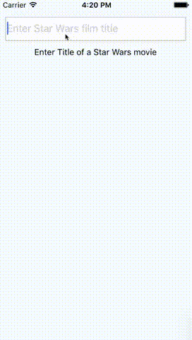
A pure JS autocomplete component for React Native. Use this component in your own projects or use it as inspiration to build your own autocomplete.

Autocomplete Example

Play around with the Example Snack

How to use react-native-autocomplete-input

Tested with RN >= 0.26.2. If you want to use RN < 0.26 try to install react-native-autocomplete-input <= 0.0.5.

Installation

# Install with npm
$ npm install --save react-native-autocomplete-input

# Install with yarn
$ yarn add react-native-autocomplete-input

Example

// ...

render() {
  const { query } = this.state;
  const data = filterData(query);
  return (
    <Autocomplete
      data={data}
      value={query}
      onChangeText={(text) => this.setState({ query: text })}
      flatListProps={{
        keyExtractor: (_, idx) => idx,
        renderItem: ({ item }) => <Text>{item}</Text>,
      }}
    />
  );
}

// ...

Android

Android does not support overflows (#20), for that reason it is necessary to wrap the autocomplete into a absolute positioned view on Android. This will allow the suggestion list to overlap other views inside your component.

//...

render() {
  return(
    <View>
      <View style={styles.autocompleteContainer}>
        <Autocomplete {/* your props */} />
      </View>
      <View>
        <Text>Some content</Text>
      </View>
    </View>
  );
}

//...

const styles = StyleSheet.create({
  autocompleteContainer: {
    flex: 1,
    left: 0,
    position: 'absolute',
    right: 0,
    top: 0,
    zIndex: 1
  }
});

Props

Prop Type Description
containerStyle style These styles will be applied to the container which surrounds the autocomplete component.
hideResults bool Set to true to hide the suggestion list.
data array An array with suggestion items to be rendered in renderItem({ item, i }). Any array with length > 0 will open the suggestion list and any array with length < 1 will hide the list.
inputContainerStyle style These styles will be applied to the container which surrounds the textInput component.
listContainerStyle style These styles will be applied to the container which surrounds the result list.
listStyle style These style will be applied to the result list.
onShowResults function onShowResults will be called when the autocomplete suggestions appear or disappear.
onStartShouldSetResponderCapture function onStartShouldSetResponderCapture will be passed to the result list view container (onStartShouldSetResponderCapture).
renderTextInput function render custom TextInput. All props passed to this function.
flatListProps object custom props to FlatList.
renderResultList function render custom result list. Can be used to replace FlatList. All props passed to this function.

Known issues

  • By default the autocomplete will not behave as expected inside a <ScrollView />. Set the scroll view's prop to fix this: keyboardShouldPersistTaps={true} for RN <= 0.39, or keyboardShouldPersistTaps='always' for RN >= 0.40. (#5). Alternatively, you can use renderResultList to render a custom result list that does not use FlatList. See the tests for an example.
  • If you want to test with Jest add jest.mock('react-native-autocomplete-input', () => 'Autocomplete'); to your test.

Contribute

Feel free to open issues or do a PR!

react-native-autocomplete-input's People

Contributors

ajenkins avatar aranda-adapptor avatar beaudry avatar bilalyaqoob avatar binchik avatar chrisdel101 avatar dependabot[bot] avatar eliseo-juan avatar eugeniashraga avatar evansiroky avatar huszy avatar jasontwong avatar javier-rotelli avatar jetpack3331 avatar jigarvyas avatar joeroddy avatar kesha-antonov avatar kiraninbng avatar mhyassin avatar mitchiemt11 avatar mrlaessig avatar mrondin1 avatar otacilion avatar peacechen avatar sharnik avatar susmitha-bogala avatar szajbus avatar theneva avatar topwebtek7 avatar vonovak avatar

Stargazers

 avatar  avatar  avatar  avatar  avatar  avatar  avatar  avatar  avatar  avatar  avatar  avatar  avatar  avatar  avatar  avatar  avatar  avatar  avatar  avatar  avatar  avatar  avatar  avatar  avatar  avatar  avatar  avatar  avatar  avatar  avatar  avatar  avatar  avatar  avatar  avatar  avatar  avatar  avatar  avatar  avatar  avatar  avatar  avatar  avatar  avatar  avatar  avatar  avatar  avatar  avatar  avatar  avatar  avatar  avatar  avatar  avatar  avatar  avatar  avatar  avatar  avatar  avatar  avatar  avatar  avatar  avatar  avatar  avatar  avatar  avatar  avatar  avatar  avatar  avatar  avatar  avatar  avatar  avatar  avatar  avatar  avatar  avatar  avatar  avatar  avatar  avatar  avatar  avatar  avatar  avatar  avatar  avatar  avatar  avatar  avatar  avatar  avatar  avatar  avatar

Watchers

 avatar  avatar  avatar  avatar  avatar  avatar  avatar  avatar  avatar  avatar  avatar  avatar  avatar  avatar  avatar

react-native-autocomplete-input's Issues

Item's onPress does not work sometimes.

This is my component:

                    <Autocomplete
                    data={data}
                    onChangeText={this.props.onSelectedProvinceChange}
                        defaultValue={this.props.province}
                        autoCorrect={false}
                        style={{paddingLeft: 15, paddingRight: 15, color: Commons.Colors.gray_dark, fontFamily: Commons.Fonts.regular, fontSize: Commons.Fonts.p,}}
                        inputContainerStyle={{borderRadius: 4, borderColor: Commons.Colors.gray}}
                        containerStyle={{marginRight: 5, marginLeft: 5}}

                    renderItem={data => (
                      <TouchableOpacity onPress={() => this.props.onSelectedProvinceChange(data)}>
                        <Text style={{color: Commons.Colors.gray_dark, fontFamily: Commons.Fonts.regular, fontSize: Commons.Fonts.p}}>{data}</Text>
                      </TouchableOpacity>
                    )}
                  />

If i use:
listStyle={{paddingRight: 15, paddingLeft: 15}}
or in "Text" or "TouchableOpacity" componentes:
style={{paddingRight: 15, paddingLeft: 15}}

Edit1: onPress with styles or without it, run only sometimes.. :s

Edit2: ok, without ScrollView it works fine, Related to #5 .

dynamic list style

lets say, we have 1000 items on the list,, therefore, setting the liststyle like this

listStyle={{height: 100}}

will make sure your dropdown will be limited to the height. However, if the list contains fewer items like 1 or 2, the dropdown will still show greater height. how do we make it dynamic in the sense if items are too much, then fixed the height,, then if not, then adjust the height accordingly?

Ability to disable Autocomplete-input

There is probably already a way to do this but I couldn't find it in the documentation. I want to disable the autocomplete while the data loads. I also want to limit what can be submitted. Tried simply adding disabled={this.state.loading} but that didn't work.

How would I do this using react-native-autocomplete-input? Thanks in advance.

List does not scroll on iOS

It works great on Android
On iOS the list is filled with content but it's not scrollable
Tested with the latest commit
React native 0.47.1

using the example from the readme

How to float ontop of content beneath?

Right now my app looks like this and I can't seem to understand how to make it float ontop like yours demo!

Is it possible? Btw, thanks for the library!

image

Migrate to prop-types package (React.PropTypes has been deprecated)

React 16 (the default version for RN 0.45) has deprecated React.PropTypes. The package prop-types should be used instead.
https://facebook.github.io/react/blog/2017/04/07/react-v15.5.0.html

Console log react-native-autocomplete-input/index.js line 18:
ExceptionsManager.js:71 Warning: View.propTypes has been deprecated and will be removed in a future version of ReactNative. Use ViewPropTypes instead.

All other PropTypes should use the prop-types package as well. Remove PropTypes from
import React, { Component, PropTypes } from 'react';
and add
import PropTypes from 'prop-types';

change autocomplete textbox background color.

Hi @l-urence
I have used autocomplete input and my code looks like this

<Autocomplete
                    autoCapitalize="none"
                    autoCorrect={false}
                    containerStyle={{zIndex:5}}
                    inputContainerStyle={{borderColor:'transparent',height: 50,backgroundColor:'red'}}
                    data={countryList.length === 1 && comp(this.state.countryQuery, countryList[0].name) ? [] : countryList}
                    defaultValue={this.state.countryQuery}
                    onChangeText={text => this.setState({countryQuery: text })}
                    placeholder="Search for your country."
                    renderItem={data => (
                      <TouchableOpacity onPress={() => this.onCountrySelection(data)}>
                        <Text style={styles.itemText}>
                          {data.name}
                        </Text>
                      </TouchableOpacity>
                    )}
                    />

I need is to change the background color to transparent so that it will look good with my design.

i tried using background color in both containerStyle and inputContainerStyle but nothing works..

if use style={{backgroundColor:'#ececec '}} then it works for android not in iOS..

any workaround idea to get this done.

Thanks in advance.

Autocomplete with remote filtering

I don't know if this is an issue o a PR. In the example code the films are all loaded only one time when the component mount then it filters the list based on the query inserted in the input. This could be a good solution when you have a short list. I came from the web so usual i filter the list on server side, i mean when the input change i make a new fetch with the new query and obtain the new list of results. How could i change the example code to get this behavior ?
I tried passing to the data propriety a method that make the fetch but i get an infinite loop. Is this way of use not correct ?

Element type is invalid on example

When I tried the example it throws this error Element type is invalid: expected a string (for built-in components) or class/function (for composite components) but got: object.

I'm testing in Android with RN 0.24

Autocomplete suggestions are not displaying (Android)

I tried running your Example.js on both a real device and an android emulator and the autocomplete window does not show up when I enter the letter 'P' in the input field. What I'm expecting is a dropdown that shows the 3 titles as per your animated gif. Is there a known issue with android or any reason why the example isn't working as expected?

I also tried adding a console.log to the 'onShowResult' event and it never outputs to Logcat (which makes me believe something isn't right)

Thanks in advance

Jest Testing: Cannot read property 'style' of undefined

Fails white testing with jest.
"react": "16.2.0",
"react-native": "0.53.0",
"jest": "22.3.0"

 FAIL  src/components/AutoComplete/AutoCompleteComponent.test.js
  โ— Test suite failed to run

    TypeError: Cannot read property 'style' of undefined

      1 | // @flow
    > 2 | import Autocomplete from 'react-native-autocomplete-input';
      3 | import React, { Component } from 'react';
      4 | import {
      5 |   Platform,

      at Object.<anonymous> (node_modules/react-native-autocomplete-input/index.js:186:450)
      at Object.<anonymous> (src/components/AutoComplete/AutoCompleteComponent.js:2:35)
      at Object.<anonymous> (src/components/AutoComplete/AutoCompleteComponent.test.js:5:28)

Need some help on styling text input.

Hi,
Can you please provide an example code for applying custom style to auto complete text input? I'm trying to use renderTextInput method as follows.

 renderTextInput(props) {
   const myProps = {
     style: [styles.textInp, ...props.style],
     ...props
   };   
   return <TextInput {...myProps} />;
 }

Dependencies problems

Hello, i try to install but i get some erros of dependence. I solution this by install all packages bellow:

babel-plugin-transform-es2015-arrow-functions
babel-plugin-transform-es2015-modules-commonjs
babel-plugin-transform-object-rest-spread
babel-plugin-transform-react-jsx

Crash on Android 4.4.4 with long list

This is a very bizarre bug. In https://github.com/sussol/mobile we use your autocomplete input, but on earlier versions of Android it crashes under certain conditions:

  • List of options is long
  • Other scenes are rendered in the background

Unfortunately the crash is silent and sudden, and reveals no information about why it happened.

Through a long chain of trial and error, stripping back your code until the crash stopped happening, I found a very odd culprit. With everything else kept the same, it will stop crashing if you remove the borderRadius style for the list key within androidStyles. Madness!

In fact, passing through borderRadius: 0 in the listStyles prop also works, so that's what we'll do for now, but you might like to remove borderRadius to avoid other users experiencing the same thing.

Autocomplete input inside ScrollView

Not sure that is a library problem, but touch events of autocomplete options is not working when Autocomplete component placed inside ScrollView.

Maybe someone saw this behavior earlier or I did something wrong?

Text input background color

input

Hello, I want to change the background color of the text input and also the radius but, as you can see the image, giving "inputContainerStyle" a style doesnt seem to be working? What am I doing wrong?

thanks.

Set scroller to suggestions container

I am setting listContainerStyle={{ height: 300 }} It works even I am able to see the scroller but I cannot scroll. When I try to scroll then scrollview gets scrolled.

InputContainerStyle borderBottomWidth not applied.

in Android,

inputContainerStyle={{ borderWidth: 0, borderBottomWidth: 1, borderBottomColor: 'red', }}

This is not working properly. I can't see any border.

But In iOS, I can see bottom border properly.

Maybe there is something problem or Do I miss something?

I have to use this but because of some issues I got in trouble.

AutoComplete dropdown is not scrollable

<TouchableOpacity onPress={() => { this.setState({ query: common_name }), this.onSelect(common_name)}}>

{common_name}

This is me renderItem Code. Please help.

Can't select with similar string result

Hi,
I have issue with the similar string result, can't hide/close the list when I select the first record from suggestion. I attached the UI.
iphone 6-7 2

                        <Autocomplete
                            listStyle={{
                            margin : 0,
                            top : 0,
                            borderWidth: 1
                        }}
                            renderTextInput={this
                            ._renderTextInput
                            .bind(this)}
                            inputContainerStyle={{
                            borderWidth: 0,
                            height: styled.moderateScale(40)
                        }}
                            autoCapitalize="none"
                            autoCorrect={false}
                            containerStyle={styles.autocompleteContainer}
                            data={data.length === 1 && comp(query, data[0].styleID)
                            ? []
                            : data}
                            defaultValue={query}
                            onChangeText={text => this.setState({query: text})}
                            placeholder="Enter style ID"
                            renderItem={({styleDesc, styleID, customer}) => (

                             <ScrollView keyboardShouldPersistTaps='always' >
                                <TouchableOpacity
                                    onPress={this
                                    ._onStyleSelectedPress
                                    .bind(this, styleID, styleDesc, customer)}>
                                    <View style={styles.itemView}>
                                        <Text style={styles.itemText}>
                                            {styleID}                                            
                                        </Text>
                                    </View>
                                </TouchableOpacity>
                          </ScrollView>
                        )}/>

On press does not change the text input

Hi,
After the autocomplete find the element, when I select it this does not show in the text input.
does anyone can understand what's happening?

<Autocomplete
data={notEatitems.length === 1 && comp(query, notEatitems[0]) ? [] : notEatitems}
defaultValue={query}
keyboardShouldPersistTaps={true}
onChangeText={text => this.setState({query: text})}
renderItem={data => (
<TouchableOpacity onPress={() =>
this.setState({query: data})}>
{data}

)}
/>

screen shot 2016-11-06 at 12 51 35

Suggestions list is not absolute positioned in Android

Hello, It seems to the suggestions list not absolute positioned or enough z-index in Android, so the list box won't shown over its outer view component. (the cursor gone to upside and list followed in specific outer height)

222

Above light box is suggestions list box, it never shown long enough in Android...

In iOS, working properly e.g it is shown over its outer view height as you can see in below.

444

Feature request: renderList

I think it is nice to be able to render a custom list for the suggestions like the renderTextInput and renderItem props.

Two clicks needed to select the item from the list

Here is my component:

          <Autocomplete
            data={possibleAddresses}
            inputContainerStyle={styles.inputElement}
            style={styles.inputBox}
            containerStyle={styles.autocompleteContainer}
            placeholder="321 Acme St"
            onChangeText={text => this.lookupAddressMatches(text)}
            listStyle={styles.resultList}
            renderItem={data => (
              <TouchableOpacity
                onPress={() => this.setAddress(data)}
              >
                <Text style={styles.resultListItem}>{data.formattedAddress}</Text>
              </TouchableOpacity>
            )}
          />

My problem is that in order to select an item from the list, they have to click twice on it (at least on Android, haven't tried ios).

The first click blurs the input box and the second click triggers the onPress of the TouchableOpacity in my renderItem.

Is there a way to not have this behaviour and have the onPress callback triggered even if the field is not currently blurred?

Suggestion list hidden below next UI element

Hi,

I am making an address form where country, state and city are autocompletable inputs. When placing the Autocomplete elements one below the other the only the bottom most list is showing properly. The lists of the Autocomplete elements above are getting hidden behind the bottom elements.

screen shot 2017-04-24 at 5 33 59 pm

  renderAddressForm = () => {
  const address = this.state.formLabel === 'Edit Address' ? this.state.submitAddress : this.state.addressOffline;

  const { countryQuery, searchCountry, stateQuery, searchState } = this.state;
  const countries = this.findCountry(countryQuery);
  const states = this.findState(stateQuery);

return (
<View style={{ flex: 1, justifyContent: 'center', alignItems: 'center', backgroundColor: 'white', paddingBottom: 5 }}>

  <Text style={{ padding: 5, fontSize: 15 }}>{this.state.formLabel}</Text>
  
  <View style={{ flexDirection: 'row', marginTop: 2 }}>
    <View style={{ flex: 0.3, flexDirection: 'row', justifyContent: 'flex-start', alignItems: 'center', marginLeft: 10 }}>
      <Text style={{ fontSize: 15 }}>Street</Text>
    </View>
    <View style={{ flex: 1, flexDirection: 'row', justifyContent: 'flex-start', alignItems: 'center', marginRight: 10 }}>
      <Item style={{ flex: 1, paddingLeft: 10, borderRadius: 5, backgroundColor: '#e5e5e5' }}>
        <Input
          placeholder='Enter Street'
          onChangeText={(text) => this.onChangeStreet(text)}
          value={address.street}
          onContentSizeChange={(event) => {
			this.setState({ streetHeight: event.nativeEvent.contentSize.height });
          }}
          style={{ height: Math.max(35, this.state.streetHeight), fontSize: 16 }} />
      </Item>
    </View>
  </View>


  <View style={{ flexDirection: 'row', marginTop: 2 }}>
    <View style={{ flex: 0.3, flexDirection: 'row', justifyContent: 'flex-start', alignItems: 'center', marginLeft: 10 }}>
      <Text style={{ fontSize: 15 }}>Area</Text>
    </View>
    <View style={{ flex: 1, flexDirection: 'row', justifyContent: 'flex-start', alignItems: 'center', marginRight: 10 }}>
      <Item style={{ flex: 1, paddingLeft: 10, borderRadius: 5, backgroundColor: '#e5e5e5' }}>
        <Input
          placeholder='Enter Area'
          onChangeText={(text) => this.onChangeArea(text)}
          value={address.area}
          onContentSizeChange={(event) => {
            this.setState({ areaHeight: event.nativeEvent.contentSize.height });
          }}
          style={{ height: Math.max(35, this.state.areaHeight), fontSize: 16 }} />
        </Item>
    </View>
  </View>

  <View style={{ flexDirection: 'row', marginTop: 2 }}>
    <View style={{ flex: 0.3, flexDirection: 'row', justifyContent: 'flex-start', alignItems: 'center', marginLeft: 10 }}>
      <Text style={{ fontSize: 15 }}>Landmark</Text>
    </View>
    <View style={{ flex: 1, flexDirection: 'row', justifyContent: 'flex-start', alignItems: 'center', marginRight: 10 }}>
      <Item style={{ flex: 1, paddingLeft: 10, borderRadius: 5, backgroundColor: '#e5e5e5' }}>
        <Input
          placeholder='Enter Landmark'
          onChangeText={(text) => this.onChangeLandmark(text)}
          value={address.landmark}
          onContentSizeChange={(event) => {
            this.setState({ landmarkHeight: event.nativeEvent.contentSize.height });
          }}
          style={{ height: Math.max(35, this.state.landmarkHeight), fontSize: 16 }} />
        </Item>
    </View>
  </View>

  <View style={{ flexDirection: 'row', marginTop: 2 }}>
    <View style={{ flex: 0.3, flexDirection: 'row', justifyContent: 'flex-start', alignItems: 'center', marginLeft: 10 }}>
      <Text style={{ fontSize: 15 }}>Pincode</Text>
    </View>
    <View style={{ flex: 1, flexDirection: 'row', justifyContent: 'flex-start', alignItems: 'center', marginRight: 10 }}>
      <Item style={{ flex: 1, paddingLeft: 10, borderRadius: 5, backgroundColor: '#e5e5e5' }}>
        <Input
          placeholder='Enter Pincode'
          onChangeText={(text) => this.onChangePincode(text)}
          value={address.pincode}
          style={{ height: 35, fontSize: 16 }} />
      </Item>
    </View>
  </View>

  <View style={{ flexDirection: 'row', marginTop: 2 }}>
    <View style={{ flex: 0.3, flexDirection: 'row', justifyContent: 'flex-start', alignItems: 'center', marginLeft: 10 }}>
      <Text style={{ fontSize: 15 }}>Country</Text>
    </View>
    <View style={{ flex: 1, flexDirection: 'row', justifyContent: 'flex-start', alignItems: 'center', marginRight: 10 }}>
      <Autocomplete
        placeholder='Select Country'
        autoCorrect={false}
        data={searchCountry ? countries : []}
        onChangeText={(text) => this.setState({
          countryQuery: text,
          searchCountry: true,
        })}
        style={{ height: 35, fontSize: 16, paddingLeft: 18, borderRadius: 5, backgroundColor: '#e5e5e5' }}
        defaultValue={countryQuery}
        containerStyle={{ flex: 1 }}
        inputContainerStyle={{ borderWidth: 0 }}
        listStyle={{ zIndex: 2, position: 'absolute' }}
        renderItem={item => (
          <TouchableOpacity onPress={() => this.onSelectCountry(item)}>
            <Text style={{ fontSize: 15, margin: 2 }}>{item.name}</Text>
          </TouchableOpacity>
        )}
      />
    </View>
  </View>

  <View style={{ flexDirection: 'row', marginTop: 2 }}>
    <View style={{ flex: 0.3, flexDirection: 'row', justifyContent: 'flex-start', alignItems: 'center', marginLeft: 10 }}>
      <Text style={{ fontSize: 15 }}>State</Text>
    </View>
    <View style={{ flex: 1, flexDirection: 'row', justifyContent: 'flex-start', alignItems: 'center', marginRight: 10 }}>
      <Autocomplete
        placeholder='Select State'
        autoCorrect={false}
        data={searchState ? states : []}
        onChangeText={(text) => this.setState({
          stateQuery: text,
          searchState: true,
        })}
        style={{ height: 35, fontSize: 16, paddingLeft: 18, borderRadius: 5, backgroundColor: '#e5e5e5' }}
        defaultValue={stateQuery}
        containerStyle={{ flex: 1 }}
        inputContainerStyle={{ borderWidth: 0 }}
        listStyle={{ zIndex: 2, position: 'absolute' }}
        renderItem={item => (
          <TouchableOpacity onPress={() => this.onSelectState(item)}>
            <Text style={{ fontSize: 15, margin: 2 }}>{item.name}</Text>
          </TouchableOpacity>
        )}
      />
    </View>
  </View>

</View>
 );
}//end of renderAddressForm

How can I get the country suggestion list to appear on top of the state list ?

Problem with list render

I have implemented the component, but the autocomplete list render fail.

My code:

                <Autocomplete
                    data={subjects}
                    onChangeText={this.props.onChangeSearchTerm}
                    defaultValue={this.props.searchTerm}
                    autoCorrect={false}
                    ref = {'searchInput'}
                    style={{paddingLeft: 15, paddingRight: 15, color: Commons.Colors.black, fontFamily: Commons.Fonts.regular, fontSize: 16, textAlign: 'center', backgroundColor: Commons.Colors.white}}
                    inputContainerStyle={{borderWidth: 0}}
                    placeholder={'Buscar...'}
                    containerStyle={{}}
                    listStyle={{paddingRight: 15, paddingLeft: 15, backgroundColor: Commons.Colors.white}}
                    renderItem={value => (
                      <TouchableOpacity style={{justifyContent: 'center', backgroundColor: Commons.Colors.white}} onPress={() => {

                          this.refs.searchInput.blur();

                        }
                      }>
                        <Text style={{color: Commons.Colors.gray02, fontFamily: Commons.Fonts.regular, fontSize: 14}}>{value}</Text>
                      </TouchableOpacity>
                    )}
                  />

But the result:
captura de pantalla 2016-09-05 a las 8 46 10

Somebody know how can i fix it?

Trigger event after populating auto-complete-input

Can I trigger an event (Eg: navigating to a new screen) after the suggestion is selected and auto complete text is populated by that suggestion?

Right now I have to explicitly add a view component to navigate. Like,
<Button title="Show Calendar" onPress={ () => this.gotopage() }/>

Forcing renderItem to run on any Keypress

The data is loaded only on first keypress and backspace in the autocomplete and for all further keypresses the data is only filtered.

Thus renderItem runs only during first keypress or when backspacekey is pressed.

I have written my autocompete suggestion logic inside renderItem so i need it to run every time a key is pressed. Is it possible?

Depending on the suggestions loaded further more 5 rows are loaded which are dependent on suggestions.I am trying to build country suggestion and its top 5 tourist attractions places.

For example if some one types "ind" autocomplete suggestion would show india as first suggestion and then more 5 rows are displayed. These 5 rows shows top 5 tourist attractions in india.

I have written my logic in renderItem, so I need it to run on any keypress
renderItem={({ country, touristlist_array }) => { if(dataset.length>0) { this.loadResults(touristlist_array); if(some condition){ return (<View> <TouchableOpacity onPress={() => this.setState({ query: country })}> <Text style={styles.itemText}> {country} </Text> </TouchableOpacity> {this.load_topfive_touristattractions()} //loads another 5 rows </View> );} else { return (<TouchableOpacity onPress={() => this.setState({ query: country })}> <Text style={styles.itemText}> {title} </Text> </TouchableOpacity>); } }}}

Styling issue after adding the Autocomplete Input.

I have successfully implemented the Autocomplete input. But After adding the autocomplete text input, all other texts and buttons below the Autocomplete text input is moved to the end of the screen. When I tried by removing the Autocomplete Input from render, those texts and buttons are back to their normal position.

Any ideas will be really helpful for me to overcome this issue ?

not working properly in inside scrollView

This library is not working with scrollView. We have here a country listing. there is lots of field in one screen and I have to include the ScrollView to this part. If ScrollView add the i can't select the autocompletion data.

please help me to fix this issue

When on click results does not disappear

Whenever you search a result and click that result, the list query component does not go away. If you don't click any other input, it wont go away. Is there any solution to this?

An example of the behavior:
image

Im using RN 0.33.0
RN autocomplete 2.0.0-rc.0

Trouble changing the results font.

This module is great but wondering if it's possible to change the font of the results list. I tried to pass in fontSize to props.listStyle but was told it was not supported.

Is it possible to show the results list in a ScrollView?

Thanks for this awesome component!
If I type something in the suggestion box and there a lot of results, the keyboard covers up the results. Is there a way to render the results list in a ScrollView or something like it? We would like to be able to scroll through the list and not have to type until the result renders above the keyboard without it covering it? Can I use onStartShouldSetResponder? I'm not sure how to use it.

auto complete list drop down list not shown on top in Android

i use tabnavigator of react-navigation in my app. The autocomplete component is put as a header inside navigationOptions.

In iOS, the drop down list can show perfectly on top of the tab bar, but not in Android.

I have tried position: absolute and zIndex: 1 in the parent view of autocomplete. However, it does not help.

Thank you very much for your advice

List under adjacent inputs

I am doing a form using an autocomplete input. I have an autocomplete and then a textinput. When I search for something in the autocomplete input, the list of results shows under the textinput. The autocomplete is inside a flex container (flex:1, flexDirection: row) with a text on the side. Another styles should be applied in this case?

image

RN : 0.33
Autocomplete: 2.00.rc

item not existing

for example, if there is a new tag, how do we add the new tag to the list in the dropdown? so if i typed something new, that new thing will always appear last... and thus will be the only choice.

autoFocus when user click on elsewhere

Hello,
I wanted to know if you have a props to this issue?

for example if the user regret and want to deactivate the search bar by clicking below it. how can i make this?

Recommend Projects

  • React photo React

    A declarative, efficient, and flexible JavaScript library for building user interfaces.

  • Vue.js photo Vue.js

    ๐Ÿ–– Vue.js is a progressive, incrementally-adoptable JavaScript framework for building UI on the web.

  • Typescript photo Typescript

    TypeScript is a superset of JavaScript that compiles to clean JavaScript output.

  • TensorFlow photo TensorFlow

    An Open Source Machine Learning Framework for Everyone

  • Django photo Django

    The Web framework for perfectionists with deadlines.

  • D3 photo D3

    Bring data to life with SVG, Canvas and HTML. ๐Ÿ“Š๐Ÿ“ˆ๐ŸŽ‰

Recommend Topics

  • javascript

    JavaScript (JS) is a lightweight interpreted programming language with first-class functions.

  • web

    Some thing interesting about web. New door for the world.

  • server

    A server is a program made to process requests and deliver data to clients.

  • Machine learning

    Machine learning is a way of modeling and interpreting data that allows a piece of software to respond intelligently.

  • Game

    Some thing interesting about game, make everyone happy.

Recommend Org

  • Facebook photo Facebook

    We are working to build community through open source technology. NB: members must have two-factor auth.

  • Microsoft photo Microsoft

    Open source projects and samples from Microsoft.

  • Google photo Google

    Google โค๏ธ Open Source for everyone.

  • D3 photo D3

    Data-Driven Documents codes.