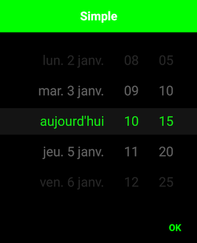
You can now select a date and a time with only one widget !


new SingleDateAndTimePickerDialog.Builder(context)
            //.bottomSheet()
            //.curved()
            //.stepSizeMinutes(15)
            //.displayHours(false)
            //.displayMinutes(false)
            //.todayText("aujourd'hui")
            .displayListener(new SingleDateAndTimePickerDialog.DisplayListener() {
                                @Override
                                public void onDisplayed(SingleDateAndTimePicker picker) {
                                     //retrieve the SingleDateAndTimePicker
                                }
                            })

            .title("Simple")
            .listener(new SingleDateAndTimePickerDialog.Listener() {
                @Override
                public void onDateSelected(Date date) {

                }
            }).display();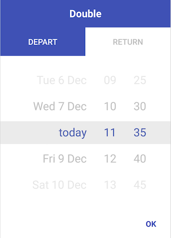
new DoubleDateAndTimePickerDialog.Builder(context)
            //.bottomSheet()
            //.curved()
            //.stepSizeMinutes(15)
            .title("Double")
            .tab0Text("Depart")
            .tab1Text("Return")
            .listener(new DoubleDateAndTimePickerDialog.Listener() {
                @Override
                public void onDateSelected(List<Date> dates) {

                }
        }).display();
new SingleDateAndTimePickerDialog.Builder(this)
            .bottomSheet()
            .curved()
            .displayMinutes(false)
            .displayHours(false)
            .displayDays(false)
            .displayMonth(true)
            .displayYears(true)
            .displayDaysOfMonth(true)
            .display();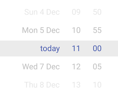
<com.github.florent37.singledateandtimepicker.SingleDateAndTimePicker
        android:layout_width="wrap_content"
        android:layout_height="230dp"
        app:picker_curved="true"
        app:picker_cyclic="true"
        app:picker_visibleItemCount="7"
        />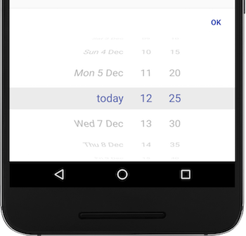
new SingleDateAndTimePickerDialog.Builder(context)
                                    .bottomSheet()
                                    .curved()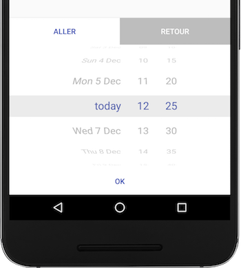
new DoubleDateAndTimePickerDialog.Builder(context)
                                    .bottomSheet()
.curved()You can change the minutes steps (default : 5min)
new SingleDateAndTimePickerDialog.Builder(context)
            .stepSizeMinutes(15)
            .display();
And change some colors
new SingleDateAndTimePickerDialog.Builder(context)
            .backgroundColor(Color.BLACK)
            .mainColor(Color.GREEN)
            .titleColor(Color.WHITE)
.display();Require user to select a date between a range
new SingleDateAndTimePickerDialog.Builder(context)
            .defaultDate(defaultDate)
            .minDateRange(minDate)
            .maxDateRange(maxDate)
            .display();
Or simply require user to select a future date
new SingleDateAndTimePickerDialog.Builder(context)
            .mustBeOnFuture()
.display();Some/most options are also available via XML:
    <com.github.florent37.singledateandtimepicker.SingleDateAndTimePicker
        android:id="@+id/single_day_picker"
        android:layout_width="wrap_content"
        android:layout_height="230dp"
        app:picker_curved="true"
        app:picker_selectorColor="@android:color/transparent"
        app:picker_stepSizeHours="2"
        app:picker_stepSizeMinutes="5"
        app:picker_cyclic="false"
        app:picker_mustBeOnFuture="true"
        app:picker_visibleItemCount="7"
        />
Get divider lines around selected by overwriting one or more of
    <color name="picker_default_divider_color">@android:color/transparent</color>
    <dimen name="picker_default_divider_height">1dp</dimen>
    <drawable name="picker_default_divider">@drawable/picker_divider</drawable>
Use in conjuction with
app:picker_selectorColor="@android:color/transparent" on layout.
In your module

implementation 'com.github.florent37:singledateandtimepicker:2.2.0'
//compatible with androidXAuthor: Florent Champigny http://www.florentchampigny.com/
Blog : http://www.tutos-android-france.com/
Fiches Plateau Moto : https://www.fiches-plateau-moto.fr/


Copyright 2016 florent37, Inc.

Licensed under the Apache License, Version 2.0 (the "License");
you may not use this file except in compliance with the License.
You may obtain a copy of the License at

   http://www.apache.org/licenses/LICENSE-2.0

Unless required by applicable law or agreed to in writing, software
distributed under the License is distributed on an "AS IS" BASIS,
WITHOUT WARRANTIES OR CONDITIONS OF ANY KIND, either express or implied.
See the License for the specific language governing permissions and
limitations under the License.
 React
React
 Typescript
 Django
 Laravel
 Facebook
 Microsoft
 Google
 Alibaba
 D3
D3
 Tencent