Git Product home page Git Product logo

macos-dark's Introduction

built-with-azurra-framework

macOS Ventura

Theme reproducing the clean and bright look of Apple's OS (but in dark mode)

Preview

macOS-dark

Supported platforms

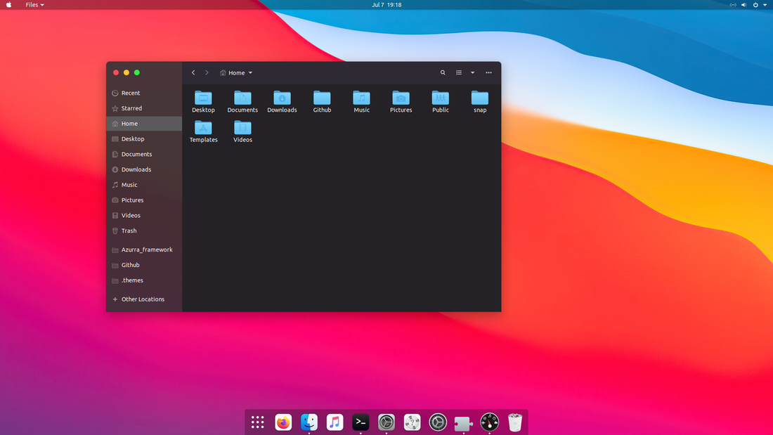
  • Any GTK-based desktop
  • Cinnamon
  • Gnome
  • LXDE/Openbox
  • MATE
  • Xfce

Manual installation

Go to releases, download the latest .zip file and extract it to the themes directory i.e. /home/USERNAME/.themes

macos-dark's People

Contributors

elbullazul avatar goodwillcoding avatar lenuswalker avatar

Stargazers

 avatar  avatar  avatar  avatar  avatar  avatar  avatar  avatar  avatar  avatar  avatar  avatar  avatar  avatar  avatar  avatar  avatar  avatar  avatar  avatar  avatar  avatar  avatar  avatar  avatar  avatar  avatar  avatar  avatar  avatar  avatar  avatar  avatar  avatar  avatar  avatar  avatar  avatar  avatar  avatar  avatar  avatar  avatar  avatar  avatar  avatar  avatar  avatar  avatar  avatar  avatar  avatar  avatar  avatar  avatar  avatar  avatar  avatar  avatar  avatar  avatar  avatar  avatar  avatar  avatar  avatar  avatar  avatar  avatar  avatar  avatar  avatar  avatar  avatar  avatar  avatar  avatar  avatar  avatar  avatar  avatar  avatar  avatar  avatar  avatar  avatar  avatar  avatar  avatar  avatar  avatar  avatar  avatar  avatar  avatar  avatar  avatar  avatar  avatar  avatar

Watchers

 avatar  avatar  avatar  avatar  avatar  avatar  avatar  avatar  avatar  avatar  avatar  avatar  avatar  avatar  avatar  avatar

macos-dark's Issues

Warning color and colors being blended properly. More opinions really.

I changed my warning color to the selected_bg_color so that orange is gone. I know it is a true warning color but it really looks good to me at the same blue as the selected_bg. I am learning some along the way. I slimmed your theme down just to fit xfce you know really in the apps file and then took the imports out of the gtkrc file. Theme is still the fastest on my machine. I love it I really do. Maybe some day I can make one. I have watched videos and read but without a real 1 2 3 guide to learn from it is hard.
screenshot_2019-03-07_15-47-54
I made an icon theme or recolored a very nice icon theme today that matches your theme. And if you still would I would like to have a version with thunar search bar lit up all the time or just tell me what to do if it not much of a thing. You can get these icons if you want.
screenshot_2019-03-07_21-01-21

I updated this because I still am seeing the weird line where the colors are not being blended properly or something. I found this theme today and it is propably the best I have seen as colors BLENDING like they should and I believe how they are doing this is by using gradients but however they are doing it looks great and is about the same color as your theme at the top too. I would love to see these type of header bars on your theme.
Screenshot_2019-03-09_00-37-54
That is the flexiom theme. If you had title bars like that with your pretty little glow no body could be that for sure because already nobody can beat your little glow search bars.

Screenshot_2019-03-09_00-45-21

Screenshot_2019-03-09_15-24-00

The guy that builds the Flexiom theme also uses the new style theme building and keeps it all in like one page of .css and I am telling you that if you combined those header bars and a little of that gradient look to your header bars along with your beautiful little blue glow YOU WOULD HAVE THE BEST THEME OUT PERIOD. I know you probably like to keep it original but with those two elements combined into your theme there is know doubt at least for xfce and Gnome you would have the number 1 theme out. You have the look but those header bars are magnificent just like your selected_bg glow is so please please combine the two and make the best theme out hands down.I think the way they are making colors blend so well is using gradient blending of some sort.Oh these buttons are flat like your but I think you will like these or I wouldn't show you. They are from same theme.

Screenshot_2019-03-09_11-05-56

While Colored Status bar

i installed this theme on Unity 7.5 installed on Ubuntu 18.04, all worked well except statusbar color, its white instead of black and looks damn ugly, then i tried to use it on gnome on 18.04 and it worked well and status bar was black too... have a look at it :)

Scroll bars and buttons. (Some of this is just opinions.)

Scroll bars in xfce settings are black and the background is black. I will give an example. I am not for sure but i think gtk2 folder controls this. This is stock Adwaita theme. The scroll bars are this color and the grey part turns blue when you select it. The turning blue part is no big deal. Also looks at the buttons they are same color but kinda bubbled out to look like a true button. They look good like this. Same kind of buttons throughout the theme.
screenshot_2019-03-05_12-14-32
screenshot_2019-03-05_12-14-59

This is yours. I am just talking about scroll bars and buttons.The scroll bars are black and stay black even when clicked on. The buttons look as though they are sunk back into the theme instead of actual buttons. None of this looks awful or anything but I know you are putting the finishing touches on your theme and these are the little things that make themes really stand out to me. The details. This is yours.

screenshot_2019-03-05_12-19-28
screenshot_2019-03-05_12-19-43
Selected background color is black in whisker menu and I think a few other places. It may have been meant to be that way but the selected background color is blue in thunar so i don't know.I will say over and over again that the performance this theme is incredible. Selected background color is black in this menu also and I think it is a normal gtk menu. The weird line I found in your header bar is present in the Adwiata theme also. Just letting you know.
screenshot_2019-03-05_12-24-58
Something things the Adwaita theme looks crappy at but the scroll bars and buttons are not those things so if you wanted to follow there lead on the buttons and scroll bars then I think that would look great. I love your theme still but as a theme freak and someone who knows that just the little details are what really make a theme stand out then I thought I would let my opinions be heard.

These type header bar look too flat .
screenshot_2019-03-06_11-54-53
screenshot_2019-03-06_12-08-02

Somehow they are adding this look to them and it looks great. It would not take away from MAC look. It would add to it.
screenshot_2019-03-06_11-56-48
screenshot_2019-03-06_12-07-28

window buttons absent

window buttons are absent on maximum windows except for terminal emulator and nautilus
screenshot from 2019-01-06 23-04-29
what I changed in theme

  1. Removed apple's logo just commented out the background image(activities Menu)
  2. Changed folder's name from MacOS-Dark-master to MacOS Dark Knight
    Loaded fine in gnome tweaks

--USING--
Ubuntu18.04 gnome
--Edit--
changed from communitheme from login screen to ubuntu on x11 and work well now

Sharper icons?

Here is how the icons - the window decorations - look on my Mint computer (screen size 14"; screen resolution 2560x1440; HiDPI; ).

image

Nice - and, now, centered (which is good) - but . . a little fuzzy, perhaps?

Search bar in nautilus and the search bars are too flat.

Top bars in new install of Arch gnome. They just don't look coorect and the selected_bg is not showing.
Screenshot from 2019-03-14 19-54-22

They are too flat.

Screenshot from 2019-03-14 19-58-42

That one shows how flat the title bar are but they are all like that.
And maybe offer a version without the transparency in side bar. Performance is great but for gnome just need a little tweaking.

All the problems with MacOS-Dark theme outlined in one article.

I did it this way because I had messed up the other when telling you these problems but instead of opening a new issue I edited the old one but I don't think that was correct either because you don't see it as a new issue. Well here it is all laid out with as clear as understanding as you will get. Just click the link and look at that issue. It is edited from other day.
#14 (comment)

Search bar in thunar. ( Observation)

1.The outline only glows around the thunar search bar when it is clicked inside of so pretty much never. It looks great when it is lit up so light that baby up all the time or add maybe a less lit up glow to the search bar for normal use and let the more bright glow come on for when it is clicked. Another idea is add an regular outline of some sort to the search bar and let the other be for when you have it clicked inside of it but I don't know if I or anyone else is ever gonna see that beautiful blue glow in thunar because I don't think many people ever type inside that search bar. I know I never do. I DO NOT KNOW HOW IT WOULD LOOK LIKE THIS BECAUSE I AM NOT GOOD ENOUGH TO CHANGE THIS INSIDE THE CONFIGS. ( 2.) I have noticed a weird line about straight down the middle if the header bars for regular style gnome apps.There is the search icon built into the header bar and well about middle ways of the circle in the search icon there is what looks like an edge a color that doesn't blend or something and it runs all the way across the header bar on all regular style gtk apps like these.
screenshot_2019-03-01_10-32-27

On this one the line or edge or whatever it is is about half down the box that says saved colors and goes downward for not very far and then all the way across the top bar.
screenshot_2019-03-01_16-39-48

(3) Something that I think would be a great addition is a .xml text editor theme with the same background color black as the base color of your theme. I have plenty but they all change the background of the theme to a different black and I like your black so pretty much I don't like them anymore but if we had a couple for your theme then this would also set your theme apart from others as well. Here is one I got from the gtk website called vsdark and it has blue in it with a dark background but it does change the black background also so if it just was changes to match the black in your base color then it would look great. Just change the background to your black and change txt to xml. These can be put in usr/share/gtksourceview-3.0/styles/ or .local/share/gtksourceview-3.0/styles/

vsdark.txt

The chrome theme is very nice by the way. Also everything else is looking pretty really good and clean.
I am on gtk 3.24.5.
screenshot_2019-03-01_22-45-10

screenshot_2019-03-01_14-37-11

screenshot_2019-03-01_22-12-35

screenshot_2019-03-01_22-23-30
The more I use this theme the more I love it and I am telling you the performance is very good with this theme compared to the others I have been using. More snappy.

checkbox is not properly shown

Below image is from dia.
There is a checkbox next to Template class. I guess the marker should be blue or something visible but it is not recognizable. Same behavior is shown in macOS-Sierra.

screenshot from 2017-05-29 23-38-15

As a Unity lover with 18.04,

the issue with top panel color was solved by last commit, but another issue remained, when in dark theme, i opened Nautilus and Terminal, when i focus on terminal, the backgrounded Nautilus's colors becomes weird, the color of Disk and Documents panes became too much weird, like white things in black theme, i will post screens as i install it again, i use Ubuntu as my main OS and 16.04 works perfect but watching to upgrade to 18.04 with unity...

Isuses with MacOS-Dark Xfwm theme and panel in xfce.

  1. Slider buttons in settings need to be a different color than black.
    2.Opacity shouldn't be set in themerc file.
  2. Windows try to pop up in corners after I change them to center over and over.
    4.If you are gonna take the control way from xfce users about buttons at least give them guidance for a
    new thermerc file to set if they want it the old way with buttons on right and controls working in settings.
  3. The xfwm4 theme buttons are blurry in the colors.
  4. The pulse audio button and whisker menu buttons are wrong color. There is a screen with another mac theme with clear buttons right below. it is the first one with title of different buttons.
    screenshot_of_different_buttons

screenshot_2019-02-05_14-40-09

screenshot_2019-02-05_14-29-55

screenshot_2019-02-05_14-29-24

Suggestions.

I know you are still working. The window buttons are looking good. BUT I didn't think the rest of the theme didn't need much to be perfect and as matter of fact probably just the slider buttons fixed and I really can't remember but not much. The panel in xfce is much too dark and glassy now as well as thunar being a little too dark.I don't know how themes do it but maybe add the little outlines around the the theme edges and the lines in thunar.

Metacity theme doesnt work

i currently am running mate-desktop and putting the themes in the folder makes them show up, but applying them doesnt work (question mark on theme image)

Recommend Projects

  • React photo React

    A declarative, efficient, and flexible JavaScript library for building user interfaces.

  • Vue.js photo Vue.js

    🖖 Vue.js is a progressive, incrementally-adoptable JavaScript framework for building UI on the web.

  • Typescript photo Typescript

    TypeScript is a superset of JavaScript that compiles to clean JavaScript output.

  • TensorFlow photo TensorFlow

    An Open Source Machine Learning Framework for Everyone

  • Django photo Django

    The Web framework for perfectionists with deadlines.

  • D3 photo D3

    Bring data to life with SVG, Canvas and HTML. 📊📈🎉

Recommend Topics

  • javascript

    JavaScript (JS) is a lightweight interpreted programming language with first-class functions.

  • web

    Some thing interesting about web. New door for the world.

  • server

    A server is a program made to process requests and deliver data to clients.

  • Machine learning

    Machine learning is a way of modeling and interpreting data that allows a piece of software to respond intelligently.

  • Game

    Some thing interesting about game, make everyone happy.

Recommend Org

  • Facebook photo Facebook

    We are working to build community through open source technology. NB: members must have two-factor auth.

  • Microsoft photo Microsoft

    Open source projects and samples from Microsoft.

  • Google photo Google

    Google ❤️ Open Source for everyone.

  • D3 photo D3

    Data-Driven Documents codes.