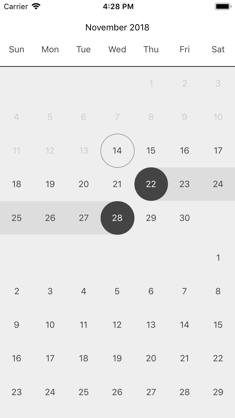
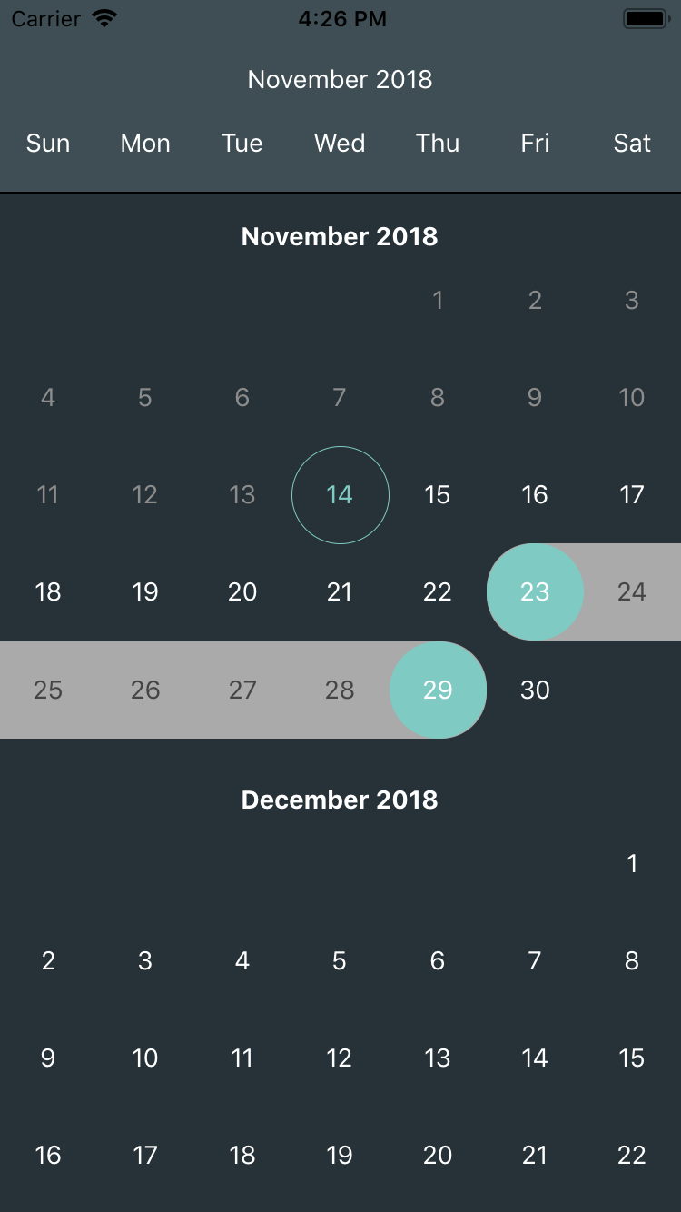
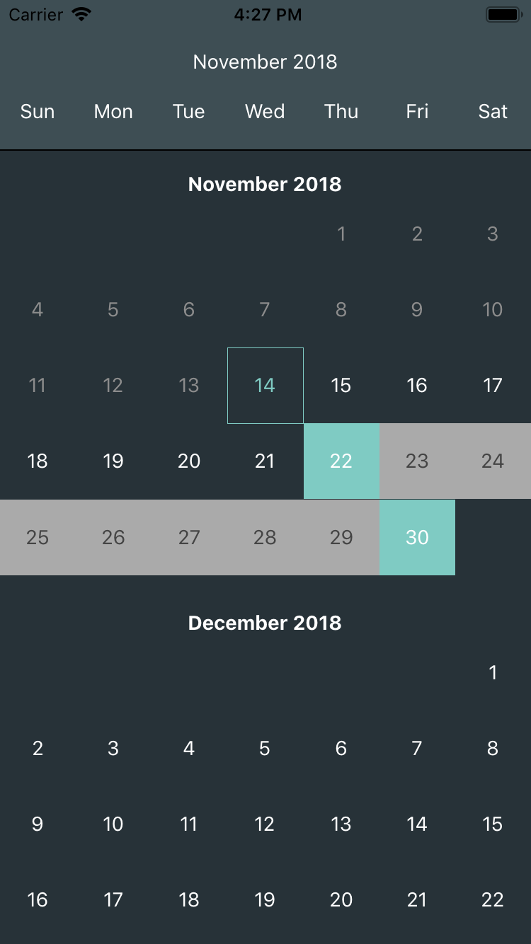
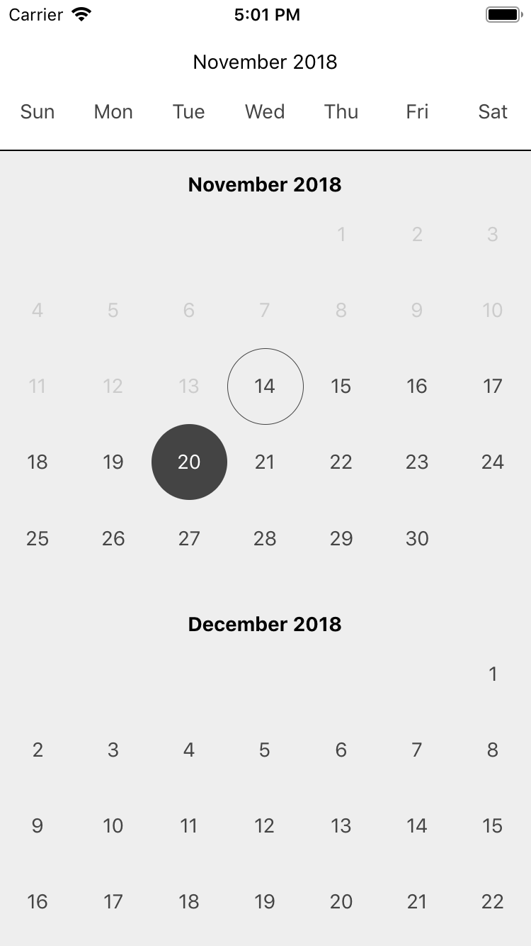
Native-Dates is a React Native single/range date picker including Gregorian, Shamsi (Persian) and Hijri calendars support using Moment.js and RTL Support.
Install Native-Dates using the following command:
npm install native-dates --save
All you need to do is to import Native-Dates into your react native component and easily use it. Example:
import React, {Component} from 'react';
import {View, StyleSheet} from "react-native";
import NativeDates from 'native-dates';

export default class App extends Component {
    render() {
        return (
            <View style={styles.main}>
	            <NativeDates
		           onSelectionChange={(value) => {console.log(value)}}
		        />
			</View>
		);
	}
}

const styles = StyleSheet.create({
    main: {
	    flex:1,
	    width: '100%',
	    height: '100%',
	}
})
Native-Dates includes lots of useful props so you can change it anyway you want. Here is a list of Native-Dates props:
| Props name | Desciption | Values | Default value |
|---|---|---|---|
| type | Type of calendar | 'gregorian','jalali','hijri' | 'gregorian' |
| monthsCount | Number of months shown in date picker | (Number) | 4 |
| startDate | The date that calendar use to start generating | (Date) | new Date() |
| selectFrom | The date that is marked when date picker appears | (Date) | new Date() |
| selectTo | The date that is marked as second date (usable in range date picker) | (Date) | null |
| onSelectionChange | Function that returns a value when marked dates are changed in date picker | (Function) | null |
| rangeSelect | Specify if date picker is single or range | (Boolean) | false |
| moment | The moment object that helps generate Shamsi and Hijri calendars | (Moment Object) | null |
| width | The date picker main width | (Number) | Dimensions.get('window').width |
| monthsLocale | Months names shown in date picker | (Array) | ['January', 'February', 'March', 'April', 'May', 'June','July', 'August', 'September', 'October', 'November', 'December'] |
| weekDaysLocale | Weekdays names shown in date picker | (Array) | ['Sun', 'Mon', 'Tue', 'Wed', 'Thu', 'Fri', 'Sat'] |
Some extra useful props to make Native-Dates more customizable.
| Props name | Desciption | Values | Default value |
|---|---|---|---|
| style | The datepicker main style | (Style Object) | null |
| month | The object that controls how a month is displayed in date picker. (For complete example refer to Month Section) | (Object) | null |
| day | The object that controls how a day is displayed in date picker. (For complete example refer to Day Section) | (Object) | null |
| monthNameMode | Specify where months names shows up. (Be static at the top of date picker, be at the top of every month of date picker or both of them.) | 'static','simple',both' | 'both' |
| staticMonthBackColor | Static months names background color. (Works when monthNameMode is 'static' or 'both'.) | (Color) | null |
| staticMonthTextColor | Static months names text color. (Works when monthNameMode is 'static' or 'both'.) | (Color) | null |
| monthNameChangeThreshold | Height of a month shows on phone screen to change static month name (Works when monthNameMode is 'static' or 'both'.) | (Number) | 60 |
| weekdaysNameMode | Specify where weekdays names shows up. (Be static at the top of date picker, be at the top of every month of date picker or both of them.) | 'static','simple',both' | 'static' |
| staticWeekdaysBackColor | Static weekdays names background color (Works when weekdaysNameMode is 'static' or 'both'.) | (Color) | null |
| staticWeekdaysTextColor | Static weekdays names text color. (Works when weekdaysNameMode is 'static' or 'both'.) | (Color) | null |
| showSeparator | Specify if the date picker months seperator is shown or not | (Boolean) | false |
| separatorColor | Months seperator color | (Color) | '#eee' |
| separatorHeight | Months seperator height | (Number) | 1 |
You can use month props to control how a month is displayed in date picker. There are 2 ways you can use month props:
<NativeDates
	month={
		{
			header: {
				headerStyle: (Style Object),	// Style of each month whole header
				headerTextStyle: (Style Object),	// Text style of each month header
				weekdaysStyle: (Style Object),	// Style of each month weekdays section
				weekdaysItemStyle: (Style Object),	// Style of each items of each month weekdays section
				weekdaysTextStyle: (Style Object),	// Text style of each month weekdays section
			},
			style: {(Style Object)}	// This style object effects whole each month display.
		}
	}
/>
<NativeDates
	month={
		{
			header: {
				monthHeader: function(year, monthName, weekdaysNames){
					// Now do everything you want with year , monthName and weekdaysNames
				}
			},
			style:{(Style Object)}	// This style object effects whole each month display.
		}
	}
/>
Note: Using 'monthHeader' function causes all items of header object of method #1 become useless .
You can use day props to control how a day is displayed in date picker. There are 2 ways you can use day props:
<NativeDates
	day={
		{
			commonBackColor: (Color),	// Background color of an usual day that is not selected or disabled.
			commonTextColor: (Color),	// Text color of an usual day that is not selected or disabled.
			disabledBackColor: (Color),	// Background color of a disabled day.
			disabledTextColor: (Color),	// Text color of a disabled day.
			selectedBackColor: (Color),	// Background color of a selected day.
			selectedTextColor: (Color),	// Text color of a selected day.
			selectedBorderRadius: (Number),	// Border radius of a selected day.
			todayBorderColor: (Color),	// Border color of today (the day in which we are at the moment).
			todayTextColor: (Color),	// Text color of today (the day in which we are at the moment).
			todayBorderRadius: (Number),	// Border radius of today (the day in which we are at the moment).
			todayBorderWidth: (Number),	// Border width of today (the day in which we are at the moment).
			inRangeBackColor: (Color),	// Background color of the days that are between start and end selected dates (works when rangeSelect is true).
			inRangeTextColor: (Color),	//Text color of the days that are between start and end selected dates (works when rangeSelect is true).
		}
	}
/>
<NativeDates
	day={
		{
			dayComponent: function(date,status,disabled,onDayPress){
				// Now do everything you want with date, status, disabled and onDayPress
			}
		}
	}
/>
Note: Using 'dayComponent' function causes all items of day object of method #1 become useless .
- Mojtaba Izadmehr (Github)


 React
React
 Typescript
 Django
 Laravel
 Facebook
 Microsoft
 Google
 Alibaba
 D3
D3
 Tencent