
This is a custom history card for Home Assistant. This card offers a highly interactive and configurable way to view the history of your entities in HA. The card uses asynchronous stream caching and adaptive data decimation to hide the high latency of HA's history database accesses and tries to make it into a smooth interactive experience.

The history explorer card can be configured interactively through the UI or manually through YAML. The card can contain one or multiple charts, every chart can display the history of one or multiple entities. Currently the card supports line charts for numerical entities and timeline charts for non-numerical ones. The order the charts are displayed in the history, as well as the colors used for charts and timeline states are all fully configurable.
history-explorer-demo.mp4
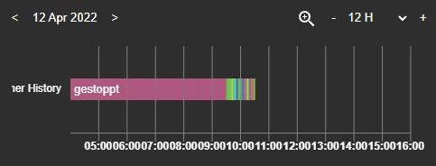
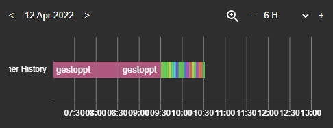
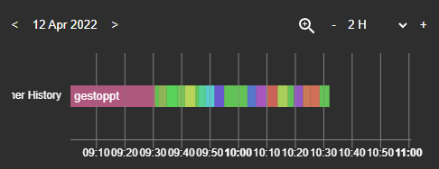
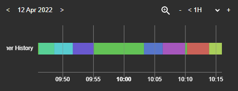
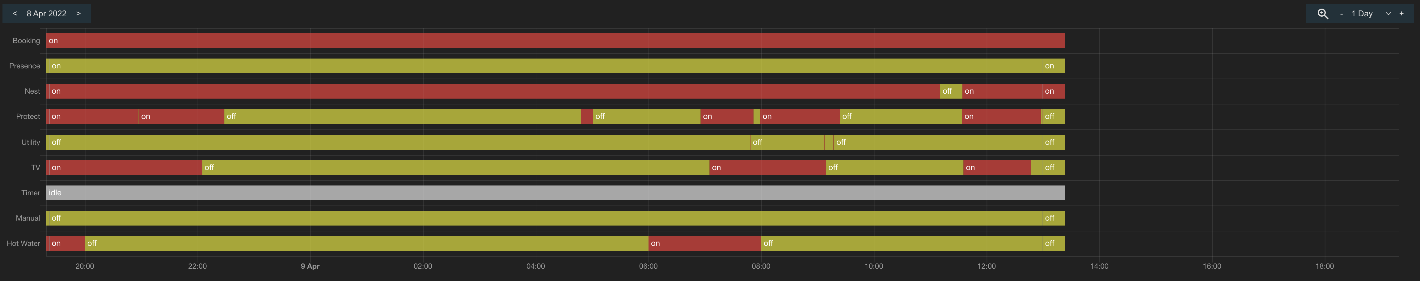
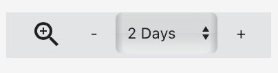
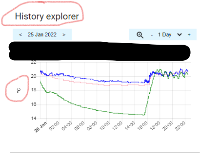
When the card is opened, it will display the history of the configured entities for the last 24 hours starting at the current date and time. On the top left you will find the date selector previous and next buttons, use them to quickly browse through the days. Your can use the right side time range selector (dropdown or plus / minus buttons) to zoom into or out of the history. You can also use the interactive zoom mode (magnifying glass icon) to select a region on a graph to zoom into. Another convenient way to zoom in and out of the graphs is by using the mouse wheel while holding the CTRL key.
Click or tap on a graph and drag left or right to slide it through time. The card will stream in the database as you move along. If you have a slow DB (like on an SD card), you may see empty parts on the chart that will progressively fill as the data comes in. The larger the shown time range, the more the effect is visible. So scrolling through entire weeks will generate more database accesses than scrolling through days or hours at a time, especially on slower CPUs, like phones.
Once you release the mouse button after dragging (or release your finger from the chart), the card will automatically readjust the y axes on all charts to better reflect the new data. The card will also synchronize all other charts in the history to the same point in time. That way you will always see the same time range on all your data and everything will be aligned.
Clicking the date selector will bring you back to the current date and time without changing your zoom level. A double click on the date selector will bring your back and also reset your zoom to the configured default range.
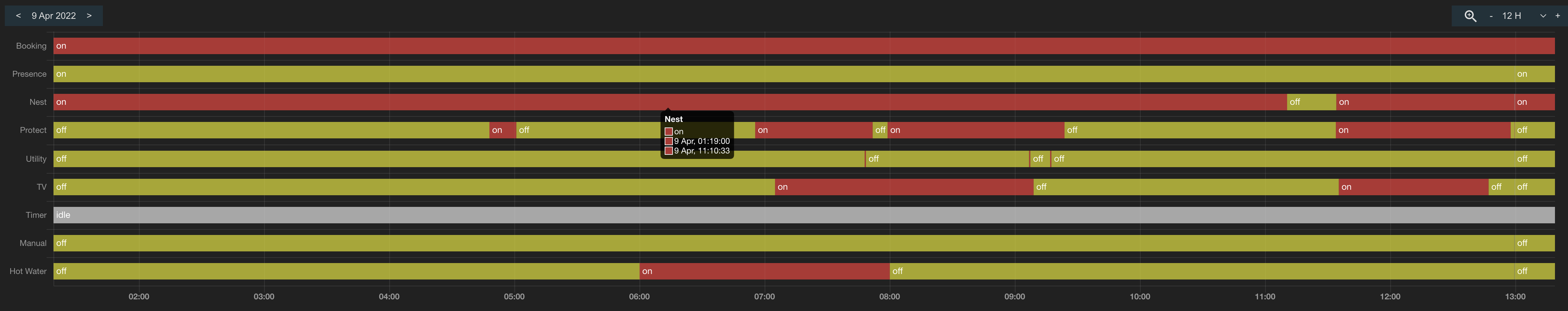
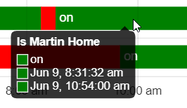
Like in the native HA history panel, you can hover over the chart line or state timelines to get a tooltip of the selected values or state.
The card is capable of replacing the history graph in the HA more info popup that appears when you click an entity anywhere on your dashboard.
Please refer to this post on the HA forums for more information on how to enable and configure the option.
The history explorer card is now part of the default HACS Home Assistant Community Store. This is the preferred way to install this card.
- Download the
history-explorer-card.jsfile and copy it into yourconfig/wwwfolder - Add a resource reference to it. On the HA UI, navigate to Configuration -> Dashboards -> Resources. Visit the Registering resources page on the Home Assistant support site for more information.
- Click on the
+ Add Resourcebutton - Type
/local/history-explorer-card.jsinto the URL field and make sure the resource type field says Javascript Module - Hit create
You can now add the card to your dashboard as usual. You may have to refresh the page in your browser once after adding the card to properly initialize it.
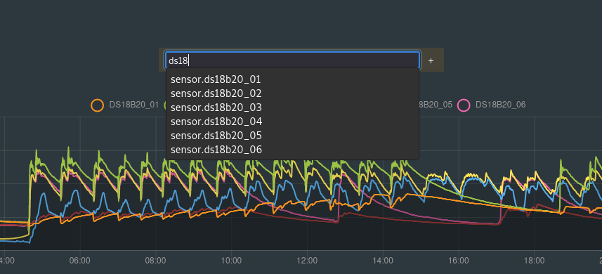
The entities visible on the history explorer card can be defined in the card configuration or they can be added or removed on the fly through the card UI without changing the configuration. Both modes can be combined. The entities defined in the YAML will be displayed first and will always be visible when the dashboard is opened. Dynamically added entities will be displayed next. The entities you add or remove over the UI are remembered in your browsers local storage, so you don't to add them every time you reopen the HA page.
You can manage your dynamically configured entities like this:

If you want to manage all your entities dynamically, you will need to supply an empty YAML. You can still add global configuration settings.
type: custom:history-explorer-card
graphs:
By default the UI entity dropdown will list all entities known to HA. This can be a little overwhelming if you have lots. Alternatively the card can only list entities that are actually recorded and available in the database. Doing this will require a database access which can take a few seconds on larger installs. You can use the card normally while the list is loading in the background. The add entity list will become available as soon as the data is loaded. To turn on this mode use the following config in your YAML:
type: custom:history-explorer-card
recordedEntitiesOnly: true
The entity entry field accepts the * wildcard and can automatically add multiple entities that match the provided pattern. Some examples:
person.*      - Add all entities from the person domain
*door*        - Add all entities that contain the term ‘door’ in the name, regardless of domain
sensor.*door* - Add all entities that contain the term ‘door’ in the name, but only from the sensor domain
*             - Add all available entities in the list
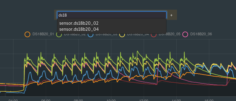
The entities shown in the list can be further filtered using the filterEntities option. The same wildcard syntax applies here. For example:
type: custom:history-explorer-card
filterEntities: 'binary_sensor.*'   # Show only binary sensors in the selector dropdown list
filterEntities:                     # Or use multiple filters, entities matching any of the filters will be added
  - '*power*'
  - 'sensor.*energy*'
Dynamically added entities can be individually removed by clicking the x close button next to them or all together using the option in the entity action dropdown menu:

When the dashboard is opened, the card will show the last 24 hours by default. You can select a different default time range in the YAML. Use m, h, d, and w to denote minutes, hours, days and weeks respectively. For longer time scale, o and y denote months and year. Currently the maximum range is one year. If no postfix is given, hours are assumed.
type: custom:history-explorer-card
defaultTimeRange: 4h     # show the last 4 hours when opening the card
defaultTimeRange: 2d     # or 2 days...
defaultTimeRange: 15m    # or 15 minutes...
defaultTimeRange: 3w     # or 3 weeks
defaultTimeRange: 6o     # or 6 months
defaultTimeRange: 1y     # or 1 year
By default the card will open the graphs with the current date and time aligned to the right of the chart. You can define a custom time offset using the defaultTimeOffset setting which will be applied when you open the card or click the date button. Both relative time offsets (denoted by lower case time identifiers such as h,d,w,o,y) and offsets snapped to the current hour, day, month or year are supported. The latter will use upper case time identifiers H,D,O,Y. For example:
type: custom:history-explorer-card
defaultTimeOffset: 1h       # Add 1 hour of empty space after the current time
defaultTimeOffset: -1d      # Show the previous days' data
defaultTimeOffset: 1D       # Show the current day from midnight to midnight
defaultTimeOffset: 1O # Show the entire current month, starting at the 1stBy default the card will not refresh on its own when sensor values change. It can be manually refreshed by reloading the page. If you would like your card to automatically reflect changing values on the fly, two strategies can be enabled. Both can be combined if needed.
Automatic refresh will monitor the entities that are displayed in your graphs for changes and refresh the graphs as needed. This strategy will usually cover the most common use cases and is recommended if you have just a few entities display in your history explorer card and if these entities don't change too often.
type: custom:history-explorer-card
refresh:
  automatic: true
If you have many fast changing entities displayed in your graphs, then auto refresh can strain your database bandwidth due to the constant requests. In this case it is better to use a regular update interval, independent of the sensor changes. The following example will refresh the card at a fixed rate, every 30 seconds. You will need to reload the page after changing the refresh interval.
type: custom:history-explorer-card
refresh:
interval: 30For line graphs, each dynamically added entity will be displayed in its own graph by default. If you prefer having entities with compatible units of measure grouped into a single graph, then you can override this default behavior with the following YAML setting:
type: custom:history-explorer-card
combineSameUnits: true
Timeline graphs will always automatically group if possible. Graphs defined manually in the YAML will never auto-group, their grouping can be controlled in the YAML.

You can hide an entity in a graph by clicking its label on the top. Click it a second time to make the entity visible again. An entity can be hidden by default using the hidden property in your entityOptions or in the manual YAML (see the advanced YAML example at the end of this readme).
If you would like to entirely remove the labels from the UI, use the legendVisible flag:
type: custom:history-explorer-card
legendVisible: falseThree modes are available for line charts: cubic splines, line segments and stepped. Cubic splines, the default, are the smoothest but can sometimes overshoot after steep gradients followed by longer constant sections. Line segments will connect your data points using straight lines. They are less smooth, but can't overshoot. Stepped mode will show the raw quantized data.

You can specify the line mode in the YAML global settings. Possible options are curves, lines or stepped. The default if the option is not present is curves.
type: custom:history-explorer-card
lineMode: lines
The line mode can also be set for fixed entities defined in the YAML and for dynamic entities or device classes (see below).
A small margin will be added to the top and bottom of line charts, so to give some headroom to curves should they overshoot and make it visually nicer. You can turn off these margins if you don't want the additional space. It's recommended to use lines or stepped mode if you remove both margins to avoid curves overshooting outside of the chart area:
type: custom:history-explorer-card
axisAddMarginMin: false
axisAddMarginMax: falseBy default the min/max scales for the Y axis are adjusted automatically to the data you are currently viewing.
Pressing the axis lock icon will temporarily disable autoscaling and lock the Y axis to the currently active range. Pressing it again will revert back to the defaults for the graph:

The Y axis can also be interactively modified. Pressing and holding the SHIFT key will unlock interactive zooming and panning of the graph in vertical direction. Pressing your mouse button while holding SHIFT over a graph will allow you to drag the graph into both horizontal and vertical directions. Using the mousewheel while holding SHIFT will change the Y axis scale. When interacting with the Y axis, the axis lock icon will automatically be enabled. Click the icon to go back to the default scale at any time.
You can override the automatic y axis range with your own values for both fixed graphs defined in the YAML, as well as for dynamically added entities or device classes. The minimum and maximum Y values, as well as the tick step size can be manually overridden. Each setting works independently. You can, for example override the step size only, but leave the range on automatic.
graphs:
  - type: line
    options:
      ymin: 0       # Minimum Y locked to 0
      ymax: 40      # Maximum Y locked to 40
      ystepSize: 5  # Step size is fixed at 5
See the customizing dynamic line graphs section and the advanced YAML example below for more examples.
The rounding precision used for displaying data point values on the tooltip in line charts can be defined globally through the rounding key followed by the amount of fractional digits. The default is 2 digits.
type: custom:history-explorer-card
rounding: 4If your history data contains an unavailable state, for example if a sensor went offline for a while, then the card will interpolate over the missing data in line charts to avoid gaps by default. If you prefer to keep the unavailable state visible, so to easily see when and how often your sensors disconnected or became unavailable, then you can disable the interpolation using the YAML below. Timeline charts will always show unavailable or unknown states, regardless of how this parameter is set.
type: custom:history-explorer-card
showUnavailable: trueThe current sensor values can be optionally shown next to their label names in line or bar graphs:
type: custom:history-explorer-card
showCurrentValues: true
The card will automatically reduce the data shown in the charts and remove details that would not be visible or useful at a given time range. For example, if you view a per-hour history, nothing will be removed and you will be able to explore the raw data, point by point. If you view an entire week at once, there's no need to show data that changed every few seconds, you couldn't even see it. The card will simplify the curves and make the experience a lot faster that way.
This feature can be turned off in the options if you want, either globally or by entity. Two different decimation algorithms are available. By default, a fast approximate one is used, offering highest rendering performance and a relatively good approximation of the graph shape at lower zoom levels. Optionally, an accurate decimation mode can be enabled. It offers accurate representation of local minima and maxima, at all zoom ranges. But rendering will be slower. Decimation mode can be selected globally at the card level or per entity.
type: custom:history-explorer-card
decimation: false       # Disable decimation, the raw sensor data will be used at all scales (very slow).
decimation: fast        # Fast approximate decimation, good balance between speed and accuracy. The default.
decimation: accurate    # Accurate minmax preserving at all scales.
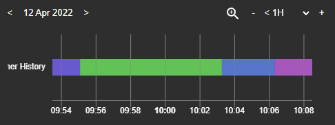
Decimation works on state timelines by merging very small state changes into 'multiple' sections when they can't be seen individually anymore. Zoom into the timeline and the details will appear. The color used for the multiple sections can be adjusted per graph.

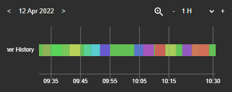
Holding the Alt key (or Option key on Mac) while hovering over a graph will reveal all the individual samples making up the line chart:

If you would like to permanently show individual samples for certain graphs, this can be configured per graph using the showSamples option:
type: custom:history-explorer-card
entityOptions:
  humidity:
    showSamples: true      # always show samples for humidity graphs
graphs:
  - type: line
    options:
      showSamples: true    # explicitly show samples for this manually defined graph
    entities:
- entity: sensor.outside_temperatureEntities that represent a total (monotonically increasing or net metering) can be visualized as adaptive bar charts. This applies to entities such as, for example, consumed energy, water or gas, rainfall, or network data usage. The data is visualized over a time interval (10 minutes, hourly, daily or monthly) that can be toggled on the fly and independently for each graph.

Bar charts use the bar chart type and can be used in both dynamically and statically added entities by setting the type accordingly. When dynamically adding an entity with a state class of total_increasing, then the bar chart type is automatically used. If the entity does not have this state class, then its type must be explicitly set to bar.
Use the selector on the top right of the graph to choose the time interval your data is displayed at. You can add the same entity multiple times in separate graphs with different intervals. Selecting as line will show the raw data of the entity as a line graph. The default interval is hourly. It can be overridden using the interval option. Possible values are 10m, hourly, daily or monthly.
Example configuration of a bar chart display for the entity sensor.rain_amount when added dynamically. The default interval is 10 minutes and the type is explicitly set to bar. The latter is not needed if the entity has a total_increasing state class.
entityOptions:
  sensor.rain_amount:
    type: bar
    color: '#3e95cd'
    interval: 10m     # Default interval for this entity can be 10m, hourly, daily or monthly
Bar graphs can be manually added in the YAML too. Multiple entities can be combined into a single graph. The bars for each entity will then be displayed side by side:

graphs:
  - type: bar
    title: Rainfall
    options:
      interval: daily
      stacked: false
    entities:
      - entity: sensor.rain_amount
        scale: 0.5
      - entity: sensor.rain_amount
Set the stacked option to true to display the bars on top of each other rather than side by side:

Bar graphs can be color coded depending on the value they display rather than having a single color. The color range thresholds are provided as value pairs under the color key. You can provide as many thresholds as you want. Both dynamic and YAML defined graphs are supported.
entityOptions:
  energy:           # apply this color coding to all sensors of the energy device class (also works for domains or individual entities)
    type: bar
    color:
      '0.0': blue   # Bar is blue between below and up to 1.0 kWh
      '1.0': green  # Bar is green between 1.0 - 1.5 kWh
      '1.5': red    # Bar is red at 1.5 kWh and above
By default bar graphs will adhere to the standards defined by HA for the total_increasing state class, meaning that a decrease of the data value will be interpreted as a meter reset. This prevents the use with net metering sensors, as those can have decreasing totals as part of their operation. If you would like to visualize total accumulating sensors that can decrease (net metering), use the netBars setting (available in both entityOptions and manual predefined YAML). You can mix net metered and non-net metered (total increasing) sensors in the same graph.
graphs:
  - type: bar
    entities:
      - entity: sensor.net_meter
        netBars: true
        color:
          '-1000': red   # Red for negative bars
          '0.0': green   # Green for positive bars
NOTE: This is very similar to the way HA implements the total state class and you can visualize total net metered sensors with this option. However, the last_reset attribute is not implemented in this card, so the bar just following a meter reset will be wrong.
Timeline charts are typically used to visualize entities with non-numerical data. When you dynamically add an entity without a unit of measure, then the card will automatically use a timeline chart to visualize its states.

By default the state texts shown in a timeline chart represent the raw underlying state as used by Home Assistant internally. For example, binary sensors will show their state as onor off, regardless of their device class. If you prefer to see device class dependent states (like Opened/Closed for doors or Detected/Clear for motion sensors), you can change the state text display mode as shown in the YAML below:
type: custom:history-explorer-card
stateTextMode: raw    # Show the raw untranslated state names, this is the default
stateTextMode: auto   # Show the automatically translated device class dependent state names
stateTextMode: hide # Hide all state text labelsThe default colors used for the states shown on timeline graphs can be customized in many different ways. Customizing is done by adding the statesColor key to the card YAML. Colors act on individual entities, entire device classes, domains or global states. You can, for example, have distinct colors for the on and off states of your motion sensors and your door sensors, even if they're both binary sensors.
The card accepts all normal HTML color definition strings as well as CSS variables. The latter need to be provided as-is (for example --primary-color, without the CSS var function).
The following example will turn the on state of all door sensors blue and the on state of all motion sensors yellow. The on state of other sensor device classes will not be affected. They will inherit their colors from either an entity specific, a device class or domain wide or a global color rule, in that order (see below). You specify the device class followed by a dot and the state you'd like to customize:
type: custom:history-explorer-card
stateColors:
  door.on: blue
  motion.on: yellow
You can also specify state colors for an entire domain. The following example will turn the off state for all binary sensors that don't have a color defined for their device class purple and the home state of the person domain green:
type: custom:history-explorer-card
stateColors:
  binary_sensor.off: purple
  person.home: 'rgb(0,255,0)'
Finally, you can color a specific state globally through all device classes and domains. This can be used as a generic fallback. The following example colors the off state of all sensors red, as long as they don't have a specific rule for their device class or domain:
type: custom:history-explorer-card
stateColors:
  off: '#ff0000'
Customizable states aren't limited to on or off values. Any raw state value may be used, such as values assigned by template or MQTT sensors. For example:
type: custom:history-explorer-card
stateColors:
  sensor.Dry: tan
  sensor.Wet: green
A general default color can be set per domain, device class or entity. If present, it will serve as a fallback to all states in that domain, device class or entity that were not explicitely defined. In the following example, the states of the input_text.air_quality entity are defined. The bad state will be red, the good state will be green. All other states of that entity, regardless of what they are, will be yellow due to the catch-all key.
type: custom:history-explorer-card
stateColors:
  input_text.air_quality.bad: red
  input_text.air_quality.good: green
  input_text.air_quality: yellow        # Fallback, catches all states from this entity that are not 'good' or 'bad'
There is a special virtual state that is added to all entities, the multiple state. This state substitutes an aggregation of multiple states on the timeline when they were merged due to data decimation. Like normal states, you can specify the color for this special state for individual entities, device classes, domains or globally.
Entities representing a directional angle value, like a bearing or direction, can be displayed using a timeline of compass arrows. This is especially useful for visualizing wind directions:

Compass arrow graphs use the arrowline type and can be used in both dynamically and statically added entities. See the Customizing dynamically added graphs section for an example of the former and the advanced YAML example for the latter.
When you add a new line graph using the add entity dropdown, the graph will use the default settings and an automatically picked color. You can override these settings either for specific entities, for device classes or for entire domains. For example, you could set a fixed Y axis range for all your humidity sensors or a specific color or line interpolation mode for your power graphs.
type: custom:history-explorer-card
entityOptions:
  humidity:                 # Apply these settings to all humidity sensors
    color: blue
    fill: rgba(0,0,255,0.2)
    ymin: 20
    ymax: 100
    lineMode: lines
  sensor.outside_pressure:  # Apply these settings specifically to this entity if added
    color: green
    fill: rgba(0,255,0,0.2)
    ymin: 900
    ymax: 1100
    width: 2
  sensor:                   # Apply these settings to all other entities in the sensor domain
    color: red
    fill: rgba(0,0,0,0)
You can also change the graph type for certain entities, device classes or domains. For example, you could display a numeric entity, which would normally be shown as a linegraph, with a timeline. Or you could default to the directional arrow graph mode for your wind direction sensors:
type: custom:history-explorer-card
entityOptions:
sensor.wind_bearing: # This sensor should be shown as compass arrows instead of a line graph
type: arrowline
color: black # Optional color for the arrows, remove for auto selection based on the theme
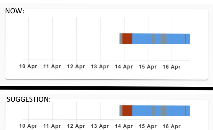
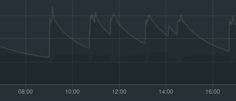
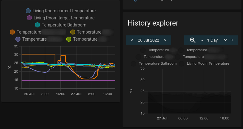
fill: rgba(0,0,0,0.2) # Optional background color for the arrowsWhen this setting is enabled, the card will try to pull in long term statistics for an entity once the limit of the history data is reached. The integration of both history sources is entirely seamless. You keep scrolling and zooming in or out of your data, as usual. The statistics and history data will be combined on the fly at all time ranges. This only works for entities that have long term statistics available. Graphs for all other entities will just become blank as soon as the history data limit is reached.

In the screenshot above, the blue graph is the outdoor temperature, the red graph is the temperature of a barn. The outdoor temperature has statistics available, the barn temperature does not. So you see the red line stopping where the history database retention period ends (Oct 11th). The outdoor temperature continues way past this point, as the card will turn to long term statistics. Note that the card will always prefer history data over long term statistics data if available, because it’s more precise.
Long term statistics support is enabled by default and is configured to use average values and hourly intervals. You can optionally configure the feature (or turn it off) or even force the use of statistics only, effectively turning off the use of the short term history state DB, by adding the following to the card YAML:
type: custom:history-explorer-card
statistics:
  enabled: true    # true is the default, use false to turn LTS support off.
  mode: mean
  period: hour     # reporting period. hour, day or month. Default is hour.
  force: false     # set to true if you want to use long term statistics only
The (optional) mode parameter controls how the statistics data is processed before being integrated into the history stream. mean = use the average value, min = minimum value, max = max value. The default if the option is not present is mean. This setting does not apply to total_increasing values like energy sensors, which are calculated differently.
The card supports user defined Javascript expressions modifying the data right before display through the process option. This can be used to filter or shape data, apply non-linear scaling or transform data from one graph type to another. The supplied JS expression is provided with the original input state value (can be a string or a number, depending on the graph and data source). The expression must evaluate to the desired new state. Complex custom processing functions can degrade rendering performance.
Custom processing functions works for dyanmically added entities, manually defined YAML graphs and graphs in the more info panel.
Example showing a humidity numerical entity as a timeline graph, where humidity below 30% appears as state dry, above 70% as wet and everything inbetween as normal:
type: custom:history-explorer-card
graphs:
  - type: timeline
    entities:
      - entity: sensor.room_humidity
        process: '( state < 30 ) ? "dry" : ( state > 70 ) ? "wet" : "normal"'
Example of a spike rejection filter for dynamic temperature entities, removing invalid positive or negative temperature spikes, marking them invalid and letting the graph interpolate over them:
type: custom:history-explorer-card
entityOptions:
  temperature:
process: '( Math.abs(state) < 100 ) ? state : "unavailable"'The raw data for the currently displayed entities and time range can be exported as a CSV file by opening the entity options and selecting Export as CSV. Note that CSV exporting does not work in the HA Companion app. Both history and long term statistics can be exported.

The exported CSV can be customized. The following settings are optional. If they are not present, the defaults will be used.
type: custom:history-explorer-card
csv:
  separator: ';'            # Use a semicolon as a separator, the default is a comma
  timeFormat: 'DD/MM/YYYY'  # Customize the date/time format used in the CSV. The default is 'YYYY-MM-DD HH:mm:ss'.
  statisticsPeriod: hour    # Period used for statistics export. Hour, day or month is supported. Default is hour.
  exportAttributes: true    # Export all entity attributes along with their state, in separate columns. Default if off (no attrbutes).
numberLocale: 'en-US' # Format numbers using the given locale. If this settings is not defined, the raw DB values will be written (no formatting).The default History Explorer header can be changed or removed using the header setting in the YAML:
type: custom:history-explorer-card
header: 'My sample history'
header: ' '   # Using a single space will remove the header and leave some padding space
header: hide # The hide option will remove the header entirelyThe card will try to adapt its UI colors to the currently active theme. But for best results, it will have to know if you're running a dark or a light theme. By default the card asks HA for this information. If you're using the default Lovelace theme, or another modern theme that properly sets the dark mode flag, then you should be all with the default settings. If you are using an older theme that uses the legacy format and doesn't properly set the dark mode flag, the card may end up in the wrong mode. You can override the mode by adding this YAML to the global card settings (see below) to force either dark or light mode:
type: custom:history-explorer-card
uimode: dark
Replace dark with light to force light mode instead.
The color for various elements of the UI can be customized further:
type: custom:history-explorer-card
uiColors:
  gridlines: '#ff000040'
  labels: green
  buttons: '#80f00050'
  selector: 'rgba(255,255,255,255)'
closeButton: '#0000001f'The position of the time control toolbar and the entity selector can be customized through YAML settings:
type: custom:history-explorer-card
uiLayout:
  toolbar: top
  selector: bottom
Possible options are top, bottom, both and hide. When selecting both, the UI element will be duplicated and shown both on top and on the bottom. This is useful on large histories that require a lot of vertical scrolling. When hide is selected, the respective UI element is not shown. You can also hide the interval selector for total increasing entities with interval: hide.
Toolbars can be made sticky, always floating on top or below the graphs. This can be handy to keep the toolbar controls in reach while scrolling through a long list of graphs. Use the following YAML to make the top, bottom or both sticky. On mobile it is not recommended to make the lower toolbar sticky if it contains an entity selector, as the entity dropdown list may be hard to reach.
type: custom:history-explorer-card
uiLayout:
  sticky: top   # Make the top toolbar controls sticky, so they always stay on top.
If you prefer the + and - zoom icons in the time range control to work the other way round, you can invert them using the following YAML:
type: custom:history-explorer-card
uiLayout:
  invertZoom: true
The width of the label area to the left of the graphs can be customized and the labels optionally hidden with the following YAML:
type: custom:history-explorer-card
labelsVisible: false   # this will hide the unit of measure labels and the entity names left of the graphs or timelines
labelAreaWidth: 10     # the width of the label area in pixels, default is 65
The height of graphs can be set with these options:
type: custom:history-explorer-card
lineGraphHeight: 100     # default line graph height is 250
barGraphHeight: 100      # default bar graph height is 150
timelineBarHeight: 18    # timeline bar height (default is 24)
timelineBarSpacing: 30   # spacing from the top of one timeline bar to the next (default is 40)
Alternatively you can set a custom height for individual line or bar graphs, both dynamic ones and manually defined ones. Per-graph height will override global height options:
type: custom:history-explorer-card
entityOptions:
  humidity:
    height: 150        # set the height of all humidity graphs to 150
graphs:
  - type: line
    options:
      height: 200      # explicitly set the height of this manually defined graph
    entities:
- entity: sensor.outside_temperatureThe tooltip popups used in timelines and arrowlines support three different sizes: full, compact and slim. By default, the size is selected automatically depending on the available space around the graph. The size can be overidden manually:
type: custom:history-explorer-card
tooltip:
  size: slim       # Supported sizes are full, compact, slim. Use auto for automatic size (this is the default).
The state color boxes in the tooltips can optionally be hidden for line graphs or timelines (or both):
tooltip:
  showColorsLine: false       # hide the color boxes in the tooltip popups for line graphs
  showColorsTimeline: false   # hide the color boxes in the tooltip popups for timeline graphs
The tooltips can optionally show the duration of the selected state next to the start and end times:
tooltip:
  showDuration: true
You can hide the entity name label on tooltips for line and bar charts to make it even more compact:
tooltip:
  showLabel: false
The way state names are shown on the tooltip (raw or translated / device class dependent) will normally follow the mode set by stateTextMode for timeline charts on the card level. If you want the tooltips to use another mode, then it can be overridden. For example:
tooltip:
stateTextMode: raw # Show raw state names in the tooltip even if timelines show translated statesBy default, time tick density is automatic and adjusts to the width of your screen. That’s always a compromise between looking good (no clipping), being readable at all screensizes from mobile to wall sized 8k TV and subjective preferences over tick densities. In most cases, the default automatic selection will yield good results. But if needed, the density can be customized using the timeTicks setting.
timeTicks:

  # If present, this will skip the auto-density and force the use of your selected density.
  densityOverride: 'highest'  # Options are: low, medium, high, higher, highest.

  # optional, this can be used to shorten the date representation on the time ticks, to make more space if you want high tick densities.
  dateFormat: 'short'         # Options are normal and short. Default is normal.
Example with no timeTicks and everything set to automatic defaults:

Using densityOverride at higher, leaving the date format at normal:

And same as above but settings the dateFormat to short:

Overriding the density will disable automatic density calculations depending on card or screen width. So you can easily end up in situations where the labels will overlap.
You can have multiple history explorer cards on the same view or over several views and dashboards. Each card has its own configuration. For the cards to be able to manage their respective configurations, each card needs its own unique name. When adding the card over the UI, a random name is assigned by default. You can adjust the name if needed. If you add the card manually over YAML, you will have to provide your own unique name for each card.
If you only use a single history explorer card on your Lovelace, then the name is optional.
type: custom:history-explorer-card
cardName: history-card-5
YAML configuration is optional. And while the interactive configuration is preferrable, it can sometimes be useful to keep a set of predefined entities.
Here's a basic example configuration:
type: custom:history-explorer-card
graphs:
- type: line
entities:
- entity: sensor.outside_temperature
color: '#3e95cd'
fill: rgba(151,187,205,0.15)
- entity: sensor.annexe_temperature
color: '#ee3452'
fill: rgba(0,0,0,0)
- type: line
entities:
- entity: sensor.outside_pressure
color: '#3ecd95'
fill: rgba(151,205,187,0.15)
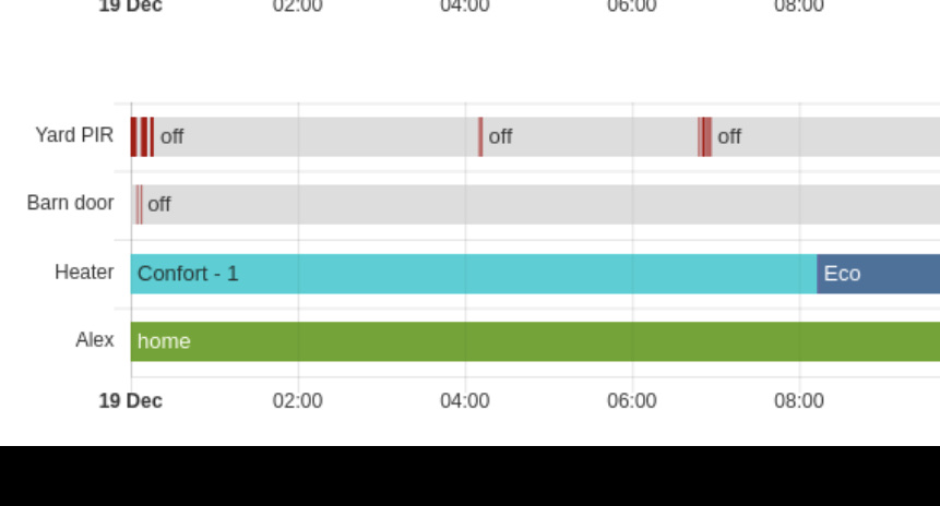
- type: timeline
title: Non-numerical sensors
entities:
- entity: binary_sensor.pir_yard
name: Yard PIR
- entity: binary_sensor.door_barn
name: Barn door
- entity: input_select.qubino2_3
name: Heater
- entity: person.alex
Use wildcards to automatically add multiple entities. The following snippet will add all sensors with temperature in their name to a line graph, except for entities with fridge in their name and the cpu_temperature sensor:
type: custom:history-explorer-card
graphs:
  - type: line
    entities:
      - entity: sensor.*temperature*
        exclude:
          - entity: '*fridge*'
          - entity: sensor.cpu_temperature
        fill: rgba(0,0,0,0)
And a more advanced example:
type: custom:history-explorer-card
cardName: advanced-history
uimode: dark
stateColors:
  person.home: blue
  person.not_home: yellow
decimation: false
header: 'My sample history'
graphs:
  - type: line
    options:
      ymin: -10
      ymax: 30
      showTimeLabels: true   # false will hide the time ticks on this graph
    entities:
      - entity: sensor.outside_temperature
        color: '#3e95cd'
        fill: rgba(151,187,205,0.15)
        width: 4
        lineMode: stepped
      - entity: sensor.annexe_temperature
        color: '#ee3452'
        fill: rgba(0,0,0,0)
        lineMode: lines
        hidden: true         # This entity is hidden by default !
  - type: line
    entities:
      - entity: sensor.outside_pressure
        color: --my-special-green
        fill: rgba(151,205,187,0.15)
  - type: timeline
    title: Non-numerical sensors
    entities:
      - entity: binary_sensor.pir_yard
        name: Yard PIR
      - entity: binary_sensor.door_barn
        name: Barn door
      - entity: input_select.qubino2_3
        name: Heater
  - type: arrowline
    title: Wind bearing
    entities:
      - entity: sensor.wind_bearing
        color: black
        fill: rgba(0,0,0,0.2)
Replace the entities and structure as needed.
The history explorer can be run as a sidebar panel. Add a new empty dashboard with the Show in sidebar box checked. Set the view type to Panel (1 card) and add the history explorer card to the view.


 React
React
 Typescript
 Django
 Laravel
 Facebook
 Microsoft
 Google
 Alibaba
 D3
D3
 Tencent