Git Product home page Git Product logo

elm-mdc's Introduction

Material Components for the Web for Elm

Build

Elm-mdc allows you to write beautiful Elm applications with a Material Design look. It uses the CSS from Google's Material Components for the Web, but reimplements the JavaScript in Elm.

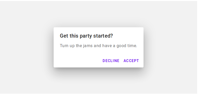
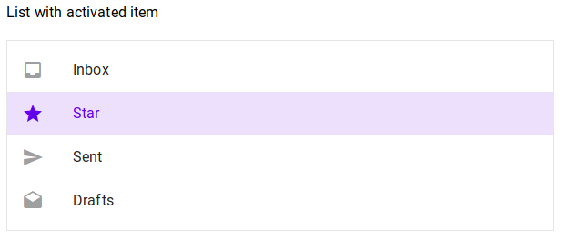
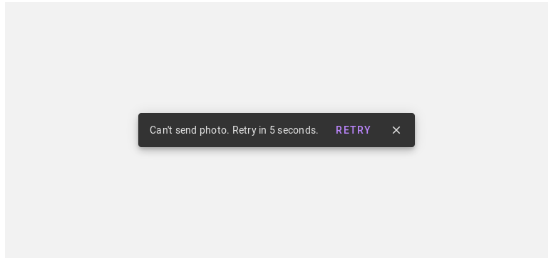
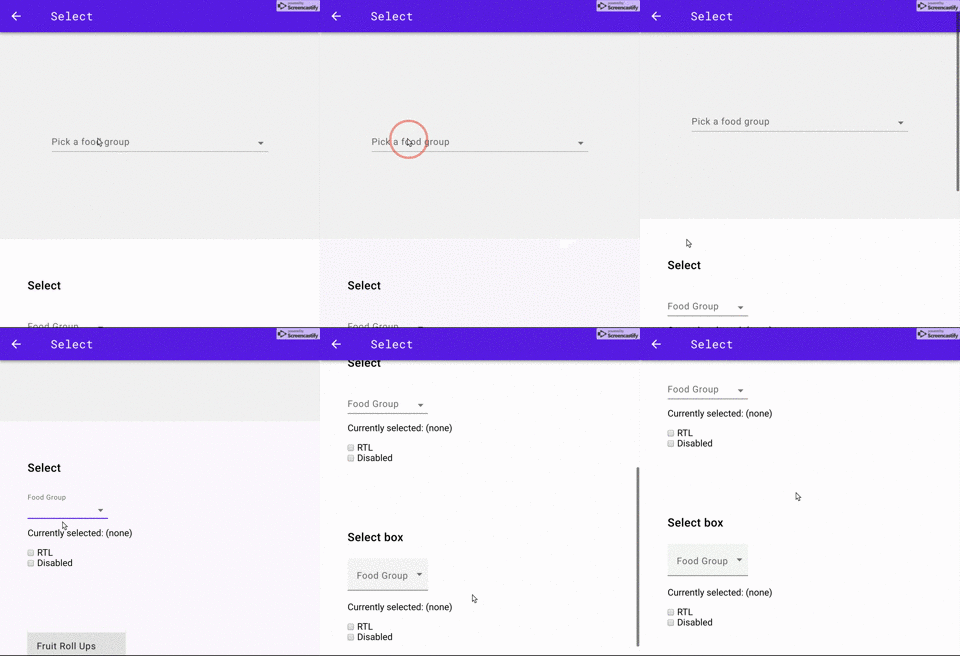
Screenshots

Demo

Live demo & package documentation (not released on package.elm-lang.org yet, see Building the documentation below).

Getting started

Create an index.html that looks like this:

<head>
  <meta charset="utf-8">
  <meta name="viewport" content="width=device-width, initial-scale=1.0">
  <title>Getting Started</title>

  <link href="https://fonts.googleapis.com/css?family=Roboto:300,400,500" rel="stylesheet">
  <link href="https://fonts.googleapis.com/icon?family=Material+Icons" rel="stylesheet">
  <link href="https://cdnjs.cloudflare.com/ajax/libs/normalize/7.0.0/normalize.min.css" rel="stylesheet">
  <link href="elm-mdc/material-components-web.css" rel="stylesheet">

</head>
<body class="mdc-typography">
  <script src="elm-mdc/elm-mdc.js"></script>
  <script src="elm.js"></script>
  <div id="elm">
    <script type="text/javascript">
      Elm.Main.init({ node: document.getElementById('elm') });
    </script>
  </div>
</body>

The first three CSS files are provided by Google. The fourth CSS file is provided by this library and contains the MDC CSS.

Put the JavaScript in the body. The first JavasSript file, elm-mdc.js, is provided by this library. The second JavaScript file, called elm.js here, is your compiled Elm application.

Make sure that the file elm-mdc.js is correctly served by your web server, as otherwise this library will behave unexpectedly. See below for instructions on how to build elm-mdc.js as well as material-components-web.css.

Install

Assuming an empty directory, you create an elm-mdc application as follows:

  1. elm init.
  2. Install this library from github:
git clone [email protected]:aforemny/elm-mdc.git
  1. Build the required sources:
cd elm-mdc
make
cd ..
  1. Add the required libraries (see elm-mdc/elm.json):
elm install elm/regex
elm install elm/svg
elm install elm/json
elm install K-Adam/elm-dom
  1. Change the source-directories property in elm.json to include elm-mdc:
    "source-directories": [
        "src",
        "elm-mdc/src"
    ],
  1. Create an index.html as above.
  2. Create your first application, for now let's just copy the hello world example: cp -p elm-mdc/examples/hello-world/Main.elm src/Main.elm
  3. Compile it: elm make src/Main.elm --output app.js

And that's it.

Example application

See examples/hello-world/ for a full example. You have to run make in the root repository before to create the files elm-mdc.js and material-components-web.css.

module Main exposing (..)

import Browser
import Html exposing (Html, text)
import Material
import Material.Button as Button
import Material.Options as Options


type alias Model =
    { mdc : Material.Model Msg
    }


defaultModel : Model
defaultModel =
    { mdc = Material.defaultModel
    }


type Msg
    = Mdc (Material.Msg Msg)
    | Click


main : Program () Model Msg
main =
    Browser.element
        { init = \_ -> init
        , subscriptions = subscriptions
        , update = update
        , view = view
        }


init : ( Model, Cmd Msg )
init =
    ( defaultModel, Material.init Mdc )


subscriptions : Model -> Sub Msg
subscriptions model =
    Material.subscriptions Mdc model


update : Msg -> Model -> ( Model, Cmd Msg )
update msg model =
    case msg of
        Mdc msg_ ->
            Material.update Mdc msg_ model

        Click ->
            ( model, Cmd.none )


view : Model -> Html Msg
view model =
    Html.div []
        [
          Button.view Mdc "my-button" model.mdc
              [ Button.ripple
              , Options.onClick Click
              ]
              [ text "Click me!" ]
        ]

Build instructions

Building the demo

$ make build-demo
$ open build/index.html

Building the demo on Windows

$ build.cmd build-demo
$ build/index.html

Building the documentation

$ make docs

Building the documentation on Windows

$ build.cmd docs

Starterkit and hot reload

To get started with this library more easily, have a look at the elm-mdc starterkit. This contains a fully featured example that demonstrates hot code reload.

History

The implementation is based on debois/elm-mdl, which uses the now abandoned Material Design Lite framework.

Contribute

Contributions are warmly encouraged - please get in touch! Use GitHub to report bugs, too.

elm-mdc's People

Contributors

a00git avatar adrianroe avatar aforemny avatar berenddeboer avatar bookvik avatar debois avatar dependabot[bot] avatar domenkozar avatar dpinn avatar fbessou avatar groob avatar hakonrossebo avatar isomoar avatar iwalkalone avatar jdreutt avatar jvoigtlaender avatar knewter avatar lionar avatar mdjnewman avatar moonlightowl avatar overminddl1 avatar puhrez avatar ribwortplantain avatar simonh1000 avatar slegrand45 avatar swojtasiak avatar teodorlu avatar tiago-pereira avatar vipentti avatar wscherphof avatar

Stargazers

 avatar  avatar  avatar  avatar  avatar  avatar  avatar  avatar  avatar  avatar  avatar  avatar  avatar  avatar  avatar  avatar  avatar  avatar  avatar  avatar  avatar  avatar  avatar  avatar  avatar  avatar  avatar  avatar  avatar  avatar  avatar  avatar  avatar  avatar  avatar  avatar  avatar  avatar  avatar  avatar  avatar  avatar  avatar  avatar  avatar  avatar  avatar  avatar  avatar  avatar  avatar  avatar  avatar  avatar  avatar  avatar  avatar  avatar  avatar  avatar  avatar  avatar  avatar  avatar  avatar  avatar  avatar  avatar  avatar  avatar  avatar  avatar  avatar  avatar  avatar  avatar  avatar  avatar  avatar  avatar  avatar  avatar  avatar  avatar  avatar  avatar  avatar  avatar  avatar  avatar  avatar  avatar  avatar  avatar  avatar  avatar  avatar  avatar  avatar  avatar

Watchers

 avatar  avatar  avatar  avatar  avatar  avatar  avatar  avatar  avatar  avatar  avatar  avatar  avatar  avatar  avatar  avatar  avatar  avatar  avatar  avatar

elm-mdc's Issues

API changes

The API is quite low-level currently. We only map upstream's CSS classes to HTML elements and we wrap the root HTML element to a Component. While this works OK in most cases and gives you lots of freedom about your DOM, it has two issues:

  • it does not utilize Elm's type system to produce correct code
  • it does not allow for propagating the component's Model to child HTML elements

Long term, I would like to have a high-level wrapper for the current low-level API, overcoming both issues.

Short term, I will only implement the following changes to the current API, so that a release is possible in the near future.

  • I will drop current view functions and what is called Simple TEA architecture in README.md. I will only support render, and probably rename that function to view. The Simple TEA architecture is not feasible because of event dispatching which is used in the core of this library.

Short-term roadmap:

  • Rename render to view
  • Refactor JavaScript assets
  • Add nativeControl Properties
  • Update event handlers in Options to match elm-lang/html
  • Use Dispatch on all components and nativeControls
  • Refactor internal exports from components
  • Remove Store from public API
  • Remove doc annotation from internal modules
  • Revise internal module's file structure
  • Move internal types to Model rather than Implementation
  • Refactor non-component internal modules
  • Revise Ripple API

Component Simple menu

Component:

  • CSS components
  • JS components
  • Demo

Bugs:

  • Change Menu api to default to Lists
  • Solve and add keyboard focus handling
  • Solve and add trigger selected item by keyboard
  • Add bezier progress
  • Solve and add window.client{Width,Height} decoder
  • Add RTL support

Write documentation

  • Component Typography
  • Component Toolbar
  • Component Theme
  • Component Textfield
  • Component Tabs
  • Component Switch
  • Component Snackbar
  • Component Slider
  • Component Menu
  • Component Select
  • Component Ripple
  • Component Radio buttons
  • Component List
  • Component Linear progress
  • Component Layout grid
  • Component Icon toggle
  • Component Grid list
  • Component Floating action button
  • Component Elevation
  • Component Drawer
  • Component Dialog
  • Component Checkbox
  • Component Card
  • Component Button

Publish demo

  • Component Typography
  • Component Toolbar
  • Component Theme
  • Component Textfield
  • Component Tabs
  • Component Switch
  • Component Snackbar
  • Component Slider
  • Component Simple menu
  • Component Select
  • Component Ripple
  • Component Radio buttons
  • Component List
  • Component Linear progress
  • Component Layout grid
  • Component Icon toggle
  • Component Grid list
  • Component Floating action button
  • Component Elevation
  • Component Temporary Drawer
  • Component Persistent Drawer
  • Component Permanent Drawer above Toolbar
  • Component Permanent Drawer below Toolbar
  • Component Dialog
  • Component Checkbox
  • Component Card
  • Component Button

Component Toolbar

Component:

  • CSS component
  • JS component
  • Demo

Bugs:

  • Waterfall relies on window.onscroll

Component Tabs

Component:

  • CSS components
  • JS components
  • Demo

Bugs:

  • RTL support

Missing installation info / Broken package link

So, i was using debois-mdl successfully and i wanted to migrate from mdl to mdc, but it seems this package is not registered in the main elm repository.

Following your link package documentation
yelds

Could not find any versions of package aforemny/elm-mdc

elm-make also gets a bit angry

Running "elm:compile" (elm) task
Error: Your .elm/packages/ directory may be corrupted. I was led to believe that
aforemny/elm-mdc existed, but I could not find anything when I went to look up
the published versions of this package.

Am i missing part of your documentation?

Options for focus trapping within Dialogs

Dialogs do not implement focus trapping. The upstream demo uses focus-trap.

How to do focus trapping within Elm, or how to integrate it are open questions to me. A first step could be to study the focus-trap implementation.

Calling "inner" in LayoutGrid's view function.

According to https://material.io/components/web/catalog/layout-grid/ , a layout-grid should always contain a layout-grid__inner.
With the current implementation we have to manually call inner view in a LayoutGrid's view :

  LayoutGrid.view
    []
    [ LayoutGrid.inner
        []
        [ LayoutGrid.Cell
            []
            [ text "..." ]
        ]
    ]

Have you considered calling inner view directly in the LayoutGrid's view ?
It would allow to write

  LayoutGrid.view
    []
    [ LayoutGrid.Cell
        []
        [ text "..." ]
    ]

In its current state the "elm-mdc" documentation says that the inner view is only needed when nesting a grid into another grid. If we were to keep the current implementation, I think that the documentation should be updated. :)

Contrast with Elm Animations

This is a somewhat naive suggestion, and apologies if this is well trodden territory, but I tried elm-mdl once and found that tuple update responses created rather a lot of boilerplate, and you are following that same pattern.

More recently I tried elm-style-animation and found it to be much easier to work with. It basically taps into a subscription on requestAnimationFrame and is able to work off of that. For the user, you need to pass the subscription to elm-animation, but not much more than that.

I have not idea whether that would work for material design but wanted to draw it to your attention.

In the same vein, it would be great for the elm community if you could highlight which MDC elements can be used with CSS only - again to get around the challenges of tuple-returning functions in larger apps.

Assigning Option.attribute on native control rather than wrapping div

Is it possible to assign an attribute to a control and have the attribute apply to the native control rather than the wrapping div?

RadioButton.view lift [0] model.mdc [Options.attribute (Html.attributes.id "myradio"] []]

results in the id 'myradio' being applied to a div that wraps the radio input rather than the radio input itself.

Standard behavior for radio buttons is that clicking on a the label of a radio button should also cause the radio button to be selected, the mechanism for making this happen in html is to assign an id to the radio input and then assign the same to the for attribute of the label:
<input type="radio" id="myradio" /> <label for="myradio>One</label>

Is there a syntax that let's me apply the id to the input itself?

Drawer support for mini variant

I wonder if it could be possible to extend the drawer functionality by 1 or 2 modes of operation.

The first thing would be what is called a "persistent" drawer compared to the "permantent drawer" that is called "fixedDrawer" in elm-mdl and elm-mdc.
The definition can be found in the material ui guideless for drawer navigations

The second question would be a variant that is called "Mini variant" in the same specification.

However I am aware that this project is early on and the migration from mdl to mdc is still work in progress, but I thought maybe it is good to know this need already. In my current app, as well as in the specification is desktop and especially tablet devices which can have a persistent drawer, but users should be able to minimize it still (ideally to the mini variant as well)

Roadmap

This was a bit pre-mature… :)

Component Button

Component:

  • CSS components
  • JS components
  • Demo

Bugs:

  • Accent and primary ripple have wrong colors in demo

How to supply an initial value to a Textfield?

I tried to do this:

            [ Textfield.label ""
            , Options.onChange (forceInt >> UpdateMonthlyElectricityBill)
            , Textfield.value (toString value)
            ]
            [ ]````

but providing a value means I can't change the textfield anymore. I.e. all input I specify is ignored.

`demo` compiles (but no final output files), but `elm-mdc` alone doesn't

I guess this repo is heavily work in progress? If so excuse me =) Or am I doing something wrong? elm-make "succeeds" ("compiled n modules" --- just no html/js outputs even when using explicit --output foo args) when run in the demo sub-directory.

But in elm-mdc, it doesn't even proceed to compilation, complaining about missing documentation --- annoyingly so, I think this sort of check should be in elm-package (for those about to publish) not in elm-make, sheesh..

A question, how do you actually transpile+run your own demo code-base here?

Component Ripple

Component:

  • CSS components
  • JS components
  • Demo

Bugs:

  • CSS support is unchecked
  • CSS variable support is missing upstream
  • Add user-facing function rippleSurface

elm-make says: I cannot find module 'AnimationFrame'. Module 'Material.GridList' is trying to import it.

I want to play with this promising package, but can't seem to elm-make it:

[00:46 rox ~/g/elm-mdc (master)]$ elm-make
Some new packages are needed. Here is the upgrade plan.

  Install:
    debois/elm-dom 1.2.3
    elm-lang/core 5.1.1
    elm-lang/dom 1.1.1
    elm-lang/html 2.0.0
    elm-lang/mouse 1.0.1
    elm-lang/svg 2.0.0
    elm-lang/virtual-dom 2.0.4
    elm-lang/window 1.0.1

Do you approve of this plan? [Y/n] Y
Starting downloads...

  ● debois/elm-dom 1.2.3
  ● elm-lang/window 1.0.1
  ● elm-lang/html 2.0.0
  ● elm-lang/dom 1.1.1
  ● elm-lang/mouse 1.0.1
  ● elm-lang/virtual-dom 2.0.4
  ● elm-lang/core 5.1.1
  ●
 elm-lang/svg 2.0.0
Packages configured successfully!
I cannot find module 'AnimationFrame'.

Module 'Material.GridList' is trying to import it.

Potential problems could be:
  * Misspelled the module name
  * Need to add a source directory or new dependency to elm-package.json

Component Snackbar

Component:

  • CSS components
  • JS components
  • Demo

Bugs:

  • Make Snackbar.dismiss usable
  • Demo: startAlign, endAlign snackbars require inline CSS

Make elm-mdc.js compatible with Elm.Main.embed

I'm seeing:

TypeError: Argument 1 of MutationObserver.observe is not an object. elm-mdc.js:1:5421

in My FireFox (nightly) console. Not sure what this is or if this is important, but just logging here.

Component Dialog

Component:

  • CSS components
  • JS components
  • Demo

Bugs:

  • Focus trapping not implemented

Remove Dialog.openOn

This issue is just a heads up that I want to change the Dialog API one more time.

I will remove Dialog.openOn, and Dialogs will be opened by settings the Dialog.open class. It works well and is more flexible. You can emulate Dialog.openOn by having a boolean flag in your model. I will reference the commit here which will contain more details.

Getting value from Textfield

The slider component has an onChange callback, but I can't see such a thing with the Textfield. How do I update my model when the Textfield changes?

And what about blur and focus events?

Drawer html does not use the <nav> + <a> structure from the official examples

The official documentation says drawers have a nav inside them for the items:

  <nav class="mdc-drawer__drawer">
    <header class="mdc-drawer__header">
      <div class="mdc-drawer__header-content">
        Header here
      </div>
    </header>
    <nav id="icon-with-text-demo" class="mdc-drawer__content mdc-list">
      <a class="mdc-list-item mdc-list-item--activated" href="#">
        <i class="material-icons mdc-list-item__graphic" aria-hidden="true">inbox</i>Inbox
      </a>
      <a class="mdc-list-item" href="#">
        <i class="material-icons mdc-list-item__graphic" aria-hidden="true">star</i>Star
      </a>
    </nav>
  </nav>
</aside>

However the examples use a list, generating quite different (and styled) output. What would be the best way to fix this? I probably can generate the html myself and get that in there instead of the Lists.ul, but shouldn't there be some kind of support to make this easier?

Component Slider

Component:

  • CSS components
  • JS components
  • Demo

Bugs:

  • RTL support

Component Checkbox

Component:

  • CSS components
  • JS components
  • Demo

Bugs:

  • Make label trigger Checkbox (mdc-form-field)

Handling dispatching of events messages for `styled` elements

Hi @aforemny.

It is possible to send two message on a single event when clicking on a button:

Button.view Mdc [123] model.mdc
    [ onClick Save
    , onClick CloseDialog
    ]
    [ text "Click me!"]

I would have expected the following snippet to work the same way but it only sends the second message:

styled div
    [ onClick Save
    , onClick CloseDialog
    ]
    [ text "Click me!"]

After investigation I discovered that in the first scenario it works because render function of Material.Internal.Component adds a Lift property to the property list of the rendered component (by using the Material.Internal.Options.dispatch helper): corresponding code

When this property is present, events messages are correctly dispatched but there is currently no way to add this property for styled elements since the dispatch function is not exposed in the public API. This would be solved with:

styled div
    [ onClick Save
    , onClick CloseDialog
    , Options.dispatch Mdc
    ]
    [ text "Click me!"]

I tried exposing the dispatch function in the Material.Options module but that requires adding a dependency on the Material module which creates a circular dependency: it seems that Material.Internal.GlobalEvents imports Material.Options (see here) but I think it should be Material.Internal.Options.

There are probably alternatives to exposing the dispatch handler, for example, making styled take a (Material.Msg m -> m ) argument:

styled = Options.styled Mdc

view =
    styled div
        [ onClick Save
        , onClick CloseDialog
        ]
        [ text "Click me!"]

Recommend Projects

  • React photo React

    A declarative, efficient, and flexible JavaScript library for building user interfaces.

  • Vue.js photo Vue.js

    🖖 Vue.js is a progressive, incrementally-adoptable JavaScript framework for building UI on the web.

  • Typescript photo Typescript

    TypeScript is a superset of JavaScript that compiles to clean JavaScript output.

  • TensorFlow photo TensorFlow

    An Open Source Machine Learning Framework for Everyone

  • Django photo Django

    The Web framework for perfectionists with deadlines.

  • D3 photo D3

    Bring data to life with SVG, Canvas and HTML. 📊📈🎉

Recommend Topics

  • javascript

    JavaScript (JS) is a lightweight interpreted programming language with first-class functions.

  • web

    Some thing interesting about web. New door for the world.

  • server

    A server is a program made to process requests and deliver data to clients.

  • Machine learning

    Machine learning is a way of modeling and interpreting data that allows a piece of software to respond intelligently.

  • Game

    Some thing interesting about game, make everyone happy.

Recommend Org

  • Facebook photo Facebook

    We are working to build community through open source technology. NB: members must have two-factor auth.

  • Microsoft photo Microsoft

    Open source projects and samples from Microsoft.

  • Google photo Google

    Google ❤️ Open Source for everyone.

  • D3 photo D3

    Data-Driven Documents codes.