Comments (25)
 SyncedSynapse
commented on August 17, 2024
SyncedSynapse
commented on August 17, 2024
Sorry, but i don't agree with this. Every media player app that i know off has 3 media buttons as their main controls (play/pause, ff, rw) and we should follow that.
For you use case, try using the skip next/previous buttons on the now playing screen.
from kore.
 gvkt
commented on August 17, 2024
gvkt
commented on August 17, 2024
Very odd rationalization.
You have not used Windows Media Player?

Your suggested alternative doesn't work because you cannot see the list of what is next especially if you want to skip past a few in the list based on the titles.
If you don't feel like implementing it fine but here is some usability feedback if interested.
The two screen (Now Playing and Main Screen) split needs a rethink in Kore because the usage keeps getting split between the two.
A redesign would contain a full screen for Now Playing screen very much like the current which focuses entirely on control of currently playing media, especially when extended control is needed. But this screen should rarely ever be needed.
The main screen needs to have a combination of controls that enable one to navigate Kodi (jog controls) with a subset of the media control buttons so you don't need to go to the Now Playing screen unless you really want extended controls. As far as I can see every third party remote for Kodi has this kind of a screen and they all include a stop button. There is plenty of space on the screen especially in a tablet. But some of the third party remotes have really smart designs to fit the controls even on a phone form factor.
A good model for this is the Kodi OSD controls itself that comes up when audio is playing (may be part of Confluence theme only)

from kore.
SyncedSynapse
commented on August 17, 2024
Reopened as you requested, for a few days, though i maintain my opinion: a stop button doesn't fit in phones and isn't essential (in tablets it makes more sense, and i admit that the interface isn't optimized for tablets).
from kore.
 antivirtel
commented on August 17, 2024
antivirtel
commented on August 17, 2024
What if you bind the long press of pause button the requested stop function? The GUI is not needed to redesign, but there will be the desired new function!
You should just mention in the Change Log, and BTW, that should be displayed after the first run of the installed / upgraded application!
from kore.
 MartijnKaijser
commented on August 17, 2024
MartijnKaijser
commented on August 17, 2024
Long press on pause to stop is just plain weird and not user friendly. Mentioning in the changelog is pointless as no one reads that.
from kore.
antivirtel
commented on August 17, 2024
I agree, but then why is that painful to add the ◼ stop button to the central UI?
from kore.
 kokarn
commented on August 17, 2024
kokarn
commented on August 17, 2024
I'll just say i +1 the stop button, use it quite frequently.
On Fri, Jun 12, 2015 at 12:14 AM B. Roland [email protected] wrote:
I agree, but then why is that painful to add the ◼ stop button to the
central UI?—
Reply to this email directly or view it on GitHub
#80 (comment).
from kore.
gvkt
commented on August 17, 2024
I agree that a long press on a pause is counter-intuitive from usability perspective.
But I am only seeing post-rationalizations so far for a deeply held opinion that there shouldn't be a stop button, not defensible practical reasons.
You can easily accommodate the stop button on a phone by using the same form factor as the library listing for the icon, title and subtitle rather than making it bigger in the central UI.
Here is a photoshopped mockup in portrait mode of before and after using actual screenshots and using same dimensions as in the screenshots for LIbrary listing and button sizes in the original. One can do a similar exercise for landscape mode.
Original:

Modified:

I would think it common sense that a stop button is more useful than bigger icon and title on a remote
from kore.
antivirtel
commented on August 17, 2024
I'd rather not hide the bottom of the artwork, but make the existing 3's width smaller, and put among them.
from kore.
gvkt
commented on August 17, 2024
The bottom of the artwork is NOT hidden.
The artwork and text is scaled down to the exact dimensions of the item that you would see in the Library listing for the movie (that I cut and pasted from its screenshot to show). I made the left end open to show that the combination in the modified picture occupies exactly the same foot print as the original. Hope that clarifies.
from kore.
gvkt
commented on August 17, 2024
Here is the Library listing for the item which is the exact form factor used in the modified

A better modified version with a spacer so it doesn't appear as if the buttons are overlapping artwork

from kore.
gvkt
commented on August 17, 2024
You may be able to fit all the four next to the artwork (where the running time and year is) in the scaled down form factor above as @antivirtel suggested because there is wider space for it than the original. One will need to experiment to make sure there is enough space in between for the minimum recommended touch button sizes and spacings.
from kore.
antivirtel
commented on August 17, 2024
I agree! As far as I know, there is an option for the minimal width, and the auto spacing between buttons, will do the rest!
from kore.
 bromix
commented on August 17, 2024
bromix
commented on August 17, 2024
👎 I try something tomorrow (mockup) I have to sleep now. For my opinion all solutions lack of consistency and design by context. I could be wrong but I want to try something too to explain what I mean ;)
from kore.
gvkt
commented on August 17, 2024
It might be useful to separate out the issue of whether there ought to be a Stop button on center screen from how to design that interface to accommodate it. I think the latter is easily done and any objections in that regard comes from not being convinced about having a Stop button in the first place.
So, I did some web searching to find out what other people may have discussed before in other contexts in order to understand that view point.
This debate is an old one, the earliest I could find was back in 2007 for a Roku remote
http://forums.roku.com/viewtopic.php?f=1&t=12476
Even on physical remotes
http://forums.directv.com/thread/11253022
http://forums.solidsignal.com/content.php/3631-No-stop-button-on-your-new-DIRECTV-remote-Here-s-what-you-do
https://forums.tivo.com/pe/action/forums/displaypost?postID=11189095#e11189095
http://www.tivocommunity.com/tivo-vb/showthread.php?t=488651
https://forums.plex.tv/index.php/topic/160489-where-is-the-stop-button/
https://community.spotify.com/t5/Closed-Ideas/Stop-button-Does-nobody-miss-the-Stop-button/idi-p/11683
Now the above might give the impression that most things do not have a Stop button but this is not the case. VLC remote on the mobile devices does have one, so do the third party competitors to Kore.
But there does seem to be a dogmatic view in some circles that stop button is not needed. I read through all the discussions I could find to figure out rationales and did find a couple of justifiable ones as detailed below.
Valid reasons for not having a Stop button:
There is no practical difference between Pause and Stop.
This typically applies to interfaces to media players on the device itself, in particular mobile devices as opposed to remotes.
The reason is that typically on mobile devices you use pause for temporary interruptions. You switch the app or shut off display or go to main screen or whatever if you wish to stop for a long time. In these devices, the above actions, as the usual app paradigm, take care of cleaning up the interface and freeing the app or its state automatically if and when needed. This is the same reason why most mobile device apps do not have an exit command. But this rationale does not apply to use of Kore for controlling a TV/STB display, for example. The fact that Kore may be running on a mobile device isn't relevant for needing a stop for the device being controlled. So self-contained media players on mobile devices are not a good model for the UI of a remote on a mobile device controlling another device.
- There are other buttons that do the same thing as what a stop might be needed for.
In interfaces to media players on the device itself, or in remotes, you will note in the above discussions linked that often there has been alternate buttons available (back arrow, up arrow, exit, menu, etc) that make the stop button superfluous/redundant.
In media players on the device itself there are typically other controls that apply to the use case scenarios that require a stop. Like bring up the playlist again, like scanning the search results again for the next one to play. But this is not always an option in Kore used as a remote for Kodi. Because you may be traversing the UI of a plugin and so Kore cannot assume anything about the traversal requirements using the center screen arrow controls often after stopping the currently playing item.
In remotes, there may be a back or an up or exit button that has the same effect as what one might want to use the stop for - for example, stop and go back to the item list from which you started the currently playing item (say search results from YouTube plugin).
The equivalent in Kore is pause followed by a back arrow to achieve the same thing. Just back arrow isn't an equivalent because the last item still playing is distracting and moreover wasting bandwidth in streaming situations for an item you know you will not be returning to.
This is the only justifiable rationale that I can see for not having a stop button in center screen.
But let us think about this with an open mind.
The above rationale is much more relevant to a tightly populated physical remote where reducing the number of buttons is very useful. This really is not the case in Kore center screen even on phones as the mockups above demonstrate.
I have been using Kore daily for over a month now for several hours a day as my main remote for my TV Viewing which is Kodi based. The honest experience (which isn't likely different from others using plugins not just the local library media) is that a stop button is used much more frequently than a pause (which is typically for a not so common interruption situation only, I do have a strong bladder and good snack/beer impulse control!). You likely switch through partially watched sources (live TV is always "partially watched") much more often than when you are interrupted or have to take a short break.
Not saying a pause should be replaced by a stop. It is critical to have a single button for pause for interruptions but requiring a pause and back arrow every time a stop would fit the bill seems like an unnecessary burden especially with those buttons in two different unrelated places for very little benefit than satisfying some design ideological dogma.
Alternatively you keep switching back and forth between now playing screen for stop and center screen to navigate. This is even more annoying.
All of the above is solved with a stop button on center screen with no negative outcome I can see. I would also argue that a stop button is much more intuitive than doing a pause and back arrow. In fact, I wasn't even sure this would be an equivalent workaround until I experimented for this thread. Just kept switching screens for stop button which is what I expect most people land up doing.
I have attempted to have an intellectually honest discussion with effort to understand the opposing views. I hope people with such views will reciprocate with similar effort to understand the usage feedback rather than push a dogmatic opinion.
If there is agreement that a stop button is perhaps a good idea on center screen for pragmatic reasons, then one can design the UI in many different ways to accommodate without much impact on existing design.
Thanks for listening.
from kore.
bromix
commented on August 17, 2024
@gvkt TMTR, but you're correct with this:
There is no practical difference between Pause and Stop.
This typically applies to interfaces to media players on the device itself, in particular mobile devices as opposed to remotes.
Original:

Mockup:

First thanks to @SyncedSynapse for your great work. I love your app, because it honors the style guide and UX of Android. That also the reason why I have to answer to this thread and give my thoughts to it, because I do this every day at work....development, design, UX and the expectations of the user are a battle of believe and disbelieve.
I would just remove the thumb in the Remote panel, because of consistency. The Now Playing panel already shows all information of the current playing content, so no need to show only part of it in the Remote panel (duplicates). Also I would use the controls of the Now Playing panel in the Remote panel (see image), maybe the seek-bar too, because it's the remote :) (Yatse is doing the same thing) and the people have the stop-button.
Not using the stop-button makes only sense if you're only working with content directly on the device itself. In conjunction with a HTPC (or similar device), you have to provide a complete remote control. The seek/pause/play-design pattern is only valid for 'phones' because of space (that's why apps have to provide different views for different resolutions -> responsive design).
Keep Margins/Padding:

Just my thoughts and opinion on this, I'm not battling for my wishes, you're the developer of this great app and you have to decide.
Keep up the good work and don't do everything what people tell you to do, because they are yelling at you in the comment of an issue :)
from kore.
gvkt
commented on August 17, 2024
Agree with @bromix entirely. Except for the yelling part. Don't think anyone is yelling. Just discussing passionately because we all love this stuff. :-) We can only appeal to the app developer's attention with logic not demand it because we truly believe it will improve the usability of the app.
I would be OK with not having the artwork again in the center screen but a text line of what is playing would be very useful as a remote interface because this is not always visible on the display screen and this information is good to have.
There is another problem to pause/back arrow equivalent for stop.
If you decide to go back to the item paused from the list displayed after a pause and back-arrow, you need to remember to do the Toggle Full Screen hidden in an overflow menu in yet another part of the screen followed by a Play. You cannot just select the item again because the plugin will likely try to resume from the last time you started not the latest pause. It would not necessarily have recorded the pause point to start it again at that point with a new select of the same item.
With a stop, you can go back with the resume function of the plugin because the stop point would have been recorded. Just one select on the current item to go back and resume from where you had stopped.
This may be due to the design of Kodi and/or plugins but that is the reality.
I have found other minor issues with using pause in streaming viewing (rather than viewing local media) because of Kodi/plugin limitations with too long a pause that fails to resume on a new connection and that pause point is lost. So pause should really be used for relatively short interruptions only in stream viewing. Difference between Stop and Pause become much more pronounced in streaming viewing.
from kore.
antivirtel
commented on August 17, 2024
I don't fully agree with @bromix - I think at least the title of the played stuff should be kept, if you drag & drop the whole "Now playing" screen's features, you should then remove that left screen, and have just the remaining 2. The predecessor, the XBMC Remote had no such issue, because it didn't really mix this two things (now playing and remote buttons). What happened with that code?
BTW, the artwork can the background, as some Media player apps do, like PowerAMP I'm using:
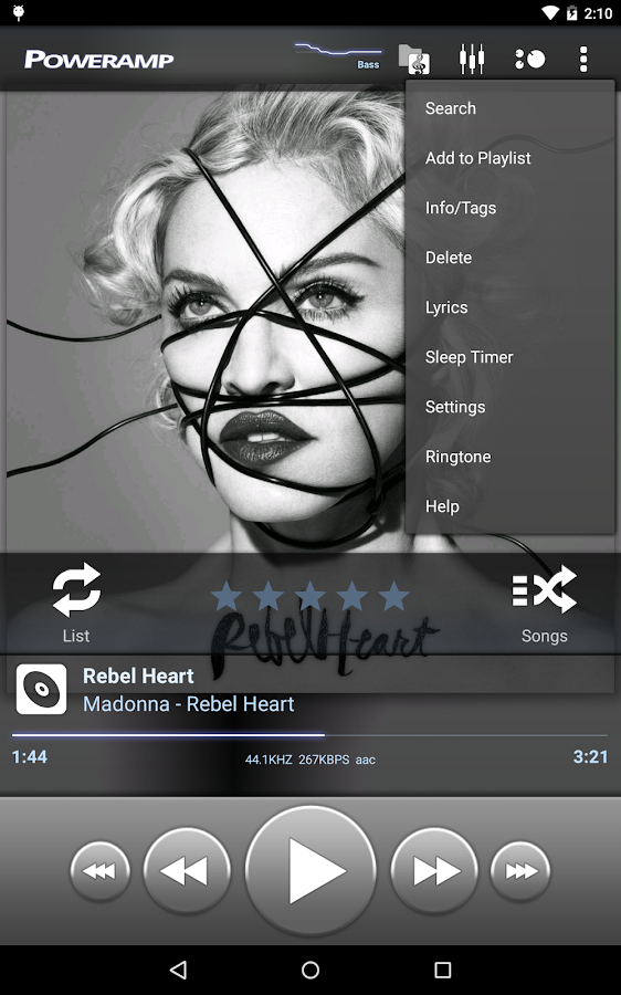
I hope you see that GUI, that's what I call: a well designed one!
from kore.
gvkt
commented on August 17, 2024
@bromix a question for you after having thought about your suggestions. You find having the content thumbnail and title redundant in "remote" panel for consistency in design and yet you have the full play controls duplicated in both screens.
Perhaps one way to look at this is by conceptual functional difference of the two screens which should be the basis for having two screens.
To me, the Now Playing screen is what you use for an immersive experience with the currently playing media typically long periods and/or sequential progress through tracks/playlists - a media player so to speak and I think the current design more or less captures that with the full controls for that purpose.
The center panel is what you primarily use for navigation through Kodi as a remote which might include short play periods (check out content for selection, sample, short pieces, etc) and hence requires the necessary controls for it.
I think the current design does this well except for not having the Stop key. I think we both agree on this last part including most others who have chimed in here. If you need extended play controls, they you are in Now Playing context with current media and are better off in that screen. What you want to avoid is flipping back and forth between the two screens to do what you want too often. This is the problem now for the Stop button functionality.
The UI ought to follow that conceptual functional separation I think. Having some redundancy between screens in such an organization is not a bad thing. What screen you are on depends on what context you are in with the relevant minimal controls for that context and duplicated elements if there is commonality between those contexts. I don't find that inconsistent in design.
Also I think having the thumbnail in the center panel makes it a bit visually interesting rather than be a bland remote with buttons.
from kore.
bromix
commented on August 17, 2024
@gvkt please keep it short...I don't see any question.
You're right I missed that. I just would remove the controls in the Now Playing and move them completely to the Remote panel.
So Now Playing is the pure information panel and the Remote panel has all the controls. Just keeping it simple. Design is not everything, I try to tell that our designers every day...but they want burning discs rolling into the screen and explode to ashes...but the UX suffers and our customers can't use or understand the software because the usability is out of context. It's hard to find the right level between design and usability, but most of the time it's the simple solution.
Dinner is served, I have to eat ;)
from kore.
gvkt
commented on August 17, 2024
@bromix, while I understand where you are coming from, seems to me that cramming all the controls into a single screen and neutering the Now Playing screen doesn't really make it simple and is a step backwards towards mimicking physical remotes that suffer from button overload.
I like the separation of the two screens that Kore currently has (the third play list screen is hardly ever used in my usage) with some redundant controls for overlapping functions in the two different contexts. Only a minor tweak needed in my opinion.
Anyway, enough said from me on this topic. If the above discussion hasn't convinced of any need to change anything, nothing more is likely to. :-)
UI and UX are complicated subjects with a lot of opinions, rationalizations obviously. Shops that seem to do well are those that take a good position to start with and then really listen to the customer feedback (not developers or product managers) even if it violates some ideological or theoretical principle.
from kore.
antivirtel
commented on August 17, 2024
I think @gvkt we are having the same ideas, you should discuss the other things with @bromix using private channels. No more off topic please!
The question is easy: Will the head developers accept a PR with a plus stop button in the central Remote screen? If so, I can try to do that.
from kore.
gvkt
commented on August 17, 2024
@antivirtel let me know if you need any help in development or testing if you embark on that route.
from kore.
 wp9015362
commented on August 17, 2024
wp9015362
commented on August 17, 2024
@gvkt wrote:
In the current release, the panel with the control buttons (center panel) only has back, pause and forward butons. It would be useful to have a stop button there to avoid having to switch back and forth between left and center panels
+1
Please add a stop button to the center panel.
Regards
from kore.
wp9015362
commented on August 17, 2024
The stop button has been added now in version 1.5.0:
😃
Thank you very much @SyncedSynapse !
from kore.
Related Issues (20)
- TV/EPG tab missing HOT 3
- Fdroid version
- Wear version
- EventServer detection doesn't work if mute is remapped
- Kore is able to detect lib
- Missing skip buttons in notification HOT 1
- option: add media to favourites
- Missing BACKWARD and FORWARD buttons in lock screen HOT 1
- 30 sec skip (configurable)?
- Timeout when updating the Movie list
- Slow to load albums from Artist view
- Playback position when starting playing new album not updated
- [Feature request] Viewing Player Debug Info, Player Process Info HOT 1
- Kore will disconnect from Kodi on a local network if WiFi and mobile data are active (Android 12) HOT 1
- Kore volume control needs to be larger HOT 1
- Android Auto
- Add support for the Invidious add-on when sharing YouTube URLs HOT 1
- Option to have a persistent notification HOT 2
- Abandoned? HOT 7
- Cannot connect to Kodi by IP (but same Kodi works on another phone) HOT 12
Recommend Projects
-
 React
React
A declarative, efficient, and flexible JavaScript library for building user interfaces.
-
Vue.js
🖖 Vue.js is a progressive, incrementally-adoptable JavaScript framework for building UI on the web.
-
 Typescript
TypeScript is a superset of JavaScript that compiles to clean JavaScript output.
-
TensorFlow
An Open Source Machine Learning Framework for Everyone
-
Django
The Web framework for perfectionists with deadlines.
-
 Laravel
A PHP framework for web artisans
-
D3
Bring data to life with SVG, Canvas and HTML. 📊📈🎉
-
Recommend Topics
-
javascript
JavaScript (JS) is a lightweight interpreted programming language with first-class functions.
-
web
Some thing interesting about web. New door for the world.
-
server
A server is a program made to process requests and deliver data to clients.
-
Machine learning
Machine learning is a way of modeling and interpreting data that allows a piece of software to respond intelligently.
-
Visualization
Some thing interesting about visualization, use data art
-
Game
Some thing interesting about game, make everyone happy.
Recommend Org
-
Facebook
We are working to build community through open source technology. NB: members must have two-factor auth.
-
Microsoft
Open source projects and samples from Microsoft.
-
Google
Google ❤️ Open Source for everyone.
-
Alibaba
Alibaba Open Source for everyone
-
D3
Data-Driven Documents codes.
-
Tencent
China tencent open source team.
from kore.